Secret Garden DIY Wedding Invitations

Secret Garden 004 DIY Wedding Set

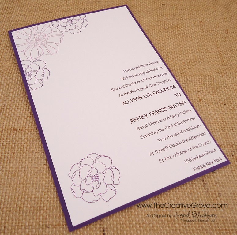
It’s finally a good few days into June, so I’ve been thinking of weddings.  I thought I would showcase a simple but elegant Wedding set that fits every brides budget.  This is great little set that covers the invitation, thank you card and place card.  There is no question, the wedding invitations and paper items that go along with it will run any bride a pretty bundle.  With Stamps, ink and any word processing program you too can make amazing item for your wedding without paying an arm and a leg.

Secret Garden 004 Wedding Invite

Creative Tips –

  • Stampin’ Up! colors are great for just this purpose.  The inks are vibrant and rich.  Here I chose Elegant Eggplant and Perfect Plum.
  • My wedding invitation is 8 1/2 x 5 1/2” and fits into an A9 envelope.Secret Garden 004 Invite Front-Back
  • I used my word software to print onto a piece of 8 1/2 x 11 piece of cardstock.  I first created two columns.  One side had my Invitation and the other column had my reception information.  This invitation/reception card is front and back to save on the budget.
  • My Thank You card uses our Notecard and Envelopes package.  They are pre-scored for your ease and makes a quick and simple Thank You card.  The Thank You stamp is from our Lacy & Lovely stamp set, but The Thank You in our new Four You Stamp set would be perfect also.Secret Garden 004 Thank You Card
  • The Place Holder card is also quite simple.  I can get 16 per page printed at 1 1/4” x 3”.  The full size is 3” x 3 1/4” folded so that it’s 1 1/2” x 3 1/4”.Secret Garden 004 Place Holder
  • For a little variety I made the Table Number out of our Island Indigo Paper, but it is stamped with the same stamp set.  I ran 1/2 a sheet through on our Mini Milk Carton Die through the Big Shot for the base.  I filled it with rice and used a small dowel for the stick.  I printed the table number twice and matted it twice.  I adhered them together with Sticky Strip.  It’s a cute little item that does not take up much place.Secret Garden 004 Table Number

Overall, there are so many ideas out there for weddings.  This set will run you $151 before shipping and tax, and you’ll have an additional $25 to spend from the hostess benefits.  The best part about it – it makes 100 invitations, RSVP Cards/Envelopes, Thank You cards and place cards.  Now that’s not bad for something that’s elegant and full sized.  Here’s what you will need:Secret Garden 004 DIY Wedding Set

Invitation Kit – 100 Invitations w/reception card, RSVP cards/Envelopes, Thank You cards/Envelopes + Coordinating Place Cards

    • $8.50ea (4) Ultra Smooth Whisper White Cardstock (40 sheets each) (100730)
    • $6.95ea (3) 8 ½” x 11” Colored Cardstock (24 sheets each) (105126)
    • $5.95 (5) Note Cards & Envelopes (20 each) (131527)
    • $6.50 (3) White Envelopes (40 each) (107301)
    • $6.95 Snail Adhesive (104332)
    • $4.50 (2) Snail Refill (104331)
    • $25.95 Secret Garden Stamp Set Wood (129144c, 131940)
    • $5.95 (2) Coordinating Classic Ink Pads (126963, 126969)

* Additional items – Kit price is based on a wood stamp set, if you order the clear, you will need the Starter Kit bundle Acrylic Blocks.  You will also need A9 envelopes and a paper trimmer.

    Signature Snowflake 001

To Shop 24/7 in the Creative Store – Click here!

Secret Garden

Mojo Simply Sketched

Simply Sketched 003 Main

It’s the first Mojo Monday of the new Catalog!  So today I thought I’d use a few stamp sets that are brand new.  You’ve seen a few sneak peeks from me with Simply Sketched before, but and I thought I’d have some fun with the new color Crisp Cantaloupe.  I decided to pair it with Midnight Muse – primarily because I chose one of the color combinations in the catalog layout – I love how they label the colors for our ease.  And I needed it, as my Color Coach is en route to me in my very first order – I can’t wait to get it to play with all the cool new stuff!

                    Simply Sketched 003 FrontMojo296Sketch

Creative Tips –

  • I decided to keep the sizes of the circles simple.  This would have been much easier with my brand new Circle Framelits (there are 10 sizes!), but they are somewhere crossing the US from Utah to Florida as we speak.  So I used my 2 1/2” Circle punch as my main size. 
  • I stamped my flower in Versamark and Midnight Muse before embossing it with Clear Embossing Powder.  Of course I used my Embossing Buddy first!
  • I chose to water color my image using Aqua Painters in various shades of Crisp Cantaloupe.  To get the darker highlights, I just went over my original coloring two to three times.  The stems I did in Pear Pizzazz – a new fav! Simply Sketched 003 CU
  • I added a little texture by embossing my back Crisp Cantaloupe circle with the Chevron TIEF folder.
  • I originally had my Pear Pizzazz piece of card stock plain, but the card needed a little something.  Enter the best background stamp in the world – Travel Journal Builder Wheel.  I have three stacked here, which was the perfect dimension.  You can also unmount your wheels and use them as regular stamps, did you know that?! I wheeled my Jumbo wheel with the three builder wheels on it on a Pear Pizzazz Ink Pad since I’m still waiting on my ink refills to make a cartridge.  Simply Sketched 003 Side
  • Once everything was layered just as I wanted it, I paper Pierced my corners first.  I chose to add five punches to the top and three to the bottom.  You don’t have to always do the same.  I used my Paper Piercing Tool, Stampin’ Pierce Mat and Essentials Paper Piercing Pack.
    • I used the stamp For You from probably one of the coolest new stamp sets – Chalk Talk which has the best framelits in the catalog.  It’s a very cool new tag set that has endless options!  You can even get it as a bundle and save 15%.  I punched it out using our 1 3/8” Circle Punch and popped it up using Stampin’ Dimensionals.Simply Sketched 003 Height
  • For a finishing touch I added three large Pearl Basic Jewels, and one medium to the greeting.  I love the end result and think the colors work well together.

Today is the final day you can order from the retired lists and old catalog.  So don’t wait!!!  Of course you can order from the new catalog too. Smile  If you don’t have your very own copy, click here to find out how to get one shipped directly to you.

Signature Snowflake 001

To Shop 24/7 in the Creative Store – Click here!

Simply Sketched 003 Angle

Stamp Sets – Simply Sketched (129672c, 129669w), Chalk Talk (130634c, 130631w) Chalk Talk Bundle (132730c, 132731w), Travel Journal Builder Wheel (3) (126937)  Ink – Crisp Cantaloupe (131176), Pear Pizazz (131180), Midnight Muse (126860), Versamark (102283) Paper – Whisper White (100730), Crumb Cake (120953), Midnight Muse (126843), Crisp Cantaloupe (131298), Pear Pizzazz (131201) Cool Tools – Aqua Painters (103954), 2 1/2” Circle Punch (120906), 1 3/8” Circle Punch (119860), Paper Piercing Tool (126189), Stampin’ Pierce Mat (126199), Essentials Paper Piercing Pack (126187), Chevron TIEF (127749) Finishing Touch – Stampin’ Dimensionals (104430), Pearl Basic Jewels (119247)

Chalk Talk Bundle

Simply Sketched Stamp Set

So Long Farewell to the Spring Catalog…Project Parade!

Secret Garden 002 MainOh Hello 001 Main

We’ve had so much fun at The Creative Grove with the Spring Catalog this year.  The CG Crew felt this year’s mini catalog was the best one in 25 years.  So if there is anything that you were holding out on, don’t wait – tomorrow starts the brand new catalog year which means that today is the official LAST day to order from the Spring Catalog.  Some products made it into the new catalog, but most unfortunately did not.  So we bid good bye to several favorites.

Click on any image to see the card details and creative tips.

Ciao Baby 001 Main

Ciao Baby – I didn’t get to stamp with this set as much as I would like, but here is the first actual creative scenery card I’ve ever made actually based off a real life photo or experience.  It brings back such great memories of a wonderful day in St. Barts. Click Here for card details, creative tips and more photos

By the Tide – This was by far my most highly anticipated stamp set out of this year’s catalog.  I was dying to do an underwater scene like the one above and below.  The images were just begging to be brayered.  I love all the projects I’ve made with this set, and there were many more, just made as exclusive content for clubs and classes.  The top right one actually was a CG Crew project in January.  Click each photo for card details, creative tips and more photos.

By the Tide 003 Main

Collage Curios – This is a fun set that I was shocked didn’t make the new Catalog.  Here are a few easy projects that highlight this stamp set in a great way.  This project was acutally a CG Crew project in March.  We loved making this along with a necklace out of Soda Pop Tops.  Those little flowers from our 5/8” Flower Trim and Soda Pop Tops also didn’t make it, which makes me glad I’m stocked up!  The Soda Pop Top card features all the best from the Spring Catalog – Honeycomb Embossing Folder, Pool Party Core’dinations Paper, Paper Doilies, Hearts a Flutter Bundle, Oval Framelits, Collage Curios, Soda Pop Tops and 5/8” Flower Trim. Click each photo for card details, creative tips and more photos.

Collage Curios 002 Side

Hearts a Flutter – This set I had a ton of fun with around Valentine’s Day.  I love the coordinating framelits that come along with it as well.  As a bundle you save 15% which I just love!  And the framelit set has a banner flag die in it.  Below you see my use of the new Occasions Paper Piercing Templates in the Spring Mini – I just love all the different sizes of Hearts on the one of three templates.  The first project was my actual Anniversary card for my sweetie Michael and was a Just Cards Class card.  Smile Click each photo for card details, creative tips and more photos.

Swallowtail okay, I think we can all agree that this ended up being my surprisingly favorite stamp set out of this years Spring Catalog.  There are so many projects you didn’t even see with this amazing stamp too.  But this is still probably one of my top five cards I’ve made over the past five months.  My favorite detail is the Banner Flag.  Look closely – that’s the butterfly image stamped tone on tone under the Thanks.  I’ll miss that Thanks too – it’s part of the stamp set Kindness Matters which is retiring from the big catalog – and at $8.95 for the clear set is by far the best Stamp Set deal you’ll find.  I think that one stamp has gotten almost as much usage as Thinking of You from Sweet Essentials.  Click each photo for card details, creative tips and more photos.

Some more favorites from the Swallowtail Stamp Set.

Swallowtail 007 MainSwallowtail 004 Main

Do you want to get the latest specials and creative tips sent right to your inbox?  Then click here to sign up for my Creative Tips Mailing List!

Signature-Snowflake-001_thumb1_thumb

Into the Sunset with Serene Silhouettes

Today is about color.  I have to admit, I struggled with a project today…let’s just say that I can procrastinate with the best of them if I put my mind to it, how about you?  This is why I usually create between the hours of 5 and 9 am!  Well, if this is the result of a little procrastination every now and then, I guess it’s not that bad!  Today I focused on starting with three of the retiring colors as no other stamp set struck me with inspiration.  So it’s all about River Rock, Bashful Blue and Riding Hood Red today.

Once I knew what colors wanted, I went looking for inspiration on Pinterest and I happened to see a card with Serene Silhouettes and the rest is shall we say history.  Thankfully this stamp set isn’t going away, and I thought, humm….it’s been a few weeks since I whipped out my brayer.  I’m sure my friend and CG Crew member Amy has been wondering if my brayer got locked up in a drawer somewhere…she and I seem to text each other a new brayer project we’ve created almost every week it feels like…lol!

As I sat in front of my blank piece of 5.5” x 4.25” Whisper White paper, I thought of my Dad.  I grew up in San Francisco and we had a view of the Pacific Ocean from my house.  I’m lucky, I’ve seen my fair share of amazing sunsets over Ocean Beach.  And on a good day, you can even see the Farallon Islands in the distance.  My dad used to always tell us stories about the firemen who would dive for abalone there in the shark infested waters.  This card is paying homage to my roots back home in San Francisco, California.  The grass in the sand dunes, gorgeous blue waters, an amazing sunset and sea gulls flying around with islands in the distance.   Here’s to you Dad, I miss seeing you more often, I’m thinking of you and hope your day is filled with beauty like this!

Creative Tips –

  • I started out by stamping my main image in Versamark and then coloring it with all retiring colors – Lucky Limeade, River Rock and Riding Hood Red with Classic Ink Pads and Stampin’ Write Markers.  (They’ll be gone for good on June 3rd – if even available still)
  • I then embossed my image in Crystal Clear Embossing Powder. 
  • I repeated the grass portion of the same stamp set several times along the bottom. Serene Silhouettes 001 Bottom Angle
  • Once my stamped images were cooled and set, I masked my horizon and began to brayer my ocean in Bashful Blue.  I went across in a horizontal motion and then focused from the left and then the right in a vertical motion, leaving my middle a bit white.
  • I went over it with Tempting Turquoise to brighten it up a bit and then focused on the horizon line both with my brayer and a sponge.
  • I switched my mask and placed a sun on my paper under my mask in the area where the sun sinks into the water. 
  • I brayered the top 2/3 of my sky, in this order, with Bashful Blue, Tempting Turquoise and hit the very top with Island Indigo.
  • I layered Daffodil Delight next with my brayer from the horizon to the blue to create a little pop of yellow.  Where it met the Bashful Blue it created that pop of green that you get.  Serene Silhouettes 001 CU Sunset
  • I intensified my color with a Daffodil Delight sponge in a circular motion.
  • I added a hint of Tangerine Tango first with a brayer and then with a little sponging from the horizon.
  • My final color is Riding Hood Red just at the horizon line to add a little drama and intense orange color right at the horizon.
  • I removed all my mask and sponged a little color into my sun with Daffodil Delight and then just a hint of Tangerine Tango.
  • I lightly sponged some Daffodil Delight in the water where I left the white area.  I didn’t over do this as I didn’t want it to turn green from the Bashful Blue.  If you don’t leave enough whitish space, you will get too much green – remember yellow and blue make green.  I followed up with a hint of Tangerine Tango.Serene Silhouettes 001 Front
  • I created a mask of two islands and sponged them in using Early Espresso.
  • For my finishing touch, I used a White Gel Pen to create my seagulls & water ripples .  Finally, I used Early Espresso and a sponge to frame my card.

I hope you love this card as much as I do.  I just love sunsets, who doesn’t!  We’ve had some amazing ones here in Florida this week, maybe I just have them on the brain!  I hope your evening is filled with beauty today.  I’d love to hear from you – let me know if you whip out your brayer and give some creative scenery a try! 

Hands on Creative Scenery Classes

If you’re in the Orlando area on June 21st, I will be teaching Creative Scenery 101!  For more information on this fun class click here.  If you would like me to come to you directly, contact me – I’m up for traveling to teach these classes!  Be sure to check back here for the online version of this class later this month as well. Smile

To Shop 24/7 in the Creative Store – Click here!

Serene Silhouettes 001 Side


Stamp Sets – Serene Silhouettes (127324c, 132073w), Sweet Essentials (126455w, 126457c) Ink – Versamark (102283), Tempting Turquoise (126952), Island Indigo (126986), River Rock (126977), Daffodil Delight (126944), Tangerine Tango (126946), Riding Hood Red (126968), Red Riding Hood Marker (119701 – Regals Marker Collection)  Paper – Whisper White (100730), Early Espresso (119686)  Cool Tools – Stamping Sponges (101610), Brayer (102395), Blender Pen (102845), VersaMarker (retired), Clear Embossing Powder (109130), Heat Tool (129053), 1” Circle Punch (119868)  Finishing Touch – White Gel Pen (105021)

Farewell Kindness Matters

Kindness Matters 002 Main

Do you ever just have those go to kind of stamp sets?  Kindness Matters has definitely been one for me. I probably use the Thanks greeting from this set more than any other, and I know I have a guaranteed great card every time I use the butterflies.  It’s a fabulous set that if you don’t have, don’t miss out.  Best part – it’s one of our least expensive sets, so there’s great value too!

Today I’ve paired this fun stamp set with a few of our retiring colors.  Yesterday you read how Not Quite Navy has been my #1 favorite color for 11 1/2 years (still…sniff…sniff), but this year, one of my go to colors has definitely been Baja Breeze.  I was is complete shock when this color retired.  And quite sad, as I have so many cool things in Baja Breeze.  It was such a great color to work with.  It’s sad that I’m speaking of it in the past tense, but this is my grieving week, and then Friday I’ll move on! Smile

Kindness Matters 002 Side

Creative Tips –

  • I always want to use the Rock n Roll technique when I use this stamp.  The butterflies to me just need that multi color.  Perhaps it’s because most butterflies are multi colored.  I stamped the main image randomly and from various angles on an oval that I cut out using the new Ovals Collection Framelits and my Big Shot.  It’s the second smallest one.  I used So Saffron, but didn’t want the butterflies to take away from my main ones, so I stamped them off once to decrease their vibrancy. Kindness Matters 002 Butterflies
  • Next I stamped my main images on a piece of scrap paper.  I used the new color Crushed Curry.  I really wanted my yellow to stand out from the So Saffron.  I rocked my image in Baja Breeze and then slightly on the edges in Not Quite Navy.  To get a good outline on my images in Not Quite Navy, I touched up my image with my Stampin’ Write Marker in the same color.  I also thumped the marker along the center of each butterfly.
  • Of course blue and yellow make green, but I think since this blue is so much darker, it stands on its own.
  • I cut out my rock n rolled butterflies with my paper snips and ran some Snail adhesive down each center.  I curls and popped up the wings with some Stampin’ Dimensionals that I trimmed down to fit.  This way the butterflies look like they are in flight.Kindness Matters 002 CU
  • I took a piece of our retiring Baja Breeze 1/2” Seam Binding Ribbon and pulled a few of the middle fibers to ruffle the ribbon a bit.  Once I had it how I wanted, I adhered it using Glue Dots – the single best way to attach fibers to anything!
  • I ran a piece of Not Quite Navy through my Big Shot using the Chevron Embossing Folder for a little contrast and added half of one of our new Paper Doilies.  Together the combination has a collage feel, yet also looks contemporary.
  • I try to apply the law of thirds to just about all my projects in the design aspect.  You’ll see that my main image is in the top third of the space, while my Pearl Basic Jewels accents are also in threes, within three.  You always want to add your embellishments in odd numbers.  Kindness Matters 002 Front
  • Since the Seam Binding Ribbon is such a large accent, I balanced it out on the other side with one of our Vintage Faceted Buttons on the opposite side.  I used Pearls to complete my triangle, and used some of our White Bakers Twine for the knot.  Of course I attached it using Glue Dots.Kindness Matters 002 Height
  • One tool that I will keep on using, and if you don’t have one I encourage you to get it right away – that’s the Color Spritzer Tool.  Combined with any of our Stampin’ Write Markers, you can fill any space in just the right way.  I used my Not Quite Navy Marker to add the speckling to both my oval and main project.  Don’t hold it too close, as the dots will be highly concentrated together. 
  • You may be wondering where my greeting is, well…after playing around with several banners, tags to be attached with vintage trinkets like our safety pins and staples, I decided to just put the greeting on the inside.  Although, there’s nothing wrong with a blank card too! 🙂
    As this week quickly winds down, I’m trying to use all my favorite things one last time for you before moving on.  It’s not so easy!  You many be wondering why move on at all?  Well, in my Stampin’ Up! world, if it’s not current, then use it sparingly.  That’s okay, believe me when I tell you I have a secret stash of Not Quite Navy card stock in both sizes…lol! 
    There are a handful of stamp sets that will make the cut and remain on the shelves of the Creative Studio.  But not many!  I find that I think I’m going to stamp with them, and then I don’t.  So I’ve gotten quite good at purging.  Which is to your benefit – look next week for all my “retired” sets on here.  Some go back 10 years! Have a creative day today – and most of all, have fun!

    Come Stamp with Me!

    f you are in the Orlando area and want to come to the Creative Studio to stamp – be sure to check out the classes tab above.  I have Just Cards and Creative Cards classes on Monday June 3rd!  And of course, don’t miss my free but fully loaded with fun New Catalog Kick Off Thursday June 6th. Smile

Signature Snowflake 001

To Shop 24/7 in the Creative Store – Click here!

Kindness Matters 002 Angle

Stamp Sets – Kindness Matters (122902c, 122900w) Ink – So Saffron (126957), Baja Breeze (126960), Crushed Curry, Not Quite Navy (126971), Not Quite Navy Stampin’ Write Marker (Regals Collection – 119701) Paper – Whisper White (100730), Not Quite Navy (101722), Baja Breeze (111352)  Cool Tools – Paper Snips (103579), Color Spritzer Tool (107066) Finishing Touch – Stampin’ Dimensionals (104430), Pearl Basic Jewels (119247),  Baja Breeze 1/2” Seam Binding Ribbon (122331)

new stampColor Spritzer Tool I107066

Mojo Happy Hour

Happy Hour 001 Main

It’s that sad and exciting week in Stampin’ Up!  It’s our final time to say good bye to good ‘ol friends and hello to new ones.  What am I talking about, you may be wondering – well…it’s the final week for some of my all time favorite products – some that have been with me for 11 1/2 years!  And of course – hello to the brand spankin’ new ones in the new catalog.  If you want your very own free catalog click here!

Of course, what better way to send of our dear favs other than Mojo Monday!  I truly love creating in this fun Challenge.  I find that it really gets my week off to a great creative start. Smile

Mojo295Sketch

Today we are saying good bye to my two favorite retiring colors – Not Quite Navy (Gasp!!) and More Mustard.  Not Quite Navy and I have been good friends my whole life.  So it was natural, when I joined the Stampin’ Up! sisterhood in January 2002, that Not Quite Navy quickly became my all time favorite color.  And More Mustard, which is the exact color of Dijon Mustard – another favorite of mine…I can’t eat a hard boiled egg without it, is sadly being depleted with each card here in the Creative Studio.  I think I only have three full sheets of it left!

And my favorite Designer Series Paper this year was hands down Fan Fair.  How could you not like something with a giant Eiffel Tower and World Map in it?! 

So since we’re saying good bye to some good friends, I thought I would say hello to a new one for me.  Not that the stamp set Happy Hour is new to the catalog, but it is new to me!  I’ve wanted this set all year, and felt it was about time to start stamping with it.  And since Champagne is a fitting beverage to toast our retiring and new friends, why not three glasses of it!

Of course, I had to sneak my signature smashed flower in there too – everything is better with a smashed flower!   And just plug in smashed flower into the search box on the right to see the many projects I’ve created with this easy and addictive flowers.  Click Here To learn how to make smashed flowers

Creative Tips:

  • I gravitate to the square cards in this challenge, so that was an easy choice for me.
  • I used my color coach to choose my colors and then decided on Early Espresso as a highlight. 
  • Champagne is bubbly and sparkly, so I had to have Rhinestone Basic Jewels!  Instead of my usual flower center, I chose to add our Large Rhinestone Jewels. 
  • My card needed a little something in the corners, so I added a large and two small Rhinestones instead of Paper Piercing.  But the Paper Piercing would have looked great too. Happy Hour 001 Side
  • I chose the Fan Fair DSP because it’s just the right amount of pattern without taking away from the spirit of card.  Balance is important when working with patterned paper, otherwise you can quickly overwhelm your project.
  • To bring a little drama and emphasis to various spots, I popped up the Champagne glasses, banner flag and smashed flowerClick Here for a video on how to make a perfect Banner Flag endHappy Hour 001 Height
  • I couldn’t get my greeting stamped right today for the life of me – ever had that happen?  So I finally just filled it in with my Not Quite Navy Stampin’ Write marker.  I’m so glad it’s the same ink as our Classic Ink Pads.  If you look closely at my photos you can tell, but only because it’s zoomed in, holding the card in front of you, you’d never notice.
  • My card measures 5 3/8” x 5 3/8” and my white panel is 5” x 5”.  My Early Espresso panel is just an 1/8” larger so that I have a 1/16” border…or is it too early in the day for fractions…lol!
  • My interior white square is 3”x 3” and the Not Quite Navy square is 3 1/8”x 3 1/8”. This card came together easily for me.  I hope you like it, it has a classic and traditional look to it.  I love the colors, I hope you do too!  Happy Memorial Day. Smile

Free New Catalog

If you would like your very own brand new FREE 2013-2014 catalog click here to find out how to get one!

Signature-Snowflake-001_thumb1

To Shop 24/7 in the Creative Store – Click here!

Stamp Sets – Happy Hour (126642c, 132013w) Ink – Not Quite Navy (126971), Not Quite Navy Stampin’ Write Marker (Regals Collection – 119701) Paper – Whisper White (100730), Not Quite Navy (101722), Early Espresso (119686), More Mustard (100946), Fan Fair Designer Series Paper (126918) Cool Tools – 1” Square Punch (124094), Fancy Flower Punch (118073), Paper Snips (103579) Finishing Touch – Stampin’ Dimensionals (104430), Rhinestone Basic Jewels (119246), Large Rhinestone Basic Jewels (129324)

Happy Hour

Swallowtail Emboss Resist

Swallowtail 008 Main

The Swallowtail stamp is one of my favorites to create an simple but elegant card in just minutes.  Today I decided to emboss and show you a little emboss resist. 

Creative Tips:

  • I like stamping with the swallowtail stamp on an angle.  To me it’s like she’s in flight.  Try it at different angles.
  • This is a detailed stamp, so I encourage you to use an Embossing Buddy first on your Whisper White card stock. 
  • Next ink up your image in Versamark ink.  Versamark is a watermark pigment ink.  It’s sticky – that’s how we’re going to get the embossing powder to stick to it.  Because it’s a watermark ink, stamped on a color, you immediately have a faint (watermark) matching color of ink – it’s a must have!
  • Next I poured White Embossing Powder all over my Swallowtail image.  Because our powder is so fine, it really gets into the detail of this stamp well.  If you haven’t tried Stampin’ Up! embossing powder, I encourage you to do so.  I guarantee you’ll notice the difference, my customers swear by it!
  • Melt your powder using our Heat Tool being sure to really get the entire image.  Tip – if your powder looks grainy and not smooth, it’s not melted.  With an image this large it’s easy to miss some, so take your time and check.Swallowtail 008 CU
  • I used Tangerine Tango to color my butterfly.  I gave my project a couple of minutes to cool, and then sponged my Classic Tangerine Tango directly over my image.  The raised embossed image resists the ink and pops.  It’s a cool technique that’s a big wow. 
  • To finish my project off, I sponged around the edge to create a frame. 

You can over emboss, and there’s no real fix for that.  Before I joined the Stampin’ Up! sisterhood, I over embossed all the time. I would get so frustrated because my images always looked really funny and not that pretty.  My embossing powder would turn this funky color, and you just knew it wasn’t right.  I guess that’s why I’m not a good griller either…I always over cook the meat.  It never looks done…lol!

This is a simple project that really comes together in minutes.  I love the simplicity of it.  Now it’s your turn!

Are you getting my Exclusive Video Series?

Be sure to sign up for my Creative Tips Newsletter and get the latest Creative Grove news in addition to my free Creative Techniques Video Series!  Don’t miss out on our creative community – the only way to get this exclusive content is to sign up in the box on the upper right or click here.

Signature Snowflake 001

To Shop 24/7 in the Creative Store – Click here!

Swallowtail 008 Main

Stamp Sets – Swallowtail (129213w, 129216c), Thanks so Much (retired) Ink – Versamark (102283), Tangerine Tango (126946)  Paper – Whisper White (100730), Tangerine Tango (111349) Cool Tools – Heat Tool (129053), Embossing Buddy (103083), White Embossing Powder (109132) 

Swallowtail Stamp 129216L

A great Tip for Edgelits

Lacy & Lovely 01w Main

One of my customers was recently going through one of my many basket of cards for ideas here in my classroom.  She stumbled upon this card and I happened to tell her that I made 100 of these last summer.  She said there was no way she would ever cut out that many of those Finishing Touches Edgelits because she didn’t like to pop out the little pieces (notice there are two on this card – so that’s 200!).  I told her I’d show her a little trick I learned along the way and thought I’d share that with you today too!

001

Anytime I’m using the Doilies or Edgelits, I use a lint brush to help me get out those little pesky pieces.  It does most of the work for me and I then can quickly pop the remaining ones out with my Paper Piercing Tool.  It goes so quickly, I think you’d be absolutely amazed!

Another little tip I have for when you are mass producing them is to run two through your Big Shot at the same time.  While it’s not recommended to do more than that (you can actually break your machine if you force anything through), what’s great about doing two is that on one all the little pieces come completely out!  Then on the second I just whip out my lint brush & Paper Piercer and finish it off. 

If you’d like to see all the details of how I made this card Click Here.

Try it, I think you’ll be amazed!

Signature Snowflake 001

To Shop 24/7 in the Creative Store – Click here!

Lacy & Lovely 01w Angle

Stamp Sets – Lacy and Lovely, Travel Journal Script Builder Wheel Paper – Very Vanilla, Cajun Craze, Always Artichoke, So Saffron Ink – Cajun Craze, Always Artichoke, So Saffron Cool Tools – Big Shot, Finishing Touches Edgelits, Apothecary Accents Framelits, Delicate Doilies Sizzlits, Decorative Label Punch    Finishing Touch – Stampin’ Sponges, Stampin’ Dimensionals,  Pearl Basic Jewels, Linen Thread

Lacy and Lovely