How to Create Realistic Scenic Cards

Spooky Hollow Clear Stamp Set used to create a Twilight Scenic Halloween Card

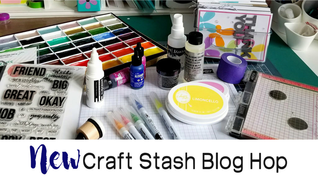
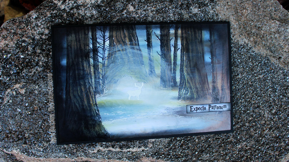
Earlier today I showcased a realistic scenic card when I participated in a fun blog hop for the new Catherine Pooler release – Kind of Batty. I had filmed my card, but hadn’t had a chance to get the video done – well…here it is!!

If you’ve already hopped through the incredible blog hop, enjoy this one! If you’re catching it later on in the evening – then you may have seen this. 🙂

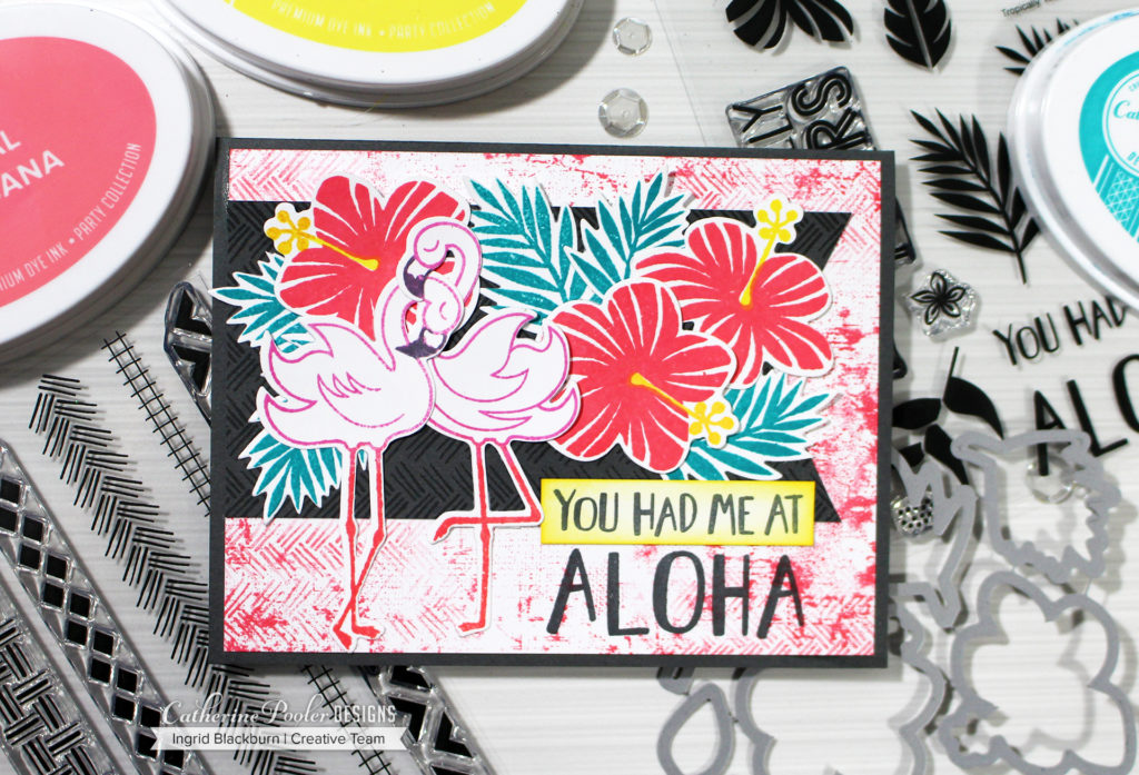
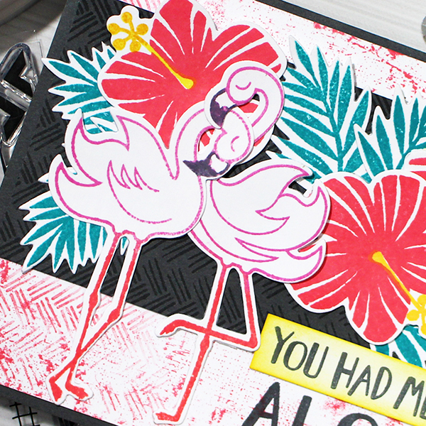
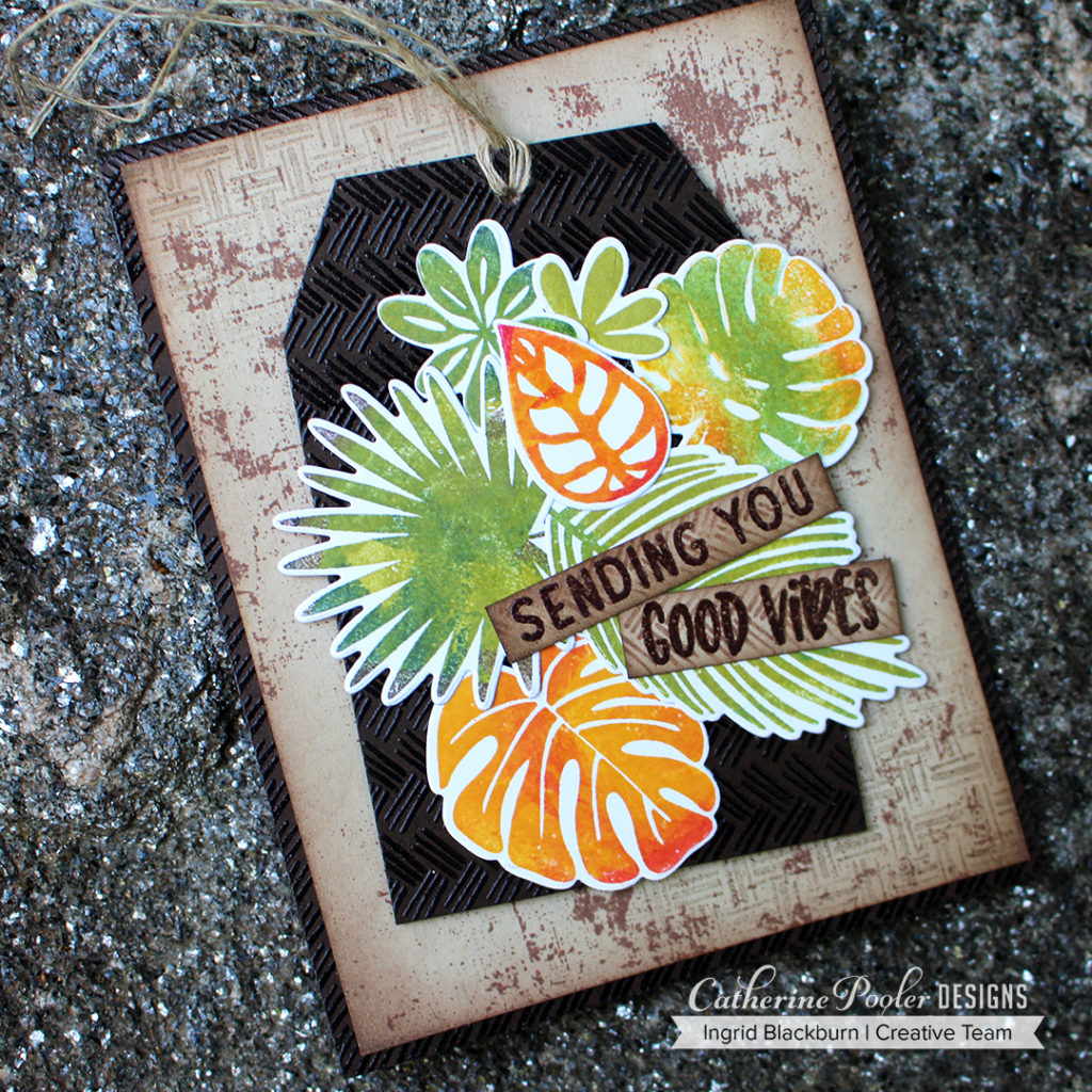
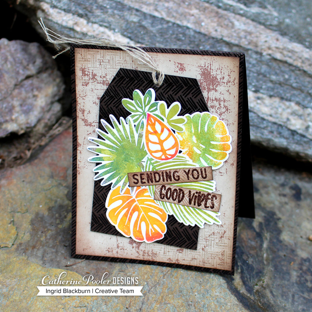
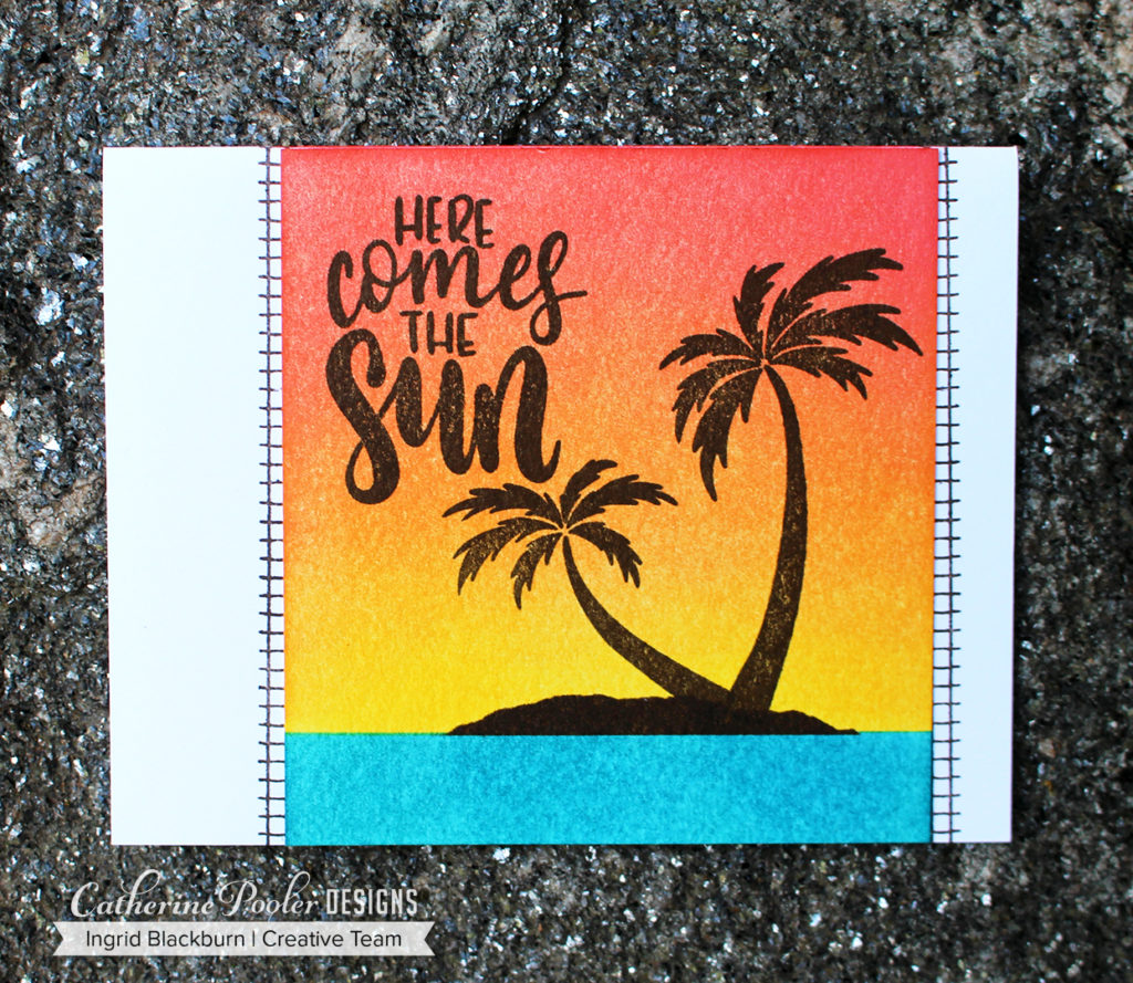
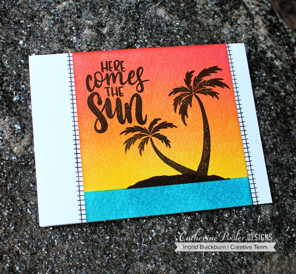
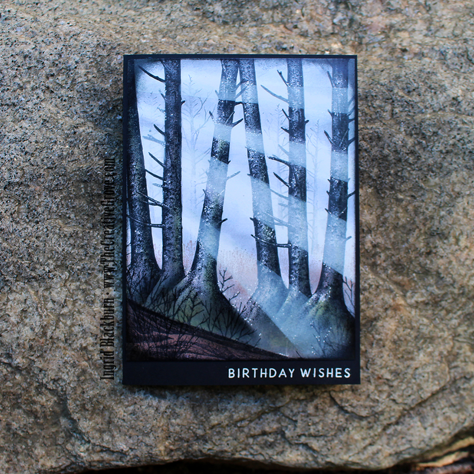
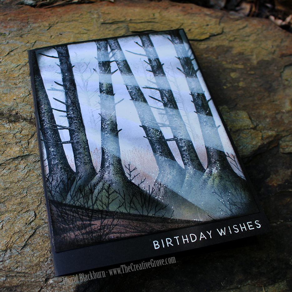
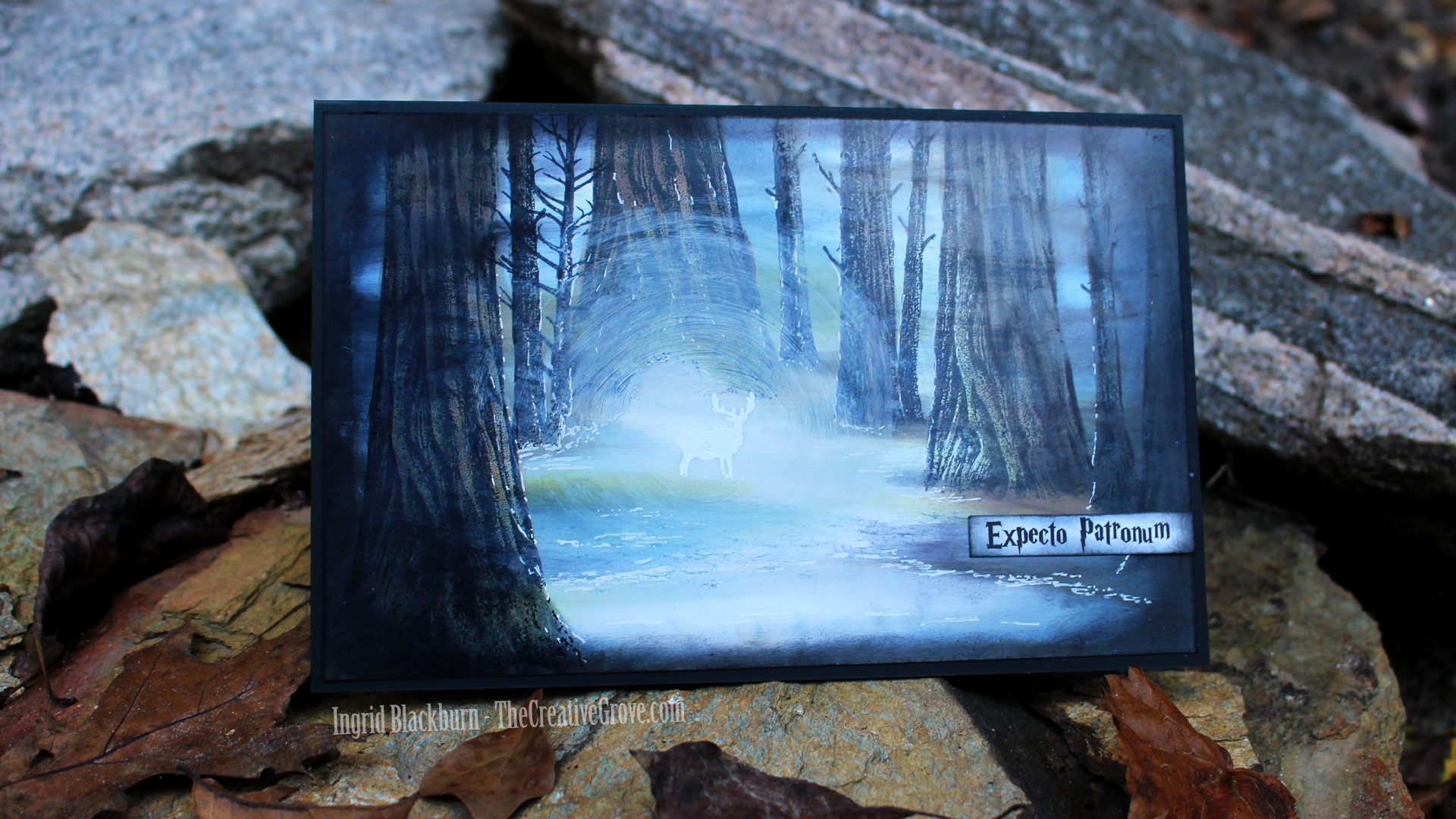
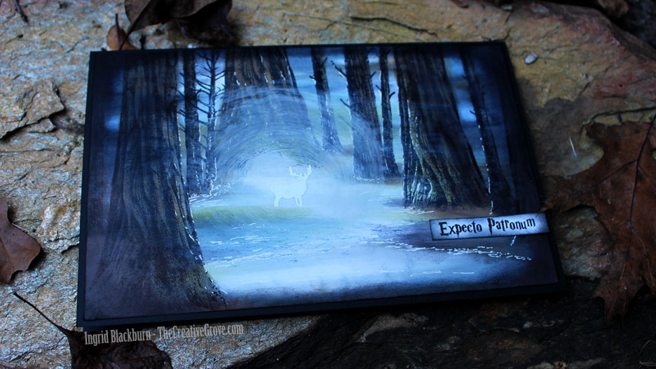
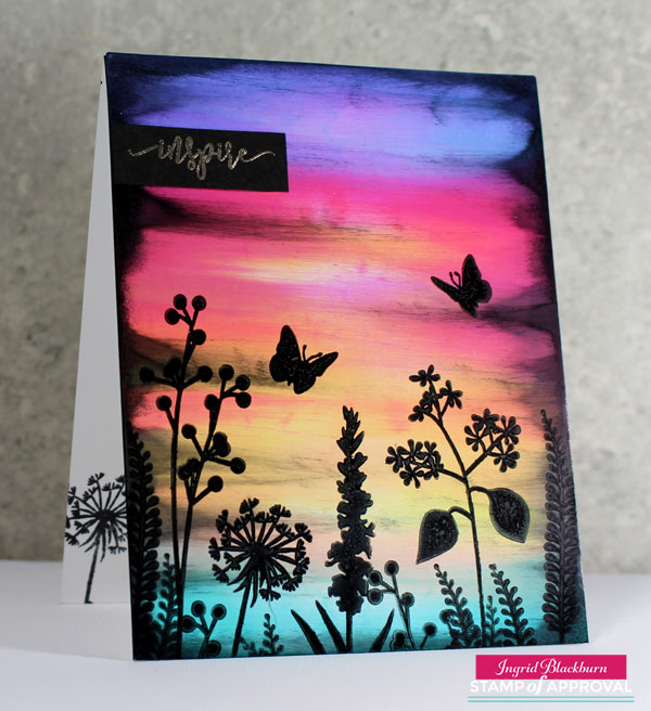
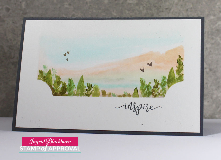
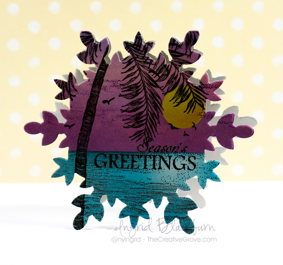
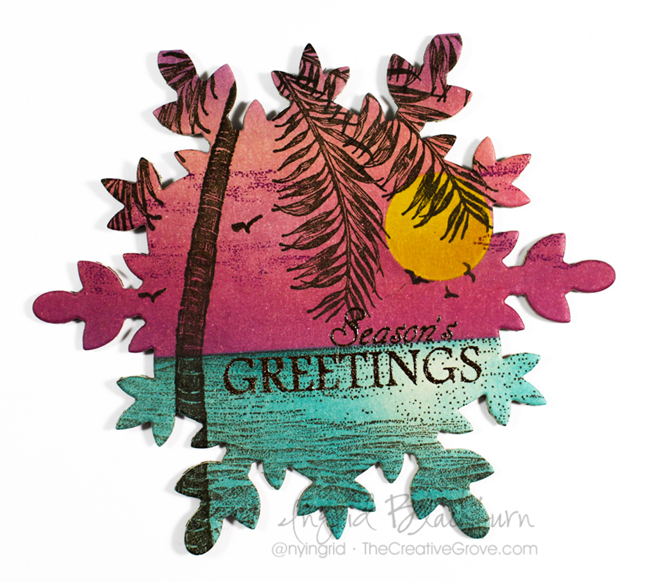
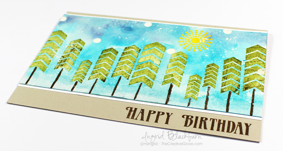
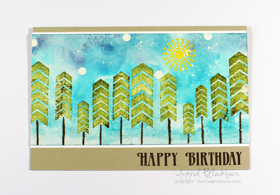
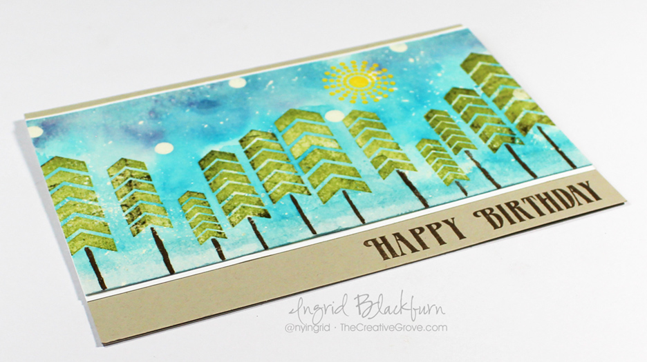
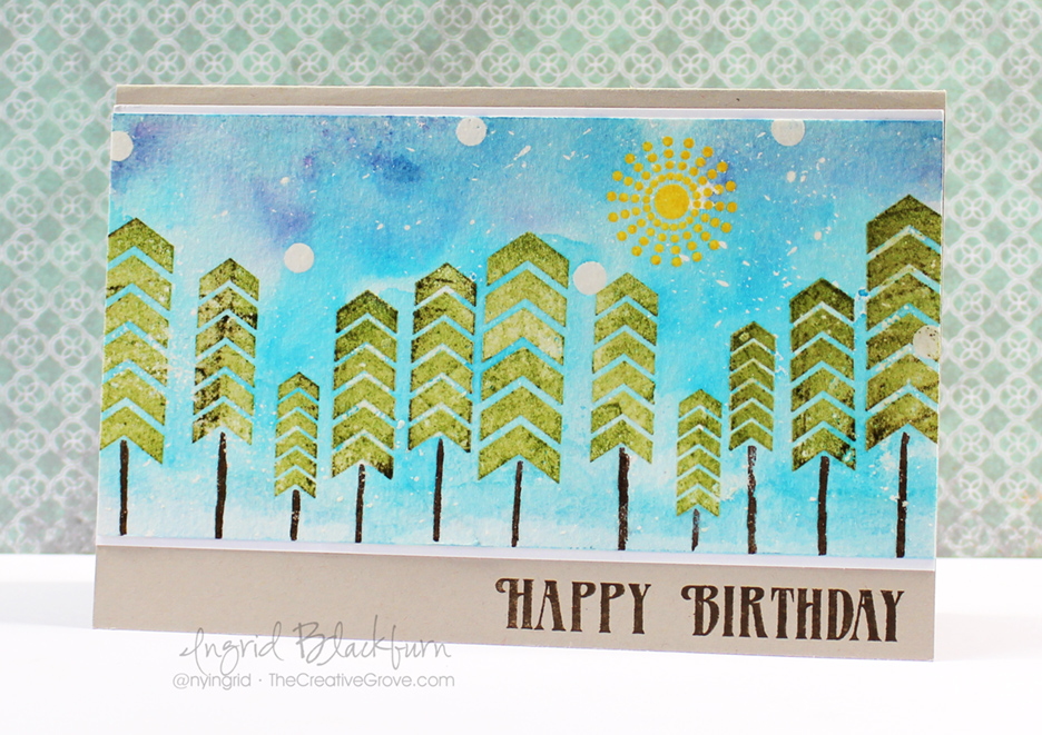
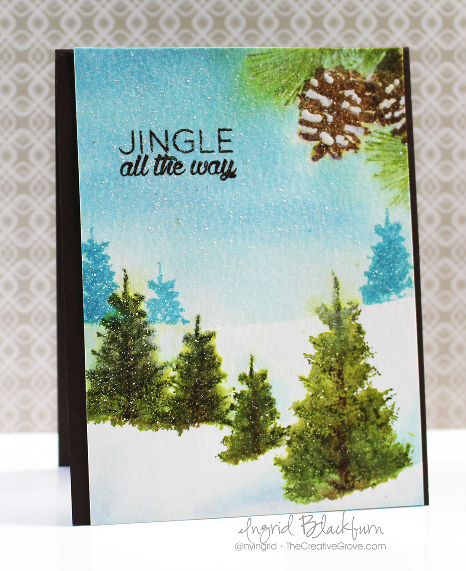
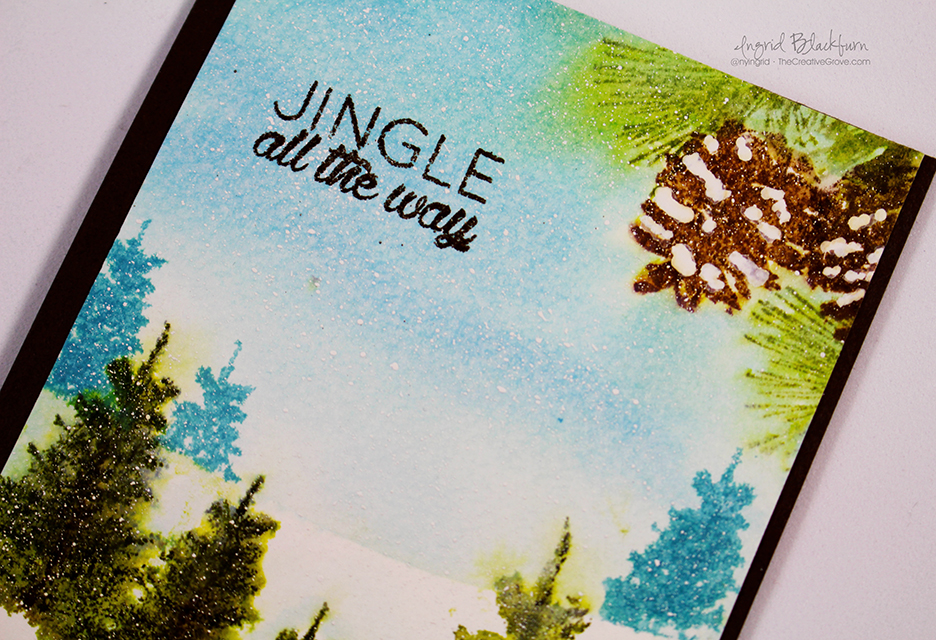
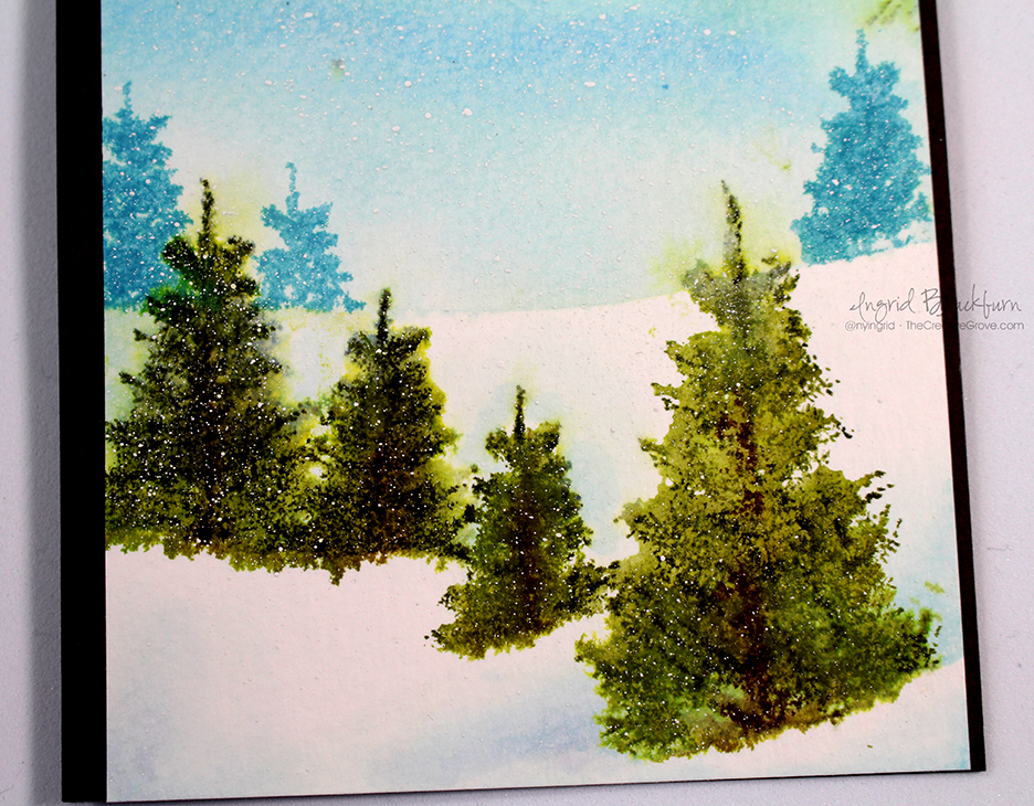
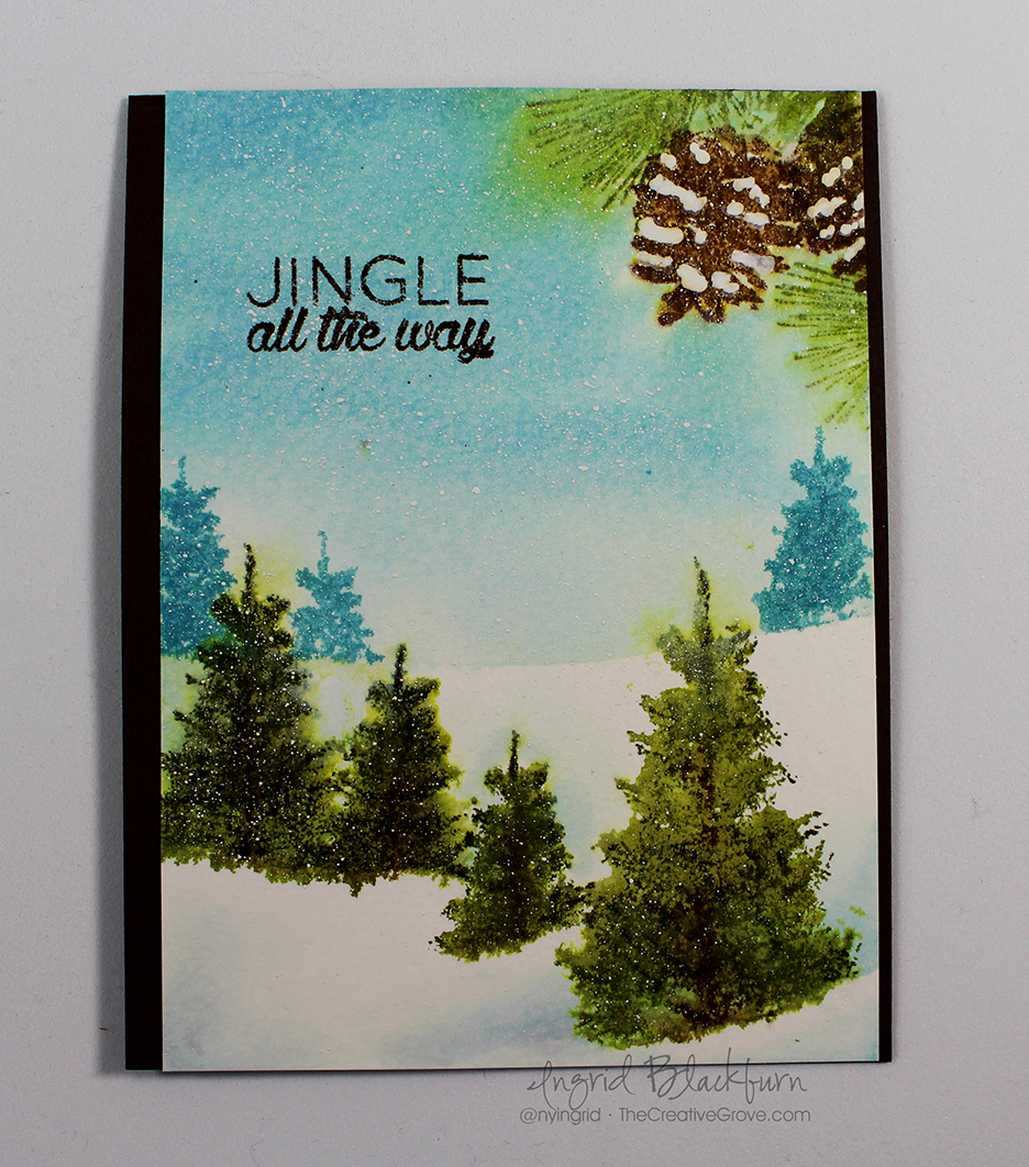
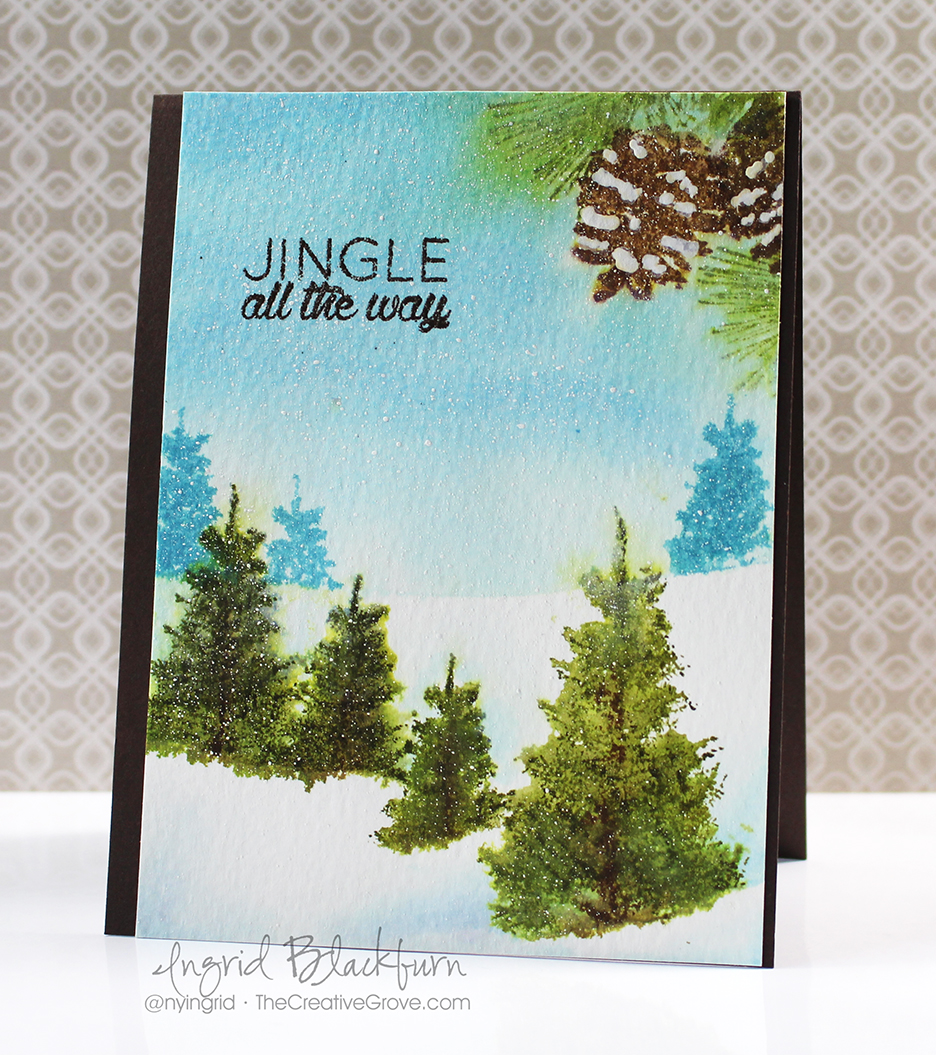
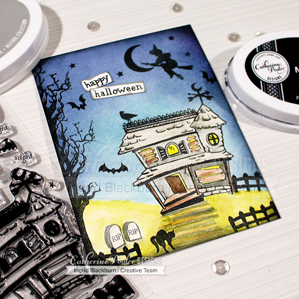
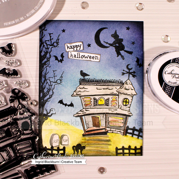
Scenic cards are totally my jam. I LOVE to create scenes like these:

But the secret is in using the right stamps in the right location on your card! I talk about this in this video I filmed for you:

Click Here to watch in HD on YouTube

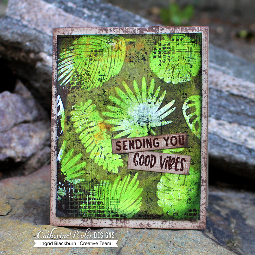
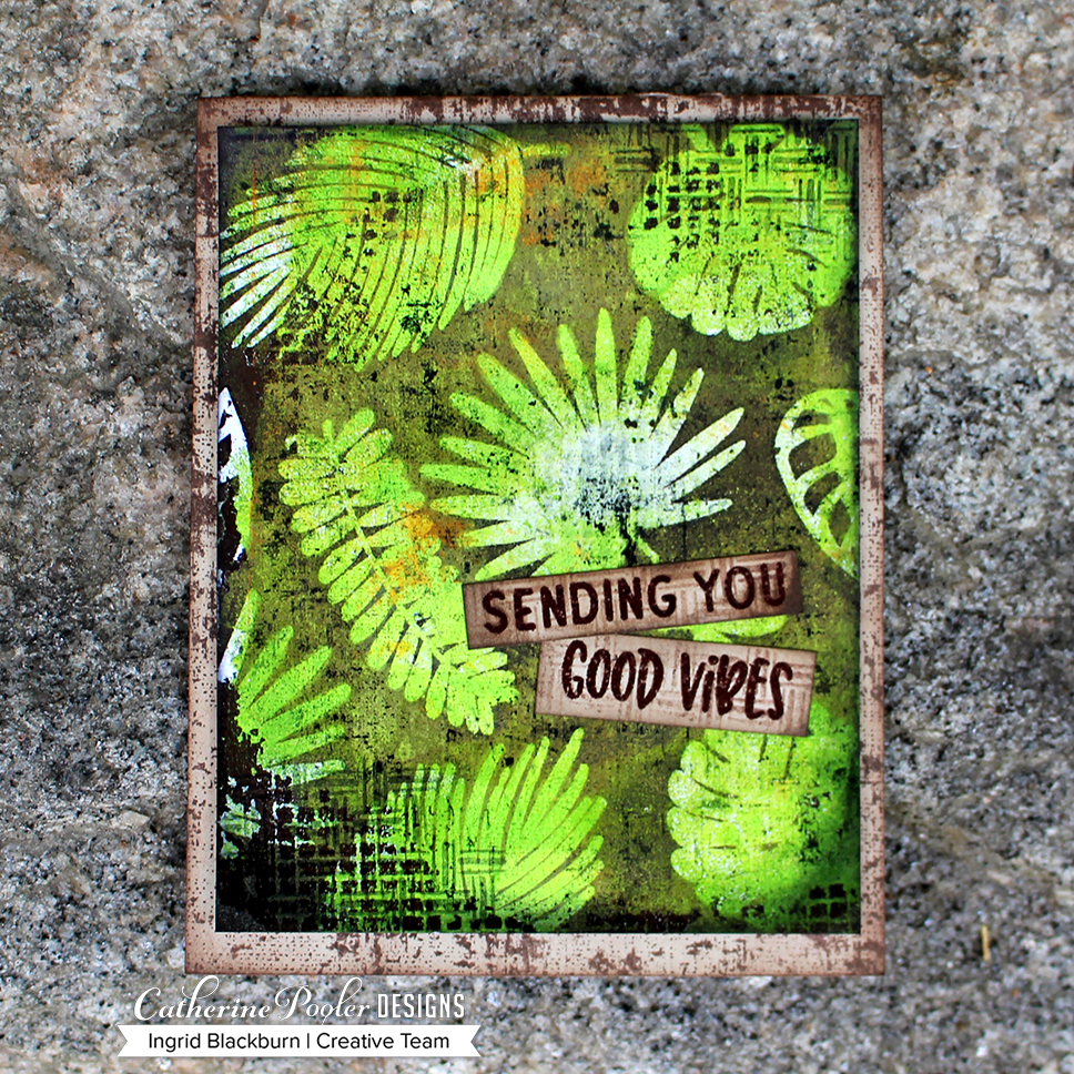
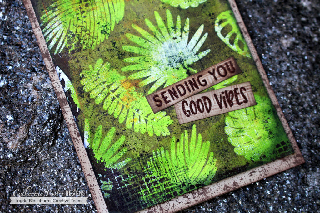
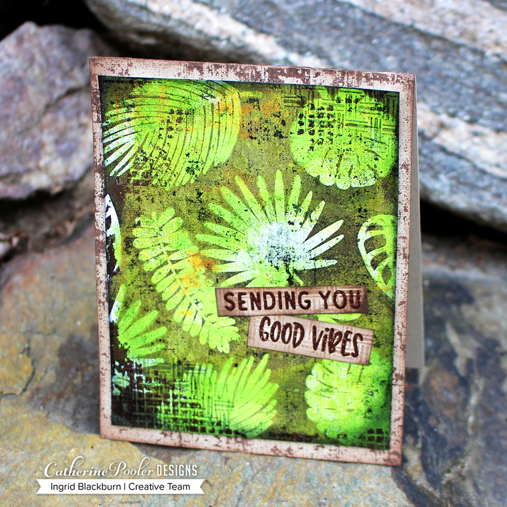
This card was SO much fun to make, and quite easy actually. You just need a plan. There are several techniques used in this one layer card, but the end result is fun and playful. It’s the perfect card for my 13 year old niece Chiarra. She’ll definitely love it.

Tips on making Realistic Scenic Cards

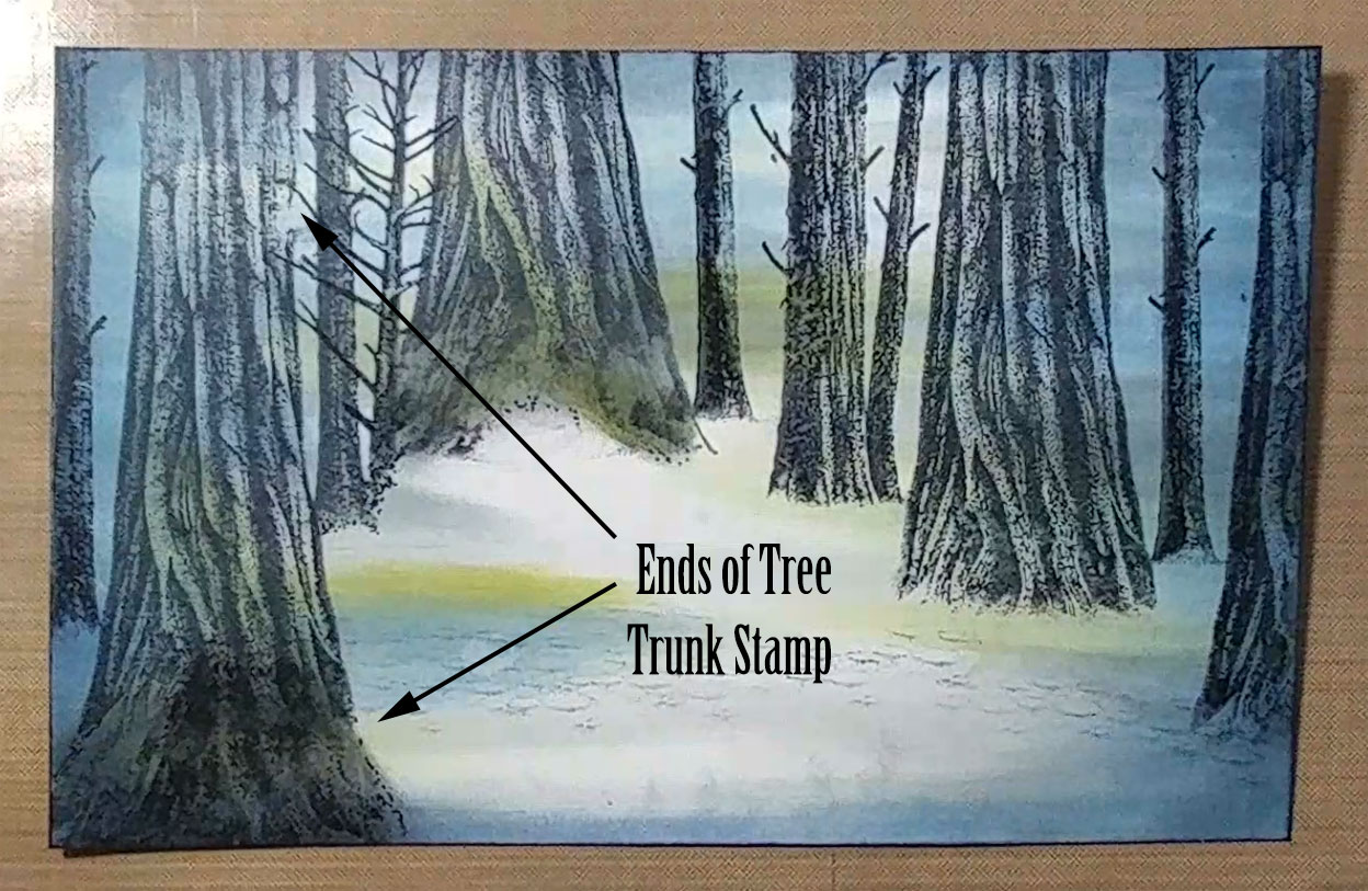
The best tip I can give you is to be aware of scale of your stamps. Larger images belong closer up and smaller images further away. Think about looking in the distance – the image is smaller, so should your stamp be. If I can stamped the cat for instance next to the house – it would be as big as the front door! Now that’s a BIG cat. But close up, makes sense – he’s at your feet. And the same sized door can be further away and be 10 times larger than the cat.

If you want a large tree in the foreground of your card – lengthen your tree – to give it that effect. Watch the video to see just how.

Framing also helps create realistic scenic cards. By framing my scene it drew the viewer in, giving you the feel of you’re watching something take place. You are coming out of the tunnel (vignette) and stumbling into the foreground of the scene.

Spooky Hollow Twilight Scenic Card

So the next time you make a scenic card – think of the perspective. What do you see? What size are your stamps? Where can they positioned for more realistic scenic cards.

If you didn’t hop along the past three days – check out these blog posts here and the one on Catherine’s site. Prizes will be drawn on Monday 8/20! Be sure to leave comments along the way – and if you haven’t already – subscribe to my YouTube channel. I have many videos about to go live in the next few weeks – I’d love to hear what you think!

Blog Hops:

Leave me a comment below and tell me what kind of cards YOU love to make. I can’t wait to hear!!

Thanks for stopping by today! Keep those fingers inky –
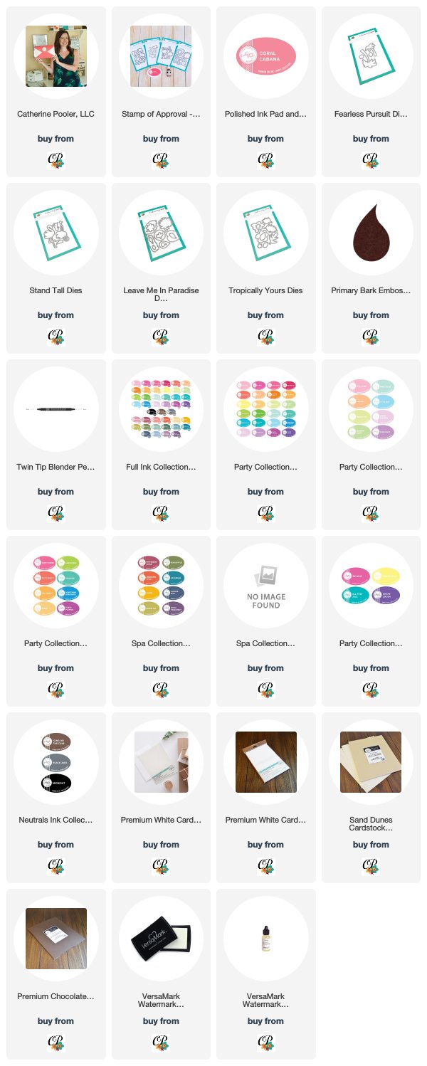
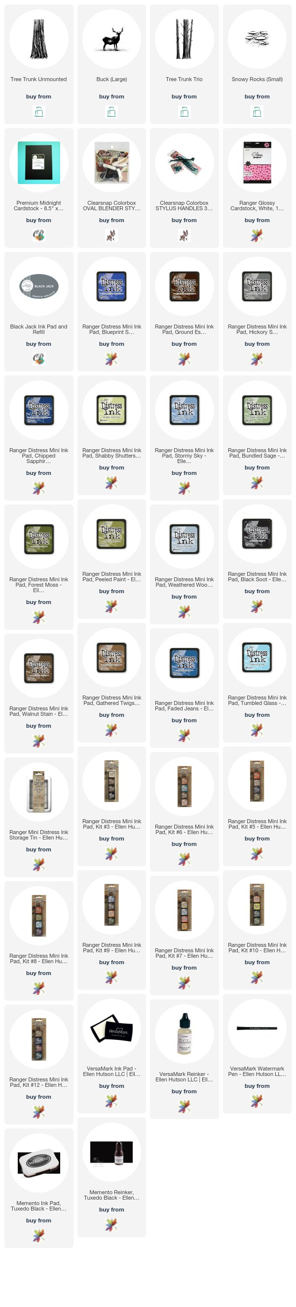


Supplies

To make finding the supplies I used in these projects a bit easier for you, here are a few clickable links. Compensated Affiliate Links are used when possible. Click here for disclosure. Happy Shopping!


Tropically Yours Stamp of Approval Blog Hop Day Three

Tropically Yours Blog Hop

Welcome to the Tropically Yours Stamp of Approval Blog Hop – Day Three! You’re probably hopping on over from Laurel Beard’s blog. Laurel is ah-mazing, isn’t she?!!! I love the texture she creates in her projects – plus she enables my crafty habit all the time…lol!

We’ve been showcasing the fabulous products in the Tropically Yours SOA box since Sunday, and let me tell you, we’re gonna finish it off the Creative Team hops with a bang today.

The Tropically Yours Stamp of Approval box is by far my favorite. I’m a sucker for anything foliage, texture and pattern. Throw in some scenic elements, and um, hello…have you ever been to my blog before?!! But before we get into the creative…let’s talk about the when, where and why.

If you’re a StampNation member, then join us tonight live from the clubhouse PJ Release Party – yup – I’ll be there!! You’ll be the first to get access to this hot collection in the shop. The waitlist will get the secret link at 9 am Wednesday first. So don’t miss being on the waitlist – why not, right? It’s all about access! If any boxes are left over at 6 pm later on Wednesday (and I’ll be floored if there are any – the collection is that good), the box will release to the public.

Tropically Yours Stamp of Approval

The Tropically Yours SOA Collection works flawlessly together. Most of the sentiments are hand lettered, so they are unique. The images are bold, great for techniques, and have just the right amount of CPD spunk. The textures…can we talk about those a second?

First off, Canvas Grunge background stamp – when Shawna Clingerman designed this textured design, I nearly fell out of my chair! Now, I am a bit of a clutz, so that’s not that far of a stretch, but I think I did audibly gasp. This stamp is SO up my alley, and you’ll see why shortly…Good Vibes Borders – what can I say – there isn’t one stamp in that set that you will not use over, and over – and then over again. It’s just THAT good. It’s rare to find an entire set of texture stamps that can not only create incredible full backgrounds, but be just the right little something your project needs, you know? Plus have sentiments…

Leave me in Paradise, Stand Tall, Tropically Yours and Fearless Pursuit – all of which I’m using today…I’ve never seen four stamp sets that work SO well together. Each one is distinctly different and has it’s own flavor, but together they really bring out the best in each other.

Make sure you don’t miss the Add-Ons – all four cookie cutter dies are additional (perfect for those who have a scan and cut like me, right?!!). Um, and yes…there’s a new ink in town – Coral Cabana. It’s part of the Carnivale Collection of Inks in the Party Line, and it’s gorgeous.


I’m showcasing all six stamp sets for you today…but there’s more…the Cabana Tiles Dies – wow. I don’t have a project today with those, but did you see what some of my Creative Team teammates did with those – I mean WOW!

So, head on over to the shop – get all your extras already into your cart, so that when the time comes….you just have to add the SOA and Add-ons and checkout. After all, you don’t want to miss all those little things (adhesive, the new Zig Blender Pen, Embossing Powders & Glitters, Paper – you’ll want some Sand Dunes cardstock if you don’t already have it, and the INKS!

Tropically Yours Projects

No. 1 – You Had Me At Aloha

First up…a little playful fun. This card has a lot going on. First off – look past all the cuteness on it to the textures. That Canvas Grunge background stamp is so beautiful, especially in that Coral Cabana. The textures it has is incredible. And this is stamped off!

I rarely use it directly stamped – it’s a powerful image, and when using it in the background…place a piece of copy paper – or better yet – a different project on it, lightly tap with your fingers and then do the same with your piece. For added interest, use the Good Vibes Boirders stamps repetitively in a light manner in the corners. See how they fade into the card?

I also used the same stamp in Black Jack on the Smoke cardstock. That pattern is literally pure perfection for a background, and it’s super easy to line up too!

The Flamingos are just darling. Their legs are in Coral Cabana, bodies in Be Mine and to get a black beak, squeeze your Black Jack ink pad to collect some ink in the lid. Use a Zig Blender Pen to pull some ink and color like a marker. The Tropically Yours stamp set has some great tropical floral images to go with a few fun sentiments. I love how fun this card is – with a tropical nod to Jerry McGuire!

No. 2 – Sending You Good Vibes

This is one of my favorites. The colors and textures just have make me smile. Seriously – take a good look at the texture created on the stamped images – and that’s just with ink!

The background has a great weathered and distressed look. Use the Canvas Grunge and Good Vibes Borders stamps and do a little ink blending on the edges and corners to antique it a bit. To compliment that, Use a different border stamp on the tag and card base – embossed in my new favorite WOW embossing powder – Bark! I love that color – and wait till tomorrow when I showcase the look of it on dark vs. light cardstock. On Catherine Pooler Chocolate cardstock though, it takes on this deep brown color that with these incredible border stamps is texture galore.

Stamp the same image lightly in Over Coffee onto Sand Dunes, once you’ve embossed your sentiment. Those are a few of the options from the Good Vibes Borders stamps – have I mentioned that set rocks!!

Notice the corners. Again there’s some repetitive stamping going on with the borders stamps. The key to achieving that look is to start light – stamp off onto scrap paper once or twice and then stamp once or twice and repeat. Line your stamp up each time to extend your pattern, and to get that faded look, change up how far in you go with that stamp. I started not quite half way in and ended up less than half that distance. It’s a great look.

The gorgeous hues of the spa line of inks really look amazing on the Leave Me in Paradise images. I like to die cut my images first then stamp – I find it simpler. The green leaves are a mixture of Green Tea, Eucalyptus and on some Spruce. The Oranges are Sauna, Mandarin Spice and on one Rockin’ Red.

My favorite leaf though is the one above the word You. To get that look, you’ll want to ink up just the outsides in Sauna/Mandarin Spice. Fade out the edges towards the middle with a mini ink blending tool, stamp and then ink up the middle with a little Green Tea/Eucalyptus – fading out the edges. Stamp and there’s your blended look! Isn’t it gorgeous?

No. 3 – Here Comes the Sun

Here comes the sun, here comes the sun… And I say… it’s all right. Sorry – now that’ll be stuck in your head all day! This classic and super simple card is a fun one with endless possibilities. To get a super smooth ink blend, I use watercolor paper – Laurel Beard gave me that tip a few years ago, thanks chickie!!

You’ll want to mask off your horizon line and then sponge your sky. Here you see Coral Cabana up top and Limoncello at the horizon. That gorgeous tangerine color in the middle is those two colors blended. I love the shade it creates!

Once you are happy with your sky, reverse your horizon mask and sponge All That Jazz at the horizon and Fiesta Blue at the bottom. Create a mask by tearing a small space at the edge. Use that along with a straight edge mask for your island. Pounce in Icing on the Cake to create your island.

Because this is on watercolor paper, I used my MISTI to stamp my images. The rough texture is tough to get a perfect image the first time. I repeatedly stamped my two palm trees. Isn’t it cool how they almost form a heart! To make sure I had enough space – I laid out my sentiment, then the trees.

The five sentiments in the Fearless Pursuit stamp set are all hand lettered by Shawna. I just LOVE them all. They are unique in appearance and different from what you see everyday. They are uplifting and perfect for so many of the people in your lives. I see myself using them ALL the time. PLUS she added a crazy amount of image stamps – There are 28 stamps in this set!!

Don’t you just love that little frayed grid on the sides – yup, you guessed it – Good Vibes Borders again. That pattern reminds me of Easy Joint Dry Wall Tape. I use that in mixed media projects as a texture all the time. So I was so excited to see a stamped version of it!

No. 4 – Mixed Media Good Vibes

You didn’t think I wasn’t going to throw something unexpected your way did you? This project has a story – a good one. I almost skipped this one for today, but in the end…I just had to share it with you. And it went all sorts of wrong – I almost threw the messed up version away – GASP! So I laid it to the side, and set out to re-do it. That’s this project. The almost trash (which is now my favorite, by the way) project I’ll have up tomorrow.

So back to today’s Mixed Media project. I had Batik fabrics in my head when I thought of this. So I figured i’d get out my Gel Plate and create a fun little background for a starting point – 9 2 page art journal spreads, and about 16 more monoprints later I had an arsenal of things to choose from. I picked my favorite green textured print and set out to create some cards.

To play off the Canvas Grunge stamp, my goal was to create a textured look. I incorporated using some Easy Joint Dry Wall Tape as a stencil – I figured it looked just like the stamp in Good Vibes, this way I could get that look, but use acrylic paint. So I ended up with a gorgeous piece of Greens, Burnt Umber and some Orange.

I cut my monoprint down into four card front sized pieces and set out to make some cards. This is one, tomorrow Click Here to see the others….. Can’t have everything in one day…lol! Next up was to work on a few techniques to give me the look I was shooting for – Joseph’s Coat and Faux Bleaching.

To get this look, you’ll want to emboss your images in Versamark and emboss in Clear. This allows you to “trap” the gorgeous monoprint from underneath, in stamp form. Here’s where I went wrong – I covered my entire project with white gesso next. Normally, that would be fine – only when I went to create the Faux Bleached look – I couldn’t lift it! I just sat there stunned. Click Here to see how I “fixed it”.

So in the second pass, I skipped that part and went straight into the Joseph’s Coat technique. I took my Icing on the Cake ink pad and smooshed it all over my project. The embossed areas resisted the ink and I dried the rest with a heat tool. Now my base is covered in paint, so it’s not like regular paper – it doesn’t absorb dye ink like normal, and the effect is a great one. It’s a grungy, weathered brown, not the deep look you would think you’d get.  You can see some of the orange and green fighting it’s way to get out from under the brown cover.

Next up – Faux Bleaching. I turned on my iron, and got out the yellow pages. Place your project inbetween two pages and iron over it! The heat from the iron re-melts the clear embossing powder which gets absorbed by the pages in the book. You’ll need to move it around and switch up your pages a bit, and because there’s paint in there – it took a bit longer. The result was pretty awesome!

Next up, ink up your background stamp in Midnight ink…what?!! Yes…it’s an archival ink and perfect for stamping on painted surfaces. Lightly stamp off onto scrap paper first, then lay your project over your background stamp. With a light touch, tap a few areas from the back to transfer the ink. Your project with resist in some areas, so if you have a particular look in mind – you’ll need to work at it a bit.

The texture the Canvas Grunge Background Stamp added, made the card! Use the basket weave stamp to lightly add those corners in stamped off midnight like the other projects. Next, lightly sponge the edges in Midnight – ever so lightly. Midnight is the perfect super deep black archival ink to add to Mixed Media. It’s my go to actually over all others on the market.

Create a little grunge canvas look to your card base and super lightly frame with an ink blending tool Icing on the Cake ink. Pop up your Mixed Media piece for a little drama to your card and add your sentiments (from Good Vibes Borders) like a little sign you’d find on an island road.

What do you think? I think the coolest part of it is that the background is one layer – meaning, no raised areas and super smooth. It is a true work of art. Mixed Media isn’t for everyone, and that’s okay – I was super intimidated by it just a few years ago. But once you jump into the deep end, you’ll wish you had earlier. The projects are THAT incredible.

So, to wrap up an epic blog hop post – if you’ve hung in with me till the end – tell me in the comments! Which product are you the most excited by? I’d love to know… The Tropically Yours Collection is for stampers of all kinds. Those who love Clean and Simple, Scrapbookers, Art Journalers, and Mixed Media artists.

Tropically Yours Blog Hop

Tropically Yours Blog Hop List & Prizes

Did you know…we’re giving away a Tropically Yours SOA box to three lucky winners! And if you already bought one – no worries – you’ll get a $100 gift certificate instead, cool, right?!!! All you have to do, is comment on each stop along the hop – all three days. That’s it!

  1. Catherine<– Hop Here NEXT!!
  2. Tracie 
  3. Kristie  
  4. Jen Carter  
  5. Ilina Crouse  
  6. Laurel  
  7. Ingrid <– You’re HERE!!! 

Thanks for stopping by and hopping with us for the past three days!

Till next time –


Supplies

To make finding the supplies I used in these projects a bit easier for you, here are a few clickable links. Compensated Affiliate Links are used when possible. Click here for disclosure. Happy Shopping!


New Craft Stash Blog Hop: Day One – Creating Sunbeams in Scenic Cards Video

How to create Sunbeams on a scenic card

Welcome, today I’m hopping along with some crafty friends, well….just because! Several weeks ago, several of us were chatting about how we have all this “New” product just kind of sitting around, and it occurred to us to break some of that out and have a “just for fun” blog hop! So naturally I thought – I’ll create a scenic card and make Sunbeams on a foggy day with my new Mossy Tree Trunks stamp that I’ve had for eons, but have never used…so “new” to me!

Do you have any craft supplies sitting around that are “new” because you haven’t used them? Break them out!

So here we are – over the next 3 days, we have a fun filled hop each day for you. Come get inspired and be sure to comment along the way to be entered for a chance to win one of six prizes plus a few more from several of the blogs along the way!

How to Create Sunbeams on a Scenic Card Tutorial

Click Here to watch in HD on YouTube

Creating  sunbeams is actually quite easy on your project. The most important thing to remember is to pick a lightsource and have everything emminate from that spot as in the video.

Here’s a photo I took while walking in the Black Forest in Germany one morning. See how the sunbeams just pop out of the scenery, and come from one fixed point?

Sunrays in Forest

Pigment ink sits on top of paper vs. dye ink that soaks in. So when you layer your pigment  sunbeams, they’ll create a diffused ray that sits on top of your stamped image. I chose to wipe a slight ray away from my stamped image to help accentuate this beam of light, but it is not necessary.

One of the most important points to remember is that to really allow your “light” to show – you need dark as well. That contrast is what makes the scene – dark vs. light.

To help give the scene a mystical look, try to keep your background “in the fog”. I was born and raised in San Francisco, so I naturally love fog, and miss it terribly – I know I’m weird. So I thought – let’s put it into our project! To create that mystery in the background, don’t over stamp or color. Keep the light in the scene – and make sure you’re stamping any background images really light. In the video, you’ll see that I stamped the images off onto scratch paper up to 4 times before stamping on the glossy cardstock.

I use Kromecoat 12 pt. glossy cardstock for my scenic cards. It’s a nice heavy weight glossy cardstock. You’ll also want a dye ink that doesn’t dry immediately – I like to use Memento, Distress Dye and Catherine Pooler Designs inks along with the Colorbox Stylus Tool with sponge tips. This card is sized 5 x 7″.

Of course, to see all the tips and tricks along the way – you’ll have to watch the video, don’t worry, I sped a ton of it up – this project took me nearly 2 hours to complete – but is so realistic, it was worth every minute. There’s a great transition at the end of the video that showcased the evolution of the card.

If you’d like to see another fun project I created using pigment ink in a scene, be sure to check out my Harry Potter Scenic Card here. In that one you’ll learn how to use pigment ink in a circular way to create an explosion of light. There’a a video too!

I hope you enjoyed this tutorial!

Blog Hop Prizes

Comment to Win Prizes

We have some amazing sponsors & Prizes:

PLUS….

I’m giving away a prize pack to one lucky commenter from one of my blog posts! So be sure to leave comments on all the blogs – all three days for your chance to win!!

So now it’s YOUR turn to hop along and be inspired by some of my crafty friends. Thanks for taking the time to hang a bit with me today. I’ll be back in a few days with a mixed media project for you. And stop by tomorrow as well – I’ll post that hop list too!

Day One Blog Hop List:

  1. Ingrid Blackburn – You are Here
  2. Jenny Colacicco Hop here Next!
  3. Ashlea Cornell
  4. Karen Baker
  5. Ali Farmer
  6. Catherine Pooler
  7. Allison Cope  
  8. Veronica Zalis

Day Two Blog Hop List:

  1. Melissa Miller
  2. Tracey McNeely
  3. Kelly Martin
  4. Amy Seigler
  5. Michelle Wallace
  6. Ilina Crouse
  7. Maureen Merritt  
  8. Nance Salkeld
  9. Deepti Stephens

Till then – keep those fingers inky –


Supplies

To make finding the supplies I used in these projects a bit easier for you, here are a few clickable links. Compensated Affiliate Links are used when possible. Click here for disclosure. Happy Shopping!


Harry Potter Inspired Card Video Hop

Harry Potter Card Hop

Have you ever been inspired by a favorite book or movie? Today I bring you a fun little video card hop, inspired by the Harry Potter series and a few of my crafty friends for a Harry Potter Scenic Card Tutorial!

This summer, Justine Hovey and I met up for lunch in Stuttgart, Germany while we were both visiting. I don’t even remember how we got onto the conversation – but we discovered yet, another love that we shared in common – Harry Potter! We thought, that would be a just for fun video hop – and my mind immediately went to my friend Laurel Beard – who I knew loved Harry Potter just as much as me. And Justine knew Jessica Frost Ballas was just as addicted, and this hop was born!

Harry Potter Scenic Card Tutorial - Ingrid Blackburn

So here’s a fun, book/movie series inspired hop for you – filled with prizes, a little magic and of course – Harry Potter!

Be sure to hop along all four blogs and YouTube channels – leave comments – cause we’re giving away prizes on each blog – Harry Potter themed prizes!! Plus it’s fun to see how each designer was inspired.

If you’ve followed me a little, I’m sure it’s no surprise to you that I just HAD to create a Harry Potter scenic card! Harry Potter inspires me in so many ways – the castle, forest, bricks, owls, forest, dark vs. light, books, forest, wands, magic and oh, did I mention FOREST?!!! Naturally I had to create one of my favorite scenes of all time (Spoiler Alert) – the Dementor attack/Patronus charm at the end of Book 3.

Harry Potter Scenic Card Tutorial

I knew the perfect stamps to use too…Stampscapes. Kevin Nakagawa’s gorgeous line of stamps would perfectly evoke that larger than life feel I wanted to create along the frozen lake deep into the Forbidden Forest. Here’s a video of exactly how I created this beauty.

Click Here to watch video in HD on YouTube

The Tree Trunk stamp was perfect for this card. But I needed it at different heights – and what do you do when your card is larger than the stamp? That’s part of the beauty of Stampscapes stamps. The way Kevin has beautifully drawn these scenic elements is with little dots. So it’s very easy to naturally stretch and build onto your scene with it looking effortless and part of the original design.

So in this image, the left most trunk is actually only 4.5″ tall and the card is 5.25″ high. So how do you stretch your image so that it goes the full length? Simple – flip the top of the trunk around and stamp to fill that area. Now, you can’t have your tree get fatter – so you’re limited to a small part of the stamp, but see how it seamlessly lines up?

Stampscapes Tree Trunk Stamp

For the bottom – fill in the area with a little bit of color – add some dots with a micron pen and some distress markers. Then take the bottom of your stamp – ink it up and fade out the edges on it. That leaves you with the gorgeous texture – use that to fill in your trunk base. It just blends effortlessly! With more shading, and there’s zero chance of anyone noticing that wasn’t meant to be. Would you have seen the seam if I hadn’t pointed it out to you?

To bring the Harry Potter Scenic Card to life, layer your ink colors light to dark into your scene from the edge in. I used Kromekote Glossy cardstock – 12 pt for a strong base that let the colors glide with the Colorbox Stylus tool. Blues, Greys, Greens and Browns – your nature colors fill the scene with depth.

The key to this scene is the dark mystical nature of the Forbidden Forest. Without it, and it’s just another forest scene. We need the play of good vs. evil here – light vs. dark. Since I wasn’t sure how I could create a Dementor, I used dark shadows to get that effect playing off the bright explosive Patronus Charm.

Harry Potter Card - Forest Scene

And to get that bright glow – emboss the large buck (my Harry Patronus – the stag) and surround it with the white explosive glow. To get it to look just right, I had to play – and as you see in the video…a few ways just didn’t give the right feel. Swirls with a paper towel and some Hero Hues Unicorn Pigment ink did the trick.

Some finishing touches of white gel pen to emphasize ice and cold along the lake edge and glow in the tree trunks mixed with the perfect dark edging pulls the scene together. I didn’t have a greeting that worked for me, so I created my own with a downloaded Harry Potter free font.

I LOVE the third movie – and this is one of my favorite scenes. I think I love Harry and Hermine climbing over the huge roots at the base of these monster trees the most. The forest is so mystical and dark – I can do with out the dementors – they always freak me out…so it’s a good thing I can create my own Patronus – at least in a Harry Potter Scenic Card form!

Harry Potter Forest Card - Stampscapes - Ingrid Blackburn

What’s your favorite book/movie? Do you have something about this series that inspires you? Colors, characters, elements? When you start to create yourself – tag us with #CraftyPotterHeads! We’d love to see what you make.

Leave me a comment and I’ll enter you into my Harry Potter drawing! I’m giving away a couple decks of Harry Potter playing cards – to be delivered by Owl Oct. 1st….okay…I guess USPS will have to do. Back to reality for this muggle…

Thanks for stopping by! Now Accio Firebolt – hop on and visit my crafty friends for more chances to win and some creative magical inspiration!

Harry Potter Magical Blog Hop List

Ingrid Blackburn – You are Here
Jessica Frost Ballas – Head on over here Next!
Justine Hovey
Laurel Beard

[optin_box style=”27″ alignment=”center” email_field=”email” email_default=”Enter your email address” integration_type=”aweber” double_optin=”Y” list=”3846012″ name_field=”name” name_default=”Enter your first name” name_required=”Y” opm_packages=””][optin_box_field name=”headline”]Want to LEARN with more exclusive videos?[/optin_box_field][optin_box_field name=”paragraph”]PHA+UGx1cyB5b3XigJlsbCBiZSBhZGRlZCB0byBteTxzdHJvbmc+wqBGUkVFPC9zdHJvbmc+wqBDcmVhdGl2ZSBUaXBzIEUtbGV0dGVyIHdoZXJlIEkgc2hhcmUgZXhjbHVzaXZlIHByb2plY3RzLCB2aWRlb3MgJmFtcDsgdGhlIDEyIERheXMgb2YgQ2hyaXN0bWFzPC9wPgo=[/optin_box_field][optin_box_field name=”privacy”][/optin_box_field][optin_box_field name=”top_color”]undefined[/optin_box_field][optin_box_button type=”0″ button_below=”Y”]Get Instant Access![/optin_box_button] [/optin_box]

Supplies

To make finding the supplies I used in these projects a bit easier for you, here are a few clickable links. Compensated Affiliate Links are used when possible. Click here for disclosure. Happy Shopping!


Naturally Inspired Stamp of Approval Collection – 2 videos!

Naturally Inspired Stamp of Approval Blog Hop - Ingrid Blackburn

Welcome to Day 3 of The Naturally Inspired Stamp of Approval Blog Hop! You probably hopped on over from Lydia Evans’ blog – she’s uber talented, isn’t she? I’m such a fan of hers. The whole hop list is at the end, but first here are a few projects to showcase just how amazing this curated collection inspired me.

If you’re new to Stamp of Approval – click here to check out everything you need to know about this amazing collection of Stamps, Dies and Stencils.

And make sure you are on the wait list so you get access to the collection at 9:00 am tomorrow June 7th before the public. The Add-ons are limited – especially the Wild Garden Dies, you don’t want to miss out.

Of course, If you are a StampNation member – you not only get to order hours earlier…but I’ll see you at the exclusive Slumber Party release tonight – I’ll be participating live – so come stamp with me, Catherine and many others from the Design Team.

Stamp of Approval

How I’m Naturally Inspired

If you’ve followed me for a while you know nature is my thing – in case you haven’t noticed – I love trees, the mountains, flowers – and especially greenery! I’m 100% at home walking in the mountains, woods, among trees & flowing water – I’m a born and raised northern California girl after all. Growing up in San Francisco, I’m partial to the ocean – and having lived 10 years in Florida…I never tire of these sunsets:

My true inspiration for my work is nature around me – it brings me the peace I need to think clearly and allow the creativity to flow. So much so, that I even have a few little Christmas trees all around me on my desk…lol!

In a few weeks, I’m heading back to the Black Forest for the Summer – and I can’t wait to just be in my element again (I spent the last three years there). Here’s a little sneak into my world – sadly it’s the wrong time of year for the snow, but you will definitely find me shortly wandering along one of thousands of paths and trails daily:

I love the textures and colors of nature. It drives my creations. Today I have a few colorful pieces (and videos) for you too! And wouldn’t you know…I even managed two scenic cards – very different from each other as well. Enjoy!

Project One – Naturally Inspired Sunset Silhouettes

I love scenic cards – and when I first saw the Wild Garden stamp set designed by Lisa Kirkbride, this card literally popped into my head. Paired up with Catherine Pooler Designs vibrant inks, I just knew the ink swipe technique was calling. Here’s a video on how I created this colorful layered sunset on glossy paper.

Click Here to view the video tutorial in HD on YouTube

Aren’t those colors just amazing. And with this fun technique, the possibilities are unlimited. In addition to the SOA collection, the Wild Garden set also has add-on dies which are perfect to cut out those intricate shapes.

Ink Swipe Technique on Scenic Cards

Project Two – Medallions

One of my favorite parts of this box is the surprise elements. Usually you’ll have some awesome stamps, dies and maybe even a stencil – but Catherine really outdid herself this time. Especially with the Wanderlust exclusive embossing glitter by WOW! It’s an exclusive mix just for this Collection and let me tell you – it sparkles! I think I was able to capture the sparkle pretty well here – it’s super cool on black too, becomes sparkly yellow – like a yellow diamond.

The Medallions are so versatile – I’ve just scratched the surface with them. If you didn’t see the sneak peek Catherine let you in on for my Navy Metallic card in the Facebook Live the other day – stop by in a few days, I’ll have that project right here along with a few more.

This project showcases Catherine Pooler Designs Inks: Party Dress, Bellini, It’s a Girl, Sweet Sixteen and Tiki Torch.

Medallion Mix Up by Catherine Pooler Designs

This project keeps the Medallion Mix Up images stamped as a nest within each other – but then uses the same colors in an overlapped pattern in the back. While I love the look, it was a bit busy – so to tone it down just a smidge and allow the focal piece to jump out a bit – try adding a simple sheet of vellum. You still see all that colorful goodness, without allowing it to overtake your project.

But today it’s all about some fun colorful medallions mixed with all that sparkly goodness. I won’t lie, I’m addicted to the Best Die – I LOVE Shawna Clingerman’s (the illustrator) hand scripted font – who wouldn’t, right?

And then glitter that baby up – WOW! Literally.

WOW! Wanderlust Embossing Glitter

But don’t think to just keep the glitter to just there – add it to the edge of your circle or card front for a truly special look. And just imagine this card in Blues & browns for a great Masculine look!

Project Three – Colorful Feathers

The Naturally Inspired Collection lends itself quite well to great clean and simple design, here’s a super quick and fun one. The Feather stamp is amazing – did you see that all the little birds in the set that can be stamped as if they are transformed out of the tip?!! How clever is that!

I kept things colorful and simple here – some great ink colors…a little mystery too! I’m in LOVE with the Simply the Best stamp set – you can create so many amazing sentiments with this set. And I just love the various ways to stamp Best – quirky, scripty – just LOVE that.

Quick Clean and Simple Cards by Ingrid Blackburn

But I have to admit – my favorite stamp in the entire collection is that diamond pattern. It’s only about 1 1/2 inches long – but look at how cool it looks stamped in a row?!! You will find that it is SUPER easy to layer end to end – I did this one by hand – no Misti needed here.

Pretty cool huh? NOW…see how I used that very same feather – and colors in the next project. Yes, this next project was made with all those colorful bright colors – honest!

Project Four – Watercolored Landscape

I love both my scenic cards today for very different reasons. The techniques couldn’t be any farther apart from one another. This one is an effortless watercolor that combines the vibrant colors from the first into the muted subtle shades that you see here. The moment I saw the little birds from Birds of a Feather, I was on a mission to see how I could take the stamps from this collection and stretch them into something different – trees!

Here’s a detailed video on how to recreate just that. And if you loved this, definitely subscribe to my YouTube channel too:

Click Here to see this video tutorial in HD on YouTube

Kind of cool, huh? I love creating something new and unique from existing supplies – versatility in my products is SO important. Plus being a fan and DT team mate of Kristie Goulet – the queen of uniquely stamped cards will do that to you!

Watercolor Landscape Cards using the Naturally Inspired Collection

I have detailed supplies and instructions on both scenic cards in the Naturally Inspired SOA PDF Guide – it’s jam packed with great projects to get you started – definitely one of my favorite components of each collection – detailed how to instructions!

So I encourage you to think outside the box with this collection. It won’t be hard. You’ll get such varied results which is just awesome.

These four projects believe it or not – uses almost every item in the box. I love it when I can create 10 different projects and no two are the same – I can’t wait to show you the rest. That’s the sign of a home run to me! So let’s get you entered in to win one of these amazing Naturally Inspired collections yourself!

Naturally Inspired Stamp of Approval Collection by Catherine Pooler Designs

To win one, just hop along and leave some love on all my team mates blogs. All the blogs from the last two days too – the Design Team inspirational line up is epic! Tell us what inspires you too.

Here’s the talented line up for today:

1. Catherine Pooler
2. Taheerah Atchia
3. Laurel Beard
4. Lydia Evans
5. Ingrid Blackburn You are here!
6. Heather North < Hop here Next!
7. Cynde Whitlow

Hope you enjoyed these projects and videos. Was I was able to inspire you to get creating yourself? I want to know what inspires you – tell me in the comments below! You never know – you may just win a Naturally Inspired Collection yourself.

Till next time –

[optin_box style=”31″ alignment=”center” email_field=”email” email_default=”Enter your email address” integration_type=”aweber” double_optin=”Y” list=”3846012″ name_field=”name” name_default=”Enter your first name” name_required=”Y” opm_packages=””][optin_box_field name=”headline”]LEARN MORE WITH OUR EXCLUSIVE FREE VIDEO SERIES[/optin_box_field][optin_box_field name=”paragraph”]PHA+TG9yZW0gaXBzdW0gZG9sb3Igc2l0IGFtZXQsIGNvbnNlY3RldHVyIGFkaXBpc2NpbmcgZWxpdC4gRG9uZWMgdmVsIG51bmMgbm9uIGxhY3VzIHZlbmVuYXRpcyBjb21tb2RvLjwvcD4K[/optin_box_field][optin_box_field name=”privacy”][/optin_box_field][optin_box_field name=”top_color”]undefined[/optin_box_field][optin_box_button type=”0″ button_below=”Y”]Get Instant Access![/optin_box_button] [/optin_box]


Shaped Cards – Snowflake Tropics


DIY Shape Cards

Creating shaped cards just takes a little imagination and a large die. I thought this week I would put a little spin on my snowflake Christmas card and create a tropical scene – why not?!! After all, I did just spend 10 years in Florida!

This month at Happy Little Stampers, the Christmas Challenge focuses on Shaped Cards. Since it’s been snowing a little every day here in the forest, I thought a snowflake card would be perfect!

HLS Christmas Challenge March 2016

We also have a great guest designer this month – Rahmat – Cards & Cooking Corner  Be sure to check out her blog and project too!

Tomorrow I’ll have  a video to show you for this card as well, so stop on by!

How to create Shaped Cards – Tropical Snowflake

  • Measure your snowflake die and cut a card base slightly larger. Mine measured 3 3/4 tall by 4 1/4 wide folded.  (7 1/2 x 4 1/4″)
  • Score your card at 3 3/4″ and mask off the back flap with a post it note.

Tropical Christmas Cards

  • Stamp your water using 139H Seaside Cove by Stampscapes in Early Espresso. Tip – you want to have the glistening part somewhere on your card.
  • Mask off the horizon line at the top of your stamped image (the sky) and sponge in your bottom. Try to keep the glisten part light. I used Broken China, Mermaid Lagoon and Peacock Feather Distress Inks and Mini Sponge Tools by Ranger.
  • Add a little extra color to the horizon line.Flip your mask so that the water is hidden.
  • Cut a sun mask using a 3/4″ circle punch and post it note. Tip – if you can’t get the mask to punch cleanly, place your post it note in between a folded piece of copy paper and punch.
  • Sponge your sky in your desired colors. I used Tattered Rose, Worn Lipstick & Seedless Preserves Distress Inks.

Shaped Cards

  • Create a stencil by punching the same punch in the center of a square post it note.
  • Remove the sun mask and replace it with a sun stencil. Sponge with Fossilized Amber, Mustard Seed and a tiny bit of Spiced Marmalade at the bottom.
  • Stamp your Palm Tree (Palm Stalks 123F [Stampscapes] – cut apart) & Palm Fronds – Stampscapes fronds #2 & #3 in Espresso.
  • Add the birds either with a stamp or draw by hand. I used a partial stamping of Gulls #302A with an Espresso Marker, and free hand drew a few more.
  • Stamp your greeting – I needed a small stacked greeting, so I used this one from Christmas Bell Medley by Stamplorations.
  • Now that your scene is done, we can create the shaped card.
  • Keep your card folded as you run it through your Big Shot or other die cutting machine.

Snowflake Shaped Card for Christmas

  • Be sure to slightly mis-align the top so that the card fold remains intact – meaning you have a flat edge at the uppermost top two snowflake arms (for lack of a better word!)
  • Cut your die, make sure it cuts through both pieces!
  • And there you have it – a snowflake shaped card.

Now this card is rather small, but it’s cute and would actually make a super cute tag or ornament – you could even pop a photo on the inside in the shape of a circle.

So I hope that inspired you a bit. I’m looking forward to seeing what you create. Don’t forget to check out the design teams cards too – we all have different shapes! Enter the Happy Little Stampers Christmas Challenge here.

Earlier this week, I saw my super talented friends Kristie and Bonnie play along with tropical themed Christmas cards for Merry Monday, so I thought I’d join them by combining the two challenges for this project! Be sure to check out those amazing cards too!

194

Hope you give both challenges a try. I’ll be back in a few days with a Mixed Media one!

Keep those fingers inky –

Signature

[optin_box style=”2″ alignment=”center” email_field=”email” email_default=”Enter your email address” email_order=”2″ integration_type=”aweber” double_optin=”Y” list=”3846012″ name_field=”name” name_default=”Enter your first name” name_order=”1″ name_required=”Y” opm_packages=””][optin_box_field name=”headline”]Learn with our exclusive FREE video series[/optin_box_field][optin_box_field name=”paragraph”]PHA+R2V0IHRoZSBmcmVlIENyZWF0aXZlIFRpcHMgRS1sZXR0ZXIgYW5kIGxlYXJuIHdpdGggc3Vic2NyaWJlciBleGNsdXNpdmUgdmlkZW8gYW5kIHBpY3RvcmlhbCBjb250ZW50LiBJbmNsdWRpbmcgb3VyIHllYXJseSAxMiBEYXlzIG9mIENocmlzdG1hcyBzZXJpZXMhPC9wPgo=[/optin_box_field][optin_box_field name=”privacy”][/optin_box_field][optin_box_field name=”top_color”]undefined[/optin_box_field][optin_box_button type=”0″ button_below=”Y”]Get Instant Access![/optin_box_button] [/optin_box]

Watercolor Smash in the Mix Mash Forest

Have you ever tried the Watercolor Smash technique? It’s a super easy one that creates amazing looks. Paired here together with the Mix Mash stamp set by Happy Little Stampers, you get a fun and quirky little scene made out of some graphic elements. Don’t you just love stretching your stamps in ways they weren’t intended?

Distress Techniques SHOP Mix Mash (2)

So you can fully understand all the little tips and ideas that went into creating this card, I filmed a short video tutorial for you. I don’t know how your mind works, but the first time I saw this stamp set, this card idea popped into my head! Enjoy the video:

Watch on YouTube

The Watercolor Smash Technique Tutorial

  • The scene was created on a 6 3/8 x 3 1/4″ piece of 140# cold pressed Hahnnenmuhle watercolor paper. The final card is 4 1/4 x 6 3/8″ folded Sahara Sand card stock by Stampin Up. You’ll also need a white – 6 3/8 x 3 7/16″.
  • I had an idea to create a sunny, snowy day – I know…contradiction…so I wanted to add some flicked masking fluid first with a toothbrush. You have to set it aside to fully dry before beginning – no heat tool!
  • To keep with the quirky theme, add a few of the smallest circles from Mix Mash in the sky portion of the card. Emboss in clear embossing powder.
  • Add the sun by first stamping in Versamark Ink, then Mustard Seed Distress Ink (Ranger).

Watercolor Smash techniques

  • Add the trees in the same manner as the sun, using Peeled Paint and Forest Moss Distress with Versamark. TIP – clean your stamp in between so you don’t get green in your watermark pad! I also varied the size and height of the trees so it wasn’t too uniform.
  • Emboss trees in clear, add trunks using a Ground Espresso Distress Marker. Don’t do too many at once before adding the embossing powder – you don’t want the ink to soak into your watercolor paper to quickly. If it does, run over it with a Versamarker, but be sure to only get the brown!
  • Lay down the colors as in the video – Tumbled Glass, Broken China, Mermaid Lagoon and Chipped Sapphire.
  • Add a fair amount of water with a fine mist spritz bottle.
  • Lay your project – image side to ink over your blue palette and smash, holding your card stock there so the ink and water can grab onto your project. You’ll see the sides of your paper curl up just a bit.

Scenic Cards

  • Don’t worry if you didn’t get it right in one smash. That’s the beauty of this technique. Keep smashing to get the color you want in certain sections. To get a smooth look, be sure not to allow your project to dry in between.
  • Use a Pentel Water brush loaded with Broken China to move color into desired spots. TIP – Be sure your brush has the same amount of water as your paper, if it is too dry, it will pull watercolor from your project.
  • Once you have the look you are going for, dry your project – either naturally, or with a heat tool. I chose to use a heat tool, but don’t hover over your embossed images too much – you’ll over-emboss them! TIP – if your paper is too soaked and bent, your color and water will seep to the outside. To keep that from happening, just dry the edges a bit with a heat tool so that your project flattens out a bit, then continue to dry naturally if so desired.

Create backgrounds with the Watercolor Smash/Smooshing technique

  • When your project is fully dry, rub off your masking fluid.
  • Place the white matte where it will be on the folded card base – do not adhere yet.
  • Stamp greeting from Mix Mash set in Ground Espresso ink to match your trunks. Zap with a heat tool to set.
  • Add Mono liquid glue to the back, adhere to a white matte and then to the stone folded card base.

Mix Mash Stamp Set

That’s it! I hope you enjoyed this tutorial. I love this card – it’s fun nature is what I love about stamping. This technique is so fun, easy and one I use frequently. Once you’ve done a few, you’ll quickly add it to your stamping toolbox. Be sure to subscribe for an exclusive video series with more techniques below!

Keep those fingers inky –

Signature

[optin_box style=”2″ alignment=”center” method=”post” email_field=”email” email_default=”Enter your email address” email_order=”2″ integration_type=”aweber” double_optin=”Y” list=”3846012″ name_field=”name” name_default=”Enter your first name” name_order=”1″ name_required=”Y” opm_packages=””][optin_box_field name=”headline”]Learn with our exclusive FREE video series[/optin_box_field][optin_box_field name=”paragraph”]PHA+R2V0IHRoZSBmcmVlIENyZWF0aXZlIFRpcHMgRS1sZXR0ZXIgYW5kIGxlYXJuIHdpdGggc3Vic2NyaWJlciBleGNsdXNpdmUgdmlkZW8gYW5kIHBpY3RvcmlhbCBjb250ZW50LiBJbmNsdWRpbmcgb3VyIHllYXJseSAxMiBEYXlzIG9mIENocmlzdG1hcyBzZXJpZXMhPC9wPgo=[/optin_box_field][optin_box_field name=”privacy”][/optin_box_field][optin_box_field name=”top_color”]undefined[/optin_box_field][optin_box_button type=”0″ button_below=”Y”]Send me exclusive tips![/optin_box_button] [/optin_box]

Watercolored Mountainside

Happy New Year! It’s a new year, and what better way than to kick off with a Challenge?!! This month’s Christmas challenge over at Happy Little Stampers is Jingle. You might be going – Christmas, what? Well, I didn’t create NEAR enough cards last year, so I”m excited to be getting an early start!

I scoured my stash and would you believe it…I don’t have a single jingle bell stamp or die! So I got a little creative. I thought I could draw and watercolor one – well, let’s just say that didn’t go so well….lol!

So, I knew I had this great saying – actually three jingle sayings, so I decided to go with the spirit and place the word prominently instead! After all, the song Jingle Bells does say…Dashing through the snow and Over the Hills we go! Now I know this isn’t a one horse sleigh, but I imagine this to be a little of the scenery that I would see from the sleigh. That’s where this all started from.

I hope my project inspires you in some way to add a little jingle to your Christmas cards and get an early start for your 2016 stash. For more details, be sure to keep reading!

HLS Christmas Challenge January 2016

Watercolor Stamping Technique

Be sure to stop by the challenge over at Happy Little Stampers and see all the amazing creations made by the Design Team! And this month we have a wonderful Guest Designer with us – Sarah from Funky Fossil Designs.

Watercolor Tips & Techniques for Christmas Cards

  • Watercolor cards work well on good quality watercolor paper. I used Canson 140 pound cold pressed paper and a #6 round brush.
  • For this scene, I decided to use some brand new stamps that Santa brought me this past Christmas – Natures Gifts and Prancers by Penny Black. These two sets are perfect to evoke the scene I had envisioned along with my Jingle greeting from the Mixed Christmas Sentiments by Happy Little Stampers.

Prancers Stamp Set - Penny Black

  • To create your snow drifts, add a little water with a #8 round brush where you’d like to have a snow drift. Dropwatered down Broken China and a little Weathered Wood to to base of the line. Paint your snow drift using a clean wet brush to blend it outward creating a light took upwards on your bank. I’d encourage practicing this on scrap paper a bit first. It takes a bit to get the hang of it.
  • Stamp your pine cones and needles at the top right. To get a painted look, use the watercolor stamping technique – ink up your stamp, then spritz a few times to get the ink wet before stamping onto your paper. Move the ink around with a wet paint brush if needed. I used Peeled Paint and Forest Moss for the greenery and Gathered Twigs/Ground Espresso for the Pine cones and trunks.
  • TIP – find a balance between the amount of water and ink.
  • Once you have your snow drifts and pine needles/cones in place, add a top edge to your drifts with a mask – I cut into a piece of Painters Tape. To paint your sky, you’ll first want to wet your area. Try not to touch your needles or pine cones too much to keep the color from bleeding. A little works – too much is a mess.

Natures Gifts by Penny Black

  • Once your sky is wet, add a little Broken China Distress Stain – keeping the darkest of the color at the top and blending it out with a wet paint brush toward your horizon.
  • Stamp your trees using the watercolor stamping technique and the Broken China Stain. I used the two smaller trees from the Prancers Set.
  • Stamp your front trees, masking off the bank with a torn piece of painters tape in the general shape – I didn’t worry about being too perfect. I used the same shades as the pine needles and cones. Watercolor stamp and under layer that gives a great shaded base. Once a bit dry, re-stamp without spritzing for a bit of detail. TIP – if this part is too wet, you’ll lose all your detail.

Watercolored Snow Scenic Cards

  • Allow your project to fully dry.
  • I needed a greet greeting, so I pulled out my trusty Mixed Christmas Sentiments by Happy Little Stampers.
  • Stamp your greeting in Versamark and emboss in Espresso Embossing Powder.
  • Add the snow using Pro White by Daler Rowney and spatter flicking with a toothbrush.

Watercolor Christmas Cards

  • Paint snow onto your pine cones using the Pro White and small paint brush.
  • Cut scene to desired width if necessary – mine is 5 1/2 x 3 7/8″ and mounted onto a top folding A2 card in Early Espresso.

I just love the watercolored snow drift look in this card. I am a huge admirer and personally am always inspired by two great stampers and watercolor artists – Heather Telford and Micheline “Mimi” Jourdain both on the Design Team for Penny Black. I’ve learned a ton from Heather over the years, and have to admit, that I myself have gotten into watercolored cards and flicked snow because of her artistry over the years. So thanks Heather!

Watercoloring techniques for scenic cards

Now if you find any tiny little part of this card inspiring, please hop on along to the Jingle Challenge over at Happy Little Stampers this month and play along with us. The Design Team has some great inspiration for you, and I can’t wait to see what YOU do!

Keep those fingers inky!

Signature.png

If you liked this tutorial and would like to see a similar project that goes into depth and detail including a step by step video and PDF – be sure to Click Here to check out our 12 Days of Christmas 2015 class!

12 Days of Christmas 2015 Button