Mixed Media Tropical Cards

I love the look of Mixed Media Tropical Cards. Today I’m getting a little inky with my Gel Press and have created some  incredible textured Tropical inspired masterpieces!

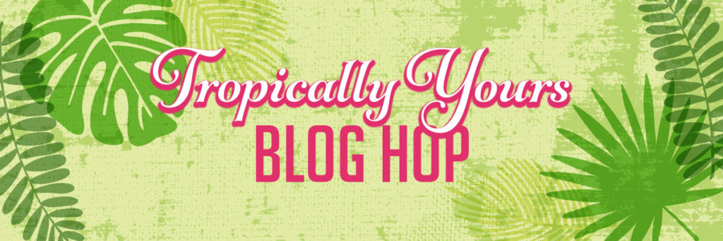
Tutorial: Mixed Media Tropical Cards

To get that fun island weathered feel, I thought a tropical looking monoprint would be a great base to these projects. What exactly is a monoprint? A monoprint is a form of printmaking where the lines and images of the print can only be made once. This makes it a bit unique and special. You can always create multiple prints, but no two will be exactly alike.

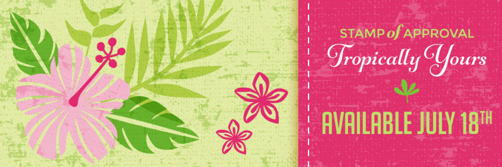
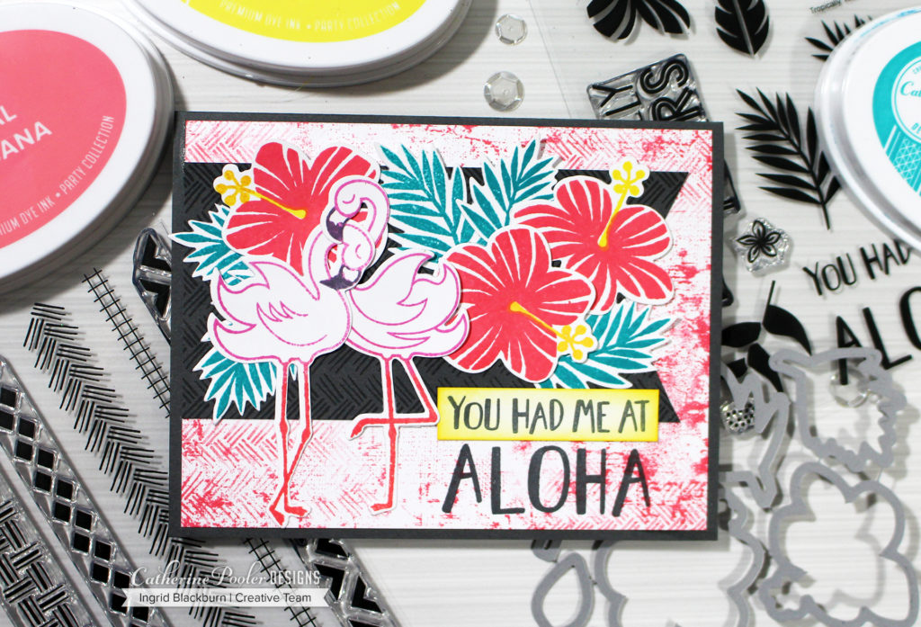
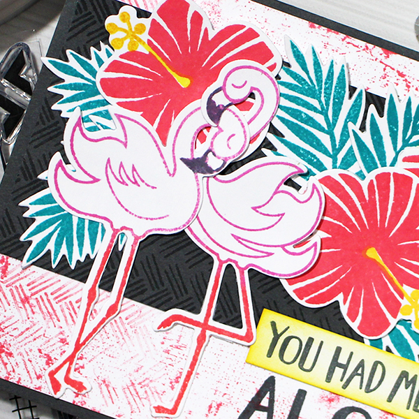
When I saw the Leave Me in Paradise and Fearless Pursuit stamp sets in the Tropically Yours SOA, I knew I wanted to create some Mixed Media Tropical cards.

First, you’ll need a base print for these projects. I chose to use an 8×10 Gel Press plate. This gave me a larger print that I could then cut down into 4 card fronts – hey I’m all about getting the most bang for my buck, you know?!!

Creating a Monoprint can be as simple or complex as you want. The one thing to remember, when you start a Gel Printing session, the more you get into it – the more interesting character and texture you build up and leave behind for future prints.

Here is the concept broken down into it’s most simplest form:

  1. Spread Acrylic Paint onto your gel press with a brayer
  2. Add texture with stencils or other items, or leave as is
  3. Start to pull prints. You’ll get 2-3 prints with each pull – a first print, the ghost print, and the final remnants.

That’s pretty much it. What makes them so intriguing are the stories between the lines. Meaning the stuff that gets left behind, or built up. That’s what we have going on in today’s print.

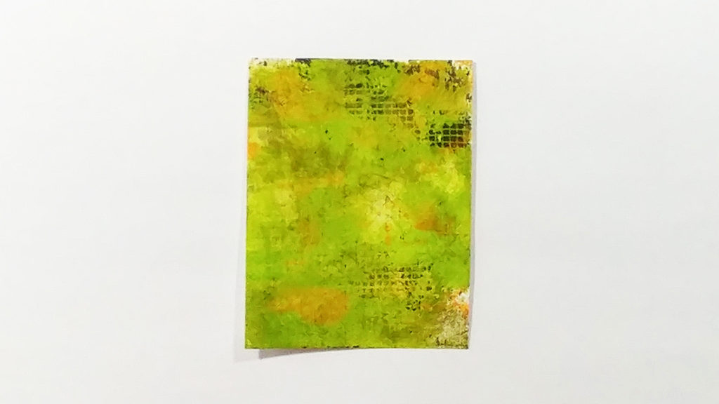
I knew I wanted to use the Leave me in Paradise stamp set, so I wanted to work with Greens as a base. To get the layered weathered look, I created several prints first in various shade – Browns, Orange, Yellows and Greens. Once I had little bits of paint left behind, and the prints were starting to feel a bit more complex, I created an orange print. Have you ever seen tropical leaves? They are deep and vibrant greens, yellows, orange and red.

With some orange bits dried onto the gel press, and some interesting Brown in the corners, layer up some vibrant greens. I used Dirty Martini by Dylusions mixed with some lime by Dina Wakely. Both of these paints are fairly fluid. They helped to reactivate all that dried goodness underneath.

Lay a sheet of cardstock over, and run your hands firmly on the back. We’re trying to pull as much as we can off here. The print had gorgeous depth and interesting character from a piece of Dry Wall Mounting Tape in the corners.

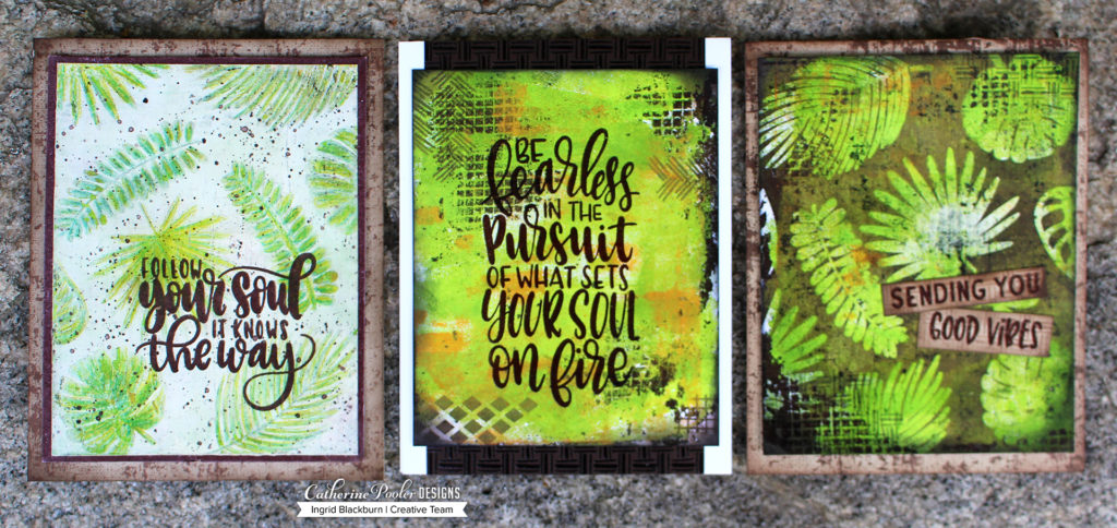
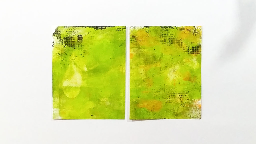
Cut down that piece into four and next create your cards. To see the main card I was looking to create and read a bit more about it’s process, Click Here for my blog post yesterday.

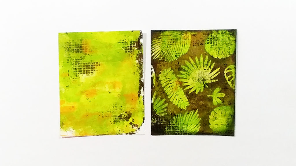
The goal was always to create a batik look to my project. But what happened next, I wasn’t prepared for and nearly threw in the towel! I had stamped the gorgeous leaves from Leave me in Paradise in Versamark ink and heat embossed them in Clear. I wanted to create a Joseph’s Coat/Faux Watercolored look to my project, so rather than coat it in dark ink, I chose to paint over everything with White Gesso.

Next was the Faux Watercolor technique – Place your piece in a phone book (or other scrap paper), fold a few sheets over it and iron off your embossing. No problem, right? Boy was I wrong. That Gesso held tight and the clear embossed leaf images were trapped.

So how do you fix this? I thought it was something for the round file, but I talked myself into just putting it to the side and trying one more time. Next I did a true Joseph’s Coat technique and used Icing on the Cake Dye ink. Here’s what it should have looked like – monoprint base and ironed off/joseph’s coat technique:

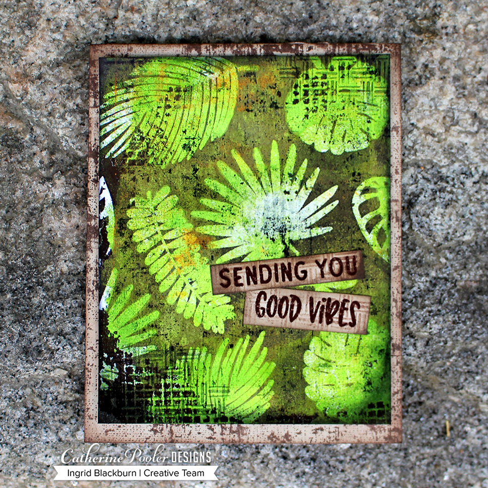
And here’s the final piece – a success! That project turned out to be a stunner…Details are on yesterday’s blog post.

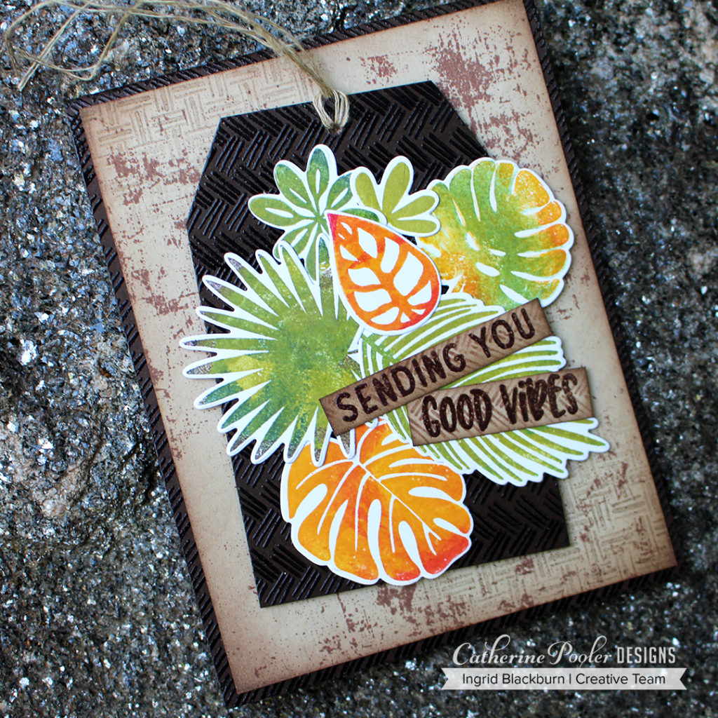
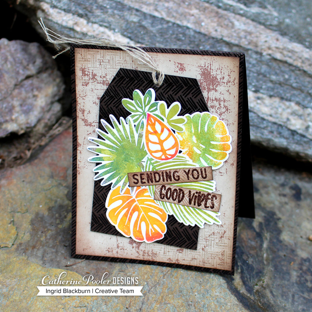
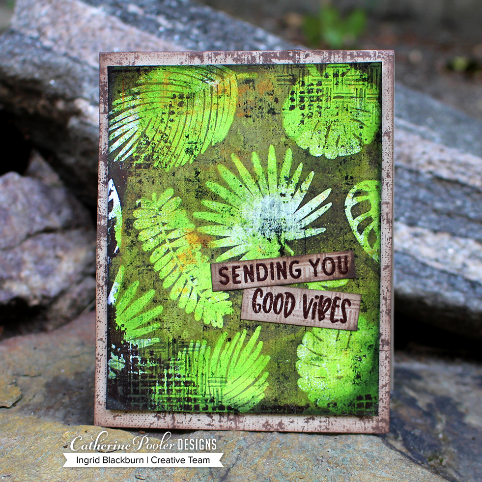
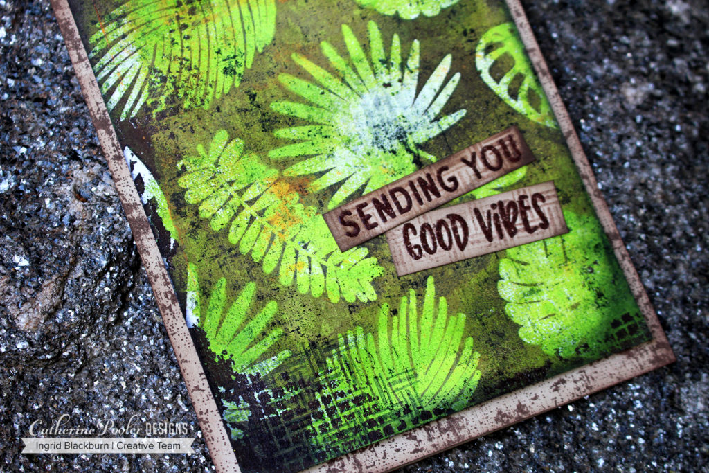
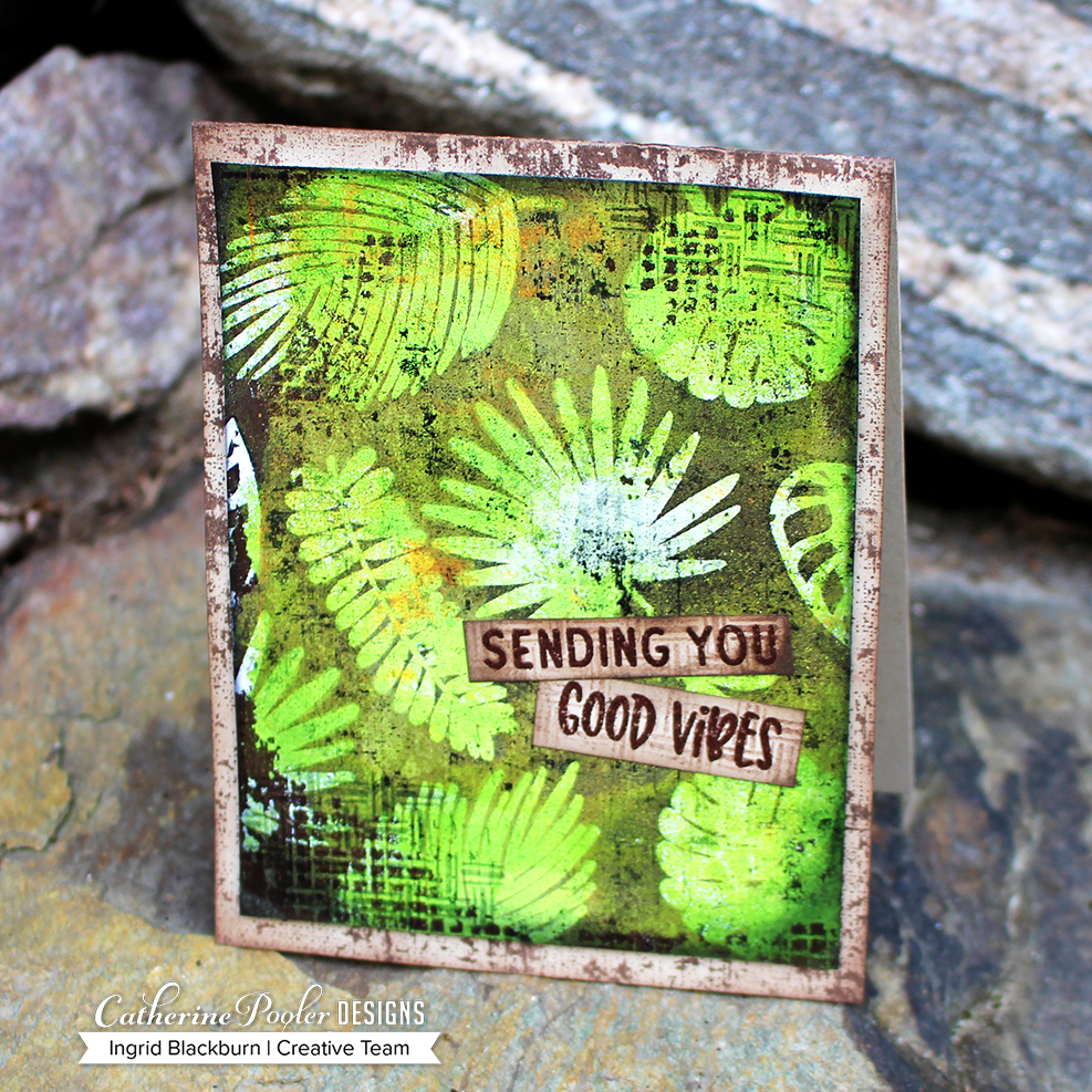
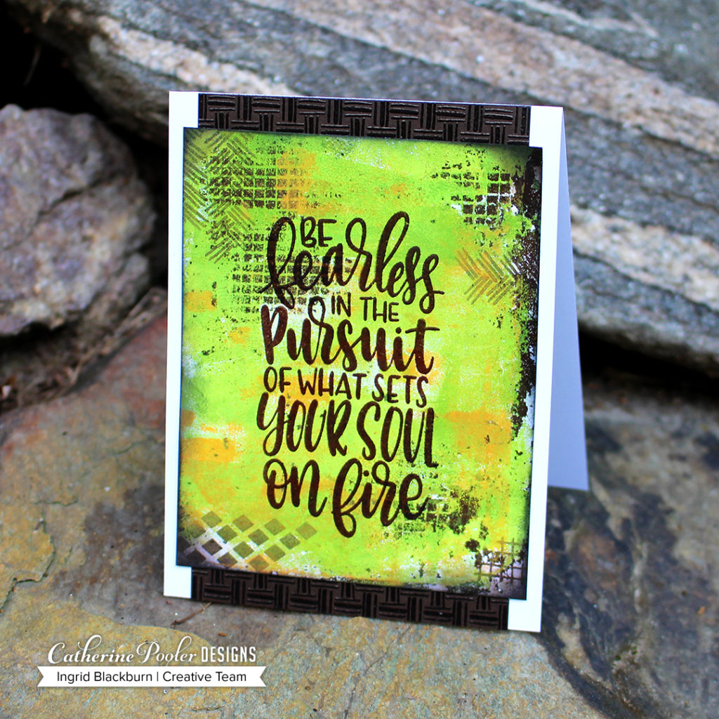
And with one the other two remaining monoprints, just pop the drop dead gorgeous Fearless sentiment onto it and emboss in WOW Bark embossing powder. Add some of the textures from Good Vibes Borders in the corners to accentuate the print in Icing on the Cake ink and Matte it onto a a strip of cardstock that’s been embossed in the textures and bark for added interest. Doesn’t it look like basketweave? This card is simple, fun and definitely easy to duplicate. But in the sense that the monoprints will be different – how cool, right?

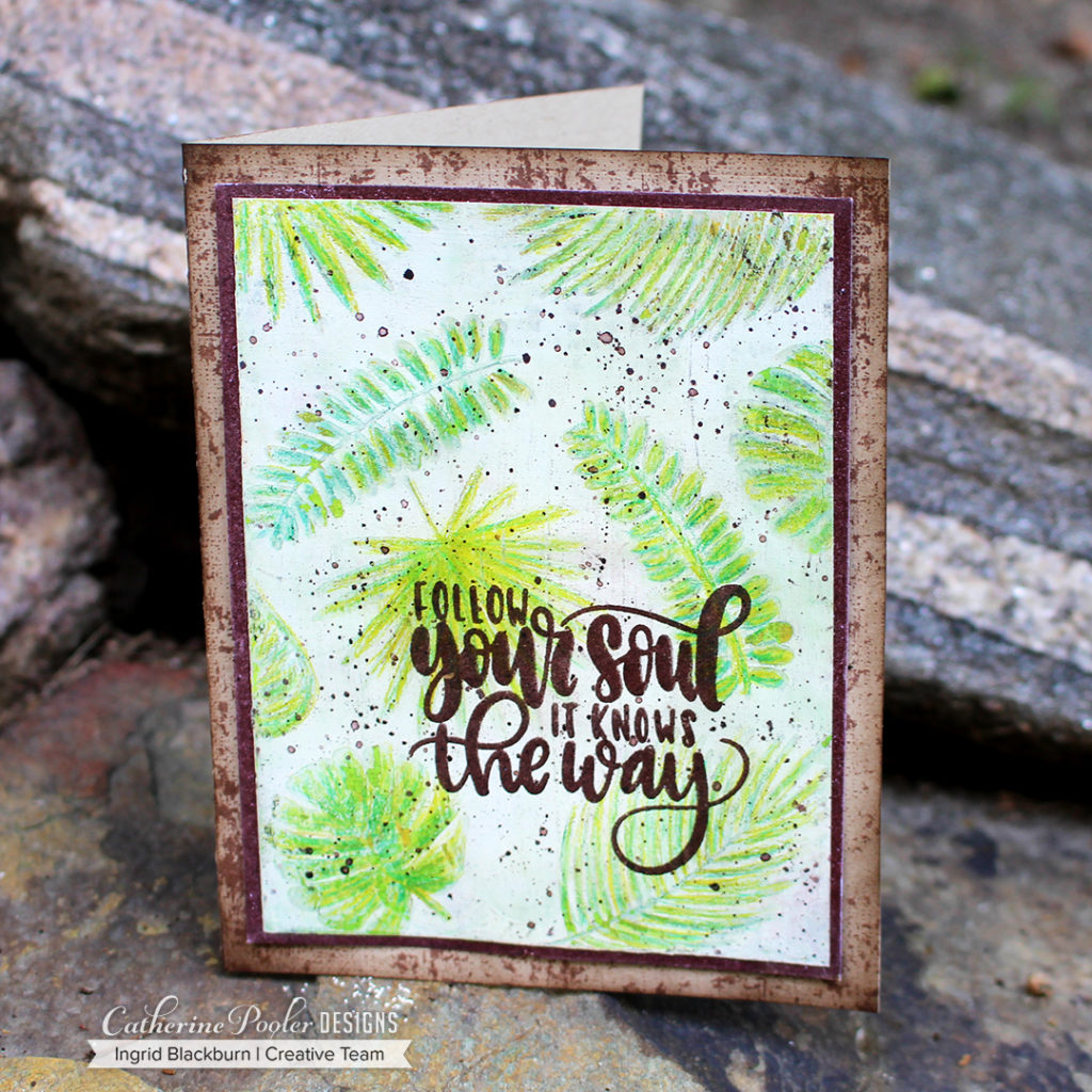
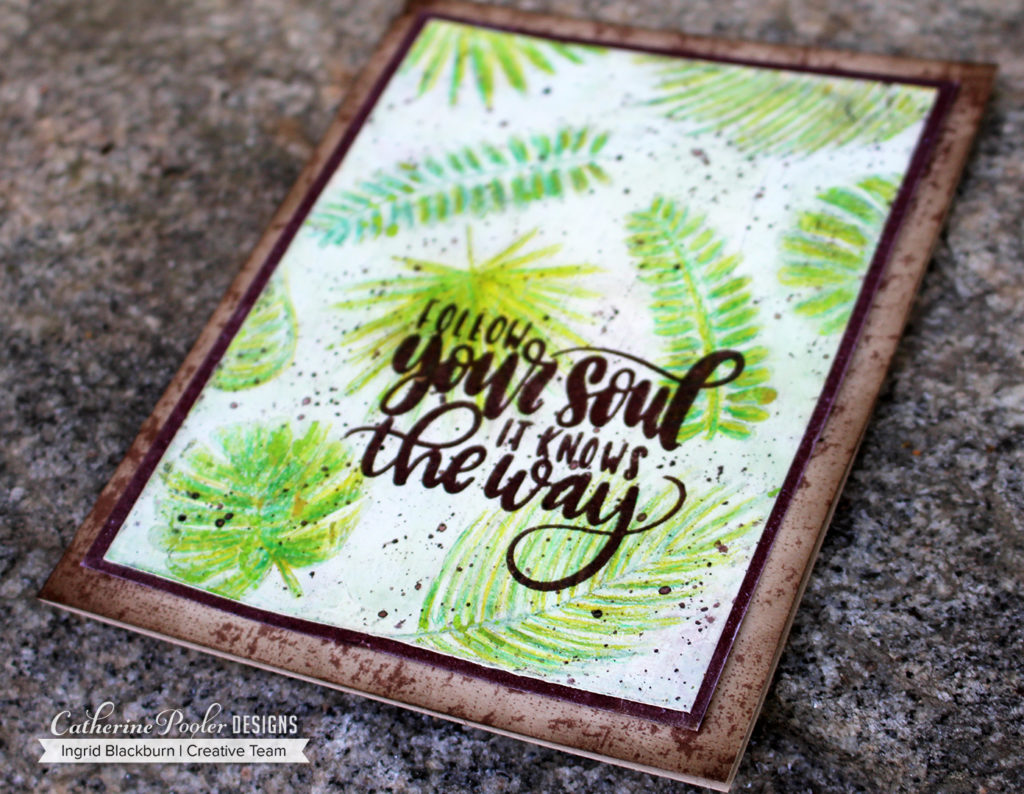
Now back to the piece headed to the trash…wait….hold the phone! That’s when genius struck. Okay – I’m bound to have one good idea every now and again…What if we could bring the covered images back to life with colored pencils?!!

Here’s a look at it along the way….

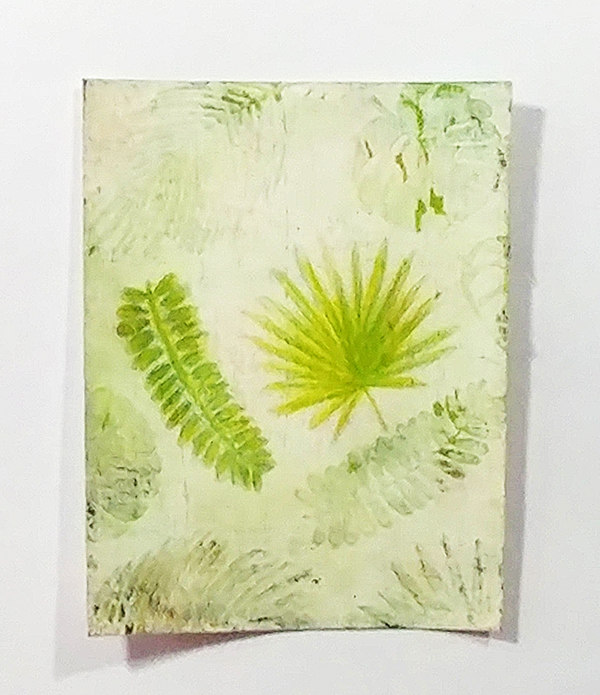
Next up, just color the images with several shades of colored pencils. I used a 72 pencil set I have by Arteza, and about 6 shades of Green. Once the pencil colors were laid on top of the botched images, smooth them out using a blender pencil. I used one by Caran d’Ache to get a smoother look. The end result was a light watercolor almost look to the piece.

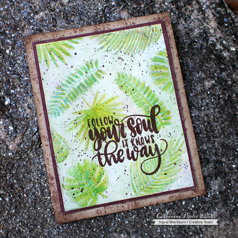
The Gesso in-between is cracked and weathered, which only adds to the project. It needed something, so once you’ve embossed that rockin’ sentiment from the Fearless Pursuit stamp set in Bark by WOW, splatter some Payne’s Grey acrylic paint watered down with a few drops of Icing on the Cake ink refill.

Matte onto an edged embossed piece in Bark – notice how different it looks on white cardstock than Chocolate?!! I LOVE this embossing powder. It’s new to Catherine’s shop too!

Create a little grunge on your card base with Over Coffee Ink on Sand Dunes cardstock and you’re all set.

Overall, the monoprints are super cool true Mixed Media pieces. But what’s really awesome about them, they are one layer. The person you give these cards to will never figure out how you did that?!!

And the moral of this long epic story #2…don’t throw anything in the round file.

I hope you’ve enjoyed these couple of cards. I love the texture and creative way I can use these stamps. There are some FUN products in the box. You’ll love it all. Best part – it truly works with each other.

Thanks for stopping by today! Keep those fingers inky –

Supplies

To make finding the supplies I used in these projects a bit easier for you, here are a few clickable links. Compensated Affiliate Links are used when possible. Click here for disclosure. Happy Shopping!


Tropically Yours Stamp of Approval Blog Hop Day Three

Tropically Yours Blog Hop

Welcome to the Tropically Yours Stamp of Approval Blog Hop – Day Three! You’re probably hopping on over from Laurel Beard’s blog. Laurel is ah-mazing, isn’t she?!!! I love the texture she creates in her projects – plus she enables my crafty habit all the time…lol!

We’ve been showcasing the fabulous products in the Tropically Yours SOA box since Sunday, and let me tell you, we’re gonna finish it off the Creative Team hops with a bang today.

The Tropically Yours Stamp of Approval box is by far my favorite. I’m a sucker for anything foliage, texture and pattern. Throw in some scenic elements, and um, hello…have you ever been to my blog before?!! But before we get into the creative…let’s talk about the when, where and why.

If you’re a StampNation member, then join us tonight live from the clubhouse PJ Release Party – yup – I’ll be there!! You’ll be the first to get access to this hot collection in the shop. The waitlist will get the secret link at 9 am Wednesday first. So don’t miss being on the waitlist – why not, right? It’s all about access! If any boxes are left over at 6 pm later on Wednesday (and I’ll be floored if there are any – the collection is that good), the box will release to the public.

Tropically Yours Stamp of Approval

The Tropically Yours SOA Collection works flawlessly together. Most of the sentiments are hand lettered, so they are unique. The images are bold, great for techniques, and have just the right amount of CPD spunk. The textures…can we talk about those a second?

First off, Canvas Grunge background stamp – when Shawna Clingerman designed this textured design, I nearly fell out of my chair! Now, I am a bit of a clutz, so that’s not that far of a stretch, but I think I did audibly gasp. This stamp is SO up my alley, and you’ll see why shortly…Good Vibes Borders – what can I say – there isn’t one stamp in that set that you will not use over, and over – and then over again. It’s just THAT good. It’s rare to find an entire set of texture stamps that can not only create incredible full backgrounds, but be just the right little something your project needs, you know? Plus have sentiments…

Leave me in Paradise, Stand Tall, Tropically Yours and Fearless Pursuit – all of which I’m using today…I’ve never seen four stamp sets that work SO well together. Each one is distinctly different and has it’s own flavor, but together they really bring out the best in each other.

Make sure you don’t miss the Add-Ons – all four cookie cutter dies are additional (perfect for those who have a scan and cut like me, right?!!). Um, and yes…there’s a new ink in town – Coral Cabana. It’s part of the Carnivale Collection of Inks in the Party Line, and it’s gorgeous.


I’m showcasing all six stamp sets for you today…but there’s more…the Cabana Tiles Dies – wow. I don’t have a project today with those, but did you see what some of my Creative Team teammates did with those – I mean WOW!

So, head on over to the shop – get all your extras already into your cart, so that when the time comes….you just have to add the SOA and Add-ons and checkout. After all, you don’t want to miss all those little things (adhesive, the new Zig Blender Pen, Embossing Powders & Glitters, Paper – you’ll want some Sand Dunes cardstock if you don’t already have it, and the INKS!

Tropically Yours Projects

No. 1 – You Had Me At Aloha

First up…a little playful fun. This card has a lot going on. First off – look past all the cuteness on it to the textures. That Canvas Grunge background stamp is so beautiful, especially in that Coral Cabana. The textures it has is incredible. And this is stamped off!

I rarely use it directly stamped – it’s a powerful image, and when using it in the background…place a piece of copy paper – or better yet – a different project on it, lightly tap with your fingers and then do the same with your piece. For added interest, use the Good Vibes Boirders stamps repetitively in a light manner in the corners. See how they fade into the card?

I also used the same stamp in Black Jack on the Smoke cardstock. That pattern is literally pure perfection for a background, and it’s super easy to line up too!

The Flamingos are just darling. Their legs are in Coral Cabana, bodies in Be Mine and to get a black beak, squeeze your Black Jack ink pad to collect some ink in the lid. Use a Zig Blender Pen to pull some ink and color like a marker. The Tropically Yours stamp set has some great tropical floral images to go with a few fun sentiments. I love how fun this card is – with a tropical nod to Jerry McGuire!

No. 2 – Sending You Good Vibes

This is one of my favorites. The colors and textures just have make me smile. Seriously – take a good look at the texture created on the stamped images – and that’s just with ink!

The background has a great weathered and distressed look. Use the Canvas Grunge and Good Vibes Borders stamps and do a little ink blending on the edges and corners to antique it a bit. To compliment that, Use a different border stamp on the tag and card base – embossed in my new favorite WOW embossing powder – Bark! I love that color – and wait till tomorrow when I showcase the look of it on dark vs. light cardstock. On Catherine Pooler Chocolate cardstock though, it takes on this deep brown color that with these incredible border stamps is texture galore.

Stamp the same image lightly in Over Coffee onto Sand Dunes, once you’ve embossed your sentiment. Those are a few of the options from the Good Vibes Borders stamps – have I mentioned that set rocks!!

Notice the corners. Again there’s some repetitive stamping going on with the borders stamps. The key to achieving that look is to start light – stamp off onto scrap paper once or twice and then stamp once or twice and repeat. Line your stamp up each time to extend your pattern, and to get that faded look, change up how far in you go with that stamp. I started not quite half way in and ended up less than half that distance. It’s a great look.

The gorgeous hues of the spa line of inks really look amazing on the Leave Me in Paradise images. I like to die cut my images first then stamp – I find it simpler. The green leaves are a mixture of Green Tea, Eucalyptus and on some Spruce. The Oranges are Sauna, Mandarin Spice and on one Rockin’ Red.

My favorite leaf though is the one above the word You. To get that look, you’ll want to ink up just the outsides in Sauna/Mandarin Spice. Fade out the edges towards the middle with a mini ink blending tool, stamp and then ink up the middle with a little Green Tea/Eucalyptus – fading out the edges. Stamp and there’s your blended look! Isn’t it gorgeous?

No. 3 – Here Comes the Sun

Here comes the sun, here comes the sun… And I say… it’s all right. Sorry – now that’ll be stuck in your head all day! This classic and super simple card is a fun one with endless possibilities. To get a super smooth ink blend, I use watercolor paper – Laurel Beard gave me that tip a few years ago, thanks chickie!!

You’ll want to mask off your horizon line and then sponge your sky. Here you see Coral Cabana up top and Limoncello at the horizon. That gorgeous tangerine color in the middle is those two colors blended. I love the shade it creates!

Once you are happy with your sky, reverse your horizon mask and sponge All That Jazz at the horizon and Fiesta Blue at the bottom. Create a mask by tearing a small space at the edge. Use that along with a straight edge mask for your island. Pounce in Icing on the Cake to create your island.

Because this is on watercolor paper, I used my MISTI to stamp my images. The rough texture is tough to get a perfect image the first time. I repeatedly stamped my two palm trees. Isn’t it cool how they almost form a heart! To make sure I had enough space – I laid out my sentiment, then the trees.

The five sentiments in the Fearless Pursuit stamp set are all hand lettered by Shawna. I just LOVE them all. They are unique in appearance and different from what you see everyday. They are uplifting and perfect for so many of the people in your lives. I see myself using them ALL the time. PLUS she added a crazy amount of image stamps – There are 28 stamps in this set!!

Don’t you just love that little frayed grid on the sides – yup, you guessed it – Good Vibes Borders again. That pattern reminds me of Easy Joint Dry Wall Tape. I use that in mixed media projects as a texture all the time. So I was so excited to see a stamped version of it!

No. 4 – Mixed Media Good Vibes

You didn’t think I wasn’t going to throw something unexpected your way did you? This project has a story – a good one. I almost skipped this one for today, but in the end…I just had to share it with you. And it went all sorts of wrong – I almost threw the messed up version away – GASP! So I laid it to the side, and set out to re-do it. That’s this project. The almost trash (which is now my favorite, by the way) project I’ll have up tomorrow.

So back to today’s Mixed Media project. I had Batik fabrics in my head when I thought of this. So I figured i’d get out my Gel Plate and create a fun little background for a starting point – 9 2 page art journal spreads, and about 16 more monoprints later I had an arsenal of things to choose from. I picked my favorite green textured print and set out to create some cards.

To play off the Canvas Grunge stamp, my goal was to create a textured look. I incorporated using some Easy Joint Dry Wall Tape as a stencil – I figured it looked just like the stamp in Good Vibes, this way I could get that look, but use acrylic paint. So I ended up with a gorgeous piece of Greens, Burnt Umber and some Orange.

I cut my monoprint down into four card front sized pieces and set out to make some cards. This is one, tomorrow Click Here to see the others….. Can’t have everything in one day…lol! Next up was to work on a few techniques to give me the look I was shooting for – Joseph’s Coat and Faux Bleaching.

To get this look, you’ll want to emboss your images in Versamark and emboss in Clear. This allows you to “trap” the gorgeous monoprint from underneath, in stamp form. Here’s where I went wrong – I covered my entire project with white gesso next. Normally, that would be fine – only when I went to create the Faux Bleached look – I couldn’t lift it! I just sat there stunned. Click Here to see how I “fixed it”.

So in the second pass, I skipped that part and went straight into the Joseph’s Coat technique. I took my Icing on the Cake ink pad and smooshed it all over my project. The embossed areas resisted the ink and I dried the rest with a heat tool. Now my base is covered in paint, so it’s not like regular paper – it doesn’t absorb dye ink like normal, and the effect is a great one. It’s a grungy, weathered brown, not the deep look you would think you’d get.  You can see some of the orange and green fighting it’s way to get out from under the brown cover.

Next up – Faux Bleaching. I turned on my iron, and got out the yellow pages. Place your project inbetween two pages and iron over it! The heat from the iron re-melts the clear embossing powder which gets absorbed by the pages in the book. You’ll need to move it around and switch up your pages a bit, and because there’s paint in there – it took a bit longer. The result was pretty awesome!

Next up, ink up your background stamp in Midnight ink…what?!! Yes…it’s an archival ink and perfect for stamping on painted surfaces. Lightly stamp off onto scrap paper first, then lay your project over your background stamp. With a light touch, tap a few areas from the back to transfer the ink. Your project with resist in some areas, so if you have a particular look in mind – you’ll need to work at it a bit.

The texture the Canvas Grunge Background Stamp added, made the card! Use the basket weave stamp to lightly add those corners in stamped off midnight like the other projects. Next, lightly sponge the edges in Midnight – ever so lightly. Midnight is the perfect super deep black archival ink to add to Mixed Media. It’s my go to actually over all others on the market.

Create a little grunge canvas look to your card base and super lightly frame with an ink blending tool Icing on the Cake ink. Pop up your Mixed Media piece for a little drama to your card and add your sentiments (from Good Vibes Borders) like a little sign you’d find on an island road.

What do you think? I think the coolest part of it is that the background is one layer – meaning, no raised areas and super smooth. It is a true work of art. Mixed Media isn’t for everyone, and that’s okay – I was super intimidated by it just a few years ago. But once you jump into the deep end, you’ll wish you had earlier. The projects are THAT incredible.

So, to wrap up an epic blog hop post – if you’ve hung in with me till the end – tell me in the comments! Which product are you the most excited by? I’d love to know… The Tropically Yours Collection is for stampers of all kinds. Those who love Clean and Simple, Scrapbookers, Art Journalers, and Mixed Media artists.

Tropically Yours Blog Hop

Tropically Yours Blog Hop List & Prizes

Did you know…we’re giving away a Tropically Yours SOA box to three lucky winners! And if you already bought one – no worries – you’ll get a $100 gift certificate instead, cool, right?!!! All you have to do, is comment on each stop along the hop – all three days. That’s it!

  1. Catherine<– Hop Here NEXT!!
  2. Tracie 
  3. Kristie  
  4. Jen Carter  
  5. Ilina Crouse  
  6. Laurel  
  7. Ingrid <– You’re HERE!!! 

Thanks for stopping by and hopping with us for the past three days!

Till next time –


Supplies

To make finding the supplies I used in these projects a bit easier for you, here are a few clickable links. Compensated Affiliate Links are used when possible. Click here for disclosure. Happy Shopping!