Watercolor Painted Poppies Video Tutorial

Blooming-Garden---Ingrid-Blackburn-Sneak-2

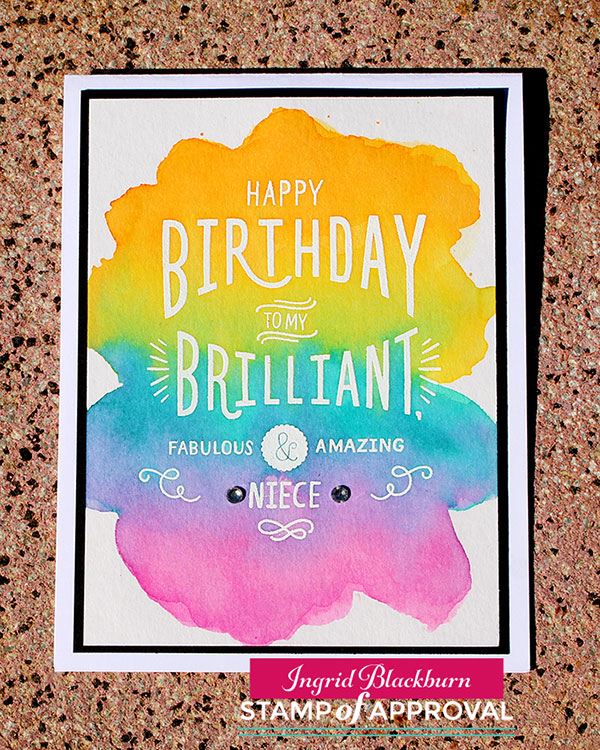
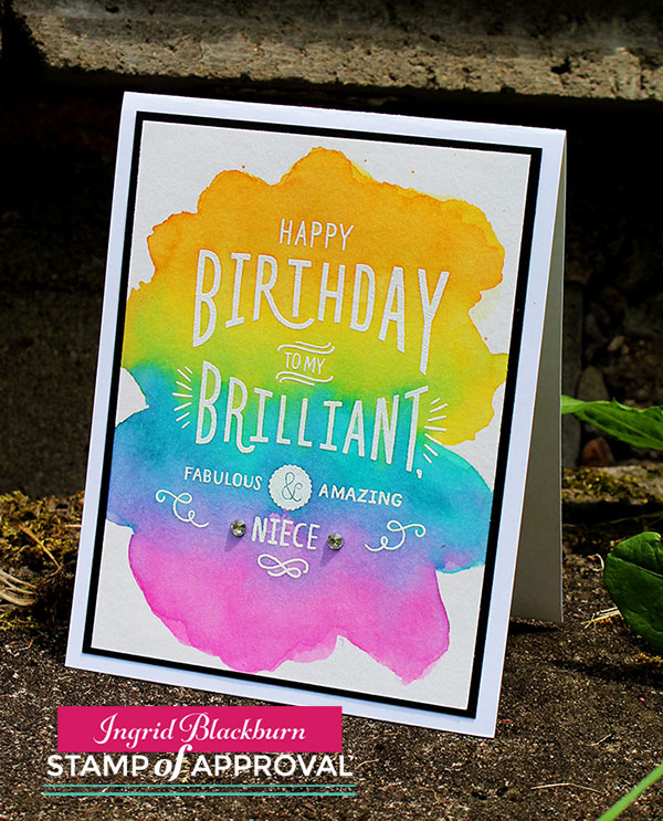
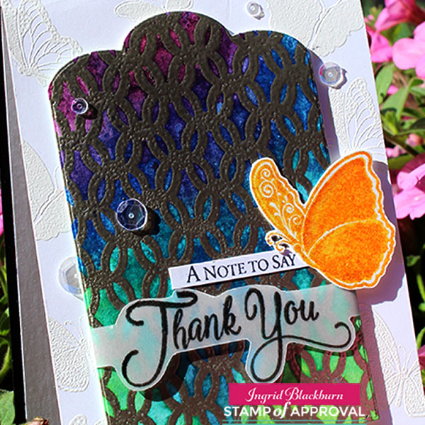
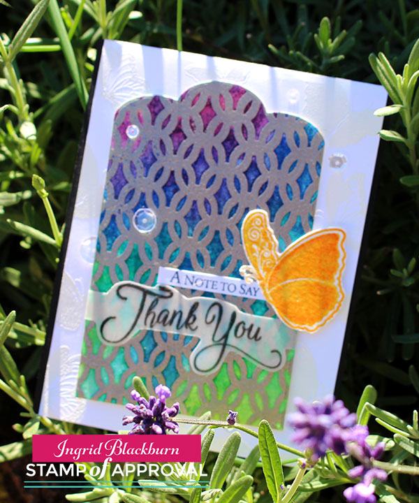
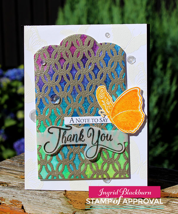
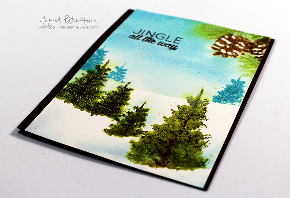
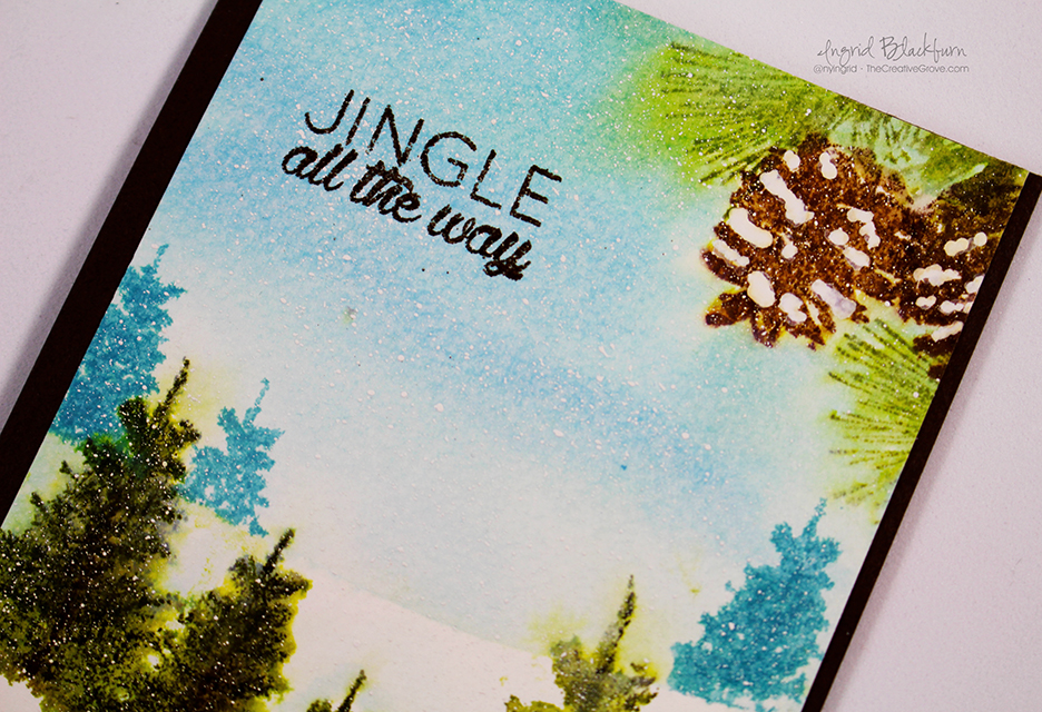
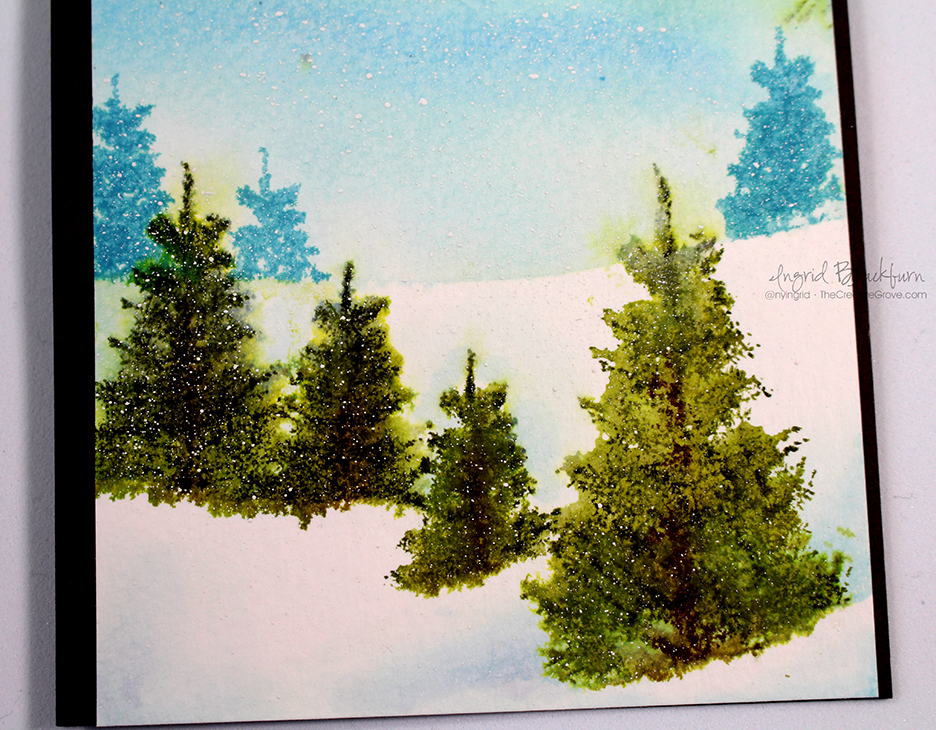
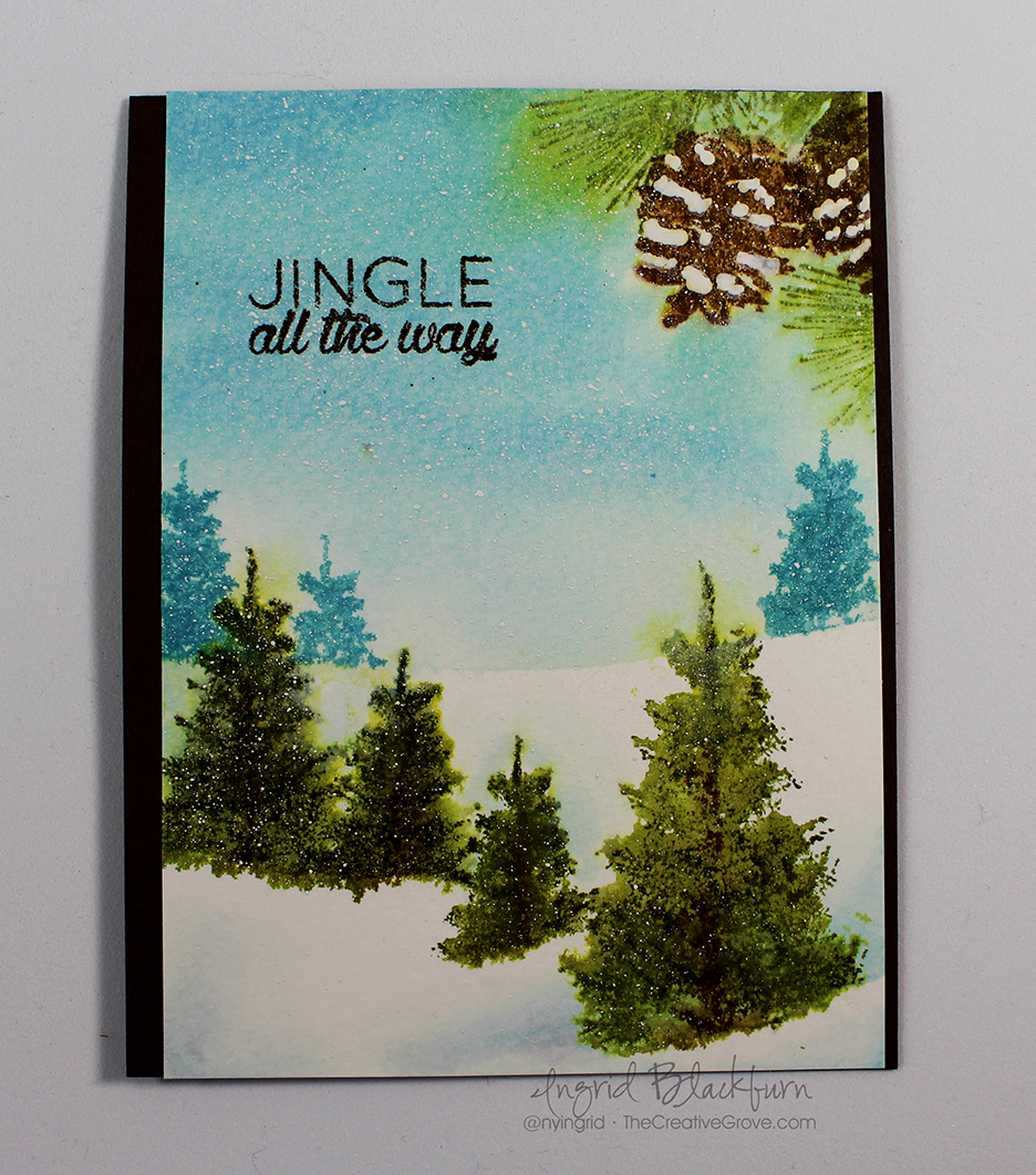
Have you every just had a crazy amount of fun making a card before? Well, that was me with this project! I’m guest blogging over at my friend Catherine Pooler’s blog today and have a written and video tutorial for you – be sure to hop on over there to check it out!

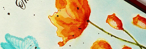
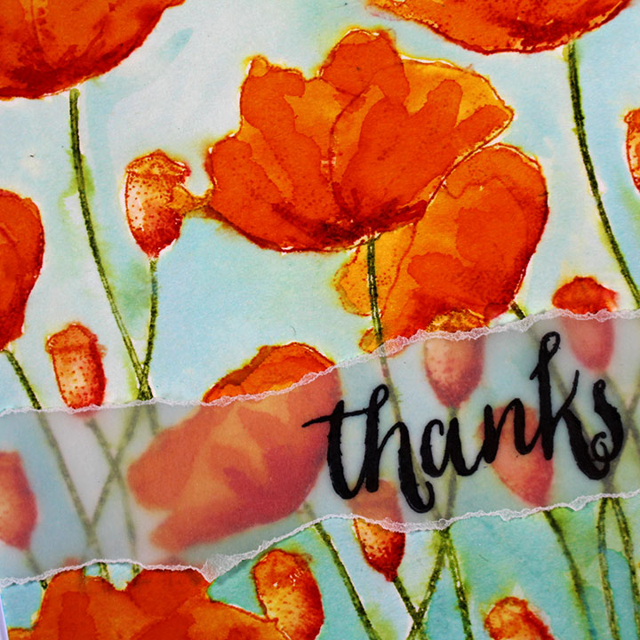
A few weeks ago over at StampNation, we had a fun challenge CASEing one of our members – Gail Hislop. I used one of her creations to get inspired and created this field of poppies – I have to say, I think it’s the prettiest watercolored card I’ve EVER made! To see it, you need to be on StampNation, so if you’re a member – here’s a direct link…Field of Poppies Card

Gail-Hilsop-Case---Sneak-Peek

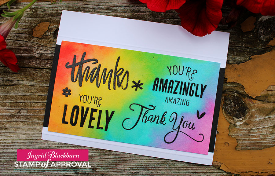
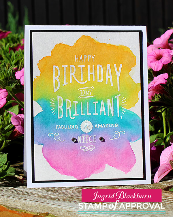
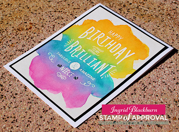
The last time I was with Catherine – in real life – was last fall. We hung out one morning over coffee. I did what any good crafter would do…I brought cards with me! She fell in love with one of my tutorials for my Just Cards class, and wanted me to show how to watercolor stamp and paint it. So we hopped onto periscope and I did a quick live tutorial.

When she asked me to do a guest post on her blog…I immediately went to this technique. I knew she’d love an in depth tutorial, so what are you waiting for – hop on over to Catherine’s blog and check it out! Be sure to leave a comment and let us know what you think!! 🙂

See you VERY soon!

Signature

thumbnail-2

PS – and if you’re a StampNation member…be sure to see my in depth tutorials on Embossing Powders & some fun techniques for the summer event – Heat it Up!


SOA Lovely Notes Blog Hop

Lovely Notes SOA Blog Hop

Welcome to the Lovely Notes Collection Blog Hop – Day 3! What do you think so far…pretty amazing, right? Well I hope to add a little creative inspiration for you today with a few projects. I’ve been sharing a few projects over the past few days – this collection is so easy to create with, and I have so much more to keep sharing with you this week.

The Stamp of Approval Lovely Notes Collection is a curated collection of stamps and dies that work fabulously together or alone. Not only do you get a box FULL of amazing stamps and dies, but you’ll get a downloadable PDF Project Guide (for free!) with tons of project tutorials using them!

The stamps and dies in the Stamp of Approval Collections are brand new on the market and won’t be released for individual sale for several months. To find out how to get a box, you have to be on the wait list! Yes, these boxes sell out so fast – the last one was gone in 33 hours….so don’t wait. The wait list will find out before the public will. Click Here to sign up for the wait list and find out more.

Today I’m going to inspire you with several of the components of this collection. Specifically the Lovely Flowers, Lovely Flowers & Banners Dies, Lovely Lattice Background, Butterfly Notes, Wonderful Wreath – all by Catherine Pooler Designs, and Handpainted Thanks by Neat & Tangled. So let’s get right to it with a little Christmas in July, here are your tutorials!

Lovely Notes Project Tutorials

Wonderful Wreath

I was in love with this wreath the moment I saw it. It reminds me of olive branches – delicate and whimsical. To get this clean and simple look, stamp your wreath on white in Stampin Up Pear Pizzazz, the berries in Primrose Petals, hang some ornaments in Baja Breeze and tie it all up with an Early Espresso bow. It was that simple. This is a GREAT mass produced card.

Lovely-Notes-SOA-Project-2---Ingrid-Blackburn-001


For an elegant touch, emboss your greeting in Gilded Gold by Brutus Monroe – my new favorite gold. Add a few sparkling clear sequins by Pretty Pink Posh and a little simple paper piecing in the corners finishes it off.

I’m addicted to the tilt for the matte in the background (thanks Maureen!) – a little Early Espresso on a Pear Pizzazz card base. It’s that simple.

Thanks Friend

This awesome handpainted Thanks stamp by Neat & Tangled is my new favorite greeting – I love bold scripty greetings. I used this stamp just one way – did you know there are two others that layer for a multi tone effect! How cool is that?

You’ll want to stamp some of the Lowely Flowers and cut them using the coordinating Dies. I used the Stampin Up colors – Marina Mist, Wisteria Wonder, Rose Red & Garden Green. On a large piece of white scrap paper – at least card front size, stamp the thanks towards the bottom center/right. Repeatedly stamp thanks in a light neutral tone, I used River Rock. TIP – alter where the word starts on each line so that it flows.

Lovely Notes SOA Collection - Ingrid Blackburn


Stamp the dots from Lovely Flowers in the middle 2/3 of the Soft Suede card base. I stamped it completely across so that the left and right side were even.

Cut your tag out using the large banner die from the Lovely Flowers & Banners Dies set. Try to place the Rose Red Thanks a bit off centered to the right at the bottom. You definitely want some neutral below as well. Stamp the word Friend from the Lovely Flowers Stamp set in Soft Suede on a piece of scrap and attach to your tag.

Pop the tag up using Foam Tape or Fun Foam and adhere your embellishments. TIP – The leaf branch has three sprigs – I cut mine apart to get it just right – sometimes just one or two.

That’s it – it’s a cute card – I had way too much fun with the Lovely Flowers stamps & dies as you’ll see tomorrow!

Bold Watercolor Greetings

If you’ve followed me for a while here, on YouTube or in an online class – you know I love to watercolor! This project takes some of the various greetings in this collection and puts them to good use. I wanted greetings that would stand out, so I used two from Lovely Flowers, one from Butterfly Notes and one of my new favorite Thanks from Handpainted Thanks. Here’s a video tutorial for you:

Click Here to watch video in HD on YouTube

To get this outline look, first stamp your images in versamark. Go back over them with a de-static tool and stamp again in Versafine Onyx Black Ink. Emboss in Black and heat set. Once cool, secure your project down with low tack painters tape on the upper and lower edges.

Smoosh some Distress Ink onto your craft mat or acrylic block – I used Rusty Hinge, Ground Espresso, Gathered Twigs and Vintage Photo. Grab some ink with a large wet brush and start painting onto your dry watercolor paper. You want your watercolor to flow together without getting out of control.

Handpainted Thanks - Lovely Notes Collection - Ingrid Blackburn

TIP – if your paper accumulates too many puddles or your colors blend out of control, gently dip the edge of a dry paper towel into a puddle to sop it up without removing color. Or use a thirsty brush (Not dripping wet). Water will naturally be attracted to a dry surface.

Once you have the look you want, heat set or allow to dry on it’s own. TIP – keep some lighter areas along with dark for a balance.

Stamp the Lovely Lattice Background stamp in Ground Espresso onto a folded Espresso card base. I just inked up the top and bottom. Quickly dip into clear embossing powder and heat set for a tone on tone look. If using a vanilla or white background, use Versamark ink for a watermark look. The key is not to compete with your watercolor, but rather support it.

It’s a pretty quick and easy project. I made four as I wasn’t sure of the look I wanted. Here’s a rainbow one too:

Lovely Notes Stamp of Approval Ingrid Blackburn


I added a little dry embossed line to the top and bottom for a simple embellishment. No matter what color combination you choose, you’ll love this technique.

Now that you have some inspiration…time to find out just how you can win a free box!

Lovely Notes SOA Win

It’s your turn to hop along and check out what the uber talented Amy Tsutura has in store for you next! Here’s the blog hop list:

Catherine Pooler

Neat and Tangled

Kristie Goulet

Yoonsun Hur

Ingrid Blackburn – That’s Me * You are here*

Amy Tsuruta You’re next stop!

Justine Hovey

Be sure to leave a comment on each designers blog for a chance to win a Lovely Notes Collection of your own! There’s a giveaway for all three days of the hop! If you missed out on any of the Blog Hops – start at the beginning with Catherine’s Blog and Day 1.

And stop by tomorrow for more inspiration –

Signature

[optin_box style=”12″ alignment=”center” email_field=”email” email_default=”Enter your email address” integration_type=”aweber” double_optin=”Y” list=”3846012″ name_field=”name” name_default=”Enter your first name” name_required=”Y” opm_packages=””][optin_box_field name=”headline”]Learn more with our exclusive FREE video series:[/optin_box_field][optin_box_field name=”paragraph”]PHA+UGx1cyB5b3XigJlsbCBiZSBhZGRlZCB0byBteSBGUkVFIENyZWF0aXZlIFRpcHMgRS1sZXR0ZXIgd2hlcmUgSSBzaGFyZSBleGNsdXNpdmUgcHJvamVjdHMsIHZpZGVvcyAmYW1wOyB0aGUgMTIgRGF5cyBvZiBDaHJpc3RtYXMgUHJvamVjdCBTZXJpZXM8L3A+Cg==[/optin_box_field][optin_box_field name=”privacy”][/optin_box_field][optin_box_field name=”top_color”]undefined[/optin_box_field][optin_box_button type=”0″ button_below=”Y”]Get Instant Access![/optin_box_button] [/optin_box]

Fill-in-the Blank Colorwash Resist

Have you ever tried a colorwash resist? It’s no secret that I love to emboss and add bright vibrant colors with Distress Inks. This project combines both. It’s day 2 of the Stamp of Approval Blog Hops – did you hop along today and yesterday? If not, I have links below!

13603495_10157037138765580_7410031084960510169_o

There were some seriously wicked cards created by some of the most talented stampers!! Be sure to stop by tomorrow – I’m “on deck”….and I have several projects to share with you.

Watercolor Wash

Today I have a quick, straightforward project that I think you’ll love. It’s super easy and if you’re new to watercolor, it’s a great one to start off with.

First, ink up the Fill-in-the-Blank Birthday Stamp in Versamark, add the Niece (or fill-in whichever you need) and emboss it in white on 140# Cold Pressed Watercolor Paper.

Next add your color – it’s seriously THAT easy!

Colorwash Resist Technique Tips:

  • To duplicate this look, grab a #10 watercolor brush and paint on the colors Spiced Marmalade, Mustard Seed, Peacock Feathers and Picked Raspberries – top down.

Watercolor Colorwash Resist

  • To use the distress ink, use the reinkers, or smoosh your pad into your craft mat (or acrylic block). You don’t need to spritz it – unless you are using the reinkers – that’s very concentrated – spritz a few times.
  • With a wet brush, paint on the colors, one at a time.
  • You’ll want to monitor the amount of water you are adding as the colors start to bleed together.
  • Take your time – use a dry paper towel to lightly dip into an unwanted water pool, the wet will go where the dry is (you can use a thirsty brush also).

Fill-In-the blank Birthday-Color-Wash-003

  • If you have any unwanted blending, just come back into it with a watercolor brush – try a #6 for a bit more control. Go back over that area with a little more color and blend out any unwanted looks.
  • As long as your project is still wet, you have a little play. Once it dries, you can still adjust it, but it’s much more difficult.
  • Distress works great together – pick colors that blend well and don’t create mud.

Simple Watercolor Cards - Ingrid Blackburn

Have fun! If you’re not on the Stamp of Approval wait list yet, click here to find out more about this amazing collection of stamps & dies. It goes on sale on the 13th – but only to the wait list at first. You don’t want to miss out.

Lovely Notes SOA Banner

And if you haven’t seen the other amazing projects created by the SOA team – Click here for the beginning posts of each Blog Hop –

Day 1                 Day 2

Can’t wait to share more with you tomorrow –

Signature

[optin_box style=”12″ alignment=”center” email_field=”email” email_default=”Enter your email address” integration_type=”aweber” double_optin=”Y” list=”3846012″ name_field=”name” name_default=”Enter your first name” name_required=”Y” opm_packages=””][optin_box_field name=”headline”]Learn more with our exclusive FREE video series:[/optin_box_field][optin_box_field name=”paragraph”]PHA+UGx1cyB5b3XigJlsbCBiZSBhZGRlZCB0byBteSBGUkVFIENyZWF0aXZlIFRpcHMgRS1sZXR0ZXIgd2hlcmUgSSBzaGFyZSBleGNsdXNpdmUgcHJvamVjdHMsIHZpZGVvcyAmYW1wOyB0aGUgMTIgRGF5cyBvZiBDaHJpc3RtYXMgUHJvamVjdCBTZXJpZXM8L3A+Cg==[/optin_box_field][optin_box_field name=”privacy”][/optin_box_field][optin_box_field name=”top_color”]undefined[/optin_box_field][optin_box_button type=”0″ button_below=”Y”]Get Instant Access![/optin_box_button] [/optin_box]

Butterfly Notes in the Garden

The day has finally arrived – the new Stamp of Approval Blog Hops are here! While I’m not on the “official” list for today…catch that on Tuesday, I will be sharing some creative fun with you from this collection over the next week.  I have to admit, it’s been hard to sit on my hands and not share this awesome jam packed collection with you, and I’m excited that I finally get to let the stamps fly – well in this case today…here are some new Butterflies for you – Butterfly Notes by Catherine Pooler Designs.

Butterfly Notes - Catherine Pooler Designs

This card is so much prettier in person than photographed. It was really hard to capture the background – soaring skies filled with four different fluttering butterflies – all embossed in white on white. But I needed something to support the colorful tag – or banner (upside down of course).

This collection of butterflies really is a great one. What I love about it so much is that there are various orientations of the butterfly images – everything from transparent wings, to flight directions, to gorgeous details along the edges or back wings – as you see in this close up here:

Lovely-Notes-SOA-Project-3---Ingrid-Blackburn-005


And then of course my all time favorite thing – sentiments with images. I don’t know about you, but for me when sentiments are included with stamps, my heart sings. I love it when I can go back to a stamp set over and over again, not just for the images. I’m all about versatility in my purchases, aren’t you?

I watercolored the tag with distress inks first – my thought was garden at the bottom – greens, then sky – blues evolving darker into some purple. To create the garden metal gate, once the watercolored piece was dry, emboss the Lovely Lattice background stamp in Pewter. Pewter is such an elegant color and gives an antique look that I just love. Next, you’ll want to cut this gorgeous watercolored piece out using the large banner/tag from the Lovely Flowers & Banners Dies set.

Lovely Lattice Background


Watercolor stamp Spiced Marmalade using the butterfly image & once dry add a little Spectrum Sparkle Pen to it for some glitz. Place your orange butterfly over the blues – they are complimentary colors so they really support each other in harmony.

A little strip saying above the cut out embossed on vellum scripty Thank You from this set supports the card without taking away any focus. Of course, I couldn’t resist a few sparkling clear sequins as well – were you really surprised?

The card is folded white (11 x 4″) and then mounted onto a 1/4 panel of black for the base. That gives a slight black edge on the left and right – it needed it to help pop the white, and is a bit unexpected.

Lovely-Notes-SOA-Project-3---Ingrid-Blackburn-003

I love this card for it’s subtle notes and pop of bright colors. Be sure to stop by Catherine’s Blog to start the hop today – each of the three days, there’s a collection up for grabs – so leave comments along the way for all the blog hops! Catherine shared three videos over the past few days showcasing the products in the Lovely Notes Collection, so be sure you are on the wait list to be the first to get a hold of it right when it’s released July 13th – they go really fast!

Lovely Notes SOA Banner

See you tomorrow with more inspiration –

Signature

[optin_box style=”12″ alignment=”center” email_field=”email” email_default=”Enter your email address” integration_type=”aweber” double_optin=”Y” list=”3846012″ name_field=”name” name_default=”Enter your first name” name_required=”Y” opm_packages=””][optin_box_field name=”headline”]Learn more with our exclusive FREE video series:[/optin_box_field][optin_box_field name=”paragraph”]PHA+UGx1cyB5b3XigJlsbCBiZSBhZGRlZCB0byBteSBGUkVFIENyZWF0aXZlIFRpcHMgRS1sZXR0ZXIgd2hlcmUgSSBzaGFyZSBleGNsdXNpdmUgcHJvamVjdHMsIHZpZGVvcyAmYW1wOyB0aGUgMTIgRGF5cyBvZiBDaHJpc3RtYXMgUHJvamVjdCBTZXJpZXM8L3A+Cg==[/optin_box_field][optin_box_field name=”privacy”][/optin_box_field][optin_box_field name=”top_color”]undefined[/optin_box_field][optin_box_button type=”0″ button_below=”Y”]Get Instant Access![/optin_box_button] [/optin_box]


Watercolored Mountainside

Happy New Year! It’s a new year, and what better way than to kick off with a Challenge?!! This month’s Christmas challenge over at Happy Little Stampers is Jingle. You might be going – Christmas, what? Well, I didn’t create NEAR enough cards last year, so I”m excited to be getting an early start!

I scoured my stash and would you believe it…I don’t have a single jingle bell stamp or die! So I got a little creative. I thought I could draw and watercolor one – well, let’s just say that didn’t go so well….lol!

So, I knew I had this great saying – actually three jingle sayings, so I decided to go with the spirit and place the word prominently instead! After all, the song Jingle Bells does say…Dashing through the snow and Over the Hills we go! Now I know this isn’t a one horse sleigh, but I imagine this to be a little of the scenery that I would see from the sleigh. That’s where this all started from.

I hope my project inspires you in some way to add a little jingle to your Christmas cards and get an early start for your 2016 stash. For more details, be sure to keep reading!

HLS Christmas Challenge January 2016

Watercolor Stamping Technique

Be sure to stop by the challenge over at Happy Little Stampers and see all the amazing creations made by the Design Team! And this month we have a wonderful Guest Designer with us – Sarah from Funky Fossil Designs.

Watercolor Tips & Techniques for Christmas Cards

  • Watercolor cards work well on good quality watercolor paper. I used Canson 140 pound cold pressed paper and a #6 round brush.
  • For this scene, I decided to use some brand new stamps that Santa brought me this past Christmas – Natures Gifts and Prancers by Penny Black. These two sets are perfect to evoke the scene I had envisioned along with my Jingle greeting from the Mixed Christmas Sentiments by Happy Little Stampers.

Prancers Stamp Set - Penny Black

  • To create your snow drifts, add a little water with a #8 round brush where you’d like to have a snow drift. Dropwatered down Broken China and a little Weathered Wood to to base of the line. Paint your snow drift using a clean wet brush to blend it outward creating a light took upwards on your bank. I’d encourage practicing this on scrap paper a bit first. It takes a bit to get the hang of it.
  • Stamp your pine cones and needles at the top right. To get a painted look, use the watercolor stamping technique – ink up your stamp, then spritz a few times to get the ink wet before stamping onto your paper. Move the ink around with a wet paint brush if needed. I used Peeled Paint and Forest Moss for the greenery and Gathered Twigs/Ground Espresso for the Pine cones and trunks.
  • TIP – find a balance between the amount of water and ink.
  • Once you have your snow drifts and pine needles/cones in place, add a top edge to your drifts with a mask – I cut into a piece of Painters Tape. To paint your sky, you’ll first want to wet your area. Try not to touch your needles or pine cones too much to keep the color from bleeding. A little works – too much is a mess.

Natures Gifts by Penny Black

  • Once your sky is wet, add a little Broken China Distress Stain – keeping the darkest of the color at the top and blending it out with a wet paint brush toward your horizon.
  • Stamp your trees using the watercolor stamping technique and the Broken China Stain. I used the two smaller trees from the Prancers Set.
  • Stamp your front trees, masking off the bank with a torn piece of painters tape in the general shape – I didn’t worry about being too perfect. I used the same shades as the pine needles and cones. Watercolor stamp and under layer that gives a great shaded base. Once a bit dry, re-stamp without spritzing for a bit of detail. TIP – if this part is too wet, you’ll lose all your detail.

Watercolored Snow Scenic Cards

  • Allow your project to fully dry.
  • I needed a greet greeting, so I pulled out my trusty Mixed Christmas Sentiments by Happy Little Stampers.
  • Stamp your greeting in Versamark and emboss in Espresso Embossing Powder.
  • Add the snow using Pro White by Daler Rowney and spatter flicking with a toothbrush.

Watercolor Christmas Cards

  • Paint snow onto your pine cones using the Pro White and small paint brush.
  • Cut scene to desired width if necessary – mine is 5 1/2 x 3 7/8″ and mounted onto a top folding A2 card in Early Espresso.

I just love the watercolored snow drift look in this card. I am a huge admirer and personally am always inspired by two great stampers and watercolor artists – Heather Telford and Micheline “Mimi” Jourdain both on the Design Team for Penny Black. I’ve learned a ton from Heather over the years, and have to admit, that I myself have gotten into watercolored cards and flicked snow because of her artistry over the years. So thanks Heather!

Watercoloring techniques for scenic cards

Now if you find any tiny little part of this card inspiring, please hop on along to the Jingle Challenge over at Happy Little Stampers this month and play along with us. The Design Team has some great inspiration for you, and I can’t wait to see what YOU do!

Keep those fingers inky!

Signature.png

If you liked this tutorial and would like to see a similar project that goes into depth and detail including a step by step video and PDF – be sure to Click Here to check out our 12 Days of Christmas 2015 class!

12 Days of Christmas 2015 Button


Watercolor Polka Dots

Watercolor Handmade Card Main L

Have you just sometimes wanted a fun card?  Well that’s what todays project is all about – just plain old fun.  Lord knows we all need more of it in life, right?  Here’s your recipe for a fun energetic card – take a few vibrant colors, paint alternating circles – don’t worry so much about the size and shape or getting it perfect.  This is all about just letting go and letting your imagination take control. 

Tools and Colors –  I went with Schminke Hordam Aquarell Half Pans (Artists Watercolors) in Transluscent Orange and Magenta, and used my starter set made by Marie’s in Lemon Yellow.  You can use whatever watercolors your have, or even Stampin’ Up! inks – just use the refills.  Paint brushes – I used a Da Vinci Cosmo Top Mix B in a size 14 and a Da Vinci Kolinsky Rotmarder in size 3 and 5 for smaller touches.   These are out of my painting brush supplies, but use anything you have, Aqua Painter or other ones you have lying around. 

Paper – I used the Stampin’ Up! watercolor paper, which works fine for these purposes.  Since I’ve been painting a bit lately, I’ve been using higher quality papers.  The Stampin’ Up! paper, while 140 pound cold pressed paper, I found it to be a bit rough.  For the black in the project I used the Basic Black Stampin’ Write Marker – both ends.  The stamp is from the set Four You by Stampin’ Up!

Watercolor Handmade Card Angle R

Tip – I first wet my piece of Stampin’ Up! Watercolor Paper completely and then made my circles.  After doing it this way, I would recommend to paint on dry paper instead.  Especially if you are brand new to watercolor, as it’s very easy to be heavy handed with water.  And in this case – your colors will run and expand – which is what you’re looking to achieve with wet on wet.  If you look closely at mine, you’ll see some bleed beyond the black – that’s because I added the black to minimize this look, but I couldn’t get rid of it all.

I added the black also for a point of interest to help the dots stand out.  This is a fun and easy way to fix your card, but also adding contrast with the ultimate dark color against the fun, vibrant bolds.  For the yellow, I chose a watered down wash of Lemon Yellow, applied once my watercolor paper was dry.  This is an important step – and one of the hardest to do – allow your paper to dry in between!  Just make another and by the time you’re done, you should be good to go.

Watercolor Handmade Card Angle

Tip – Don’t crop your paper first – it’s better to go larger and then have the ability to edit down in case you make any mistakes!  And it goes without saying – think like wrapping paper – your design does not end before the edge.  Give your project that continuous look that is more natural.

Scribbles – I didn’t have a stamp to use that I liked on the dots, so I just scribbled a continuous circle using the finer point of my Marker.  Here’s the biggest tip with this – don’t try and be precise.  Just be sure to cross at least one line at some point.  It creates a little nest and looks a bit more whimsical.  Practice on scrap paper if you’re nervous.

Watercolor Handmade Card Main R

I wanted my print to stand out as that’s the real star here, so the banner is white with just black ink, and the color is matted on black cardstock with a wider white base.  Just the banner is popped up on dimensionals.

I hope you liked this fun little project.  It would be a fun birthday card for anyone!  While they aren’t totally perfect, the best part – I totally let myself go and just let the art flow.  Be sure to stop by again this week for more fun ways to watercolour your cards!

Signature Snowflake 001

Watercolor Handmade Card Angle L

Shop 24/7 in my Online Store – Here

For other art supplies, check out these online resources:

Dick Blick and Jerry’s Artarama

For online card classes – be sure to check them out in the classroom under the Online Classes tab above!