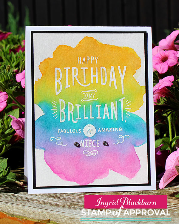
Have you ever been inspired by a favorite book or movie? Today I bring you a fun little video card hop, inspired by the Harry Potter series and a few of my crafty friends for a Harry Potter Scenic Card Tutorial!
This summer, Justine Hovey and I met up for lunch in Stuttgart, Germany while we were both visiting. I don’t even remember how we got onto the conversation – but we discovered yet, another love that we shared in common – Harry Potter! We thought, that would be a just for fun video hop – and my mind immediately went to my friend Laurel Beard – who I knew loved Harry Potter just as much as me. And Justine knew Jessica Frost Ballas was just as addicted, and this hop was born!
So here’s a fun, book/movie series inspired hop for you – filled with prizes, a little magic and of course – Harry Potter!
Be sure to hop along all four blogs and YouTube channels – leave comments – cause we’re giving away prizes on each blog – Harry Potter themed prizes!! Plus it’s fun to see how each designer was inspired.
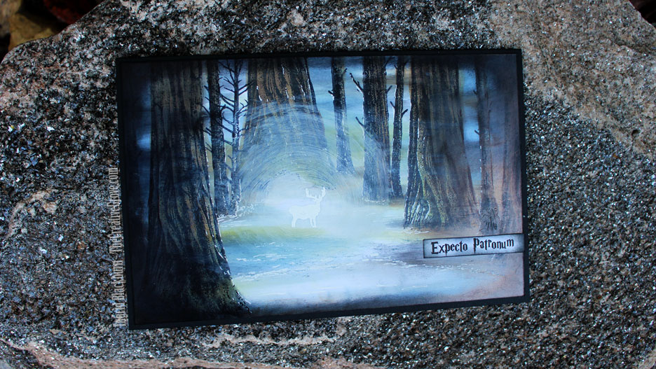
If you’ve followed me a little, I’m sure it’s no surprise to you that I just HAD to create a Harry Potter scenic card! Harry Potter inspires me in so many ways – the castle, forest, bricks, owls, forest, dark vs. light, books, forest, wands, magic and oh, did I mention FOREST?!!! Naturally I had to create one of my favorite scenes of all time (Spoiler Alert) – the Dementor attack/Patronus charm at the end of Book 3.
Harry Potter Scenic Card Tutorial
I knew the perfect stamps to use too…Stampscapes. Kevin Nakagawa’s gorgeous line of stamps would perfectly evoke that larger than life feel I wanted to create along the frozen lake deep into the Forbidden Forest. Here’s a video of exactly how I created this beauty.
Click Here to watch video in HD on YouTube
The Tree Trunk stamp was perfect for this card. But I needed it at different heights – and what do you do when your card is larger than the stamp? That’s part of the beauty of Stampscapes stamps. The way Kevin has beautifully drawn these scenic elements is with little dots. So it’s very easy to naturally stretch and build onto your scene with it looking effortless and part of the original design.
So in this image, the left most trunk is actually only 4.5″ tall and the card is 5.25″ high. So how do you stretch your image so that it goes the full length? Simple – flip the top of the trunk around and stamp to fill that area. Now, you can’t have your tree get fatter – so you’re limited to a small part of the stamp, but see how it seamlessly lines up?
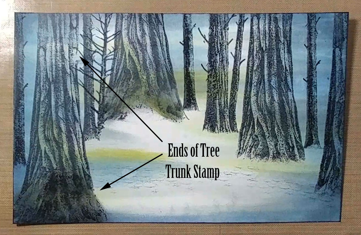
For the bottom – fill in the area with a little bit of color – add some dots with a micron pen and some distress markers. Then take the bottom of your stamp – ink it up and fade out the edges on it. That leaves you with the gorgeous texture – use that to fill in your trunk base. It just blends effortlessly! With more shading, and there’s zero chance of anyone noticing that wasn’t meant to be. Would you have seen the seam if I hadn’t pointed it out to you?
To bring the Harry Potter Scenic Card to life, layer your ink colors light to dark into your scene from the edge in. I used Kromekote Glossy cardstock – 12 pt for a strong base that let the colors glide with the Colorbox Stylus tool. Blues, Greys, Greens and Browns – your nature colors fill the scene with depth.
The key to this scene is the dark mystical nature of the Forbidden Forest. Without it, and it’s just another forest scene. We need the play of good vs. evil here – light vs. dark. Since I wasn’t sure how I could create a Dementor, I used dark shadows to get that effect playing off the bright explosive Patronus Charm.
And to get that bright glow – emboss the large buck (my Harry Patronus – the stag) and surround it with the white explosive glow. To get it to look just right, I had to play – and as you see in the video…a few ways just didn’t give the right feel. Swirls with a paper towel and some Hero Hues Unicorn Pigment ink did the trick.
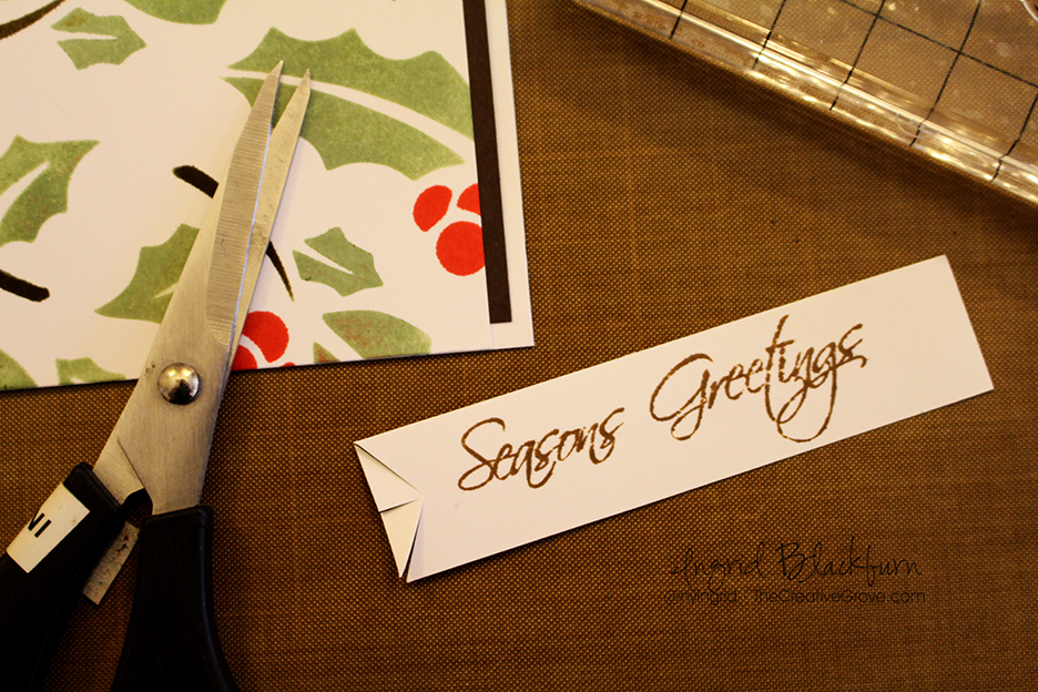
Some finishing touches of white gel pen to emphasize ice and cold along the lake edge and glow in the tree trunks mixed with the perfect dark edging pulls the scene together. I didn’t have a greeting that worked for me, so I created my own with a downloaded Harry Potter free font.
I LOVE the third movie – and this is one of my favorite scenes. I think I love Harry and Hermine climbing over the huge roots at the base of these monster trees the most. The forest is so mystical and dark – I can do with out the dementors – they always freak me out…so it’s a good thing I can create my own Patronus – at least in a Harry Potter Scenic Card form!
What’s your favorite book/movie? Do you have something about this series that inspires you? Colors, characters, elements? When you start to create yourself – tag us with #CraftyPotterHeads! We’d love to see what you make.
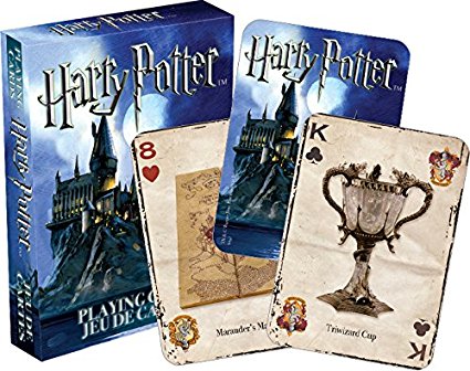
Leave me a comment and I’ll enter you into my Harry Potter drawing! I’m giving away a couple decks of Harry Potter playing cards – to be delivered by Owl Oct. 1st….okay…I guess USPS will have to do. Back to reality for this muggle…
Thanks for stopping by! Now Accio Firebolt – hop on and visit my crafty friends for more chances to win and some creative magical inspiration!
Harry Potter Magical Blog Hop List
Ingrid Blackburn – You are Here
Jessica Frost Ballas – Head on over here Next!
Justine Hovey
Laurel Beard
[optin_box style=”27″ alignment=”center” email_field=”email” email_default=”Enter your email address” integration_type=”aweber” double_optin=”Y” list=”3846012″ name_field=”name” name_default=”Enter your first name” name_required=”Y” opm_packages=””][optin_box_field name=”headline”]Want to LEARN with more exclusive videos?[/optin_box_field][optin_box_field name=”paragraph”]PHA+UGx1cyB5b3XigJlsbCBiZSBhZGRlZCB0byBteTxzdHJvbmc+wqBGUkVFPC9zdHJvbmc+wqBDcmVhdGl2ZSBUaXBzIEUtbGV0dGVyIHdoZXJlIEkgc2hhcmUgZXhjbHVzaXZlIHByb2plY3RzLCB2aWRlb3MgJmFtcDsgdGhlIDEyIERheXMgb2YgQ2hyaXN0bWFzPC9wPgo=[/optin_box_field][optin_box_field name=”privacy”][/optin_box_field][optin_box_field name=”top_color”]undefined[/optin_box_field][optin_box_button type=”0″ button_below=”Y”]Get Instant Access![/optin_box_button] [/optin_box]
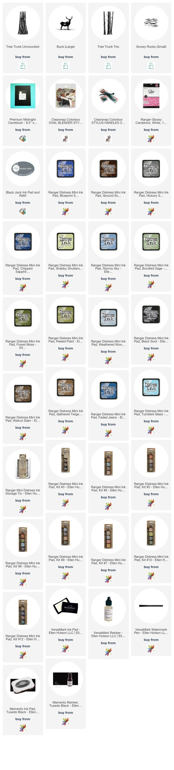
Supplies
To make finding the supplies I used in these projects a bit easier for you, here are a few clickable links. Compensated Affiliate Links are used when possible. Click here for disclosure. Happy Shopping!