How to Draw Underwater Scenes with Colored Pencils

Have you ever wanted to draw underwater scenes or just create your own little world? You’d be surprised at just how easy it actually is with Colored Pencils. No, you don’t have to be an artist – so those of you who immediately said – but Ingrid, I can’t draw…keep reading!

The key to keeping this particular project real, is to create a super light background, and inter-twine the top with the bottom. You want to keep some basics in mind – things up close are larger, and things farther away are smaller – so when creating your dunes – the ones in the foreground are large and gradually get thinner and smaller as they recede into the background. Water too. That helps give it a realistic feel.

I added the shadow of the fish after I shot the video. The sunrays are streaming through the water directly from above the fish – so the shadow is below him.

You too can create this little world. Trust me when I say it’s easy – just take your time. When you draw underwater scenes with colored pencils – they are forgiving. Erase, get it how you like, just have fun. Keep it on the lighter side – you can always go darker.

Here’s a detailed video of the entire project for you. Enjoy!

Be sure to leave me a comment over on youtube, a thumbs up if you liked it and subscribe if you haven’t already! Click Here to see it in HD over on YouTube.

Click to Watch on YouTube to expand and see full screen

Thanks for watching – I hope you enjoyed this project. It’s a fun one. And if you missed the new release by Catherine Pooler – catch it here.

If you want to see more colored pencil projects – tell me in the comments below! 🙂
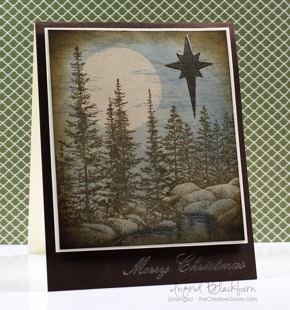
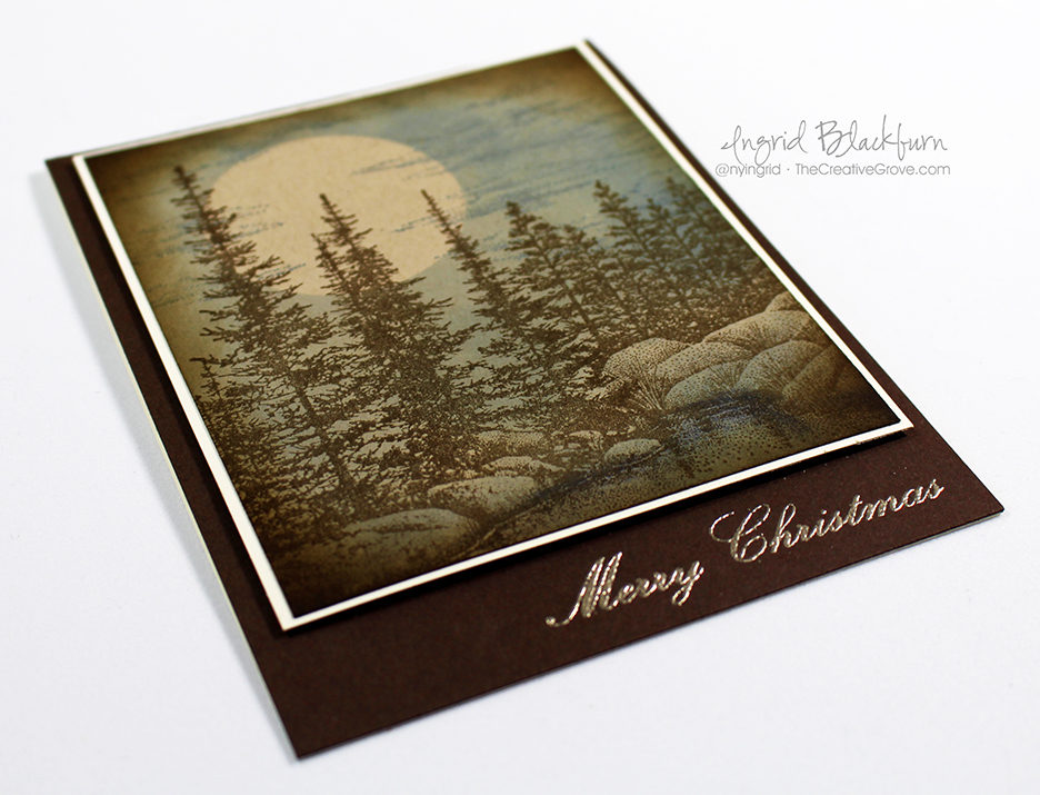
SUPPLIES

Below are all the supplies I used for these projects.

Naturally Inspired Stamp of Approval Collection – 2 videos!

Naturally Inspired Stamp of Approval Blog Hop - Ingrid Blackburn

Welcome to Day 3 of The Naturally Inspired Stamp of Approval Blog Hop! You probably hopped on over from Lydia Evans’ blog – she’s uber talented, isn’t she? I’m such a fan of hers. The whole hop list is at the end, but first here are a few projects to showcase just how amazing this curated collection inspired me.

If you’re new to Stamp of Approval – click here to check out everything you need to know about this amazing collection of Stamps, Dies and Stencils.

And make sure you are on the wait list so you get access to the collection at 9:00 am tomorrow June 7th before the public. The Add-ons are limited – especially the Wild Garden Dies, you don’t want to miss out.

Of course, If you are a StampNation member – you not only get to order hours earlier…but I’ll see you at the exclusive Slumber Party release tonight – I’ll be participating live – so come stamp with me, Catherine and many others from the Design Team.

Stamp of Approval

How I’m Naturally Inspired

If you’ve followed me for a while you know nature is my thing – in case you haven’t noticed – I love trees, the mountains, flowers – and especially greenery! I’m 100% at home walking in the mountains, woods, among trees & flowing water – I’m a born and raised northern California girl after all. Growing up in San Francisco, I’m partial to the ocean – and having lived 10 years in Florida…I never tire of these sunsets:

My true inspiration for my work is nature around me – it brings me the peace I need to think clearly and allow the creativity to flow. So much so, that I even have a few little Christmas trees all around me on my desk…lol!

In a few weeks, I’m heading back to the Black Forest for the Summer – and I can’t wait to just be in my element again (I spent the last three years there). Here’s a little sneak into my world – sadly it’s the wrong time of year for the snow, but you will definitely find me shortly wandering along one of thousands of paths and trails daily:

I love the textures and colors of nature. It drives my creations. Today I have a few colorful pieces (and videos) for you too! And wouldn’t you know…I even managed two scenic cards – very different from each other as well. Enjoy!

Project One – Naturally Inspired Sunset Silhouettes

I love scenic cards – and when I first saw the Wild Garden stamp set designed by Lisa Kirkbride, this card literally popped into my head. Paired up with Catherine Pooler Designs vibrant inks, I just knew the ink swipe technique was calling. Here’s a video on how I created this colorful layered sunset on glossy paper.

Click Here to view the video tutorial in HD on YouTube

Aren’t those colors just amazing. And with this fun technique, the possibilities are unlimited. In addition to the SOA collection, the Wild Garden set also has add-on dies which are perfect to cut out those intricate shapes.

Ink Swipe Technique on Scenic Cards

Project Two – Medallions

One of my favorite parts of this box is the surprise elements. Usually you’ll have some awesome stamps, dies and maybe even a stencil – but Catherine really outdid herself this time. Especially with the Wanderlust exclusive embossing glitter by WOW! It’s an exclusive mix just for this Collection and let me tell you – it sparkles! I think I was able to capture the sparkle pretty well here – it’s super cool on black too, becomes sparkly yellow – like a yellow diamond.

The Medallions are so versatile – I’ve just scratched the surface with them. If you didn’t see the sneak peek Catherine let you in on for my Navy Metallic card in the Facebook Live the other day – stop by in a few days, I’ll have that project right here along with a few more.

This project showcases Catherine Pooler Designs Inks: Party Dress, Bellini, It’s a Girl, Sweet Sixteen and Tiki Torch.

Medallion Mix Up by Catherine Pooler Designs

This project keeps the Medallion Mix Up images stamped as a nest within each other – but then uses the same colors in an overlapped pattern in the back. While I love the look, it was a bit busy – so to tone it down just a smidge and allow the focal piece to jump out a bit – try adding a simple sheet of vellum. You still see all that colorful goodness, without allowing it to overtake your project.

But today it’s all about some fun colorful medallions mixed with all that sparkly goodness. I won’t lie, I’m addicted to the Best Die – I LOVE Shawna Clingerman’s (the illustrator) hand scripted font – who wouldn’t, right?

And then glitter that baby up – WOW! Literally.

WOW! Wanderlust Embossing Glitter

But don’t think to just keep the glitter to just there – add it to the edge of your circle or card front for a truly special look. And just imagine this card in Blues & browns for a great Masculine look!

Project Three – Colorful Feathers

The Naturally Inspired Collection lends itself quite well to great clean and simple design, here’s a super quick and fun one. The Feather stamp is amazing – did you see that all the little birds in the set that can be stamped as if they are transformed out of the tip?!! How clever is that!

I kept things colorful and simple here – some great ink colors…a little mystery too! I’m in LOVE with the Simply the Best stamp set – you can create so many amazing sentiments with this set. And I just love the various ways to stamp Best – quirky, scripty – just LOVE that.

Quick Clean and Simple Cards by Ingrid Blackburn

But I have to admit – my favorite stamp in the entire collection is that diamond pattern. It’s only about 1 1/2 inches long – but look at how cool it looks stamped in a row?!! You will find that it is SUPER easy to layer end to end – I did this one by hand – no Misti needed here.

Pretty cool huh? NOW…see how I used that very same feather – and colors in the next project. Yes, this next project was made with all those colorful bright colors – honest!

Project Four – Watercolored Landscape

I love both my scenic cards today for very different reasons. The techniques couldn’t be any farther apart from one another. This one is an effortless watercolor that combines the vibrant colors from the first into the muted subtle shades that you see here. The moment I saw the little birds from Birds of a Feather, I was on a mission to see how I could take the stamps from this collection and stretch them into something different – trees!

Here’s a detailed video on how to recreate just that. And if you loved this, definitely subscribe to my YouTube channel too:

Click Here to see this video tutorial in HD on YouTube

Kind of cool, huh? I love creating something new and unique from existing supplies – versatility in my products is SO important. Plus being a fan and DT team mate of Kristie Goulet – the queen of uniquely stamped cards will do that to you!

Watercolor Landscape Cards using the Naturally Inspired Collection

I have detailed supplies and instructions on both scenic cards in the Naturally Inspired SOA PDF Guide – it’s jam packed with great projects to get you started – definitely one of my favorite components of each collection – detailed how to instructions!

So I encourage you to think outside the box with this collection. It won’t be hard. You’ll get such varied results which is just awesome.

These four projects believe it or not – uses almost every item in the box. I love it when I can create 10 different projects and no two are the same – I can’t wait to show you the rest. That’s the sign of a home run to me! So let’s get you entered in to win one of these amazing Naturally Inspired collections yourself!

Naturally Inspired Stamp of Approval Collection by Catherine Pooler Designs

To win one, just hop along and leave some love on all my team mates blogs. All the blogs from the last two days too – the Design Team inspirational line up is epic! Tell us what inspires you too.

Here’s the talented line up for today:

1. Catherine Pooler
2. Taheerah Atchia
3. Laurel Beard
4. Lydia Evans
5. Ingrid Blackburn You are here!
6. Heather North < Hop here Next!
7. Cynde Whitlow

Hope you enjoyed these projects and videos. Was I was able to inspire you to get creating yourself? I want to know what inspires you – tell me in the comments below! You never know – you may just win a Naturally Inspired Collection yourself.

Till next time –

[optin_box style=”31″ alignment=”center” email_field=”email” email_default=”Enter your email address” integration_type=”aweber” double_optin=”Y” list=”3846012″ name_field=”name” name_default=”Enter your first name” name_required=”Y” opm_packages=””][optin_box_field name=”headline”]LEARN MORE WITH OUR EXCLUSIVE FREE VIDEO SERIES[/optin_box_field][optin_box_field name=”paragraph”]PHA+TG9yZW0gaXBzdW0gZG9sb3Igc2l0IGFtZXQsIGNvbnNlY3RldHVyIGFkaXBpc2NpbmcgZWxpdC4gRG9uZWMgdmVsIG51bmMgbm9uIGxhY3VzIHZlbmVuYXRpcyBjb21tb2RvLjwvcD4K[/optin_box_field][optin_box_field name=”privacy”][/optin_box_field][optin_box_field name=”top_color”]undefined[/optin_box_field][optin_box_button type=”0″ button_below=”Y”]Get Instant Access![/optin_box_button] [/optin_box]


Vintage Christmas Star

Vintage Christmas Star 001

Today’s challenge keyword is star – so let’s learn how to incorporate that into this vintage holiday card. This month’s challenge at Happy Little Stampers is to use a star in some form on your card. I have to admit, I started off in a very different direction…then ultimately decided to create a simple card with a vintage masculine feel that could showcase the ultimate Christmas star.

HLS Christmas Challenge December 2015

I guess I’ve been in a vintage kind of a mood these past few months. At least here on the blog! I don’t know what it is that seems soothing about this color palette to me, but I’m really loving the feel. Maybe it’s because I’ve been injured and not able to walk as much as I would like in the woods…who knows?!! Here’s a quick tutorial for you, and be sure to stop by again next week for the video!

Creating a Quick Vintage Feel to your Holiday Cards –

  • This project was done on kraft colored paper – not white. It helps with the overall look and feel.
  • I find that the brown tone fits this style better than black. So ink your stamps up in a dark brown – something earthy. I used Ground Espresso by Ranger Distress.
  • Stamp the Stampscapes Pines & Rocks Lg on the left and the left side of Lakeside Reflections Lg to the right Tip – use a torn piece of paper towel to mask off the edge and create a seamless scene.

Vintage Christmas Star 002

  • Place two post it notes in copy paper and punch out your moon with a 1 1/4″ circle punch. This will be your mask.
  • Place your moon where you’d like it before adding blues to the sky
  • Use a mini sponge tool and some blue hues to shade in your water and sky.
  • Stamp Cloud Strips Lg by Stampscapes in Stormy Sky Distress. Be sure to overlap the moon slightly.
  • Once you have the look you’d like – add a little shading with s neutral like Weathered Wood Distress to the rocks.
  • Sponge the entire scene around the perimeter with  a brown – I used Gathered twigs for a slightly different feel than the trees.
  • Add your star and emboss in Pewter. I used the Nativity Angel Stencil by Stamplorations.

Vintage Christmas Star 004

  • The perfect sentiment makes this card and nails the vintage feel. Here you see one of the many sentiments from Mixed Christmas Sentiments by Happy Little Stampers. Emboss it in Pewter for a great look, rather than something bright.
  • The scene is matted onto Vanilla card stock for contrast before being popped up on fun foam onto an Espresso card base.

I do hope you like this card – it’s actually a great one to mass produce and goes much faster than you think! I hope this inspired you to create something special with a star for your cards. Be sure to enter them into the Christmas Challenge at Happy Little Stampers!

Keep those fingers inky –


Signature.jpg

[optin_box style=”2″ width=”500″ alignment=”center” email_field=”email” email_default=”Enter your email address” integration_type=”aweber” double_optin=”Y” list=”3846012″ name_field=”name” name_default=”Enter your first name” name_required=”N”][optin_box_field name=”headline”]Learn with our exclusive FREE Video Series[/optin_box_field][optin_box_field name=”paragraph”]PHA+R2V0IHRoZSBmcmVlIENyZWF0aXZlIFRpcHMgRS1sZXR0ZXIgYW5kIGxlYXJuIHdpdGggc3Vic2NyaWJlciBleGNsdXNpdmUgdmlkZW8gYW5kIHBpY3RvcmlhbCBjb250ZW50LiA8ZW0+PHN0cm9uZz48c3BhbiBzdHlsZT0iY29sb3I6ICM4MDAwMDA7Ij5JbmNsdWRpbmc8L3NwYW4+wqA8L3N0cm9uZz48L2VtPm91ciB5ZWFybHkgMTIgRGF5cyBvZiBDaHJpc3RtYXMgc2VyaWVzITwvcD4K[/optin_box_field][optin_box_field name=”privacy”][/optin_box_field][optin_box_field name=”top_color”]undefined[/optin_box_field][optin_box_button type=”1″ text=”Subscribe now!” text_size=”26″ text_color=”#ffffff” text_bold=”Y” text_letter_spacing=”0″ text_shadow_panel=”Y” text_shadow_vertical=”1″ text_shadow_horizontal=”0″ text_shadow_color=”#000000″ text_shadow_blur=”0″ styling_width=”36″ styling_height=”15″ styling_border_color=”#000000″ styling_border_size=”1″ styling_border_radius=”6″ styling_border_opacity=”100″ styling_shine=”Y” styling_gradient_start_color=”#345523″ styling_gradient_end_color=”#68ab46″ drop_shadow_panel=”Y” drop_shadow_vertical=”1″ drop_shadow_horizontal=”0″ drop_shadow_blur=”1″ drop_shadow_spread=”0″ drop_shadow_color=”#ffffff” drop_shadow_opacity=”50″ inset_shadow_panel=”Y” inset_shadow_vertical=”0″ inset_shadow_horizontal=”0″ inset_shadow_blur=”0″ inset_shadow_spread=”1″ inset_shadow_color=”#000000″ inset_shadow_opacity=”50″ location=”optin_box_style_2″ button_below=”Y”]Subscribe now![/optin_box_button] [/optin_box]

Sparkly Moonlit Evening

Stampscapes Scenic Card

We had a fun first month with the new Christmas Challenge at Happy Little Stampers – well the fun isn’t stopping there! This month the theme is Sparkle, so I figure what’s more sparkly than Snow?

HLS Christmas Challenge August 2015

I whipped out some of my favorite stamps for this beauty – Stampscapes. And I have a treat for you today  – I filmed it too! The first video is about the Ink Swipe technique using a Colorbox Stylus and Sponge Applicator. I’ve always admired Kevin Nakagawa’s (Artist and Owner of Stampscapes) videos and creations, so I hope I do his technique some justice! It’s quite a bit longer than my regular videos, so grab a beverage, and enjoy all the creative tips along the way!

The Second video shows you how to put the Sparkle in your card  – that’s the Christmas Challenge theme after all…and how to create the snowflake window with your scene. That one’s a bit more normal length…lol! Both showcase a very cool idea, so have fun with them. They are completely step by step.

View Scenic Card Portion on YouTube

View Snowflake cutout card portion on YouTube

The videos will teach you how to use the Colorbox Stylus tool on glossy card stock for a mystical moonlit scene. It’s loaded with tips and how to’s so enjoy! And I can’t wait to see YOUR creations at Happy Little Stampers for the Christmas Challenge – be sure to play along!

And if you didn’t get a chance to visit any of the challenges at Happy Little Stampers…be sure to stop by to see the new Stamps! What???!! Yes, there is a new stamp company in town – get your hands on the first series. Definitely check out the shop here.

Measurements:

  • Card Base – 11 x 5 1/5″ top folding card
  • Card Front – White – 5 1/4 x 5 1/4″
  • Glossy Card Stock for Scene – 4 3/4 x 4″
  • Glimmer Paper, Navy Card Stock – Stampin Up

Supplies:

  • Stamps – Small Lakeside Cove, Doe – Stampscapes
  • Stencils – Winter – Memory Box
  • Dies – Handlettered Holiday – WPlus9, Festive Flurry – Stampin Up (Retired)
  • Inks – Tuxedo Black – Memento; Ranger Distress –  Tumbled Glass, Broken China, Stormy Sky, Chipped Sapphire, Pumice Stone; Illuminate – Stampin Up, Frost White – Colorbox
  • Other – Colorbox Stylus Tool with Sponge Applicator, Fun Foam, 2 Way Glue Pen, Dazzling Diamonds Glitter – SU, White Gel Pens, Q-Tips, Mini Sponge Tool, Liquid Glue

Ink Swipe Technique

Creative Tips – 

  • Be sure to add a light layer of ink (Distress, Adirondack Lights) to your glossy card stock first to help the rest glide with the stylus tool.
  • To keep your scene elevated evenly use fun foam to mount it for a bit of elevation off the main card.
  • Sponge lightly but thoroughly. Try not to press too hard through your stencil to avoid unsightly marks from your sponge tool.
  • If you don’t have a pearlescent pigment ink like Illuminate – try silver, white or even versamark.
  • If you’re not into scenic cards – throw a photo in that spot!

Snowflake Stampscape 002

I also love to play along with other challenges – another one of my favorites is Muse Christmas Visions – and this week the inspired card had snowflakes in it. Even though the stars spoke out to me too, it was the snowflakes that ended up on my card to provide the sparkle. Cool how it all tied in!

I also played along with these challenges too this month:

So, now that you’ve learned a little here – be sure to check out all the other great inspirational projects at the Christmas Challenge at Happy Little Stampers! I can’t wait to see what you come up with.

Signature-24-pt_thumb.jpg

[optin_box style=”13″ width=”500″ alignment=”center” action=”https://www.aweber.com/scripts/addlead.pl” disable_name=”Y” method=”post” email_field=”email” email_default=”Enter your email address” integration_type=”aweber” double_optin=”Y” list=”3846012″ name_field=”name” name_default=”Enter your first name” name_required=”Y”][optin_box_field name=”headline”]If you enjoyed this tutorial…[/optin_box_field][optin_box_field name=”paragraph”]PHA+4oCmeW914oCZbGwgbG92ZSBvdXIgPGVtPjxzdHJvbmc+PHNwYW4gc3R5bGU9ImNvbG9yOiAjMjQ0YzVlOyI+ZnJlZTwvc3Bhbj4gPC9zdHJvbmc+PC9lbT5zdWJzY3JpYmVyIG9ubHkgdmlkZW8gc2VyaWVzLiDCoExlYXJuIG5ldyB0ZWNobmlxdWVzIHRocm91Z2ggb3VyIDxzcGFuIHN0eWxlPSJjb2xvcjogIzI0NGM1ZTsiPjxlbT48c3Ryb25nPmV4Y2x1c2l2ZTwvc3Ryb25nPjwvZW0+wqA8L3NwYW4+Q3JlYXRpdmUgVGlwcyBlLWxldHRlcsKgYW5kIHN1YnNjcmliZXIgb25seSB2aWRlbyBhbmQgcHJvamVjdCB0dXRvcmlhbHMhPC9wPgo=[/optin_box_field][optin_box_field name=”privacy”][/optin_box_field][optin_box_field name=”top_color”]undefined[/optin_box_field][optin_box_button type=”1″ text=”Send me exclusive tips!” text_size=”32″ text_color=”#000000″ text_bold=”Y” text_letter_spacing=”0″ text_shadow_panel=”Y” text_shadow_vertical=”1″ text_shadow_horizontal=”0″ text_shadow_color=”#f6fefb” text_shadow_blur=”0″ styling_width=”50″ styling_height=”19″ styling_border_color=”#000000″ styling_border_size=”1″ styling_border_radius=”6″ styling_border_opacity=”100″ styling_shine=”Y” styling_gradient_start_color=”#a3b640″ styling_gradient_end_color=”#80902c” drop_shadow_panel=”Y” drop_shadow_vertical=”1″ drop_shadow_horizontal=”0″ drop_shadow_blur=”1″ drop_shadow_spread=”0″ drop_shadow_color=”#000000″ drop_shadow_opacity=”50″ inset_shadow_panel=”Y” inset_shadow_vertical=”0″ inset_shadow_horizontal=”0″ inset_shadow_blur=”0″ inset_shadow_spread=”1″ inset_shadow_color=”#80902c” inset_shadow_opacity=”50″ location=”optin_box_style_13″ button_below=”Y”]Send me exclusive tips![/optin_box_button] [/optin_box]

Moonlit Meadow

This past week you’ve seen several projects made with the classic stamp set Lovely as a Tree by Stampin’ Up!.  And if you are on the Creative Tips List, you even got an exclusive project too!  I thought I’d continue for one more just to round out the week.  This project came about because I wanted to use the color Perfect Plum in a creative scene.  So, the obvious choice was a moonlit evening.  Enjoy the tips and I hope you enjoyed this week of Lovely as a Tree projects here at The Creative Grove!

Miss the 1+2=3 series featuring Lovely as a Tree this week?  See Part 1 here!

DSC01424

Creative Tips –

  • Start off by embossing your scene in SU Early Espresso powder.
  • Use a mask for the ground made out of copy paper, and a moon post it punched with a 1” circle punch.

DSC01437

  • Brayer or sponge your sky using various shades of blue.  I used Adirondack Lights Cloud Blue, Stampin’ Up! Soft Sky, Marvy Salvia Blue, SU Island Indigo and SU Not Quite Navy.
  • Keep your horizon light, not white, but definitely lighter in color.  It helps to give that moonlit glow.

DSC01438

  • Brayer and/or Sponge your ground.  You’ll want to come from the sides to keep the area where the moon is reflecting light.  I used Adirondack Cloud Blue, SU Smoky Slate and SU Perfect plum.

I had some issues, and went a little too dark on the bottom left corner.  I tried to remove some which didn’t work and ended up pulling up some of my paper.  It’s just been a week of mishaps on all my projects!  So, I did something I don’t usually do, I added a few scraps to over it up.  To get the perfect angle, you’ll want to stack your pieces and cut them together.  The pearls finished the strips, and the banner greeting was the perfect final touch.  You know, it didn’t turn out that bad!

DSC01428

I hope you’ve enjoyed unofficial Lovely as a Tree week!  Have fun stamping this weekend. Smile

Signature-Blog

[optin_box style=”14″ alignment=”center” action=”http://www.aweber.com/scripts/addlead.pl” disable_name=”Y” method=”post” email_field=”email” email_default=”Enter your email address” email_order=”1″ integration_type=”custom” double_optin=”Y” name_default=”Enter your first name”][optin_box_hidden][/optin_box_hidden][optin_box_code]

[/optin_box_code][optin_box_field name=”headline”]If you enjoyed this tutorial…[/optin_box_field][optin_box_field name=”paragraph”]PHA+PHNwYW4gc3R5bGU9ImNvbG9yOiAjNjQ2MzVlOyI+TGV04oCZcyBzdGF5IGluIHRvdWNoISBNeSBvY2Nhc2lvbmFswqA8L3NwYW4+PHNwYW4gc3R5bGU9ImNvbG9yOiAjNjY2Njk5OyI+PHN0cm9uZz48ZW0+ZXhjbHVzaXZlPC9lbT48L3N0cm9uZz7CoDwvc3Bhbj48c3BhbiBzdHlsZT0iY29sb3I6ICM2NDYzNWU7Ij5DcmVhdGl2ZSBUaXBzIGUtbGV0dGVyIHdpbGwgdGVhY2ggeW91IHRvIG1ha2UgcHJvamVjdHMgdGhhdCB5b3UgbG92ZeKApjwvc3Bhbj48L3A+Cg==[/optin_box_field][optin_box_field name=”privacy”][/optin_box_field][optin_box_field name=”top_color”]undefined[/optin_box_field][optin_box_button type=”0″ button_below=”Y”]Send me exclusive tips![/optin_box_button] [/optin_box]

1+2=3 Stamp Series #001: Part 2

Yesterday we talked about masking and creating a scene.  But what happens when your masks or worse, sponging fails you?  Today’s and tomorrow’s projects, are the result of un-recoverable mistakes.  I’ll confess.  The project to the left below was supposed to be project 1 and the one on the right was the second.  Of course it was, I had to keep going because I wanted a one layer card as one of the projects and I kept messing up!  Can you relate?

Today is all about turning failure into a winning strategy!  I’m sure you can relate – we’ve all had this happen at some point, no?  If you missed yesterday’s project Click Here to read all about it.

Of course, it seems like when there is a mistake, it usually happens at the very end.  It’s Murphy’s Law – who is this Murphy person anyway?  If you know – tell me in the comments – I’ve always wanted to know…lol!

Here you see what was supposed to be two one layer cards.  I went the easy way out on one by using a few post it notes moving them around rather than putting my full mask back down which required more steps.  Well, the joke was on me as now I had to think outside the box to try and save my hard work!

DSC01407

And the other – on my very last pass in the upper left corner, I grabbed my sponging tool too hard and my nails left three marks…argh!  I couldn’t believe it!  There was no saving it.  So my only option was to cut.  So this project ended up as #2.  Here are the series details:

1 – Stamp – For this series I thought I’d choose a stamp set that has been available for over 20 years and is still on the market…the ever popular Stampin’ Up! set Lovely as A Tree.  This works with any large tree stamp.  Since there aren’t any greeting stamps in this set, I used one from the retired set Perfect Words.

2 – Colors – Two colors were used in all three projects: Sahara Sand and Soft Suede by Stampin Up.  For the cardstock in later projects, I only used Soft Suede along with Whisper White.

3 – Projects – while a few are a bit similar, they are vastly different.  Enjoy!

DSC01418

Series #001 – Project 2: In the Shadow of the Mountain

  • Once I cut the top off, I re-sponged it in both Sahara Sand and Soft Suede.
  • I created this one just like yesterday’s project.  I even used the same mountain mask – I just shifted it to give it a different look by creating a much larger mountain.

DSC01447

  • In this project, you see more of the trees in the distance and only two up close.
  • The actual scene measures 2 5/8” x 3 1/2” with the White Matte measuring 3” x 4 1/4”.  This gives a small space at the bottom where you can criss-cross some linen thread.  By popping up your scene you add a little emphasis to your creation.

DSC01448

    • Rather than leaving the white space so plain in the background, choose to add a background stamp.  Here you see Canvas (retired) by Stampin’ Up!.  But several companies have stamps just like this one.  It’s a great go to design!
    • By only using the background stamp on 2/3 of the card it doesn’t overpower the card.  Leaving some pure white space on the bottom helps to keep the focal point on the scene.  Use a small strip that your probably have in your scrap bin to cover up the end of the stamping leading into the white space.  Or use another mask when you stamp it that’s torn for an easy blend.


  • DSC01419

Although the scene is similar to the first, the card is a completely different look.  I hope you liked my turn lemons into lemonade card – tomorrow’s is even better!  See you then.

Signature-Blog

[optin_box style=”14″ alignment=”center” action=”http://www.aweber.com/scripts/addlead.pl” disable_name=”Y” method=”post” email_field=”email” email_default=”Enter your email address” email_order=”1″ integration_type=”custom” double_optin=”Y” name_default=”Enter your first name”][optin_box_hidden][/optin_box_hidden][optin_box_code]

[/optin_box_code][optin_box_field name=”headline”]If you enjoyed this tutorial…[/optin_box_field][optin_box_field name=”paragraph”]PHA+PHNwYW4gc3R5bGU9ImNvbG9yOiAjNjQ2MzVlOyI+TGV04oCZcyBzdGF5IGluIHRvdWNoISBNeSBvY2Nhc2lvbmFswqA8L3NwYW4+PHNwYW4gc3R5bGU9ImNvbG9yOiAjNjY2Njk5OyI+PHN0cm9uZz48ZW0+ZXhjbHVzaXZlPC9lbT48L3N0cm9uZz7CoDwvc3Bhbj48c3BhbiBzdHlsZT0iY29sb3I6ICM2NDYzNWU7Ij5DcmVhdGl2ZSBUaXBzIGUtbGV0dGVyIHdpbGwgdGVhY2ggeW91IHRvIG1ha2UgcHJvamVjdHMgdGhhdCB5b3UgbG92ZeKApjwvc3Bhbj48L3A+Cg==[/optin_box_field][optin_box_field name=”privacy”][/optin_box_field][optin_box_field name=”top_color”]undefined[/optin_box_field][optin_box_button type=”0″ button_below=”Y”]Send me exclusive tips![/optin_box_button] [/optin_box]


Using a Variety of Supplies

Diversity is always great in artistic supplies.  Today I wanted to share a card with you that uses a variety of companies.  After all, do ALL your clothes come from the same store?  Probably not.  So, along with that theory, here is a colorful scene that uses Stampscapes Images, Marvy  and Adirondack Dye based inks and a Signo White Gel Pen.  This scene is a re-creation of one done by Kevin Nakagawa from Stampscapes

Misty Forest Buck (3)

This misty forest scene makes me want to go hiking!  To get the sweeping motion of the ink carried across the cardstock, you will need a Colorbox Stylus which has sponge applicators.  You can find this tool in almost any craft store.  It does take a little getting used to and be sure to use a light touch.  But when using the stylus tool, you have to have the right inks. 

While I love my Stampin’ Up! inkpads, they tore up my sponge tips with this technique.  Which, I’ll be honest – will frustrate you and you’ll need new tips!  Stampin’ Up’s fast drying edge is great for clean and simple stamping, but not for this technique.   What you need, is the right ink – a wetter dye based ink like the Marvy Matchables or Adirondack Ink Pads.  Both of these have a wetter saturation and work better with the stylus tool and glossy cardstock. 

Note – Marvy has discontinued several of their colors of ink pads here in the US (just a few months ago), so if you come across them – nab them up!  Not to worry, the reinkers are not being discontinued, so you’ll have access to the full color spectrum for their markers (which let’s be honest – ROCK!) and you can always use the reinkers just like paints, which is great for this technique.

Misty Forest Buck (2)

To stamp the images first, use a black that sets well without bleeding – I use Memento Tuxedo Black Ink.  It’s the best non-bleed ink I’ve come across.  Then create your under layer with your lighter tones first.  Remember, you can always darken any scene up, you can’t however make it lighter.  It’s the same theory in painting.  Get your undertones first. 

Once I have my scene set up, I can add highlights and contrasts using darker colors.  I framed my scene here using darker blues, greens and browns.  Leaving some light can be hard – I have to admit, one of my challenges – but I promise, you’ll love that contrast at the end – so resist, resist, resist!  For finishing touches, you’ll want to use white pigment ink and a q-tip to create the fog.  The highlights were made with a white gel pen. 

Misty Forest Buck (1)

The depth in this card captivates you.  the light in the sky balances the darkness.  It really seems like the beginning or end of an old movie – you know and the dark circle opens or closes the scene?  I hope you enjoyed it!  Now go have fun with all your supplies!

Personal Note – thanks to so many of you emailing me lately!  I have to admit I haven’t been stamping too much lately due to an injury to my right thumb which affected my right wrist.  Of course I’m right handed – and it’s just doesn’t work with my left hand!  No matter how hard I try. Smile  This also kept me off the computer for any long sort of typing.  The angle has been tough – including using a mouse.  So, after a lot of trying to work my way through it, I actually had to take a real break to recover!  Not so easy. 

Thankfully, I’ve been back in the studio and even trying some other artistic mediums that aren’t as much pressure on my thumb and wrist – like painting!  It’s been therapeutic to be creative again!  I’ve only been able to watch stuff online and make sketches and notes on projects and upcoming classes.  Thanks for stopping by today, I look forward to seeing you around the grove for more.

Signature Snowflake 001

Products Used:

Adirondack Ink Pads  Colorbox Stylus Tool Marvy Matchables  Signo White Gel Pen

Taking a different view

Tropical Lagoon 002 003

For you today, I have a tweaked version of a great card.  It’s a completely different look – a more subdued, dare I say masculine look?  Today, I’m going to share with you how to take a great project and then improve upon it so that you get more from those great ideas that you have.

I thought that you would enjoy seeing what I mean.  Here are both projects on top of each other.  Which one do you prefer?  I mean, they both are great, but yet evoke a different feel.  Be sure to tell me in the comment section which one you prefer!  I am rather curious…go do it now and then come back and read the rest!


It’s funny, I love the sunset cards, but there’s something about the other one that mesmerizes me as well.  I can’t quite put my finger on it.  Here it is close up.  To see the other close up click here.

The main difference between the two, other than the color, is that the foreground palm trees are embossed first to really resist the background and remain clean.  I just love that pop of Jungle Green.  The Cloud Space stamp was added in place of the sunset – that’s a FABULOUS stamp. Smile

I made this card for a friend of my Dad’s who lost his wife to a long battle with cancer.  When I remember her, I think of how much she loved the beach and waters of the Mediterranean and Atlantic.  She would come back from vacations in Spain so brown it was unbelievable.  Laura was a real artist who painted the most amazing sceneries on canvas.  Of course by trade, she was a pharmacist, but I remember her as an artist.  Laura, this one’s is in memory of you. Smile

Signature Snowflake 001

To Shop 24/7 in the Creative Store – Click here!

Stamp Sets – Stampscapes Stamps Ink – Marvy – Oriental Blue, Turquoise, Caribbean Blue, Jungle Green, Yellow, Brilliant Yellow; Adirondack Lights – Cloudy Blue, Aqua, Peach Bellini; Stampin’ Up! – Early Espresso, Crushed Curry, Tangerine Tango, Sahara Sand, Crisp Cantaloupe, Early Espresso Marker Paper –Glossy White, Early Espresso Tools – Colorbox Stylus, Brushtix Mixed Media Brushes Finishing Touch – Uni-ball Signo White Gel Pen