
For you today, I have a tweaked version of a great card. It’s a completely different look – a more subdued, dare I say masculine look? Today, I’m going to share with you how to take a great project and then improve upon it so that you get more from those great ideas that you have.
I thought that you would enjoy seeing what I mean. Here are both projects on top of each other. Which one do you prefer? I mean, they both are great, but yet evoke a different feel. Be sure to tell me in the comment section which one you prefer! I am rather curious…go do it now and then come back and read the rest!
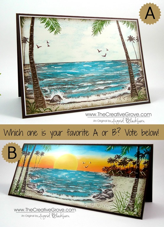
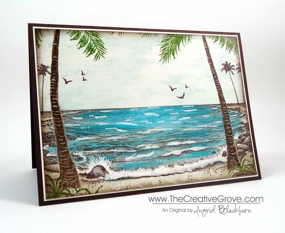
It’s funny, I love the sunset cards, but there’s something about the other one that mesmerizes me as well. I can’t quite put my finger on it. Here it is close up. To see the other close up click here.
The main difference between the two, other than the color, is that the foreground palm trees are embossed first to really resist the background and remain clean. I just love that pop of Jungle Green. The Cloud Space stamp was added in place of the sunset – that’s a FABULOUS stamp. ![]()
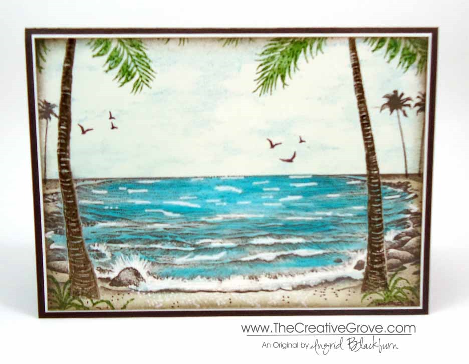
I made this card for a friend of my Dad’s who lost his wife to a long battle with cancer. When I remember her, I think of how much she loved the beach and waters of the Mediterranean and Atlantic. She would come back from vacations in Spain so brown it was unbelievable. Laura was a real artist who painted the most amazing sceneries on canvas. Of course by trade, she was a pharmacist, but I remember her as an artist. Laura, this one’s is in memory of you. ![]()

To Shop 24/7 in the Creative Store – Click here!
Stamp Sets – Stampscapes Stamps Ink – Marvy – Oriental Blue, Turquoise, Caribbean Blue, Jungle Green, Yellow, Brilliant Yellow; Adirondack Lights – Cloudy Blue, Aqua, Peach Bellini; Stampin’ Up! – Early Espresso, Crushed Curry, Tangerine Tango, Sahara Sand, Crisp Cantaloupe, Early Espresso Marker Paper –Glossy White, Early Espresso Tools – Colorbox Stylus, Brushtix Mixed Media Brushes Finishing Touch – Uni-ball Signo White Gel Pen
Hi, Ingrid!
I would choose ‘A’ it is more pleasing because it is all in proportion. You look into the bay and your eye is then taken all the way out to the horizon. Beautiful.
Although I do live on the coastal area of the east coast of Australia where the sun rises every morning, I do love sunrises, card ‘B’ appears disproportionate.
I think the rising/setting sun just needs a little tweaking and then it would be impossible to choose between the two!
I am looking at signing-up for your 101 brayer lessons, but this may have to wait until early next year! I love your work! Thank you, so very much.
I totally agree with you Susan! Thanks so much for your perspective….I’m going to have to tweak it now. 🙂
You’ll love the 101 class, and take a look at the bundle – it’s a steal and you’ll have everything you need to make amazing sceneries! Enjoy the holidays down under. 🙂
Hi Ingrid,
I’m not sure how I should pick I love the sunset but it feels like I’m already there and the other one looks like your inviting me there. It feels warm and looks like a nice place to be. so I will go with the no sunset one.
I love your perspective on it Carolyn. I hadn’t really thought of it that way. This was a fun experiment – I got some awesome feed back from everyone! Thanks for jumping in! 🙂
I love them both, but i have to say without the sunset. When i go to the beach, the sunset,while beautiful, signals i have to leave the beach and that makes me sad. i like the “open” feel also.
Thanks Pam – I love seeing what other people think…never thought about it that way. 🙂
Ingrid,
What a hard decision! They are both beautiful. Since you insist that we choose I think I’m going to choose A. I love the look of the beautiful clouds. It just soothing to me.
If I have to choose I must go with the first one…Makes me want to be on the beach with that view!
I love that one too! 🙂
I too love the first one more, I do think it’s the clouds and muted feel. Don’t get me wrong, I love the sunset one too…but the first one makes me feel like I’m there I guess. Thanks for chiming in! 🙂