Using a Variety of Supplies

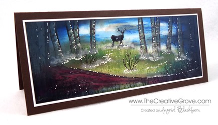
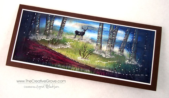
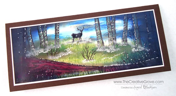
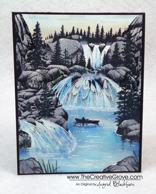
Diversity is always great in artistic supplies.  Today I wanted to share a card with you that uses a variety of companies.  After all, do ALL your clothes come from the same store?  Probably not.  So, along with that theory, here is a colorful scene that uses Stampscapes Images, Marvy  and Adirondack Dye based inks and a Signo White Gel Pen.  This scene is a re-creation of one done by Kevin Nakagawa from Stampscapes

Misty Forest Buck (3)

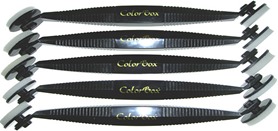
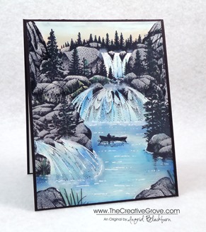
This misty forest scene makes me want to go hiking!  To get the sweeping motion of the ink carried across the cardstock, you will need a Colorbox Stylus which has sponge applicators.  You can find this tool in almost any craft store.  It does take a little getting used to and be sure to use a light touch.  But when using the stylus tool, you have to have the right inks. 

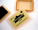
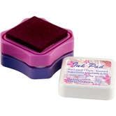
While I love my Stampin’ Up! inkpads, they tore up my sponge tips with this technique.  Which, I’ll be honest – will frustrate you and you’ll need new tips!  Stampin’ Up’s fast drying edge is great for clean and simple stamping, but not for this technique.   What you need, is the right ink – a wetter dye based ink like the Marvy Matchables or Adirondack Ink Pads.  Both of these have a wetter saturation and work better with the stylus tool and glossy cardstock. 

Note – Marvy has discontinued several of their colors of ink pads here in the US (just a few months ago), so if you come across them – nab them up!  Not to worry, the reinkers are not being discontinued, so you’ll have access to the full color spectrum for their markers (which let’s be honest – ROCK!) and you can always use the reinkers just like paints, which is great for this technique.

Misty Forest Buck (2)

To stamp the images first, use a black that sets well without bleeding – I use Memento Tuxedo Black Ink.  It’s the best non-bleed ink I’ve come across.  Then create your under layer with your lighter tones first.  Remember, you can always darken any scene up, you can’t however make it lighter.  It’s the same theory in painting.  Get your undertones first. 

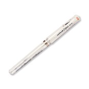
Once I have my scene set up, I can add highlights and contrasts using darker colors.  I framed my scene here using darker blues, greens and browns.  Leaving some light can be hard – I have to admit, one of my challenges – but I promise, you’ll love that contrast at the end – so resist, resist, resist!  For finishing touches, you’ll want to use white pigment ink and a q-tip to create the fog.  The highlights were made with a white gel pen. 

Misty Forest Buck (1)

The depth in this card captivates you.  the light in the sky balances the darkness.  It really seems like the beginning or end of an old movie – you know and the dark circle opens or closes the scene?  I hope you enjoyed it!  Now go have fun with all your supplies!

Personal Note – thanks to so many of you emailing me lately!  I have to admit I haven’t been stamping too much lately due to an injury to my right thumb which affected my right wrist.  Of course I’m right handed – and it’s just doesn’t work with my left hand!  No matter how hard I try. Smile  This also kept me off the computer for any long sort of typing.  The angle has been tough – including using a mouse.  So, after a lot of trying to work my way through it, I actually had to take a real break to recover!  Not so easy. 

Thankfully, I’ve been back in the studio and even trying some other artistic mediums that aren’t as much pressure on my thumb and wrist – like painting!  It’s been therapeutic to be creative again!  I’ve only been able to watch stuff online and make sketches and notes on projects and upcoming classes.  Thanks for stopping by today, I look forward to seeing you around the grove for more.

Signature Snowflake 001

Products Used:

Adirondack Ink Pads  Colorbox Stylus Tool Marvy Matchables  Signo White Gel Pen

Taking a different view

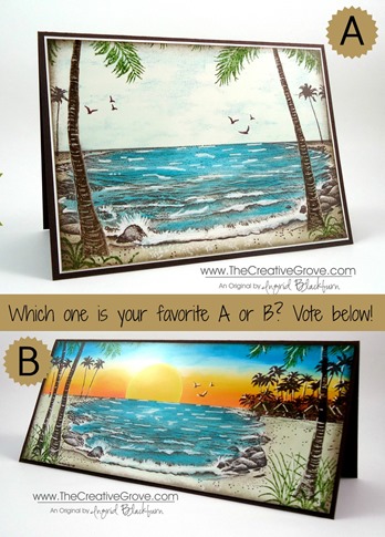
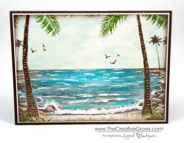
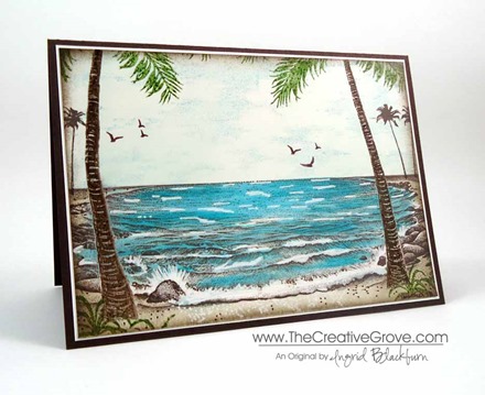
Tropical Lagoon 002 003

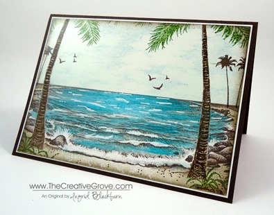
For you today, I have a tweaked version of a great card.  It’s a completely different look – a more subdued, dare I say masculine look?  Today, I’m going to share with you how to take a great project and then improve upon it so that you get more from those great ideas that you have.

I thought that you would enjoy seeing what I mean.  Here are both projects on top of each other.  Which one do you prefer?  I mean, they both are great, but yet evoke a different feel.  Be sure to tell me in the comment section which one you prefer!  I am rather curious…go do it now and then come back and read the rest!


It’s funny, I love the sunset cards, but there’s something about the other one that mesmerizes me as well.  I can’t quite put my finger on it.  Here it is close up.  To see the other close up click here.

The main difference between the two, other than the color, is that the foreground palm trees are embossed first to really resist the background and remain clean.  I just love that pop of Jungle Green.  The Cloud Space stamp was added in place of the sunset – that’s a FABULOUS stamp. Smile

I made this card for a friend of my Dad’s who lost his wife to a long battle with cancer.  When I remember her, I think of how much she loved the beach and waters of the Mediterranean and Atlantic.  She would come back from vacations in Spain so brown it was unbelievable.  Laura was a real artist who painted the most amazing sceneries on canvas.  Of course by trade, she was a pharmacist, but I remember her as an artist.  Laura, this one’s is in memory of you. Smile

Signature Snowflake 001

To Shop 24/7 in the Creative Store – Click here!

Stamp Sets – Stampscapes Stamps Ink – Marvy – Oriental Blue, Turquoise, Caribbean Blue, Jungle Green, Yellow, Brilliant Yellow; Adirondack Lights – Cloudy Blue, Aqua, Peach Bellini; Stampin’ Up! – Early Espresso, Crushed Curry, Tangerine Tango, Sahara Sand, Crisp Cantaloupe, Early Espresso Marker Paper –Glossy White, Early Espresso Tools – Colorbox Stylus, Brushtix Mixed Media Brushes Finishing Touch – Uni-ball Signo White Gel Pen

Dog Days of Summer: Tropical Lagoon

Stampscapes Tropical Lagoon 9.5.13  (12)_thumb[2]

Is your creative process for a project always perfect?  I know mine sometimes is not.  Yesterday I worked on a project for my friend Trish in Australia.  What you see above is the final result.  Here’s the creative process it took me this time around.  I hope this helps some of you!

Stampscapes-Tropical-Lagoon-9.5.13--[3]

This time, I began with the following project. My  lagoon stamp was larger than my intended project size, so I wanted to only use part of it with still having room for a palm tree in the forefront for perspective.  It didn’t work out as I intended. 

Stampscapes Tropical Lagoon 1 CU_thumb[3]

My original project is at the bottom.  The grass didn’t blend with the palm tree well enough, I didn’t care for the extra grass and so much real estate at the bottom.  By accident I swiped red right over my sun, the card stock had divot’s  at the top that wouldn’t take in any ink, and the bungalows were stamped strangely.  Now, you may be saying I’m being nit-picky, but that’s a whole lot of things wrong for me, so I created a plan to fix my scene.

I began by taking a piece of scrap paper and stamping my scene on a larger card – 3 3/4” x 9” instead.  Here you see my beginning project, my test scene and the final project all next to each other.  I think you’ll agree with me – it’s MUCH better!Stampscapes Tropical Lagoon 9.5.13  (3)_thumb[7]

I used several colors of Marvy, Adirondack Lights, and Stampin’ Up! inks to get my desired look with a Colorbox Stylus Sponge Tool  Now I’m going to have to make one for myself!  Stampscapes Tropical Lagoon 9.5.13  (16)_thumb[2]

Creative Tips –

  • I stamped the entire scene in Early Espresso rather than Black.
  • I stamped the lagoon and then masked the sky.  I colored in my water – Aqua Adirondack Lights, Caribbean and Turquoise Blue.  I kept the color in streaks so to leave a little light in it.
  • For the sand, I used Sahara Sand Stampin’ Up! ink.  I then masked the water and my sun.  The sky is made of Yellow, Brilliant Yellow, Crushed Curry, Peach Bellini, Crisp Cantaloupe, Tangerine Tango, Cloudy Blue and Oriental Blue.Stampscapes Tropical Lagoon 9.5.13  (18)_thumb[3]
  • The huts were stamped after the horizon masks were removed and right on the horizon line.  The roofs were colored in using a Brushtix Sponge Tip applicator and Jungle Green with Early Espresso Marker accents.
  • You can extend the dots that make up the surrounding scene with the fine tip of the Early Espresso Marker.
  • The reeds and tropical plant are stamped with Jungle Green.  It was necessary to mask the tree with a little bit from a paper towel.Stampscapes Tropical Lagoon 9.5.13  (17)_thumb[3]
  • Three of the birds were colored with the Early Espresso Marker and stamped in the sky.
  • The Palms extend off the page and I stamped the lower parts of the leaves in Jungle Green.
  • To brighten up the scene and give it some life, you can use a Uniball Signo White Gel Pen.  You may want to go over some of the natural waves from the stamp if you’ve gotten color on them like I did.  Add some dots in the sand for the foam left behind the wave that rolls onto the shore.
  • Highlight the trees, huts and birds, keeping in mind where you light source is coming from.Stampscapes Tropical Lagoon 9.5.13  (10)_thumb[3]Stampscapes Tropical Lagoon 9.5.13  (14)_thumb[3]
  • Here you see the difference between sponging the edge of the scene in Early Espresso and leaving the canvas as is.Stampscapes Tropical Lagoon 9.5.13  (13)_thumb[2]

I love the end result – it’s by far the best Stampscapes tropical scene I’ve done.  In the end, I used 9 various stamps to create this scenery.  I hope you love it too!  It’s a fitting end to the summer.

Online Brayer Class

Do you want to learn how to make creative scenery cards?  Try our Brayer 101 – Introduction to Creative Scenery online class.  You’ll learn how to master this technique using a brayer to create unbelievable scenes that will leave you feeling like an artist.  Find out more here.

Signature-Snowflake-001_thumb1

To Shop 24/7 in the Creative Store – Click here!

Stamp Sets – Stampscapes Stamps Ink – Marvy – Oriental Blue, Turquoise, Caribbean Blue, Jungle Green, Yellow, Brilliant Yellow; Adirondack Lights – Cloudy Blue, Aqua, Peach Bellini; Stampin’ Up! – Early Espresso, Crushed Curry, Tangerine Tango, Sahara Sand, Crisp Cantaloupe, Early Espresso Marker Paper –Glossy White, Early Espresso Tools – Colorbox Stylus, Brushtix Mixed Media Brushes Finishing Touch – Uni-ball Signo White Gel Pen

Stampscapes: Sunrise Canoe Ride

Stampscapes 004 Main R

Are all of your clothes from the same store?  Probably not, so why would your crafting supplies be?  The world of rubber stamping is vast and varied.  So take what you already have – inks, paper, tools, and incorporate a little nature from Stampscapes into it! 

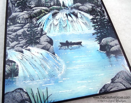
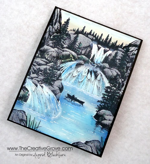
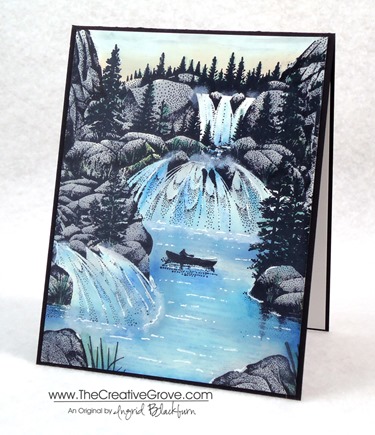
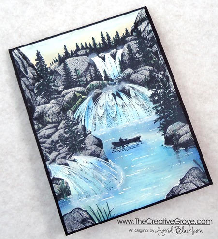
If I had my way, I’d live at the base of this scene.  Well, pretty close to it at least, the falls might be too loud!  About six months ago I came upon a scene built with these amazing outdoor scenery stamps.  You already know how I love to create brayer scenes, so these stamps really jumped out at me. 

Stampscapes stamps were first created by Kevin Nakagawa in 1993.  They are individual nature stamps that you can very easily combine together to create a seamless scene.  The designs are tonal in nature which allows them to overlap seamlessly.  Here I used 9 different stamps to build this scene.  I know, you’re probably saying, what?  I’ve become quite the addict, and have loved incorporating them into my stamping passion.  If you love creative scenery and scenes with depth, I know you will too.  Enjoy the steps to how I made this card.Stampscapes 004 Front

Creative Tips –

  • This scene was stamped in Black Dye ink on Glossy cardstock.  You can use a dye based ink pad like Memento Tuxedo Black or Marvy Black.  You will want an ink that will dry, that’s why you want a dye based ink.  The Stampin’ Up! Basic Black has had it’s issues since they’ve been working to perfect the formula, so I wouldn’t recommend it for a project on glossy paper at this point.
  • The Cascading Falls is the main image, so to build around that, you’ll want stamps that can accentuate it, not take away from it. 
  • The other images you will want to use for this scene are:  The right side of Side Falls, the left side of Lakeside Reflections, both the right and left side of Tall Rock with Falls, Rock 1 and 2, Reeds, Shimmering Water, and Solo Canoeist.  All stamps are in the large format with the exception of Reeds.
  • When building the scene, you want to overlap about 1/4” of the edge with your new image to create a seamless blend of images without any gaps.  Use a torn piece of paper towel rather than an actual cut out mask.  Since these stamps are tonal in nature, they blend seamlessly with each other.  The added bonus … this method is so much faster that traditional masking!
  • To add color, you will want to carefully place color with your Colorbox Stylus tool using various shades of blue.  Remember to always start with the lightest shade working into darker ones.  Keep some white space to keep the scene light.Stampscapes 004 CU Pool
  • Add a slightly darker shade around the rocks, building up a shadow underwater.  You might want to do the same at the base of your three falls.
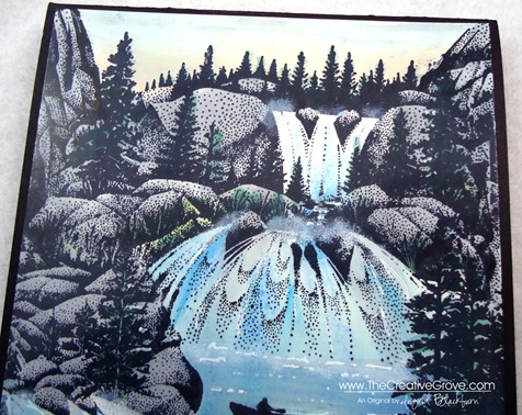
  • Be careful not to add too much blue to your falls, waterfalls reflect light and they are primarily white.  I added three shades of blue in streaks in the general same areas. 
  • Use a grey ink color to shade your rocks with your stylus tip.  You will want to be careful as you edge your rocks near the water.  Try also adding a few grey streaks into your pool of water for some shadowing, but not much!Stampscapes 004 Side
  • You can add some green to your trees with a more precise applicator such as a Brushtix Mixed Media Brushes by Tsukineko or use markers.  When using markers, be careful not to add too much color as the images are quite fine.
  • The ripples in the water were stamped with Marvy Salvia Blue.  This gives the water a little depth and movement without taking away from the scene.  Use a light/medium blue for this.
  • To highlight your scene, add some movement in the water with streaks and dots using a Uni-ball Signo White Gel Pen.  Also add random streaks to your waterfalls.  Be sure to add texture along the rocks and base of the falls.  Stampscapes 004 CU Falls
  • To give the look of water mist that you see on waterfalls, you will want to loosen the end of a Q-tip to give it a lighter texture and dab it into the Whisper White White Craft Ink Pad.  It’s a pigment ink that is sticky and will give you the lightness and movement that you are looking for.  Be careful not to press to hard – practice on scrap paper first. 
  • For the sunrise, you can add a little Peach Bellini by Adirondack Lights at the top of your forest line. 
  • I got a little blob of black in my sky on the left, so I dabbed my Q-tip into my grey and lightly added some streaks for clouds in my sky.  You can quickly and easily overdo this, so make sure to use gentle pressure and less is more.
  • Stampscapes 004 Main L

    Creative Scenery Classes

    If you love creative scenes, check out the online Brayer 101: Introduction to Creative Scenery class.  In this class, you will learn how to master the use of your brayer to build scenes using Stampin’ Up! stamps and layering ink in a seamless way.  For more information, click here.

Signature-Snowflake-001_thumb1

To Shop 24/7 in the Creative Store – Click here!

Stampscapes 004 Angle

Stamp Sets – Stampscapes Stamps Ink – Marvy – Black, Prussian Blue, Salvia Blue, Light Blue, Bottle Green, Grey; Adirondack Lights – Cloudy Blue, Aqua, Peach Bellini; Stampin’ Up! – Whisper White Craft Pad  Paper –Glossy White, Basic Black Tools – Colorbox Stylus, Brushtix Mixed Media Brushes Finishing Touch – Uni-ball Signo White Gel Pen, Q-tip