POWERFUL SIMPLE CARDS you’ll love

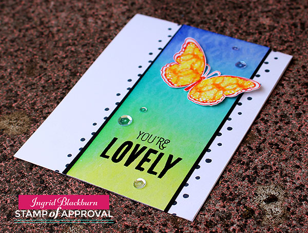
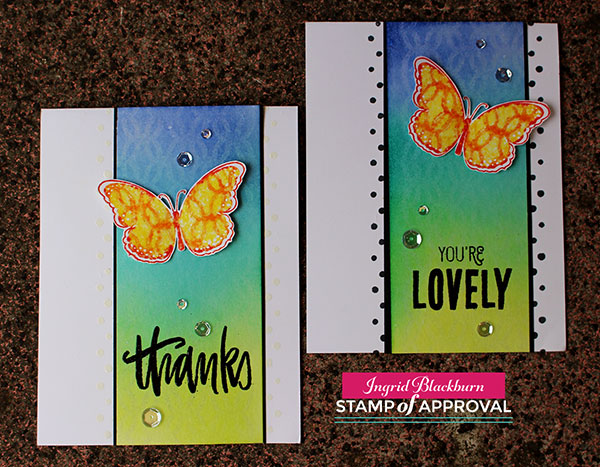
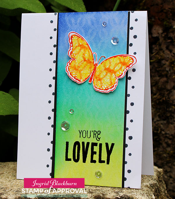
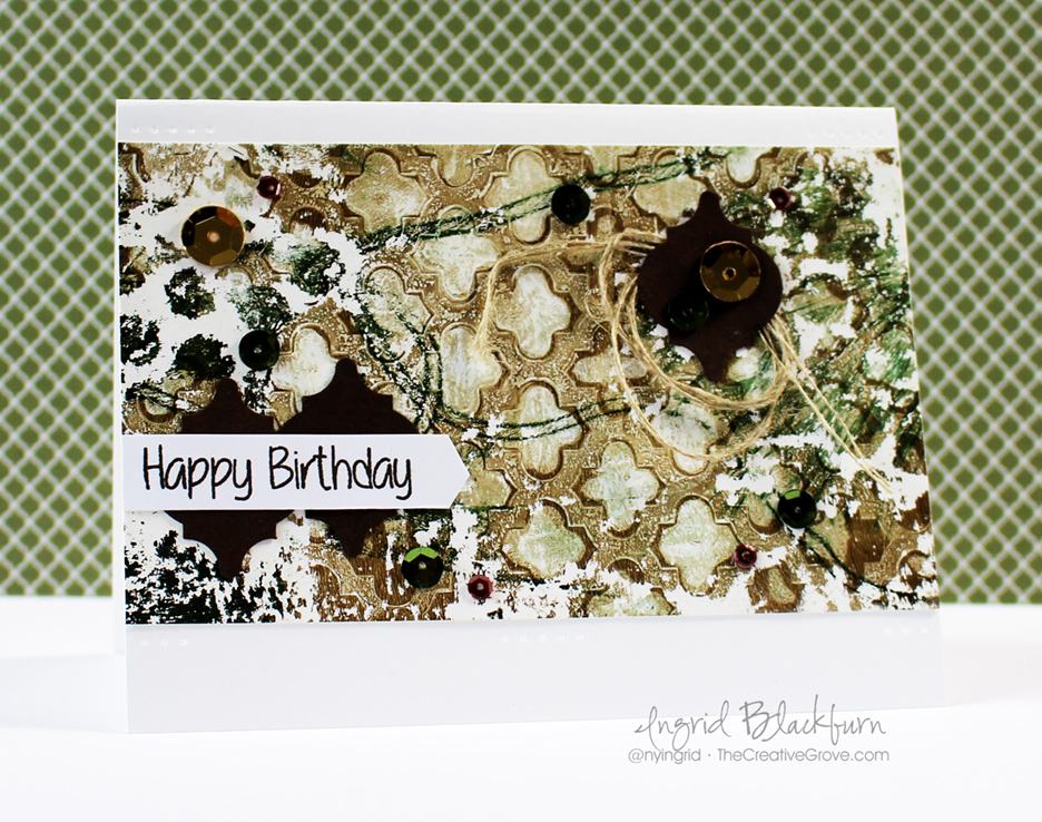
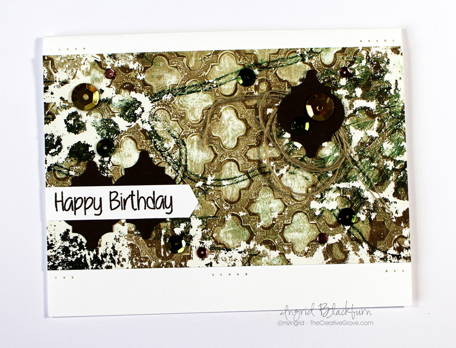
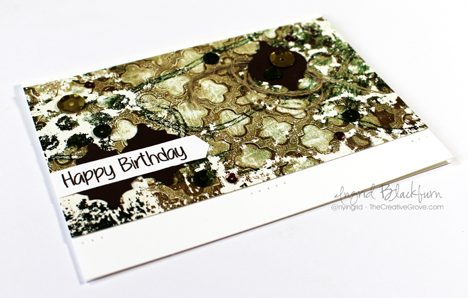
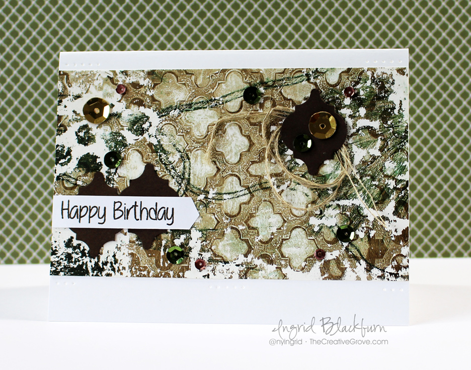
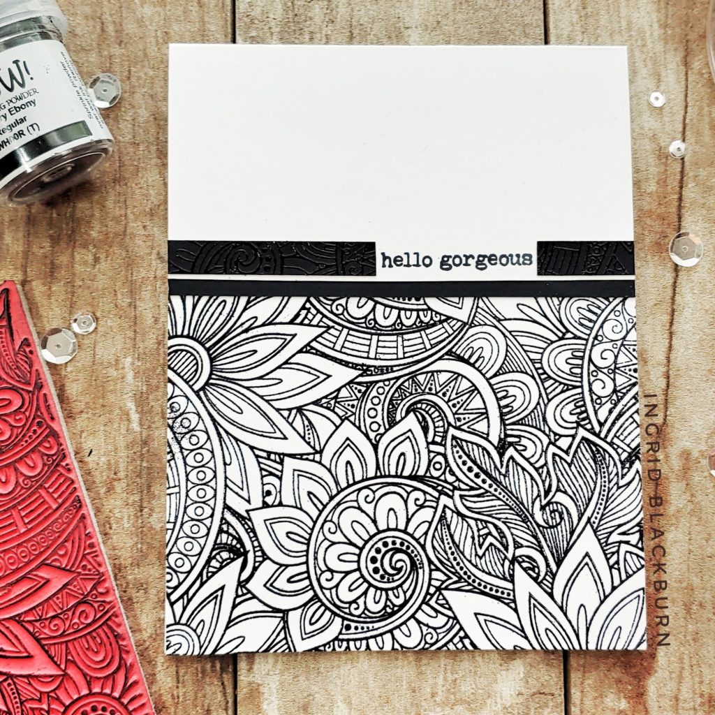
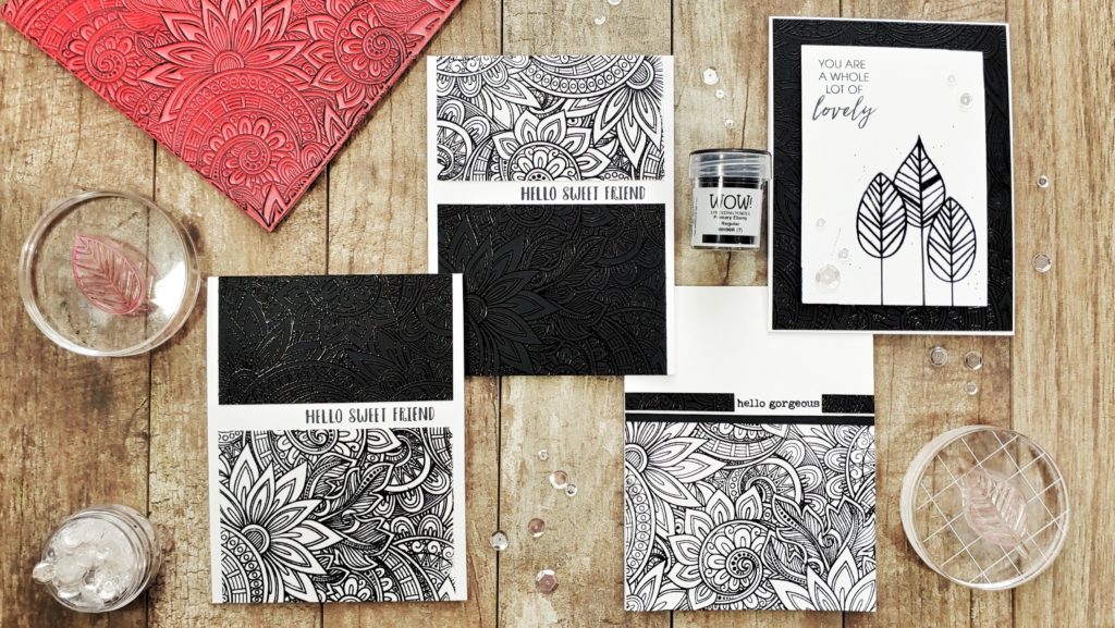
Sometimes simple cards can be quite powerful! While using color can be incredible, have you ever given the most basic color palette a try – Black & White?

Ingrid Blackburn Simple Cards

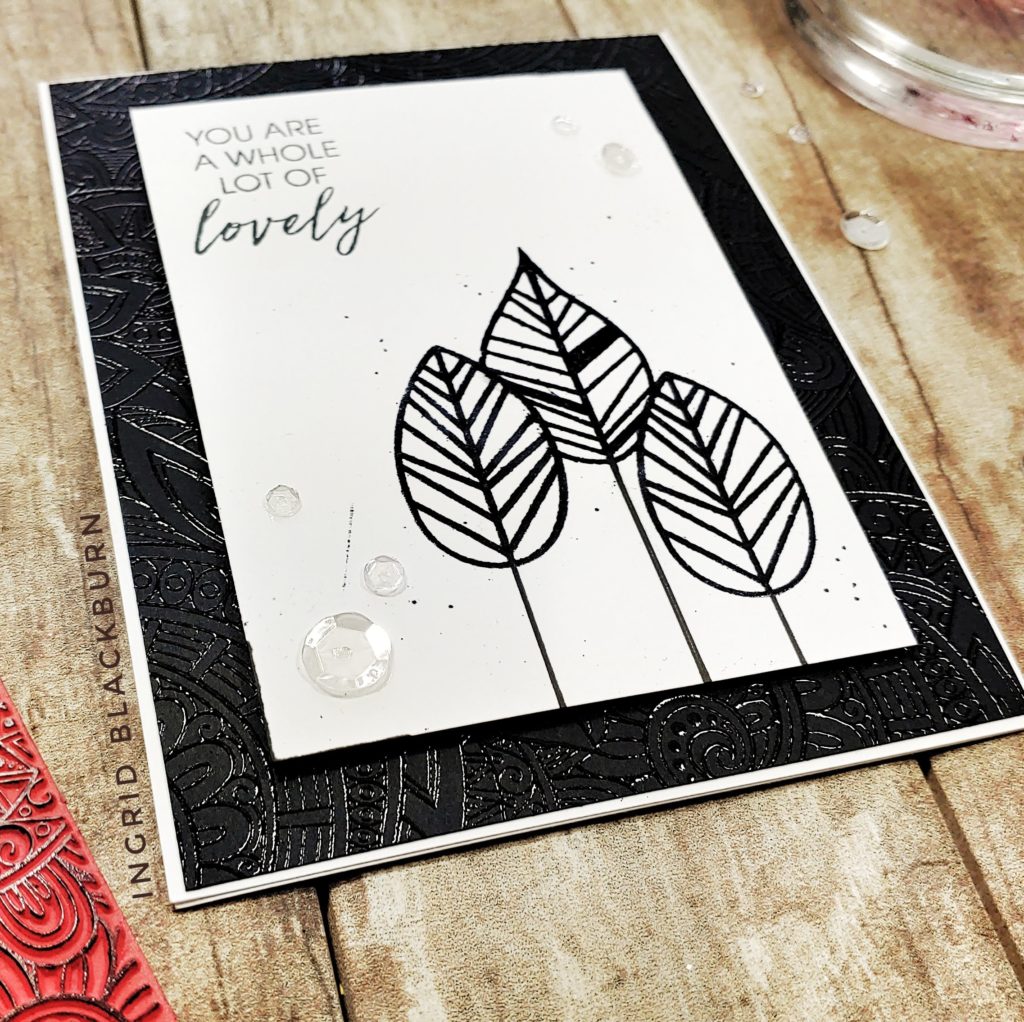
Today, I thought it would be fun play a little with some black and white card combinations. As you’ll quickly see, these three layout concepts can be made quickly, without a lot of supplies and make quite a powerful statement.

Ingrid Blackburn Simple Cards

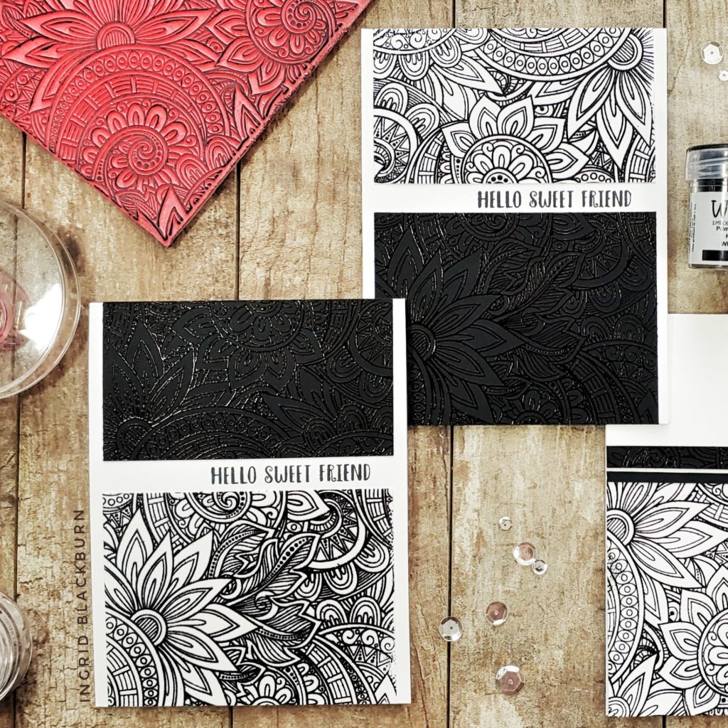
Some simple and classic heat embossing gives you powerful black and white simple cards. Playing with the mix of tone on tone and contrast really packs a punch, don’t you think? Have you ever tried this? Let me know in the comments!

If you want even more inspiration with simple and powerful cards, even some not so simple technique cards …. be sure to check out my youtube channel here too.

Ingrid Blackburn Simple Cards

The inspiration that was at the heart of today’s creations came from wanting to unite together behind our crafty sisters and brothers of color – in life, but also in the art industry. I wanted to stand together with you in support for the never-ending fight for equality all over the world.

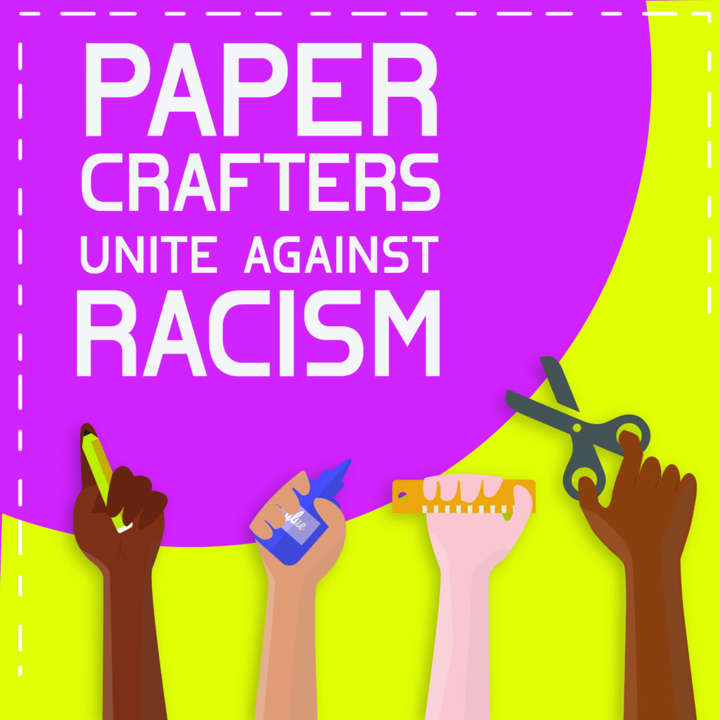
Today, some crafty friends and I are hopping from blog to blog, on instagram and youtube united. The hop is beginning with our crafty friends of color, and followed by everyone else. Hope you enjoy the beautiful inspiration we all bring to you, and find yourself some beautiful crafty voices. Thank you for your support!

To continue hopping for more inspiration, CLICK HERE for Charlotte’s blog.

The hop begins on Justine Hovey’s website HERE.

Thanks for spending a few moments with me today! See you next time…

Lovely Lattice Butterflies – SOA is live!

Lovely Lattice Background - Catherine Pooler Designs

I’ve been creating a lot with the kissing technique lately. I have to say, this simple technique always amazed me!  It’s been a cram packed few days of inspiration here and on the design team blogs. If you’ve missed any of the fun, I have links at the end for you.

Lovely Notes SOA Now

Today the Stamp of Approval Lovely Notes Collection goes live – yup…if you’re on the wait list you’ve received a link to head on over and grab a box. It’s the first release of these six stamp and two dies sets. You’ll also get a loaded PDF with projects and step by step instructions – how’s that for a place to start! Not on the list – no worries – get on it right here and get a head start on the public release tomorrow (if it hasn’t sold out!).

If you’ve seen any of my past three posts, you know I still have more projects for you – yup…today I even have another video! Over at StampNation, there’s a challenge going live today – Meadow Daydreams. I have to say, this challenge is made for me – I LOVE this kind of a color palette and theme. I’m actually shocked that I didn’t do a scenic card! Here’s a sneak peek into the project I created…to see it, you have to be a member of StampNation though.

Meadow-Daydreams-Sneak Peek

New Inspiration for you

So to piggy back on the challenge – I created a few cards with the same color palette, theme and then I loaded them up with techniques – after all, that’s kind of my thing, isn’t it?I have a video tutorial for you here and a written one below.And if you aren’t already – I’d love for you to subscribe to my YouTube channel too – click here.

Click Here to see the video in HD

Lattice Butterfly Tutorial – the Kissing Technique + others

  • Ink up your Lovely Lattice Background stamp by Catherine Pooler Designs in Versamark
  • Transfer your image to a piece of 140# Cold Pressed Watercolor Paper (5 1/2 x 4 3/4″) & clean your stamp
  • Sponge your colors over your image blending the colors Twisted Citron, Peacock Feathers and Blueprint Sketch

Kissing Technique - Stamp of Approval

  • Allow your Distress Ink to fully dry while working on your butterflies
  • Ink up the large butterfly from Butterfly Notes by Catherine Pooler Designs in Squeezed Lemonade & Edge in Barn Door.
  • Ink up your Lovely Lattice Background stamp in Spiced Marmalade (you only need an area as large as your stamp)
  • Kiss your inked up butterfly to your inked up background stamp; thus transferring your image to it – or kissing

Butterfly Notes - Stamp of Approval - Catherine Pooler

  • Stamp on a piece of regular white card stock and heat emboss immediately in clear embossing powder. If your image has dried before your powder sticks, just stamp over your butterfly in versamark. Repeat for a second butterfly.
  • Fussy cut out your images
  • Cut your background in half (5 1/2 x 4 3/8″) and rub a de-static bag onto the bottom half. Stamp (Versamark) the greeting Thanks – Handpainted Thanks by Neat & Tangled & You’re Lovely by Catherine Pooler Designs – Lovely Flowers. Emboss in Black.
  • Trace the edges of your strip lightly for a guide where you plan to adhere it to your card base.
  • Stamp the polka dots from Lovely Flowers (landscape so you have the alternating ends) down the side using the line to keep your pattern straight. You’ll need to overlap the bottom dot with the top for an even pattern. I stamped one in Memento Tuxedo Black and the other I embossed with Versamark and white embossing powder.

The Kissing Technique - Versamark - Ingrid Blackburn

  • Matte your background onto black (5 1/2 x 4 1/2″) so that it just has a sliver of black – this will cover your line.
  • Adhere your butterfly with two mini glue dots in the center and place a foam dot under each wing toward the top to help with the illusion of flight.
  • Add Sparkling Clear Sequins by Pretty Pink Posh.

I love how the background stamp just magically appears. This technique has the biggest wow on glossy card stock & with darker inks, but the subtle effect here is lovely and the perfect accent.

Stamp of Approval

Lovely Notes SOA Banner

Thanks for joining me today! I have two more projects headed your way in the days to come, so be sure to stop back by! In the meantime, if you missed any of the six projects I posted this week, or the blog hops for all 18 designers – yup…there were that many – click on the links below for the starting point of each hop:

Day 1               Day 2               Day 3

And don’t forget to check out the Stamp of Approval – Lovely Notes Collection – it’s live right now – but just for those on the wait list!

Now that we’ve given you a ton of inspiration, it’s your turn – take what you learned here today or over the past three days and create your own cards – go get your fingers inky!!!

Signature

[optin_box style=”12″ alignment=”center” email_field=”email” email_default=”Enter your email address” integration_type=”aweber” double_optin=”Y” list=”3846012″ name_field=”name” name_default=”Enter your first name” name_required=”Y” opm_packages=””][optin_box_field name=”headline”]Learn more with our exclusive FREE video series:[/optin_box_field][optin_box_field name=”paragraph”]PHA+UGx1cyB5b3XigJlsbCBiZSBhZGRlZCB0byBteSBGUkVFIENyZWF0aXZlIFRpcHMgRS1sZXR0ZXIgd2hlcmUgSSBzaGFyZSBleGNsdXNpdmUgcHJvamVjdHMsIHZpZGVvcyAmYW1wOyB0aGUgMTIgRGF5cyBvZiBDaHJpc3RtYXMgUHJvamVjdCBTZXJpZXM8L3A+Cg==[/optin_box_field][optin_box_field name=”privacy”][/optin_box_field][optin_box_field name=”top_color”]undefined[/optin_box_field][optin_box_button type=”0″ button_below=”Y”]Get Instant Access![/optin_box_button] [/optin_box]


Mixed Media Challenge: Paint

Mixed-Media-Gelli-Plate-Monoprint-2.1016-001

We’re playing around with Paint over at Happy Little Stampers this month for the Mixed Media Challenge. I thought I would re-visit my Gelli Plate and create a cool monoprint using some Acrylic paint for you. I hope this project inspires you in some way! I’d love for you to join us, the prize is a gift certificate this month, so you have nothing to lose!

HLS Mixed Media challenge February 2016

To create this fun card, I used several layers of acrylic paint, some left over Christmas tree branches, bubble wrap, a stencil and some twine. I pulled prints from each layer, and layered each one on this piece. The end result is a varied project with deep character. You’ll notice the Phthalo Green, Burnt Umber and white acrylic paint layers. I love the distressed look it took toward the end. My Umber dried a bit so I only was able to pull a partial in those spots, but that left me with some awesome character.

Mixed-Media-Gelli-Plate-Monoprint-003

To finish the card, I punched a few pieces of Espresso card stock, used a little linen thread and some sequins. I thought a simple banner with the greeting from the HLS Butterfly Birthday set would be perfect. Rather than create a traditional banner edge, I pulled my card stock through half a hexagon punch and punched the reverse for the point. I thought it went a bit better with the image from the Moroccan Simon Says Stamp stencil. The card needed something, so a little paper piercing rounded it all out.

Mixed-Media-Gelli-Plate-Monoprint-002b

I think it turned out pretty cool, I love that I can paint with several layers on a monoprint and it still is just like a piece of printed paper – that’s so cool! So how are you going to paint your creation?

Mixed-Media-Gelli-Plate-Monoprint-004

Remember, Mixed Media can be simple like this card – all you need is stamps, ink, and a way to develop texture with another element like a stencil, or paste, or paint. Quite simple!

So get those fingers inky – mine were for this one!

Signature

[optin_box style=”2″ alignment=”center” email_field=”email” email_default=”Enter your email address” email_order=”2″ integration_type=”aweber” double_optin=”Y” list=”3846012″ name_field=”name” name_default=”Enter your first name” name_order=”1″ name_required=”Y”][optin_box_field name=”headline”]Learn with our exclusive FREE video series[/optin_box_field][optin_box_field name=”paragraph”]PHA+R2V0IHRoZSBmcmVlIENyZWF0aXZlIFRpcHMgRS1sZXR0ZXIgYW5kIGxlYXJuIHdpdGggc3Vic2NyaWJlciBleGNsdXNpdmUgdmlkZW8gYW5kIHBpY3RvcmlhbCBjb250ZW50LsKgPGVtPjxzdHJvbmc+SW5jbHVkaW5nwqA8L3N0cm9uZz48L2VtPm91ciB5ZWFybHkgMTIgRGF5cyBvZiBDaHJpc3RtYXMgc2VyaWVzITwvcD4K[/optin_box_field][optin_box_field name=”privacy”][/optin_box_field][optin_box_field name=”top_color”]undefined[/optin_box_field][optin_box_button type=”0″ button_below=”Y”]Get started now![/optin_box_button] [/optin_box]


Frosted Crooky Cake

Frosted-Crooky-Cake-001

Okay, I know Crooky Cake is not the official name of this stamp set, but it’s stuck in my head – thanks Catherine! The official name of this super cute stamp set is Bring on the Cake – designed by SugarPea Designs. For now, you can only get it the Young at Heart Stamp of Approval collection – which is almost sold out – just a few boxes left! It will be released, along with the matching dies sometime in 2016/2017.

I have to say, normally, I wouldn’t immediately buy this kind of a set for myself – I gravitate towards nature, backgrounds and designs. But the more I stamp with it, the more versatility I see in it, and I’m in love with this one & all the little companion dies too – those rock, especially since there are two frames with it too!

Frosted-Crooky-Cake-002

I love stamp sets that have little stamps – the flowers, swirls, streamers and stars make this a very cool and fun set to create with. The long streamer stamps will be quite cool for backgrounds (yes, tons of ideas for cards with that), and don’t get me started on the sentiments – those are great! I love font/script together, and this set did not disappoint. Can you tell how much I love it?!! To get a close up look, check out Catherine’s video about this set along with some cool samples – Click Here.

Along with today’s cake, I used the Harleen stencil by Winnie & Walter. Another great one – also in the Stamp of Approval collection. I did a little double stenciling. Since there are only a few boxes left, I wanted to show you this creation. Here’s the video post as well – be sure to check it out along with the written tutorial – Click here for Video and Tutorial  If you missed my other card – Click Here.

Frosted-Crooky-Cake-004

I wanted you to see what a fun and quirky design this card has. I call it the Frosted Crooky Cake, in honor of my friend Catherine Pooler who had a helping hand in designing this fun set.

So make a wish, check out the Stamp of Approval Young at Heart Collection if you haven’t already, and if you miss out on this great box of stamps, dies and stencils (did I mention there’s only a few left)…don’t fret – you too can have a piece of crooky cake (Bring on the Cake) later in 2016/2017 too – of course you’ll have to wait! 😉

See you soon with the video tutorial!

Signature

[optin_box style=”2″ alignment=”center” email_field=”email” email_default=”Enter your email address” email_order=”2″ integration_type=”aweber” double_optin=”Y” list=”3846012″ name_field=”name” name_default=”Enter your first name” name_order=”1″ name_required=”Y”][optin_box_field name=”headline”]Learn with our exclusive FREE video series[/optin_box_field][optin_box_field name=”paragraph”]PHA+R2V0IHRoZSBmcmVlIENyZWF0aXZlIFRpcHMgRS1sZXR0ZXIgYW5kIGxlYXJuIHdpdGggc3Vic2NyaWJlciBleGNsdXNpdmUgdmlkZW8gYW5kIHBpY3RvcmlhbCBjb250ZW50LsKgPGVtPjxzdHJvbmc+SW5jbHVkaW5nwqA8L3N0cm9uZz48L2VtPm91ciB5ZWFybHkgMTIgRGF5cyBvZiBDaHJpc3RtYXMgc2VyaWVzITwvcD4K[/optin_box_field][optin_box_field name=”privacy”][/optin_box_field][optin_box_field name=”top_color”]undefined[/optin_box_field][optin_box_button type=”0″ button_below=”Y”]Get started now![/optin_box_button] [/optin_box]

White Christmas Cards

White-Christmas-Cards-001

Don’t you just love white on white cards? They make the perfect Christmas cards. This month at the Happy Little Stampers Christmas Challenge, we have a Tic Tac Toe challenge. I chose the classic diagonal path of White, Gold and Sentiment – a classic.

HLS Christmas Challenge February 2016tictactoe badge

This month we have an awesome guest designer for the Christmas Challenge – Ksenija Rizova, you may know her in the blog-o-sphere as Sweet Kobylkin. Be sure to Click Here to check out her blog and creation.

White Christmas Tutorial

  • Create your textured background on the top 2/3 of a folded A2 white card. I used the Large Winter Snowflakes by Memory Box and Dreamweaver white embossing paste.

White-Christmas-Cards-005

  • Sprinkle glitter onto your wet embossing paste snowflakes, and set aside to dry completely.
  • Emboss the Impression Obsession Tree Group in White, then Iridescent Ice.
  • Fussy Cut out and add glitter to the hill line.

White-Christmas-Cards-003

  • Add a second piece of card  stock with a slight downward slope in the opposite direction to overlap over your stamped trees. Add glitter with two way glue to the hill edge.
  • Once your embossing paste is dry. Add trees and front hill to your card, getting the spacing just right. Trim the bottom to fit the front and add a greeting embossed in Gold. I chose one from Everyday Sentiments by Happy Little Stampers.

White-Christmas-Cards-004

  • Add sparkling clear sequins by Pretty Pink Posh.

Now it’s your turn! Which bingo path are you going to take? I can’t wait to see what you enter into this month’s Christmas Challenge.

Keep those fingers inky –

Signature

[optin_box style=”2″ alignment=”center” email_field=”email” email_default=”Enter your email address” email_order=”2″ integration_type=”aweber” double_optin=”Y” list=”3846012″ name_field=”name” name_default=”Enter your first name” name_order=”1″ name_required=”Y”][optin_box_field name=”headline”]Learn with our exclusive FREE video series[/optin_box_field][optin_box_field name=”paragraph”]PHA+R2V0IHRoZSBmcmVlIENyZWF0aXZlIFRpcHMgRS1sZXR0ZXIgYW5kIGxlYXJuIHdpdGggc3Vic2NyaWJlciBleGNsdXNpdmUgdmlkZW8gYW5kIHBpY3RvcmlhbCBjb250ZW50LsKgPGVtPjxzdHJvbmc+SW5jbHVkaW5nwqA8L3N0cm9uZz48L2VtPm91ciB5ZWFybHkgMTIgRGF5cyBvZiBDaHJpc3RtYXMgc2VyaWVzITwvcD4K[/optin_box_field][optin_box_field name=”privacy”][/optin_box_field][optin_box_field name=”top_color”]undefined[/optin_box_field][optin_box_button type=”0″ button_below=”Y”]Send me exclusive tips now![/optin_box_button] [/optin_box]


HLS Poinsettia Challenge

Watercolored Poinsettia 001

What’s a girl to do to create amazing cards for you from the road – watercolor using distress inks, naturally! I brought a few Christmas sets with me, just in case we weren’t back yet (We’ve been traveling for 9 weeks so far); so when I sat down for this month’s Poinsettia Challenge, I stared at my stamp set and this idea popped in my head.

You know by now that I love to watercolor, especially with distress inks, so I thought a more three dimensional Poinsettia on a cool smooshed background might look cool, and I have to say – even I’m thrilled with how it turned out – and I’m my worst critic! I bet you are your own worst critic too – tell me in the comments – it can’t just be me!

HLS Christmas Challenge October 2015

This month at the Happy Little Stampers Christmas Challenge, the theme is Poinsettia. So I hope this card inspires you in some way to create your own amazing creation and join in the Challenge. Not only does the design team have some amazing projects created for you…we also have a guest designer this month – Pat from Colourful Creations.

You’ll see a tutorial below. I know I normally have a video, but I don’t have a tripod with me – sorry about that! But if you are looking for some great holiday inspiration – later this month my annual 12 Days of Christmas card series is starting – be sure to be on the Creative Tips E-Letter to get those – they won’t be on the blog!!

To join me this month, use any element of this or the design teams cards as inspiration, just make sure it has a poinsettia in some way on your card and is Christmas themed. I can’t wait to see your creations – now for the good stuff!

Watercolored Poinsettia 003

Creative Tips on Watercolor using Distress Inks

Here was my thought process for choosing the colors for the card. Originally I was going to do a no line watercolor white poinsettia, but then I was in the mood for red. I knew a deeply watercolored red 3D poinsettia would look awesome, but needed an equally awesome background. So what do you choose? On the color wheel, the complimentary color (opposite on the wheel) to red  is green. So while the leaves would be green, I thought maybe a more vibrant version with lighter bleached out in spots along with great texture created with deeper flicks and edges might just do the trick!

  • To start, you’ll want to smoosh a few greens into your craft mat or work surface. I used Bundled Sage, Peeled Paint and Mowed Lawn. Bundled Sage helped me with the lighter bleached out spots, Mowed Lawn was my bright vibrant contrast to that, Peeled Paint married the two.
  • Generously spritz your colors. Make sure you lay down enough to cover your background piece. While spritzing, you want to have enough water down without overdoing it. To gauge the amount of water, when you press your watercolor card front down and it comes up dry or not glistening, you don’t have enough water. On the other hand if all your color runs right off your watercolor paper, you have too much! It’s a science, so play around. Don’t worry if you don’t get it right, just go right back with another layer adjusted with more or less water. Layers is what makes this piece awesome! So it’s very forgiving.

Watercolored Poinsettia 002

  • Don’t over do the smooshing – get just enough to cover your piece. This way you keep the light areas light. If you have too much light, strategically smoosh more vibrant spots over some without pressing it into the whole card.
  • Set your background aside to dry before moving onto the next step.
  • Next – create the splatter. I did this in two ways – flicked water, then colored splatter.
  • First spritz your hand and flick your colored surface. Here’s a video on this technique (at the 2:59 mark)
  • Smoosh some Forest Moss into your craft mat. Spritz with water to get it into a liquid state – just add enough, you don’t want it too diluted in hue. Load up a paint brush and splatter it hard with your finger on the opposite hand creating splatter onto your card. If you hold it closer to your project it will be more condensed. I held mine about 10 inches from my card to get it to splatter outward.
  • Edge your watercolor paper directly with your ink pad – a little more generously at the corners to complete your background.
  • Set it aside to try. Now you can move onto the Poinsettia!

Watercolored Poinsettia 006

  • To get a more painted look to your Poinsettia. you’ll want to use a few shades of red and create layers. Stamp your image in a lighter shade twice on a larger piece of 140# cold pressed watercolor paper. I used Tattered Rose and stamped it off so that it was really light. This will give you an outline to work with without defining the edges. This allows you to control the look of the flower, rather than painting in the lines of an outlined image.
  • You will color one flower completely and another just the smaller inner flower. When painting the larger flower – ignore the lines of the smaller flower – just extend the leaf as if it’s a large petal. Look really close at mine and you’ll see the smaller outline slightly – but you have to really look for it!

Watercolored Poinsettia 005

  • Color your berries on the smaller flower in using Peeled Paint. Your larger flower you’ll color the berries with Festive Berries to match the flower better.
  • Next create a light wash of Worn Lipstick by spritzing it generously with water. Test it out on a scrap piece to make sure it’s light. It’s easier to start lighter and add darker layers for depth – you can’t go so easily dark to light.
  • Add a spritzed version of Festive Berries, keeping some light areas. Apply your color using the veins of the flower as a guide and spread the color outward with wet brush – I used a Pentel AquaBrush.
  • Repeat using Barn Door and add a little detail to the veins with Fired Brick. With each layer, add the color in different spots – some heavier and lighter. This will help you to develop texture in  your flower.
  • Fussy cut both of your flowers out right at the line image – don’t leave any excess white. You should have a large and smaller flower.
  • Edge your petals in Gathered Twigs. Be careful to just get the very edge and not onto the flower if possible. Use a Distress marker if you’re more comfortable.

Watercolored Poinsettia 004

  • Stamp your leaves in Bundled Sage and Paint them in a similar manner using a light wash of Bundled Sage and add a little Peeled Paint  and an even smaller amount of Forest Moss at the veins. Keep them really light to help as a contrast from the background.
  • Fussy cut them out. Glue your leaves to the larger flower, and then your smaller flower on top.
  • Emboss your greeting onto Espresso card stock – I used the set Mixed Christmas Sentiments by Happy Little Stampers. I then created a banner and attached it to the back of my flower.
  • Before using liquid glue to attach the flower and banner to the card, I gently bent up s few of the petals and the banner to give a better 3D look.
  • Add some sparkling clear sequins by pretty pink posh for a final touch.

Watercolored Poinsettia 007

Here are the card dimensions:

  • Card – Top folding 8 1/2 x 5 1/2″ White
  • Card front – 140# water color paper by Canson – 3 3/4 x 5″
  • Espresso – Matte – 5 1/2 x 3 1/2″, banner – scrap

I hope you enjoyed this little tutorial on watercolor using distress inks, okay – not so little. You can use watercolor paints as well, or any dye based inks that blend well with water. In my experience, the distress are the most transparent of the dye inks out there. Have fun with it, and I can’t wait to see what you create. And don’t forget – if you want the 12 Days of Christmas series, be sure to sign up for the Creative Tips E-letter.

Signature-24-pt_thumb.jpg

Black and White Emboss Resist Poppies

Pleasant Poppies Background Stamp

The emboss resist technique is one that you probably use in card making so often that you don’t even give it a thought. It can be used in several ways; today we’re going to feature it with a little coloring using markers and the Pleasant Poppies background stamp.

Embossing techniques are probably some of my favorites. And embossing in general was probably one of the biggest wow techniques you first saw when learning how to stamp, am I right? I’d love to know what it was for you…tell me in the comments below!

Emboss Resist + Markers Video Tutorial

This project tutorial uses emboss resist to create monochromatic poppies for a truly striking card. Like I say in the video, creating black flowers is kind of weird for me, but I have to admit, the card is gorgeous! Here’s the step by step tutorial:

View on YouTube

Now that you’ve seen the video, I listed some instructions for this project. If you haven’t had a chance to see the video, it gives a lot more detail than the tutorial below.

Emboss Resist Technique

Creative Tips –

  • You’ll want to create your background first. Stamp the Dictionary stamp in tone on tone ink (Basic Gray). The Basic Gray card front measures 4 x 5 1/4”.
  • Be sure the background is completely dry as in the video.
  • Use a de-static tool like an embossing buddy on your card front.
  • Emboss the Pleasant Poppies stamp using White Pigment Ink and embossing powder.
  • Color your flowers in using a Basic Black marker.

Embossing Techniques

    • The embossed poppy outline will “resist” the dye ink – that’s the emboss resist technique! Simple, right?
    • Color your images in sections.
    • Lightly dampen a paper towel by spritzing it with a fine mist mini-spritzer. I can not stress lightly enough. You don’t want to add water to your project, just use it as a tool to remove the ink that the embossed image resisted.
    • Wipe lightly over your emboss resisted image. I first pat it, then wipe, being careful not to push my towel into my cardstock. You want to just stay on the raised surface.
    • Add a greeting embossed on Vellum card stock and adhere your card front to the white base. The card base measures 4 1/4 x 11”.

How to embossing tutorials

That’s it! You can try this technique with any colors, but you’ll want to make sure that your marker is darker than your background image (the dictionary stamp). Otherwise you’ll see the background image through your colored flower.

I entered this card in the following challenges:  Happy Little Stampers and Virginia’s View.

HLS March Sketch Challenge   Virginias View March 2014

So what did you think? Are the emboss resist flowers Weird or Striking for you – tell me in the comments – I’d love to know!

Signature

[optin_box style=”14″ alignment=”center” disable_name=”Y” email_field=”email” email_default=”Enter your email address” email_order=”1″ integration_type=”aweber” double_optin=”Y” list=”2841626″ name_field=”name” name_default=”Enter your first name” name_required=”Y”][optin_box_field name=”headline”]If you enjoyed this tutorial…[/optin_box_field][optin_box_field name=”paragraph”]PHA+Li4ueW914oCZbGwgbG92ZSBvdXIgPHNwYW4gc3R5bGU9ImNvbG9yOiAjMjQ0YzVlOyI+PGVtPjxzdHJvbmc+ZnJlZSA8L3N0cm9uZz48L2VtPjwvc3Bhbj5zdWJzY3JpYmVyIG9ubHkgdmlkZW8gc2VyaWVzISDCoEdldCB0aGXCoDxzcGFuIHN0eWxlPSJjb2xvcjogIzI0NGM1ZTsiPjxlbT48c3Ryb25nPmV4Y2x1c2l2ZTwvc3Ryb25nPjwvZW0+PC9zcGFuPsKgQ3JlYXRpdmUgVGlwcyBlLWxldHRlciB3aGljaCB3aWxsIHRlYWNoIHlvdSBuZXcgdGVjaG5pcXVlcyB0byBhZGQgdG8geW91ciBzdGFtcGluZyBza2lsbCBzZXQuIMKgTGVhcm4gaG93IHRvIG1ha2UgcHJvamVjdHMgeW91J2xswqBsb3ZlITwvcD4K[/optin_box_field][optin_box_field name=”privacy”][/optin_box_field][optin_box_field name=”top_color”]undefined[/optin_box_field][optin_box_button type=”1″ text=”Send me exclusive tips!” text_size=”26″ text_color=”#000000″ text_bold=”Y” text_letter_spacing=”-1″ text_shadow_panel=”Y” text_shadow_vertical=”1″ text_shadow_horizontal=”0″ text_shadow_color=”#a3b640″ text_shadow_blur=”0″ styling_width=”100″ styling_height=”10″ styling_border_color=”#000000″ styling_border_size=”1″ styling_border_radius=”6″ styling_border_opacity=”100″ styling_shine=”Y” styling_gradient_start_color=”#a3b640″ styling_gradient_end_color=”#5b661e” drop_shadow_panel=”Y” drop_shadow_vertical=”1″ drop_shadow_horizontal=”0″ drop_shadow_blur=”1″ drop_shadow_spread=”0″ drop_shadow_color=”#000000″ drop_shadow_opacity=”50″ inset_shadow_panel=”Y” inset_shadow_vertical=”0″ inset_shadow_horizontal=”0″ inset_shadow_blur=”0″ inset_shadow_spread=”1″ inset_shadow_color=”#a3b640″ inset_shadow_opacity=”50″ location=”optin_box_style_14″ button_below=”Y”]Send me exclusive tips![/optin_box_button] [/optin_box]

CAS Expressions

I love to create textures.  This project gives you a quick tutorial on how to create a simple but effect textured background to express just how much you love someone.  Well, the background is great for just about anything – especially masculine cards!

CAS Love 001

I made a video for you to see exactly how I created this background – it’s a quick one, and if you need a bigger size, be sure to check it out on YouTube here.


CAS Love 006

The Concept and Inspiration:

I took a look at a few challenges this morning and made this card with them in mind.  The first was to get the design down – I used the CASe this Sketch idea and then incorporated my concept from two others – the feel of the card from Muse and the colors from The Card Concept.  I love the final result, and it is a super easy card to make.  Of course my favorite part is the textured background.  I entered this card into the following challenges:

CAS(e) this Sketch

Muse Card Club

The Card Concept

Thanks for stopping by, of course if you’d like exclusive videos and Creative Tips content, be sure to subscribe to Creative Tips E-Letter list.

Have a great day!

Signature

CAS Love 002