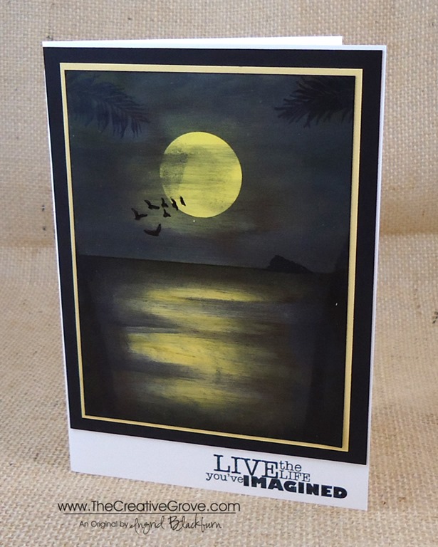
It’s Merry Monday! I am so honored to be a guest designer this week on this very cool weekly challenge blog. If you haven’t yet participated…definitely check it out! The challenges are fresh and intriguing. You’ll definitely stretch your Christmas card making abilities into a new stratosphere. Like this week – Sequins!

I wouldn’t normally reach for this little embellishment, but boy what a new addiction I have now after this one! Thanks a lot girls – look what you’ve done. ![]()

Creative Tips –
- I used the large Stampscapes Pines and Rocks stamp in Night of Navy by Stampin’ Up! here. Simple, just stamped on some Crumb Cake card stock.
- To bring the snowy feel in, I used a Uniball Signo White Gel pen for some highlights and snow in the sky.
")
- To create some mist and bigger flakes, I used a qtip and white pigment ink.
- For the sparkle and a fun touch, I added not only the sequins in clear, but the little pieces from the sequin holes. They add just the right sparkle to this project.
- The card front and banner are popped up for some character along with some subtle sponging in crumb cake.
")
")
- A simple banner greeting from Sweet Essentials from Stampin’ Up! finish this card perfectly.
Now it’s your turn! I can’t wait to see your cards entered. Have a Merry Monday!

[optin_box style=”13″ width=”500″ alignment=”center” action=”https://www.aweber.com/scripts/addlead.pl” disable_name=”Y” method=”post” email_field=”email” email_default=”Enter your email address” integration_type=”aweber” double_optin=”Y” list=”3846012″ name_field=”name” name_default=”Enter your first name” name_required=”Y”][optin_box_field name=”headline”]If you enjoyed this tutorial…[/optin_box_field][optin_box_field name=”paragraph”]PHA+4oCmeW914oCZbGwgbG92ZSBvdXIgPGVtPjxzdHJvbmc+PHNwYW4gc3R5bGU9ImNvbG9yOiAjMjQ0YzVlOyI+ZnJlZTwvc3Bhbj4gPC9zdHJvbmc+PC9lbT5zdWJzY3JpYmVyIG9ubHkgdmlkZW8gc2VyaWVzLiDCoExlYXJuIG5ldyB0ZWNobmlxdWVzIHRocm91Z2ggb3VyIDxzcGFuIHN0eWxlPSJjb2xvcjogIzI0NGM1ZTsiPjxlbT48c3Ryb25nPmV4Y2x1c2l2ZTwvc3Ryb25nPjwvZW0+wqA8L3NwYW4+Q3JlYXRpdmUgVGlwcyBlLWxldHRlcsKgYW5kIHN1YnNjcmliZXIgb25seSB2aWRlbyBhbmQgcHJvamVjdCB0dXRvcmlhbHMhPC9wPgo=[/optin_box_field][optin_box_field name=”privacy”][/optin_box_field][optin_box_field name=”top_color”]undefined[/optin_box_field][optin_box_button type=”1″ text=”Send me exclusive tips!” text_size=”32″ text_color=”#000000″ text_bold=”Y” text_letter_spacing=”0″ text_shadow_panel=”Y” text_shadow_vertical=”1″ text_shadow_horizontal=”0″ text_shadow_color=”#f6fefb” text_shadow_blur=”0″ styling_width=”50″ styling_height=”19″ styling_border_color=”#000000″ styling_border_size=”1″ styling_border_radius=”6″ styling_border_opacity=”100″ styling_shine=”Y” styling_gradient_start_color=”#a3b640″ styling_gradient_end_color=”#80902c” drop_shadow_panel=”Y” drop_shadow_vertical=”1″ drop_shadow_horizontal=”0″ drop_shadow_blur=”1″ drop_shadow_spread=”0″ drop_shadow_color=”#000000″ drop_shadow_opacity=”50″ inset_shadow_panel=”Y” inset_shadow_vertical=”0″ inset_shadow_horizontal=”0″ inset_shadow_blur=”0″ inset_shadow_spread=”1″ inset_shadow_color=”#80902c” inset_shadow_opacity=”50″ location=”optin_box_style_13″ button_below=”Y”]Send me exclusive tips![/optin_box_button] [/optin_box]
")
")


")
")
")

")
")
")


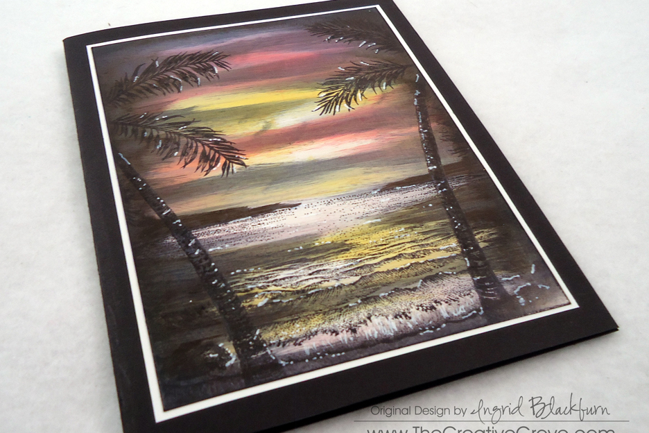
![Stampscapes Tropical Lagoon 9.5.13 (12)_thumb[2]](https://thecreativegrove.com/wp-content/uploads/2013/09/Stampscapes-Tropical-Lagoon-9.5.13-12_thumb2.jpg "Stampscapes Tropical Lagoon 9.5.13 (12)_thumb[2]")
![Stampscapes-Tropical-Lagoon-9.5.13--[3]](https://thecreativegrove.com/wp-content/uploads/2013/09/Stampscapes-Tropical-Lagoon-9.5.13-3.jpg "Stampscapes-Tropical-Lagoon-9.5.13--[3]")
![Stampscapes Tropical Lagoon 1 CU_thumb[3]](https://thecreativegrove.com/wp-content/uploads/2013/09/Stampscapes-Tropical-Lagoon-1-CU_thumb3.png "Stampscapes Tropical Lagoon 1 CU_thumb[3]")
![Stampscapes Tropical Lagoon 9.5.13 (3)_thumb[7]](https://thecreativegrove.com/wp-content/uploads/2013/09/Stampscapes-Tropical-Lagoon-9.5.13-3_thumb7.jpg "Stampscapes Tropical Lagoon 9.5.13 (3)_thumb[7]")
![Stampscapes Tropical Lagoon 9.5.13 (16)_thumb[2]](https://thecreativegrove.com/wp-content/uploads/2013/09/Stampscapes-Tropical-Lagoon-9.5.13-16_thumb2.jpg "Stampscapes Tropical Lagoon 9.5.13 (16)_thumb[2]")
![Stampscapes Tropical Lagoon 9.5.13 (18)_thumb[3]](https://thecreativegrove.com/wp-content/uploads/2013/09/Stampscapes-Tropical-Lagoon-9.5.13-18_thumb3.jpg "Stampscapes Tropical Lagoon 9.5.13 (18)_thumb[3]")
![Stampscapes Tropical Lagoon 9.5.13 (17)_thumb[3]](https://thecreativegrove.com/wp-content/uploads/2013/09/Stampscapes-Tropical-Lagoon-9.5.13-17_thumb3.jpg "Stampscapes Tropical Lagoon 9.5.13 (17)_thumb[3]")
![Stampscapes Tropical Lagoon 9.5.13 (10)_thumb[3]](https://thecreativegrove.com/wp-content/uploads/2013/09/Stampscapes-Tropical-Lagoon-9.5.13-10_thumb3.jpg "Stampscapes Tropical Lagoon 9.5.13 (10)_thumb[3]")
![Stampscapes Tropical Lagoon 9.5.13 (14)_thumb[3]](https://thecreativegrove.com/wp-content/uploads/2013/09/Stampscapes-Tropical-Lagoon-9.5.13-14_thumb3.jpg "Stampscapes Tropical Lagoon 9.5.13 (14)_thumb[3]")
![Stampscapes Tropical Lagoon 9.5.13 (13)_thumb[2]](https://thecreativegrove.com/wp-content/uploads/2013/09/Stampscapes-Tropical-Lagoon-9.5.13-13_thumb2.jpg "Stampscapes Tropical Lagoon 9.5.13 (13)_thumb[2]")

")
")


