An Experiment in Watercolor

DSC09930

My oldest – Rachel asked me to create a project for her upcoming wedding – an artistic guest book.  You may know it by a Jewish Ketubah, or have seen it from Quaker weddings as well.  It’s basically a large sized declaration of the couples love, and vows signed by all who witnessed the union and celebration.  It makes a great keepsake of a very special day.

Well, any of these online go for a pretty hefty price tag.  I saw the norm between $300-$500!  SO, enter the crafty step-mom.  The kids had given me watercolors for Christmas (how ironic), as most of these I found online were done by watercolor artists.  Thus, my experiment in Watercolor.

I’ve been playing around learning exactly how to watercolor.  I of course know a little from watercoloring my images on my cards.  Since I do consider myself somewhat creative and artistic…I thought, why not?  Well…the art world is a whole other animal!  And me with my K-8 art training!  Thankfully I am a crafty paper crafter who happens to love making creative scenery with dye based inks – a head start!  But learning the world of color, perspective, negative and positives, notation, and so much more without the proper education has been quite…well how do we say it – thrown into the deep end with cement shoes! 

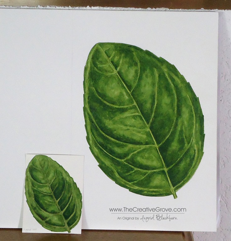
So, since I’ve been laid up with a nagging thumb and wrist injury that’s kept me off my blogs on the computer and stamping…I you tubed, googled, pinterest and researched till the cows came home – mostly with my left hand and on my smart phone!  I stumbled upon some great watercolor artist instructional sites and waded into the water.  To my surprise, painting doesn’t hurt me the way stamping does at the moment – I can keep being creative while I heal– yeah!!!  My first project – a basil leaf.  Now, if you know me…you know that I don’t do anything half way, and certainly not simple!

Getting into botanical watercoloring is precise and I decided to learn from a great self taught UK artist – Anna Mason.  She came up with her own technique to layer (that’s an understatement) colors over one another to create gorgeous 3D watercolors.  Since Rachel wants a floral motif, I wanted to paint as realistic as I could and Anna’s technique suits my purposes perfectly.

The small one was my first go at it – and then I went life size – 10 inches in height.  I still have a way to go to master this technique – but this leaf looks amazing in real life close up!

I also ventured out to take a local watercolor class.  It’s always great to learn something from someone trained.  And honestly, nice to be a student too – doesn’t happen often!  Tanya – my local art teacher is well…let’s just say uber talented!  She bit off a little more than we could chew in the class – as no one was close to finishing either project in the 5 hour class!  Yes, you read that right!  Boy did I learn a ton!

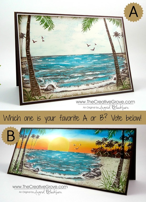
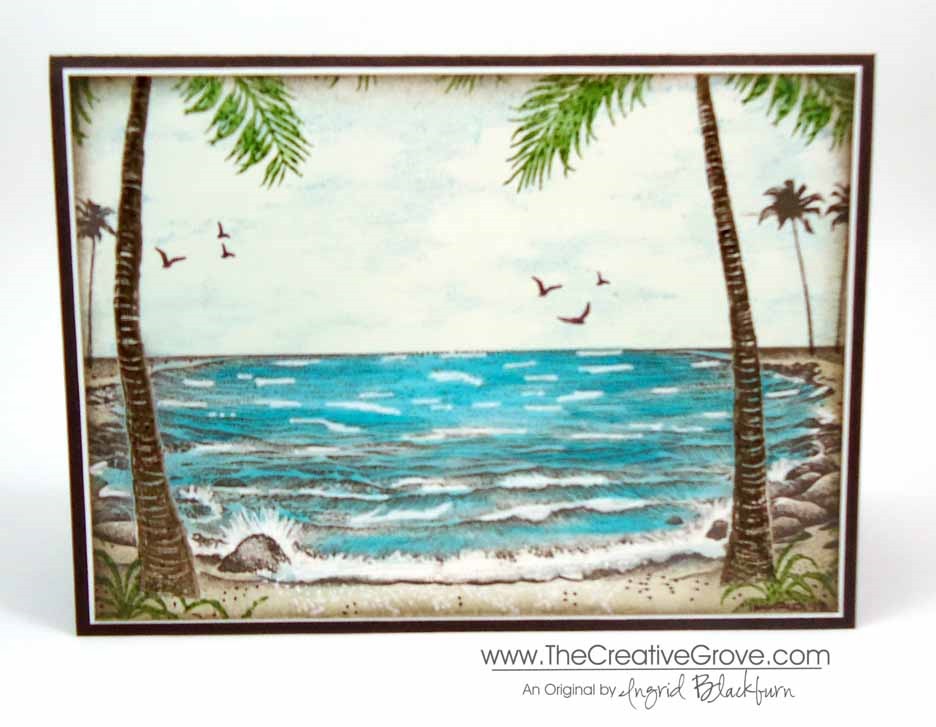
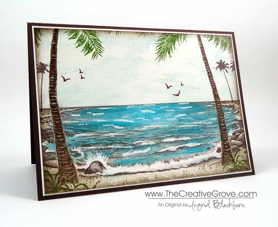
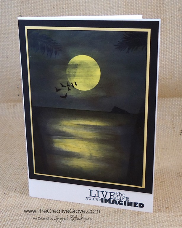
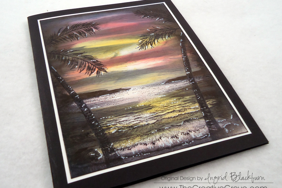
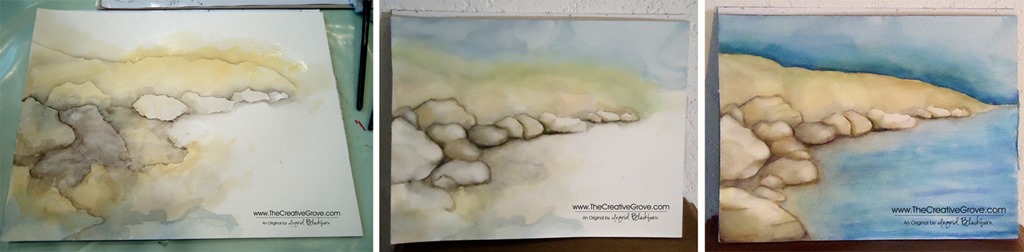
Our class was on positive and negative.  We basically threw some paint down randomly in certain areas and created scenery out of the space!  It was quite interesting.  I think you’ll laugh at my piece that I created in class…but be amazed at what it turned into!

Here is the initial piece with the spaces that I identified as rocks (Don’t be scared – keep reading…it turns out okay!)…

DSC09903

Now…here’s what I turned in into – I’m still a bit amazed!  Note – rocks suck…they are SUPER hard to do, and I really had to keep perspective and light in my mind.  Creating a shape that actually looks like something out of a blob isn’t all that easy!  But it’s amazing what your mind does start to see. 

DSC09919

You can see it all start to take shape.  I removed some color and ugly patches – not that my paper liked that…and once I did a more drastic transformation – here is the finished piece…

DSC09927 

I know…there were colors in places that did not belong – and for all the stuff that went wrong – I just love it.  It was definitely a work in progress and I learned so much from the experience.  I think that’s why I love the end result.  I doesn’t always have to be perfect – I know…pick yourself up off the floor!  Here they are side by side – cool to see the transformation.

I’m still working on the forest scene that was our second project, and I”ll share that someday in the future when I’m ready to!  I hope you enjoyed this watercolor journey with me today.  I’m excited to keep going and learn more – always the student!

You’ll have to let me know what you think – Don’t be shy…I’m very much in the beginning stages of this – do you watercolor or paint?  I’d sure love to know!!

Signature Snowflake 001

Warmth and Wonder: Just out of the woods

Warmth & Wonder Christmas Brayer Card 008

Today, I wanted to make a simple Creative Scene using advanced Brayer techniques and the Holiday Hostess Set Warmth and Wonder.  I have to confess, I slept in today.  Usually I start Mojo Monday at 5 am, that’s what time the sketch goes up!  So as I began to wake up and saw the sketch, I knew this would take me a while.  I’ve been dying to make this card, and today’s sketch was perfect for it!

Many of you have wondered how to make amazing scenes like this.  They look so simple, but actually aren’t.  They involve many different techniques and steps, but every person can make this card – regardless of your stamping ability.  In our classroom, we have a few Brayer classes that teach you step by step with precise videos to help bring the inner artist out in each of you.  The advanced class is in pre-release, save $10 until 10/24 here.  Similar Brayer Cards:

      Evergreen 003 005Plant Hope 002 Side

I needed a custom size card and envelope for this card.  I didn’t want the creative scene to be too small.  So I started out by deciding how big my scene should be and built my card around that.  With the Envelope Punch Board I can make any size envelope I need, so I didn’t have to worry about that!  What a stress relief!  Click here for a quick video on how to make a custom sized envelope.  Here’s the Mojo Monday sketch and my project.

            Warmth & Wonder Christmas Brayer Card 011Mojo316Sketch

Creative Tips –

  • Create the scene using Early Espresso, Always Artichoke, Soft Sky and Marina Mist, embossing powders, masks, a brayer and some sponges.  You will want to pop it up on dimensionals to help set it apart from the rest of the card.Warmth & Wonder Christmas Brayer Card 013
  • Sponging the various pieces of the card tied it together.  Sponging the creative scene draws the reader into it.
  • The background was sanded using the Stampin’ Sanding System in a random fashion. 
  • The circle was cut out with the Circle Collections Framelits – it’s the 3rd largest.Warmth & Wonder Christmas Brayer Card 014
  • To get the diagonal stripe on the vellum, use the Stylish Stripes Embossing Folder.
  • The ribbon is Soft Sky 1/2” Seam Binding Ribbon Warmth & Wonder Christmas Brayer Card 020
  • The little banner flags are made with paper from the Winter Frost Designer Series Paper Stack and the hexagon punch.  View a video to see how to make banner flags here
  • It was hard to figure out how to incorporate a greeting.  You don’t want to take away from the scene too much, so a simple banner with a greeting from this very set brought out to the circle worked well.Warmth & Wonder Christmas Brayer Card 007
  • Here is the card height so you can see the height of the various elements.
    Warmth & Wonder Christmas Brayer Card 010
    If you’d like to learn how to use your brayer along with many other tools to create little works of art like this one, check out all the classes we have.  We even have a bundle here at a huge savings!
    Have a creative day!
    Signature Snowflake 001

Shop 24/7 in the Creative Online Store – click here

Evergreen Stamp Silhouette: Forest Evening Sky

Stampin Up Evergreen Stamp Set (1)

Have you used the Evergreen stamp set as a silhouette image yet?  The filler tree is the perfect stamp to create an Evergreen filled night sky.  Here you see a clean and simple one layer card that is quickly made, but looks great with the ease of color transition and forest underneath a starry sky. 

One layer cards are not only cost effective, but their simplicity is quite striking.  I think you will find that the more you give one layer cards a try, the more you will make.  For me the key to a successful one layer card is lots of white space.  You want the eye to gravitate toward your focal point, not random images.  Stampin Up Evergreen Stamp Set (3)

In this card, I was going for a forest feel underneath an early evening sky.  You know, just when the stars are starting to come out.  Can you hear the crickets?  I’d love to be in this place right now!  That’s the emotion I was going for with this simple but creative scenic card using the Evergreen stamp set.  So, now it’s your turn to give it a try!

Supplies Needed –

  • Stamps – Evergreen (online only), Lots of Thanks
  • Ink – Night of Navy, Pear Pizzazz, Soft Sky, Marina Mist, Midnight Muse
  • Paper – Whisper White, Post-it Notes
  • Tools – Sponge, Signo White Gel Pen

To learn how to make more creative scenery cards, be sure to check out the online Brayer Classes we have focused on this style of card.  Create amazing artistic works of art and master the techniques for those cards.  Click here to find out more information.

Creative Tips –

  • First you will want to mask your upper and lower card areas.  Tip – I use my grid paper to line up my post it notes on the left and right to make sure I’m straight.
  • Next, start with the earth.  Here you see Pear Pizzazz as a light green color for the forest brush.  Stampin Up Evergreen Stamp Set (6)
  • When adding the color with a sponge you will want to start off your paper and lightly sponge it on in a circular motion.  This way you will have an even color rather than splotchy.  Don’t start directly on your project.  Use your grid paper or the post it note as a starting point.
  • Once you have a light coating of green, switch to soft sky.  You don’t need to worry too much about adding a lot of color to the top of your sky, as you will layer darker colors there, but have a little. 
  • Next, add a little Marina Mist.  Keep it at the top to the top half.  As the sun goes down in the sky, most of the light is at the horizon, leaving a darker sky up top.  That’s the effect you are going for here.Stampin Up Evergreen Stamp Set (5)
  • Lastly, add a little Midnight Muse ever so lightly to the uppermost part of the sky.  Be careful when bringing it down into the main portion of your sky, as it will overtake the lighter colors rather quickly and before you know it, your sky is all dark!
  • To get a solid evergreen silhouette image, you will want to stamp your Evergreen tree in Night of Navy – Stampin’ Up!’s darkest shade of blue.  Vary the height of the tree for a little contrast.
  • For a starry sky, use the Signo White Gel Pen to create different sized stars in the sky.  Group a few together and vary the height in your project.Stampin Up Evergreen Stamp Set (2)

This project is a quick one, I think you’ll be amazed at how fast you can actually make it!  The end result is so beautiful.  Feel free to sign it like artwork too!  You created that sky.  Add a sentiment or leave it blank – it’s up to you.  I think you will love using this evergreen stamp set for a silhouette tree image, now it’s your turn!Stampin Up Evergreen Stamp Set (4)

Signature Snowflake 001

To shop 24/7 – click here!

Taking a different view

Tropical Lagoon 002 003

For you today, I have a tweaked version of a great card.  It’s a completely different look – a more subdued, dare I say masculine look?  Today, I’m going to share with you how to take a great project and then improve upon it so that you get more from those great ideas that you have.

I thought that you would enjoy seeing what I mean.  Here are both projects on top of each other.  Which one do you prefer?  I mean, they both are great, but yet evoke a different feel.  Be sure to tell me in the comment section which one you prefer!  I am rather curious…go do it now and then come back and read the rest!


It’s funny, I love the sunset cards, but there’s something about the other one that mesmerizes me as well.  I can’t quite put my finger on it.  Here it is close up.  To see the other close up click here.

The main difference between the two, other than the color, is that the foreground palm trees are embossed first to really resist the background and remain clean.  I just love that pop of Jungle Green.  The Cloud Space stamp was added in place of the sunset – that’s a FABULOUS stamp. Smile

I made this card for a friend of my Dad’s who lost his wife to a long battle with cancer.  When I remember her, I think of how much she loved the beach and waters of the Mediterranean and Atlantic.  She would come back from vacations in Spain so brown it was unbelievable.  Laura was a real artist who painted the most amazing sceneries on canvas.  Of course by trade, she was a pharmacist, but I remember her as an artist.  Laura, this one’s is in memory of you. Smile

Signature Snowflake 001

To Shop 24/7 in the Creative Store – Click here!

Stamp Sets – Stampscapes Stamps Ink – Marvy – Oriental Blue, Turquoise, Caribbean Blue, Jungle Green, Yellow, Brilliant Yellow; Adirondack Lights – Cloudy Blue, Aqua, Peach Bellini; Stampin’ Up! – Early Espresso, Crushed Curry, Tangerine Tango, Sahara Sand, Crisp Cantaloupe, Early Espresso Marker Paper –Glossy White, Early Espresso Tools – Colorbox Stylus, Brushtix Mixed Media Brushes Finishing Touch – Uni-ball Signo White Gel Pen

Finding Inspiration

Where do you look for creative inspiration?  For me, I usually head to Pinterest or look in magazines.  I love to look at photographs and generally a color palate or random organization of shapes will strike up an idea.  I thought today I would take you on a journey for a simple CASE (copy and steal everything) of a photo for me. Smile

When you see a photo online, do you sometimes shift in your chair, or move your head?  That to me is the sign that I’ve found something.  Here is the photo I found on Pinterest and my final project:

Cable-Beach-Broome-North-Western-Australia Moonlit Waters 004

While it’s not exact, it was my first attempt at making a mostly all black scenery.   I immediately thought, I can do that.  I’ll challenge myself and try something totally new.  I have to admit – it felt all wrong…lol!

Creative Tips –

  • You will want to start by masking a horizon line and beginning with your sky.
  • Give a good coat of various shades of yellow.  Here I used Glossy paper and a stylus tool to layer several coats of ink.Moonlit Waters 007
  • Mask your moon and continue layering ink, switching to Black.  You’ll want to leave a little faint yellow showing through around your moon for the glow.
  • My edge of my mask lifted up, so I got a splotch of black on my moon on the left side.  To cover that mistake up, I lifted my mask completely and dragged my stylus across a little to create whispy clouds.  Here is my friend Amy’s who didn’t get any on hers – see the difference? Moonlit Waters 001
  • When done with your sky, fully dry and switch your mask to reveal the water and cover the sky.
  • Layer color from the sides across your water being careful to leave the middle showing the moonlight reflection.
  • To create the feel of water, you will want to bring in a little black into your yellow.  Do this a little at a time so that you don’t cover up too much at once.  If you feel like you aren’t sure if you want to add more, stop.Moonlit Waters 008
  • Once you have the desired look, stamp your palm trunks and leaves at the top to give the viewer’s perspective.
  • Stamp the birds, layering a few over your moon.
  • Create a mask for the island and add into the horizon opposite your birds with a sponge in black ink.
  • Pick a saying that fits your scene.
  • This card is finished 5 x 7 and the scenery layer is 4 1/4 x 5 1/2”

It’s a fun scene and looks so striking in person.  I can’t wait to try it in purples next!

If you loved this card…

Be sure to subscribe to the creative tips e-letter & FREE video series. There’s a great scenic project in our first video series that I think you’ll love. And if you want to learn more about scenic cards, be sure to check out our Brayer 101 & 102 classes in addition to our upcoming Stampscapes class where we’ll make this similar project: Find out more HERE

Eveing Sunset Palm Cove Thumbnail

Signature_thumb.jpg

[optin_box style=”2″ alignment=”center” email_field=”email” email_default=”Enter your email address” email_order=”2″ integration_type=”aweber” double_optin=”Y” list=”3846012″ name_field=”name” name_default=”Enter your first name” name_order=”1″ name_required=”Y” opm_packages=””][optin_box_field name=”headline”]Learn more with our exclusive FREE video series:[/optin_box_field][optin_box_field name=”paragraph”][/optin_box_field][optin_box_field name=”privacy”]Plus you’ll be added to my FREE Creative Tips E-letter where I share exclusive projects, videos & the 12 Days of Christmas series[/optin_box_field][optin_box_field name=”top_color”]undefined[/optin_box_field][optin_box_button type=”0″ button_below=”Y”]Get Instant Access![/optin_box_button] [/optin_box]

Stamp Sets – Stampscapes Stamps, Really Good Greetings (130333c, 130330w) Ink – Marvy – Black, Yellow, Brilliant Yellow  Adirondack Lights – Sandal Paper –Glossy White, So Saffron, Basic Black Tools – Colorbox Stylus

Moonlit Waters 006

Fall One Layer Wishes

Have you ever tried creative depth with Lovely as a Tree, or any nature stamps? I was in a simplicity mood this morning.  I love color and the mountains.  When I think of the mountains, I’m reminded of when I lived in Utah and California.  The scenery was so beautiful, and it really put me at peace.  So this morning, I wanted to create a Fall Foliage scenery on a one layer card.

I grabbed my Lovely as a Tree stamp set and went to work.  It took me three cards to get the right result, but I’m happy with it!  Here is the result!

If you love the look of this stamp set – be sure to check out my online brayer class too!

Lovely as a Tree OLC tutorial – 

    • First I cut out a mask leaving a 3/4” border on the top, left and right.
    • I inked up my six tree stamp in Crushed Curry, stamped it off and then stamped it three times filling the top 2/3 of the frame.  When inking my stamp, I did not ink up the bottom grass and trunks.  You can do this with a marker or your ink pad.Lovely as a Tree004 CU
    • I lightly sponged Soft Sky to create my rectangular frame, being sure to focus a bit heavier on the outline than the middle.  I filled in the bottom 1/3 before stamping my main image.
    • To color my main image, I used Stampin’ Write Markers.  I first colored my trees, then my trunks in Early Espresso.
    • For my Greeting, I used the Four You stamp set – I LOVE this set.

Lovely as a Tree004 Main L

It’s a simple card, but I love the color.  It makes me feel like I’m looking out at a scene in the Uinta mountains in Utah.  I hope you like it too!

Lovely as a Tree004 Angle


[optin_box style=”2″ alignment=”center” email_field=”email” email_default=”Enter your email address” email_order=”2″ integration_type=”aweber” double_optin=”Y” list=”3846012″ name_field=”name” name_default=”Enter your first name” name_order=”1″ name_required=”Y” opm_packages=””][optin_box_field name=”headline”]Learn with our exclusive FREE video series[/optin_box_field][optin_box_field name=”paragraph”]PHA+R2V0IHRoZSBmcmVlIENyZWF0aXZlIFRpcHMgRS1sZXR0ZXIgYW5kIGxlYXJuIHdpdGggc3Vic2NyaWJlciBleGNsdXNpdmUgdmlkZW8gYW5kIHBpY3RvcmlhbCBjb250ZW50LiBJbmNsdWRpbmcgb3VyIHllYXJseSAxMiBEYXlzIG9mIENocmlzdG1hcyBzZXJpZXMgJmFtcDsgdGhlIHZpZGVvIGZvciB0aGlzIHByb2plY3QhPC9wPgo=[/optin_box_field][optin_box_field name=”privacy”][/optin_box_field][optin_box_field name=”top_color”]undefined[/optin_box_field][optin_box_button type=”0″ button_below=”Y”]Get Access Now![/optin_box_button] [/optin_box]