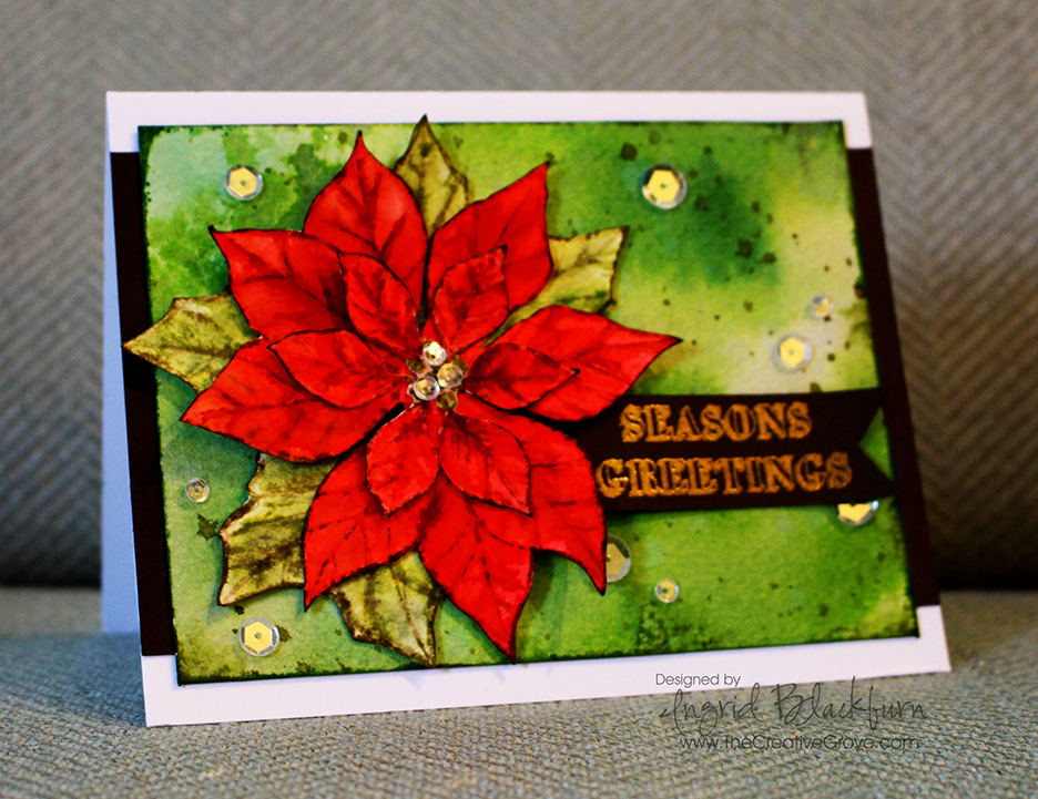
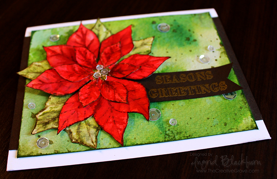
What’s a girl to do to create amazing cards for you from the road – watercolor using distress inks, naturally! I brought a few Christmas sets with me, just in case we weren’t back yet (We’ve been traveling for 9 weeks so far); so when I sat down for this month’s Poinsettia Challenge, I stared at my stamp set and this idea popped in my head.
You know by now that I love to watercolor, especially with distress inks, so I thought a more three dimensional Poinsettia on a cool smooshed background might look cool, and I have to say – even I’m thrilled with how it turned out – and I’m my worst critic! I bet you are your own worst critic too – tell me in the comments – it can’t just be me!
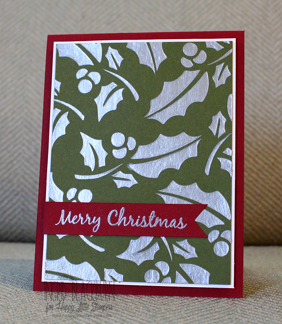
This month at the Happy Little Stampers Christmas Challenge, the theme is Poinsettia. So I hope this card inspires you in some way to create your own amazing creation and join in the Challenge. Not only does the design team have some amazing projects created for you…we also have a guest designer this month – Pat from Colourful Creations.
You’ll see a tutorial below. I know I normally have a video, but I don’t have a tripod with me – sorry about that! But if you are looking for some great holiday inspiration – later this month my annual 12 Days of Christmas card series is starting – be sure to be on the Creative Tips E-Letter to get those – they won’t be on the blog!!
To join me this month, use any element of this or the design teams cards as inspiration, just make sure it has a poinsettia in some way on your card and is Christmas themed. I can’t wait to see your creations – now for the good stuff!
Creative Tips on Watercolor using Distress Inks
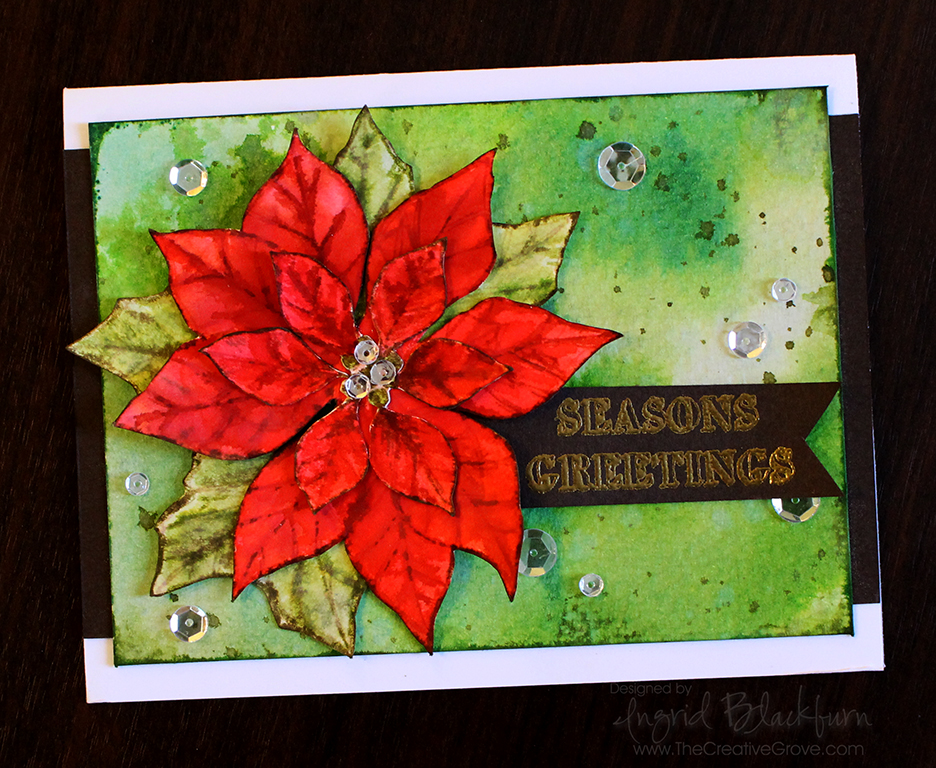
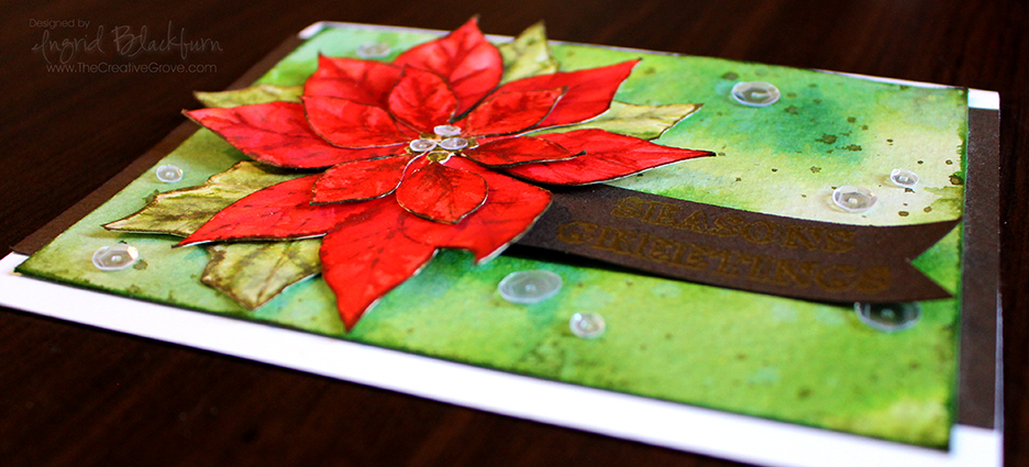
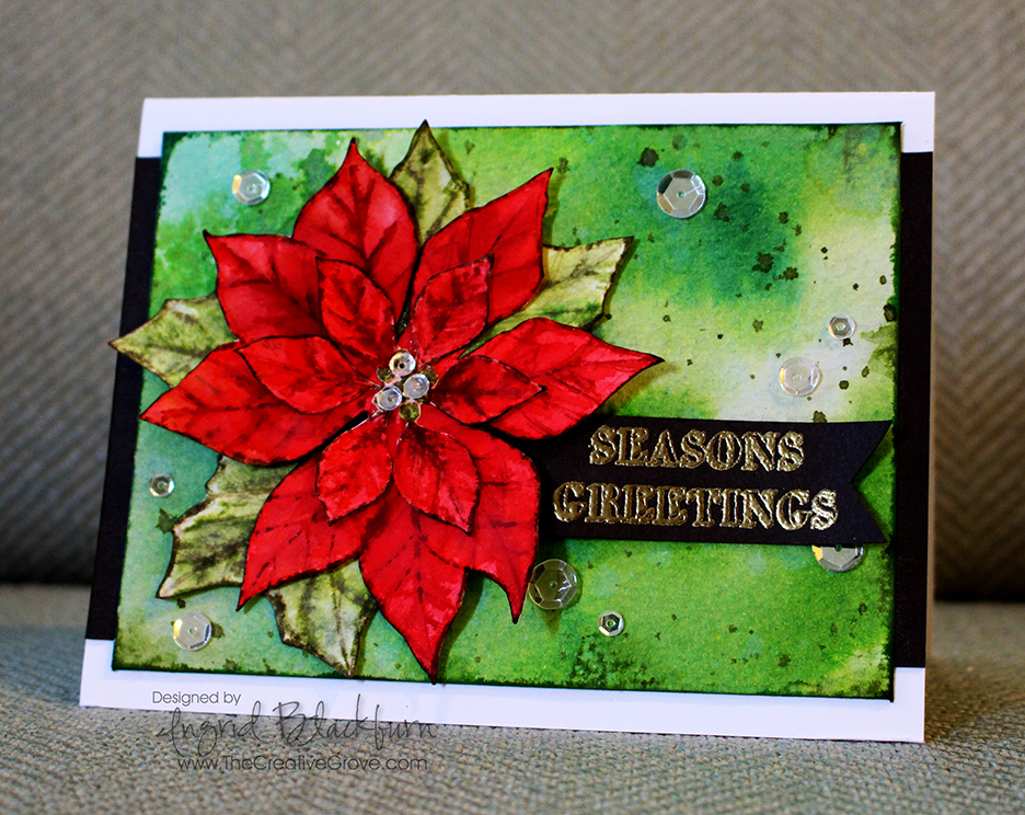
Here was my thought process for choosing the colors for the card. Originally I was going to do a no line watercolor white poinsettia, but then I was in the mood for red. I knew a deeply watercolored red 3D poinsettia would look awesome, but needed an equally awesome background. So what do you choose? On the color wheel, the complimentary color (opposite on the wheel) to red is green. So while the leaves would be green, I thought maybe a more vibrant version with lighter bleached out in spots along with great texture created with deeper flicks and edges might just do the trick!
- To start, you’ll want to smoosh a few greens into your craft mat or work surface. I used Bundled Sage, Peeled Paint and Mowed Lawn. Bundled Sage helped me with the lighter bleached out spots, Mowed Lawn was my bright vibrant contrast to that, Peeled Paint married the two.
- Generously spritz your colors. Make sure you lay down enough to cover your background piece. While spritzing, you want to have enough water down without overdoing it. To gauge the amount of water, when you press your watercolor card front down and it comes up dry or not glistening, you don’t have enough water. On the other hand if all your color runs right off your watercolor paper, you have too much! It’s a science, so play around. Don’t worry if you don’t get it right, just go right back with another layer adjusted with more or less water. Layers is what makes this piece awesome! So it’s very forgiving.
- Don’t over do the smooshing – get just enough to cover your piece. This way you keep the light areas light. If you have too much light, strategically smoosh more vibrant spots over some without pressing it into the whole card.
- Set your background aside to dry before moving onto the next step.
- Next – create the splatter. I did this in two ways – flicked water, then colored splatter.
- First spritz your hand and flick your colored surface. Here’s a video on this technique (at the 2:59 mark)
- Smoosh some Forest Moss into your craft mat. Spritz with water to get it into a liquid state – just add enough, you don’t want it too diluted in hue. Load up a paint brush and splatter it hard with your finger on the opposite hand creating splatter onto your card. If you hold it closer to your project it will be more condensed. I held mine about 10 inches from my card to get it to splatter outward.
- Edge your watercolor paper directly with your ink pad – a little more generously at the corners to complete your background.
- Set it aside to try. Now you can move onto the Poinsettia!
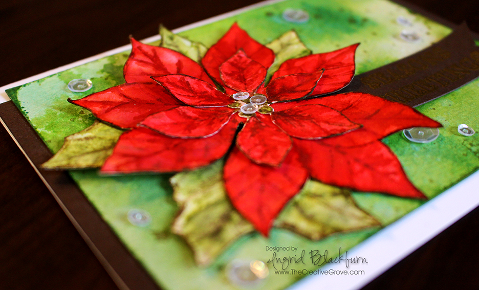
- To get a more painted look to your Poinsettia. you’ll want to use a few shades of red and create layers. Stamp your image in a lighter shade twice on a larger piece of 140# cold pressed watercolor paper. I used Tattered Rose and stamped it off so that it was really light. This will give you an outline to work with without defining the edges. This allows you to control the look of the flower, rather than painting in the lines of an outlined image.
- You will color one flower completely and another just the smaller inner flower. When painting the larger flower – ignore the lines of the smaller flower – just extend the leaf as if it’s a large petal. Look really close at mine and you’ll see the smaller outline slightly – but you have to really look for it!
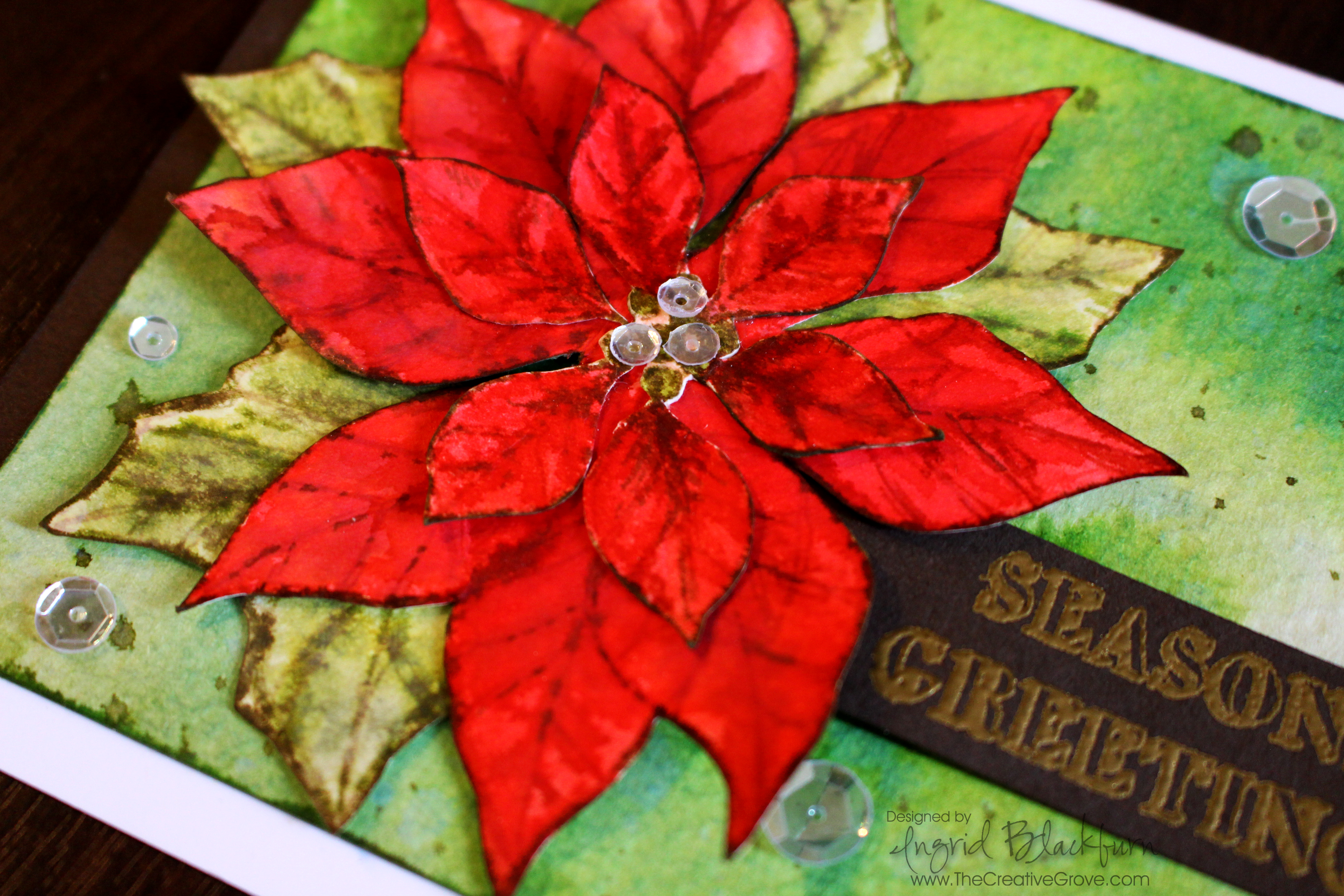
- Color your berries on the smaller flower in using Peeled Paint. Your larger flower you’ll color the berries with Festive Berries to match the flower better.
- Next create a light wash of Worn Lipstick by spritzing it generously with water. Test it out on a scrap piece to make sure it’s light. It’s easier to start lighter and add darker layers for depth – you can’t go so easily dark to light.
- Add a spritzed version of Festive Berries, keeping some light areas. Apply your color using the veins of the flower as a guide and spread the color outward with wet brush – I used a Pentel AquaBrush.
- Repeat using Barn Door and add a little detail to the veins with Fired Brick. With each layer, add the color in different spots – some heavier and lighter. This will help you to develop texture in your flower.
- Fussy cut both of your flowers out right at the line image – don’t leave any excess white. You should have a large and smaller flower.
- Edge your petals in Gathered Twigs. Be careful to just get the very edge and not onto the flower if possible. Use a Distress marker if you’re more comfortable.
- Stamp your leaves in Bundled Sage and Paint them in a similar manner using a light wash of Bundled Sage and add a little Peeled Paint and an even smaller amount of Forest Moss at the veins. Keep them really light to help as a contrast from the background.
- Fussy cut them out. Glue your leaves to the larger flower, and then your smaller flower on top.
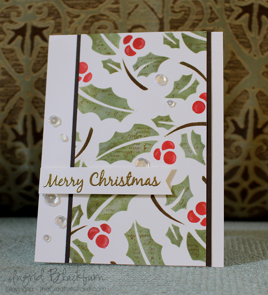
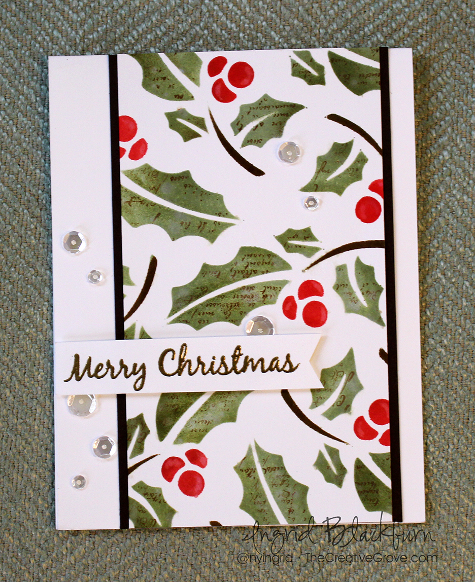
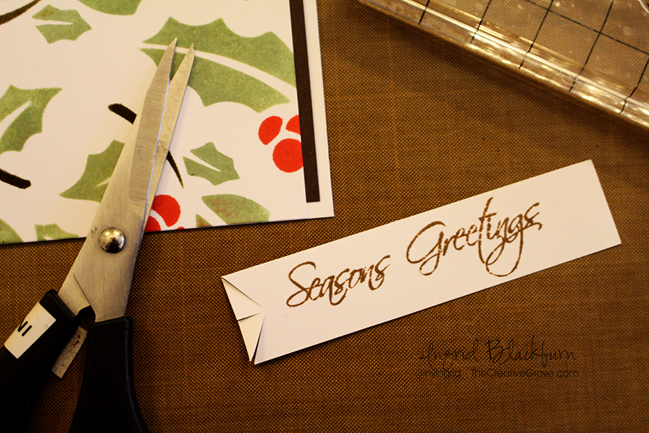
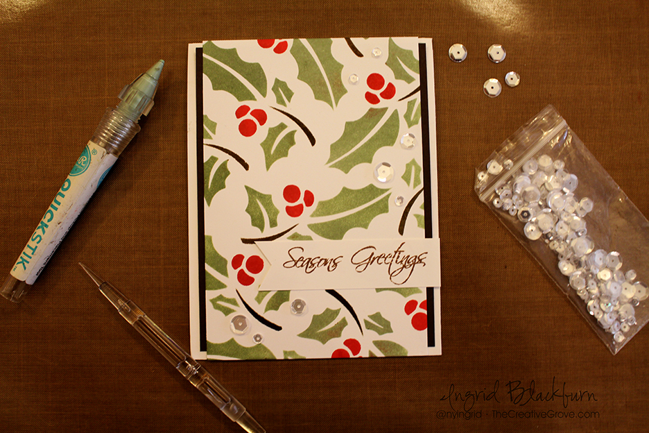
- Emboss your greeting onto Espresso card stock – I used the set Mixed Christmas Sentiments by Happy Little Stampers. I then created a banner and attached it to the back of my flower.
- Before using liquid glue to attach the flower and banner to the card, I gently bent up s few of the petals and the banner to give a better 3D look.
- Add some sparkling clear sequins by pretty pink posh for a final touch.
Here are the card dimensions:
- Card – Top folding 8 1/2 x 5 1/2″ White
- Card front – 140# water color paper by Canson – 3 3/4 x 5″
- Espresso – Matte – 5 1/2 x 3 1/2″, banner – scrap
I hope you enjoyed this little tutorial on watercolor using distress inks, okay – not so little. You can use watercolor paints as well, or any dye based inks that blend well with water. In my experience, the distress are the most transparent of the dye inks out there. Have fun with it, and I can’t wait to see what you create. And don’t forget – if you want the 12 Days of Christmas series, be sure to sign up for the Creative Tips E-letter.