Really Good Greetings Mojo Monday 300!

Really Good Greetings 002 Main R

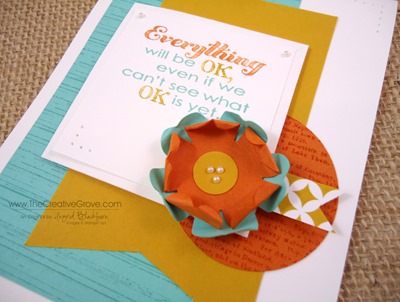
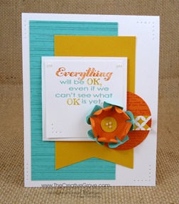
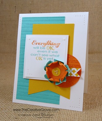
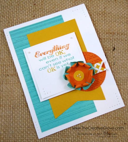
Wow, 300 sketches at Mojo Monday – that’s quite an accomplishment over the past almost 6 years!  I thought my Mojo Monday 300 card deserved some Really Good Greetings for that.  Okay, a little pun intended on the words…lol!  That was almost too easy on an early Monday morning here in the Orlando, Florida area. 

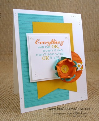
I love the way this sketch turned out, my card feels crisp, light and bright.  Of course, I went straight to my, yup you guessed it – color coach for this awesome color combination – Coastal Cabana, Crushed Curry and Pumpkin Pie.  I knew I was going to use this greeting set, and set out to use my two other favorites – Gorgeous Grunge and Dictionary.  I hope you like it – thanks for the inspiration Julee Tilman, your sketch turned out lovely!

             Mojo300SketchReally Good Greetings 002 Front

Creative Tips –

  • I chose a color combination from the Coastal Cabana card in the Color Coach collection.  I wouldn’t have put these colors together myself, but they definitely work – that’s why I always use my coach – color is not my thing!
  • I knew I didn’t want to over power the card, so I chose two trusty background type stamp sets – Gorgeous Grunge and Dictionary.  I used the stripes on the 5” x 2 5/8” panel – it’s my absolute favorite stamp in my entire collection!
  • For contrast, I kept the Crushed Curry banner solid.  To make the banner end, I used my paper snipsView my video on how to make banner flags Really Good Greetings 002 Side
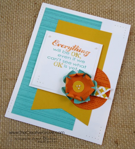
  • The Pumpkin Pie circle was cut using my new Circles Collection Framelits – it’s the #4 circle.  I stamped the dictionary background stamp using Pumpkin Pie for just that little something.
  • I struggled a bit with how to matte the greeting square.  I didn’t want to incorporate a new color and the other three colors didn’t quite work as a 1/16” border.  I finally decided to go with Whisper White on itself.  By popping it up on dimensionals, it gave it the break and shadow that I needed from a contrasting colored matte.  Really Good Greetings 002 Height
  • To color my greeting, I used the Crushed Curry, Pumpkin Pie and Coastal Cabana Stampin’ Write Markers.
  • For the flag, I used a scrap piece from the new Eastern Elegance Designer Series Paper along with my 1” Square punch
  • The flower was made by punching out two flowers using the new Pansy Punch.  I worked the edges a little of each petal and bent them in on itself.  I worked the Pumpkin Pie flower a bit more since it was in the center.  I created a flower center using the 1/2” circle punch and finished it off with three small Pearl Basic Jewels.Really Good Greetings 002 CU
  • For a finishing touch on this card, I incorporated some paper piercing.  Don’t think that your Paper Piercing always has to be the same all around your card.  If you’ll notice I have two large corners and two lines in addition to a smaller corner on the greeting.  It’s just the right amount without going overboard.

This is actually a great card for anyone who is going through something.  What I like about it the most is that it’s hopeful, bright and cheery.  It’s the perfect card to send to someone who needs a lift in life.  I hope you like it too! 

Really Good Greetings 002 Main L

Signature Snowflake 001

To Shop 24/7 in the Creative Store – Click here!

Really Good Greetings 002 Angle

Stamp Sets – Really Good Greetings (130333c, 130330w), Dictionary (130351c, 130348w),Gorgeous Grunge (130517c, 130514w) Ink – Coastal Cabana (131175), Pumpkin Pie (126945), Pumpkin Pie Stampin’ Write Marker (105115), Crushed Curry Stampin’ Write Marker (131901), 2013-2015 In Color Marker Collection (131260)  Paper – Whisper White (100730), Coastal Cabana (131297), Pumpkin Pie (105117), Crushed Curry (131199), Eastern Elegance DSP (130131) Cool Tools – Paper Snips (103579), 1/2” Circle Punch(119869), Circles Collection Framelits (130911), Pansy Punch (130698), 1” Square Punch (124094) Finishing Touch –Stampin’ Dimensionals (104430), Pearl Basic Jewels (119247), Paper Piercing Tool (126189), Stampin’ Pierce Mat (126199), Essentials Paper Piercing Pack (126187)
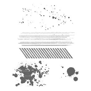
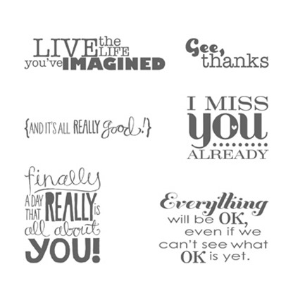
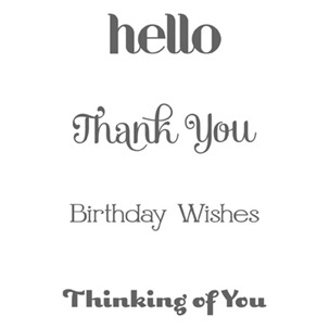
Gorgeous GrungeDictionary Background StampReally Good Greetings

Retro Regarding Dahlias

Regarding Dahlias 002 Full

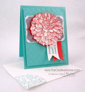
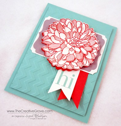
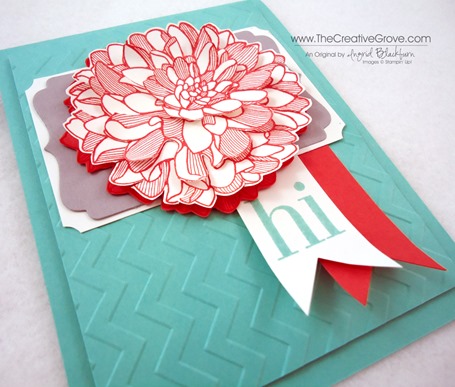
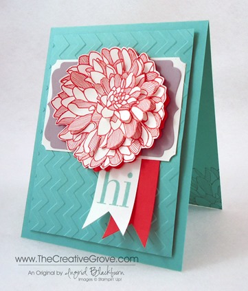
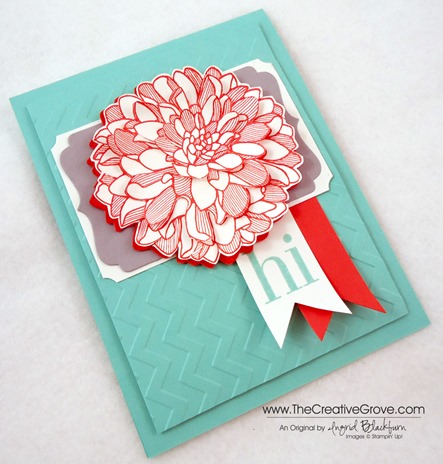
I just got the new Deco Label Framelits and wanted to try them out.  So, what better stamp set to test the waters with than Regarding Dahlias.  Now I ended up altering my framelit to suit the card better, but I think in the end it worked perfectly!  You be the judge.Regarding Dahlias 002 Side

Creative Tips –

  • My trusty Color Coach gave me this combination – another one out of my comfort zone – Coastal Cabana, Calypso Coral and Smoky Slate.  I love the retro feel of the color combination.
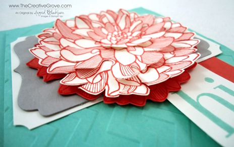
  • For the flower, I stamped my Dahlia stamp in Calypso Coral two full times on scrap Whisper White and once just needing the center on a piece of scrap.  I also stamped it once fully on Calypso Coral.  Regarding Dahlias 002 Dahlia
  • I wanted the layered look, so I cut the flower out at three depths and cut in on several petals so that I could bend them upward. 
  • To attach them together, I used Tombow Liquid Glue.  It’s the best for textures and difficult items.
  • The number three Deco Label Framelit is the perfect size for a portrait card.  I cut one in Smoky Slate and trimmed off the rounded parts.  I matted it onto a piece of Whisper White trimmed to give me a 1/16” border.  I then used my circle punch from the Itty Bitty Punch Pack to notch out the corners.Regarding Dahlias 002 CU
  • For the greeting I made a banner using my 1” Square Punch and added a Calypso Coral banner for a pop of color as well.  View my video on how to make banner flags
  • This card needed a little texture, so I added a panel of Coastal Cabana popped up and run through my Big Shot with the Chevron embossing folder.Regarding Dahlias 002 Height
  • I added a little corner stamped in Coastal Cabana and the Dahlia stamp on the inside and on the envelope for coordination.

Regarding Dahlias 002 Main L

It’s a cute card and works for any occasion.  I just love the Regarding Dahlia set – this flower is bold and fun.  I hope you enjoyed it too!  View my other card made with this great set here


Signature-Snowflake-001_thumb1

To Shop 24/7 in the Creative Store – Click here!

Regarding Dahlias 002 Angle

Stamp Sets – Regarding Dahlias (130327c, 130324w)  Ink – Calypso Coral (126983), Coastal Cabana (131175) Paper – Whisper White (100730), Coastal Cabana (131297), Calypso Coral (122925), Smoky Slate (131202) Cool Tools – 1” Square Punch (124094), Chevron TIEF (127749), Deco Label Framelits (130102), Color Coach (130118), 2013-2015 In Color Cards (130120) Finishing Touch – Stampin’ Dimensionals (104430)

Regarding DahliasDeco Label Framelits

Clean and Simple Happy Day

Happy Day 002 Main R

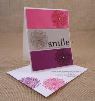
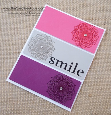
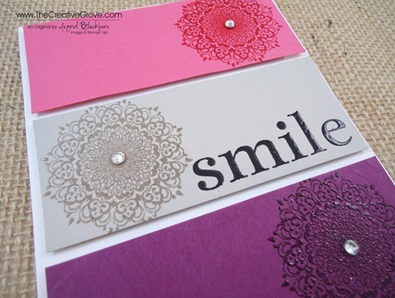
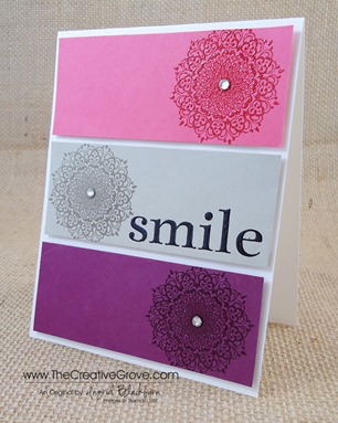
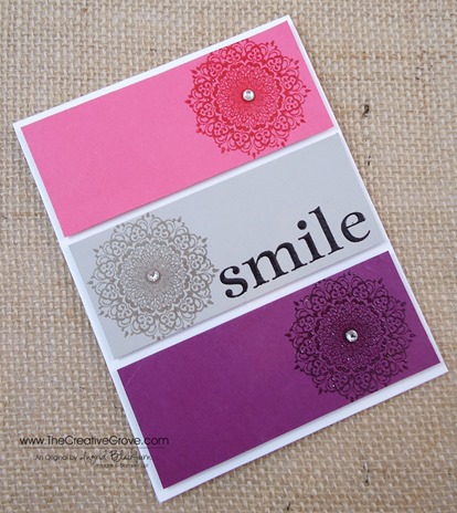
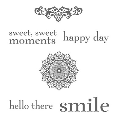
Smile, today’s project uses the Happy Day stamp set!  I was in a clean and simple mood this morning.  Part of it must have been because I cleaned off my creative space and filed away all those pesky little scraps that we tend to accumulate.  The end result, a clean and simple card that leaves the recipient smiling.  SmileHappy Day 002 Side

Creative Tips –

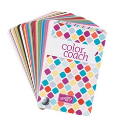
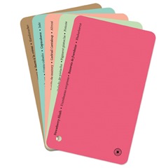
  • I pulled out my color coach and the first color to catch my eye was the new In Color Strawberry Slush.  It’s not an Ingrid color, so I was surprised to be drawn to it.  I’m more of a Midnight Muse/Island Indigo kind of a gal.  

                        Color Coach2013-2015 In Colors

  •   The top color combination was Strawberry Slush, Sahara Sand and Rich Razzleberry – I know, you’re saying huh?  Me too, but look at the end result – it totally works! (Just one reason I can’t live without my color coach!)Happy Day 002 CU
  • I was going for simplicity with a little drama, not TOO simple.  So I decided to emboss my elements and pop up my panels.
  • Tip – To emboss my medallions, I stamped my image in Versamark and then the color I needed.  I embossed each image in Clear Embossing Powder.  This particular image is super fine in design – you’ll want Stampin’ Up! embossing powder – they’re quite fine.
  • The greeting Smile, I embossed in Black for some contrast. Happy Day 002 Height
  • Each panel is popped up on Stampin’ Dimensionals and for the finishing touch, a medium sized Rhinestone was added to the center. Happy Day 002 Main L
    See, it’s a clean and simple card that will literally take you a few minutes, but the end result is striking.  The colors are really growing on me the more I look at them.


Signature Snowflake 001

To Shop 24/7 in the Creative Store – Click here!

Happy Day 002 Angle

Stamp Sets – Happy Day (130297c, 130294w) Ink – Versamark (102283), Strawberry Slush (131178), Rich Razzleberry (126950), Sahara Sand (126976) Paper – Whisper White (100730), Strawberry Slush (131295), Rich Razzleberry (115316), Sahara Sand (121043) Cool Tools –  Color Coach (130118) + In Color Cards (130120), Clear Embossing Powder (109130), Black Embossing Powder (109133) Finishing Touch –Stampin’ Dimensionals (104430),  Rhinestone Basic Jewels (119246),

Happy Day Stamp Set

Sponged Pleasant Poppies

Pleasant Poppies 004 Main R a

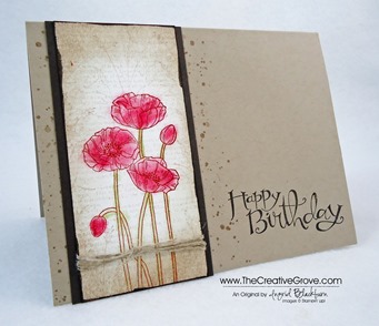
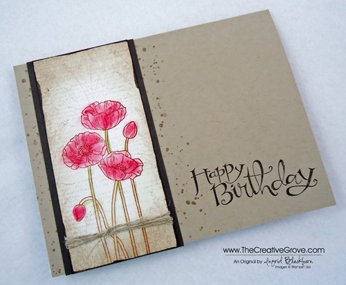
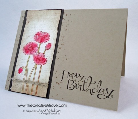
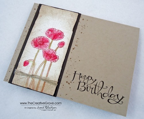
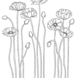
Here’s a quick and simple artsy way of coloring the Pleasant Poppies Background stamp in a collage manner.  I’ve combined some great stamps to give this look a multi-layered effect – Dictionary, Gorgeous Grunge, Wetlands and Pleasant Poppies. 

Creative Tips –

  • I stamped off the Dictionary stamp in Sahara Sand for a really light background effect.  The poppies were stamped in Cajun Craze.  Pleasant Poppies 004 Side a
  • To add a little collage effect, I added the Reed stamp from the Wetlands set – stamped off 4-5 times so that it was really light using Crumb Cake.
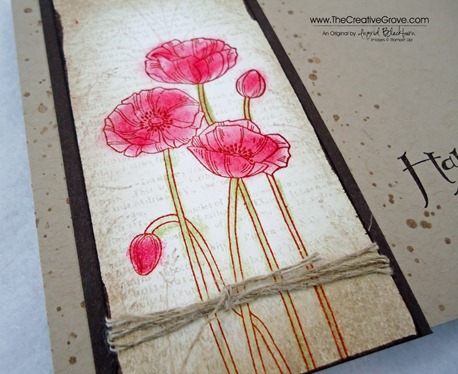
  • The poppies needed to stand out, but I didn’t want to watercolor them.  I used tiny sponges and my reversible tweezers to precisely sponge my flowers and stems.  I used Real Red and Pear Pizazz.
  • I lightly sponged Sahara Sand around my 4 1/4” x 2” piece of Whisper White being careful to keep the center white.  I added Crumb Cake and then a tiny sliver of direct to paper – Early Espresso to the edge before mounting it to a 2 1/4” x 4 1/4” Early Espresso.Pleasant Poppies 004 CU a
  • For a finishing touch, I wound some linen thread around the bottom and tied a knot.
  • Before adhering the panel to my Crumb Cake card base, I stamped the spot splatter stamp from Gorgeous Grunge in Crumb Cake in several stamped off shades so that there was just a little splatter on the edges. 
  • The greeting is in Early Espresso from the cute Sassy Salutations set that is still 25% off till June 30th – just a few more days!Pleasant Poppies 004 Main L a

I hope you like this earthy card.  I love the final result.  It’s just a little panel, cost effective, but quite artsy. 

Signature Snowflake 001

To Shop 24/7 in the Creative Store – Click here!

Pleasant Poppies 004 Angle a

Stamp Sets – Pleasant Poppies (129499c, 132061w), Gorgeous Grunge (130517c, 130514w), Dictionary (130351c, 130348w), Wetlands (126697c, 126695w), Sassy Salutations (126707c, 132070w)  Ink – Pear Pizazz (131180), Sahara Sand (126976), Crumb Cake (126975), Early Espresso (126974), Real Red (126949), Cajun Craze (126965)  Paper –Whisper White (100730), Crumb Cake (120953), Early Espresso (119686) Cool Tools – Stampin’ Sponges (101610) Finishing Touch – Linen Thread (104199)

Untitled-12Gorgeous Grunge

DictionaryUntitled-12

Evergreen Snowy Hillside

Evergreen 002 Main

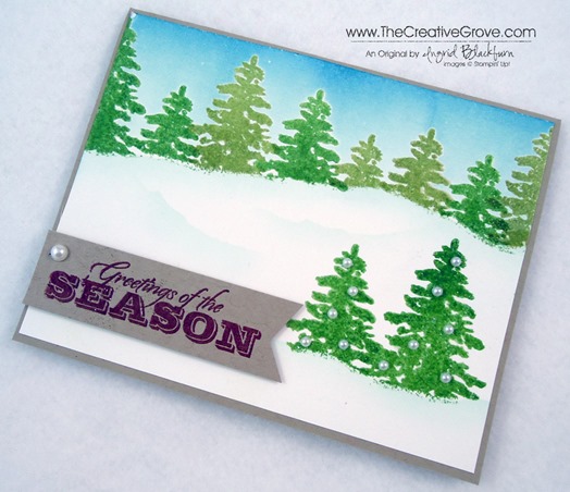
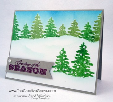
I was feeling in an Evergreen tree mood this morning.  I wanted to create a hilly snow scene since we’re having another scorching hot day here in Florida today.  Sometimes you just want to feel the cold!  I hope you like my little piece of mountain heaven.

Did you know that there are six holiday stamp sets that you won’t find in our physical catalog, but rather online only.  Be sure to check out stamps that are available only online too! Check out our exclusive online stamps here 

Creative Tips –

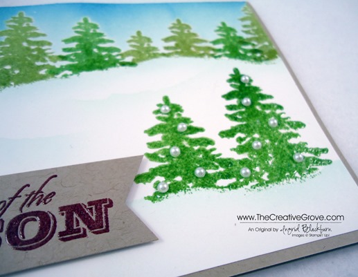
  • I stamped the large Evergreen solid image in various heights using a torn mask for my hillside.  First I stamped in Versamark ink and then I alternated between Wild Wasabi and Pear Pizazz. 
  • Once I had my skyline done I wanted two larger trees up close that I could decorate.  I tore another mask and stamped two Wild Wasabi Trees.Evergreen 002 Side
  • To give my trees a glossy look and protect them from the brayer, I embossed all my trees in Clear Embossing powder.
  • I used the skyline mask and brayered over my trees in Soft Sky and Marina Mist. 
  • To accentuate the ridge, I used the reverse mask to sponge a light edge for the snow. Evergreen 002 Trees
  • To create the snow drifts, I used the same mask, but alternated it’s direction.
  • For my tree decorations, I used Pearl Basic Jewels.Evergreen 002 Banner
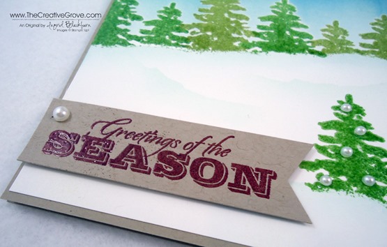
  • I used my new Hexagon Punch for the perfect banner end with my greeting.  My greeting is also stamped in Versamark and Cherry Cobbler.  This way it really pops when embossed with Clear Embossing Powder.

It’s a simple little card, but cute.  I love the wintery feel of it and I could easily mass produce these for the holidays!

Signature Snowflake 001

To Shop 24/7 in the Creative Store – Click here!

Evergreen 002 Angle

Stamp Sets – Evergreen (127973), Greetings of the Season (128033) Paper – Whisper White (107330), Crumb Cake (120953) Ink – Wild Wasabi (126959), Pear Pizazz (131180), Soft Sky (131181), Marina Mist (126962), Versamark (102283) Cool Tools – New Heat Tool (129053), Clear Embossing Powder (109130), Brayer (102395) The Perfect Finish –Stampin’ Dimensionals (104430), Pearl Basic Jewels (119247)
Evergreen 127973LGreetings of the Season 128033L

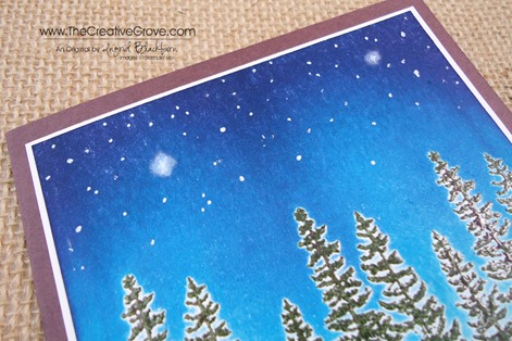
Starry Brayered Sky

Plant Hope 002 Main

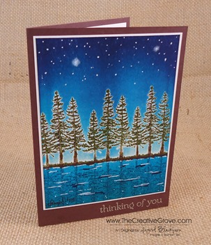
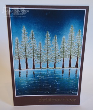
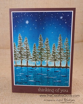
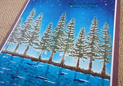
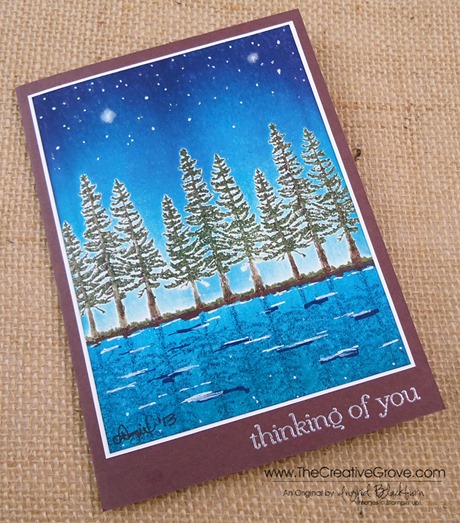
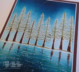
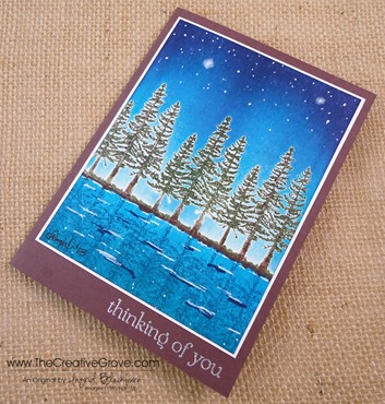
Have you ever had a card that you just wanted to re-do?  I made this card for my father for Christmas last year and I’ve been dying to re-do it for myself, but with a few changes.  I hope you like it’s evolution.

This card was originally my first creative scenery brayered creation after taking amazing classes on the art of brayering.  Since then, I’ve played…taught…played…taught…and played some more.  What I’ve learned is that your card is only as limited as your imagination, and with the help of pinterest and you tube – I’ve learned how to be quite imaginative!  

Plant Hope 002 Front

Creative Tips –

  • I wanted to change up the colors a bit and add a starry sky.  I kept my tree line in the center so that I could get enough sky and lake at the same time.
  • Once I added my tree images and embossed them in Always Artichoke and Chocolate Chip, I used a base of Soft Sky around the bottom of my trees.  I first masked off my lake shore line and added the light Soft Sky color.   My trees have better coverage this time around because I have the new ink pads.  Last year I was still using the canvas covered ones, not the awesome foam pads.  Notice the difference!Plant Hope 002 Trees
  • Then from the top I added Tempting Turquoise, Marina Mist and Midnight Muse.  I kept the Midnight Muse to the top 1 1/2 inches.
  • For that really dark night sky I added Elegant Eggplant.  Adding that over the blue gives just the right Indigo color for a night sky without making it too dark.Plant Hope 002 Side
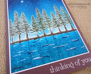
  • For the lake I brayered Tempting Turquoise, island Indigo and just a hint of Midnight Muse at the very edge.  You can see this is much lighter than my original.
  • I added a little earth with my Chocolate Chip marker so the shore line wasn’t too thin.  This time when I embossed my shoreline I masked the bottom so that my VersaMarker wasn’t too over zealous.  That way I avoided all the white from the first one.
  • Plant Hope 002 Water
  • I added the reflection of the tree line in Midnight Muse so that it would look realistic versus the color as in the first one.
  • I kept my water simple – not over done this time.  I also added a little Midnight Muse for shadows in the movement.  I drew a little at the water line as well, which gave it a more realistic look.  Plant Hope 002 Stars
  • For stars, I used my white gel pen and made them different diameters.  I wanted to create a north star and another not quite as large, so I went over it with a qtip and some white pigment ink.

I love the way the night sky turned out.  This card is a huge improvement over the original.  I still love both, but the night sky adds some mystery and intrigue that the original one didn’t have.  Of course the colors are a bit different too, but both are lovely!  Which one do you love?

Signature Snowflake 001

To Shop 24/7 in the Creative Store – Click here!

Plant Hope 002 Angle

Stamp Sets – Plant Hope (retired), Sweet Essentials (128315) Paper – Whisper White (100730), Chocolate Chip (102128) Ink – New Card – Soft Sky, Tempting Turquoise, Marina Mist, Midnight Muse, Elegant Eggplant, Always Artichoke, Chocolate Chip Marker; Original Card – Midnight Muse (126860), Marina Mist (126962), Not Quite Navy (126971), Tempting Turquoise (126952), Versamark (102283), Early Espresso Stampin’ Write Marker (119680) Cool Tools –Brayer (102395), Stamp-a-Majig (101049), Heat Tool (129053), The Perfect Finish – Clear Embossing Powder (109130), Gold Embossing Powder (109129), Silver Embossing Powder
Wetland Reeds and Sunshine

Wetlands 004 Main

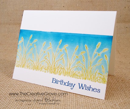
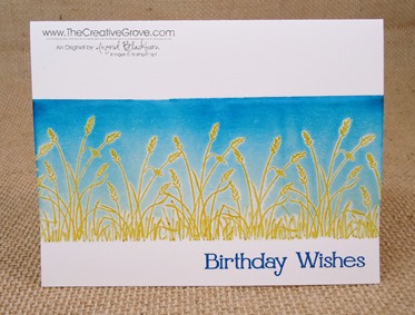
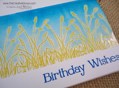
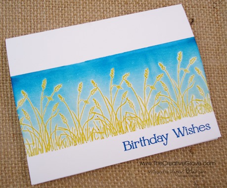
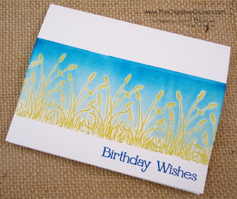
The sun shines 6.9 out of 7 days here in Florida – there’s  a reason it’s called sunny Florida.  So I wanted to do a sunny card that reflects the summer feel and what better than the reeds stamp from the Wetlands set.  When I decided to make this card I decided on a particular view – I thought what would a field of wheat look like if I was laying on the ground.  And here is the end result!Wetlands 004 Front

Creative Tips –

  • A one layer card would keep the simplicity of the scene in the forefront.  To create the white space, I masked off the top 1 1/4” and bottom 1” of my card.  I stamped my reed (wheat) in Versamark and then the Crushed Curry Classic Ink several times across my card.  Wetlands 004 CU
  • I embossed them with Clear Embossing Powder and used the Crushed Curry Stampin’ Write Marker and VersaMarker with Clear Embossing Powder to fill in the base of the image.
  • Soft Sky Classic Ink formed my base for the sky.  I used a brayer to apply a good base across from the top and base, and then again from the left and right.  Wetlands 004 Side
  • Using 1/2” on my brayer, I applied some Pacific Point to the top of my sky.
  • For a little more depth, I sponged a tiny bit of Midnight Muse at the very edge of the upper sky.
  • The greeting is stamped in Pacific Point using the new Four You set.

This card reminds me of the mid-west.  It just makes me happy and I see field of wheat and grass in the late summer.  I hope you like it too! 

Be sure to check back in the beginning of July for my online brayer classes and technique videos.  You won’t wan to miss these step by step how to videos that will help you to master this amazing and artistic technique. 


Signature-Snowflake-001_thumb1

To Shop 24/7 in the Creative Store – Click here!

Wetlands 004 Angle

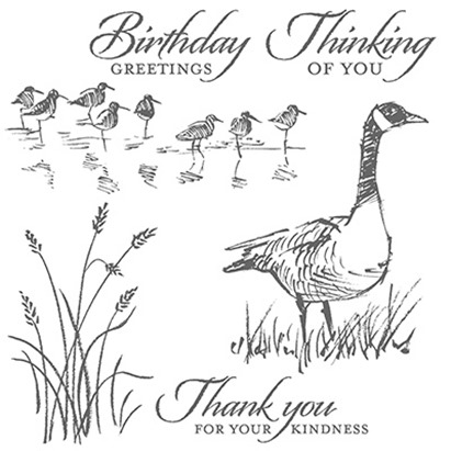
Stamp Sets – Wetlands (126697c, 126695w), Four You (130538c, 130535w) Ink – Soft Sky (131181), Pacific Point (126951), Crushed Curry (131173), Midnight Muse (126860), Crushed Curry Stampin’ Write Marker (131264), Versamark (102283) Paper –Whisper White (100730) Cool Tools – Brayer(102395),Stampin’ Sponges (101610), Clear Embossing Powder (109130)

Untitled-12Four You

Wetlands One Layer Card

Wetlands 003 009

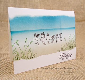
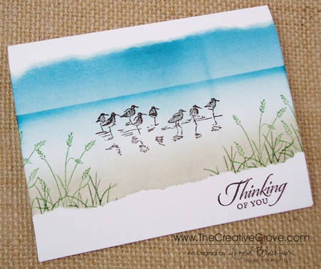
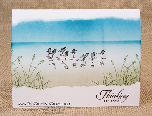
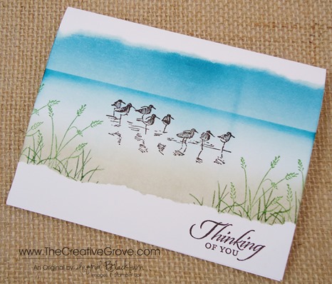
It’s been a while since I’ve made a One Layer Card and the Wetlands stamp set is the perfect set for this.  Here is a creative scenery that’s quick, easy, cost effective and just beautiful for anyone receiving this in the mail.  So get out your brayers and sponges today, and follow along with the tutorial.

Creative Tips –

  • I created a mask for the top and bottom using two sheets of printer paper.  I have to admit, my first try at this was foiled because I only used one sheet and the ink bled through to my project.  That’s one of those argh moments!Wetlands 003 Side
  • I brayered my sky and water with Soft Sky and then added a touch of Island Indigo at the top.  My Island Indigo got a little too strong about 1/2” in so I went over it with more Soft Sky to blend it out.  You can usually blend out mistakes with a little more ink in a lighter color.
  • I tossed my top mask (the blue one) and flipped my bottom mask around.  I sponged in my Sahara Sand in a circular motion to create my land.
  • For the horizon, I used a straight edge piece of printer paper and sponged on a little Island Indigo.Wetlands 003 CU
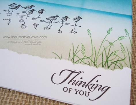
  • I stamped my birds in Early Espresso, any lighter color would not stand out enough.  I tried Basic Gray and even that wasn’t dark enough.  To test out my colors, I stamped my birds on my scrap brayered piece of printer paper that I tossed.
  • Keeping my bottom mask in place I stamped the reeds in Wild Wasabi.  I’ve tried this in lighter shades of green before and they too aren’t dark enough.
  • Brayer cards with scenery work great if you have a focal frame at the bottom of your card, as if you were standing right there looking out at your scene.Wetlands 003 Front
  • Once I had my reeds where I wanted them, I colored my reed stamp in using my Wild Wasabi marker, but only colored the grass portion.  I stamped this over my images to make them a bit fuller and bring my focal frame a little closer to the middle.
  • Normally I would use my white gel pen for some highlights, but I wanted to keep this card light and airy and uncomplicated – so I decided to leave it out.

I love this card – best part – it only cost 1/2 a sheet of Whisper White.  So if you’re stamping on a budget and have to make a lot of cards – next time try some one layer cards!

Learn how to master the techniques behind this card 

Two comprehensive classes leave you feeling like an artist ready to create any scene possible with brayers and sponges.  Detailed step by step video instruction, and much more.  Check it out in the classroom here: Find out more here

Signature-Snowflake-001_thumb1

Wetlands 003 Angle

Stamp Sets – Wetlands (126697c, 126695w) Ink – Soft Sky (131181), Island Indigo (126986), Sahara Sand (126976), Wild Wasabi (126959), Wild Wasabi Stampin’ Write Marker (131264) Paper –Whisper White (100730) Cool Tools – Brayer (102395),Stampin’ Sponges (101610)

Untitled-12