
Have you ever created an Ombre faux torn edge on a card before? This is a technique that I pull out of my toolbox over an over. Seriously…I have been teaching this technique for over 12 years! As a matter of fact – this project specifically. Do you ever have a project that just sticks with you? I’d love to know – tell me in the comments.
I love this project so much, that I finally broke down and created a video to share with you – just like I promised last week. There is a ton going on in this simple looking card – stippling, faux tearing, ombre, masking and embossing. Here – see for yourself!
So what did you think? Did you make it to the end with all the great close up photos? I love how when it all comes together it’s such a striking look. It’s funny, I remember the very first time I taught this technique live – it was at one of my class hostess’ home – Stephanie and we had about 16 people there. It was such a fun class. We actually made stationary, not a card with this technique – Edge on a 5 1/2 x 8 1/2 sheet with a matching envelope. So try it any way that you can think of.
Creative Tips –
- When I tear paper, I always tear towards me. Usually the piece I’m adding an edge to is on the left and I’m tearing around it with my right. That way I have all those amazing layers of paper on the piece I’m looking for. This project, however, you want to use the throw away piece – the right side as is. You do not want those great layers showing.

- When stippling, be sure to keep your brush moving in different spots. The key to a smooth transition – and one that is important for the Ombre look, is to not stay in the same general area. That way it flows.
- Work with colors that have the same tone – warm, cool, etc… That way they blend together.
- My first combination that I tried 12 years ago was a gorgeous one – Stampin’ Up! retired – Summer Sun, Really Rust, and the current Old Olive. That was a gorgeous combination.
- The WPlus9 stamp set Hand lettered Thanks is a great one to pair with this project. I love the scripty bold look.

Here is a deepened version of this card – it has a little Peeled Paint at the bottom and the Penny Black stencil – Oscillations in Orange as an added layer.

I’m entering this project into a few challenges this week – be sure to stop by their sites and check out the amazing talent at each!


- Just us Girls – Color Week #289
- Happy Little Stampers – April Stenciling Challenge
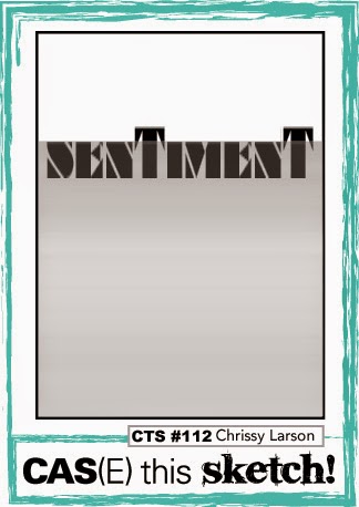
- Case this Sketch – Sketch #119
- CASology – Cue Card #143 – Ombre
I would love to know if you have a project that you duplicate over and over through the years – let me know in the comments below. I hope you enjoyed this project as much as I have. I can’t wait to see your Ombre Faux Torn Edge creations!
See you next time –

[optin_box style=”13″ width=”500″ alignment=”center” action=”https://www.aweber.com/scripts/addlead.pl” disable_name=”Y” method=”post” email_field=”email” email_default=”Enter your email address” integration_type=”aweber” double_optin=”Y” list=”3846012″ name_field=”name” name_default=”Enter your first name” name_required=”Y”][optin_box_field name=”headline”]If you enjoyed this tutorial…[/optin_box_field][optin_box_field name=”paragraph”]PHA+4oCmeW914oCZbGwgbG92ZSBvdXIgPGVtPjxzdHJvbmc+PHNwYW4gc3R5bGU9ImNvbG9yOiAjMjQ0YzVlOyI+ZnJlZTwvc3Bhbj4gPC9zdHJvbmc+PC9lbT5zdWJzY3JpYmVyIG9ubHkgdmlkZW8gc2VyaWVzLiDCoExlYXJuIG5ldyB0ZWNobmlxdWVzIHRocm91Z2ggb3VyIDxzcGFuIHN0eWxlPSJjb2xvcjogIzI0NGM1ZTsiPjxlbT48c3Ryb25nPmV4Y2x1c2l2ZTwvc3Ryb25nPjwvZW0+wqA8L3NwYW4+Q3JlYXRpdmUgVGlwcyBlLWxldHRlcsKgYW5kIHN1YnNjcmliZXIgb25seSB2aWRlbyBhbmQgcHJvamVjdCB0dXRvcmlhbHMhPC9wPgo=[/optin_box_field][optin_box_field name=”privacy”][/optin_box_field][optin_box_field name=”top_color”]undefined[/optin_box_field][optin_box_button type=”1″ text=”Send me exclusive tips!” text_size=”32″ text_color=”#000000″ text_bold=”Y” text_letter_spacing=”0″ text_shadow_panel=”Y” text_shadow_vertical=”1″ text_shadow_horizontal=”0″ text_shadow_color=”#f6fefb” text_shadow_blur=”0″ styling_width=”50″ styling_height=”19″ styling_border_color=”#000000″ styling_border_size=”1″ styling_border_radius=”6″ styling_border_opacity=”100″ styling_shine=”Y” styling_gradient_start_color=”#a3b640″ styling_gradient_end_color=”#80902c” drop_shadow_panel=”Y” drop_shadow_vertical=”1″ drop_shadow_horizontal=”0″ drop_shadow_blur=”1″ drop_shadow_spread=”0″ drop_shadow_color=”#000000″ drop_shadow_opacity=”50″ inset_shadow_panel=”Y” inset_shadow_vertical=”0″ inset_shadow_horizontal=”0″ inset_shadow_blur=”0″ inset_shadow_spread=”1″ inset_shadow_color=”#80902c” inset_shadow_opacity=”50″ location=”optin_box_style_13″ button_below=”Y”]Send me exclusive tips![/optin_box_button] [/optin_box]


")
")


