So what exactly is clean and simple card design – we’re going to explore just that…rooted in everyday life with a European Twist. In the past several weeks, I created several projects to share with you here on the blog, our member VIP Community and the free Creative Tips List – 12 Days of Christmas Newsletter before setting off for a three week tour of seven countries in the Mediterranean. We have been exploring various countries for a few weeks now, and today we are pulling into Naples, Italy. As we sail up the Amalfi coast, the rain is pelting the window early this morning. Thankfully, I don’t think it will last.
Rain or shine we venture out into each new city and country. So far I’ve been inspired by the gorgeous ancient architecture of Athens, Greece, the barren and desolate countryside of Albania, and the uber-densely populated rich textures of the island of Malta. In the coming days we will explore several ports in Italy, before venturing on to more countries and adventures.
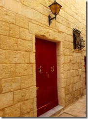
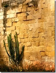
Europe has such beauty and charm, and one of the things I am definitely drawn to is it’s simplicity sometimes. Yes, there are the great works of art and architecture as in the Vatican City Sistine chapel and such beauty and grace all around, but the clean and simple look is what always captivates me. I love the contrasting colors and find myself photographing a single cactus among a gorgeous old wall, or a unique door mixed with the textures of it’s surrounding building – just like clean and simple projects.
The Core of Clean and Simple Design
A true Clean and Simple project, aka CAS, has I would say up to 70% white space with only one true focal point and minimal embellishments. It’s the empty space that allows you as the reader to focus on the beauty of the card.
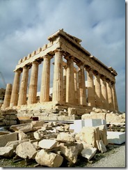
Here are a few examples to help illustrate my point. While the beauty of the Acropolis is amazing (pictured center below), because I truly love the clean and simple look, I am drawn more to the images on the right and left. There’s real beauty in these photographs – mostly from their simplicity. I took the CAS photos two days ago on the island of Malta. On the left in Mdina – the Silent City and on the right in Valetta – the capital. While the Parthenon (center) at the Acropolis is stunning, there’s a lot going on in this photo. The Ruins take over. I find the other two photos to be more interesting in texture and your eye is immediately drawn to the focal image – the door or Cactus.
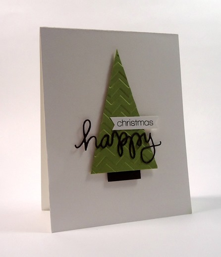
In paper crafting, clean and simple projects consist mostly of ‘white’ space with one focal point. This card definitely exemplifies that theory. Your focal point should be placed with the Rule of Thirds in mind. Break your area into a three section grid – horizontally and vertically – this gives you nine boxes (like a tic tac toe box). In a nutshell, your focal point should never just be in the center, rather it should cross one of the main lines sharing two squares. We’ll discuss that more in depth another day. This will create more interest or drama in your project rather than just placing it in the center. It makes it more appealing to the reader’s eye.
Look at all three photos above – the subject of each photo is never dead center with equal spacing – rather it crosses the thirds or two thirds – and in this, it gives the images interest, depth and character.
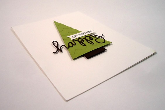
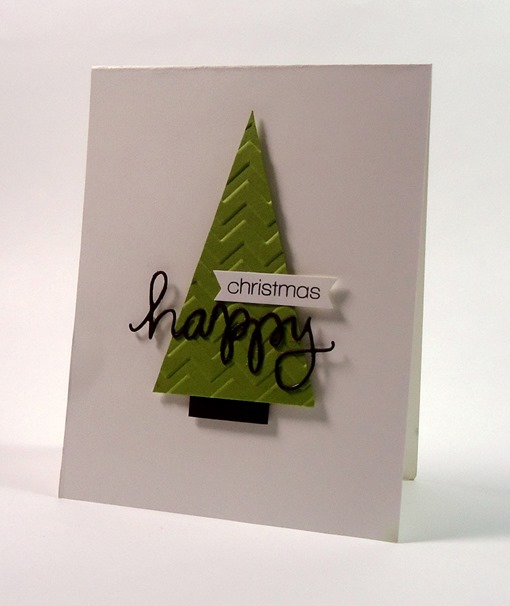
So let’s apply these rules to our project today. The beauty of the stark white mixed with the neutral colors and simple embossed tree draws me in. It also helps that the image, while in the center, crosses the top and middle rather than have equal spacing all around. It makes it more interesting. Take the tree itself as another example. The greeting is in the bottom third of the tree itself and extends to the right or left, never just directly in the center. Little details like this help pull a project together.
To make this card, first, you’ll want to cut your tree. Pick a center point on the top edge of a long rectangle and cut up from both opposite points. I used a paper trimmer, but scissors will work fine. I’d recommend longer scissors for a straighter edge over micro tip.
Once you have your tree, run it through your Big Shot with a fun embossing folder.
Add a small trunk using a coordinating brown color. I used Pear Pizazz for my tree and Early Espresso for my trunk. Cut a sentiment in Espresso as well – I used Happy by Simon Says Stamp for my steel die – Merry would also work here. Then stamp your greeting – I used Christmas from the coordinating Happy stamp set by Simon Says Stamp. Use a hexagon punch to create your banner ends and attach them both using liquid glue.
Pop your tree up for a slight shadow on your card and you’ll have a great subtle layer in a shadow. Overall, this card is super easy, quick and easily mass produced.
I love this card – simple always works for me. What do you do for your Christmas cards – Clean and Simple or ornate? Tell me in the comments below!
Thanks for stopping by for a little bit about Clean and Simple Card Design today – wait till you see what I have for you next!
![]()
[optin_box style=”14″ alignment=”center” action=”http://www.aweber.com/scripts/addlead.pl” disable_name=”Y” method=”post” email_field=”email” email_default=”Enter your email address” email_order=”1″ integration_type=”custom” double_optin=”Y” name_default=”Enter your first name”][optin_box_hidden][/optin_box_hidden][optin_box_code]
[/optin_box_code][optin_box_field name=”headline”]If you enjoyed this tutorial…[/optin_box_field][optin_box_field name=”paragraph”]PHA+PHNwYW4gc3R5bGU9ImNvbG9yOiAjNjQ2MzVlOyI+TGV04oCZcyBzdGF5IGluIHRvdWNoISBNeSBvY2Nhc2lvbmFswqA8L3NwYW4+PHNwYW4gc3R5bGU9ImNvbG9yOiAjNjY2Njk5OyI+PHN0cm9uZz48ZW0+ZXhjbHVzaXZlPC9lbT48L3N0cm9uZz7CoDwvc3Bhbj48c3BhbiBzdHlsZT0iY29sb3I6ICM2NDYzNWU7Ij5DcmVhdGl2ZSBUaXBzIGUtbGV0dGVyIHdpbGwgdGVhY2ggeW91IHRvIG1ha2UgcHJvamVjdHMgdGhhdCB5b3UgbG92ZeKApjwvc3Bhbj48L3A+Cg==[/optin_box_field][optin_box_field name=”privacy”][/optin_box_field][optin_box_field name=”top_color”]undefined[/optin_box_field][optin_box_button type=”0″ button_below=”Y”]Send me exclusive tips![/optin_box_button] [/optin_box]

Love! Perfect solution to an upcoming holiday card swap that I’ve been stressing over! Thanks for sharing!
I’m so glad! It’s a super fun card. Happy swap making. 🙂
Oh and I got so wrapped up in the pictures, I forgot to answer the question of the day. Mostly CAS is my way to go, sometimes I change it up just to be different, but really love the Clean and Simple best.
Me too. I love making intricate cards, but the CAS ones always stop me in my tracks saying – what an impact and so simple! I wish I made more intricate ones, but time is always a factor for me. 🙂
I so agree with you, love the red door best with the light above and the cactus pic with so much texture on the building, wowzer…great pictures. Your card is great, your eye is drawn in by the texture of the tree and the off center words, love it.
Thanks so much Carol! I love seeing all the textures in the world. I’m not a photographer, but learning! 🙂
I love this and I think you know my answer to your question. ; ) CAS all the way!
Me too my friend! 🙂