Merry Winter Wonderland

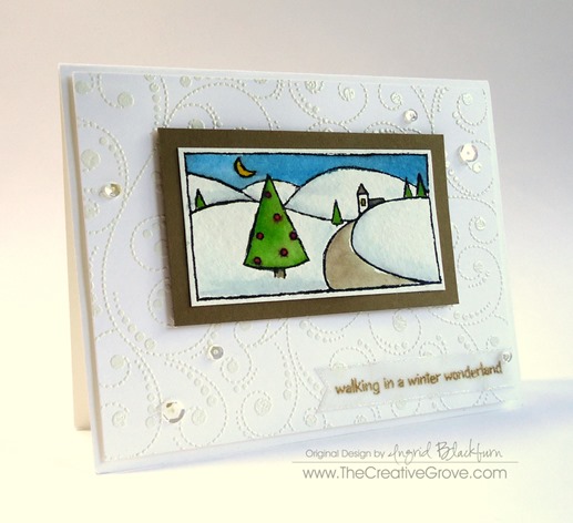
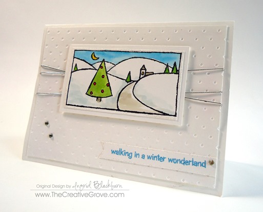
When I think of December I think Winter Wonderland.  With Christmas, trees, lights, snow and all the trimmings!  This card brings out the fun and wintery scene.  I hope you love it!  May you have a very Merry Christmas with your friends and family!

The top image has an embossed background using the Penny Black Fleur de Lys Background stamp – white on white and a watercolored White Christmas stamped image.  The sequins from Pretty Pink Posh give it a snowfall feel.

PB White Christmas 001

This image also is watercolored for the main stamped image from White Christmas, but has a glitter edge using Iridescent Ice Embossing Powder.  The background is just a dots embossing folder and the added silver cord gives it a holiday look.

PB White Christmas 002

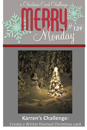
Both are for the Merry Monday Christmas Challenge.  Enjoy and have a very Merry Christmas!

139

Signature

For Creative Tips, be sure to add yourself to the Creative Tips E-Letter list to get exclusive videos and projects sent directly to you free!
Watercolor Wash Mojo Monday

DSC01411

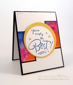
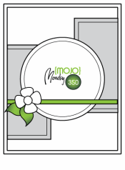
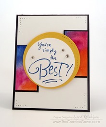
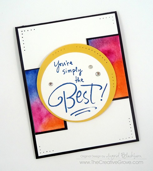
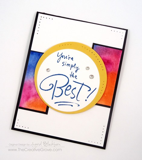
Do you sometimes just need a little pop of color in your life?  A watercolor wash is the perfect way to do just that!  Today is Monday and I have another Mojo Monday Challenge card for you.  I kept it simple and let the color be the star here without adding too much.  Here’s the original sketch and my interpretation:

                   Mojo350SketchDSC01413

If you just love the simple blend of color and want to learn various techniques to use watercolor in your cards, try our Watercolor Techniques that Wow class.

Watercolor Narrow 125

Creative Tips –

  • Choose colors that work with each other.  If you’re unsure of what to choose, get yourself a little color wheel like the one here.  The colors you see here are a Tetrad group – two sets of complimentary colors.  I knew the Magenta would blend into violet, so I chose that as a better blend then straight violet.
  • DSC01434

  • The colors used are Schminke Hordam Aquarell Yellow Lemon, Translucent Orange, Paris Blue and for the yellow – Stampin’ Up! Daffodil Yellow Cardstock.
  • The colors are the star, so the remainder of the card is kept really neutral – Basic Black and Whisper White. 
  • Stamp your greeting in a bold color like Pacific Point here.
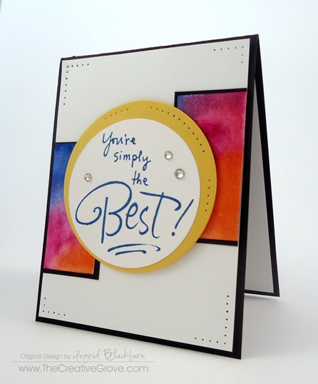
  • I don’t own a smaller set of circle framelits for that perfect border…yes, I know – what?!!  On my list (which is quite long, for some reason it keeps getting bumped…lol).

DSC01436DSC01435


  • For an accent – try something simple like paper piercing.  Keep it balanced.
  • Pop up various elements like your greeting and card front to give your project dimension.

DSC01412

    If you liked this card – check out some of our classes or our monthly technique community!  Thanks for visiting today – now get stamping!

    Signature

    Creative Techniques Banner 72

    Wetlands Seascape Watercolor Tutorial

    wetlands watercolor

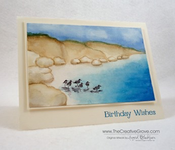
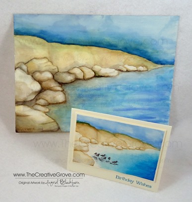
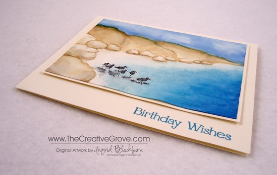
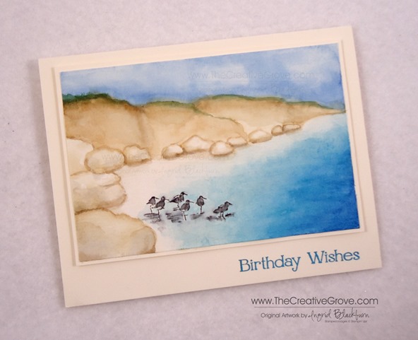
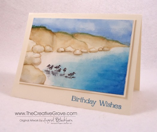
    I was feeling artistic last night and wanted to bring my watercolor experience this past few weeks full circle by combining my first ever landscape with one of my favorite Stampin’ Up! stamp sets – Wetlands.   Here are all the details to this journey plus several tips on supplies at the end that I like to use for this medium.  I know it’s long, but it’s quite in depth! Enjoy this tutorial.  For the complimentary article on tools and supplies click here.

    As you may have read a few weeks ago, I took a local art class in watercolor.  If you didn’t see my first ever landscape, it’s pictured below, but I’ve detailed the process here – you have to see what it started out as to appreciate the end result.  Check it out here.  I still can’t believe I turned my beginning mess into something beautiful that I’m actually quite proud of.  (that’s hard to do, I’m quite hard on myself with my own artwork)  Since my original had more mistakes than imaginable, I thought it might be fun to try it again, just in a smaller version that I could use stamps on as well to combine two artistic passions.

    watercolor wetlands tutorial

    I was undecided on size, so I took out the stamp I wanted to use – the sandpipers from Wetlands.  It’s a rather long stamp and to get the perspective right, I realized my card was going to have to be much larger than the traditional A2 size (5 1/2 x 4 1/4).  I held the stamp up to my grid paper and settled on a  4 x 6” size for my watercolor image with a final card of  5 1/4 x 6 3/4”.  Now that I have the Envelope Punch Board, I never worry about fitting my card to an envelope – I can just make whatever size I need!

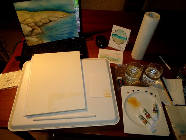
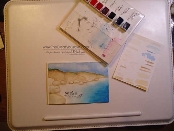
    I used my painting and other similar cards as inspiration.  I used my 100 pound rough watercolor block which is 9.4 x 12.6 inches.  I wanted to work with something that was secured and wouldn’t warp.  Of course, I wasn’t paying attention, and used the side which wasn’t glued – so that kind of worked against me in the end at the bottom – oh well!  I won’t make that mistake a second time…lol!  Here’s my workspace:

    DSC09982

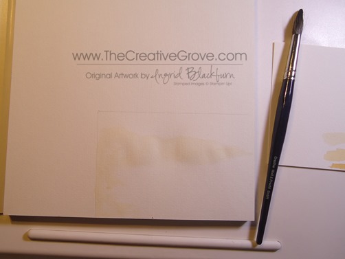
    Creating this seascape comes over several stages.  To begin, you don’t need to worry too much about being too precise, just throw down some yellow ochre wash (really light – really watered down) in the general area and let the painting form from there.  I used a size 14 brush.

    DSC09985

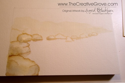
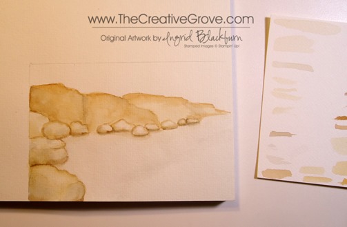
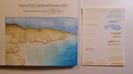
    Using Yellow Ochre in a variety of consistencies from water, milk and cream – create your rocks from the edge of your negative space.  To give them definition, decide where the light is coming from and start to shadow the rocks with a rather light wash of paynes grey or yellow ochre or a mixture of both with some burnt sienna in them.  Keep it on the light side and build up your color.

    DSC09986

    Add some more definition to the bottom of your rocks with a variety of consistencies of Burnt Umber and Paynes Grey as shadows under and between.  Use that also to define your cliffs and crevices.  Use your imagination or photos as inspiration for tone.

    I went rather light in my card because it was small, you see much more depth in the full watercolor painting of my original.  I used several images of water colored rocks that I found online as inspiration as I found rocks quite difficult to attempt.  But after a few, I got the hang of them.

    DSC09991

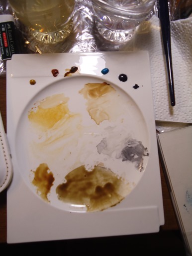
    Use a variety of washes and mixtures in a milk consistency of Yellow Ochre, Burnt Sienna, Burnt Umber and Payne’s Grey as you can see here.  TIP – Paint a quick swatch on a scrap piece of watercolor paper so that you know if you need to go heavier or more than likely – lighter with water.  This is a great habit to get into rather than practicing on your painting.

    DSC09989

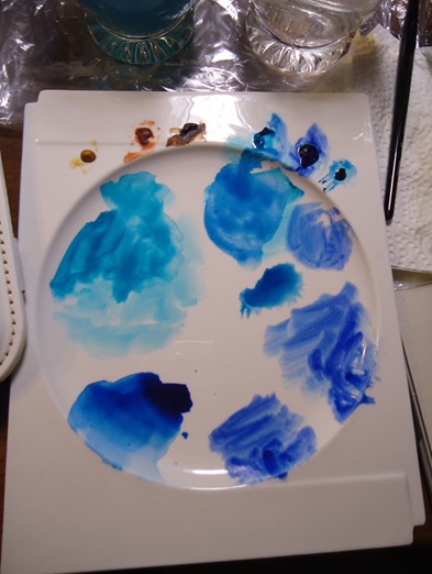
    Next I added the blues to create the sea and sky.  I used Cerulean, Ultramarine, Prussian and Paris Blues in addition to Paynes Grey to darken any up if needed.

    DSC09993

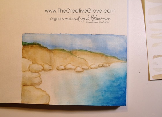
    I started with the water.  Begin with a very light wash of Paynes Grey – super light for the boundry of where you want your water to go.  Then layer a really light wash of Cerulean Blue over that.  Don’t worry if you get too much color on the beach part.  I went back and forth getting it just right.  While that area is wet, use a clean watercolor brush to push the color from the beach back into the sea.

    Add a light ultramarine/cerulean wash to the darker areas of the sea.  Once you have it the depth you want, let it dry.  Once dry, add some highlights in pure Ultramarine, but keep it minimal – just a highlight to show variety in your water depth and character.  I also added three small strands of a light watered down Prussian Blue after.

    DSC09994DSC09995

    Go over it with a clean wet watercolor brush to soften up and blend in the colors.  Play around with it, I guarantee you – you will mess it up, but while it’s wet, you can adjust it.  It’s quite forgiving, and that’s the beauty of water coloring!  Take note of the sea above and in this photo.  You can see how I blended it out a bit using a clean wet brush.

    DSC09997

    For the sky, start with a rather light wash of Paris Blue.  Choose a blue that is a bit more sky color rather than the bright sea colors.  They relate, but you can see the difference in hue between the two.  As it was still wet, I brought the intensity of the color closer to the cliff line.  I was a bit over-zealous and crossed over into my brown, but fixed that with a little Olive/Burnt Sienna mixture.  It added some color break and interest too – a happy accident.

    For the clouds, while the sky was wet, I took a clean wet brush and removed some of the blue by gently moving my brush around in spots.  It creates a nice natural look of billowy clouds.

    DSC00003

    If you make a mistake, don’t fret – go over that area first with a clean wet brush and work the color back to where you want it with a light scrubbing motion.  If that doesn’t work, just adapt!  TIP – Work in light color washes first, that way you can always bring the intensity up or adjust as needed.  It’s harder to take away – not impossible, but harder.

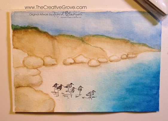
    To stamp, I removed my piece by cutting it off the block (for more on my watercolor block, read below).  I needed to use a stamp-a-majig, so I wanted to have a flat surface.  The birds were a bit long, so I left off the last two.  I inked the image up and wiped away the reflections and last two birds with a wet paper towel.  Position your transparent piece to exactly where you want it.  If you don’t have a stamp-a-majig, use a piece of transparency, or plastic to get a feel for where the birds need to be.  There’s nothing worse than spending all that time on a masterpiece only to mis-place your stamped image!

    DSC09996

    Once your scene is dry – I can’t stress that enough – do not attempt this with a wet scene.  A hairdryer will dull your colors, so air drying is the best option.  Clean up, work on your sky, something so that your sea dries.  Lightly go over your birds with a small watercolor brush (I used a size 1) in a very light Paynes Grey wash.  Be careful not to add too much water, you don’t want your image to run.  You can use Staz-On Permanent…I used Memento Tuxedo Black Dye Ink.  I have a good result with that black ink pad.  Be sure to let it dry after stamping.  I added a bit too much grey to the shadows in the water, try using a light cerulean wash instead.

    DSC00006DSC00009

    With your small watercolor brush, add a very light Cerulean wash around your stamped images to fill in the water where needed.  Be careful not to touch your birds if you’ve used Dye Ink!  This really finished my oncoming water on the shoreline and added just the right amount of color.  Remember with layers you can bring your scene to just the right color level.  You also create interest with under layers.  Just be careful not to wash away your underwork when doing this, a light touch is key.

    The birds give the scene a human interest.  It’s important to put something there – a house, boat, people, something.  It helps to balance the scene and make the reader connect with the painting.  TIP – Notice that I placed the birds in the forefront of the painting.  The stamp that I used was large in comparison to the scene, so it’s important to have the perspective just right.  That’s why the rocks are larger in the foreground and get smaller as the scene goes back.

    DSC00004

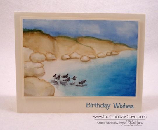
    To finish your project, matte your cut out painting onto Very Vanilla leaving a 1/8” border.  Pop that up on several stamping dimensionals (I used 12!) to really keep it elevated.  Matte onto another piece of Very Vanilla cardstock for the card base.  I used a greeting from the Four You stamp set by Stampin’ Up.  I inked that up first in Stampin’ Up!’s Island Indigo, stamped off then in Marvy Light Blue for just the right blue.

    Note – there is no white on my card at all. I think it’s best when your painting is completely painted!  My beach area has a super light wash of Yellow Ochre/Burnt Sienna and in spots Paynes Grey.

    DSC00001

    I have some great tips and DIY solutions for supplies and tools for getting started in a complementary article to this post here.  I hope you enjoyed this tutorial on this scene.  It’s super fun, is quite satisfying and I know the recipient of this card will love it, especially when they realize you pretty much created it yourself – Be sure to sign and date it!

    Signature Snowflake 001