Stacked Die Cuts – CAS Green Christmas Card

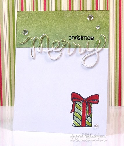
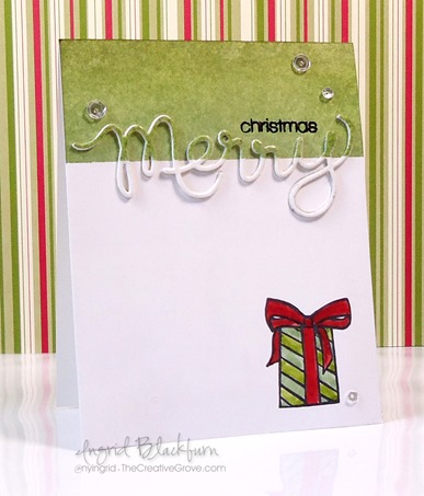
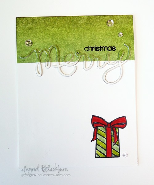
Stacked Die Cuts seem to be all the rage lately. If you haven’t tried this creative technique yet, I think you’ll be surprised at just how easy it is. Enjoy this quick tutorial into how this simple card was created!

Stacked Die Cuts 001

Stacked Die Cuts Card

  • You will first want to create your blended background on the top fourth of the card.  To see a step by step video tutorial on how to create a perfectly blended background, click here.
  • Mask off the bottom 3/4 of your card with post it notes. Use the following Distress inks in order when blending from the bottom up – Bundled Sage, Peeled Paint and Forest Moss.
  • Die cut the word Merry from your project, being sure to keep all the little pieces (Y, M – 2, E, R).  I keep these stuck to a piece of washi or painters tape so they don’t go missing.
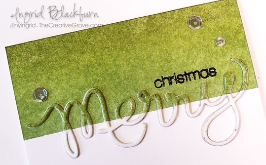
  • Emboss the word Christmas in Black up above your Negative Die Cut word in the green area. Tip – be sure that area is totally dry – definitely use a de-static tool like an embossing buddy.

Stacked Die Cuts 003

  • Lay your Green/White cut out word Merry on a piece of painters tape or masking tape. Smoosh a versamark pad over your word and emboss in clear to give a shine. Once cool, remove with tweezers and set aside.
  • Stamp your gift in the bottom right corner using Memento Tuxedo Black ink. I use this ink because I’m going to watercolor with distress inks and it doesn’t bleed and gives a crisp image.
  • Watercolor your image using Bundled Sage, Peeled Paint and Fire Brick with an Aqua Painter.  Tip – be sure your paint brush isn’t too wet, as this is regular card stock. If you use too much water, you’ll get little white dots or lines from your paper.
  • Die Cut four more words in white.
  • To create your Die Cut stack, glue all five die cuts to each other with your Blended Piece on top.

Stacked Die Cuts 004Stacked Die Cuts 006

  • Add adhesive to a piece of Copy Paper that is wider than your negative cut out, adhere so that the sticky side faces the front.
  • Add your die cut and the cut out pieces to the sticky paper exposed in the negative die cut image. And there’s your stacked die cut!
  • Attach your card front to your card base and add a little Forest Moss to the top at the fold so there is no white exposed.
  • Add sparkling clear sequins from Pretty Pink Posh if you desire using Tombow Mono Liquid Glue.

Stacked Die Cuts 002

I designed this card with three challenges in mind today – Merry Monday – Gifts and Addicted to CAS – Green and Happy Little Stampers – Sponged.

CAS_Mar2015 150ATCAS - code word green

If you liked this tutorial on Stacked Die Cuts, be sure to get our exclusive video tutorial series by being on the Creative Tips E-letter list, sign up at the bottom!

Signature

[optin_box style=”14″ alignment=”center” disable_name=”Y” email_field=”email” email_default=”Enter your email address” email_order=”1″ integration_type=”aweber” double_optin=”Y” list=”2841626″ name_field=”name” name_default=”Enter your first name” name_required=”Y”][optin_box_field name=”headline”]If you enjoyed this tutorial…[/optin_box_field][optin_box_field name=”paragraph”]PHA+Li4ueW914oCZbGwgbG92ZSBvdXIgPHNwYW4gc3R5bGU9ImNvbG9yOiAjMjQ0YzVlOyI+PGVtPjxzdHJvbmc+ZnJlZSA8L3N0cm9uZz48L2VtPjwvc3Bhbj5zdWJzY3JpYmVyIG9ubHkgdmlkZW8gc2VyaWVzISDCoEdldCB0aGXCoDxzcGFuIHN0eWxlPSJjb2xvcjogIzI0NGM1ZTsiPjxlbT48c3Ryb25nPmV4Y2x1c2l2ZTwvc3Ryb25nPjwvZW0+PC9zcGFuPsKgQ3JlYXRpdmUgVGlwcyBlLWxldHRlciB3aGljaCB3aWxsIHRlYWNoIHlvdSBuZXcgdGVjaG5pcXVlcyB0byBhZGQgdG8geW91ciBzdGFtcGluZyBza2lsbCBzZXQuIMKgTGVhcm4gaG93IHRvIG1ha2UgcHJvamVjdHMgeW91J2xswqBsb3ZlITwvcD4K[/optin_box_field][optin_box_field name=”privacy”][/optin_box_field][optin_box_field name=”top_color”]undefined[/optin_box_field][optin_box_button type=”1″ text=”Send me exclusive tips!” text_size=”26″ text_color=”#000000″ text_bold=”Y” text_letter_spacing=”-1″ text_shadow_panel=”Y” text_shadow_vertical=”1″ text_shadow_horizontal=”0″ text_shadow_color=”#a3b640″ text_shadow_blur=”0″ styling_width=”100″ styling_height=”10″ styling_border_color=”#000000″ styling_border_size=”1″ styling_border_radius=”6″ styling_border_opacity=”100″ styling_shine=”Y” styling_gradient_start_color=”#a3b640″ styling_gradient_end_color=”#5b661e” drop_shadow_panel=”Y” drop_shadow_vertical=”1″ drop_shadow_horizontal=”0″ drop_shadow_blur=”1″ drop_shadow_spread=”0″ drop_shadow_color=”#000000″ drop_shadow_opacity=”50″ inset_shadow_panel=”Y” inset_shadow_vertical=”0″ inset_shadow_horizontal=”0″ inset_shadow_blur=”0″ inset_shadow_spread=”1″ inset_shadow_color=”#a3b640″ inset_shadow_opacity=”50″ location=”optin_box_style_14″ button_below=”Y”]Send me exclusive tips![/optin_box_button] [/optin_box]
CAS Watercolor Stamped Thanks

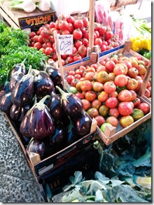
As our three week vacation in the Mediterranean comes to an end, we spend our final day today in Rome…sigh.  I’ll miss the Cioccolato Gelato, Margarita Pizza Neapolitan, Espresso and more historical sights than I can possibly store away in my mind.  What I won’t miss is are the crowds or the street hawkers…lol! To catch a glimpse into some of my favorite sights, be sure to see the end!

20141122_140909

With all this historical overload, today I need a little clean and simple!  Have you tried watercolor stamping yet?  If not, what are you waiting for!?! Today’s project is actually a product of  using what’s left over from my main project.  Always a great thing.

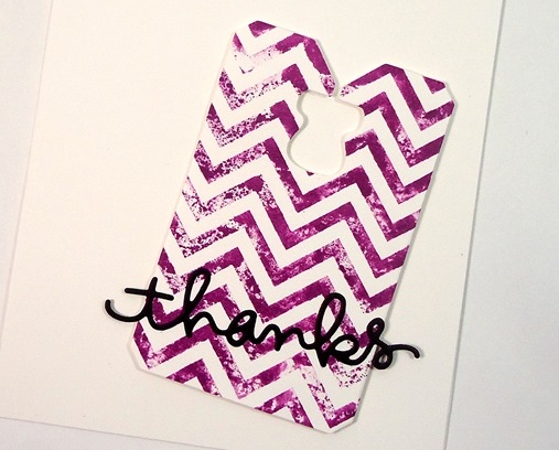
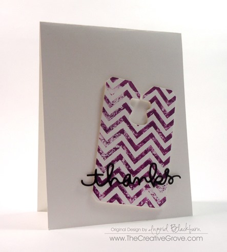
Recently I shared an awesome Watercolor Stamped Birthday Butterfly card for the VIP Community and figured, I already had the ink on my stamp, why not keep going with a scrap?  When I cut tags with my Chalk Talk Framelits by Stampin’ Up, I always cut two or three at a time and keep them in a scrap bin on my desk.  This tag is definitely one of my favs.

CAS Watercolor Stamped Tag CUp

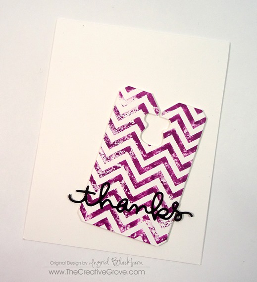
I had inked up my Chevron background stamp with Seedless Preserves Distress Ink, gave a couple spritzes with my mini mister, and then with the left over ink after my main project, threw a tag cut from Stampin Up’s Whisper White card stock on there and what you see is what was left.  Don’t you just love the grunge part of how the tag turned out?  I couldn’t do that if I intentionally tried…lol.  It was a complete product of second generation stamping.

Watercolor Stamped Tag 001

I popped it up on an angle, added a die cut thanks using my Simon Says Stamp Thanks steel die and there you have it – a card in literally minutes!  Leaving all the white gives it such a great clean and simple look – for more on that check out this article on Clean and Simple Defined.

Watercolor Stamped Tag 004

Have you tried watercolor stamping yet?  Show your projects on our Facebook page here, or tell me what inks you’ve tried it with in the comments below!  And definitely tell me what you think of all those street hawkers in places like, Athens, Rome or Paris!  I know I’m not alone…lol!  Here are a few of my favorite photos from these past few weeks…

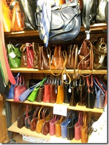
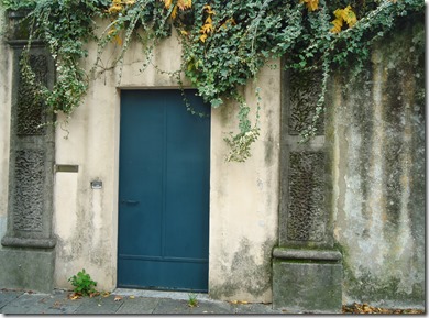
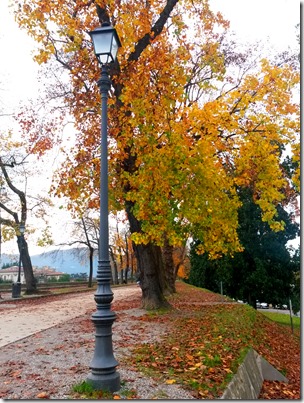
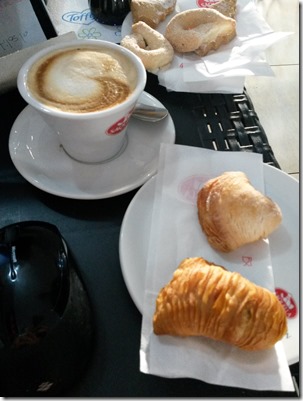
ETP Planners20141106_133333Sicila Market 001PursesLucca DoorwayPisa and CathedralTower of PisaLucca City WallCapuccinoSaranay Lunch SpotTuolon Market 001Naples Pizza 001Rome ForumRome ForumColosseumRome PantheonNaples Marketplace 001

Ciao for now –

Signature

Of course, if you’d like to see more or follow us along our Travel adventures, be sure to click right here to see and like our Travel Facebook page

Clean and Simple Birthday Card for LeAnne

Clean and Simple Flower Birthday Card (2)

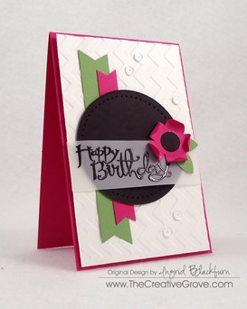
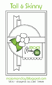
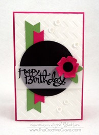
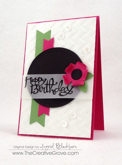
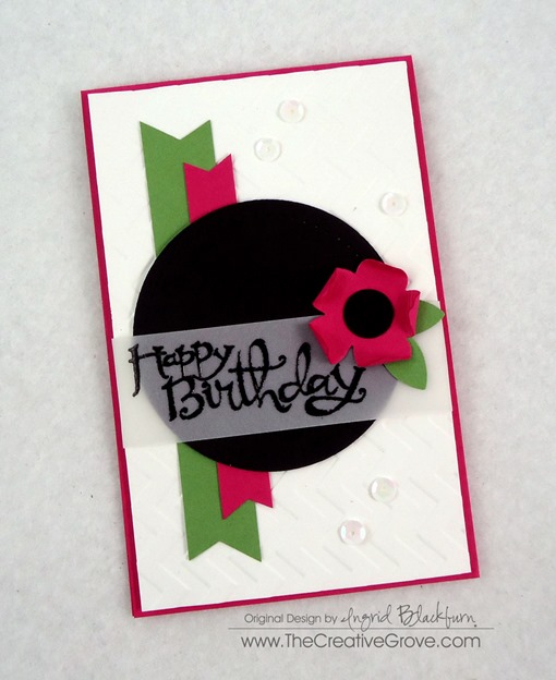
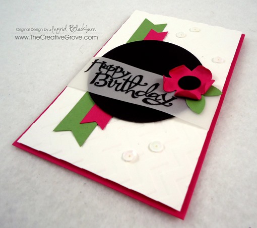
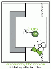
I decided to combine my Monday challenges today and when I saw the Merry Monday challenge today was a Birthday Hop – I was SO excited!  Of course, I went to Mojo Monday first thing at 5 AM East Coast Time…and fell in love with the sketch right away – I mean how could you not – the possibilities were endless!  I was already thinking up all sorts of Christmas ideas…then quickly switched gears and made a fun bright CAS birthday card instead!

Surprise Hop Graphic for LeAnnemojo356Clean and Simple Flower Birthday Card (4)

I love LeAnne Pugliese’s cards every time I see them on the Merry Monday Christmas Challenge Blog, so I decided she needed a Birthday card that was fun, sassy, and colorful with no less than my latest little addiction – sequins (thanks Deanne – I have you to blame for these).

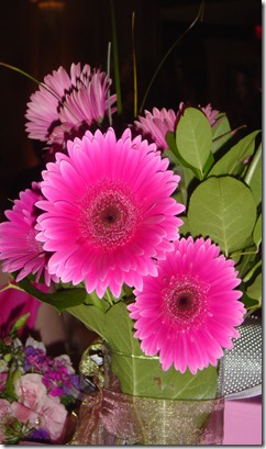
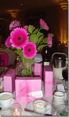
I knew I wanted to use the Sassy Salutations birthday greeting and my mind immediately went to the bright pink Gerber Daisy.  My sister-in-law Claudia had these at her wedding and I couldn’t stop taking photos of them, they were so editorial!

Claudias Wedding 015Claudias Wedding 016

Now I know the middles are mostly yellow, but I left it black so that I didn’t bring another color in.  It’s a fun little card, don’t you think?  My favorite parts – the flower, belly band and of course, I’m a convert – the sequins!  So LeAnne – this card is for you!  I hope you have a FABULOUS birthday!

Clean and Simple Flower Birthday Card (3)Clean and Simple Flower Birthday Card (1)Clean and Simple Flower Birthday Card (5)Clean and Simple Flower Birthday Card (8)

Hope you liked that!  If you’re a TCG VIP Member – you’ll see a video of this project in the Project and Resource Video library. Smile

Have a great start to the week!

Signature

Mojo Monday Garden Flowers

Mojo Monday Flowers

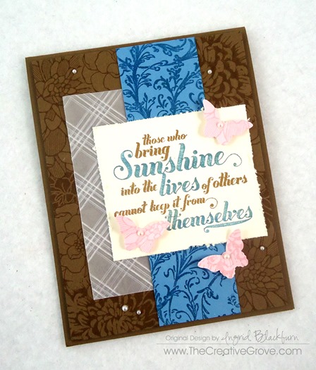
It’s the middle of summer and all the flowers here are in bloom.  I thought I’d bring you a floral card with non-traditional colors today for Mojo Monday. Smile

Today’s sketch had me immediately reach for all my floral stamps.  Did you happen to see my card last week with the amazing floral garden?  If not, check it out here.  But first see all the creative tips listed below.

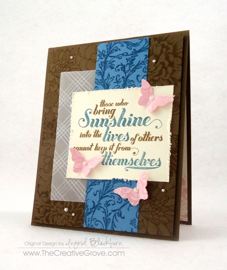
Here is today’s Mojo Monday sketch from the Challenge Blog and my interpretation:

mojo353DSC01940

As you can see, I strayed a tiny bit and excluded the scallop border.  I planned on including it, but didn’t want to take away any further from the pretty flower background I created.

Creative Tips –

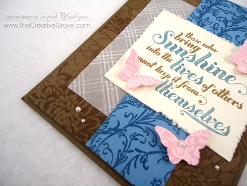
  • Mask various flower stamps that you have to create your own background.  Alternate open images with tighter ones for a filled out look.
  • Don’t feel you need to stick to traditional flower colors.  Here you see Baked Brown Sugar.

DSC01941

  • I kept playing with which colors to put in the background, and finally decided on adding a little texture to Vellum as a subtle piece.  To create this cross-hatch pattern, alternate a striped embossing folder to make the x’s.
  • Do you have stamps that are tucked way in the back and forgotten about?  My filigree background stamp seems to be one of those.  I wanted something with a romantic feel, so I embossed the pattern on a piece of Marina Mist card stock in versamark and clear embossing powder.  It compliments the flowers, yet stands on its own.

DSC01948

  • The greetings from this set are cool.  I love the boldness of chosen words and chose to highlight them.  I didn’t have a baked brown sugar marker, so I inked up the entire image with an ink pad and removed the ink from where I needed with a blender pen.  I then colored those words in with a marker that I did have.

DSC01943DSC01949DSC01947

  • I’m sure you’ve noticed that I rarely use just plain butterflies.  Here you see several stamped with floral images and then punched out.  It gives a little character to the wings and looks pretty cool!
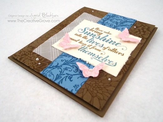
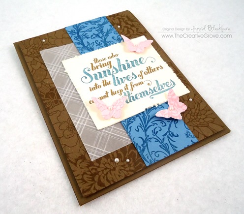
  • For a finishing touch, distress your edge of the greeting, add some pearls and pop up your card front.

Mojo Monday Flowers

This clean and simple project completely works for me.  It’s loaded with various techniques, and works – even with non-traditional garden floral colors!

Signature


[optin_box style=”13″ alignment=”center” action=”http://www.aweber.com/scripts/addlead.pl” disable_name=”Y” method=”post” email_field=”email” email_default=”Enter your email address” integration_type=”custom” double_optin=”Y” name_default=”Enter your first name”][optin_box_hidden][/optin_box_hidden][optin_box_code]


IF YOU ENJOYED THIS POST
Let’s stay in touch! My occasional Creative Tips will teach you to make projects that you love…

[/optin_box_code][optin_box_field name=”headline”]If you enjoyed this tutorial…[/optin_box_field][optin_box_field name=”paragraph”]PHA+PHNwYW4gc3R5bGU9ImNvbG9yOiAjNjQ2MzVlOyI+TGV04oCZcyBzdGF5IGluIHRvdWNoISBNeSBvY2Nhc2lvbmFswqA8L3NwYW4+PHNwYW4gc3R5bGU9ImNvbG9yOiAjNjY2Njk5OyI+PHN0cm9uZz48ZW0+ZXhjbHVzaXZlPC9lbT48L3N0cm9uZz7CoDwvc3Bhbj48c3BhbiBzdHlsZT0iY29sb3I6ICM2NDYzNWU7Ij5DcmVhdGl2ZSBUaXBzIGUtbGV0dGVyIHdpbGwgdGVhY2ggeW91IHRvIG1ha2UgcHJvamVjdHMgdGhhdCB5b3UgbG92ZeKApjwvc3Bhbj48L3A+Cg==[/optin_box_field][optin_box_field name=”privacy”][/optin_box_field][optin_box_field name=”top_color”]undefined[/optin_box_field][optin_box_button type=”0″ button_below=”Y”]Send me exclusive tips![/optin_box_button] [/optin_box]
1+2=3 Stamp Series #001: part 3

So what did you think so far?  We’ve had some great feedback from this series!  I hope you’ve enjoyed the simplicity of it.  And if you were on the Creative Tips list, then you saw the bonus 4th project too!  Don’t fret – get on the list by tomorrow (6/21/14) and I’ll send it out to you.  For the bonus project I broke from the rules a bit set forth from the challenge, but figured since it was a bonus it was okay!  Smile

So, just to review, here are the rules for this challenge:

1 Stamp – For this series I thought I’d choose a stamp set that has been available for over 20 years and is still on the market…the ever popular Stampin’ Up! set Lovely as A Tree.  This works with any large tree stamp.  Since there aren’t any greeting stamps in this set, I used one from the retired set Perfect Words.

+ 2 Colors – Two colors were used in all three projects: Sahara Sand and Soft Suede by Stampin Up.  For the cardstock in later projects, I only used Soft Suede along with Whisper White. =

= 3 Projects – while a few are a bit similar, they are vastly different.  Enjoy!

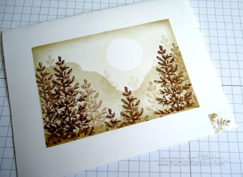
If you remember from yesterday’s post, I messed up my first and second try at this project.  Rather than let that get me down, I turned them into two totally different looks!  And a series was born.  Okay, corny enough for you – Michael is rolling his eyes…lol!  Here is my messed up version of this project – it was intended as a one layer card, but instead I turned it into the beauty you see further below.  Here is my original card – miss-masked (note the lower right corner).

DSC01406

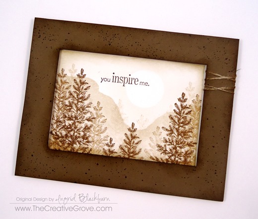
And here is the final result:

DSC01421

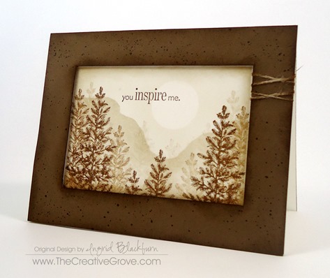
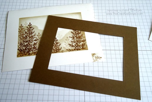
To make this card – I used the exact one layer card as a base, and added a popped up frame.  Here are a few tricks to make this seem flawless and intended.

  • The cut out frame is just slightly smaller than the original masked off window.  The original window was 3/4”, my cut out frame measures 1/16” larger – that’s the width of the frame (13/16ths) , producing a smaller visible area.  This will help to hide the white area that was masked off originally.

DSC01408

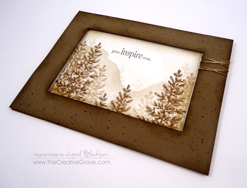
  • Add some interest to the frame.  Here you see random spritzed dots in Soft Suede using a color spritzer and a marker.  To keep with the outdoor theme, sponge both the interior and exterior of your frame.
  • Add some criss-crossed thread to one side.

DSC01442

  • Sponge the complete exterior of your one layer card first before adding the frame.  Use the same color of your frame.  This way, should your frame be slightly off, if the white shows, it blends flawlessly with your frame.  Can you see the entire top of my card?  It shows as my frame was slightly smaller.

DSC01443DSC01444

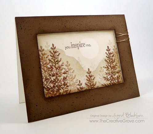
  • Finally, pop the entire frame up using foam tape or dimensionals.  Keep your tape and dimensionals closer to the inside of the frame giving it more of a shadowbox look.

To learn how I sponged, masked and created this card, check out the first and second cards in this series here:

Project One                               Project Two

DSC01420

I hope you enjoyed this series!  Thanks for joining me and be sure to stop by tomorrow for another project with this stamp set… why, just because!!  It’s completely different and used a totally different color combination, but turned out fabulous!  Just thought I’d keep the theme going this week.

Have a creative day and see you around the grove!

Signature-Blog

[optin_box style=”14″ alignment=”center” action=”http://www.aweber.com/scripts/addlead.pl” disable_name=”Y” method=”post” email_field=”email” email_default=”Enter your email address” email_order=”1″ integration_type=”custom” double_optin=”Y” name_default=”Enter your first name”][optin_box_hidden][/optin_box_hidden][optin_box_code]

[/optin_box_code][optin_box_field name=”headline”]If you enjoyed this tutorial…[/optin_box_field][optin_box_field name=”paragraph”]PHA+PHNwYW4gc3R5bGU9ImNvbG9yOiAjNjQ2MzVlOyI+TGV04oCZcyBzdGF5IGluIHRvdWNoISBNeSBvY2Nhc2lvbmFswqA8L3NwYW4+PHNwYW4gc3R5bGU9ImNvbG9yOiAjNjY2Njk5OyI+PHN0cm9uZz48ZW0+ZXhjbHVzaXZlPC9lbT48L3N0cm9uZz7CoDwvc3Bhbj48c3BhbiBzdHlsZT0iY29sb3I6ICM2NDYzNWU7Ij5DcmVhdGl2ZSBUaXBzIGUtbGV0dGVyIHdpbGwgdGVhY2ggeW91IHRvIG1ha2UgcHJvamVjdHMgdGhhdCB5b3UgbG92ZeKApjwvc3Bhbj48L3A+Cg==[/optin_box_field][optin_box_field name=”privacy”][/optin_box_field][optin_box_field name=”top_color”]undefined[/optin_box_field][optin_box_button type=”0″ button_below=”Y”]Send me exclusive tips![/optin_box_button] [/optin_box]


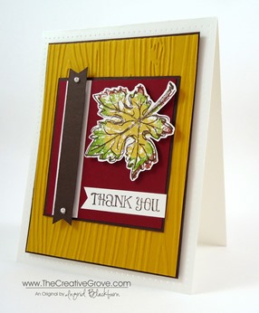
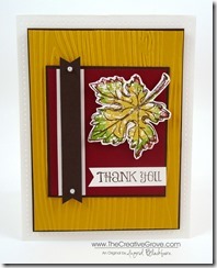
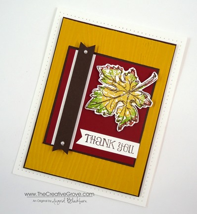
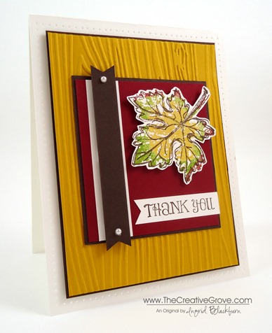
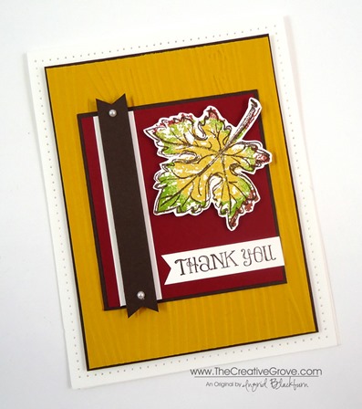
Mojo Monday Gently Falling Thanks

Gently Falling 001 004

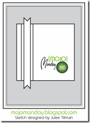
Do you ever just need a go to sketch?  Well this week’s Mojo Monday sketch is perfect for you then!  It’s simple, straightforward and would look awesome with Designer Series Paper or just card stock.  You really can’t go wrong. 

Try out some bright color combinations, play with your favorite stamp sets, or just make it all one color.  Either way, you’ll have a striking card that you and the recipient will love.  Here’s the sketch and my interpretation:

                        Gently Falling 001 006Mojo310Sketch

Creative Tips –

  • If you decide to focus on the Gently Falling stamp set like I did, you may want to keep your color palate in the season.  This is great for men or women, which is great – don’t you just love versatile cards?
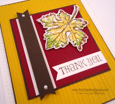
  • To give the real sense of fall, rock and roll the filler image of this two step stamp set.  That way you can get that change of color look you’re striving for.  Here you see Crushed Curry, Gumball Green and Cherry Cobbler with Early Espresso as the lined image.Gently Falling 001 010
  • Follow that up with a fun embossing folder and your big shot for the background – here you see Woodgrain.  Why not – it’s a tree!
  • The Pearl Basic Jewels complete the card with the perfect finishing touch to highlight the banner.
  • Rather than keep it to Thanksgiving, you can choose any sentiment you’d like!  Here you see the Thank You from Lots of Thanks. Gently Falling 001 008
  • Tip – to make quick and simple banner flags, use punches – like the Hexagon Punch or Square Punches.  To see a quick video on how to do this, click here.
  • The card front is popped up on Stamping Dimensionals to compliment the banner and leaf popped up as well.Gently Falling 001 009
  • To extend the matte and give it a little somethin’ somethin’, add some paper piercing!  You can quickly take a project from cute, to wow by just adding some piercing.  And you’ve heard me say it before – it’s the most inexpensive way to embellish a card.  All you need is a one time purchase – Stampin’ Pierce Mat, Paper Piercing Tool, and templates like the Essentials Paper-Piercing Pack.Gently Falling 001 005

Are you one of my VIP’s?

If you love this card and creative tips, then be sure to sign up for my Creative Tips list!  You’ll get VIP project videos and projects, special list only sales and discounts, and stay on top of all the cool and great things not only available at Stampin’ Up!, but also here at The Creative Grove. Be in the know, first on the list!  I don’t like excess email or stuff I don’t want, so know that your email address is something sacred to me.  I would never abuse that trust!  Click here if You love creative tips and want to be one of my VIP’s!   Smile

    Signature Snowflake 001

To Shop 24/7 in the Creative Store – Click here!

    Gently Falling 001 007

How to use your Background Stamps

Really Good Greetings 003 002

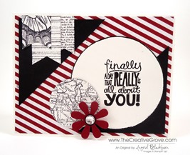
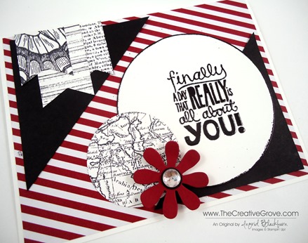
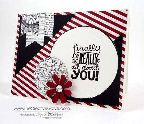
It’s Mojo Monday again and today I wanted to show you how to use all those Background stamps and papers that you have.  I love background stamps – they are super hard for me to part with when I have a sale, and I use them over and over – you should take a look at your stash too!

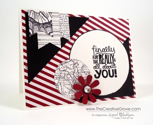
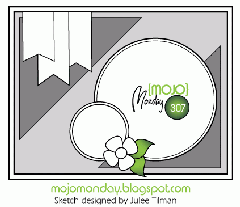
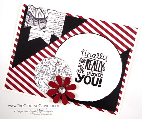
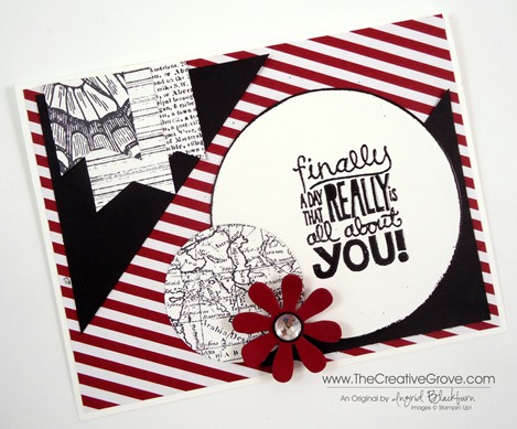
Today’s card is perfect for backgrounds.  With this design, I show you how I used four different sets plus some of my Christmas Paper from Season of Style in a birthday card.  Here is this week’s sketch and my result.

          Mojo307Sketch Really Good Greetings 003 004

Creative Tips –

  • Rather than use the Season of Style Designer Paper Stack paper as the accent triangles, you can go for a much bolder statement with it as the background.
  • You do not want to compete with the bold stripes, so when you choose your background patterns, you will want to stay away from bold lined patterns or Chevrons.  I chose some completely different designs plus one lightly lined (striped) pattern.  Really Good Greetings 003 006
  • The stripes from the Gorgeous Grunge stamp work because it has a varying amount of white space in-between the lines and they are thin lines, not bold like the Designer Paper.
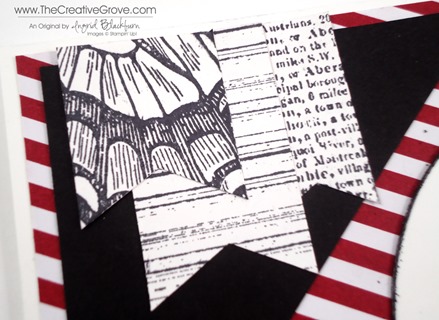
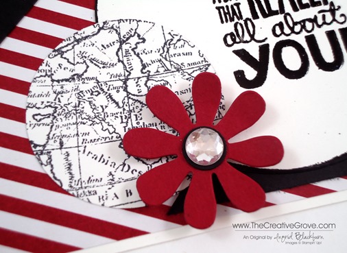
  • The backgrounds you see here are Dictionary, Gorgeous Grunge, World Map and Swallowtail – yes, that’s part of the butterfly wing!  I love patterned images like that – other good ones are the flowers from Regarding Dahlias and Blooming with Kindness.Really Good Greetings 003 008
  • The greeting is from the must have greeting set of this year – Really Good Greetings.  To help it to stand out from all the patterns and busy goings on of the card, you will want to emboss it and leave it alone on that big circle (Circle #7, counting from smallest to largest in the Circles Collection Framelits) with the large amount of white space.  The contrast the extra white space brings to the card lets it shine.  After all – the greeting says it all – and it wouldn’t work if it got hidden by all the competing elements.Really Good Greetings 003 007
  • To help the circle stand out a bit more, you can edge it with your versamark ink pad and embossed it in black as well.
  • The flower is from the BigZ die – Blossom Party Originals.  You can add a center by itself – like the black center here, which was punched with the circle punch from the Itty Bitty Shapes Punch Pack, or top it off like I did with the Large Rhinestone Jewel.  Really Good Greetings 003 009
  • To give the flower a little depth, pop it up with a Stampin’ Dimensional.
  • To make the banner ends, you can use the new Hexagon Punch or make your own with paper snips or a Square Punch.  View my Banner video hereReally Good Greetings 003 003

The sketch this week is a classic that you can use over and over again. 

New Class Release – Final 36 hours for the Pre-release Discount!

Festive Flurry Class Banner

Each month, we are going to highlight a stamp set with four four creative cards that will wow your friends and family.  This month we are highlighting the Festive Flurry Bundle.  Pre-register today and save 10% through midnight, Tuesday August 20th!  Get all the Details Here

Signature Snowflake 001

Really Good Greetings 003 005

To Shop 24/7 in the Creative Store – Click here!

Stamp Sets – Really Good Greetings (130333c, 130330w), Swallowtail (129216c, 131943w), Gorgeous Grunge (130517c, 130514w), Dictionary (130351c, 130348w), World Map (130345c, 130342w) Paper – Whisper White, Crumb Cake, Season of Style Designer Series Paper Stack, Basic Black, Cherry Cobbler Ink – Versamark, Basic Black Cool Tools – Circles Collection Framelits, 1 3/4” Circle Punch, Blossom Party Originals BigZ, Hexagon Punch, Itty Bitty Punch Pack The Perfect Finish – Stampin’ Dimensionals, Large Rhinestone Basic Jewels

DictionarySwallowtail Stamp 129216LWorld Map StampGorgeous GrungeReally Good Greetings

Santa’s List

Santas List 001 Main R

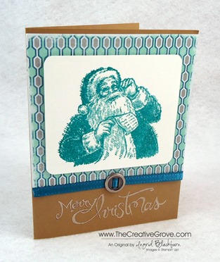
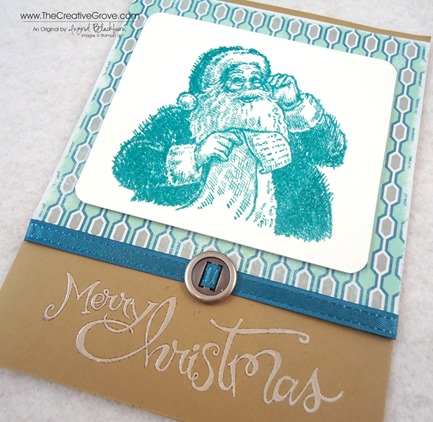
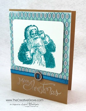
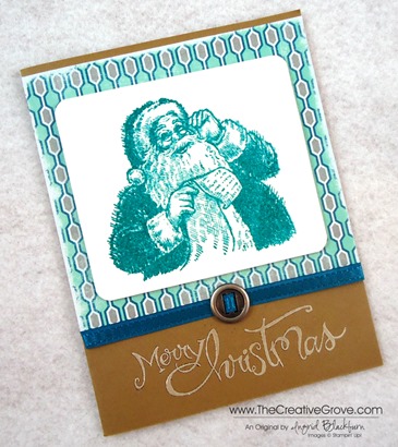
Santa’s List is a cute little three stamp set with an awesome jolly image. Here’s a quick Christmas card that uses non-traditional colors for a classic card.  It was designed by fellow CG Crew member Amy Seigler, and I loved making it!  Check out her blog here.

Creative Tips –

  • To get the main image to pop, you’ll want to emboss it.  Here Santa was stamped first in Versamark ink and then in Bermuda Bay.  You will want to used clear embossing powder to get that glossy sheen.
  • You can add some texture and character to your designer paper quickly by just sanding the edges with your Stampin’ Sanding System.  It’s quick, easy and has a great distressed and weathered look.  Santas List 001 CU
  • This card uses one of four designs in the 48 page Winter Frost Paper Stack.
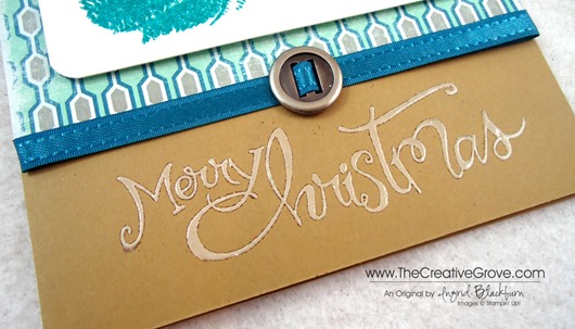
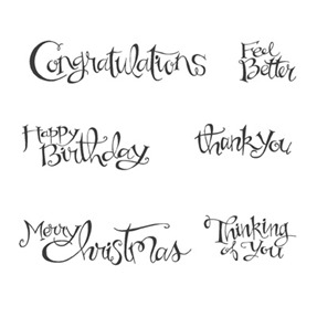
  • If you want your greeting to have the look of icing or wet snow, stamp it in Whisper White Craft Ink and emboss it with Clear embossing powder rather than white.  This way it doesn’t take over the card with that bright white look.  Santas List 001 Embossing
  • Isn’t this ribbon slide the perfect compliment to the big guy?  It’s the perfect belt buckle for all your Santa cards.  You get sixteen pieces for only $1.99 for an entire package – that’s 60% off the original price!  But hurry, they are in the clearance rack and when they’re gone, they are gone. Santas List 001 Main L

  • CG rewards

       Don’t forget to print up your CG Reward Tracker to track your earned pinecones!  Not sure what I’m talking about?  Check out the new Reward program that just started yesterday.  You earn free stamps for your online purchases!  Remember…there are still 31 hours left in your double reward points special!

    Signature Snowflake 001
    Santas List 001 Angle

To Shop 24/7 in the Creative Store – Click here!

Stamp Sets – Santa’s List (131811c, 131808w), Sassy Salutations (126707c, 132070w) Paper – Brown Sugar, Whisper White, Winter Frost Designer Series Paper Stack Ink – Versamark, Bermuda Bay, Whisper White Craft Cool Tools – 3/16” Corner Rounder, Clear Embossing Powder, Stampin’ Sanding System The Perfect Finish – Stampin’ Dimensionals, Island Indigo Satin Ribbon (retired), Ribbon Slide

  Santa's ListUntitled-12