


We’ve had so much fun at The Creative Grove with the Spring Catalog this year. The CG Crew felt this year’s mini catalog was the best one in 25 years. So if there is anything that you were holding out on, don’t wait – tomorrow starts the brand new catalog year which means that today is the official LAST day to order from the Spring Catalog. Some products made it into the new catalog, but most unfortunately did not. So we bid good bye to several favorites.
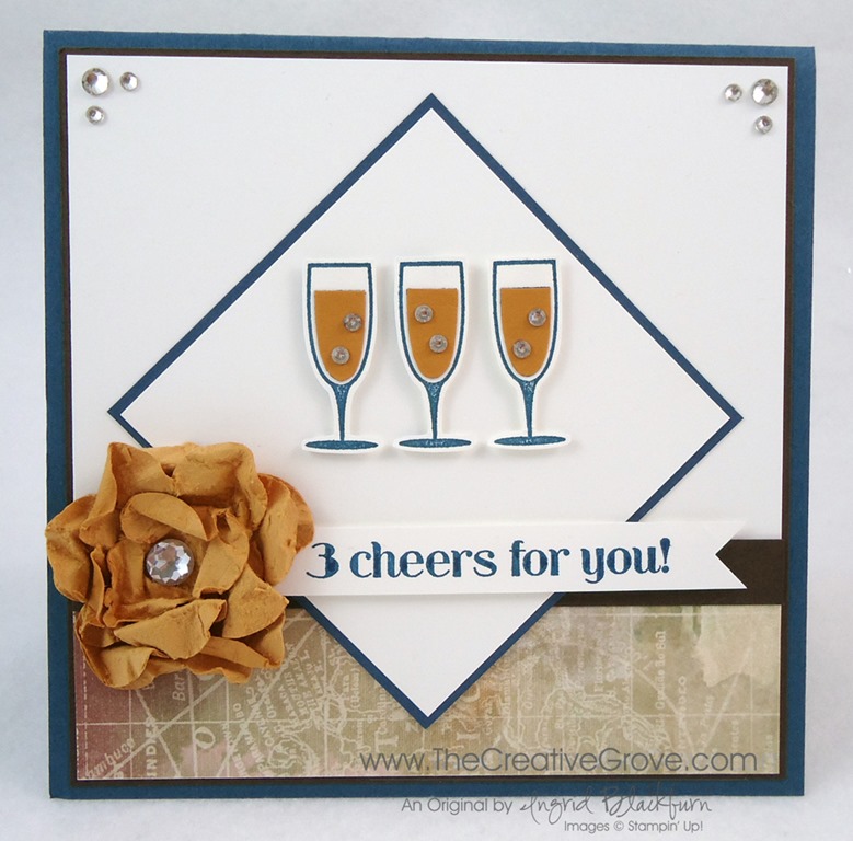
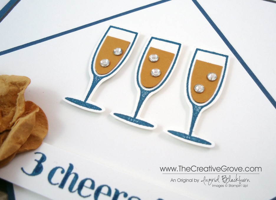
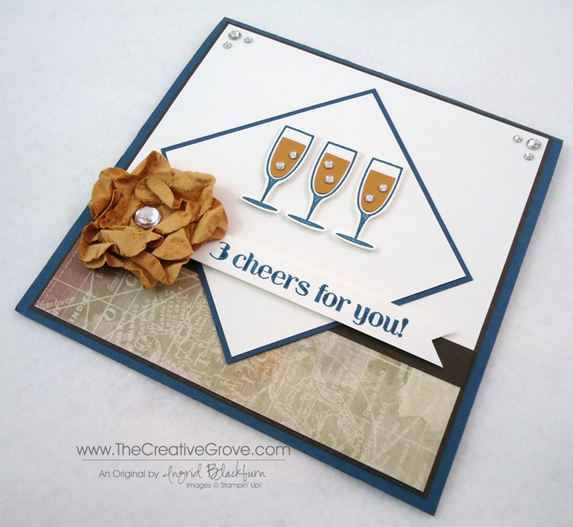
Click on any image to see the card details and creative tips.

Ciao Baby – I didn’t get to stamp with this set as much as I would like, but here is the first actual creative scenery card I’ve ever made actually based off a real life photo or experience. It brings back such great memories of a wonderful day in St. Barts. Click Here for card details, creative tips and more photos
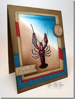
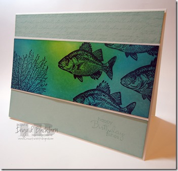
By the Tide – This was by far my most highly anticipated stamp set out of this year’s catalog. I was dying to do an underwater scene like the one above and below. The images were just begging to be brayered. I love all the projects I’ve made with this set, and there were many more, just made as exclusive content for clubs and classes. The top right one actually was a CG Crew project in January. Click each photo for card details, creative tips and more photos.

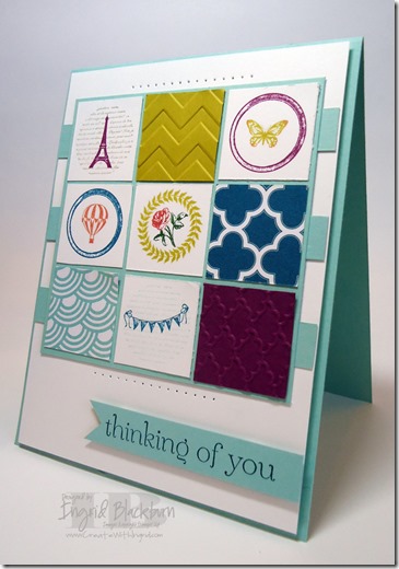
Collage Curios – This is a fun set that I was shocked didn’t make the new Catalog. Here are a few easy projects that highlight this stamp set in a great way. This project was acutally a CG Crew project in March. We loved making this along with a necklace out of Soda Pop Tops. Those little flowers from our 5/8” Flower Trim and Soda Pop Tops also didn’t make it, which makes me glad I’m stocked up! The Soda Pop Top card features all the best from the Spring Catalog – Honeycomb Embossing Folder, Pool Party Core’dinations Paper, Paper Doilies, Hearts a Flutter Bundle, Oval Framelits, Collage Curios, Soda Pop Tops and 5/8” Flower Trim. Click each photo for card details, creative tips and more photos.

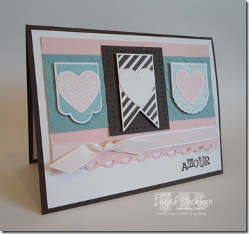
Hearts a Flutter – This set I had a ton of fun with around Valentine’s Day. I love the coordinating framelits that come along with it as well. As a bundle you save 15% which I just love! And the framelit set has a banner flag die in it. Below you see my use of the new Occasions Paper Piercing Templates in the Spring Mini – I just love all the different sizes of Hearts on the one of three templates. The first project was my actual Anniversary card for my sweetie Michael and was a Just Cards Class card. ![]() Click each photo for card details, creative tips and more photos.
Click each photo for card details, creative tips and more photos.

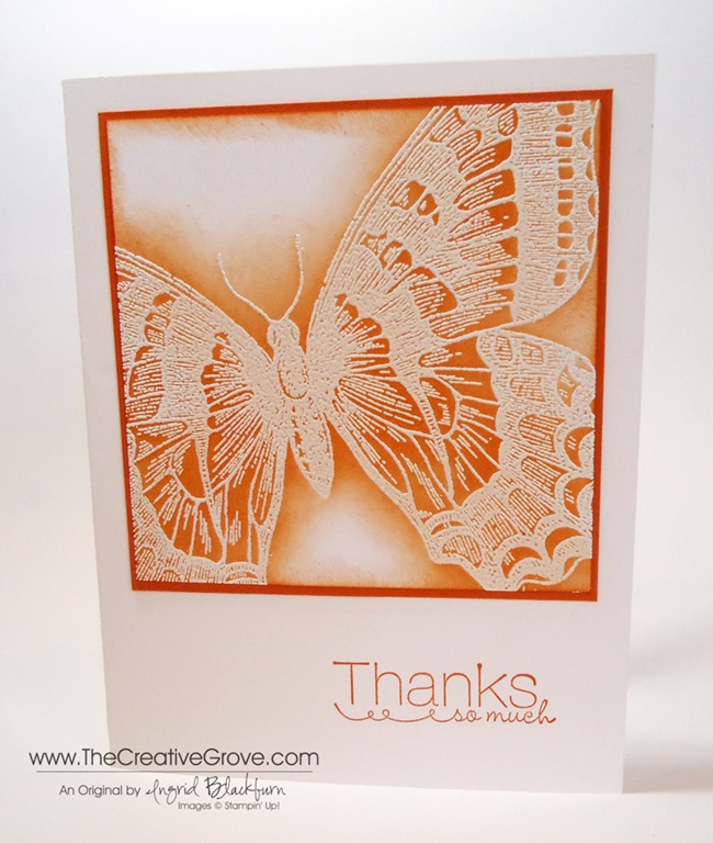
Swallowtail – okay, I think we can all agree that this ended up being my surprisingly favorite stamp set out of this years Spring Catalog. There are so many projects you didn’t even see with this amazing stamp too. But this is still probably one of my top five cards I’ve made over the past five months. My favorite detail is the Banner Flag. Look closely – that’s the butterfly image stamped tone on tone under the Thanks. I’ll miss that Thanks too – it’s part of the stamp set Kindness Matters which is retiring from the big catalog – and at $8.95 for the clear set is by far the best Stamp Set deal you’ll find. I think that one stamp has gotten almost as much usage as Thinking of You from Sweet Essentials. Click each photo for card details, creative tips and more photos.
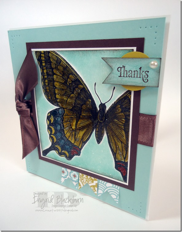
Some more favorites from the Swallowtail Stamp Set.


Do you want to get the latest specials and creative tips sent right to your inbox? Then click here to sign up for my Creative Tips Mailing List!


![Signature-Snowflake-001_thumb1_thumb[1]](https://thecreativegrove.com/wp-content/uploads/2013/05/Signature-Snowflake-001_thumb1_thumb13.jpg "Signature-Snowflake-001_thumb1_thumb[1]")


![Signature-Snowflake-001_thumb1_thumb[1]](https://thecreativegrove.com/wp-content/uploads/2013/05/Signature-Snowflake-001_thumb1_thumb12.jpg "Signature-Snowflake-001_thumb1_thumb[1]")


