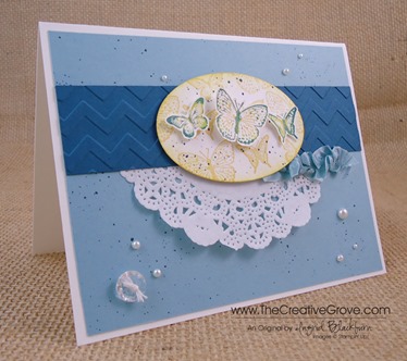
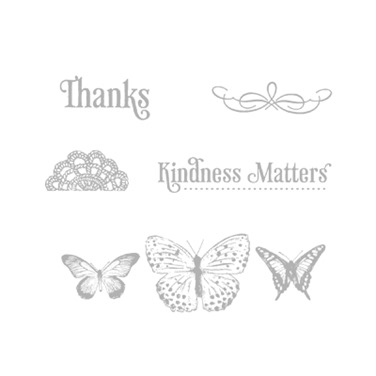
Do you ever just have those go to kind of stamp sets? Kindness Matters has definitely been one for me. I probably use the Thanks greeting from this set more than any other, and I know I have a guaranteed great card every time I use the butterflies. It’s a fabulous set that if you don’t have, don’t miss out. Best part – it’s one of our least expensive sets, so there’s great value too!
Today I’ve paired this fun stamp set with a few of our retiring colors. Yesterday you read how Not Quite Navy has been my #1 favorite color for 11 1/2 years (still…sniff…sniff), but this year, one of my go to colors has definitely been Baja Breeze. I was is complete shock when this color retired. And quite sad, as I have so many cool things in Baja Breeze. It was such a great color to work with. It’s sad that I’m speaking of it in the past tense, but this is my grieving week, and then Friday I’ll move on! ![]()
Creative Tips –
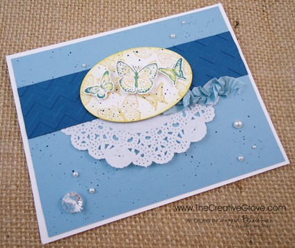
- I always want to use the Rock n Roll technique when I use this stamp. The butterflies to me just need that multi color. Perhaps it’s because most butterflies are multi colored. I stamped the main image randomly and from various angles on an oval that I cut out using the new Ovals Collection Framelits and my Big Shot. It’s the second smallest one. I used So Saffron, but didn’t want the butterflies to take away from my main ones, so I stamped them off once to decrease their vibrancy.
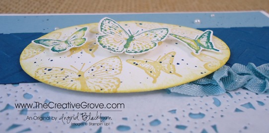
- Next I stamped my main images on a piece of scrap paper. I used the new color Crushed Curry. I really wanted my yellow to stand out from the So Saffron. I rocked my image in Baja Breeze and then slightly on the edges in Not Quite Navy. To get a good outline on my images in Not Quite Navy, I touched up my image with my Stampin’ Write Marker in the same color. I also thumped the marker along the center of each butterfly.
- Of course blue and yellow make green, but I think since this blue is so much darker, it stands on its own.
- I cut out my rock n rolled butterflies with my paper snips and ran some Snail adhesive down each center. I curls and popped up the wings with some Stampin’ Dimensionals that I trimmed down to fit. This way the butterflies look like they are in flight.
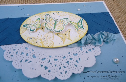
- I took a piece of our retiring Baja Breeze 1/2” Seam Binding Ribbon and pulled a few of the middle fibers to ruffle the ribbon a bit. Once I had it how I wanted, I adhered it using Glue Dots – the single best way to attach fibers to anything!
- I ran a piece of Not Quite Navy through my Big Shot using the Chevron Embossing Folder for a little contrast and added half of one of our new Paper Doilies. Together the combination has a collage feel, yet also looks contemporary.
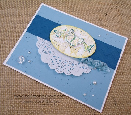
- I try to apply the law of thirds to just about all my projects in the design aspect. You’ll see that my main image is in the top third of the space, while my Pearl Basic Jewels accents are also in threes, within three. You always want to add your embellishments in odd numbers.
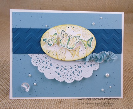
- Since the Seam Binding Ribbon is such a large accent, I balanced it out on the other side with one of our Vintage Faceted Buttons on the opposite side. I used Pearls to complete my triangle, and used some of our White Bakers Twine for the knot. Of course I attached it using Glue Dots.

- One tool that I will keep on using, and if you don’t have one I encourage you to get it right away – that’s the Color Spritzer Tool. Combined with any of our Stampin’ Write Markers, you can fill any space in just the right way. I used my Not Quite Navy Marker to add the speckling to both my oval and main project. Don’t hold it too close, as the dots will be highly concentrated together.
- You may be wondering where my greeting is, well…after playing around with several banners, tags to be attached with vintage trinkets like our safety pins and staples, I decided to just put the greeting on the inside. Although, there’s nothing wrong with a blank card too! 🙂
- As this week quickly winds down, I’m trying to use all my favorite things one last time for you before moving on. It’s not so easy! You many be wondering why move on at all? Well, in my Stampin’ Up! world, if it’s not current, then use it sparingly. That’s okay, believe me when I tell you I have a secret stash of Not Quite Navy card stock in both sizes…lol!
- There are a handful of stamp sets that will make the cut and remain on the shelves of the Creative Studio. But not many! I find that I think I’m going to stamp with them, and then I don’t. So I’ve gotten quite good at purging. Which is to your benefit – look next week for all my “retired” sets on here. Some go back 10 years! Have a creative day today – and most of all, have fun!
Come Stamp with Me!
f you are in the Orlando area and want to come to the Creative Studio to stamp – be sure to check out the classes tab above. I have Just Cards and Creative Cards classes on Monday June 3rd! And of course, don’t miss my free but fully loaded with fun New Catalog Kick Off Thursday June 6th. ![]()
To Shop 24/7 in the Creative Store – Click here!
Stamp Sets – Kindness Matters (122902c, 122900w) Ink – So Saffron (126957), Baja Breeze (126960), Crushed Curry, Not Quite Navy (126971), Not Quite Navy Stampin’ Write Marker (Regals Collection – 119701) Paper – Whisper White (100730), Not Quite Navy (101722), Baja Breeze (111352) Cool Tools – Paper Snips (103579), Color Spritzer Tool (107066) Finishing Touch – Stampin’ Dimensionals (104430), Pearl Basic Jewels (119247), Baja Breeze 1/2” Seam Binding Ribbon (122331)
