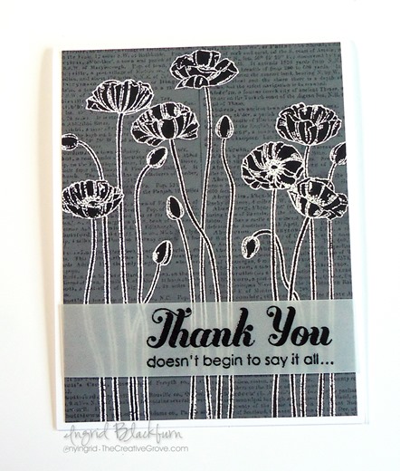
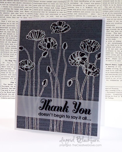
Black and White Emboss Resist Poppies

Pleasant Poppies Background Stamp

The emboss resist technique is one that you probably use in card making so often that you don’t even give it a thought. It can be used in several ways; today we’re going to feature it with a little coloring using markers and the Pleasant Poppies background stamp.

Embossing techniques are probably some of my favorites. And embossing in general was probably one of the biggest wow techniques you first saw when learning how to stamp, am I right? I’d love to know what it was for you…tell me in the comments below!

Emboss Resist + Markers Video Tutorial

This project tutorial uses emboss resist to create monochromatic poppies for a truly striking card. Like I say in the video, creating black flowers is kind of weird for me, but I have to admit, the card is gorgeous! Here’s the step by step tutorial:

View on YouTube

Now that you’ve seen the video, I listed some instructions for this project. If you haven’t had a chance to see the video, it gives a lot more detail than the tutorial below.

Emboss Resist Technique

Creative Tips –

  • You’ll want to create your background first. Stamp the Dictionary stamp in tone on tone ink (Basic Gray). The Basic Gray card front measures 4 x 5 1/4”.
  • Be sure the background is completely dry as in the video.
  • Use a de-static tool like an embossing buddy on your card front.
  • Emboss the Pleasant Poppies stamp using White Pigment Ink and embossing powder.
  • Color your flowers in using a Basic Black marker.

Embossing Techniques

    • The embossed poppy outline will “resist” the dye ink – that’s the emboss resist technique! Simple, right?
    • Color your images in sections.
    • Lightly dampen a paper towel by spritzing it with a fine mist mini-spritzer. I can not stress lightly enough. You don’t want to add water to your project, just use it as a tool to remove the ink that the embossed image resisted.
    • Wipe lightly over your emboss resisted image. I first pat it, then wipe, being careful not to push my towel into my cardstock. You want to just stay on the raised surface.
    • Add a greeting embossed on Vellum card stock and adhere your card front to the white base. The card base measures 4 1/4 x 11”.

How to embossing tutorials

That’s it! You can try this technique with any colors, but you’ll want to make sure that your marker is darker than your background image (the dictionary stamp). Otherwise you’ll see the background image through your colored flower.

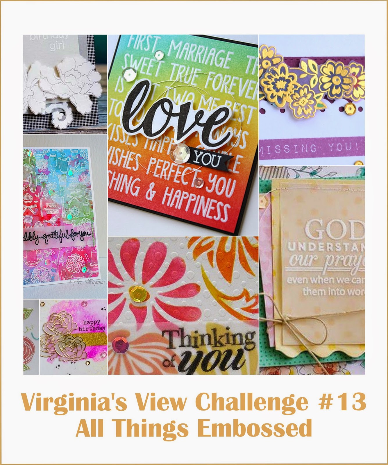
I entered this card in the following challenges:  Happy Little Stampers and Virginia’s View.
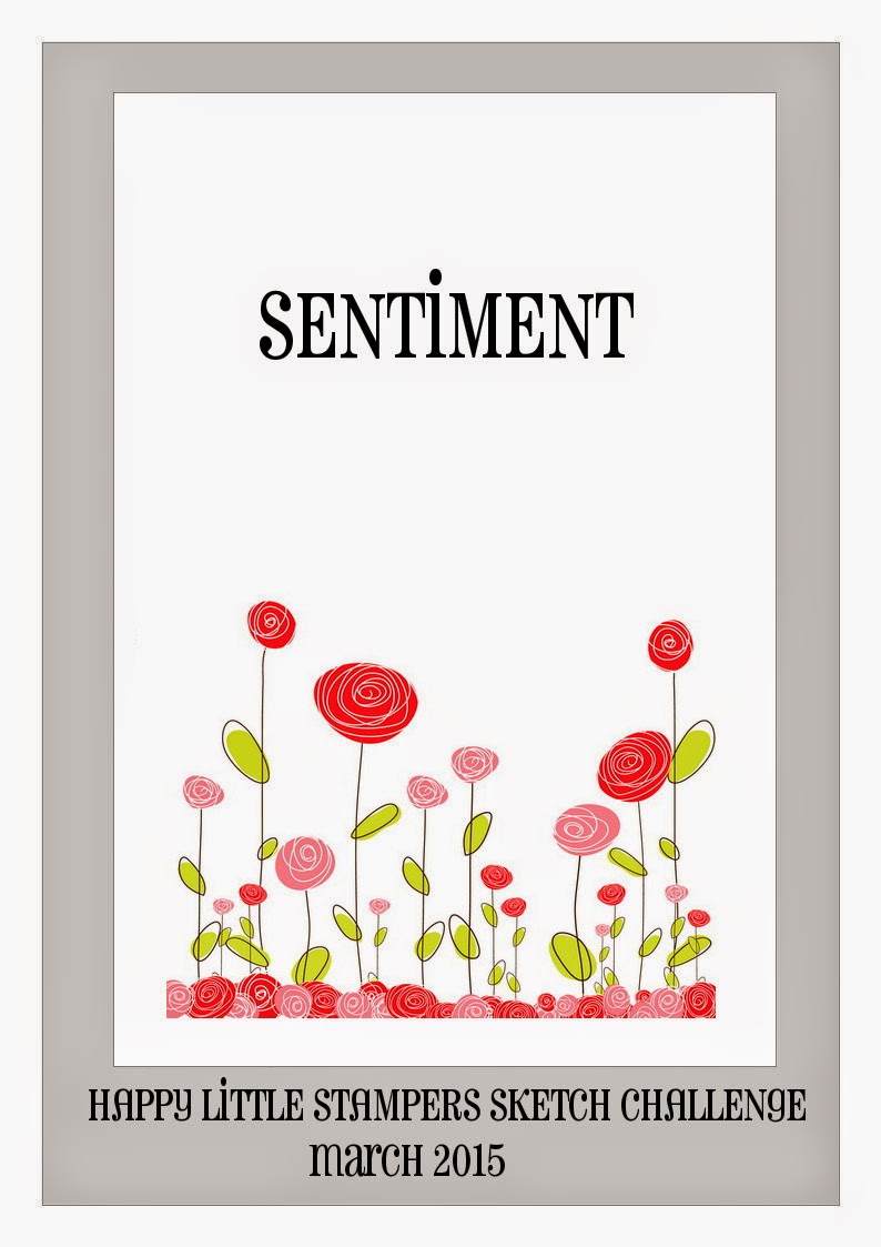
HLS March Sketch Challenge   Virginias View March 2014

So what did you think? Are the emboss resist flowers Weird or Striking for you – tell me in the comments – I’d love to know!

Signature

[optin_box style=”14″ alignment=”center” disable_name=”Y” email_field=”email” email_default=”Enter your email address” email_order=”1″ integration_type=”aweber” double_optin=”Y” list=”2841626″ name_field=”name” name_default=”Enter your first name” name_required=”Y”][optin_box_field name=”headline”]If you enjoyed this tutorial…[/optin_box_field][optin_box_field name=”paragraph”]PHA+Li4ueW914oCZbGwgbG92ZSBvdXIgPHNwYW4gc3R5bGU9ImNvbG9yOiAjMjQ0YzVlOyI+PGVtPjxzdHJvbmc+ZnJlZSA8L3N0cm9uZz48L2VtPjwvc3Bhbj5zdWJzY3JpYmVyIG9ubHkgdmlkZW8gc2VyaWVzISDCoEdldCB0aGXCoDxzcGFuIHN0eWxlPSJjb2xvcjogIzI0NGM1ZTsiPjxlbT48c3Ryb25nPmV4Y2x1c2l2ZTwvc3Ryb25nPjwvZW0+PC9zcGFuPsKgQ3JlYXRpdmUgVGlwcyBlLWxldHRlciB3aGljaCB3aWxsIHRlYWNoIHlvdSBuZXcgdGVjaG5pcXVlcyB0byBhZGQgdG8geW91ciBzdGFtcGluZyBza2lsbCBzZXQuIMKgTGVhcm4gaG93IHRvIG1ha2UgcHJvamVjdHMgeW91J2xswqBsb3ZlITwvcD4K[/optin_box_field][optin_box_field name=”privacy”][/optin_box_field][optin_box_field name=”top_color”]undefined[/optin_box_field][optin_box_button type=”1″ text=”Send me exclusive tips!” text_size=”26″ text_color=”#000000″ text_bold=”Y” text_letter_spacing=”-1″ text_shadow_panel=”Y” text_shadow_vertical=”1″ text_shadow_horizontal=”0″ text_shadow_color=”#a3b640″ text_shadow_blur=”0″ styling_width=”100″ styling_height=”10″ styling_border_color=”#000000″ styling_border_size=”1″ styling_border_radius=”6″ styling_border_opacity=”100″ styling_shine=”Y” styling_gradient_start_color=”#a3b640″ styling_gradient_end_color=”#5b661e” drop_shadow_panel=”Y” drop_shadow_vertical=”1″ drop_shadow_horizontal=”0″ drop_shadow_blur=”1″ drop_shadow_spread=”0″ drop_shadow_color=”#000000″ drop_shadow_opacity=”50″ inset_shadow_panel=”Y” inset_shadow_vertical=”0″ inset_shadow_horizontal=”0″ inset_shadow_blur=”0″ inset_shadow_spread=”1″ inset_shadow_color=”#a3b640″ inset_shadow_opacity=”50″ location=”optin_box_style_14″ button_below=”Y”]Send me exclusive tips![/optin_box_button] [/optin_box]
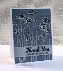
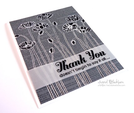
Neutral Poppies

Sometimes simple is better. I love the Pleasant Poppies background stamp.  I’ve never been able to get so much use from a background stamp before.  The versatility is just great.  This Clean and Simple (CAS) card is just perfect for any occasion – and gender.  Again, versatility is great!  Here are a few tips to help you achieve this great look.

Creative Tips:

  • Keep the color throughout your project.  I know poppies are normally orange, but the neutrality of this project is just fine. 
  • White space is a key component to Clean and Simple cards.  To help add depth to this project, a tiny bit of paper-piercing in the corners go a long way.
  • Keep the font of your greeting simple as well.  You’ll change the look of the card by adding a script rather than a printed font.  I love the look of the set Made for You.  Three simple greetings in lower case font that are just the right size for any project – and it’s only $8.95 for all three!

To tie my ribbon just perfect, I use the simple rule of right over left, left over right (or vice versa).  I do not wrap my ribbon around my project, instead, I tie a know with a large ring loop.  I then figure out where I want my ribbon and cut the loop directly below it.  I save on ribbon, and it’s easy to tie.

  • If I place my saying in the bottom right corner, then I add my embellishment to the left side to provide balance.
  • Think about popping your final card front up on Stampin’ Dimensionals for a finishing touch.  It adds dimension to your project – especially when you have paper-piercing on that layer.

SSF_Seasonal_Sayings_thumb1

Single Stamps – Do you love that Greeting set, but wish you could buy just the one or two stamps?  Well, now you can from these select stamp sets: Perfectly Penned, Word Play, Seasonal Sayings.  Buy some of our best Greetings Stamps individually!   Hurry, this special is good for a limited time only through Jan 2, 2013! For more details, click here.  

Signature Snowflake 001 

To Shop 24/7 in the Creative Store Click here!

Stamp Sets – Pleasant Poppies (129499), Made for You (126342) Paper – Whisper White (100730), Sahara Sand (121043) Ink – Sahara Sand (126976) Cool Tools –Essentials Paper-Piercing Pack (126187), Paper-Piercing Tool (126189), Stampin’ Pierce Mat (126119) The Perfect Finish – Stampin’ Dimensionals (104430), 3/8” Whisper White Taffeta Ribbon (109070)

Untitled-12Untitled-12

Mojo Monday Poppies

It’s Mojo Monday again and I really needed the inspiration this morning.  Do you ever just have that kind of a day where you can’t seem to get inspired?  Today is one for me, so this card came in handy.  I saw the sketch and immediately went to work.  I opened my drawer of my newest stamps and the Pleasant Poppies background stamp just popped (okay, a little pun intended) out at me.  Here’s what I came up with from this sketch:

Mojo263Sketch

  • I wasn’t sure which colors to use, so I grabbed my Color Coach for some inspiration.  I settled on Riding Hood Red and loved the Creative Combination of Riding Hood Red, Baja Breeze and So Saffron.
  • After playing around with the three colors, I decided a white background would make them pop the most.  Since the Riding Hood Red was such a strong color, I decided to use it as the Window Framelit Accent.  From there the colors just fell into place.
  • I inked up the left side of my Pleasant Poppies Stamp with StazOn Jet Black Ink to highlight that part of the stamp.  I cut it out using the second to smallest Framelit in the Window Frames Collection.

I colored the Poppies using my Aqua Painter and Tangerine Tango, Pumpkin Pie, Wild Wasabi inks.

I made the banner end by using a square punch.

  • I wanted a little more texture to the card, so ran my So Saffron card stock through the Big Shot with the Fancy Fan Folder.

I like the Clean and Simple look to this card.  I hope you do too!  Now that you have a little inspiration, what are you going to create?

SSF_Seasonal_Sayings

Single Stamps – Do you love that Greeting set, but wish you could buy just the one or two stamps?  Well, now you can from these select stamp sets: Perfectly Penned, Word Play, Seasonal Sayings.  Buy some of our best Greetings Stamps individually!   Hurry, this special is good for a limited time only through Jan 2, 2013! For more details, click here.  

 Signature Snowflake 001

To Shop 24/7 in the Creative Store Click here!

Stamp Sets – Pleasant Poppies (129499), Sweet Essentials (128315) Paper – Whisper White (100730), Baja Breeze (111352), So Saffron (105118) Ink – StazOn Jet Black (101406), Tangerine Tango (126946), Wild Wasabi (126959) Cool Tools –Aqua Painter (103954), 1” square punch, Curly Label Punch (119851), Window Frames Collection Framelits (129021), Festive Paper-Piercing Pack, Paper-Piercing Tool (126189), Stampin’ Pierce Mat (126119), Fancy Fan Folder (127751) The Perfect Finish – Stampin’ Dimensionals (104430)

Untitled-12

Pleasant Poppies

I wanted to play a little with my brayer today, so I did a quick background for one of the newest background sets this yet – Pleasant Poppies.  This is my first time using this sweet stamp and I have to admit I was rather excited!

I started to create my sky with the three blues – Bashful Blue, Baja Breeze and Marina Mist.  I like the strong sky the three colors formed.  I then added a little Certainly Celery to the bottom of my card panel.  I wanted it to have a wispy look to it without getting too strong with the brayer.  Here you see two cards – one I left as blue poppies and the other I added Tangerine Tango.


  • I created a good base with Certainly Celery (isn’t that just such a great name!) before taking to my card with a sponge and the ink pad.  I started off my card and sponged on in circles to create the light green feel.
  • I also did the same with a quick coat of Bashful Blue to pop the sky a little after having brayered the look I wanted to achieve.

  • To give that rich orange look that poppies – especially California Poppies from my home state have, I used Tangerine Tango.
  • I stamped on the Tangerine Tango cardstock and cut out each image with my Paper Snips before adding it to my brayered background.  This gives the card a definite pop.
  • I didn’t want the poppies to be too 3D as I felt this would take away from the card, so I popped up the card panel instead. 
  • To finish the card I matted the brayered background on Whisper White before adding the dimensionals on the orange sample.

For a more subtle look, I left the blue poppies alone and added a slight white border before adhering it directly to the Marina Mist Card.  I popped up the saying to add a little dimension.

Two similar card with very different looks.  Which one is more your style? 

Creatively yours –

Ingrid

To Shop 24/7 in the Creative Store – Click here!

Stamp Sets – Pleasant Poppies (129499), Sweet Essentials (128315) Paper – Whisper White (100730), Marina Mist (119682), Tangerine Tango (111349) Ink – Bashful Blue (126961), Baja Breeze (126960), Marina Mist (126962), Certainly Celery (126958), Basic Black (126980) Cool Tools –Brayer (102395), 1” square punch, Paper Snips (103579), Stampin’ Sponges (101610) The Perfect Finish – Stampin’ Dimensionals (104430)

Untitled-12

Untitled-12