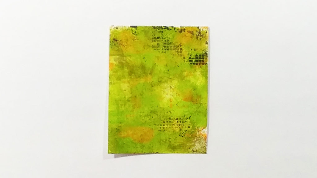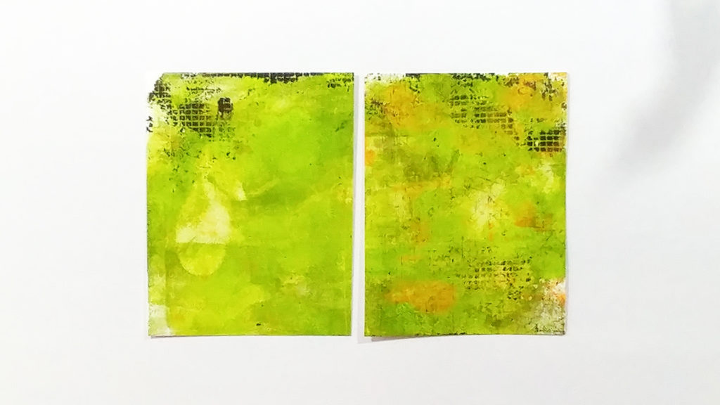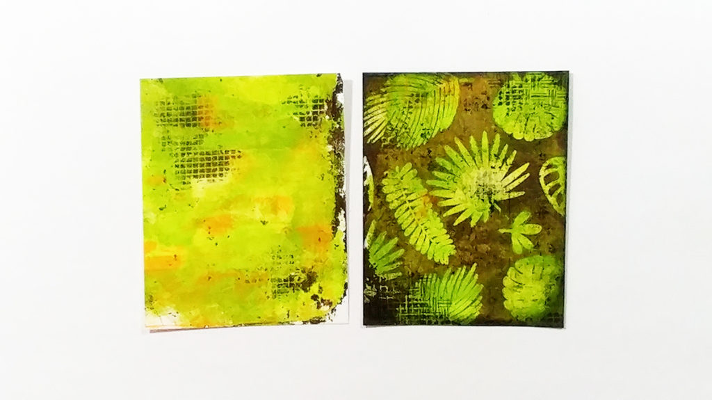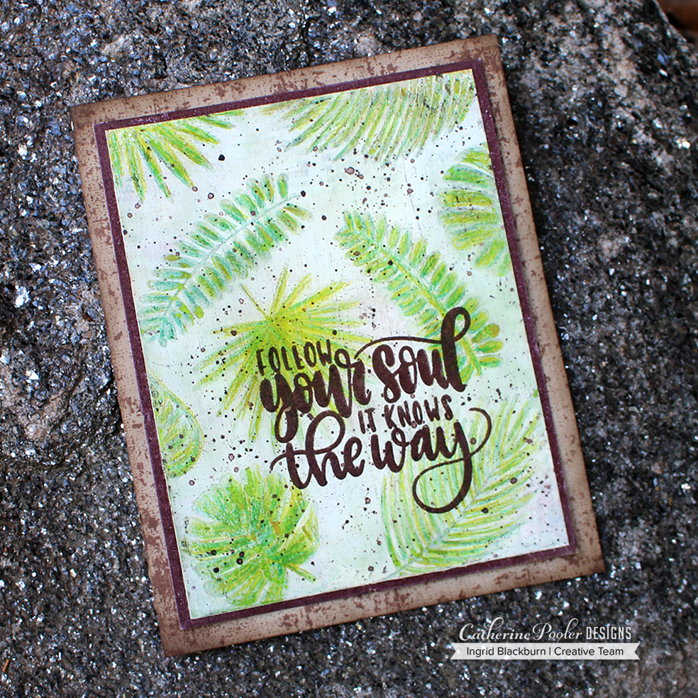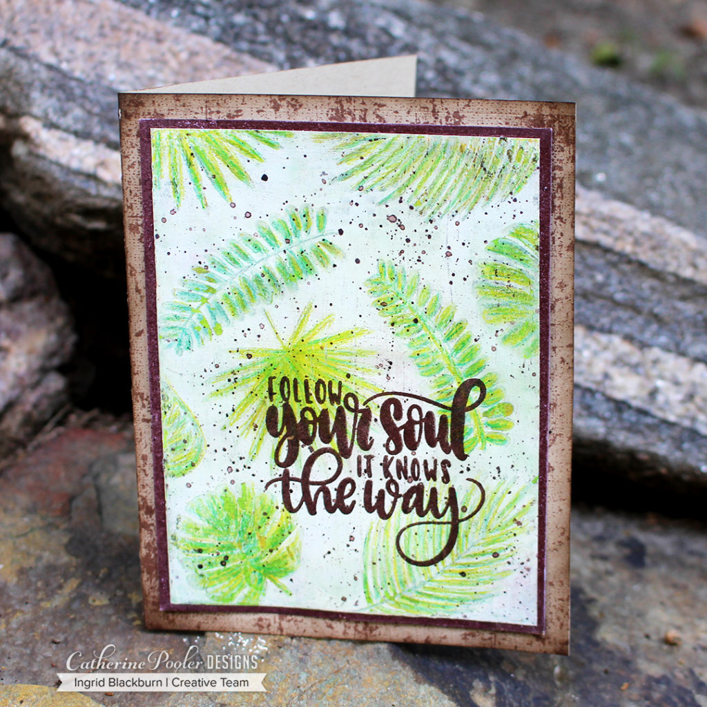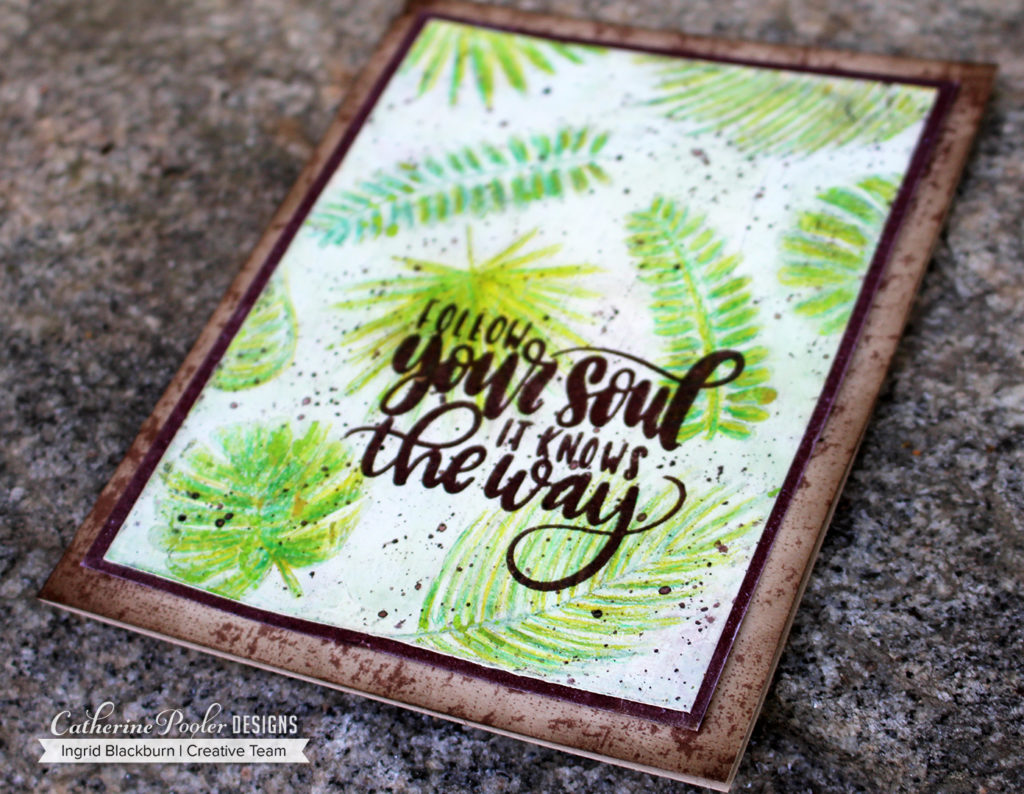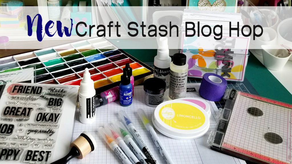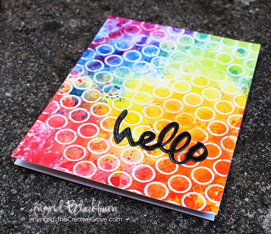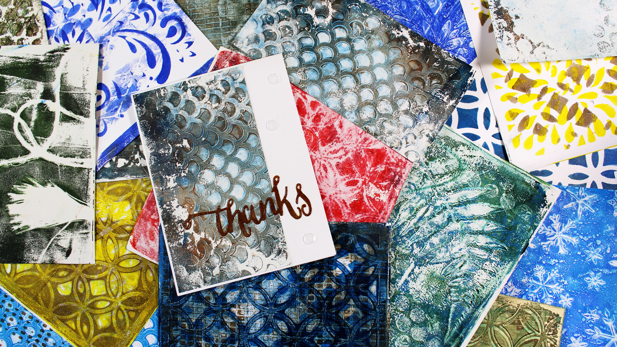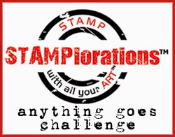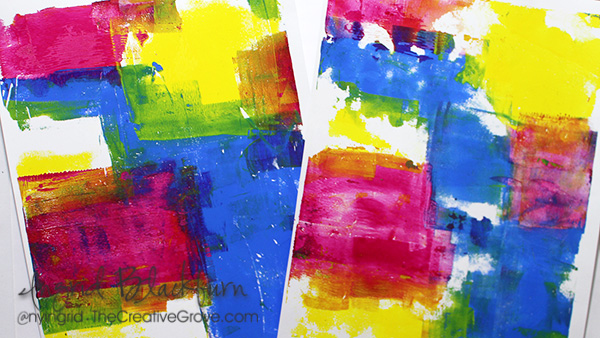
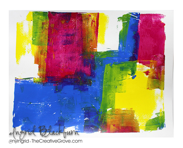
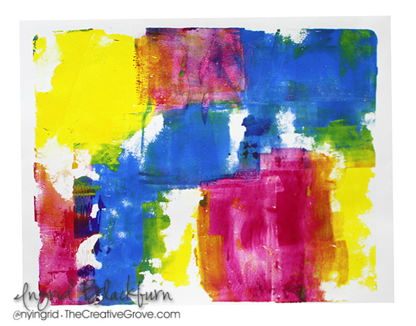
Have you ever used a gel plate to create bright colorful monoprint backgrounds? It’s so super easy, I think you’ll be shocked at how you quickly you can create a ton of vibrant colorful pieces to use on your cards, in your art journal or just create a fun piece of artwork!
To make this even easier for you – I filmed a little video for you. And there’s SO much more you can do with a gel plate, you’ll definitely want to add one (preferably two) to your tool arsenal.
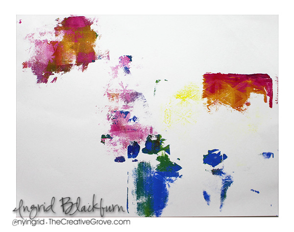
Monoprint Backgrounds Tutorial
Click this link to see video on YouTube
If you aren’t subscribed to my YouTube channel, definitely consider it. I have many more videos headed your way – you won’t want to miss them. You can even hit the little bell to be notified!
Here are a few tips you’ll want to keep in mind when playing around with this fun technique:
- Avoid muddy colors – Use colors that work well together. Remember that you’re going to be overlapping several, so you don’t want to use complimentary colors (opposite sides of the color wheel) when wet. You can layer those once one layer is dry – but not while wet.
- Use a second gel plate to help clean off your brayer – you’d be surprised how fast you can create multiple prints with just one application of paint!
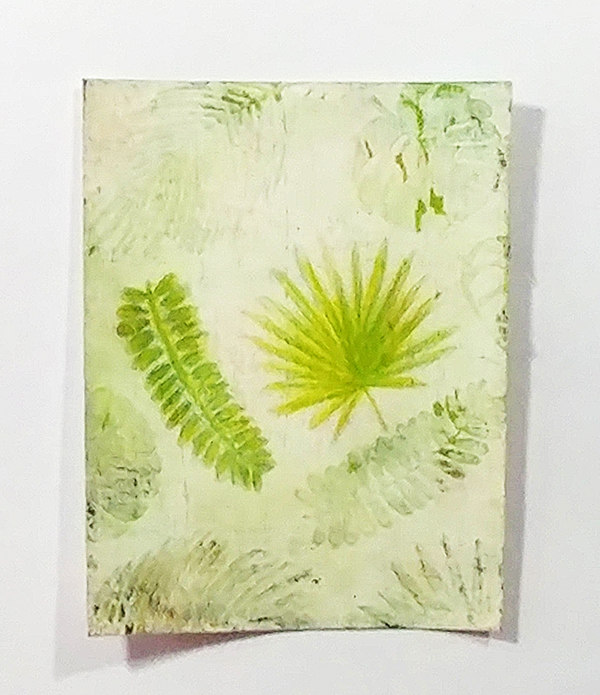
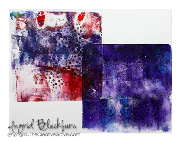
- Use good paper for your scrap clean up piece. (9/10 times, I turn that piece into a print.) The colors work amazing together, and it usually becomes a great base for a layered print
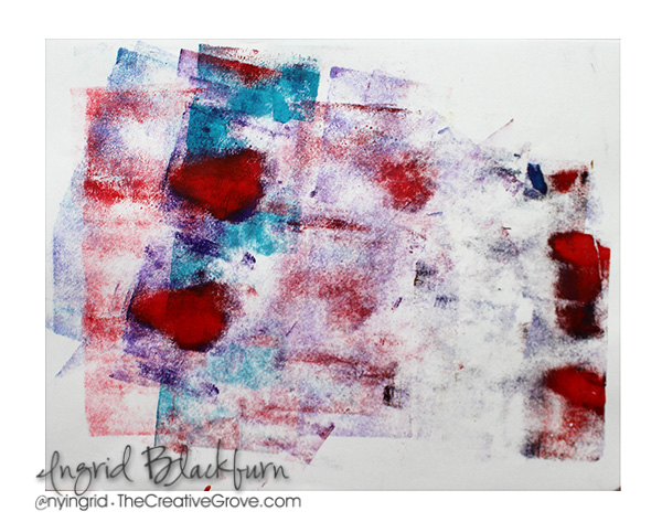
- Try to be patient when pulling your prints. Allow the paint to dry a bit so that you are able to lift those left behind layers underneath your newest paint application
- Remember to lift your brayer when applying your paint. If you just keep it on the surface of your gel plate, you are only really staying in that one section. Lifting it allows for better rotation and coverage.
- Don’t stress if just a little pulls off the plate. You can always add more – or use it as that little something in the background of a card!
I use a 4″ and 2″ brayer when creating monoprint backgrounds. Sometimes that small brayer is quite helpful to get into those little spaces. And sometimes having a larger brayer is just oh so much easier!
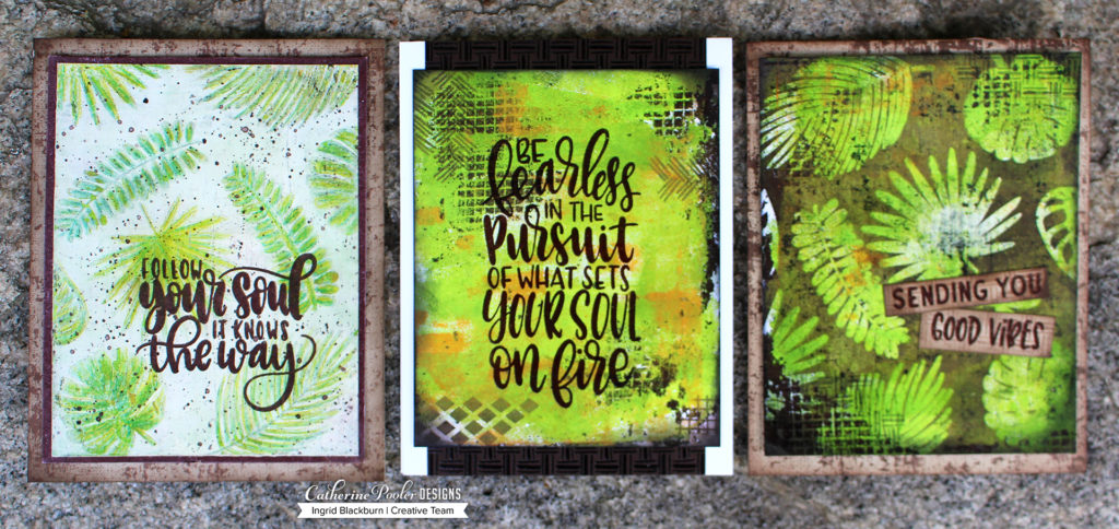
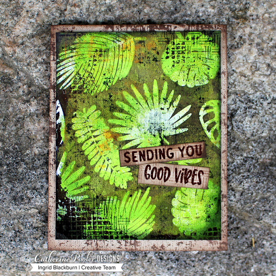
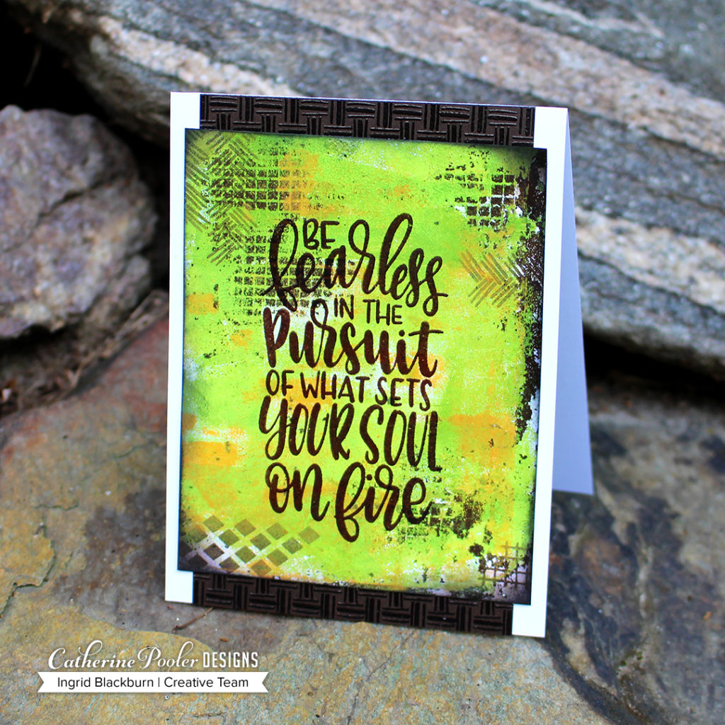
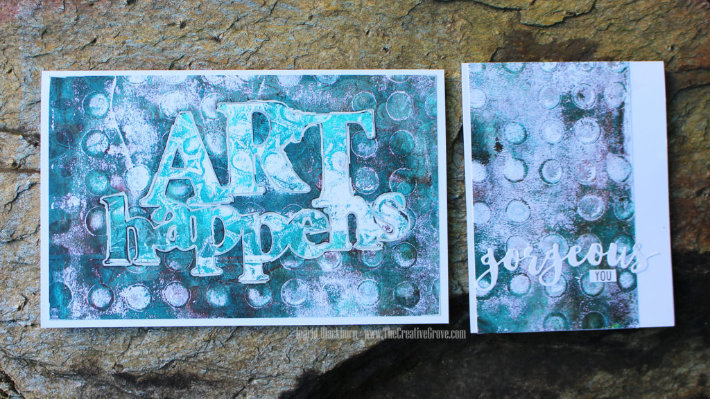
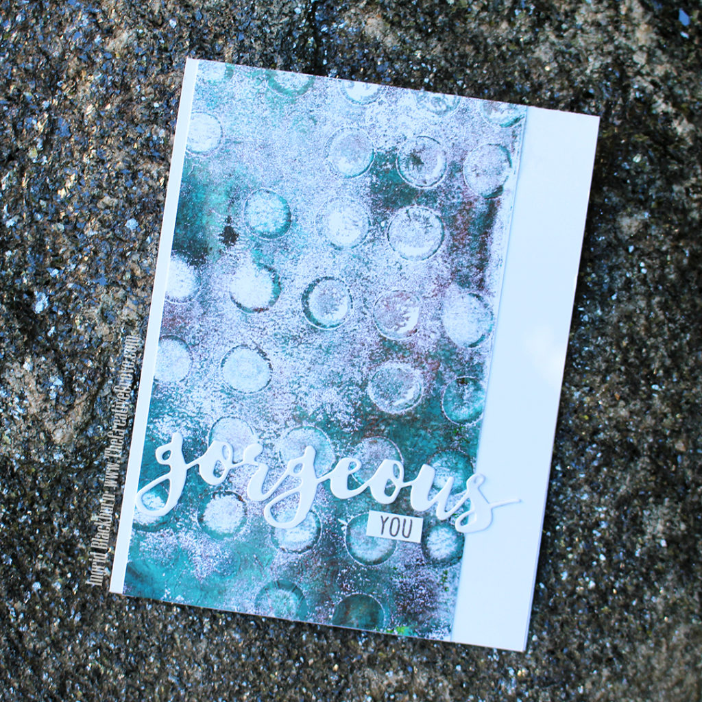
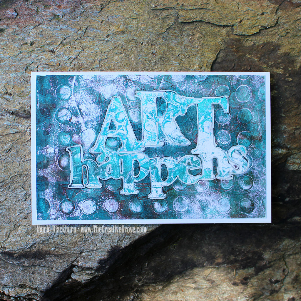
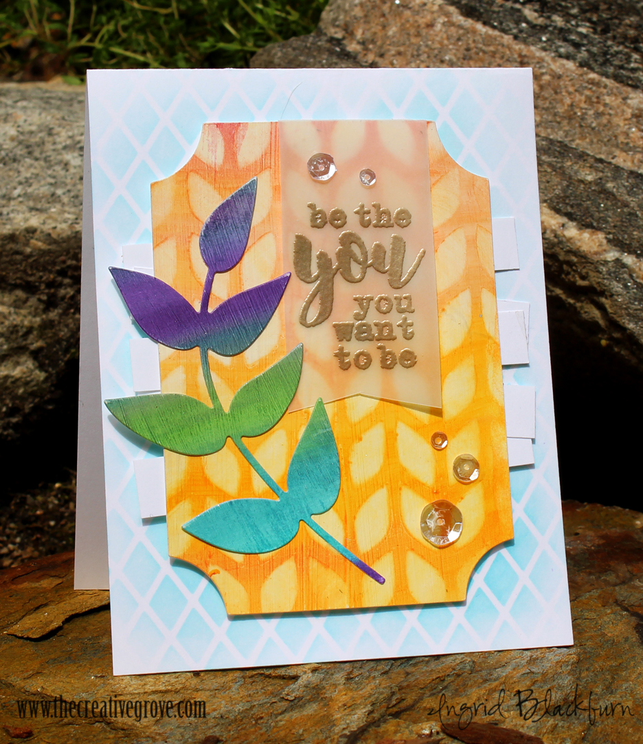
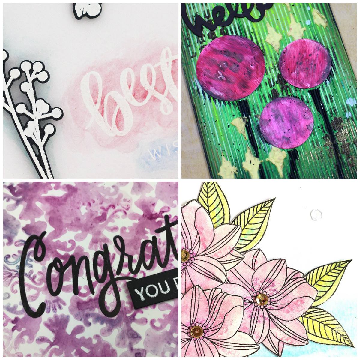
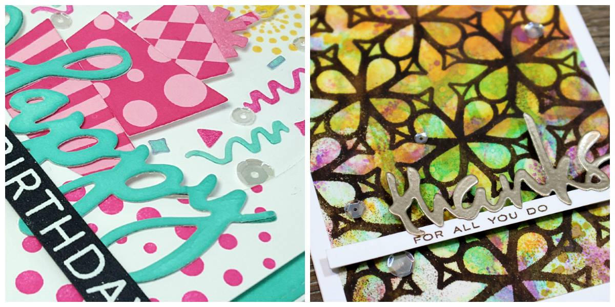
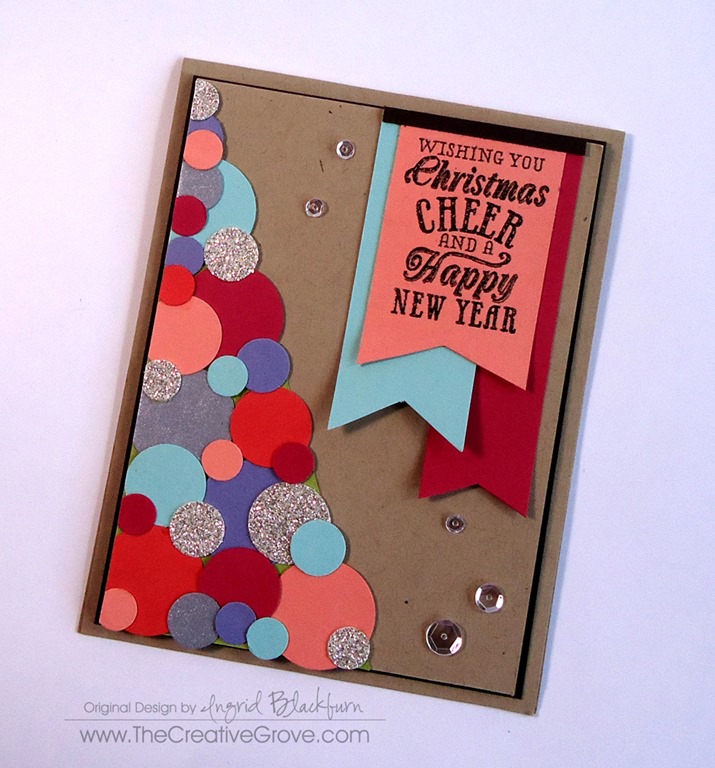
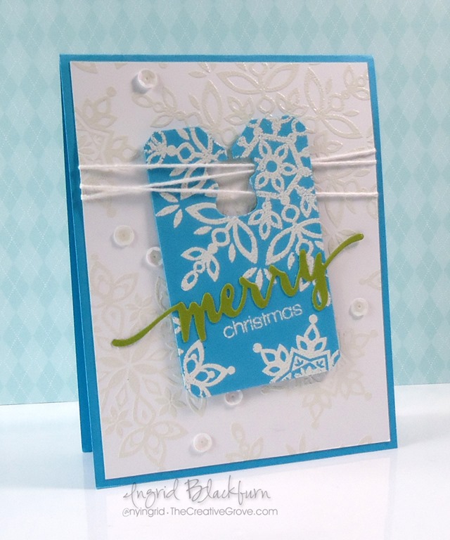
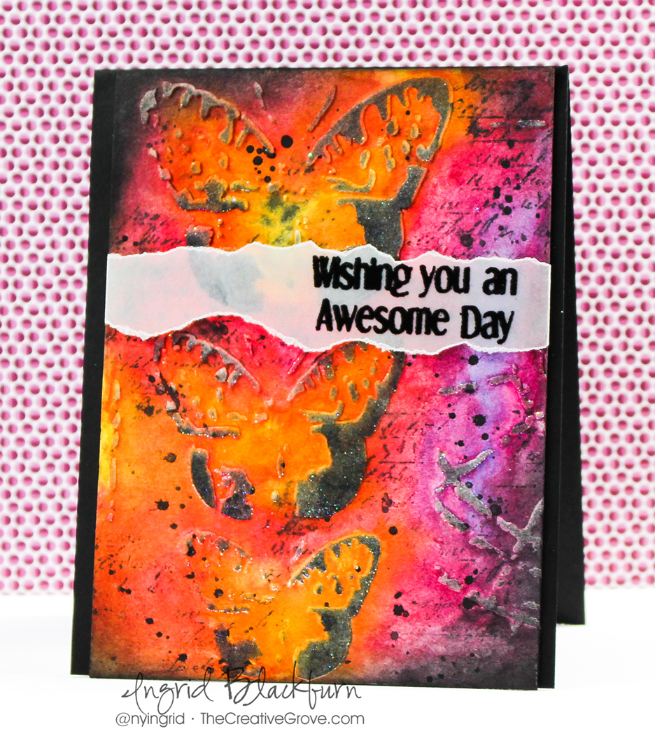
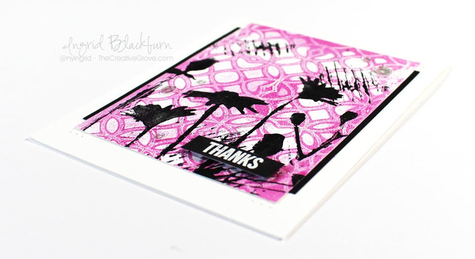
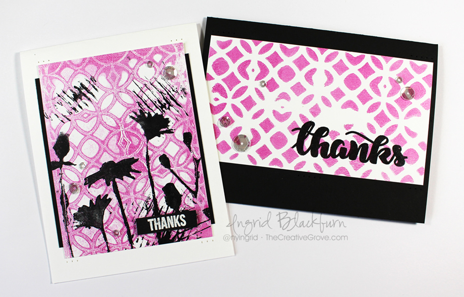
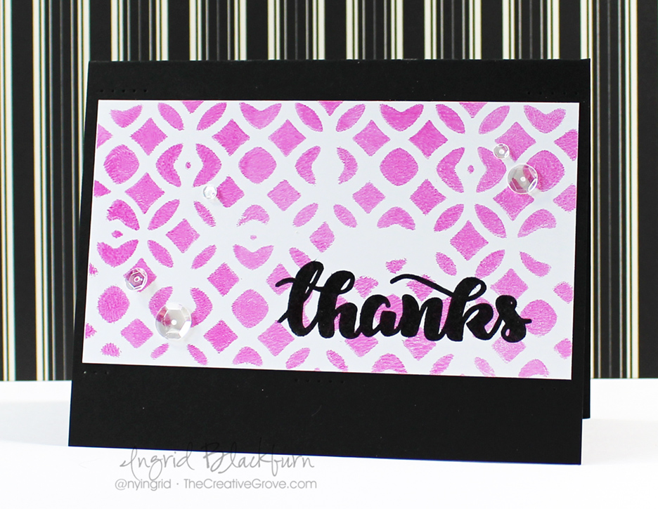
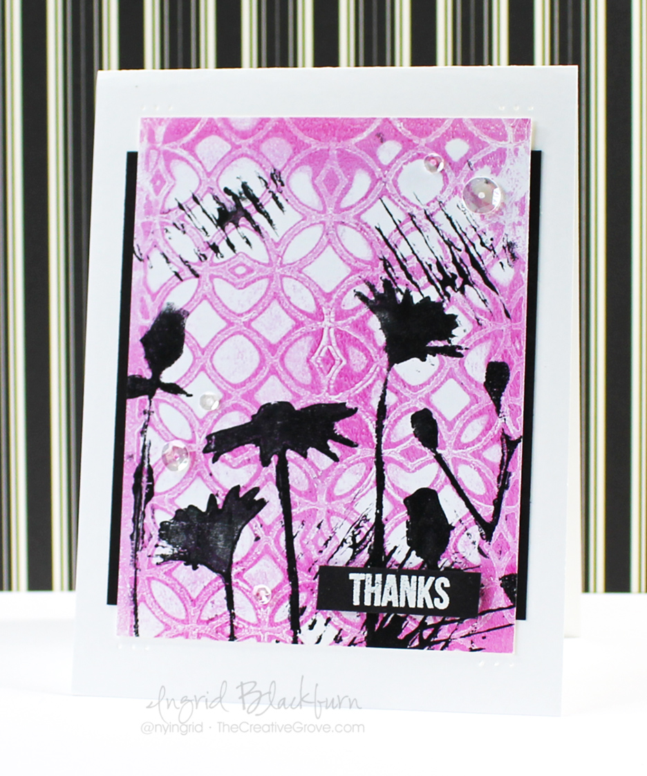
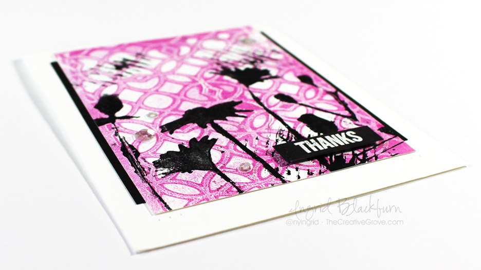
Don’t you just LOVE these? Next up I’m going to show you what to do with some of these fun backgrounds, and just how easy it is to create a whole set of cards.
Till next time –

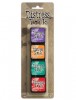
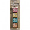
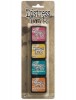
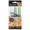
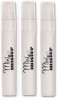
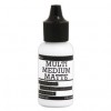
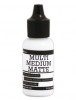
Supplies
To make finding the supplies I used in these projects a bit easier for you, here are a few clickable links. Compensated Affiliate Links are used when possible. Click here for disclosure. Happy Shopping!