Beautifully Baroque Wedding Card

Beautifully Baroque Wedding Card 002 Main L

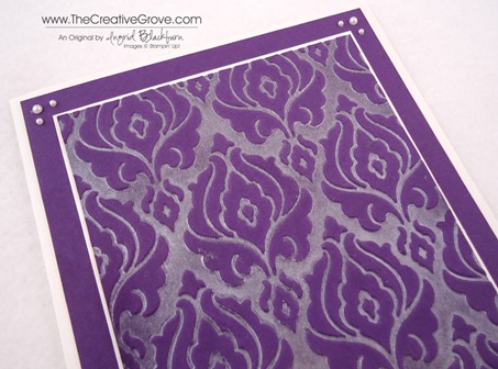
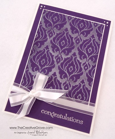
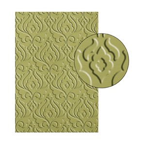
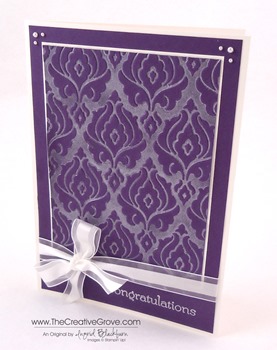
I needed an elegant wedding card this week for a family member.  The new Beautifully Baroque Embossing Folder was just perfect for such an occasion.  Paired with our rich Elegant Eggplant – the bride’s color, and our gorgeous Shimmery White card stock, this card definitely hits the mark. 

Creative Tips –

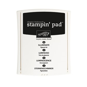
  • I created a beautiful shimmery Baroque paper using the Bisque Pottery Technique and the Illuminate Glimmer Watermark Ink Pad.Beautifully Baroque Wedding Card 002 CU
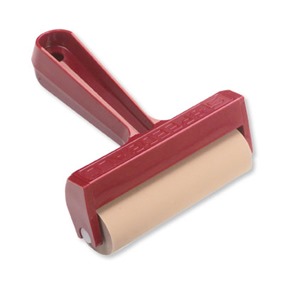
  • Use the brayer to color the top portion of your Embossing Folder with the Illuminate Pad, place your Elegant Eggplant cardstock on the lower piece of the folder, close and emboss.  The result is a gorgeous shimmery result that looks like velvet. 
  • To pair the rich embossed piece, I used our Shimmery White card stock.  It’s a wedding after all!
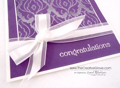
  • The greeting is embossed in Silver and I added a few Pearl Basic Jewels at the top for some added elegant finishing touches.Beautifully Baroque Wedding Card 002 Bow
  • I normally don’t do bows – they’re big and bulky, but with this being a wedding card, my go to knot isn’t going to cut it – don’t think I didn’t try…lol!  It would be cute, no – tying the knot?  Michael would have questioned it, so I went with the bow.  To get it exactly where I wanted it, I attached a piece of Ribbon first, anchored my cardstock onto the card and then used a separate piece to tie the knot.  You can also completely tie it separately and attach it with a Glue Dot.  That didn’t work for me this time, so I tied it.Beautifully Baroque Wedding Card 002 Side

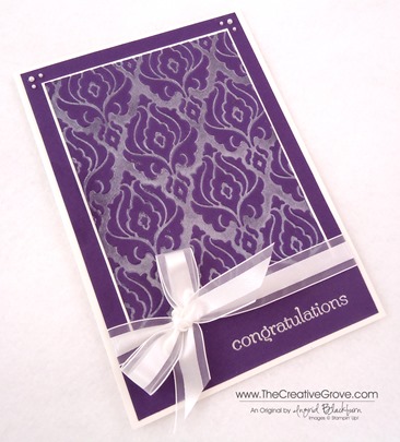
The end result is a gorgeous rich textured card.  This card is 5”x7”, and since we’re sending a check along as we can’t attend this one, I wanted to send a special card.  I’m actually quite sad we can’t go to this one. Sad smile

Free DSP_edited-1

We’re celebrating this summer!!  This month – buy any three Designer Series Papers and get one free!  Take advantage of  this awesome special!

Signature Snowflake 001

To Shop 24/7 in the Creative Store – Click here!

Beautifully Baroque Wedding Card 002 Angle

To view the details or see close ups of any products used in the above project, just click on the green link to view it in my store 24/7.  

Stamp Sets – Sweet Essentials (126457c, 132085w) Ink – Illuminate Glimmer Watermark, Versamark Paper – Whisper White, Elegant Eggplant, Shimmery White Cool Tools – Beautifully Baroque TIEF, Brayer Finishing Touch – Pearl Basic Jewels, 5/8” Organza Ribbon 
Untitled-12Beautifully Baroque Embossing Folder TIEFBrayerIlluminate Ink Pad

Swallowtail Emboss Resist

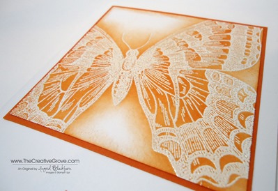
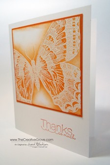
Swallowtail 008 Main

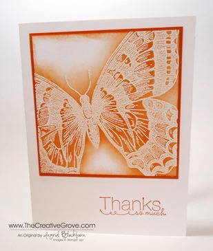
The Swallowtail stamp is one of my favorites to create an simple but elegant card in just minutes.  Today I decided to emboss and show you a little emboss resist. 

Creative Tips:

  • I like stamping with the swallowtail stamp on an angle.  To me it’s like she’s in flight.  Try it at different angles.
  • This is a detailed stamp, so I encourage you to use an Embossing Buddy first on your Whisper White card stock. 
  • Next ink up your image in Versamark ink.  Versamark is a watermark pigment ink.  It’s sticky – that’s how we’re going to get the embossing powder to stick to it.  Because it’s a watermark ink, stamped on a color, you immediately have a faint (watermark) matching color of ink – it’s a must have!
  • Next I poured White Embossing Powder all over my Swallowtail image.  Because our powder is so fine, it really gets into the detail of this stamp well.  If you haven’t tried Stampin’ Up! embossing powder, I encourage you to do so.  I guarantee you’ll notice the difference, my customers swear by it!
  • Melt your powder using our Heat Tool being sure to really get the entire image.  Tip – if your powder looks grainy and not smooth, it’s not melted.  With an image this large it’s easy to miss some, so take your time and check.Swallowtail 008 CU
  • I used Tangerine Tango to color my butterfly.  I gave my project a couple of minutes to cool, and then sponged my Classic Tangerine Tango directly over my image.  The raised embossed image resists the ink and pops.  It’s a cool technique that’s a big wow. 
  • To finish my project off, I sponged around the edge to create a frame. 

You can over emboss, and there’s no real fix for that.  Before I joined the Stampin’ Up! sisterhood, I over embossed all the time. I would get so frustrated because my images always looked really funny and not that pretty.  My embossing powder would turn this funky color, and you just knew it wasn’t right.  I guess that’s why I’m not a good griller either…I always over cook the meat.  It never looks done…lol!

This is a simple project that really comes together in minutes.  I love the simplicity of it.  Now it’s your turn!

Are you getting my Exclusive Video Series?

Be sure to sign up for my Creative Tips Newsletter and get the latest Creative Grove news in addition to my free Creative Techniques Video Series!  Don’t miss out on our creative community – the only way to get this exclusive content is to sign up in the box on the upper right or click here.

Signature Snowflake 001

To Shop 24/7 in the Creative Store – Click here!

Swallowtail 008 Main

Stamp Sets – Swallowtail (129213w, 129216c), Thanks so Much (retired) Ink – Versamark (102283), Tangerine Tango (126946)  Paper – Whisper White (100730), Tangerine Tango (111349) Cool Tools – Heat Tool (129053), Embossing Buddy (103083), White Embossing Powder (109132) 

Swallowtail Stamp 129216L

Secret Garden Blog Tour

blogtour-stampmonth-Apr

Welcome to the RemARKable Stamp of the Month Blog Tour!  I’m stop #3 on the RemARKable Blog Tour!  You probably came from Linda’s blog Ink Stamp and Scrap – she’s a great stamper, isn’t she!  Today we are stamping with one of my favorite stamp sets out of the Spring Catalog – Secret Garden.

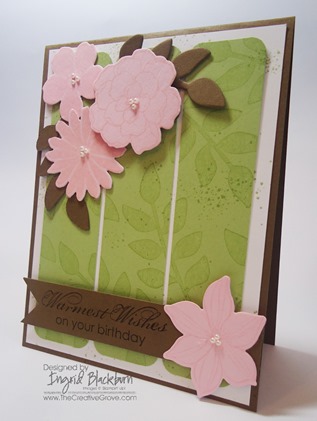
Secret Garden 002 Main B

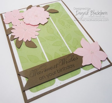
One of the reasons this set is my favorite, is that it has matching Framelits to use with your Big Shot.  I settled on a fun color combination using my Color Coach.  I chose the color Certainly Celery (I still can’t believe it’s retiring…what are we going to do!!) as my main color. 

Secret Garden 002 Side

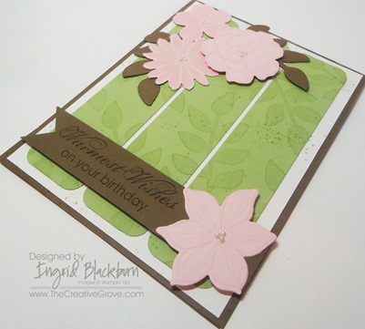
I stamped the background image and then cut it into three equal strips.  To bring a little femininity to the card I rounded the corners of each strip.  Originally I had the main card as just white, but felt it needed a little pop – so I added more Soft Suede as the main card piece.  The flowers are stamped in Pink Pirouette and then cut out using the matching Framelits for this awesome stamp set. 

Secret Garden 002 Banner CU

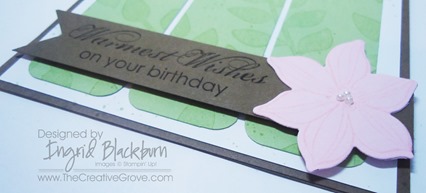
I added a little splash of color using my Color Spritzer tool and Certainly Celery Marker.  To make the banner, I used a 1” Square Punch and one of the sayings from Blooming with Kindness. 

Secret Garden 002 Flowers CU

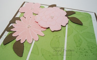
I wanted to add a little detail to the flowers, so I put three of the smallest Pearl Basic Jewels on each center for a finishing touch.  For a little drama, I popped the greeting and one of the flowers up on Stampin’ Dimensionals. 

I find this set super easy to use and have made several various cards with it.  I think you’ll love stamping with it and find that the Framelits give a great versatility to this stamp set that really sets it apart.  You’ll like using them by themselves and with the stamped images.  For more samples with this set, be sure to use the search box on the right. And of course, head on over to Melissa’s blog next – http://www.stampinup.net/blog/2089191 Enjoy the tour!

blogtour-stampmonth-next

Signature Snowflake 001

Secret Garden 002 Angle

Creative Supplies Used:

Stamp Sets – Secret Garden Ink – Certainly Celery, Pink Pirouette, Certainly Celery Marker  Paper – Whisper White, Soft Suede, Certainly Celery, Pink Pirouette  Cool Tools –Secret Garden Framelits, Corner Rounder, Color Spritzer The Perfect Finish – Stampin’ Dimensionals, Pearls

RemARKable Stamp of the Month Blog Tour – Collage Curios

blogtour-stampmonth-Feb

Welcome to stop #3 on the RemARKable Blog Tour!  You probably came from Linda’s blog Ink Stamp and Scrap – isn’t she talented!

Today we are featuring Collage Curios.  I was in a Clean and Simple (CAS) mood, so I hope you love it!

I have to admit, I wasn’t so sure where to start with this set, but I’m happy to report that once you get stamping with it, it really is easy to use!  And I can always use a stamp set that works well together in several ways.  Collage Curios 129102L

Creative Tips:

  • Since the images are small (and the perfect size to use on our awesome Soda Pop Tops), I wanted to feature several at once.  I used a grid system to achieve this.
  • I just LOVE using the Sycamore Street Designer Series Paper that you get FREE during Sale-a-bration, so I grabbed a few sheets that I love.  I then quickly decided to use the color palate of this awesome collection and my card all fell together from there.

  • For a little variety, I ran two of the squares through my Big Shot for a little texture and variety.  I chose the Fan Fair and Chevron Embossing Folders.
  • I used all but one of the stamps in this collection of 9 stamps!  The only one that didn’t make the cut is the bee, and it’s cute too!
  • My squares are 1 1/8 inch big.  My Pool Party square matte is 3 5/8 inch big which gave a 1/16th inch border around each square – just enough!
  • I wanted to add a little more, so I used some of my strips that I had left over from another project.  You know, those strips that you cut when you’re trimming down your paper – they’re usually 1/2 inch in width.  Don’t throw those out – this is one of those GREAT uses for them.  The banner too!

  • My card needed a little something, so I added the paper piercing on the top and bottom.
  • To complete my card, I added a greeting from my stand by set – Sweet Essentials and popped it up on a banner.  I used a 1” square to cut the banner.

  • My final finishing touch is that I popped the Whisper White card front up on dimensionals. 

This pool party card is SO cute in real life, when you make it, I’ll guarantee that you’ll fall in love with it!

Creative Supplies Used:

Stamp Sets – Collage Curios, Sweet Essentials  Ink –Pool Party, Island Indigo,  Summer Starfruit, Tangerine Tango, Rich Razzleberry, Sahara Sand, Tangerine Tango Marker, Garden Green Marker  Paper – Whisper White, Pool Party, Summer Starfruit, Rich Razzleberry, Sycamore Street (Sale-a-bration FREE item) Cool Tools –1” Square Punch, Essentials Paper-Piercing Pack, Paper-Piercing Tool, Stampin’ Pierce Mat, Fan Fair TIEF, Chevron TIEF The Perfect Finish – Stampin’ Dimensionals

Thanks for stopping by!  It’s now time for you to check out our next RemARKable Blogger Melissa Bollinger has creatively put together for you on our next Blog Tour stop – just click the ‘an inspiring day’ button below.  Enjoy, and happy stamping!

blogtour-stampmonth-Feb

Signature Snowflake 001

Untitled-12

Neutral Poppies

Sometimes simple is better. I love the Pleasant Poppies background stamp.  I’ve never been able to get so much use from a background stamp before.  The versatility is just great.  This Clean and Simple (CAS) card is just perfect for any occasion – and gender.  Again, versatility is great!  Here are a few tips to help you achieve this great look.

Creative Tips:

  • Keep the color throughout your project.  I know poppies are normally orange, but the neutrality of this project is just fine. 
  • White space is a key component to Clean and Simple cards.  To help add depth to this project, a tiny bit of paper-piercing in the corners go a long way.
  • Keep the font of your greeting simple as well.  You’ll change the look of the card by adding a script rather than a printed font.  I love the look of the set Made for You.  Three simple greetings in lower case font that are just the right size for any project – and it’s only $8.95 for all three!

To tie my ribbon just perfect, I use the simple rule of right over left, left over right (or vice versa).  I do not wrap my ribbon around my project, instead, I tie a know with a large ring loop.  I then figure out where I want my ribbon and cut the loop directly below it.  I save on ribbon, and it’s easy to tie.

  • If I place my saying in the bottom right corner, then I add my embellishment to the left side to provide balance.
  • Think about popping your final card front up on Stampin’ Dimensionals for a finishing touch.  It adds dimension to your project – especially when you have paper-piercing on that layer.

SSF_Seasonal_Sayings_thumb1

Single Stamps – Do you love that Greeting set, but wish you could buy just the one or two stamps?  Well, now you can from these select stamp sets: Perfectly Penned, Word Play, Seasonal Sayings.  Buy some of our best Greetings Stamps individually!   Hurry, this special is good for a limited time only through Jan 2, 2013! For more details, click here.  

Signature Snowflake 001 

To Shop 24/7 in the Creative Store Click here!

Stamp Sets – Pleasant Poppies (129499), Made for You (126342) Paper – Whisper White (100730), Sahara Sand (121043) Ink – Sahara Sand (126976) Cool Tools –Essentials Paper-Piercing Pack (126187), Paper-Piercing Tool (126189), Stampin’ Pierce Mat (126119) The Perfect Finish – Stampin’ Dimensionals (104430), 3/8” Whisper White Taffeta Ribbon (109070)

Untitled-12Untitled-12

Blast from the Past

Today I thought I would dive into my older projects to share with you one of my all time favorites.  Peaceful Wishes was one of the great stamp sets by Stampin’ Up!  And this was definitely one of my favorite cards.  The pine branches were so realistic.  And the font used for the saying is a favorite among many stampers – doesn’t it look like Scriptina? 

I used a ticket corner punch for the corners on the Purely Pomegranate and Whisper White.  I stamped in River Rock on the background for a muted depth.  This card was a fun one to make and I sent out over 100 that year.  I printed our Story on the inside so everyone knew what we were up to, and quite honestly so that I didn’t have to sign 100 cards!

I didn’t want the white to overtake the card so I did something that I don’t normally do – I left only a 1/16th edge for the base.  The effect was perfect.  I also added just a touch of stitched ribbon.  I tied a knot, fed it through a slot punch and adhered it to the back – it was quite cost effective, and did not take away from the overall look.

I hope you’ve like my little dive into the archives for this card – I miss the Purely Pomegranate color – hopefully it’ll come back one day!

Creatively yours –

Ingrid

To Shop 24/7 in the Creative Store – Click here!

Stamp Sets – Peaceful Wishes – retired Paper – Whisper White (100730), Purely Pomegranate – retired, River Rock (108640) Ink – River Rock, Purely Pomegranate Cool Tools – Horizontal Slot Punch – retired, Ticket Corner Rounder – retired The Perfect Finish – Purely Pomegranate Stitched Grosgrain Ribbon – retired