Blending Distress Inks and Creative uses for Word Stamps – One Layer Card

how to use distress inks

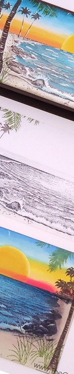
Blending Distress inks works best when you do it in layers. I remember the first time I blended Distress Inks – I thought…I don’t get it – why do people love these? They didn’t stamp well, and I got funky lines when I sponged the inks. But, once I viewed a tutorial on the amazing properties of Distress inks, I decided to give them another shot and started to not just sponge them onto my project, but blend them together and it was one of those ah ha moments. Really a wow for me – just like when you embossed for the first time!

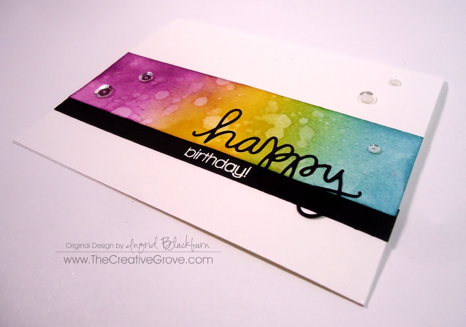
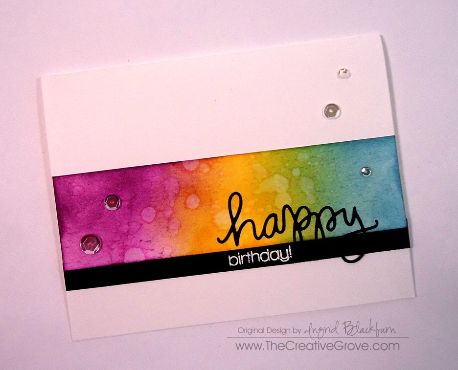
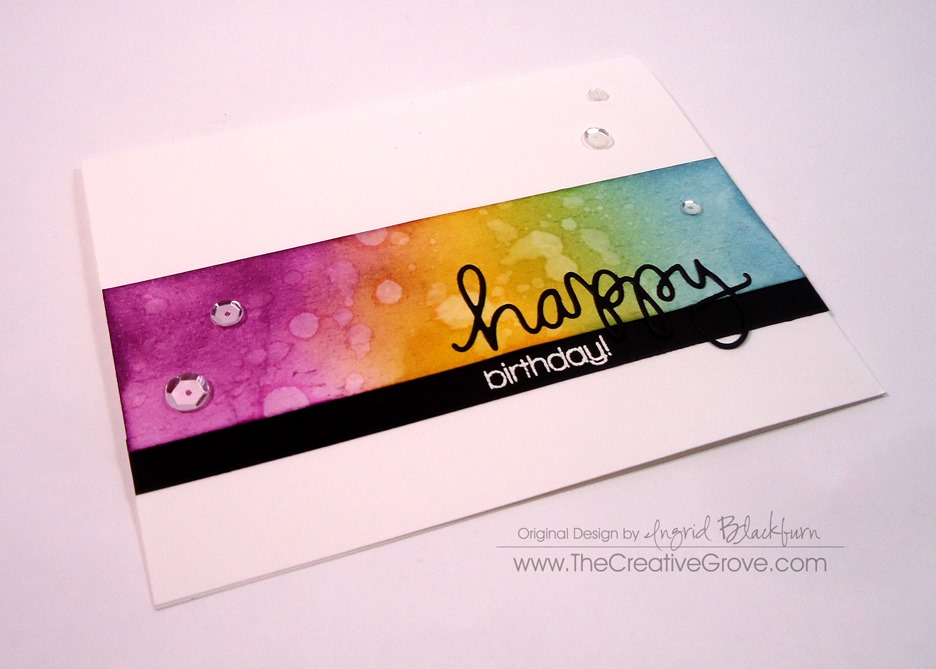
Today I have two versions of this card for you – a true one layer card and a kicked up version that is matted and uses the flicked distress technique. I also thought it would be fun to see exactly how to use your word stamps along with a step by step video tutorial on how to effortlessly blend your distress inks for an amazing background.

The concept for today’s project evolved from two challenges – CASe this Sketch #112 and One Layer Simplicity Words Challenge. This project uses your word stamps as a focal point and builds a card around that by blending distress inks.

Tutorial on distress ink

Here’s are the keys to blending Distress inks:

You need multiple layers – one, two or three are not enough. Your first one is the undercoating, then you’ll build your color as you layer. Along with building your distress ink layers, you’ll also blend out any funky marks left by your sponge tool applicator.  That’s the best part about these inks – the blending quality.

For instance, when you start to blend colors together, sometimes the darker color starts to overtake your project and it just doesn’t blend well.  Come back in with your lighter shade and it will create an effortlessly blending between the two shades. That’s where Distress Inks really differ from other dye based inks.  The inks have movable properties – especially when they come into contact with water.

tips on sponging with distress inks

On that note, you can also use your distress inks as watercolors.  Yes, add water to them, and you can paint them onto your project.  Or add water to your sponged inks and it’ll react to it.  Their movable nature makes them reactive – and not so great for stamping.  You will not get a good result like crisp edges.  When I use them to stamp with, it’s with an image that doesn’t need to be so precise.

Another thing to remember is that Distress Inks are translucent, so they blend great with other colors to create new hues. That’s probably my favorite part!

how to use distress ink

Have fun with it!  Here are the Creative Tips behind these two projects:

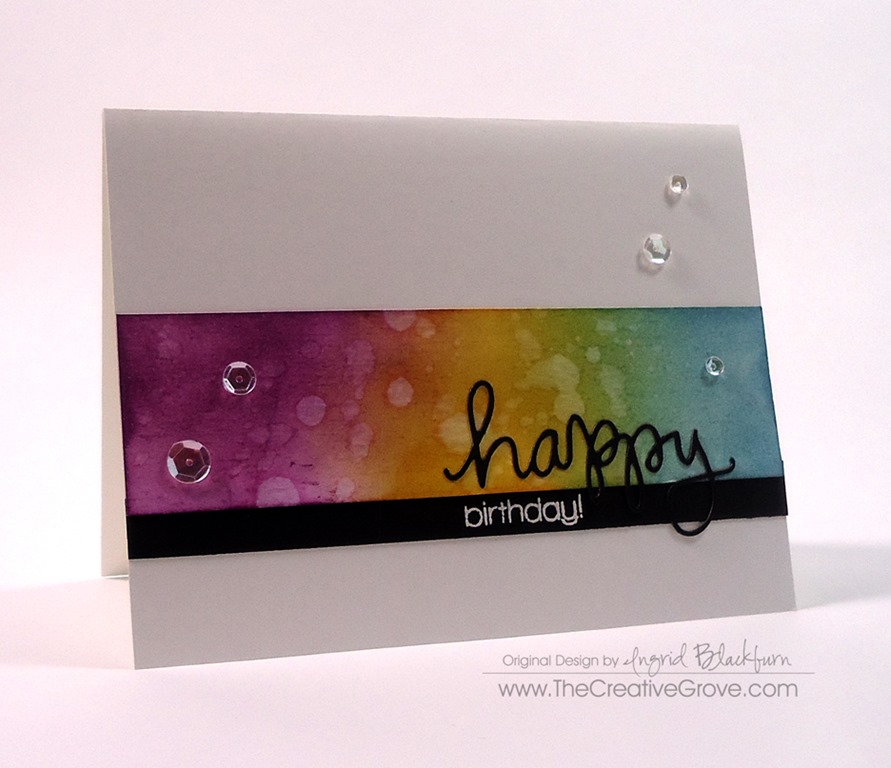
    • Mask off 1 3/4” from the top of a 4 1/4 x 5 1/5” card.  Blend your inks as in the video starting with Peacock Feathers, Broken China, Faded Jeans and Seedless Preserves.
    • Be sure to go back over the Seedless Preserves with the Faded Jeans to get the deep blue you are looking for.flicked distress technique
    • Dry the blended background at the top where you will be stamping or set to the side until dry enough that embossing powder won’t stick to it.
    • Stamp and emboss your word stamps to create a fun sentiment across the end of the blended area.  Be sure to have your words go off the sides for a continual flow.  Stamp the remaining greeting above or below to the right or left side.  Emboss.
    • The Matted card pops the black matte up using stamping dimensionals or foam tape.

Dimensions for the Matted Card –

  • Blended Piece – 3 3/4 x 5”
  • Black Matte – 3 15/16 x 5 3/16”
  • White card Base – 5 1/2 x 8 1/2”


one layer card OLC with Distress ink

I also entered this project in a few other challenges – Virginia’s View Embossing Challenge, and the Less is More Makes me Happy Challenge.

CTS_Sketch_112 Virginias View March 2014

I hope you enjoyed this tutorial on blending Distress inks. To see an exclusive video tutorial series with more great project – get our Creative Tips E-letter – see you next time!

Signature

[optin_box style=”14″ alignment=”center” disable_name=”Y” email_field=”email” email_default=”Enter your email address” email_order=”1″ integration_type=”aweber” double_optin=”Y” list=”2841626″ name_field=”name” name_default=”Enter your first name” name_required=”Y”][optin_box_field name=”headline”]If you enjoyed this tutorial…[/optin_box_field][optin_box_field name=”paragraph”]PHA+Li4ueW914oCZbGwgbG92ZSBvdXIgPHNwYW4gc3R5bGU9ImNvbG9yOiAjMjQ0YzVlOyI+PGVtPjxzdHJvbmc+ZnJlZSA8L3N0cm9uZz48L2VtPjwvc3Bhbj5zdWJzY3JpYmVyIG9ubHkgdmlkZW8gc2VyaWVzISDCoEdldCB0aGXCoDxzcGFuIHN0eWxlPSJjb2xvcjogIzI0NGM1ZTsiPjxlbT48c3Ryb25nPmV4Y2x1c2l2ZTwvc3Ryb25nPjwvZW0+PC9zcGFuPsKgQ3JlYXRpdmUgVGlwcyBlLWxldHRlciB3aGljaCB3aWxsIHRlYWNoIHlvdSBuZXcgdGVjaG5pcXVlcyB0byBhZGQgdG8geW91ciBzdGFtcGluZyBza2lsbCBzZXQuIMKgTGVhcm4gaG93IHRvIG1ha2UgcHJvamVjdHMgeW91J2xswqBsb3ZlITwvcD4K[/optin_box_field][optin_box_field name=”privacy”][/optin_box_field][optin_box_field name=”top_color”]undefined[/optin_box_field][optin_box_button type=”1″ text=”Send me exclusive tips!” text_size=”26″ text_color=”#000000″ text_bold=”Y” text_letter_spacing=”-1″ text_shadow_panel=”Y” text_shadow_vertical=”1″ text_shadow_horizontal=”0″ text_shadow_color=”#a3b640″ text_shadow_blur=”0″ styling_width=”100″ styling_height=”10″ styling_border_color=”#000000″ styling_border_size=”1″ styling_border_radius=”6″ styling_border_opacity=”100″ styling_shine=”Y” styling_gradient_start_color=”#a3b640″ styling_gradient_end_color=”#5b661e” drop_shadow_panel=”Y” drop_shadow_vertical=”1″ drop_shadow_horizontal=”0″ drop_shadow_blur=”1″ drop_shadow_spread=”0″ drop_shadow_color=”#000000″ drop_shadow_opacity=”50″ inset_shadow_panel=”Y” inset_shadow_vertical=”0″ inset_shadow_horizontal=”0″ inset_shadow_blur=”0″ inset_shadow_spread=”1″ inset_shadow_color=”#a3b640″ inset_shadow_opacity=”50″ location=”optin_box_style_14″ button_below=”Y”]Send me exclusive tips![/optin_box_button] [/optin_box]

Vibrant Flicked Accents


How to tutorial on the Flicked Distress Technique

Church bells fill the air this early Sunday morning here in Rome.  I’m drinking a rich cappuccino while writing this for you.  I created several projects to share with you while I’m traveling for several weeks through Europe, and I thought this was the perfect one to share with you today.  Yesterday we saw all the magnificent works of art in the Sistine chapel and all the Vatican museums.  Those rooms really take your breath away.

I look at those works of art and wonder how those men could paint for years on one project like that!  It really puts it all into perspective – sometimes things just take a little bit of time.  And the masters studied and worked on their craft for years, decades actually.  It’s amazing to me that with the art of Paper Crafting we get to spend a little bit of time in our day to create something beautiful to share with those that we love.  And this is one such project.

This card really packs a punch with its colors and simplicity.  It’s the simplest of cards to make, you’ll just be shocked!  No need to study for decades for this one – the right tools turn you into the master.

Learn distress ink techniques at The Creative Grove - Flicked Distress Technique

Your first step is to pick the right ink.  Just like anything in life, you need the right stuff.  You’ll want to pick inks that are translucent in nature.  That way as you layer them upon one another – be it just one shade or a mixture as you see in this card, they work together to create deeper hues rather than flat and dull.

This project uses Distress Inks because their very chemical nature is a translucent dye based ink.  What makes it so unique is that it reacts like a watercolor.  When water is added to the mix, it moves, blends and creates something new.  That’s how you get those cool effortless effects with them.  And when you add water to a set project like this one – that’s how you get those cool flicked marks, just like water spots.

If you are one of our Community members, then you have access to a step by step video on how to create the Flicked Distress Technique like this card.  It’s in our Project and Resource library.  To find out more about our online classroom site Click Here.

Flicked Distress Technique 004

Creative Tips:

To create this project, you’ll want to use the right tools with your Distress Inks by Ranger.  I used the mini sponge applicators.  Start with a strip that is long enough to cover the span of your card, mine is 5 1/2 x 1 1/2”.  You can also sponge an entire sheet and cut it down.

Using Ranger Distress Inks, start with Mustard Seed in the middle of your piece of scrap paper.  you’ll want to cover 1/2 of it – leaving enough space at the left and right to show a different color.  Yellow is a great color to combine other colors with to create new ones.  Start by sponging off your paper and lightly in a circular motion, sponge onto your project.  The reason you want to start off your paper is that the first impression you make is always a harsh one since your tool has the most ink on it at that moment.  You will naturally ease up as you work your tool further onto your project.

Add several layers of your mustard seed, and don’t worry if your sponging isn’t flawless in the beginning.  I promise it will all blend together and look effortless at the end.  That’s the beauty of Distress Inks – due to their true translucent nature, they blend effortlessly.  I was so frustrated when I first started layering mine, because it didn’t look flawless and I was really watching my pressure!  But sure enough, as I trusted the process and kept working at it – something happened and it began to look unbelievable.  I still to this day say “that’s so cool” every time I create a project like this.

Flicked Distress Technique Birthday Card

Once you’re happy with the depth of your Mustard Seed, add Broken China to the right.  continue as you did for the Mustard Seed, just overlap a little to create a beautiful shade of Green between the two.  Don’t overlap too much, just a little goes a long way.  Do the same on the opposite side with Seedless Preserves.  Once you have your layers complete, do one final pick me up with the Mustard Seed to brighten it up and you’re all set!

Spritz a little water onto your hand where your palm and fingers meet and in a firm and fluid motion flick the water a few times onto your project.  I encourage you to try this first on a practice piece to “get it”.  That gives the spots your see above.  Dry it quickly with a little zap from a heat tool.  The reason for the heat tool is that water will always react with Distress Inks, and if you get a really get area, you want it to just stop, rather than continue to work the ink.

To finish your card, emboss the word Birthday from the set happy by Simon Says Stamp onto a strip of Black card stock.  Attach it to the bottom of your strip and place the coordinating word Happy above it with liquid glue.  Add a few sparkling clear sequins by Pretty Pink Posh are you’re set!

So what did you think?  Have you tried this technique out before – I’d love to know!  Leave me a comment and tell me what color combinations you’ve tried!  Have fun – Ciao!

Signature


If you like learning how to create this technique then you’ll LOVE our online classroom community.  We add new step by step project tutorials each week with up close photographs and classes.  Learn more about how to be a part of our paper crafting community HERE.

CAS Dahlia Mojo Monday

DSC01372

It’s been a while since I played along with the Mojo Monday challenge.  I have to admit, I’ve missed it!  I’ve been in a technique zone creating our new VIP Community here at the Grove (click here to find out more), so I threw a fun simple one into this project.  Sometimes when you have a cool texture that you’ve created for your card, making the rest clean and simple really allows it to stand out.

Here’s the sketch and my version.  You can see, I stayed pretty true this time.

Mojo349SketchDSC01375

Here are some tips on how to make this card, and join our Creative Tips list (on the right) to see exclusive free videos on how to make cards just like this:

  • Crumple your paper to create a faux leather look to your cardstock.  If you find it’s hard to do this, spritz it lightly with water.  Use the sweat from your palms to aid you in crumpling this up really well.
  • Cut your solid Navy strips thin – just 3/8” wide.
  • Adhere a thin strip of Cherry Cobbler and your Navy strips with Tombo Multi Liquid Glue.  When you alter cardstock, as with the crumpling, it becomes hard to work with.

DSC01376

  • Snip off the edges of all your strips and adhere your Sahara Sand cardstock to a 5 1/4” x 4” piece of white cardstock.
  • When adhering your large piece down, keep the same amount of space to the right, left and bottom.  It becomes an extended mat.
  • Cut a 2 1/2” circle with a circle punch, framelits or nestibilities. Stamp your Dahlia image in Cherry Cobbler.  Attach to your card front, leaving the same amount of space at the top as the bottom white to balance it out.  Use Liquid Glue on textured cardstock, dimensionals or foam tape to attach to the white to adjust for the height variance.

DSC01377DSC01378

  • Stamp your greeting and emboss in white on Navy cardstock.  Create a banner with your snips or hexagon punch (see video here on how to do that).  Attach with dimensionals onto the white, glue onto other parts.
  • Pierce edges of your card with a paper piercer and a template.
  • Add large pearls to Cherry Cobbler cardstock to finish your card.
  • Pop your card front up onto your card base.

DSC01373

You’re done!  It’s a fun little project, isn’t it?  Let me know what you think!  Leave me a comment below.  Happy Creating!

Signature-Blog

Interested in learning stamping techniques each month?  Check out our new VIP Community!


The Creative Process and a Sneak Peek!

Stampscapes Tropical Lagoon 9.5.13  (6)

Do you ever feel like it is a definite process to get to your desired project result?  Do you hit a home run each time you start a new creative project?  I certainly do not!  I hope this post will help you to realize that it’s okay to re-do a project, or take it in steps.  Today, I thought it might be helpful for you to see what my desk looks like when I’m right in the middle of a project.  I took a break from packing to get a little creative for you!  Here’s a snapshot of my process – notice a not completed project in the upper right, a middle project template  in the center and then my actual finished project in process.

Stampscapes Tropical Lagoon 9.5.13  (5)

This is actually not that bad.  I cut my paper in a different space or it’s just too much!  Today you see that I’m using various types of ink pads – four different brands actually!  And to get some business inspiration at the same time, I was taking a class – that’s what’s on the computer monitor.  My space started to get a little overwhelming, and I had to put some stuff in it’s place so that I felt like I had some elbow room, but my end result worked out awesome!

To the left, you see a sneak peek of tomorrow’s project with the end result at the top, my middle test project that became my creative process, and my beginning project that went all wrong in several ways.  I know it doesn’t look like it, but trust me, it did!

I began a project for a friend and wanted it to be just right.  It didn’t quite turn out the way I had planned.  So what I did was take a piece of scrap paper and work the project out so that I felt a bit more confident and now I LOVE the end result.  Please tune in tomorrow to see it!

Update – Packing up the Stamping Studio – It’s been quite a task to pack up the studio.  We’ve been here for nine years and my craft room is 28’ x 14’ – it’s loaded with open spaces and shelves filled with projects, cards, and supplies.  And that’s not even my classroom.  Yes, I’m lucky – when I first started in this industry, I had a 4’ x 2’ folding table, chair and one plastic set of drawers – in the corner of our family room.  I couldn’t stand putting things away each time I scrapbooked or made cards – I vowed to have a room all to myself with a door someday!

I didn’t get it until we purchased our home nine years ago, and now I’m leaving my dream space.  It’s okay – we’re on to a fun adventure – but I now have the experience of knowing how much space I truly need to be creative and productive.  While my huge room (rooms if you include my even larger classroom), will be missed – I know I will be fine in a smaller space.  Actually – I’m looking forward to it.  You see, I ended up collecting way too much stuff with such a huge space (makes sense – we just have to fill it, don’t we!) – it made for a nice downsizing sale for my local customers though!  Thanks for bearing with me as I continue to pack and purge!

See you tomorrow – you’ll want to tune in…this card is my most impressive Creative Scenery project to date.  I’m going to have to make myself one to keep!  Have fun stamping!

Signature Snowflake 001

To Shop 24/7 in the Creative Store – Click here!

Stamp Sets – Stampscapes Stamps Ink – Marvy – Oriental Blue, Turquoise, Caribbean Blue, Jungle Green, Yellow, Brilliant Yellow; Adirondack Lights – Cloudy Blue, Aqua, Peach Bellini; Stampin’ Up! – Early Espresso, Crushed Curry, Tangerine Tango, Sahara Sand, Crisp Cantaloupe, Early Espresso Marker; Memento – Black Paper –Glossy White, Early Espresso Tools – Colorbox Stylus, Brushtix Mixed Media Brushes Finishing Touch – Uni-ball Signo White Gel Pen

Vintage Mojo Monday

Blooming with Kindness 003 Main

Vintage looking cards don’t have to be difficult to make.  I find that sometimes I struggle with this look, but a few elements really help make this card come together quickly.  It’s Mojo Monday again and I have to admit, I’m never round – always square!  Maybe someday I’ll step outside of my comfort zone and attempt the round, but not today.

      Mojo291SketchBlooming with Kindness 003 Front

I immediately went to my Fan Fair Designer Series Paper when I saw this sketch.  I tried it with three banners, but just had to put five on instead.  It’s ironic that today’s card is about banners, as I just filmed a video on just how to make banners yesterday.  I’ll be editing it today, so look for it tomorrow! Click Here to see the Video

Creative Tips:

  • My dimensions on this card are 5.5”x5.5” for the base.  I cut the Chocolate Chip 5”x5” and the Very Vanilla 4 7/8”x4 7/8”. 
  • After choosing the Fan Fair Designer Series Papers that  I wanted as the banners, I altered the height and width of each one for a little variety.  To make my banners, I used a 1 3/8” Square Punch.  I wanted the peak to be the same in each one, so I used it on all five banners.Blooming with Kindness 003 Banners
  • For the greeting, I have to admit that I first did two ovals with our new Oval Framelits.  But I don’t like having too much of a matte and since they are round, trimming them just isn’t an option.  So instead I used the small Apothecary Accents Framelits for the Matte.  It evokes a Spanish Inquisition feel for me – not sure why, but it does. 
  • I wanted to do a little stamping and add some texture to the backdrop of my greeting.  I went to the gorgeous flower in Blooming with Kindness.  I stamped it off once in Crumb Cake to lighten it a bit and then added my greeting from Lacy and Lovely in Early Espresso for contrast.  Of course I popped it up too.Blooming with Kindness 003 CU
  • For my ribbon accent I used our 5/8” Victoria Crochet Trim.  It’s my first time using this delicate but gorgeous ribbon, you have got to try it, the photos do not do it any justice and it’s perfect for any vintage looking card! Blooming with Kindness 003 Side
  • I needed to fill the white space up a little on the project, so I went to my good ‘ol stand by – paper piercing with the Essentials Paper Piercing Pack.  Since there was so much space at the bottom, I added 5 holes in each direction rather than my usual three.  And at the top I only did two.  It really turned out nice – grab your paper piercer any time you feel like it needs something.  The best part – it’s a one time inexpensive purchase. Overall, I just love the way this project turned out.  It’s not my normal style or color combination, but there’s just something about it that is striking and it’s definitely a vintage look.  Have fun making your own Mojo Monday creation!

Signature Snowflake 001

Check out the Retired Lists!  Get all your favorites while you still can.

Retired Stamp Sets                      Retired Accessories List

To Shop 24/7 in the Creative Store – Click here!

Blooming with Kindness 003 Angle

Stamp Sets – Lacy and Lovely (122885w, 122887c), Blooming with Kindness (126420w, 126422c) Paper – Fan Fair DSP (126918), Very Vanilla (101650), More Mustard(100946), Chocolate Chip (102128) Ink – Crumb Cake (126975), Early Espresso (126974) Cool Tools – Oval Framelits (129381), Apothecary Accents Framelits (127003), 1 3/8” Square Punch (119877), Essentials Paper-Piercing Pack (126187), Paper-Piercing Tool (126189), Stampin’ Pierce Mat (126119) The Perfect Finish – Stampin’ Dimensionals (104430), 5/8” Victoria Crocheted Trim (118481)

Blooming with Kindness126422LLacy and Lovely