Lovely Lattice Butterflies – SOA is live!

Lovely Lattice Background - Catherine Pooler Designs

I’ve been creating a lot with the kissing technique lately. I have to say, this simple technique always amazed me!  It’s been a cram packed few days of inspiration here and on the design team blogs. If you’ve missed any of the fun, I have links at the end for you.

Lovely Notes SOA Now

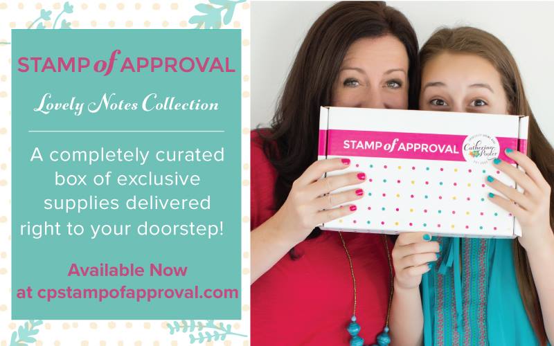
Today the Stamp of Approval Lovely Notes Collection goes live – yup…if you’re on the wait list you’ve received a link to head on over and grab a box. It’s the first release of these six stamp and two dies sets. You’ll also get a loaded PDF with projects and step by step instructions – how’s that for a place to start! Not on the list – no worries – get on it right here and get a head start on the public release tomorrow (if it hasn’t sold out!).

If you’ve seen any of my past three posts, you know I still have more projects for you – yup…today I even have another video! Over at StampNation, there’s a challenge going live today – Meadow Daydreams. I have to say, this challenge is made for me – I LOVE this kind of a color palette and theme. I’m actually shocked that I didn’t do a scenic card! Here’s a sneak peek into the project I created…to see it, you have to be a member of StampNation though.

Meadow-Daydreams-Sneak Peek

New Inspiration for you

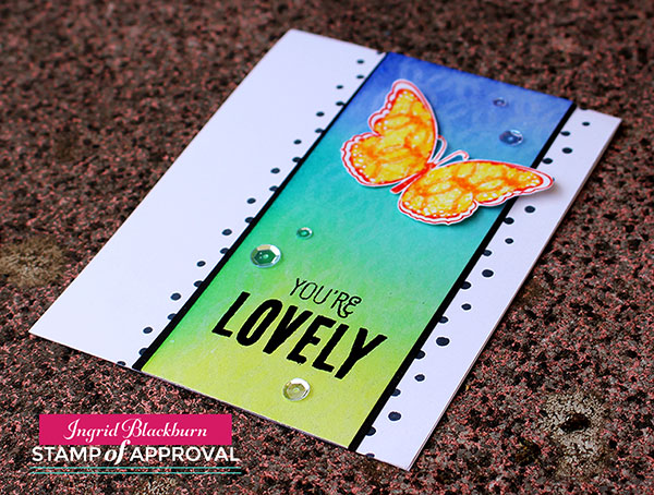
So to piggy back on the challenge – I created a few cards with the same color palette, theme and then I loaded them up with techniques – after all, that’s kind of my thing, isn’t it?I have a video tutorial for you here and a written one below.And if you aren’t already – I’d love for you to subscribe to my YouTube channel too – click here.

Click Here to see the video in HD

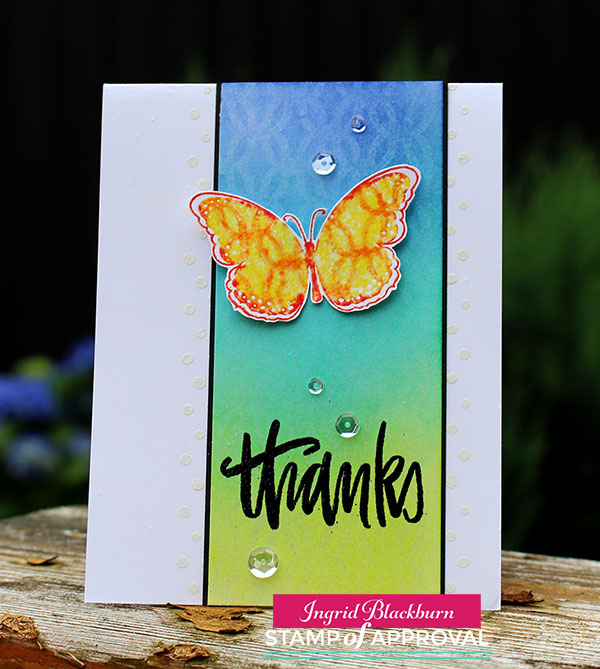
Lattice Butterfly Tutorial – the Kissing Technique + others

  • Ink up your Lovely Lattice Background stamp by Catherine Pooler Designs in Versamark
  • Transfer your image to a piece of 140# Cold Pressed Watercolor Paper (5 1/2 x 4 3/4″) & clean your stamp
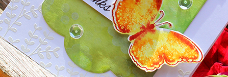
  • Sponge your colors over your image blending the colors Twisted Citron, Peacock Feathers and Blueprint Sketch

Kissing Technique - Stamp of Approval

  • Allow your Distress Ink to fully dry while working on your butterflies
  • Ink up the large butterfly from Butterfly Notes by Catherine Pooler Designs in Squeezed Lemonade & Edge in Barn Door.
  • Ink up your Lovely Lattice Background stamp in Spiced Marmalade (you only need an area as large as your stamp)
  • Kiss your inked up butterfly to your inked up background stamp; thus transferring your image to it – or kissing

Butterfly Notes - Stamp of Approval - Catherine Pooler

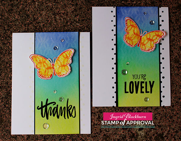
  • Stamp on a piece of regular white card stock and heat emboss immediately in clear embossing powder. If your image has dried before your powder sticks, just stamp over your butterfly in versamark. Repeat for a second butterfly.
  • Fussy cut out your images
  • Cut your background in half (5 1/2 x 4 3/8″) and rub a de-static bag onto the bottom half. Stamp (Versamark) the greeting Thanks – Handpainted Thanks by Neat & Tangled & You’re Lovely by Catherine Pooler Designs – Lovely Flowers. Emboss in Black.
  • Trace the edges of your strip lightly for a guide where you plan to adhere it to your card base.
  • Stamp the polka dots from Lovely Flowers (landscape so you have the alternating ends) down the side using the line to keep your pattern straight. You’ll need to overlap the bottom dot with the top for an even pattern. I stamped one in Memento Tuxedo Black and the other I embossed with Versamark and white embossing powder.

The Kissing Technique - Versamark - Ingrid Blackburn

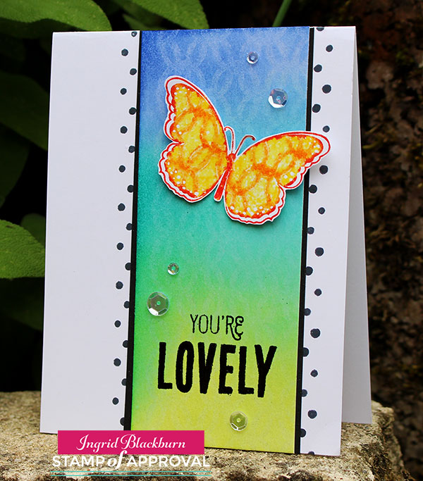
  • Matte your background onto black (5 1/2 x 4 1/2″) so that it just has a sliver of black – this will cover your line.
  • Adhere your butterfly with two mini glue dots in the center and place a foam dot under each wing toward the top to help with the illusion of flight.
  • Add Sparkling Clear Sequins by Pretty Pink Posh.

I love how the background stamp just magically appears. This technique has the biggest wow on glossy card stock & with darker inks, but the subtle effect here is lovely and the perfect accent.

Stamp of Approval

Lovely Notes SOA Banner

Thanks for joining me today! I have two more projects headed your way in the days to come, so be sure to stop back by! In the meantime, if you missed any of the six projects I posted this week, or the blog hops for all 18 designers – yup…there were that many – click on the links below for the starting point of each hop:

Day 1               Day 2               Day 3

And don’t forget to check out the Stamp of Approval – Lovely Notes Collection – it’s live right now – but just for those on the wait list!

Now that we’ve given you a ton of inspiration, it’s your turn – take what you learned here today or over the past three days and create your own cards – go get your fingers inky!!!

Signature

[optin_box style=”12″ alignment=”center” email_field=”email” email_default=”Enter your email address” integration_type=”aweber” double_optin=”Y” list=”3846012″ name_field=”name” name_default=”Enter your first name” name_required=”Y” opm_packages=””][optin_box_field name=”headline”]Learn more with our exclusive FREE video series:[/optin_box_field][optin_box_field name=”paragraph”]PHA+UGx1cyB5b3XigJlsbCBiZSBhZGRlZCB0byBteSBGUkVFIENyZWF0aXZlIFRpcHMgRS1sZXR0ZXIgd2hlcmUgSSBzaGFyZSBleGNsdXNpdmUgcHJvamVjdHMsIHZpZGVvcyAmYW1wOyB0aGUgMTIgRGF5cyBvZiBDaHJpc3RtYXMgUHJvamVjdCBTZXJpZXM8L3A+Cg==[/optin_box_field][optin_box_field name=”privacy”][/optin_box_field][optin_box_field name=”top_color”]undefined[/optin_box_field][optin_box_button type=”0″ button_below=”Y”]Get Instant Access![/optin_box_button] [/optin_box]


Farewell Kindness Matters

Kindness Matters 002 Main

Do you ever just have those go to kind of stamp sets?  Kindness Matters has definitely been one for me. I probably use the Thanks greeting from this set more than any other, and I know I have a guaranteed great card every time I use the butterflies.  It’s a fabulous set that if you don’t have, don’t miss out.  Best part – it’s one of our least expensive sets, so there’s great value too!

Today I’ve paired this fun stamp set with a few of our retiring colors.  Yesterday you read how Not Quite Navy has been my #1 favorite color for 11 1/2 years (still…sniff…sniff), but this year, one of my go to colors has definitely been Baja Breeze.  I was is complete shock when this color retired.  And quite sad, as I have so many cool things in Baja Breeze.  It was such a great color to work with.  It’s sad that I’m speaking of it in the past tense, but this is my grieving week, and then Friday I’ll move on! Smile

Kindness Matters 002 Side

Creative Tips –

  • I always want to use the Rock n Roll technique when I use this stamp.  The butterflies to me just need that multi color.  Perhaps it’s because most butterflies are multi colored.  I stamped the main image randomly and from various angles on an oval that I cut out using the new Ovals Collection Framelits and my Big Shot.  It’s the second smallest one.  I used So Saffron, but didn’t want the butterflies to take away from my main ones, so I stamped them off once to decrease their vibrancy. Kindness Matters 002 Butterflies
  • Next I stamped my main images on a piece of scrap paper.  I used the new color Crushed Curry.  I really wanted my yellow to stand out from the So Saffron.  I rocked my image in Baja Breeze and then slightly on the edges in Not Quite Navy.  To get a good outline on my images in Not Quite Navy, I touched up my image with my Stampin’ Write Marker in the same color.  I also thumped the marker along the center of each butterfly.
  • Of course blue and yellow make green, but I think since this blue is so much darker, it stands on its own.
  • I cut out my rock n rolled butterflies with my paper snips and ran some Snail adhesive down each center.  I curls and popped up the wings with some Stampin’ Dimensionals that I trimmed down to fit.  This way the butterflies look like they are in flight.Kindness Matters 002 CU
  • I took a piece of our retiring Baja Breeze 1/2” Seam Binding Ribbon and pulled a few of the middle fibers to ruffle the ribbon a bit.  Once I had it how I wanted, I adhered it using Glue Dots – the single best way to attach fibers to anything!
  • I ran a piece of Not Quite Navy through my Big Shot using the Chevron Embossing Folder for a little contrast and added half of one of our new Paper Doilies.  Together the combination has a collage feel, yet also looks contemporary.
  • I try to apply the law of thirds to just about all my projects in the design aspect.  You’ll see that my main image is in the top third of the space, while my Pearl Basic Jewels accents are also in threes, within three.  You always want to add your embellishments in odd numbers.  Kindness Matters 002 Front
  • Since the Seam Binding Ribbon is such a large accent, I balanced it out on the other side with one of our Vintage Faceted Buttons on the opposite side.  I used Pearls to complete my triangle, and used some of our White Bakers Twine for the knot.  Of course I attached it using Glue Dots.Kindness Matters 002 Height
  • One tool that I will keep on using, and if you don’t have one I encourage you to get it right away – that’s the Color Spritzer Tool.  Combined with any of our Stampin’ Write Markers, you can fill any space in just the right way.  I used my Not Quite Navy Marker to add the speckling to both my oval and main project.  Don’t hold it too close, as the dots will be highly concentrated together. 
  • You may be wondering where my greeting is, well…after playing around with several banners, tags to be attached with vintage trinkets like our safety pins and staples, I decided to just put the greeting on the inside.  Although, there’s nothing wrong with a blank card too! 🙂
    As this week quickly winds down, I’m trying to use all my favorite things one last time for you before moving on.  It’s not so easy!  You many be wondering why move on at all?  Well, in my Stampin’ Up! world, if it’s not current, then use it sparingly.  That’s okay, believe me when I tell you I have a secret stash of Not Quite Navy card stock in both sizes…lol! 
    There are a handful of stamp sets that will make the cut and remain on the shelves of the Creative Studio.  But not many!  I find that I think I’m going to stamp with them, and then I don’t.  So I’ve gotten quite good at purging.  Which is to your benefit – look next week for all my “retired” sets on here.  Some go back 10 years! Have a creative day today – and most of all, have fun!

    Come Stamp with Me!

    f you are in the Orlando area and want to come to the Creative Studio to stamp – be sure to check out the classes tab above.  I have Just Cards and Creative Cards classes on Monday June 3rd!  And of course, don’t miss my free but fully loaded with fun New Catalog Kick Off Thursday June 6th. Smile

Signature Snowflake 001

To Shop 24/7 in the Creative Store – Click here!

Kindness Matters 002 Angle

Stamp Sets – Kindness Matters (122902c, 122900w) Ink – So Saffron (126957), Baja Breeze (126960), Crushed Curry, Not Quite Navy (126971), Not Quite Navy Stampin’ Write Marker (Regals Collection – 119701) Paper – Whisper White (100730), Not Quite Navy (101722), Baja Breeze (111352)  Cool Tools – Paper Snips (103579), Color Spritzer Tool (107066) Finishing Touch – Stampin’ Dimensionals (104430), Pearl Basic Jewels (119247),  Baja Breeze 1/2” Seam Binding Ribbon (122331)

new stampColor Spritzer Tool I107066

Best of Butterflies Color Splash

Best of Butterflies 002 Main

When I think of butterflies, I think of color.  Butterflies are spots of color that fly around and color our world.  It may be simplistic, but that’s what I see every time one flies by.  So today I thought I’d add a little color to your world using the Best of Butterflies 25th Anniversary stamp set.  Be sure to stop by tomorrow for the RemARKable Blog Tour with this set.  You’ll get tons of ideas!

Best of Butterflies 002 SIde

Creative Tips –

  • I stamped my butterflies in Jet Black StazOn so that they wouldn’t smear when sponged.
  • Normally I would use Sponge Daubers, but today I wanted a little messier a look, so I used my everyday Stamping Sponges.
  • Tip – I wanted the sponging to have a light look, so I did it in a circular motion starting on my grid paper and then onto my butterfly.  That way the harsh starting color isn’t on my project.
  • When I think of the traditional butterfly, I think of the Monarch, so I started with two colors – Crushed Curry for that vibrant deep yellow and Tangerine Tango because that’s just the perfect shade. Best of Butterflies 002 CU
  • I added a fun, bright blue – Bermuda Bay and wanted a purple, so I settled on Rich Razzleberry.  I have to admit, it’s not my favorite shade for this project, but couldn’t settle on any other.  What do you think?
  • I wanted a vibrant color on the inside that worked with all the colors so I chose Crushed Curry – one of my new favs! I added a full card panel on the inside.  You could adhere it to the front cover, but the card would lose the flight effect.
  • Best of Butterflies 002 Inside

  • I have to admit, the greeting was not supposed to be a banner, but I dropped my card on my Razzleberry ink pad – whoops!  Yes, I know, you’re thinking glad it’s not just me!  Well if full disclosure is what you want, look at the bottom butterfly, see the extra ink?  I cut out a little notch where it was really noticable, but couldn’t get it all – that’s okay, I’m human too!
  • So to fix my Razzleberry spot on my card, my greeting went onto a banner.  Since I didn’t have any layers on the top of the card, I didn’t pop my banner up.
  • The greeting is with our Made for You stamp set which is only available for two more weeks!  It’s a great go to set that is so inexpensive, don’t miss out on this gem.
  • For a little pop, I added the Pearl Basic Jewels on the butterfly heads – cause let’s be honest, the heads look a little freaky, so this way they are covered up in an elegant way. Best of Butterflies 002 Front
  • I hope you love my little splash of color into your day today.  This is a fun, quick and bright card that works for any occasion.  I like the messy colored look of it – kind of like I threw paint at it.  Well, almost! 

    Are you getting my Exclusive Video Series?

    Be sure to sign up for my Creative Tips Newsletter and get the latest Creative Grove news in addition to my free Creative Techniques Video Series!  Don’t miss out on our creative community – the only way to get this exclusive content is to sign up in the box on the upper right or click here.

    Upcoming Blog Tour

    Be sure to stop by this Sunday for the 25th Anniversary Blog Tour featuring this cool stamp set.  20+ stampers with great ideas – you won’t want to miss it.

Signature-Snowflake-001_thumb1_thumb[1]

To Shop 24/7 in the Creative Store – Click here!

Best of Butterflies 002 Angle

Stamp Sets – Best of Butterflies (133345c) Made for You (126342c, 126340w) Ink – Jet Black StazOn (101406), Tangerine Tango (126946), Crushed Curry (131173), Rich Razzleberry (126950), Bermuda Bay (131171) Paper – Whisper White (100730), Crushed Curry (131173) Cool Tools – Paper Snips (103579), 1” Square Punch (124094), Stamping Sponges (101610) Finishing Touch – Pearl Basic Jewels (119247)

Best of Butterflies

Untitled-12

Stampin’ Up! Swallowtail Splendor

Swallowtail (43)

Greetings from St. John in the British Virgin Islands!  This island is a flora and fauna mecca with white gorgeous beaches and amazing snorkeling.   Unfortunately it is raining so hard we can’t leave the ship yet.  So I thought I would share a quick card with you today.  With the natural beauty that this island holds, I thought a card with the Swallowtail stamp would be appropriate.  It is quickly becoming my favorite background stamp to use.  .

Swallowtail (44)

What’s so great about the Swallowtail is that it really is such an impressive image to use as the focal point for your creative projects.  Here I chose to add a little color to my project with a blender pen and some Stampin’ Up! Markers.  I have really grown used to my clear mount Swallowtail stamp which has really surprised me.  I normally always favor wood mount stamps when it comes to background stamps.  Click here to read my first experience with this great stamp

Creative Tips:

  • I embossed my image in Black Craft Ink and Crystal Clear Embossing Powder. 
  • To color my image, I used a Summer Starfruit Marker for the base and a blender pen with More Mustard ink  for highlights and depth.  To add a little orange to my wings, I used my blender pen in the Tangerine Tango Ink Pad.
  • To collect ink for coloring, squeeze your pad and collect ink in the lid.  Don’t worry about wiping it out, the ink will stay fresh on the plastic surface.  This is one of the benefits of Stampin’ Up! Ink Pads – you can squeeze them.

Swallowtail (47)

  • For a lighter shade, use an Aqua Painters instead of a Blender Pen.
  • To bring a little emphasis to my image, I sponged more mustard around the edge of my image before mounting it to a piece of Basic Black card stock.
  • My project looked best on a base of More Mustard to pull color from the main image.
  • For my greeting, I used my favorite Thanks stamp from a set that retired 10 years ago. 

The Swallowtail stamp can be used for just about any occasion.  I personally love this look and find that it works for a masculine card as well – and that’s always a good thing!

Signature Snowflake 001

To Shop 24/7 in the Creative Store – Click here!

Swallowtail (45)

Stamp Sets – Swallowtail (129213w, 129216c) Ink – Tangerine Tango (126946), Summer Starfruit Marker (126856), More Mustard (126964)  Paper – Whisper White (100730), More Mustard (100946), Basic Black (121045)  Cool Tools – blender pen (102845), Aqua Painters (103954)  Finishing Touch – Stampin’ Sponges (101610)

Swallowtail Stamp 129216L