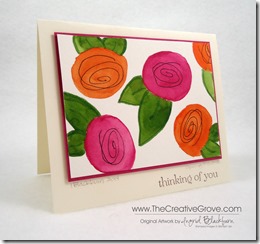
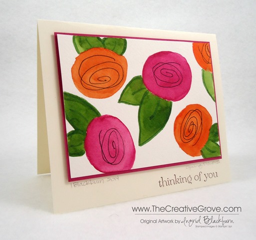
What did you think about the last watercolored card? Did you miss it, see it here! Today you will want to use the same two Schminke colors – Translucent Orange and Magenta, in the same style, but with a totally different look. Add some free form leaves with Sap Green and Olive Green as well. To give the card that pop, you will want to use some Stampin’ Up! Rose Red card stock. For a little drama, add some Dimenionals to help it stand out a bit more! It was surprising that the Magenta color matched the Rose Red card stock. But, the deep hue was almost a perfect color.
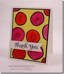
See how much different the card looks from the last one without the lemon yellow wash painted as the background? It’s really surprising to see them side by side and how different they look.
I know I added a thinking of you greeting, but this would be the perfect blank or mother’s day card! Since it is an original artwork piece, I also added a title to my little masterpiece – Spring Flowers and signed my name and date. Definitely add the date – it gives your art value, especially as the years go on! It’s also to see the progression over time. The card is 1/4 larger than the traditional A2 sized other card. It measures 5×6”.
To see the specifics about how to watercolor, technique and supplies used, visit the original post for the other sample here. To purchase or find out about any of the supplies, click the links below. I hope you enjoyed this little watercolor, my next is a landscape done mini style! Be sure to stop by in a few days for that. Happy watercoloring!
Shop 24/7 in my Online Store – Here
For other art supplies, check out these online resources:
Dick Blick and Jerry’s Artarama
For online card classes – be sure to check them out in the classroom under the Online Classes tab above!


Gorgeous! Did you paint the leaves with watercolor and then use a green marker to outline them ? thank you
SWOON!!I wish I could see the gorgeous blooms like these outside my window (it’s snowing here instead!–LOL)! I love the rich and bold color choices, Ingrid! The contrast and your pop-up frame really make the design shine! Thanks for linking up to Virginia’s View Challenge!
Thanks for visiting Virginia! I’m sorry it’s snowing there…I’ve been dying for some snow here this winter, usually there is snow, not this year. 🙁 The Challenge has been fun – love all the samples!
Very pretty card, even with the same elements as your last card, it is so different. Love the brightness of your colors and how you turned your circles into flowers….would look great in a frame.
Thanks Carol! I just love this card, it blows me away how different it is from the other one. I hadn’t thought about the frame! You are right, love that idea. Thanks for stopping by today! 🙂