Sometimes you just need a good color combination to work from. Today I have a fun little project that is simple, straightforward and has that little pop!
Have you ever heard of complimentary colors? No, they didn’t just say “Oh…excuse me did anyone ever tell you that you are prettiest shade of orange!?” Okay – that was a bit cheesy…what I really mean is that they are on opposite sides of the color wheel. When opposite sides of the color wheel come together – something amazing happens. The amazing thing is what we are focusing on today – the pop.
Before I get too into the pop (the amazing part) the opposite holds true if you actually blend the two complimentary colors – you get ick – mud. So for today, we’ll talk about layering complimentary colors like Blue and Orange, and stay in the pretty place!
Blue is my favorite color – and more often than not, I love a blend of blues. So to get a cool look, ink up the top of your Lattice Background stamp with Mint to Be, the middle with Aquatini and the bottom with Fiesta Blue. To get that seamless blend, use a mini sponge tool, dauber, or even the lighter ink pad and dab on the border where they blend. That takes any of the harshness away and you’ll be left with an ombre look.
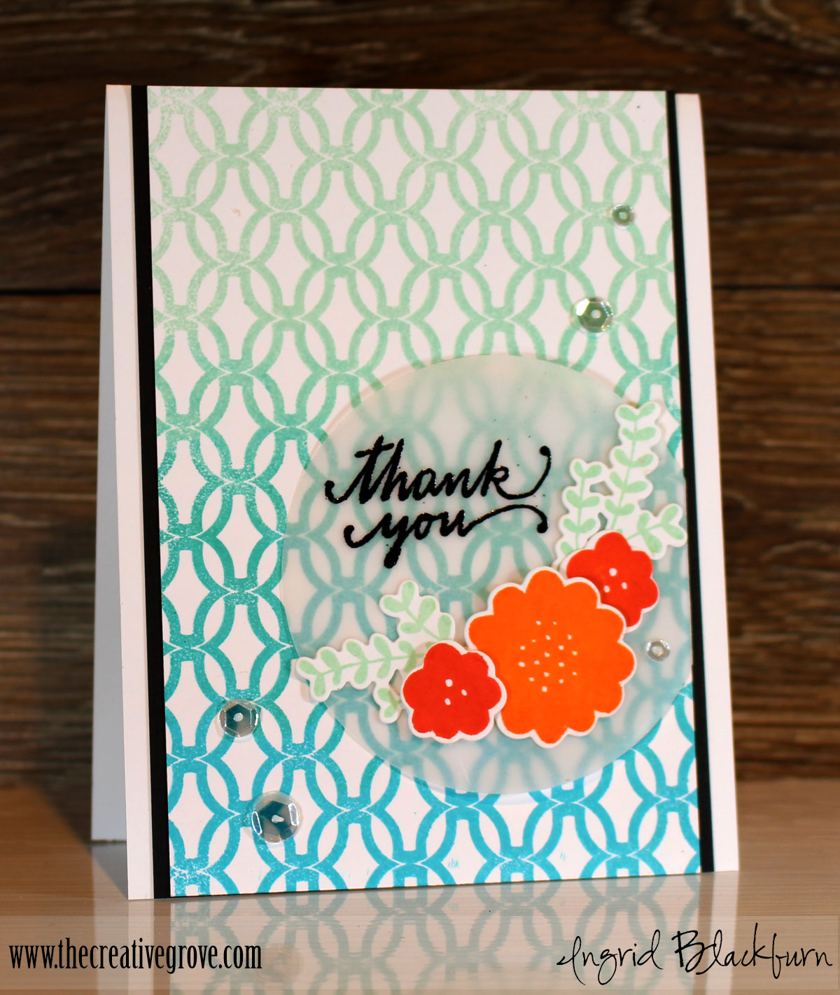
Now for the Pop! To allow your floral images to shine a bit more on their own, cut a circle using the Circle Dies out of vellum cardstock. Next cut several floral images with the Lovely Flowers Banners and Dies. Stamp the coordinating images from Lovely Flowers in Tutti Fruitti and Orange Twist. Stamp your leafy branches in Mint to Be.
We’re working with two sets of compliments here – Red/Green and Blue Orange. Tutti Fuitti is a reddish orange that pops when layered over the Mini to Be – both are not straight traditional colors, but you can see how they work together. Orange Twist is pure orange and you can see how it really pops when layered over Fiesta Blue – a pretty traditional blue. There you have it!
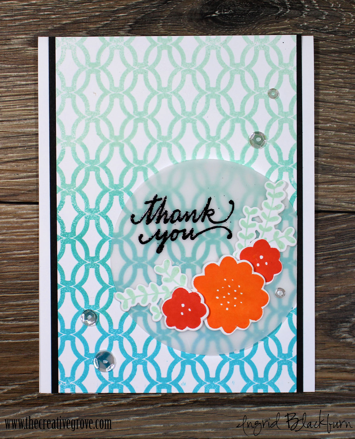
Emboss a quick little sentiment from the Still Smiling stamp set – a great sentiment/greeting set for cards, add a few sparkling clear sequins and you’re all set!
So the next time you need a pop of color – reach for your color wheel and choose a few opposites to layer. You’ll LOVE the result!
Till next time –

[optin_box style=”12″ alignment=”center” email_field=”email” email_default=”Enter your email address” integration_type=”aweber” double_optin=”Y” list=”3846012″ name_field=”name” name_default=”Enter your first name” name_required=”Y” opm_packages=””][optin_box_field name=”headline”]Learn more with our exclusive FREE video series:[/optin_box_field][optin_box_field name=”paragraph”][/optin_box_field][optin_box_field name=”privacy”]Plus you’ll be added to my FREE Creative Tips E-letter where I share exclusive projects, videos & the 12 Days of Christmas[/optin_box_field][optin_box_field name=”top_color”]undefined[/optin_box_field][optin_box_button type=”0″ button_below=”Y”]Get Instant Access![/optin_box_button] [/optin_box]
Supplies
To make finding the supplies I used in these projects a bit easier for you, here are a few clickable links. Compensated Affiliate Links are used when possible. Click here for disclosure. Happy Shopping!
Speak Your Mind