Watercolor Smash in the Mix Mash Forest

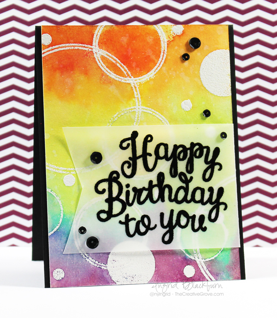
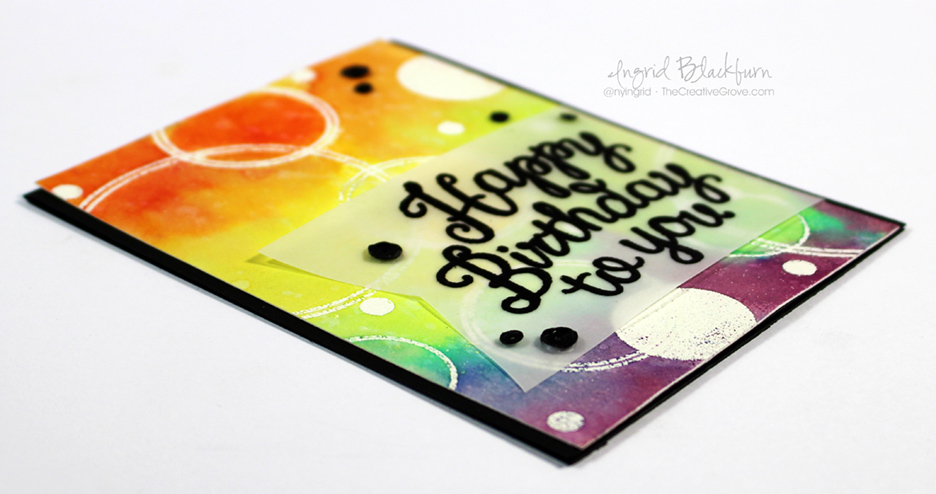
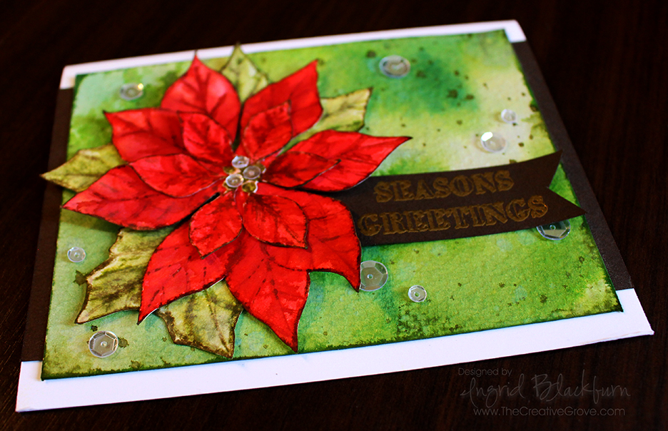
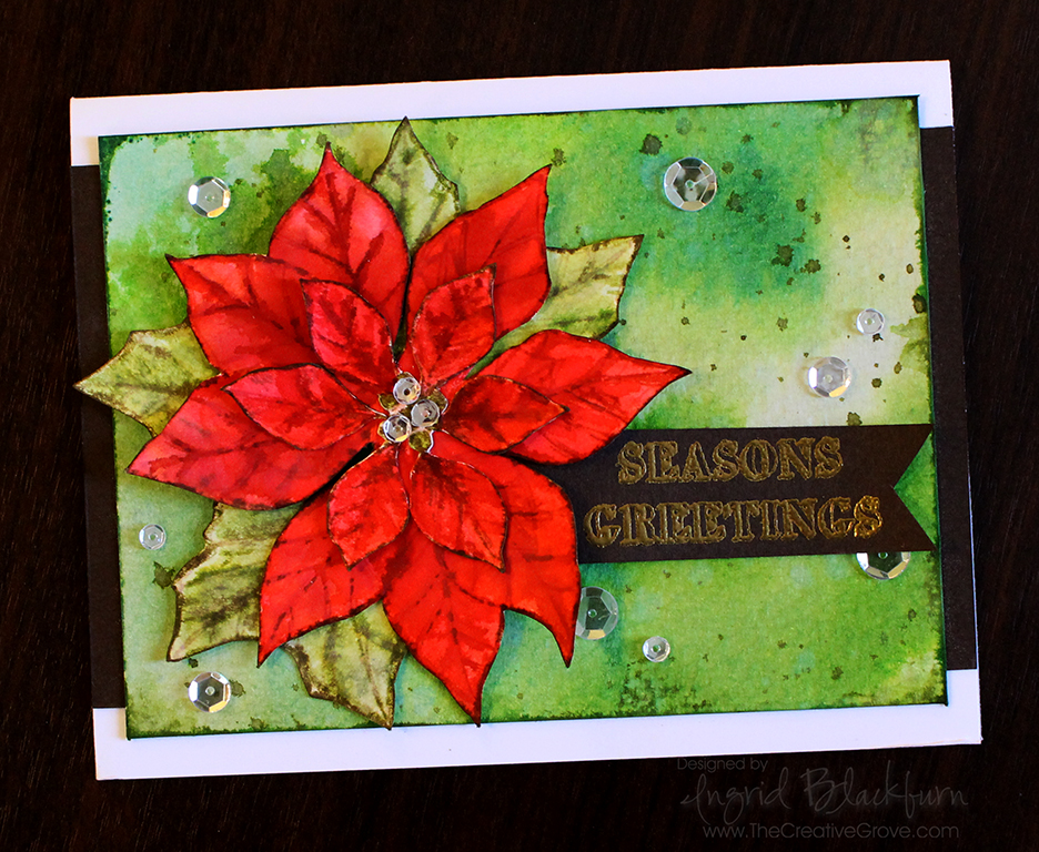
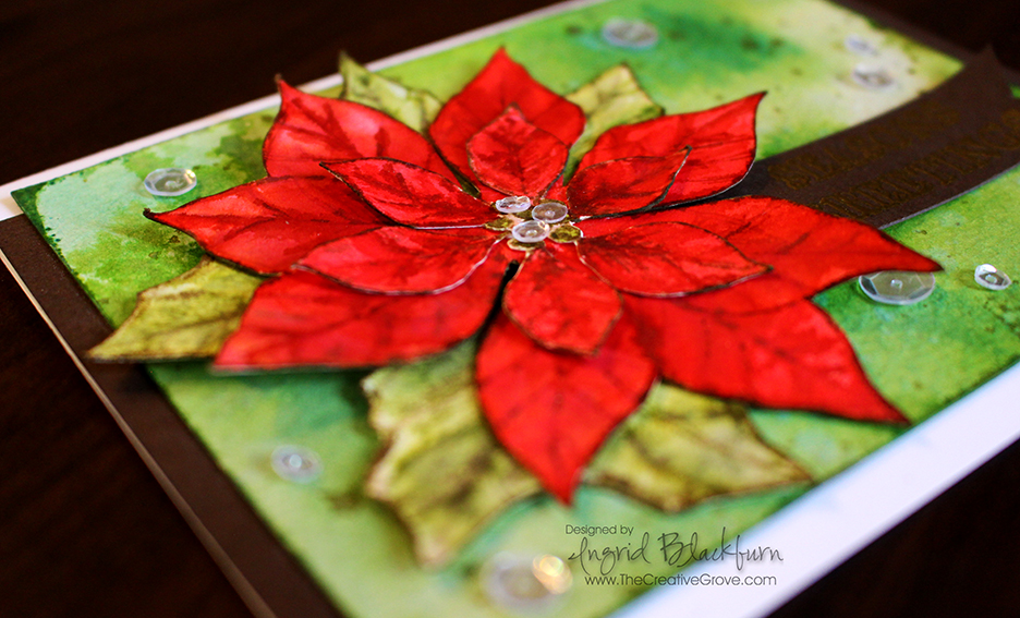
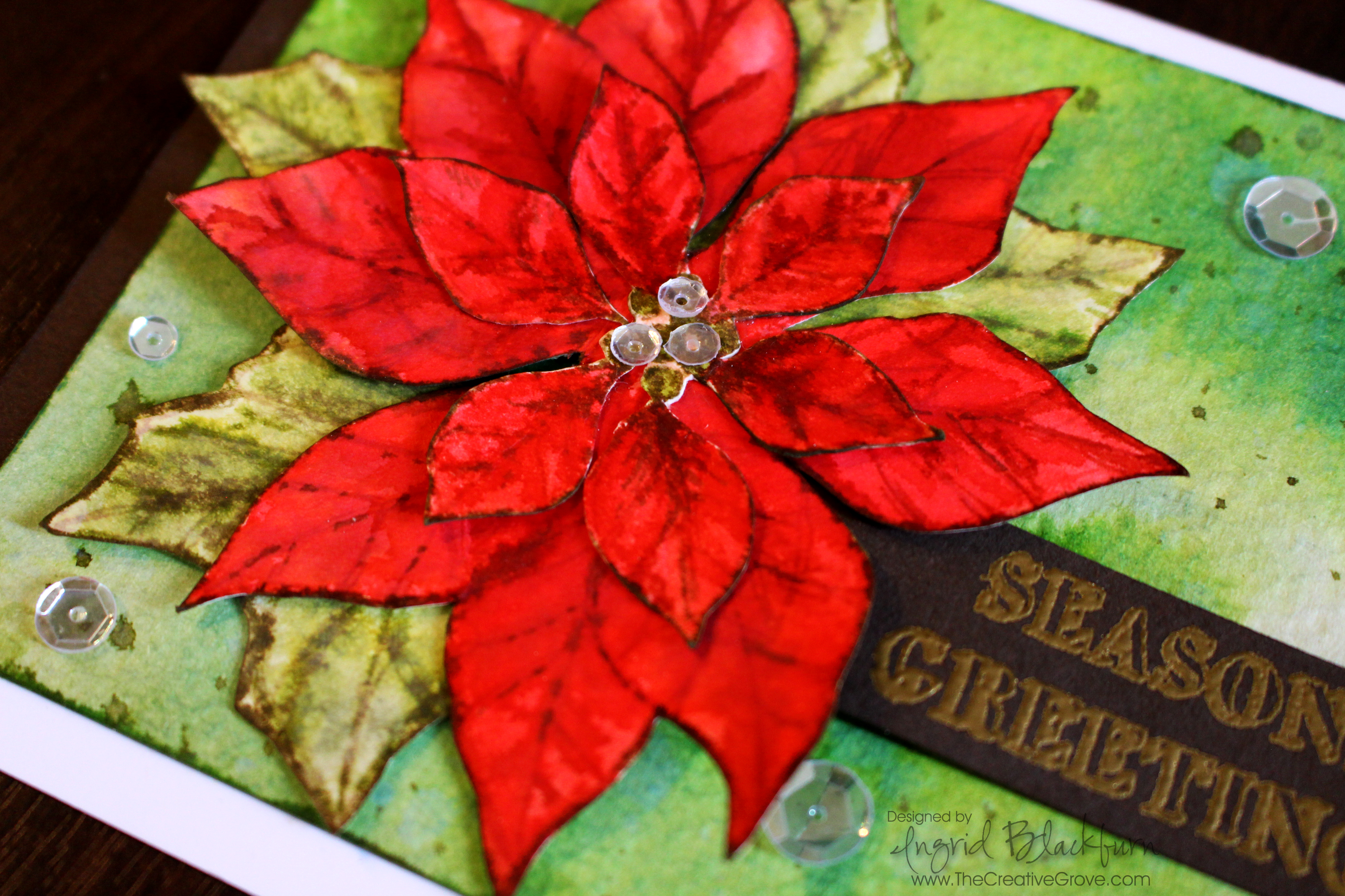
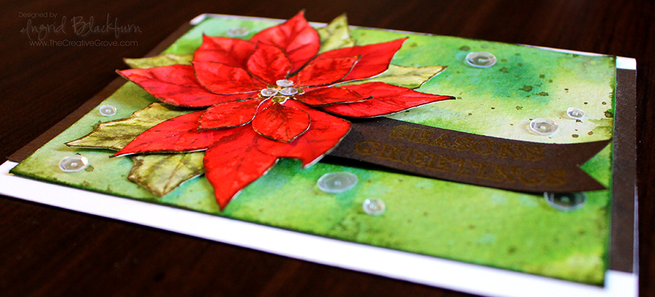
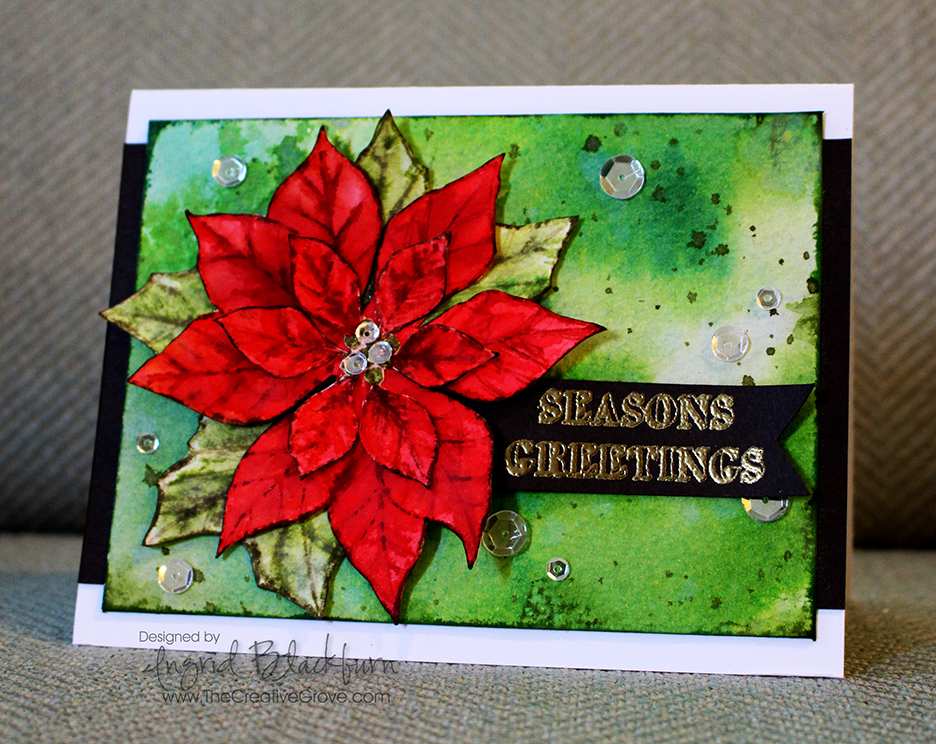
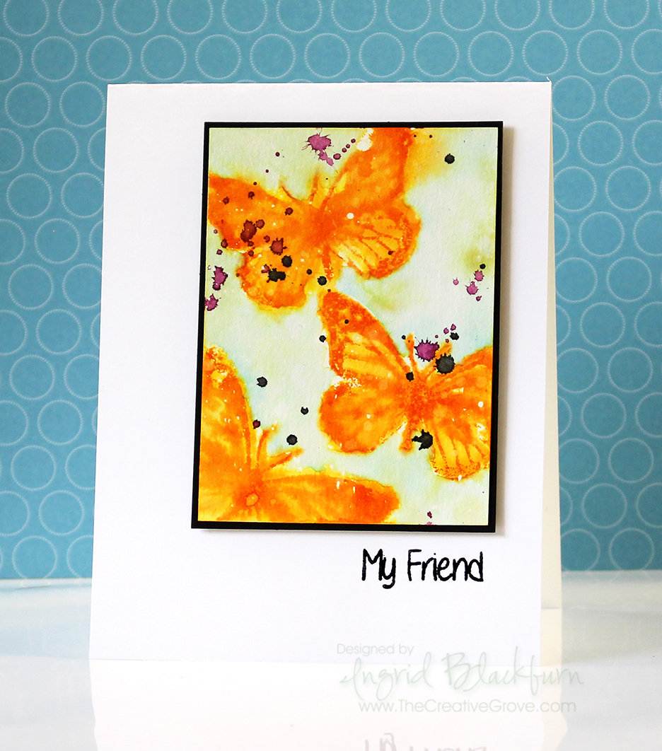
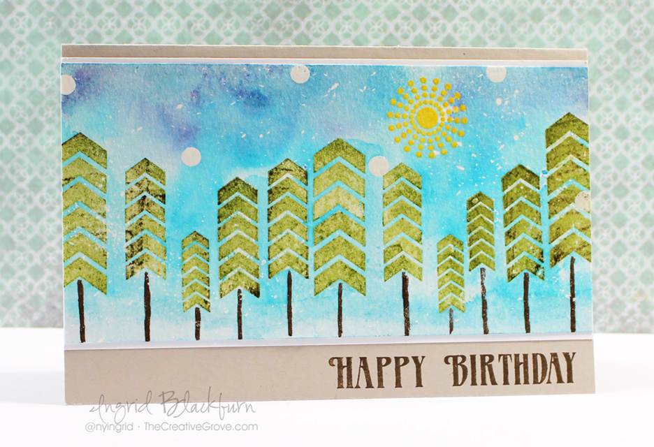
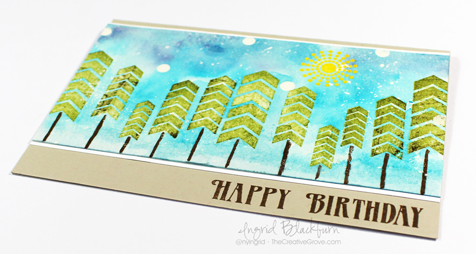
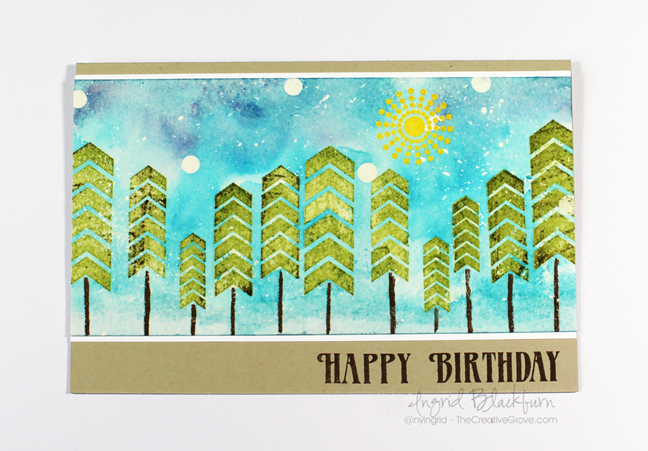
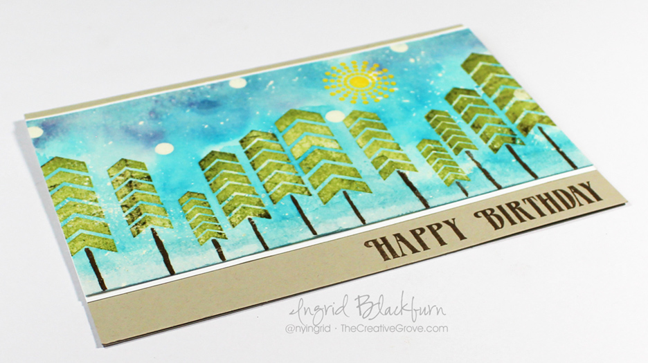
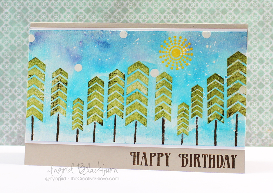
Have you ever tried the Watercolor Smash technique? It’s a super easy one that creates amazing looks. Paired here together with the Mix Mash stamp set by Happy Little Stampers, you get a fun and quirky little scene made out of some graphic elements. Don’t you just love stretching your stamps in ways they weren’t intended?

Distress Techniques SHOP Mix Mash (2)

So you can fully understand all the little tips and ideas that went into creating this card, I filmed a short video tutorial for you. I don’t know how your mind works, but the first time I saw this stamp set, this card idea popped into my head! Enjoy the video:

Watch on YouTube

The Watercolor Smash Technique Tutorial

  • The scene was created on a 6 3/8 x 3 1/4″ piece of 140# cold pressed Hahnnenmuhle watercolor paper. The final card is 4 1/4 x 6 3/8″ folded Sahara Sand card stock by Stampin Up. You’ll also need a white – 6 3/8 x 3 7/16″.
  • I had an idea to create a sunny, snowy day – I know…contradiction…so I wanted to add some flicked masking fluid first with a toothbrush. You have to set it aside to fully dry before beginning – no heat tool!
  • To keep with the quirky theme, add a few of the smallest circles from Mix Mash in the sky portion of the card. Emboss in clear embossing powder.
  • Add the sun by first stamping in Versamark Ink, then Mustard Seed Distress Ink (Ranger).

Watercolor Smash techniques

  • Add the trees in the same manner as the sun, using Peeled Paint and Forest Moss Distress with Versamark. TIP – clean your stamp in between so you don’t get green in your watermark pad! I also varied the size and height of the trees so it wasn’t too uniform.
  • Emboss trees in clear, add trunks using a Ground Espresso Distress Marker. Don’t do too many at once before adding the embossing powder – you don’t want the ink to soak into your watercolor paper to quickly. If it does, run over it with a Versamarker, but be sure to only get the brown!
  • Lay down the colors as in the video – Tumbled Glass, Broken China, Mermaid Lagoon and Chipped Sapphire.
  • Add a fair amount of water with a fine mist spritz bottle.
  • Lay your project – image side to ink over your blue palette and smash, holding your card stock there so the ink and water can grab onto your project. You’ll see the sides of your paper curl up just a bit.

Scenic Cards

  • Don’t worry if you didn’t get it right in one smash. That’s the beauty of this technique. Keep smashing to get the color you want in certain sections. To get a smooth look, be sure not to allow your project to dry in between.
  • Use a Pentel Water brush loaded with Broken China to move color into desired spots. TIP – Be sure your brush has the same amount of water as your paper, if it is too dry, it will pull watercolor from your project.
  • Once you have the look you are going for, dry your project – either naturally, or with a heat tool. I chose to use a heat tool, but don’t hover over your embossed images too much – you’ll over-emboss them! TIP – if your paper is too soaked and bent, your color and water will seep to the outside. To keep that from happening, just dry the edges a bit with a heat tool so that your project flattens out a bit, then continue to dry naturally if so desired.

Create backgrounds with the Watercolor Smash/Smooshing technique

  • When your project is fully dry, rub off your masking fluid.
  • Place the white matte where it will be on the folded card base – do not adhere yet.
  • Stamp greeting from Mix Mash set in Ground Espresso ink to match your trunks. Zap with a heat tool to set.
  • Add Mono liquid glue to the back, adhere to a white matte and then to the stone folded card base.

Mix Mash Stamp Set

That’s it! I hope you enjoyed this tutorial. I love this card – it’s fun nature is what I love about stamping. This technique is so fun, easy and one I use frequently. Once you’ve done a few, you’ll quickly add it to your stamping toolbox. Be sure to subscribe for an exclusive video series with more techniques below!

Keep those fingers inky –

Signature

[optin_box style=”2″ alignment=”center” method=”post” email_field=”email” email_default=”Enter your email address” email_order=”2″ integration_type=”aweber” double_optin=”Y” list=”3846012″ name_field=”name” name_default=”Enter your first name” name_order=”1″ name_required=”Y” opm_packages=””][optin_box_field name=”headline”]Learn with our exclusive FREE video series[/optin_box_field][optin_box_field name=”paragraph”]PHA+R2V0IHRoZSBmcmVlIENyZWF0aXZlIFRpcHMgRS1sZXR0ZXIgYW5kIGxlYXJuIHdpdGggc3Vic2NyaWJlciBleGNsdXNpdmUgdmlkZW8gYW5kIHBpY3RvcmlhbCBjb250ZW50LiBJbmNsdWRpbmcgb3VyIHllYXJseSAxMiBEYXlzIG9mIENocmlzdG1hcyBzZXJpZXMhPC9wPgo=[/optin_box_field][optin_box_field name=”privacy”][/optin_box_field][optin_box_field name=”top_color”]undefined[/optin_box_field][optin_box_button type=”0″ button_below=”Y”]Send me exclusive tips![/optin_box_button] [/optin_box]

Let the fun begin – Colorful Birthday Circles

So, today I hear the mailman drop some big mail though our slot…I make a mad dash, not sure why…must be my craft radar…and wouldn’t you know it…my Stamp Of Approval Young at Heart Collection is sitting right there! Yup, I’m out of the penalty box!!! Customs FINALLY decided I get to play along with everyone else – so I quickly open up my package, knowing I have crafty goodness just begging to be colored, stamped, inked, monoprinted and watercolored. Here is my first creation.

Stamp-of-Approval-Birthday-Circles-001

I wanted to share it quickly with you along with a reminder that if you haven’t hopped along with the blog hop from the other day…be sure to do so leaving comments all along – Catherine’s giving away two boxes at 9 AM EST August 4th! Click here to start the Blog Hop with Catherine Pooler

Blog Hop Feb 2016

I filmed this project, so look for a video on my YouTube channel in the next few days too! Here’s some watercolored Birthday fun.

Stamp-of-Approval-Birthday-Circles-002

I used the circles from the awesome set Ring in the Celebration by Winnie & Walter. I knew when I saw those circles I just had to do a little watercolor smooshing. And isn’t this greeting set by SugarPea Designs just amazing!!

Hope I got your color juices flowing today! If you have no idea what Stamp of Approval is…be sure to click here to find out! There are only a few boxes left…so don’t miss out on all the fun!

SOA Feb 2016

My fingers are already inky this morning, how about yours?

Signature

HLS Poinsettia Challenge

Watercolored Poinsettia 001

What’s a girl to do to create amazing cards for you from the road – watercolor using distress inks, naturally! I brought a few Christmas sets with me, just in case we weren’t back yet (We’ve been traveling for 9 weeks so far); so when I sat down for this month’s Poinsettia Challenge, I stared at my stamp set and this idea popped in my head.

You know by now that I love to watercolor, especially with distress inks, so I thought a more three dimensional Poinsettia on a cool smooshed background might look cool, and I have to say – even I’m thrilled with how it turned out – and I’m my worst critic! I bet you are your own worst critic too – tell me in the comments – it can’t just be me!

HLS Christmas Challenge October 2015

This month at the Happy Little Stampers Christmas Challenge, the theme is Poinsettia. So I hope this card inspires you in some way to create your own amazing creation and join in the Challenge. Not only does the design team have some amazing projects created for you…we also have a guest designer this month – Pat from Colourful Creations.

You’ll see a tutorial below. I know I normally have a video, but I don’t have a tripod with me – sorry about that! But if you are looking for some great holiday inspiration – later this month my annual 12 Days of Christmas card series is starting – be sure to be on the Creative Tips E-Letter to get those – they won’t be on the blog!!

To join me this month, use any element of this or the design teams cards as inspiration, just make sure it has a poinsettia in some way on your card and is Christmas themed. I can’t wait to see your creations – now for the good stuff!

Watercolored Poinsettia 003

Creative Tips on Watercolor using Distress Inks

Here was my thought process for choosing the colors for the card. Originally I was going to do a no line watercolor white poinsettia, but then I was in the mood for red. I knew a deeply watercolored red 3D poinsettia would look awesome, but needed an equally awesome background. So what do you choose? On the color wheel, the complimentary color (opposite on the wheel) to red  is green. So while the leaves would be green, I thought maybe a more vibrant version with lighter bleached out in spots along with great texture created with deeper flicks and edges might just do the trick!

  • To start, you’ll want to smoosh a few greens into your craft mat or work surface. I used Bundled Sage, Peeled Paint and Mowed Lawn. Bundled Sage helped me with the lighter bleached out spots, Mowed Lawn was my bright vibrant contrast to that, Peeled Paint married the two.
  • Generously spritz your colors. Make sure you lay down enough to cover your background piece. While spritzing, you want to have enough water down without overdoing it. To gauge the amount of water, when you press your watercolor card front down and it comes up dry or not glistening, you don’t have enough water. On the other hand if all your color runs right off your watercolor paper, you have too much! It’s a science, so play around. Don’t worry if you don’t get it right, just go right back with another layer adjusted with more or less water. Layers is what makes this piece awesome! So it’s very forgiving.

Watercolored Poinsettia 002

  • Don’t over do the smooshing – get just enough to cover your piece. This way you keep the light areas light. If you have too much light, strategically smoosh more vibrant spots over some without pressing it into the whole card.
  • Set your background aside to dry before moving onto the next step.
  • Next – create the splatter. I did this in two ways – flicked water, then colored splatter.
  • First spritz your hand and flick your colored surface. Here’s a video on this technique (at the 2:59 mark)
  • Smoosh some Forest Moss into your craft mat. Spritz with water to get it into a liquid state – just add enough, you don’t want it too diluted in hue. Load up a paint brush and splatter it hard with your finger on the opposite hand creating splatter onto your card. If you hold it closer to your project it will be more condensed. I held mine about 10 inches from my card to get it to splatter outward.
  • Edge your watercolor paper directly with your ink pad – a little more generously at the corners to complete your background.
  • Set it aside to try. Now you can move onto the Poinsettia!

Watercolored Poinsettia 006

  • To get a more painted look to your Poinsettia. you’ll want to use a few shades of red and create layers. Stamp your image in a lighter shade twice on a larger piece of 140# cold pressed watercolor paper. I used Tattered Rose and stamped it off so that it was really light. This will give you an outline to work with without defining the edges. This allows you to control the look of the flower, rather than painting in the lines of an outlined image.
  • You will color one flower completely and another just the smaller inner flower. When painting the larger flower – ignore the lines of the smaller flower – just extend the leaf as if it’s a large petal. Look really close at mine and you’ll see the smaller outline slightly – but you have to really look for it!

Watercolored Poinsettia 005

  • Color your berries on the smaller flower in using Peeled Paint. Your larger flower you’ll color the berries with Festive Berries to match the flower better.
  • Next create a light wash of Worn Lipstick by spritzing it generously with water. Test it out on a scrap piece to make sure it’s light. It’s easier to start lighter and add darker layers for depth – you can’t go so easily dark to light.
  • Add a spritzed version of Festive Berries, keeping some light areas. Apply your color using the veins of the flower as a guide and spread the color outward with wet brush – I used a Pentel AquaBrush.
  • Repeat using Barn Door and add a little detail to the veins with Fired Brick. With each layer, add the color in different spots – some heavier and lighter. This will help you to develop texture in  your flower.
  • Fussy cut both of your flowers out right at the line image – don’t leave any excess white. You should have a large and smaller flower.
  • Edge your petals in Gathered Twigs. Be careful to just get the very edge and not onto the flower if possible. Use a Distress marker if you’re more comfortable.

Watercolored Poinsettia 004

  • Stamp your leaves in Bundled Sage and Paint them in a similar manner using a light wash of Bundled Sage and add a little Peeled Paint  and an even smaller amount of Forest Moss at the veins. Keep them really light to help as a contrast from the background.
  • Fussy cut them out. Glue your leaves to the larger flower, and then your smaller flower on top.
  • Emboss your greeting onto Espresso card stock – I used the set Mixed Christmas Sentiments by Happy Little Stampers. I then created a banner and attached it to the back of my flower.
  • Before using liquid glue to attach the flower and banner to the card, I gently bent up s few of the petals and the banner to give a better 3D look.
  • Add some sparkling clear sequins by pretty pink posh for a final touch.

Watercolored Poinsettia 007

Here are the card dimensions:

  • Card – Top folding 8 1/2 x 5 1/2″ White
  • Card front – 140# water color paper by Canson – 3 3/4 x 5″
  • Espresso – Matte – 5 1/2 x 3 1/2″, banner – scrap

I hope you enjoyed this little tutorial on watercolor using distress inks, okay – not so little. You can use watercolor paints as well, or any dye based inks that blend well with water. In my experience, the distress are the most transparent of the dye inks out there. Have fun with it, and I can’t wait to see what you create. And don’t forget – if you want the 12 Days of Christmas series, be sure to sign up for the Creative Tips E-letter.

Signature-24-pt_thumb.jpg

Butterfly Birthday

Watercolor Stamped Birthday Butterflies 005

I am so excited…today the mailman brought me some stamps from the first ever release from Happy Little Stampers! Yes, there’s a new stamp company in town and get a load to this amazing Butterfly Birthday set! I always think of my friend Dawn when I see a butterfly – as she really loves them! Do you have a stamp image that reminds you of somebody, or is it just me? Tell me in the Comments below!

This Butterfly Birthday set has three very different bold butterflies that will definitely give you loads of ideas and a good variety of cards – just what you want from a stamp set. Even better – there are three great sayings that are the perfect size and in a handwritten print. It’s the perfect compliment, I just love it when there are greetings mixed in with great images.

Watercolor Stamped Birthday Butterflies 002

Now, you may think I’m biased, because I’m on the design team for the Christmas Challenge, but I purchased these myself, and let me tell you – the quality is there and I’m overjoyed with the design and size of each. Kylie will get these right out to you, they’re well priced and she ships internationally quite reasonably. I can’t wait to use the Mixed Christmas Sentiments set on my next challenge card – it’s always great when a set uses different fonts. Love that kind of variety.

So if you haven’t checked them out yet…be sure to do so – and one of the many challenges over at Happy Little Stampers – there is definitely something for everyone!

I watercolor stamped this card  using water along with the following distress inks – Mustard Seed, Spiced Marmalade, Tumbled Glass, Broken China, Peeled Paint, Seedless Preserves and Soot Black. I did a little light wet on wet watercoloring for the background.  Stay tuned for a video of this technique card in the upcoming weeks!

🙂

Signature-24-pt_thumb.jpg

An Experiment in Color Theory with Watercolor

watercolor

Have you ever played around with color theory using watercolor in your cards? This project shows how cool a little experimentation can be! I saw the sketch for Happy Little Stampers at the beginning of the month, and have been wanting to make this exact card ever since. Life and work kept me onto other projects, but I think you’ll agree with me, that it was worth the wait!

The sketch this month was quite colorful, and although I loved it so much that I created six completely different projects from it – yes six, I wanted to share my literal translation with you today. Here’s the original sketch and my card:

HLS May Sketch Challengewatercoloring distress inks

To get the best overlapping effect, I knew watercolor would be key. To use dye based ink for this purpose, try using distress inks to watercolor your embossed circles. Distress inks are so translucent in nature that they were perfect for this project. Keep the color wheel in mind when deciding which colors to place where, you don’t want to get a muddied color.

My favorite overlap mixture effect is in the bottom left – the large Picked Raspberry circle overlapping with the Spiced Marmelade and Salty Ocean – Both of those colors gave brilliant combinations with the pink – and surprised me!

I think the best part about this project is that I’m quite excited to try sponging new combinations, and I’m a bit more confident in the colors Picked Raspberry and Peacock Feathers – two colors that I used to be careful with when blending. Both were big surprises.

Watercolor Circles Tutorial

To get great boundaries for your watercolor – emboss the lined images from Simon Says Stamps: Scribble Flowers – there are 5, perfect for this project. Be sure to use a de-static tool to get rid of all stray pieces of embossing powder.

watercolor with distress inks

To watercolor, smoosh your pad onto a craft mat, spritz with water and use a watercolor brush. I used an Aqua Painter. Start with the lightest shades and work to dark. Spread the colors around and keep a color wheel either up on your screen or right next to you as a guide for which colors to combine.

distress watercolordistress ink color wheel

The colors used in this project – Squeezed Lemonade, Mustard Seed, Wild Honey, Spiced Marmalade, Ripe Persimmon, Salty Ocean, Peacock Feathers, Picked Raspberry, Seedless Preserves, Mowed Lawn, Barn Door.

To help pull it all together and pop your images, matte your watercolor paper onto a black matte giving a 1-1/2/16” border. Then pop that panel up onto foam tape.

Distress Ink Watercoloring


I’m also entering this into Simon Says Stamp Wednesday Anything Goes challenge! Why not – I love their stamps! 🙂

sss-wednesdayblog-logo

It’s a super fun project and has me thinking of other ways to overlap objects and watercolor. Time for more experimentations. Have fun with it!

Signature 24 pt


[optin_box style=”13″ width=”500″ alignment=”center” action=”https://www.aweber.com/scripts/addlead.pl” disable_name=”Y” method=”post” email_field=”email” email_default=”Enter your email address” integration_type=”aweber” double_optin=”Y” list=”3846012″ name_field=”name” name_default=”Enter your first name” name_required=”Y”][optin_box_field name=”headline”]If you enjoyed this tutorial…[/optin_box_field][optin_box_field name=”paragraph”]PHA+4oCmeW914oCZbGwgbG92ZSBvdXIgPGVtPjxzdHJvbmc+PHNwYW4gc3R5bGU9ImNvbG9yOiAjMjQ0YzVlOyI+ZnJlZTwvc3Bhbj4gPC9zdHJvbmc+PC9lbT5zdWJzY3JpYmVyIG9ubHkgdmlkZW8gc2VyaWVzLiDCoExlYXJuIG5ldyB0ZWNobmlxdWVzIHRocm91Z2ggb3VyIDxzcGFuIHN0eWxlPSJjb2xvcjogIzI0NGM1ZTsiPjxlbT48c3Ryb25nPmV4Y2x1c2l2ZTwvc3Ryb25nPjwvZW0+wqA8L3NwYW4+Q3JlYXRpdmUgVGlwcyBlLWxldHRlcsKgYW5kIHN1YnNjcmliZXIgb25seSB2aWRlbyBhbmQgcHJvamVjdCB0dXRvcmlhbHMhPC9wPgo=[/optin_box_field][optin_box_field name=”privacy”][/optin_box_field][optin_box_field name=”top_color”]undefined[/optin_box_field][optin_box_button type=”1″ text=”Send me exclusive tips!” text_size=”32″ text_color=”#000000″ text_bold=”Y” text_letter_spacing=”0″ text_shadow_panel=”Y” text_shadow_vertical=”1″ text_shadow_horizontal=”0″ text_shadow_color=”#f6fefb” text_shadow_blur=”0″ styling_width=”50″ styling_height=”19″ styling_border_color=”#000000″ styling_border_size=”1″ styling_border_radius=”6″ styling_border_opacity=”100″ styling_shine=”Y” styling_gradient_start_color=”#a3b640″ styling_gradient_end_color=”#80902c” drop_shadow_panel=”Y” drop_shadow_vertical=”1″ drop_shadow_horizontal=”0″ drop_shadow_blur=”1″ drop_shadow_spread=”0″ drop_shadow_color=”#000000″ drop_shadow_opacity=”50″ inset_shadow_panel=”Y” inset_shadow_vertical=”0″ inset_shadow_horizontal=”0″ inset_shadow_blur=”0″ inset_shadow_spread=”1″ inset_shadow_color=”#80902c” inset_shadow_opacity=”50″ location=”optin_box_style_13″ button_below=”Y”]Send me exclusive tips![/optin_box_button] [/optin_box]

Stacked Die Cuts – CAS Green Christmas Card

Stacked Die Cuts seem to be all the rage lately. If you haven’t tried this creative technique yet, I think you’ll be surprised at just how easy it is. Enjoy this quick tutorial into how this simple card was created!

Stacked Die Cuts 001

Stacked Die Cuts Card

  • You will first want to create your blended background on the top fourth of the card.  To see a step by step video tutorial on how to create a perfectly blended background, click here.
  • Mask off the bottom 3/4 of your card with post it notes. Use the following Distress inks in order when blending from the bottom up – Bundled Sage, Peeled Paint and Forest Moss.
  • Die cut the word Merry from your project, being sure to keep all the little pieces (Y, M – 2, E, R).  I keep these stuck to a piece of washi or painters tape so they don’t go missing.
  • Emboss the word Christmas in Black up above your Negative Die Cut word in the green area. Tip – be sure that area is totally dry – definitely use a de-static tool like an embossing buddy.

Stacked Die Cuts 003

  • Lay your Green/White cut out word Merry on a piece of painters tape or masking tape. Smoosh a versamark pad over your word and emboss in clear to give a shine. Once cool, remove with tweezers and set aside.
  • Stamp your gift in the bottom right corner using Memento Tuxedo Black ink. I use this ink because I’m going to watercolor with distress inks and it doesn’t bleed and gives a crisp image.
  • Watercolor your image using Bundled Sage, Peeled Paint and Fire Brick with an Aqua Painter.  Tip – be sure your paint brush isn’t too wet, as this is regular card stock. If you use too much water, you’ll get little white dots or lines from your paper.
  • Die Cut four more words in white.
  • To create your Die Cut stack, glue all five die cuts to each other with your Blended Piece on top.

Stacked Die Cuts 004Stacked Die Cuts 006

  • Add adhesive to a piece of Copy Paper that is wider than your negative cut out, adhere so that the sticky side faces the front.
  • Add your die cut and the cut out pieces to the sticky paper exposed in the negative die cut image. And there’s your stacked die cut!
  • Attach your card front to your card base and add a little Forest Moss to the top at the fold so there is no white exposed.
  • Add sparkling clear sequins from Pretty Pink Posh if you desire using Tombow Mono Liquid Glue.

Stacked Die Cuts 002

I designed this card with three challenges in mind today – Merry Monday – Gifts and Addicted to CAS – Green and Happy Little Stampers – Sponged.

CAS_Mar2015 150ATCAS - code word green

If you liked this tutorial on Stacked Die Cuts, be sure to get our exclusive video tutorial series by being on the Creative Tips E-letter list, sign up at the bottom!

Signature

[optin_box style=”14″ alignment=”center” disable_name=”Y” email_field=”email” email_default=”Enter your email address” email_order=”1″ integration_type=”aweber” double_optin=”Y” list=”2841626″ name_field=”name” name_default=”Enter your first name” name_required=”Y”][optin_box_field name=”headline”]If you enjoyed this tutorial…[/optin_box_field][optin_box_field name=”paragraph”]PHA+Li4ueW914oCZbGwgbG92ZSBvdXIgPHNwYW4gc3R5bGU9ImNvbG9yOiAjMjQ0YzVlOyI+PGVtPjxzdHJvbmc+ZnJlZSA8L3N0cm9uZz48L2VtPjwvc3Bhbj5zdWJzY3JpYmVyIG9ubHkgdmlkZW8gc2VyaWVzISDCoEdldCB0aGXCoDxzcGFuIHN0eWxlPSJjb2xvcjogIzI0NGM1ZTsiPjxlbT48c3Ryb25nPmV4Y2x1c2l2ZTwvc3Ryb25nPjwvZW0+PC9zcGFuPsKgQ3JlYXRpdmUgVGlwcyBlLWxldHRlciB3aGljaCB3aWxsIHRlYWNoIHlvdSBuZXcgdGVjaG5pcXVlcyB0byBhZGQgdG8geW91ciBzdGFtcGluZyBza2lsbCBzZXQuIMKgTGVhcm4gaG93IHRvIG1ha2UgcHJvamVjdHMgeW91J2xswqBsb3ZlITwvcD4K[/optin_box_field][optin_box_field name=”privacy”][/optin_box_field][optin_box_field name=”top_color”]undefined[/optin_box_field][optin_box_button type=”1″ text=”Send me exclusive tips!” text_size=”26″ text_color=”#000000″ text_bold=”Y” text_letter_spacing=”-1″ text_shadow_panel=”Y” text_shadow_vertical=”1″ text_shadow_horizontal=”0″ text_shadow_color=”#a3b640″ text_shadow_blur=”0″ styling_width=”100″ styling_height=”10″ styling_border_color=”#000000″ styling_border_size=”1″ styling_border_radius=”6″ styling_border_opacity=”100″ styling_shine=”Y” styling_gradient_start_color=”#a3b640″ styling_gradient_end_color=”#5b661e” drop_shadow_panel=”Y” drop_shadow_vertical=”1″ drop_shadow_horizontal=”0″ drop_shadow_blur=”1″ drop_shadow_spread=”0″ drop_shadow_color=”#000000″ drop_shadow_opacity=”50″ inset_shadow_panel=”Y” inset_shadow_vertical=”0″ inset_shadow_horizontal=”0″ inset_shadow_blur=”0″ inset_shadow_spread=”1″ inset_shadow_color=”#a3b640″ inset_shadow_opacity=”50″ location=”optin_box_style_14″ button_below=”Y”]Send me exclusive tips![/optin_box_button] [/optin_box]

Using the Watercolor Stamping Technique with the Swallowtail Stamp

Have you tried watercolor stamping yet? This clean and simple quick project uses a great background stamp, the Swallowtail stamp by Stampin Up, and a simple – yet creative watercolor technique.

Watercolor stamping technique

The best part about this technique is that you can get more than one card with just one inking! To help showcase just how easy the watercolor stamping technique is, I made a video just for you!  If you like the video, be sure to give it a thumbs up on You Tube and subscribe to my YouTube channel for continued technique inspiration.

View video on YouTube

As you saw in the video above, this is a super easy stamping technique that gives you the look of watercolor, but with stamping and detail you’d never be able to achieve on your own.  Here’s a breakdown of just how to do it.

Creative Tips for the Watercolor Stamping Technique

First, pick a large image – this doesn’t work too well with tiny images as they get lost.  This particular project uses a rather large stamp – yours doesn’t have to be so big! We chose the Swallowtail stamp by Stampin Up.

Next, ink up your stamp – we chose Ranger Distress Inks for two reasons – translucency and how well they react with water.  The specific colors are Tumbled Glass, Broken China, Salty Ocean, Peacock Feathers and Faded Jeans.  Be sure to pay attention to the little tricks of how and the sequence we use them in, in the video!

Watercolor Stamped Swallowtail Stamp by Stampin Up

Spritz your stamp with a fine mister.  You’ll want a fine spray rather than too strong a spray – think of a garden hose Jet Spray vs. a Shower Spray…there’s a big difference.  You want to coat your stamp, not spray your ink away.  The amount is important too – too much water will leave you with an inky splotch, vs true watercolor stamping.  You want to be able to still see some detail mixed with watercolor.  I used the Stampin Up mister, Ranger has one too.

Stamp onto 140 pound cold pressed watercolor paper.  Choose the smooth side vs. the toothy side.  You’ll want to use watercolor paper.  This particular technique uses quite a bit of water, and that amount will degrade the fibers of regular card stock into an unattractive mess that will take away from your project.

Watercolor Stamping with Distress Inks

Hold your stamp down and with this particular stamp, put a fair amount of pressure on it – it’s big!  If you can put your project onto a foam pad, you’ll get an even better impression with ease.

Distress Swallowtail 008

You can immediately stamp a second time onto regular card stock for a second impression.  You’ll get another impression just fine.  The reason you don’t need watercolor paper the second time is that the watercolor paper the first time around took most of the water away allowing you to safely stamp onto regular card stock for your second image.

Matte and add embellishments as you want.  You can see here that I created two very different project with slight adjustments.  Both have the color spritzing for a little added effect.  I love them both – hopefully you do too!

Distress Swallowtail 010

If you liked this tutorial and learned something – be sure you’re on our exclusive e-letter list – Creative Tips for a great video series you won’t see anywhere else!

Have fun creating your own watercolor stamping projects – be sure to share them with us on our facebook page!

Signature


[optin_box style=”14″ alignment=”center” disable_name=”Y” email_field=”email” email_default=”Enter your email address” email_order=”1″ integration_type=”aweber” double_optin=”Y” list=”2841626″ name_field=”name” name_default=”Enter your first name” name_required=”Y”][optin_box_field name=”headline”]If you enjoyed this tutorial…[/optin_box_field][optin_box_field name=”paragraph”]PHA+Li4ueW914oCZbGwgbG92ZSBvdXIgPHNwYW4gc3R5bGU9ImNvbG9yOiAjMjQ0YzVlOyI+PGVtPjxzdHJvbmc+ZnJlZSA8L3N0cm9uZz48L2VtPjwvc3Bhbj5zdWJzY3JpYmVyIG9ubHkgdmlkZW8gc2VyaWVzISDCoEdldCB0aGXCoDxzcGFuIHN0eWxlPSJjb2xvcjogIzI0NGM1ZTsiPjxlbT48c3Ryb25nPmV4Y2x1c2l2ZTwvc3Ryb25nPjwvZW0+PC9zcGFuPsKgQ3JlYXRpdmUgVGlwcyBlLWxldHRlciB3aGljaCB3aWxsIHRlYWNoIHlvdSBuZXcgdGVjaG5pcXVlcyB0byBhZGQgdG8geW91ciBzdGFtcGluZyBza2lsbCBzZXQuIMKgTGVhcm4gaG93IHRvIG1ha2UgcHJvamVjdHMgeW91J2xswqBsb3ZlITwvcD4K[/optin_box_field][optin_box_field name=”privacy”][/optin_box_field][optin_box_field name=”top_color”]undefined[/optin_box_field][optin_box_button type=”1″ text=”Send me exclusive tips!” text_size=”26″ text_color=”#000000″ text_bold=”Y” text_letter_spacing=”-1″ text_shadow_panel=”Y” text_shadow_vertical=”1″ text_shadow_horizontal=”0″ text_shadow_color=”#a3b640″ text_shadow_blur=”0″ styling_width=”100″ styling_height=”10″ styling_border_color=”#000000″ styling_border_size=”1″ styling_border_radius=”6″ styling_border_opacity=”100″ styling_shine=”Y” styling_gradient_start_color=”#a3b640″ styling_gradient_end_color=”#5b661e” drop_shadow_panel=”Y” drop_shadow_vertical=”1″ drop_shadow_horizontal=”0″ drop_shadow_blur=”1″ drop_shadow_spread=”0″ drop_shadow_color=”#000000″ drop_shadow_opacity=”50″ inset_shadow_panel=”Y” inset_shadow_vertical=”0″ inset_shadow_horizontal=”0″ inset_shadow_blur=”0″ inset_shadow_spread=”1″ inset_shadow_color=”#a3b640″ inset_shadow_opacity=”50″ location=”optin_box_style_14″ button_below=”Y”]Send me exclusive tips![/optin_box_button] [/optin_box]

An exercise in Blueberry Watercolor

I have been wanting to paint a Blueberry Watercolor for the longest time. I know I just had a week in Tuscany, but I’ll be honest – it was a work-cation!  I know, must be nice, right? Well, I wear two hats in this family – Paper Crafting artist and Travel marketing specialist.  That means for our other business – Elite Travel Planners, I blog, design and maintain websites, socially engage through media and of course – Tech Support!  So, since our week in Tuscany was rather heavy on the travel work…I took a day off when we came home.  It’s rare actually, for me to totally take a day for myself.  So I decided to dust off my watercolor paints and dive into a project I had been wanting to tackle for six months – a blueberry watercolor botanical.

I learned to paint botanicals with a multi layer method I learned from the watercolor artist Anna Mason.  I adapted this style of painting for some of the projects in our online paper crafting class – Watercolor Techniques that Wow!  But that’s cards, and this is full size painting.  For me, I truly get elated seeing a watercolor painting come together.  Keep in mind, I’ve only done four in my life!  To say I’m new to the full sized art is an understatement.  But what I have done is learned the skills and practiced more than you would believe.

Here are my various stages and final result of my blueberry watercolor.  This painting was based off one of Anna’s.  The blueberry measures 7 1/4” x 7 1/2”.

Blueberry Watercolor Painting Stages

Blueberry Watercolor Botanical Painting 001

Three Key Things to Keep in Mind when Painting in Watercolor

Painting a large painting is VERY different than a 5 1/2” x 4 1/4” card.  It can be a little intimidating.  And the sheer time it takes is much more than card making – that’s for sure. Here are a  few things I learned along the way:

1 – Paint – You get what you pay for

If you are just working on cards, many of the inexpensive sets are just fine.  The size is key here – most cards are small.  Of course, better quality paints are more vibrant and translucent.  But if you’re going to take 1+ days to create a full sized painting – these two factors are key.  You don’t want your painting to look dull, invest in a few artist quality paints.  If cost is a huge factor – start out with student grade paints, but stay away from inexpensive sets.  Basic rule in life applies here – if it looks too good to be true (set of 18 tubes of watercolor paints for $15), than it usually is!

You can find good quality student grade paints for a few dollars a tube.  Artist grade will run you $5 – $20 per pan/tube.  I have some links at the end for great shopping options.

2 – Paper – Block or not?

Paper is the foundation of your project.  There are many options and types of paper out there – chose wisely.  I suggest a block.  Okay – Arches cold pressed artist block may not be in your budget – but there are all sorts of options.  If you’re not sure, buy a few single sheets and cut them down to the size you need.  You’ll need to stretch them first, and by the time you’ve gotten everything you need to do that and spent the time – you may as well have bought a block!  The pluses here are too many.  Time is everything in our lives these days.  And what’s great about an block (four glued sides), beginners can really use too much water and be okay.  But beware – if you are the impatient type and speed dry your work (which I don’t recommend), a block is not for you – tape your pieces down and stretch them instead.

3 – Education

No, you don’t have to go to art school.  But take a class or two.  You’ll be glad you did.  There’s nothing better than being able to ask questions, have someone look at your work, or being able to back up an online video to really review each step.  I’ve learned so much myself!  And it’s all applicable – whether it’s a paper card making watercolor class (we have one right here) or a traditional watercolor class.  Most classes are not that expensive, and it’s great to be able to have somewhere to learn!

Ultimately – watercolor painting is fun, just get started and have a good time.  There are millions of watercolor artists around the world – jump in, the water is great and inspiration lies everywhere.  Take a little time for yourself – I sure am glad I did for my Blueberry Watercolor!

Signature

Creative Cards Watercolor VIP

Some great places to shop:

The USA –

Jerry’s Artarama

Dick Blick

UK –

Jackson’s Art Supplies

Blueberry Watercolor 001

My Blueberry Watercolor – an exercise learned from Anna Mason