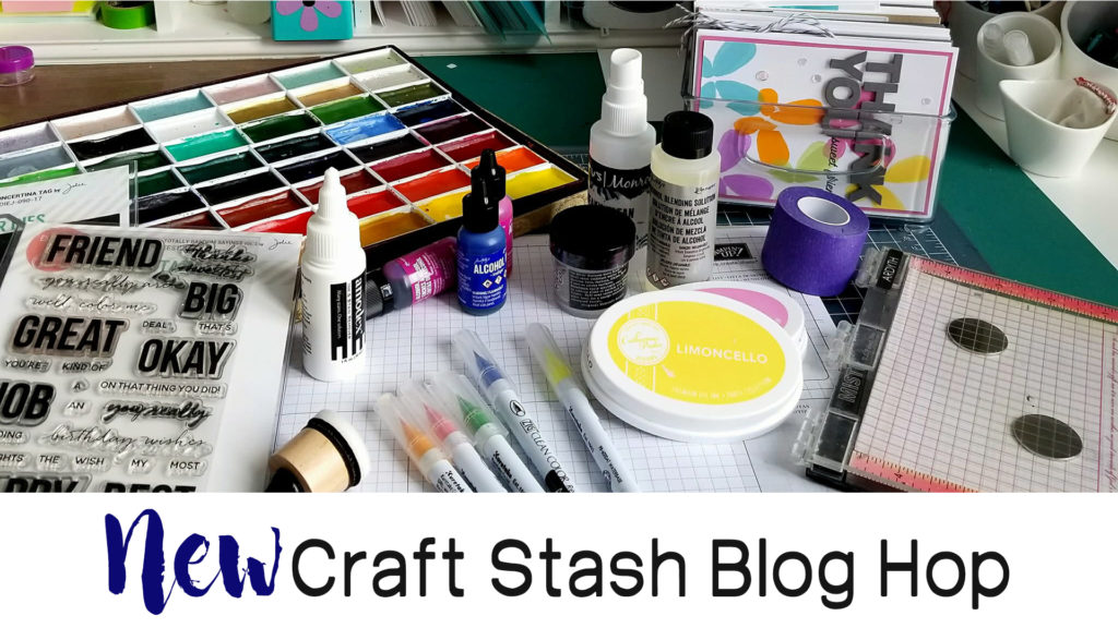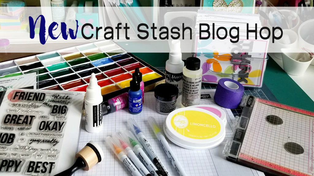
One thing I’ve learned over the past few years is that Art Happens. It truly does. Today I’m kicking off Day Three of the New Craft Stash Blog Hop with some of my crafty friends. We’ve all collected & hoarded craft supplies…come on – I know you’re one of us! Several of us were chatting a few weeks ago and decided – let’s just hop for fun and made the rule that we had to use something new. Now that means – literally new or just new as in it’s been in the drawer for a bit and it’s finally time to break it out! Today I’m using several products just like that…and I can’t wait to show you what I’ve done.
Be sure to hop on to all three days worth of hops. Get inspired to use your “new” stash, leave a comment and be entered for prizes! You’ll have until the 23rd to leave a comment. I’d love to know what new item you’re going to play with next!
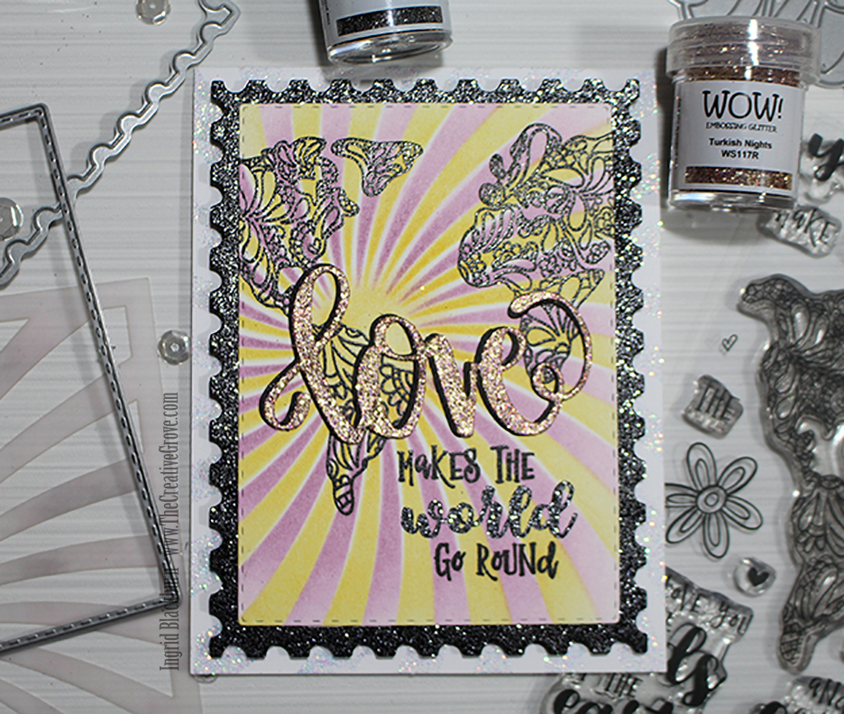
Gorgeous Art Happens Tutorial
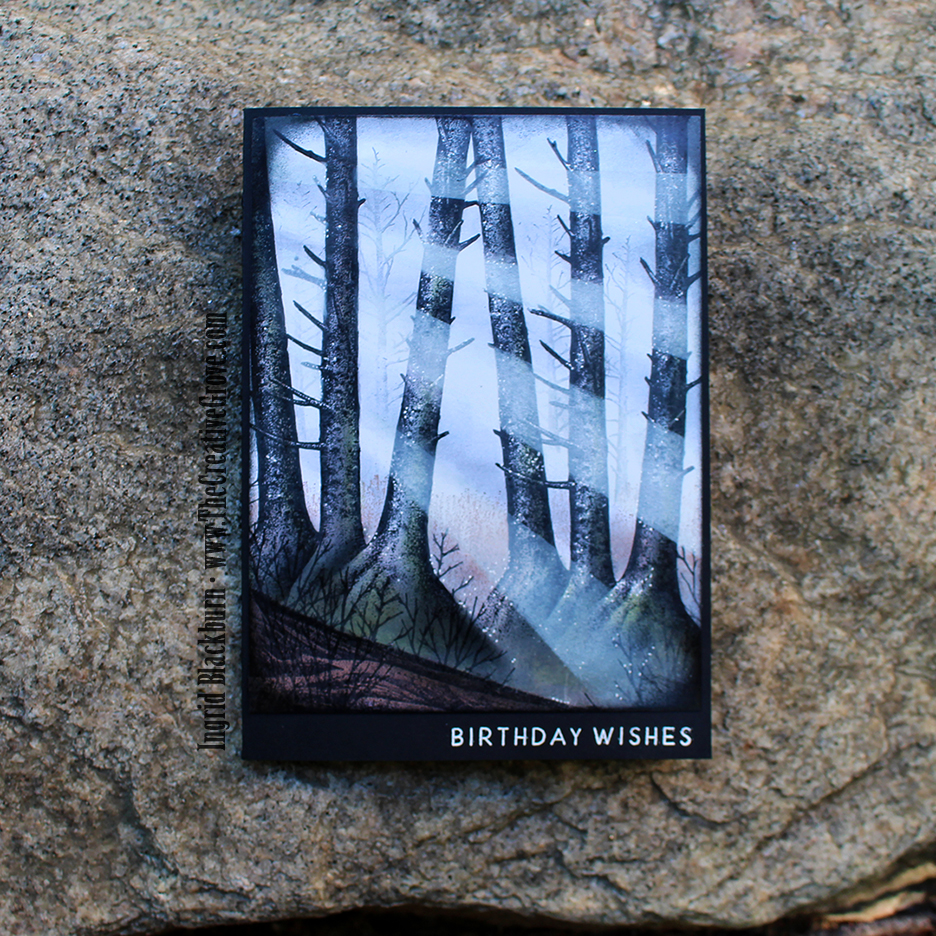
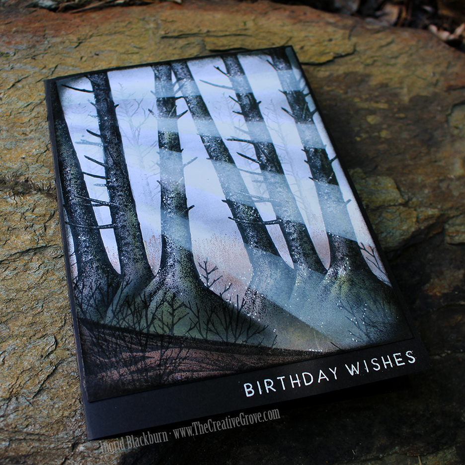
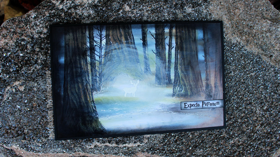
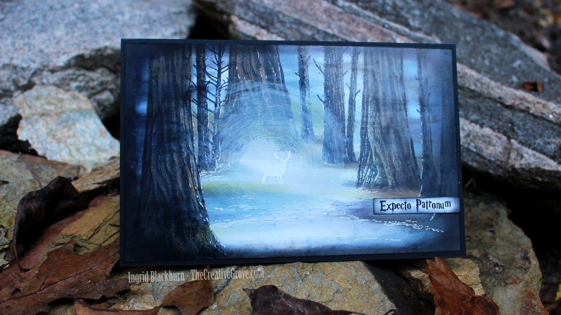
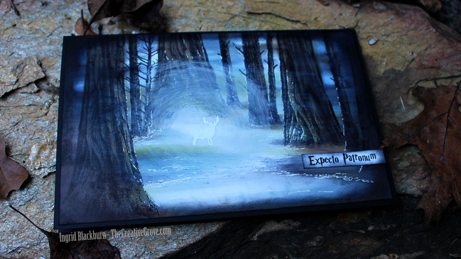
It’s no secret that I’m in love with mixed media supplies. I love to create simple mixed media projects, AND real mixed media. Well I have a treat for you today. Today’s projects are the result of a fun little gel printing session I had the other day. I wanted to use some of my newer acrylics and some new Stamplorations masks (Art Happens) and word dies. I’ll post a time lapse video later with my entire printing session, so today’s video just showcases the print I made for these two beauties…enjoy!
Click Here to view video in HD on YouTube
What do you think? It’s actually quite fun. When I first started, I’ll admit…I was quite intimidated. But the more I got into that session, and the more art that just literally poured off the plate…I kept saying things like WOW, I can’t believe I just made that and Ooh that’s gorgeous. Seriously…I was quite impressed with myself! And I think I’ll always keep that first fabulous card – cause it literally is one of those where I still say – I can’t believe I made that! You know that feeling, right?
Well, this gel printing session didn’t disappoint. I ended up with 8 art journal pages and 34 prints. Yup! Gel Printing goes so fast, and more you get into the session – little bits are left behind on the plate – Tip: do not clean your gel plate in-between. The work you create will do that for you. Today’s print that I used came about 4/5 prints into the session. Some of the beauty on the print is from prior prints. I love the patina kind of feel. That weathered look that you usually only get with time and exposure to the elements.
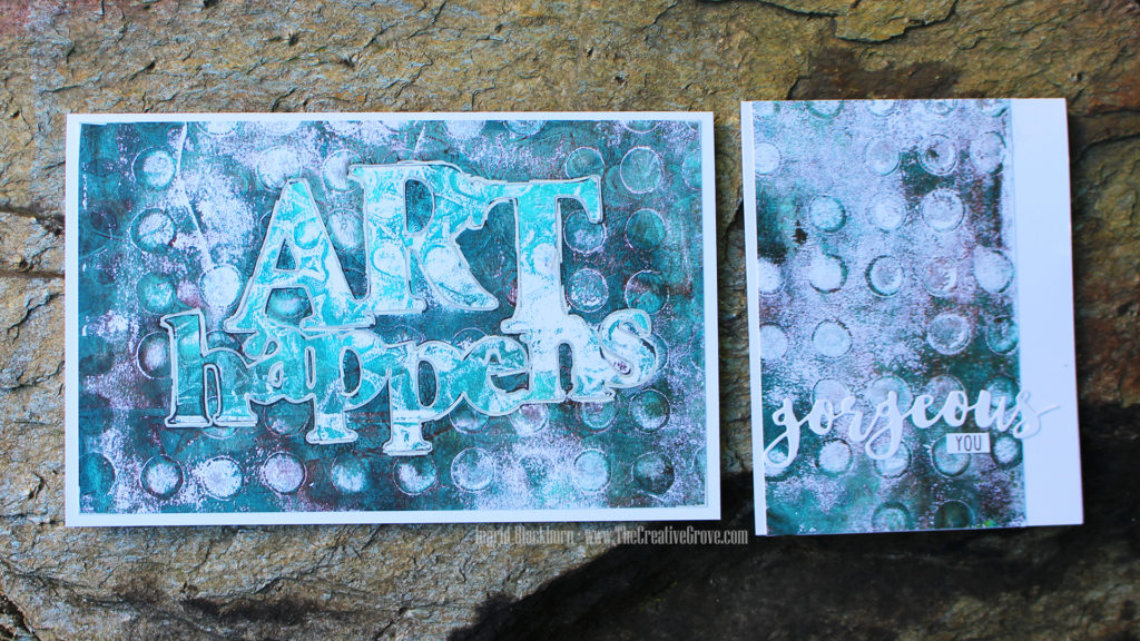
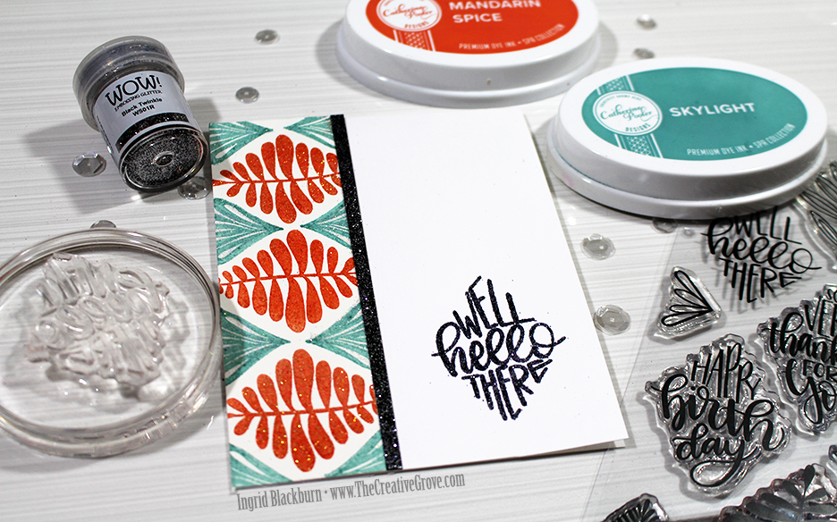
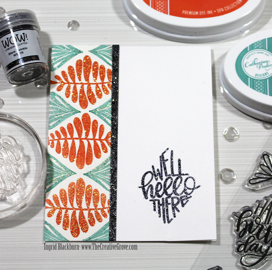
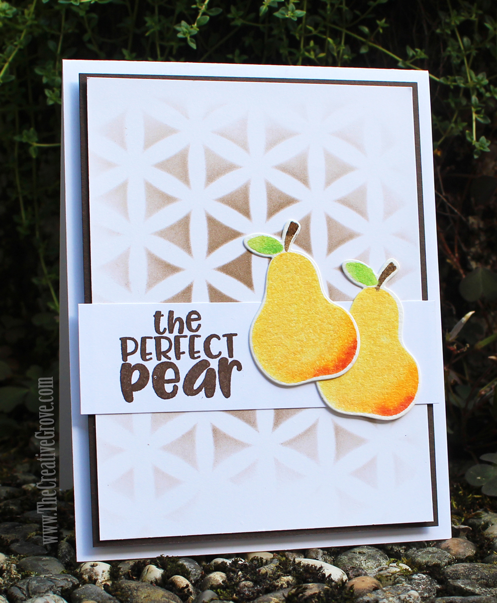
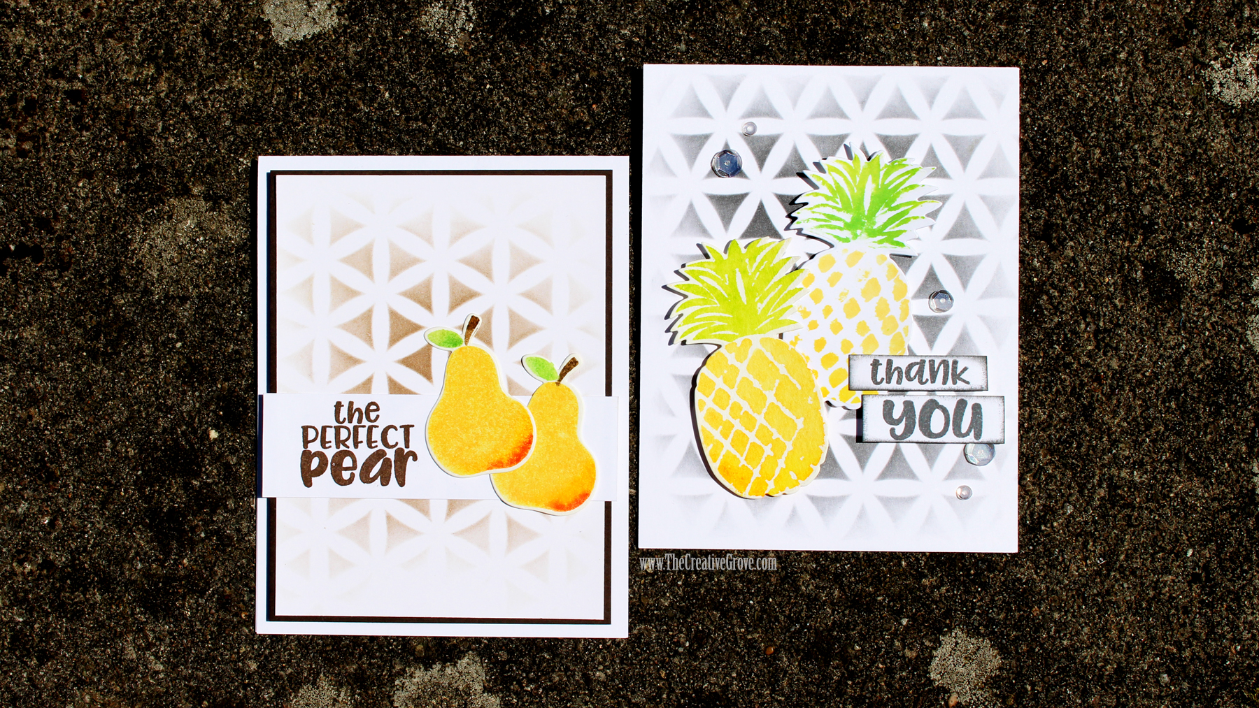
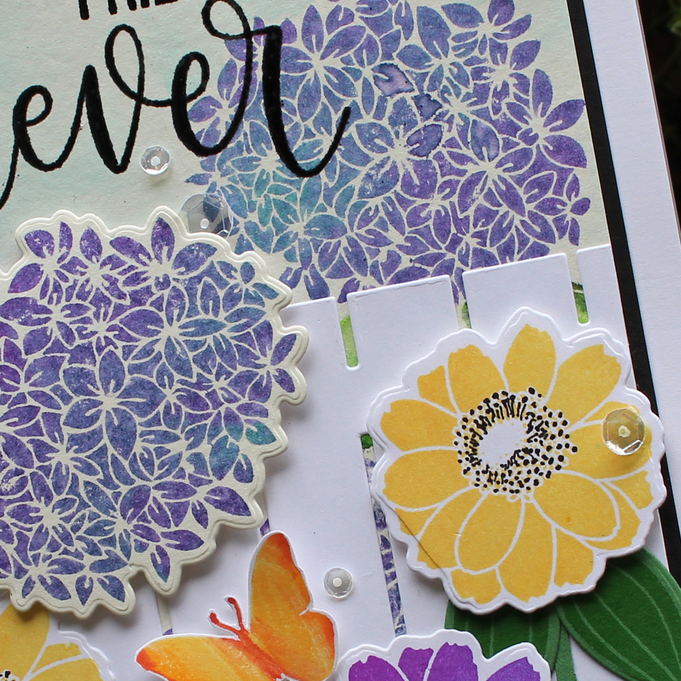
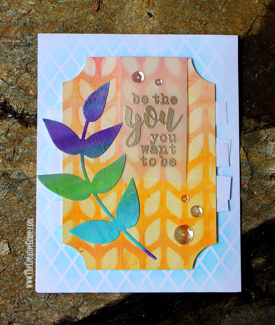
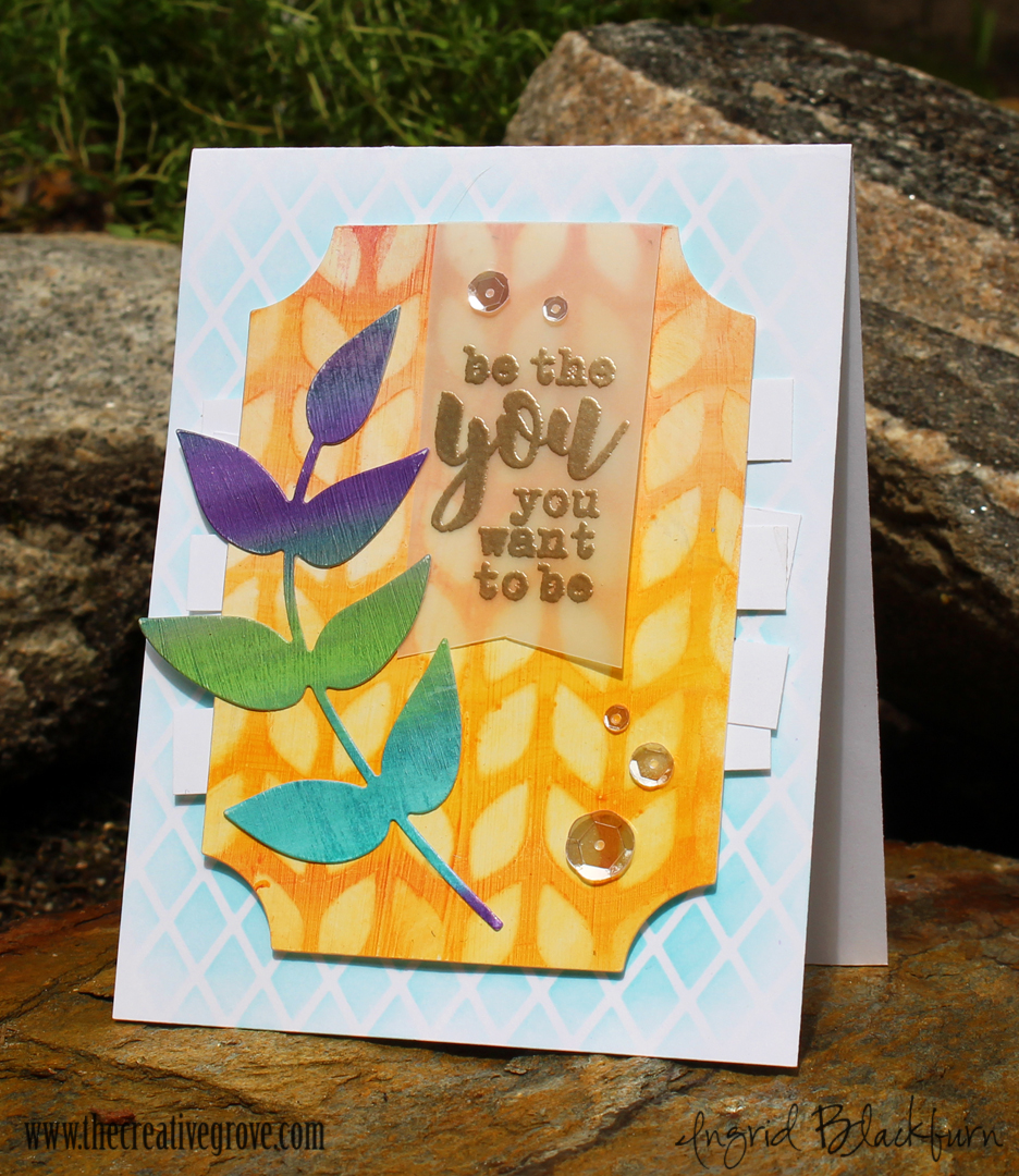
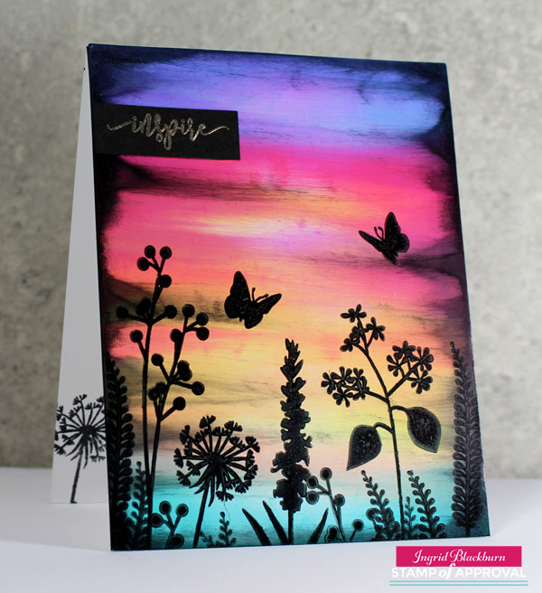
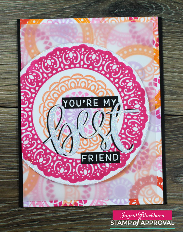
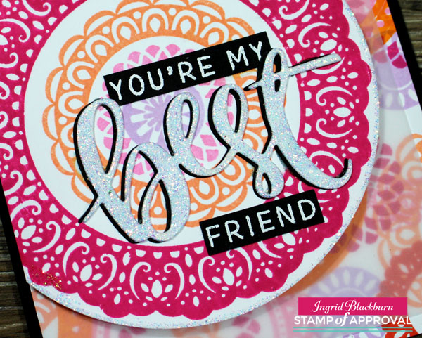
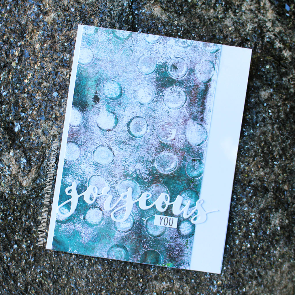
Here are the two cards – one is a traditional A2 sized card – and it needs so little to complete it. Just the Gorgeous die, cause…well hello, it’s gorgeous! And a simple little You to complete the sentiment. The die is one of the MANY fabulous word dies from Stamplorations – I am such an addict of Shery Russ dies and stencils – stamps too! She’s got some ah-mazing stuff. She’s a one woman operation, has phenomenal customer service and I swear the woman doesn’t sleep. Want to see her stuff? Click Here and use the code STAMPINGRID for 20% off orders of $15+. Hey, every little bit helps, right?!
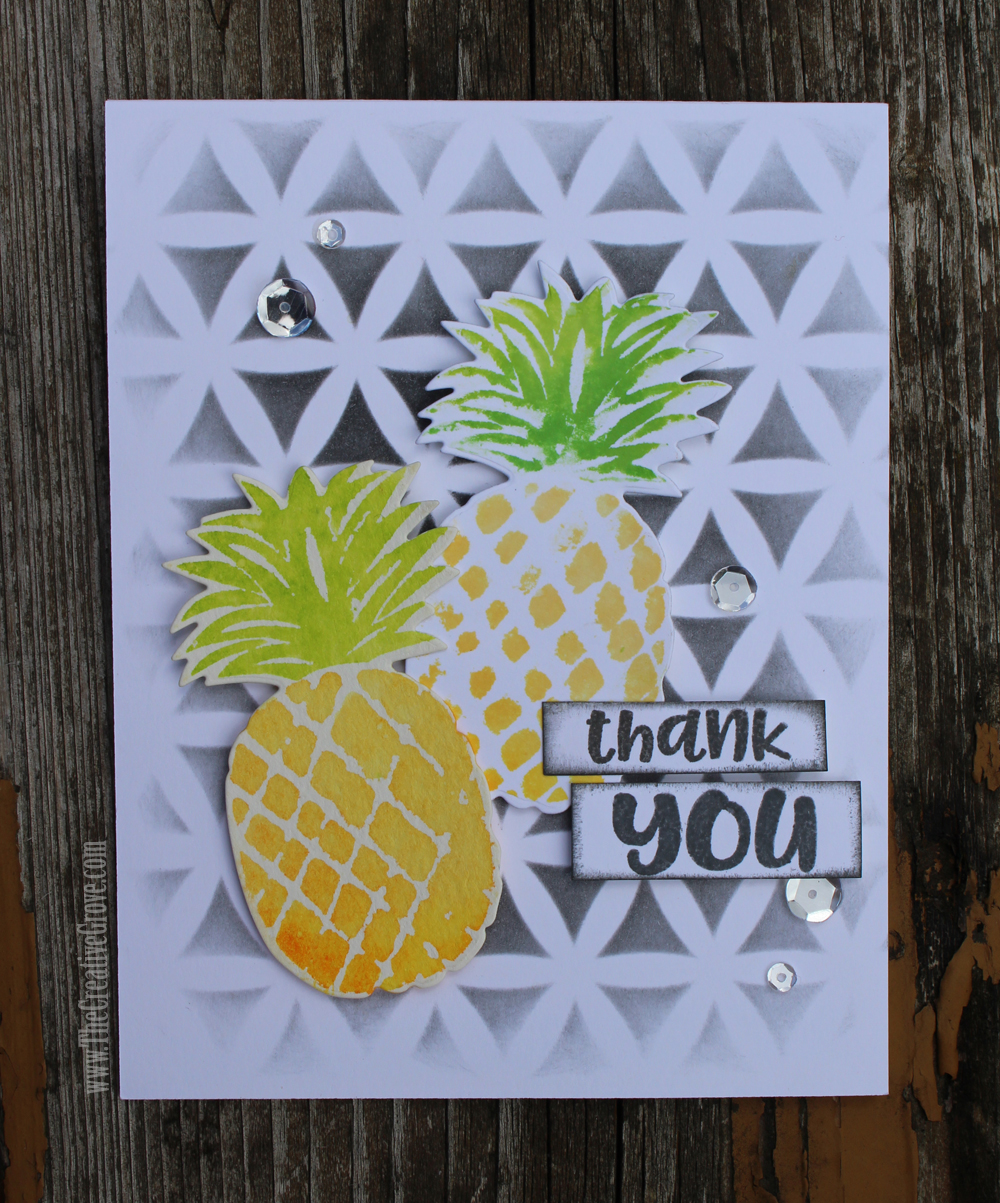
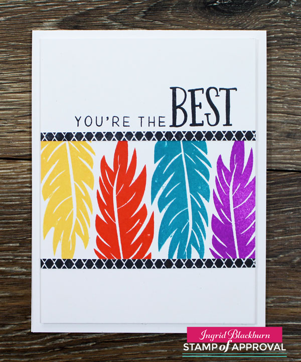
The second project uses the mask Art Happens. I have this same sentiment from Stamplorations in a smaller sized die. WAIT till you see the mixed media project coming up using that – it’s a beauty! Using masks in gel printing is a great way to preserve colors in layers and really allow them to pop as in this project. I wanted to emphasize it a bit more, so I outlined it using a Pitt pen and Posca paint pen. I was going for a sloppy look, cause let’s be honest – there’s nothing perfect about monoprinting.
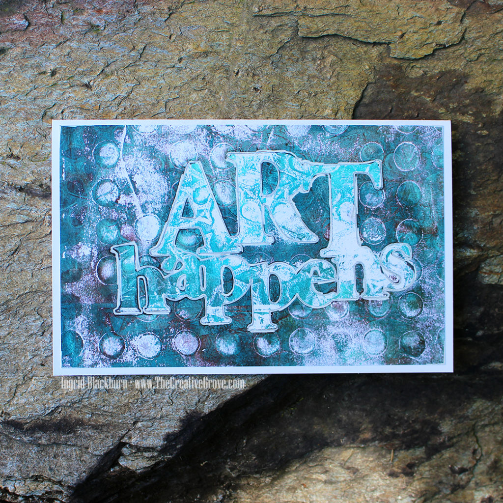
Here’s a funny fact – ask any of my crafty friends who really know me – in card making, perfection is kind of one of my OCD things. Everything has to be lined up right, matted properly, etc…so mixed media nearly gave me convulsions at first. I tried to control everything – until I realized that the magic happens when you let go and just let the art actually happen.
So I hope you’re encouraged to give monoprinting a go. It’s SO relaxing, you’ll have a crazy amount of prints to create cards with, and I know you’ll just fall in love with it like I did. Hey, if this OCD papercrafter can become a mixed media artist – there’s hope for all of us, right?
Thanks for stopping by, be sure to visit all my friends’ blogs on today’s hop, and if you missed the first two days – hop on over to those too. I have the full list below. We have incredible prizes and I’m giving away a prize pack myself! Thanks for joining us on this fun little Summer journey. I hope you’re inspired now that you know Art Happens!
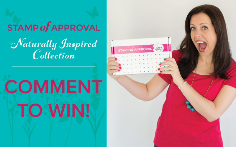
Comment to Win Prizes
We have some amazing sponsors & Prizes:
- Stampscapes – 2 prizes – choice of Nature Sheet Stamp Set ($26.50 value)
- CAS-ual Fridays Stamps – $25 gift certificate
- Catherine Pooler Designs – $25 gift certificate
- Right at Home – $20 gift certificate
- Stamplorations – $20 gift certificate
PLUS….
I’m giving away a prize pack to one lucky commenter from one of my blog posts! So be sure to leave comments on all the blogs – all three days for your chance to win!! Just comment on all the blog hop stops by 7/23/18.
So now it’s YOUR turn to hop along and be inspired by some of my crafty friends. Thanks for taking the time to hang a bit with me today. I’ll be back in a few days with a mixed media project for you. And stop by tomorrow as well – I’ll post that hop list too!
Today’s Hop List – Day Three
- Ingrid Blackburn <— You are here!
- Ardyth Percy-Robb <— Hop here next!!
- Josefine Fouarge
- Tracie Pond
- Nanette Tracy
- Lisa Harrolle
- Justine Hovey
- Susan Powell
- Jennifer Cerizo
Did you miss Day one or Two? Get caught up here:
Day One Blog Hop List:
- Ingrid Blackburn – Yup that’s me with a different post & project!
- Jenny Colacicco
- Ashlea Cornell
- Karen Baker
- Ali Farmer
- Catherine Pooler
- Allison Cope
- Veronica Zalis
Day Two Blog Hop List:
- Melissa Miller
- Tracey McNeely
- Kelly Martin
- Amy Seigler
- Michelle Wallace
- Ilina Crouse
- Maureen Merritt
- Nance Salkeld
- Deepti Stephens
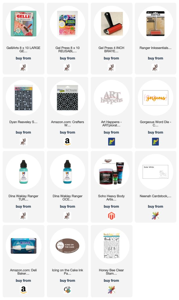
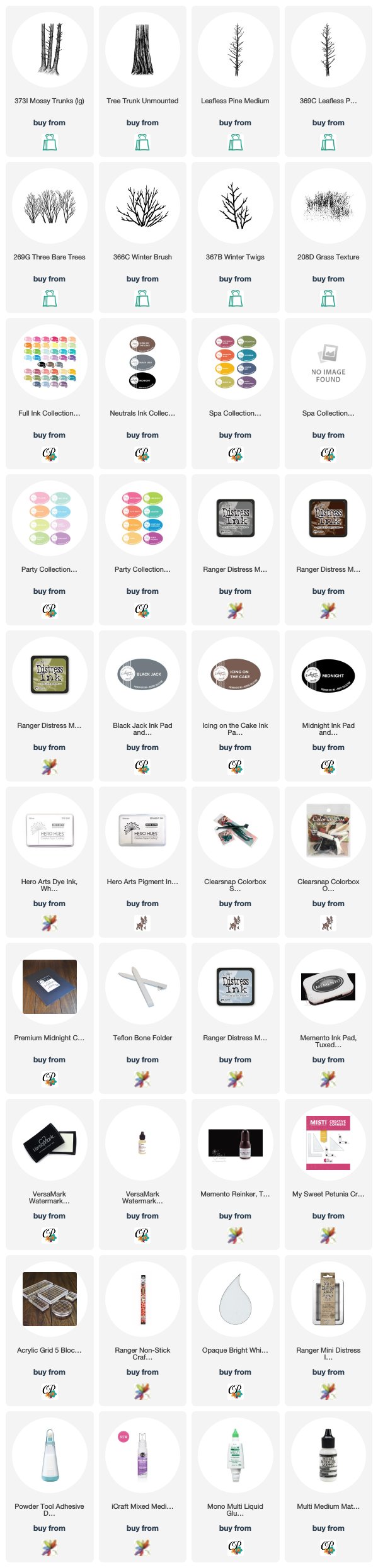
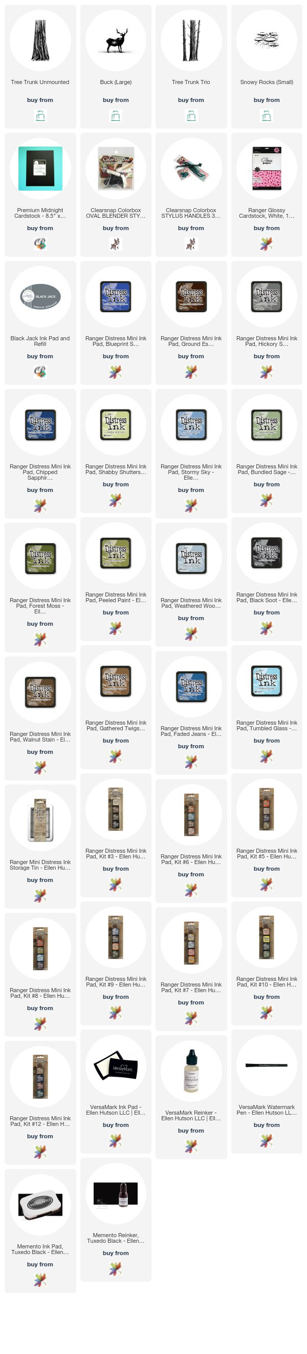
To make finding the supplies I used in these projects a bit easier for you, here are a few clickable links. Compensated Affiliate Links are used when possible. Click here for disclosure. Happy Shopping!