Effortless Ink Blending + Adding Texture – Video Hop with 120 Prizes

Do you want to know just how easy effortless ink blending can be? Well, then you’re in the right place! Today I’m participating in a video hop along with 55 other crafty friends to help Save the Crafty YouTuber!

Ink Blending Tutorial and Video Hop with prizes

What does that mean? YouTube just recently changed their requirements for being able to earn on your videos and channels. That’s how many crafters earn a little extra money to help pay for all those crafty supplies you want to see us teach you about in videos. Making a video seems like such a simple thing – trust me, it’s not. The little 8 minute video I’m showing you today took me 7 hours start to finish to bring to you. And that’s just the video part.

It’s nice to be able to earn a little bit from the ads you see on the videos. Trust me, it’s nothing to retire on, it helps cover some crafty/tech costs – but not much. I do it more for the love, but it is nice!

YouTube recently changed the minimum requirements for the ability to monetize your channel (ads on videos), and it will now take a new crafter quite an effort to get to that point. I remember what it was like to be new, it’s not easy, and it’ll take a bit to get to these new minimums.

So my good friend and fellow crafty YouTuber Justine Hovey had the brilliant idea to organize a video tutorial hop to help SAVE some of the crafty YouTuber’s out there. She’s like that – always the cheerleader for every single YouTuber – big and small. Not everyone is like that, and I’m proud to call her a dear friend.

Everyone was invited to join – including some big names. The folks you see on this hop are all true champions. They don’t care about WHO is on the hop – they just wanted to help the smaller channels. And I applaud that.

So, today I, along with several of my seasoned crafty friends and companies have teamed up with many smaller channels being directly affected by this.

The goal – help us save their ability to continue like they had before. WATCH the videos (minutes watched are important), & subscribe to their channels – another key component. I want to thank you for taking the time, not just to read this, but hop along. For your time and effort – COMMENT along the way on every video. LITERALLY every video has prizes attached to it!!!
Catherine Pooler Ink is great for Effortless Ink Blending

Catherine Pooler is giving away some ink pads on every single video! Simon Says Stamp is giving away a $25 gift certificate on every single video! Plus there are even more prizes from these amazing companies:
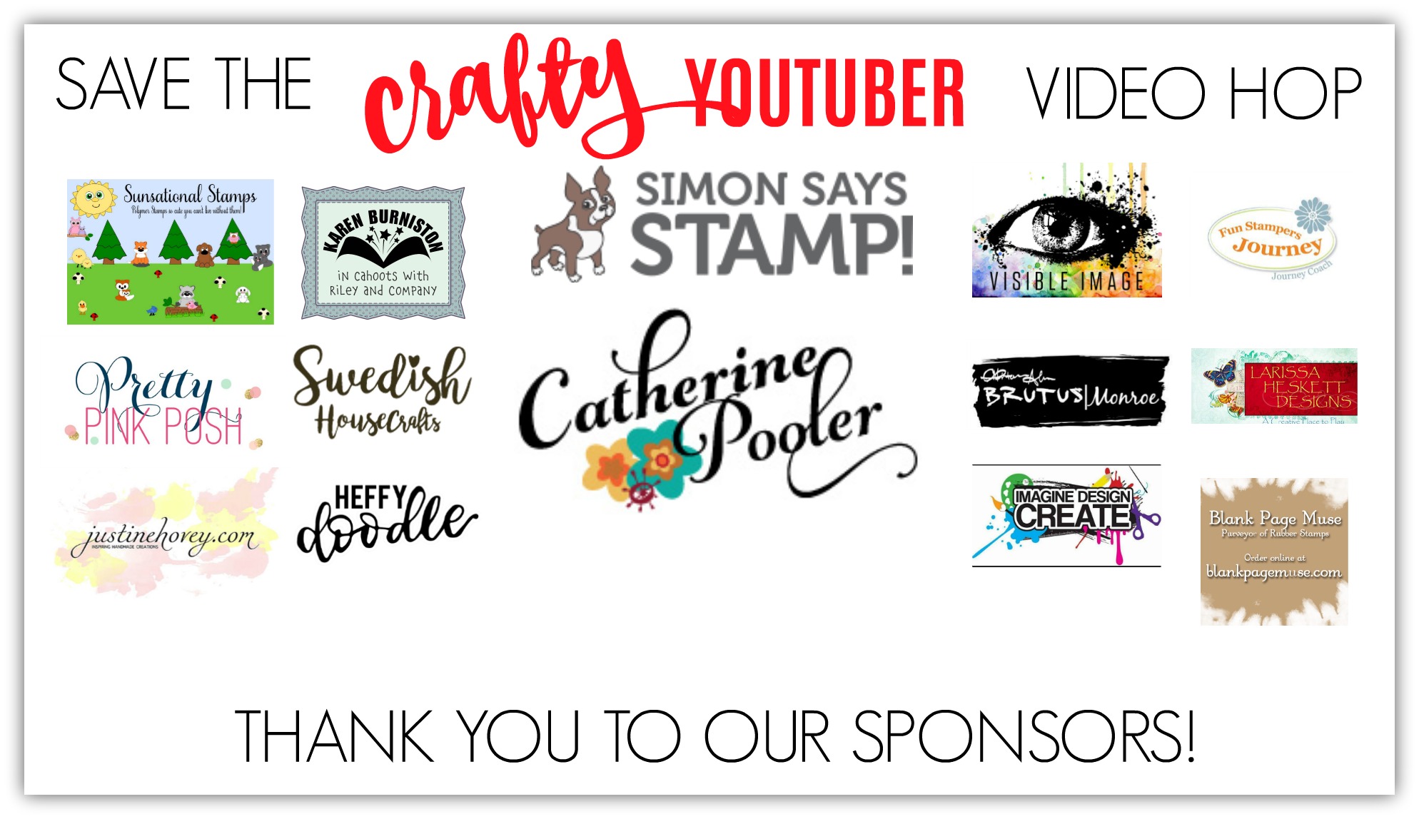
Ink Blending Video Hop Prizes

Effortless Ink Blending Tutorial & Video

For today’s tutorial, I wanted to showcase a technique that I have perfected. Seriously, if you have any trouble with getting an absolute effortless look to your ink blending – look no further. In just a few minutes I’ll show you how YOU too can have the perfectly ink blended look to your projects:

Click HERE to watch on YouTube in HD

Here are some tips to keep in mind:

  • Your pressure is EVERYTHING
  • Seriously, watch exactly how LIGHT I hold my tool in the video (1:05)
  • Work light to dark – not the other way around
  • Bring your lighter colors back into the transitions to help blend it out – KEY

I recently read an article that said to work dark to light. I 100% disagree with that.

You can not take away color, you CAN build it up.

Trust me, I have been ink blending for years. It’s probably one of the few techniques I’m the most disciplined at. Why? Pressure is EVERYTHING.

I am a fast crafter. Meaning – I’m a bit impatient. But not with ink blending. Cue screeching brake sounds….. Yes, even I have an internal throw on the brakes – watch your pressure, Ingrid voice!
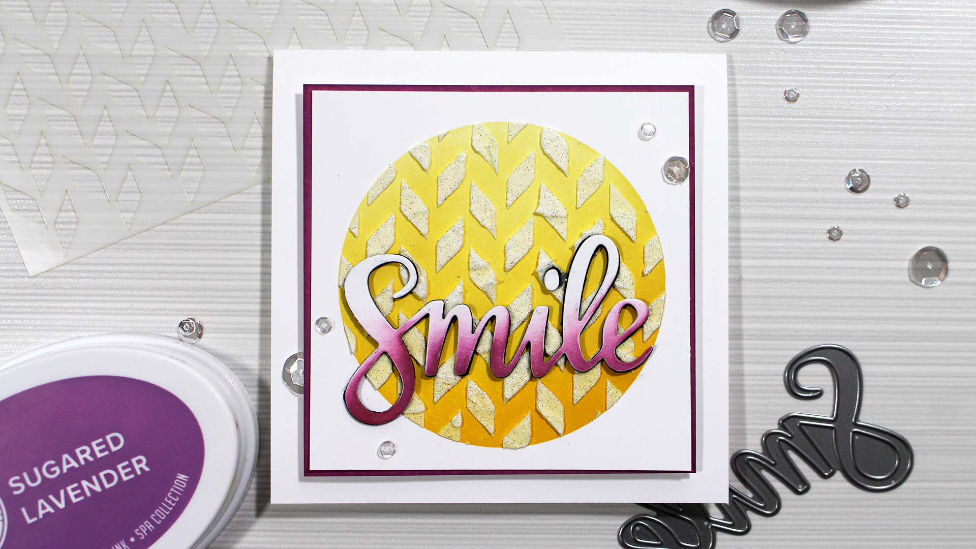
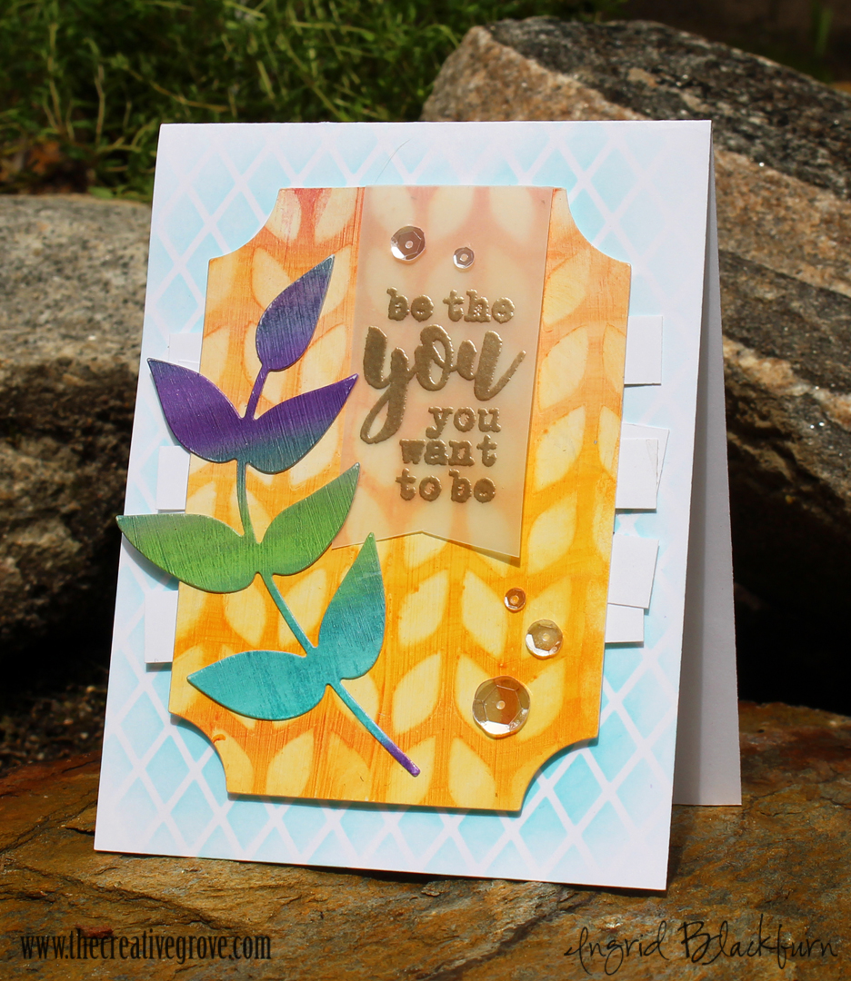
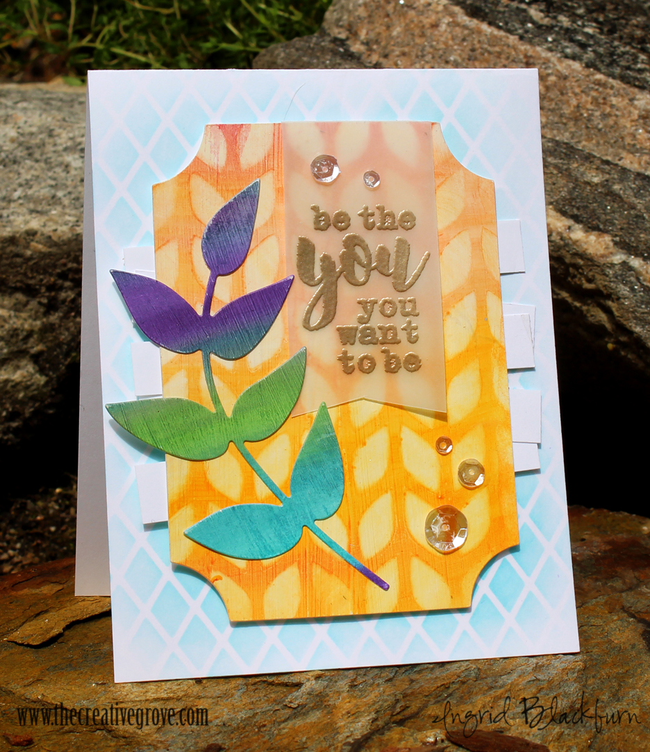
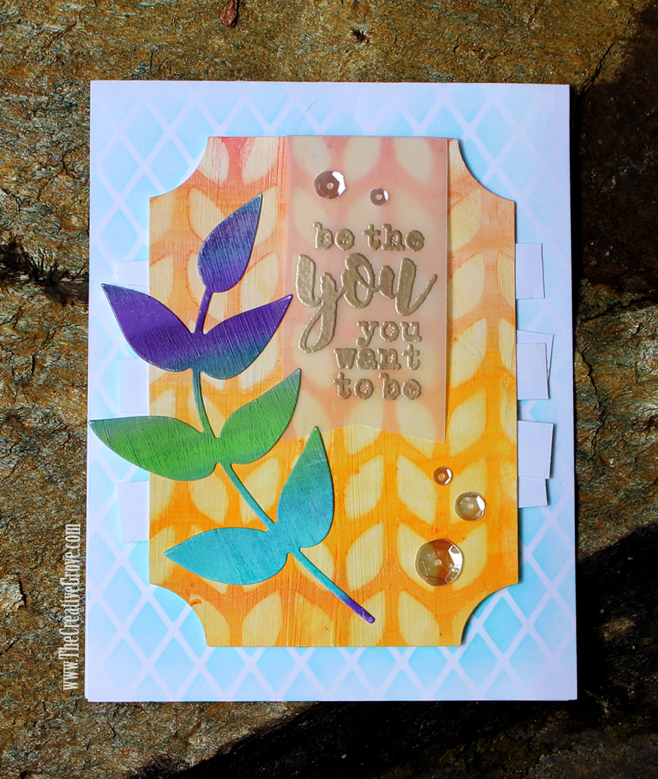
Effortless look with ink blending

Isn’t that just gorgeous? Did you watch the video yet? Did you see how to add some fun sparkly texture to this project – oh, and did you notice the BRAND spanking new colors, word die and stencil?!!! YES, they are all being released tomorrow (2/13) over at CatherinePooler.com. Stop back by here for an awesome blog hop the next few days.
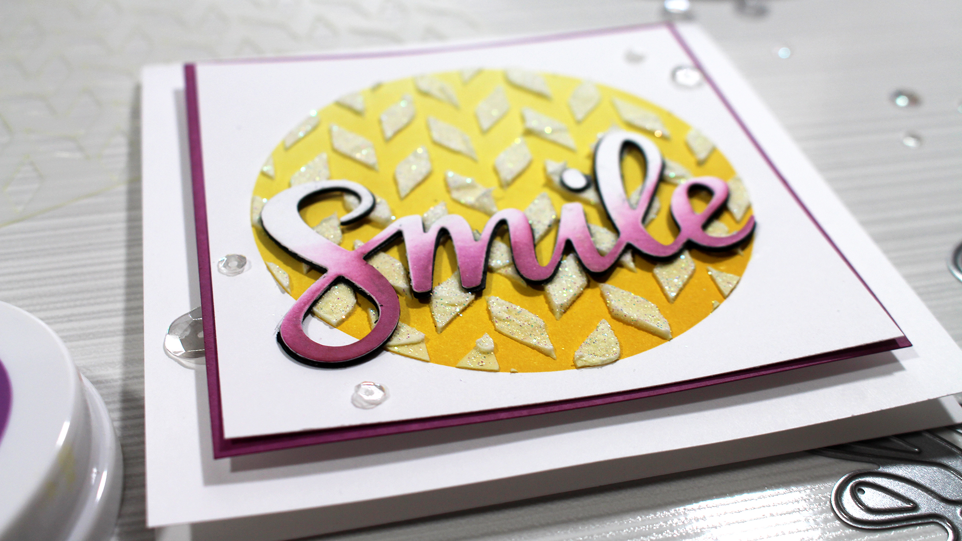
Ingrid Blackburn's Ink Blending tips

Want to learn more? Try these tutorials out:

Thanks for watching & thanks for subscribing…now go comment on everyone’s video post!!! Win those 120 prizes up for grabs!!! 🙂

Keep those fingers inky –
Ingrid Blackburn - The Creative Grove

Supplies

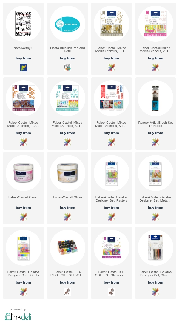
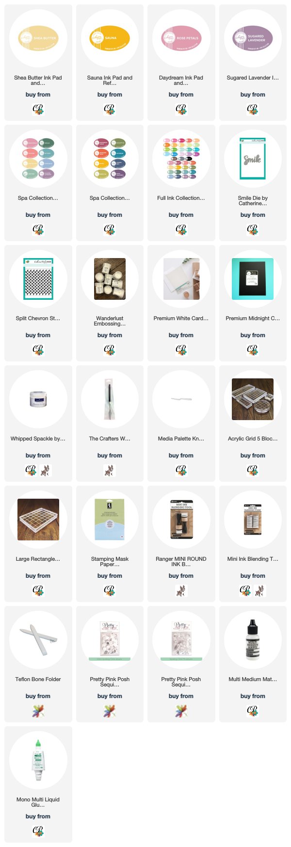
To shop all the fun items I used in today’s video visit these sites. Have any questions? Leave a comment here or on my YouTube Channel. I’ll be adding the new products on 2/13 so check back for links to those!
Three videos – Why Use Gesso, How to Seal Paper Stencils & 3 Ways to Use Gelatos

Today I have three videos for you – 3 Gelato techniques, How to Seal Paper Stencils, & a How To & Why use Gesso. It’s a mediums kind of a day today. YAY!

Over at StampNation, we’re right in the middle of a live Masterclass with Faber-Castell. Last week the coverage was all about Gelato techniques – those super richly pigments little sticks of colorful joy. I’ll be honest – I have had Gelatos on my wishlist for three years (a girl can’t buy it all…and Santa kept skipping over them…guess I wasn’t nice enough…lol).

Faber-Castell Gelato Techniques

I finally got my hands on two of the 15 piece sets – Iridescents and Pastels. Plus last week I was showcasing at a Trunk Show over at Betty’s Creative Studio in Greensboro, NC with Catherine Pooler…and Betty had this WHOLE WALL of Faber-Castell goodness. (Insert Heavenly music and cherubs here…okay – no cherubs).

Seriously – all the colors individually, in sets, stencils, mediums, tools – you name it! Well, I had to quickly snap up 8 more colors. There are 68 gorgeous colors available, and I want them all after this last week. I seriously can’t put them down – I have gelato techniques on the brain. I’m surprised I haven’t put them on my lips yet…lol. OKAY – be honest – who has? Tell me in the comments!

Here’s the skinny…Gelato’s are a little chapstick like tube that is super richly pigmented and creamy. They literally (no joke) go on like butter – and yes, I’m saying that in a thick Long Island, NY voice. There are so many quick, simple techniques you can do with these little sticks from heaven. Today I’m teaching you three simple ones.

Faber-Castell Gelato Techniques

But first…a little prep is required for our project and tools. I thought I’d film two 1 minute tool tip videos for you – whoohoo!

How and Why to Use Gesso

Before we can even talk about Gelato techniques, we have to talk about Gesso. To spread like butter – you need to prep your work surface a bit with Gesso. This video talks about how to do this, and WHY:

Click Here to watch in HD on YouTube

Now that your paper is prepped – you can always use watercolor paper too, but regular cardstock works just fine with gesso. I do several full sheets at once and set them aside to dry – it’s great having those cut down and ready to use when I need to!

Gesso also comes in clear and black. I’ve been using Gesso for a while now in Mixed Media projects. Another great use for it is to go right over a mistake – it’s a blank slate…love that! (And I’ll admit…I’ve had to use that before)

How to Seal Paper Stencils

Faber-Castell makes these awesome paper stencil packs. For about $7 you can get TEN 6×6 stencils – seriously!!! When a regular stencil costs $5-$8, I’ll take $.70 any day! Plus the packs are themed – there are some Mixed Media ones, patterns – you have five packets to choose from.

But the dilemma for me was…I like to use wet mediums with my stencils – so why have to replace something? Regular stencils are made out of a plastic material, thus can take wet mediums and abuse. Paper, not so much. SO…seal them! This is where Glaze medium comes in handy. Plus you can use it for other things too (semi gloss look, collages, etc).

Here’s a quick little 1 minute video to show you just how to seal your stencils:

http://https://youtu.be/fDjPgBrBeC4

Click Here to watch on YouTube in HD

Okay – so we’ve got our stencils sealed, and our paper is prepped. Here’s the big tutorial you’ve been waiting for.

Three Gelato Techniques

At its core – a Gelato is a colored medium. Just like an ink pad – it’s a medium you can manipulate in several ways to add vibrant color to your projects. If you think of it like that, it’s not so scary – you use ink pads every day?!!

You’re going to learn how to use gelatos to do three techniques today: Seamless Wet Blending, the Vanishing Stencil Technique, and how to stamp with Gelatos.

Here’s a video to show you exactly how:

Click Here to watch on YouTube in HD

Blending is the most basic Gelato techniques. If you’ve rubbed your gelatos over cardstock that hasn’t be gesso’d, it’s not going to blend well. And forget about using water. To use water – you need watercolor paper or gesso’d cardstock. It’s just frustrating without the proper set up – set yourself up for success!

Regular blending and water blending is a very different look. Try them both and see which one you like more!

Tips for Seamless Wet Blending

  • To get that seamless look, use your finger or a paint brush. I like to use my fingers, as I can really control what and where the medium flows.
  • Control your water – don’t add too much at the start – go gradual, better to need to add, than have to take away
  • Spray a little water onto your craft mat or acrylic block for a quick place to draw just a little H2O
  • Choose colors that blend well – stay away from complimentary colors that will create mud
  • Keep going – if you feel it needs a pop of color – directly add your gelato for a little pop

I’m a stencil addict – and the vanishing stencil is a huge wow for me. Usually I’m always adding color through a stencil – so to remove it is fun.

Tips for the Vanishing Stencil Technique

  • Pull away with a clean part of your baby wipe, twist and rotate it to get a clean piece. You don’t want to transfer right back down
  • Keep your stencil steady – if you aren’t confident you can hold it in place, secure it with tape
  • Your gelato base can’t be set. The best result is to create your background color then remove while still slightly wet even.

Once you’ve removed the color – try adding a new one in the newly blank space! Tip for adding color through a stencil – add it to your stencil and wick it to your project with a tool or fingers. It’s much easier than jamming that creamy stick through the stencil!

Gelato Techniques

Tips for Stamping with Gelatos

While I didn’t end up using that piece in the project – it did turn out super cool. Be sure to properly remove your gelato from your stamp when done. A baby wipe or water should do the trick.

  • Add an even layer of color to your stamp
  • Lightly spritz with a fine mist spritzer. Try not to over water your stamp – you will lose a lot of the crispness in your image the more you add

So how was that? Now it’s YOUR turn! Seriously, don’t be afraid of this medium. It’s super easy to get crafty with.

Do you have Gelatos? Do you have favorite Gelato techniques? If so – tell me what you think in the comments below. If they are in a drawer – get them out and have some colorful fun.

Faber-Castell Masterclass

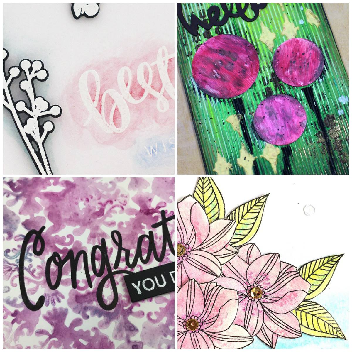
I’m looking forward to experimenting with more Gelato techniques and if you’re not a StampNation member – be sure to check it out. We had a Gelatos challenge this week (with a prize – still time to enter) Here is a little of the inspiration from the Dream Team:

There are over 700 videos, and several classes. There’s a live chat with Faber-Castell directly answering your questions this Thursday – hope you stop by there!

Till next time –

[optin_box style=”27″ alignment=”center” email_field=”email” email_default=”Enter your email address” email_order=”0″ integration_type=”aweber” double_optin=”Y” list=”3846012″ name_field=”name” name_default=”Enter your first name” name_order=”0″ name_required=”Y” opm_packages=””][optin_box_field name=”headline”]Want to LEARN with more exclusive videos?[/optin_box_field][optin_box_field name=”paragraph”]PHA+UGx1cyB5b3UnbGwgYmUgYWRkZWQgdG8gbXk8c3Ryb25nPsKgRlJFRTwvc3Ryb25nPsKgQ3JlYXRpdmUgVGlwcyBFLWxldHRlciB3aGVyZSBJIHNoYXJlIGV4Y2x1c2l2ZSBwcm9qZWN0cywgdmlkZW9zICZhbXA7IHRoZSAxMiBEYXlzIG9mIENocmlzdG1hczwvcD4K[/optin_box_field][optin_box_field name=”privacy”][/optin_box_field][optin_box_field name=”top_color”]undefined[/optin_box_field][optin_box_button type=”0″ button_below=”Y”]Get Instant Access![/optin_box_button] [/optin_box]


Stipple Brush Techniques for Cards

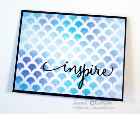
Have you ever learned stipple brush techniques for cards? Stipple brushes are another tool you can use to apply ink to your cardstock. These brushes are tightly bound at the base, are made of a bristle or synthetic fiber and the hairs are generally the same length. They usually are on a handle. The brushes I use on this project have a natural bristle and are inexpensive brushes.

Stipple brush techniques with a stencil

This video teaches you two stipple brush techniques – the Pop and Sweep. Both are rather easy, and the best tip I could offer you is to keep your hold on your brush loose. Enjoy this project:

Watch on You Tube

So what did you think? Pretty easy! Like I mentioned before, the key is a loose hold on your brush. Remember that you are laying down lots of little dots of color with the pop technique, so try not to stay in the same spot – move around a little. Here are the project specifics.

Creative Tips for two Stipple Brush Techniques

  • Secure your card front to your stencil using painters tape and then secure your stencil to your craft mat.
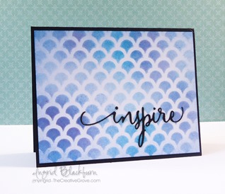
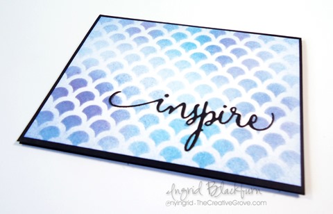
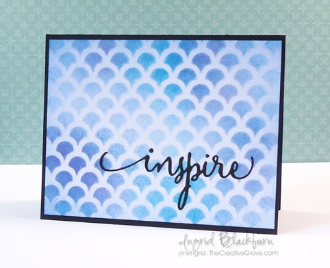
  • I used the scallop stencil by My Favorite Things.
  • Apply ink with your stipple brush in a popping or pouncing motion from either your ink pad, or from your craft mat.
  • Tip – when popping your brush through your stencil – keep it light, don’t smoosh your bristles or you will lose the dot effect and work against yourself.

stipple brush techniques in card making


  • Add your inks randomly moving your brush around rather than keeping it in one spot. If you keep it in one spot your color will become too concentrated and it won’t look effortless.
  • Tip – If you do keep your color concentrated and wish to correct it, apply more but keep the circular area of application random and outward from the concentration.
  • I used the colors Tumbled Glass, Peacock Feathers, Broken China, Faded Jeans and Seedless Preserves.

how to tutorial for Stipple brush techniques


  • 2nd Technique – the Sweep: to add a little finish to your edge, sweep your bristles in a flicking motion from your craft mat onto your edge in a quick and light manner. This is also a great way to use the remaining ink on your craft mat or flick the ink from your stencil onto your project, helping to clean your stencil in the process.
  • Mat onto a black card base and add a greeting – I used the Inspire steel die by Penny Black.

The goal of this project was to achieve a light mixture of colors with a distinct background from the stencil. I entered this project into the Happy Little Stampers April Stencil Challenge.

CAS_Apr2015

Be sure to stop by later in the week for another stipple brush example, Creative Tips E-Letter subscribers will be emailed a fun project, and VIP community members will also have another project added to their library this week.

video on stipple brush techniques

Overall, using stipple brushes in paper crafting is a pretty simple concept, and I think you’ll enjoy adding both stipple brush techniques to your technique arsenal!

Signature


[optin_box style=”14″ alignment=”center” disable_name=”Y” email_field=”email” email_default=”Enter your email address” email_order=”1″ integration_type=”aweber” double_optin=”Y” list=”2841626″ name_field=”name” name_default=”Enter your first name” name_required=”Y”][optin_box_field name=”headline”]If you enjoyed this tutorial…[/optin_box_field][optin_box_field name=”paragraph”]PHA+Li4ueW914oCZbGwgbG92ZSBvdXIgPHNwYW4gc3R5bGU9ImNvbG9yOiAjMjQ0YzVlOyI+PGVtPjxzdHJvbmc+ZnJlZSA8L3N0cm9uZz48L2VtPjwvc3Bhbj5zdWJzY3JpYmVyIG9ubHkgdmlkZW8gc2VyaWVzISDCoEdldCB0aGXCoDxzcGFuIHN0eWxlPSJjb2xvcjogIzI0NGM1ZTsiPjxlbT48c3Ryb25nPmV4Y2x1c2l2ZTwvc3Ryb25nPjwvZW0+PC9zcGFuPsKgQ3JlYXRpdmUgVGlwcyBlLWxldHRlciB3aGljaCB3aWxsIHRlYWNoIHlvdSBuZXcgdGVjaG5pcXVlcyB0byBhZGQgdG8geW91ciBzdGFtcGluZyBza2lsbCBzZXQuIMKgTGVhcm4gaG93IHRvIG1ha2UgcHJvamVjdHMgeW91J2xswqBsb3ZlITwvcD4K[/optin_box_field][optin_box_field name=”privacy”][/optin_box_field][optin_box_field name=”top_color”]undefined[/optin_box_field][optin_box_button type=”1″ text=”Send me exclusive tips!” text_size=”26″ text_color=”#000000″ text_bold=”Y” text_letter_spacing=”-1″ text_shadow_panel=”Y” text_shadow_vertical=”1″ text_shadow_horizontal=”0″ text_shadow_color=”#a3b640″ text_shadow_blur=”0″ styling_width=”100″ styling_height=”10″ styling_border_color=”#000000″ styling_border_size=”1″ styling_border_radius=”6″ styling_border_opacity=”100″ styling_shine=”Y” styling_gradient_start_color=”#a3b640″ styling_gradient_end_color=”#5b661e” drop_shadow_panel=”Y” drop_shadow_vertical=”1″ drop_shadow_horizontal=”0″ drop_shadow_blur=”1″ drop_shadow_spread=”0″ drop_shadow_color=”#000000″ drop_shadow_opacity=”50″ inset_shadow_panel=”Y” inset_shadow_vertical=”0″ inset_shadow_horizontal=”0″ inset_shadow_blur=”0″ inset_shadow_spread=”1″ inset_shadow_color=”#a3b640″ inset_shadow_opacity=”50″ location=”optin_box_style_14″ button_below=”Y”]Send me exclusive tips![/optin_box_button] [/optin_box]

Watercolor Supplies–Paper, Brushes, Palettes and Paints

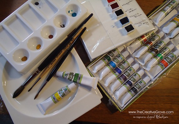
Getting started with watercolors can become quite daunting, but it doesn’t need to be.  Pictured below is really all you need:  Paper, a few brushes, two small drinking glasses, some paint and a throw away dish.  Read on for more details on a few DIY items and what I use to make landscapes and cards.  I hope you find it helpful on your watercolor journey.

To see the project in the related blog post click here.

DSC09982_thumb[5]

Watercolor paper comes in all thickness, texture and sizes.  Not/Cold Pressed is what most people are looking for, texture ranges from rough to . You want a good weight of at least 140 pound, but can get great quality paper up to 300 pound.  Stampin’ Up!’s watercolor paper is 140 pound cold pressed paper.  Despite that,  it’s not my favorite to use!  You’ll have to play around to find one that you love.

Watercolor Blocks

A watercolor block is several sheets (usually 10-30) of watercolor paper glued together so that it will straighten itself out once dried.  They are bound with a gummed edge on all or three sides while wet so that they dry flat regardless of how much fluid you add to it.  It’s a great work surface that is easily portable with a thick piece of cardboard at the base for support.  I highly recommend getting one if you really get into watercolor.  It’s also a great way to sketch, use pastels, or several kinds of mediums.  You’ll also find them for acrylics and oils.

DSC00026_thumb[2]DSC09982_thumb[7]DSC09985_thumb[7]

Just like individual paper, blocks come in several sizes, texture of paper and paper weights.  I am using one by Hahnemuhle as I couldn’t find the Arches cold pressed block locally – Arches is considered one of the best – from France.  I went with a small block for landscapes and cards that had 30 sheets that had 100 pound rough paper attached as a block.  My other block (larger projects), also by Hahnemuhle is cold pressed 140 pound (10 sheet), and there is definitely a difference in the quality of the paper – which the price reflected as well.  But for cards, the 100 pound was just fine.

Once finished with your project, you just use a dull metal side like a palette knife or I used the edge of my closed paper snips to loosen your completed project off the block. It’s rather awesome when watercoloring, and I do highly recommend a block for its ease.

DSC00013_thumb[5]

Paper

You of course can take paper from a watercolor pad or purchased individually.  When working, to prevent the warp of the paper as you add fluid, make sure to tape it to your firm surface.  A wooden or firm drawing board is ideal.  Do not remove the paper from the tape until it has completely dried.  The tape will help bring the paper back to its shape.

DIY Painting Palette and Mixing Surfaces

I found two of these flat china plates (pictured below top left) in a close out section of a target like store.  They are perfect for making washes.  I squeeze a little color on the lip that will dry and pull from that as needed in addition to my half pans. 

DSC00019_thumb[2]

Since I haven’t found the perfect water color metal tin yet for my pans, I used a piece of cardboard and layered a piece of cardstock on top (pictured above bottom right and below).  I double wrapped the entire thing in thick plastic from some packaging that I was throwing away to create a water resistant surface.  I laid two pieces of sticky strip to one side and attached my 1/2 pans.  I wrote the colors onto the cardstock first, then laid the pans next to them.  They don’t move and it’s a great make-shift palette with a little mixing space to the left if needed. 

DSC00013 copy_thumb[2]

Half Pans vs. Tubes

This is a personal choice.  I actually like both.  But, if I were forced at gunpoint to chose one, I’d go with Pans.  Less messy, more control and less waste.  You truly only pull off what you need. 

Quality

Now this is not so subjective.  I have a lesser quality tubes, as I’m just starting out and it was a gift set meant as a starter set.  Perfectly fine for me at this point.  I got 24 colors in a good range for not so much, perfect if you’re just starting out.  But as with anything in life, you get what you pay for.  So my gift set of tubes that was about $18 for 24 tubes is chalky and a bit dull in color. 

Not that I realized that until I purchased artist quality pans and started painting with those!  Holy cow – to say there is a noticeable difference is an understatement!  They are vibrant and much truer in hue once watered down.  And that’s where you’ll really see it – plus when you start mixing.  It really is night and day.

So  where do you start if you’re just beginning?  My recommendation – go with a student/academy set.  The price is a bit cheaper than artist colors, but much more vibrant than the grade school and hobby sets you’ll find.  And if the cost isn’t an issue – then hands down – go for the artists colors. 

Start with the basics – you don’t need every color – and there are a lot of colors when you get to the artist level.  But the advantage of starting with the primaries and just a few extras…you’ll learn to mix your own!  Ask your art professional in the store – not the after school kid just looking to make a few bucks – someone that knows what they are dealing with.  After all, my Schminke Hordaram Artist Watercolor 1/2 sized pans range from $5-$10 each – and yes those are the small 1/2 size!  So, get a good 12 or 24 color set with a tin (you’ll save).  You can get a 24 color Schminke 1/2 pan set for $180 (the tin by itself is $44 – ridiculous, I know!)  But you can get a wide variety of colors – or make your own collection.  The tin will make it easy to transport your pans with you, but if you only plan on water coloring at home, try my DIY palette!

I don’t have access to Winsor and Newton watercolors locally, but if you can get your hands on  these – go for this brand.  The colors are brilliant!  There is a wide range of brands out there – but if you’re going to spend $50, you might as well, just go for a few of the basics Red, Yellow and Blue of a really good quality and work your way up to more colors.  The lessons in learning to create your own colors through mixing the three primaries will be invaluable.  That’s what I’m doing, after all…I still need money for stamps! Smile

Tubes

Of course, you can squeeze tubes into wells of palettes or empty pans as well.  Be sure you use better quality paints, because as you add water and thin out your paints, once it dries if it’s lower quality – like my Maries, it’ll contract and flake right out.  The thing about tubes, squeeze out just what you need.  It’s easy to squeeze out too much.  I squeezed out just the minimum onto my palette above, and look at how much was left over at the end!  It’s sitting dry on my plate for next time.  But if that’s a while in-between, it’ll just fall right off.

DSC09930

The paint from tubes are easier on your brushes and mix with water easier for your exact desired consistency.  When I was working on my 10 inch Basil Leaf (click here to see that), I needed a lot of olive green and sap green.  I used tubes, because I needed a ton.  I didn’t have pans at the time, but being able to mix larger portions of exact color was definitely easier.

Pans are less expensive than tubes and easily accessible – no lid to take off, so they are preferred by many.  I think you’ll find that you like using both.  There’s nothing wrong with that!

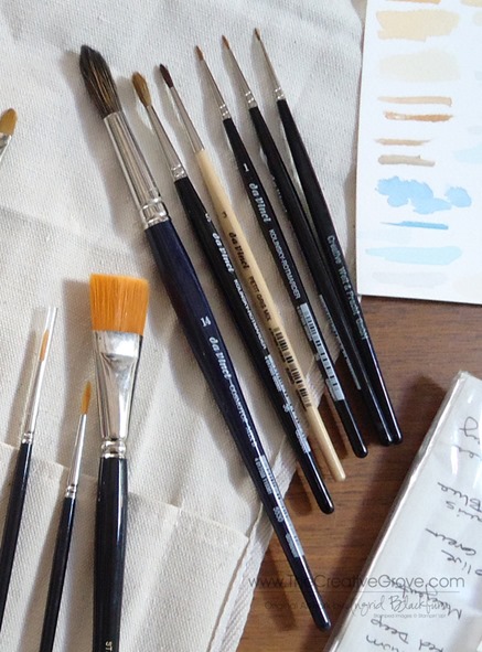
Brushes

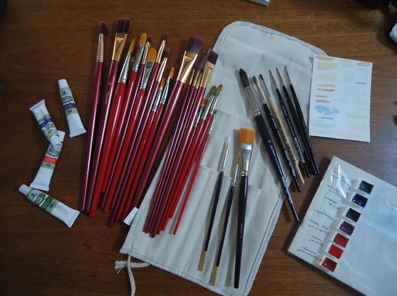
I use a Da Vinci Cosmo Top Mix B in a size 14 and a Da Vinci Kolinsky Rotmarder in size 3 and 5 for smaller touches.   These brushes when wet come to a point and can make the smallest of details.  Use anything you have, Aqua Painter or other ones you have lying around.  This will definitely be another post in itself someday.  I’m just scratching the surface here. 

DSC00028

For more detailed layered paintings like botanicals, I use my Kolinsky (Sable Hair) Rotmarder brushes, but don’t go higher than size 5.  I use size 1, 0, 000 and 3 as well.  Using the size 14 was quite an adjustment, but I found that I had more versatility.  I spend money on good brushes, so that’s why I don’t have that many. 

DSC00029

To supplement my stash, I have two $10 sets of flat and rounded brushes in various sizes.  They are more for acrylic painting, but I use them none-the-less.  Not much with the watercolors, but for water, mixing and scrubbing if needed.

For water pots, I use 2-3 small glasses, one for clean, one dirty and another I rotate in if needed.  It’s easy, and they stack for easy back and forth to the sink.

I hope that helped you with some basic supplies.  I’m still exploring the many, many brands and great supplies out there!

Signature Snowflake 001

Shop 24/7 in my Online Store – Here

For other art supplies, check out these online resources:

Dick Blick and Jerry’s Artarama

For online card classes – be sure to check them out in the classroom under the Online Classes tab above!

Using a Variety of Supplies

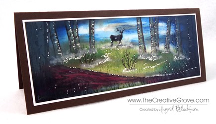
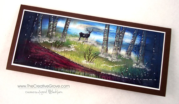
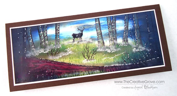
Diversity is always great in artistic supplies.  Today I wanted to share a card with you that uses a variety of companies.  After all, do ALL your clothes come from the same store?  Probably not.  So, along with that theory, here is a colorful scene that uses Stampscapes Images, Marvy  and Adirondack Dye based inks and a Signo White Gel Pen.  This scene is a re-creation of one done by Kevin Nakagawa from Stampscapes

Misty Forest Buck (3)

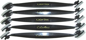
This misty forest scene makes me want to go hiking!  To get the sweeping motion of the ink carried across the cardstock, you will need a Colorbox Stylus which has sponge applicators.  You can find this tool in almost any craft store.  It does take a little getting used to and be sure to use a light touch.  But when using the stylus tool, you have to have the right inks. 

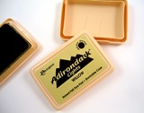
While I love my Stampin’ Up! inkpads, they tore up my sponge tips with this technique.  Which, I’ll be honest – will frustrate you and you’ll need new tips!  Stampin’ Up’s fast drying edge is great for clean and simple stamping, but not for this technique.   What you need, is the right ink – a wetter dye based ink like the Marvy Matchables or Adirondack Ink Pads.  Both of these have a wetter saturation and work better with the stylus tool and glossy cardstock. 

Note – Marvy has discontinued several of their colors of ink pads here in the US (just a few months ago), so if you come across them – nab them up!  Not to worry, the reinkers are not being discontinued, so you’ll have access to the full color spectrum for their markers (which let’s be honest – ROCK!) and you can always use the reinkers just like paints, which is great for this technique.

Misty Forest Buck (2)

To stamp the images first, use a black that sets well without bleeding – I use Memento Tuxedo Black Ink.  It’s the best non-bleed ink I’ve come across.  Then create your under layer with your lighter tones first.  Remember, you can always darken any scene up, you can’t however make it lighter.  It’s the same theory in painting.  Get your undertones first. 

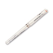
Once I have my scene set up, I can add highlights and contrasts using darker colors.  I framed my scene here using darker blues, greens and browns.  Leaving some light can be hard – I have to admit, one of my challenges – but I promise, you’ll love that contrast at the end – so resist, resist, resist!  For finishing touches, you’ll want to use white pigment ink and a q-tip to create the fog.  The highlights were made with a white gel pen. 

Misty Forest Buck (1)

The depth in this card captivates you.  the light in the sky balances the darkness.  It really seems like the beginning or end of an old movie – you know and the dark circle opens or closes the scene?  I hope you enjoyed it!  Now go have fun with all your supplies!

Personal Note – thanks to so many of you emailing me lately!  I have to admit I haven’t been stamping too much lately due to an injury to my right thumb which affected my right wrist.  Of course I’m right handed – and it’s just doesn’t work with my left hand!  No matter how hard I try. Smile  This also kept me off the computer for any long sort of typing.  The angle has been tough – including using a mouse.  So, after a lot of trying to work my way through it, I actually had to take a real break to recover!  Not so easy. 

Thankfully, I’ve been back in the studio and even trying some other artistic mediums that aren’t as much pressure on my thumb and wrist – like painting!  It’s been therapeutic to be creative again!  I’ve only been able to watch stuff online and make sketches and notes on projects and upcoming classes.  Thanks for stopping by today, I look forward to seeing you around the grove for more.

Signature Snowflake 001

Products Used:

Adirondack Ink Pads  Colorbox Stylus Tool Marvy Matchables  Signo White Gel Pen

Video: How to make a custom envelope

Custom Envelopes with Envelope Punch Board 007

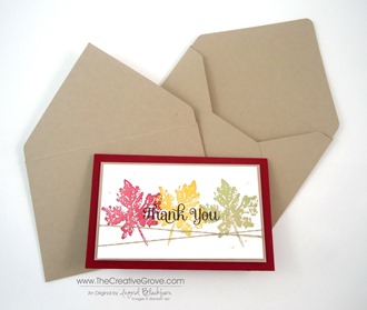
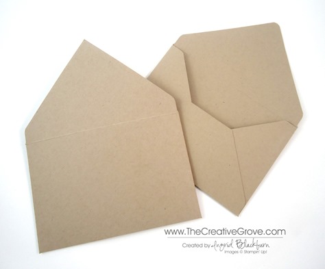
So now that you’ve made a custom sized card, how do you send it?  Make a custom sized envelope with the Envelope Punch Board of course.  Here is the video as promised!  Enjoy!

Creative Tool Tip Video:

How to make custom sized envelopes


If you missed how to make this cute simple card, click here.

Only 3 days left!

There’s still time to take advantage of the reduced price for the next specialty class – Brayer 102: Advanced Creative Scenery.  This class goes live in a few days – don’t miss out on the savings!

Signature Snowflake 001

Shop 24/7 in the online store – click here

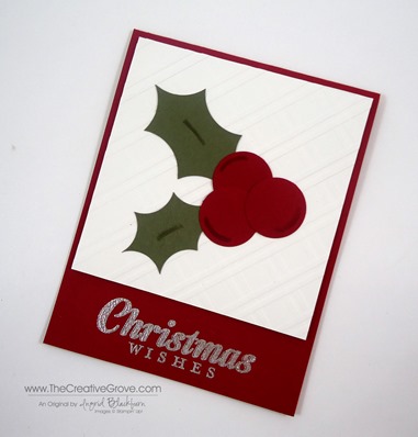
Video: How to Make Holly Leaves

How to make Holly Leaves with a Circle Punch

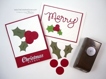
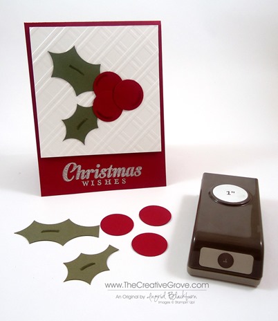
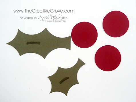
Have you ever wanted a custom sized holly leaf for a project, but didn’t have a punch or die for it?  Today I’m going to show you how to make your own custom sized holly leaf.

One of our readers, Eloise asked me yesterday to share the dimensions for the leaves on this project, so I took it another step today and made a Creative Tip video Tutorial for you all!  Enjoy.

Creative Tip Video –

Measurements –

  • Cherry Cobbler – 5.5” x 4.25”
  • Whisper White – 4” x 4”
  • Always Artichoke – 2.75” wide and 2” wide
  • Circle Punches – 1” and 1 3/8”
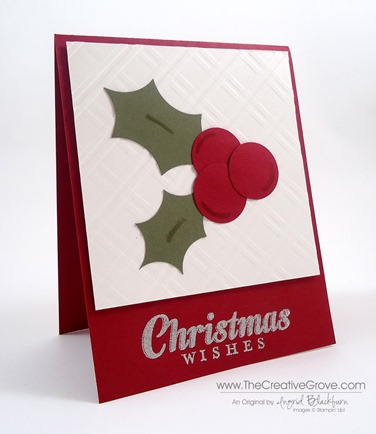
  • Cool Tools – Sylish Stripes Embossing Folder, Silver Embossing Powder, Versamark Ink and Heat Tool, Blender Pens with Always Artichoke and Cherry Cobbler Ink.

Close Up Photos:

Finished Project

Holly Leaves with a Circle Punch 003

Holly Leaves and Berries

Holly Leaves with a Circle Punch 005

Close Up

Holly Leaves with a Circle Punch 006

Holly Leaves with a Circle Punch 010

I hope you enjoyed that project!  It’s quick, easy and a great one to mass produce. 

If you want to learn more techniques to make great cards, try out one of our online classes here.  Pictured above is a sneak peek of one of the newest projects in the Thanks Class of the Month Series.  See you in the classroom!

Signature Snowflake 001 

Shop in the Creative Online Store 24/7 – click here!

Tool Tip–Embossing Buddy

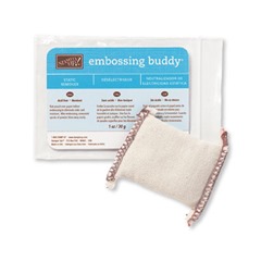
Embossing Buddy

Do you know all the benefits of an Embossing Buddy?  This little pouch can really be a life saver.  I make sure to use it each time I emboss any image that is detailed – it’s an absolute must have tool in my stamping box on my work table.  But there are a few ways to use it that you may not be aware of!

Tip – The Embossing Buddy is an antistatic fabric pouch that is filled with a powder to help get rid of any static on your project.  Take the one ounce pouch and rub it directly over the surface to be embossed.  It works on all types of paper and various other surfaces too.  This tool will ensure that no stray embossing powder flecks are left behind.  You will have a clean and crisp image when done.

Tip – Did you know that you should probably rub it on your fingers first?  Your fingers are the biggest culprit in having stray embossing powder left behind.  Why?  Well, we have all sorts of oils on our skin.  And if you live in a hot climate, just think of being sweaty, etc…  That’s a great way to leave a little behind on your cardstock that is super absorbent.  And that is exactly what your embossing powder will stick to, oils and moisture – and not where you want it to.  So rub the buddy on your fingers first!Embossing BuddyTip – Here’s a tip you probably didn’t know – helping your stamps absorb ink.  If you have a bold stamp image – sometimes it can be a little frustrating to get a clean stamped image due to the sheer volume of the image.  Try rubbing your embossing buddy on your clean stamp before inking it up!  The powder will help to absorb the ink and give you a properly inked image.

So if you don’t have this little gem of a tool – be sure to put an Embossing Buddy on your wish list for your next order.  I promise you, you will not be disappointed!

12 Weeks of Christmas banner_small

Don’t miss out on this free project resource!  If you don’t know what the 12 weeks of Christmas is, be sure to check it out here

Signature Snowflake 001

Shop 24/7 in the Creative Store – Click Here