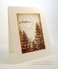
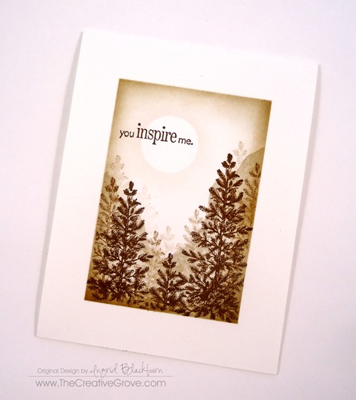
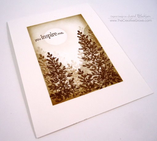
Moonlit Meadow

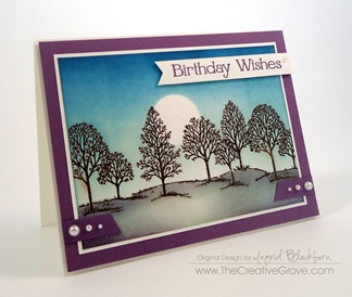
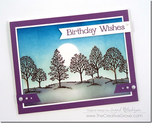
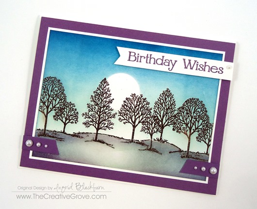
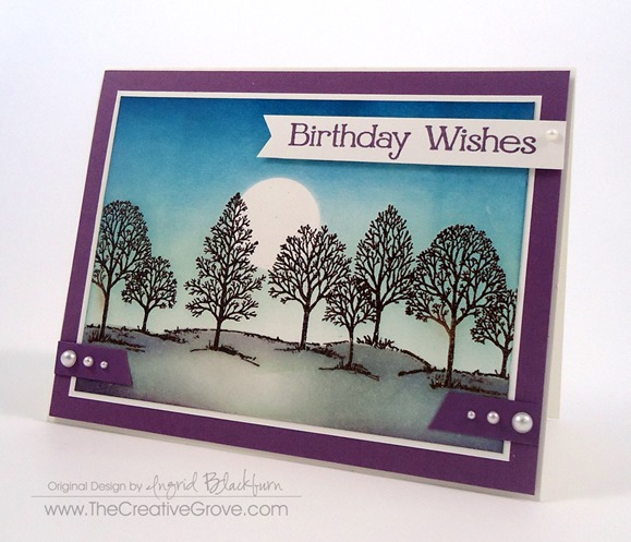
This past week you’ve seen several projects made with the classic stamp set Lovely as a Tree by Stampin’ Up!.  And if you are on the Creative Tips List, you even got an exclusive project too!  I thought I’d continue for one more just to round out the week.  This project came about because I wanted to use the color Perfect Plum in a creative scene.  So, the obvious choice was a moonlit evening.  Enjoy the tips and I hope you enjoyed this week of Lovely as a Tree projects here at The Creative Grove!

Miss the 1+2=3 series featuring Lovely as a Tree this week?  See Part 1 here!

DSC01424

Creative Tips –

  • Start off by embossing your scene in SU Early Espresso powder.
  • Use a mask for the ground made out of copy paper, and a moon post it punched with a 1” circle punch.

DSC01437

  • Brayer or sponge your sky using various shades of blue.  I used Adirondack Lights Cloud Blue, Stampin’ Up! Soft Sky, Marvy Salvia Blue, SU Island Indigo and SU Not Quite Navy.
  • Keep your horizon light, not white, but definitely lighter in color.  It helps to give that moonlit glow.

DSC01438

  • Brayer and/or Sponge your ground.  You’ll want to come from the sides to keep the area where the moon is reflecting light.  I used Adirondack Cloud Blue, SU Smoky Slate and SU Perfect plum.

I had some issues, and went a little too dark on the bottom left corner.  I tried to remove some which didn’t work and ended up pulling up some of my paper.  It’s just been a week of mishaps on all my projects!  So, I did something I don’t usually do, I added a few scraps to over it up.  To get the perfect angle, you’ll want to stack your pieces and cut them together.  The pearls finished the strips, and the banner greeting was the perfect final touch.  You know, it didn’t turn out that bad!

DSC01428

I hope you’ve enjoyed unofficial Lovely as a Tree week!  Have fun stamping this weekend. Smile

Signature-Blog

[optin_box style=”14″ alignment=”center” action=”http://www.aweber.com/scripts/addlead.pl” disable_name=”Y” method=”post” email_field=”email” email_default=”Enter your email address” email_order=”1″ integration_type=”custom” double_optin=”Y” name_default=”Enter your first name”][optin_box_hidden][/optin_box_hidden][optin_box_code]

[/optin_box_code][optin_box_field name=”headline”]If you enjoyed this tutorial…[/optin_box_field][optin_box_field name=”paragraph”]PHA+PHNwYW4gc3R5bGU9ImNvbG9yOiAjNjQ2MzVlOyI+TGV04oCZcyBzdGF5IGluIHRvdWNoISBNeSBvY2Nhc2lvbmFswqA8L3NwYW4+PHNwYW4gc3R5bGU9ImNvbG9yOiAjNjY2Njk5OyI+PHN0cm9uZz48ZW0+ZXhjbHVzaXZlPC9lbT48L3N0cm9uZz7CoDwvc3Bhbj48c3BhbiBzdHlsZT0iY29sb3I6ICM2NDYzNWU7Ij5DcmVhdGl2ZSBUaXBzIGUtbGV0dGVyIHdpbGwgdGVhY2ggeW91IHRvIG1ha2UgcHJvamVjdHMgdGhhdCB5b3UgbG92ZeKApjwvc3Bhbj48L3A+Cg==[/optin_box_field][optin_box_field name=”privacy”][/optin_box_field][optin_box_field name=”top_color”]undefined[/optin_box_field][optin_box_button type=”0″ button_below=”Y”]Send me exclusive tips![/optin_box_button] [/optin_box]
1+2=3 Stamp Series #001: part 3

So what did you think so far?  We’ve had some great feedback from this series!  I hope you’ve enjoyed the simplicity of it.  And if you were on the Creative Tips list, then you saw the bonus 4th project too!  Don’t fret – get on the list by tomorrow (6/21/14) and I’ll send it out to you.  For the bonus project I broke from the rules a bit set forth from the challenge, but figured since it was a bonus it was okay!  Smile

So, just to review, here are the rules for this challenge:

1 Stamp – For this series I thought I’d choose a stamp set that has been available for over 20 years and is still on the market…the ever popular Stampin’ Up! set Lovely as A Tree.  This works with any large tree stamp.  Since there aren’t any greeting stamps in this set, I used one from the retired set Perfect Words.

+ 2 Colors – Two colors were used in all three projects: Sahara Sand and Soft Suede by Stampin Up.  For the cardstock in later projects, I only used Soft Suede along with Whisper White. =

= 3 Projects – while a few are a bit similar, they are vastly different.  Enjoy!

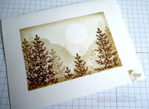
If you remember from yesterday’s post, I messed up my first and second try at this project.  Rather than let that get me down, I turned them into two totally different looks!  And a series was born.  Okay, corny enough for you – Michael is rolling his eyes…lol!  Here is my messed up version of this project – it was intended as a one layer card, but instead I turned it into the beauty you see further below.  Here is my original card – miss-masked (note the lower right corner).

DSC01406

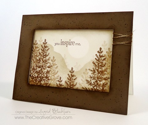
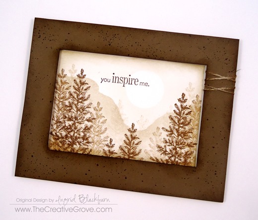
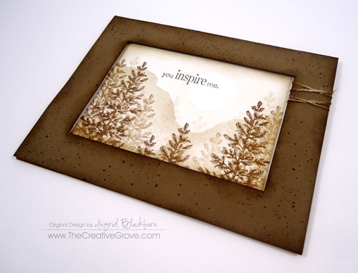
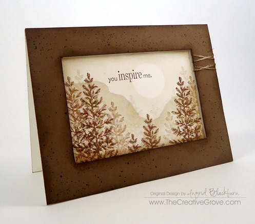
And here is the final result:

DSC01421

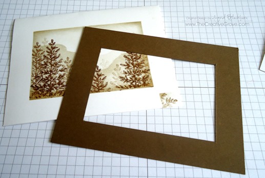
To make this card – I used the exact one layer card as a base, and added a popped up frame.  Here are a few tricks to make this seem flawless and intended.

  • The cut out frame is just slightly smaller than the original masked off window.  The original window was 3/4”, my cut out frame measures 1/16” larger – that’s the width of the frame (13/16ths) , producing a smaller visible area.  This will help to hide the white area that was masked off originally.

DSC01408

  • Add some interest to the frame.  Here you see random spritzed dots in Soft Suede using a color spritzer and a marker.  To keep with the outdoor theme, sponge both the interior and exterior of your frame.
  • Add some criss-crossed thread to one side.

DSC01442

  • Sponge the complete exterior of your one layer card first before adding the frame.  Use the same color of your frame.  This way, should your frame be slightly off, if the white shows, it blends flawlessly with your frame.  Can you see the entire top of my card?  It shows as my frame was slightly smaller.

DSC01443DSC01444

  • Finally, pop the entire frame up using foam tape or dimensionals.  Keep your tape and dimensionals closer to the inside of the frame giving it more of a shadowbox look.

To learn how I sponged, masked and created this card, check out the first and second cards in this series here:

Project One                               Project Two

DSC01420

I hope you enjoyed this series!  Thanks for joining me and be sure to stop by tomorrow for another project with this stamp set… why, just because!!  It’s completely different and used a totally different color combination, but turned out fabulous!  Just thought I’d keep the theme going this week.

Have a creative day and see you around the grove!

Signature-Blog

[optin_box style=”14″ alignment=”center” action=”http://www.aweber.com/scripts/addlead.pl” disable_name=”Y” method=”post” email_field=”email” email_default=”Enter your email address” email_order=”1″ integration_type=”custom” double_optin=”Y” name_default=”Enter your first name”][optin_box_hidden][/optin_box_hidden][optin_box_code]

[/optin_box_code][optin_box_field name=”headline”]If you enjoyed this tutorial…[/optin_box_field][optin_box_field name=”paragraph”]PHA+PHNwYW4gc3R5bGU9ImNvbG9yOiAjNjQ2MzVlOyI+TGV04oCZcyBzdGF5IGluIHRvdWNoISBNeSBvY2Nhc2lvbmFswqA8L3NwYW4+PHNwYW4gc3R5bGU9ImNvbG9yOiAjNjY2Njk5OyI+PHN0cm9uZz48ZW0+ZXhjbHVzaXZlPC9lbT48L3N0cm9uZz7CoDwvc3Bhbj48c3BhbiBzdHlsZT0iY29sb3I6ICM2NDYzNWU7Ij5DcmVhdGl2ZSBUaXBzIGUtbGV0dGVyIHdpbGwgdGVhY2ggeW91IHRvIG1ha2UgcHJvamVjdHMgdGhhdCB5b3UgbG92ZeKApjwvc3Bhbj48L3A+Cg==[/optin_box_field][optin_box_field name=”privacy”][/optin_box_field][optin_box_field name=”top_color”]undefined[/optin_box_field][optin_box_button type=”0″ button_below=”Y”]Send me exclusive tips![/optin_box_button] [/optin_box]
 

1+2=3 Stamp Series #001: Part 2

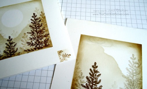
Yesterday we talked about masking and creating a scene.  But what happens when your masks or worse, sponging fails you?  Today’s and tomorrow’s projects, are the result of un-recoverable mistakes.  I’ll confess.  The project to the left below was supposed to be project 1 and the one on the right was the second.  Of course it was, I had to keep going because I wanted a one layer card as one of the projects and I kept messing up!  Can you relate?

Today is all about turning failure into a winning strategy!  I’m sure you can relate – we’ve all had this happen at some point, no?  If you missed yesterday’s project Click Here to read all about it.

Of course, it seems like when there is a mistake, it usually happens at the very end.  It’s Murphy’s Law – who is this Murphy person anyway?  If you know – tell me in the comments – I’ve always wanted to know…lol!

Here you see what was supposed to be two one layer cards.  I went the easy way out on one by using a few post it notes moving them around rather than putting my full mask back down which required more steps.  Well, the joke was on me as now I had to think outside the box to try and save my hard work!

DSC01407

And the other – on my very last pass in the upper left corner, I grabbed my sponging tool too hard and my nails left three marks…argh!  I couldn’t believe it!  There was no saving it.  So my only option was to cut.  So this project ended up as #2.  Here are the series details:

1 – Stamp – For this series I thought I’d choose a stamp set that has been available for over 20 years and is still on the market…the ever popular Stampin’ Up! set Lovely as A Tree.  This works with any large tree stamp.  Since there aren’t any greeting stamps in this set, I used one from the retired set Perfect Words.

2 – Colors – Two colors were used in all three projects: Sahara Sand and Soft Suede by Stampin Up.  For the cardstock in later projects, I only used Soft Suede along with Whisper White.

3 – Projects – while a few are a bit similar, they are vastly different.  Enjoy!

DSC01418

Series #001 – Project 2: In the Shadow of the Mountain

  • Once I cut the top off, I re-sponged it in both Sahara Sand and Soft Suede.
  • I created this one just like yesterday’s project.  I even used the same mountain mask – I just shifted it to give it a different look by creating a much larger mountain.

DSC01447

  • In this project, you see more of the trees in the distance and only two up close.
  • The actual scene measures 2 5/8” x 3 1/2” with the White Matte measuring 3” x 4 1/4”.  This gives a small space at the bottom where you can criss-cross some linen thread.  By popping up your scene you add a little emphasis to your creation.

DSC01448

    • Rather than leaving the white space so plain in the background, choose to add a background stamp.  Here you see Canvas (retired) by Stampin’ Up!.  But several companies have stamps just like this one.  It’s a great go to design!
    • By only using the background stamp on 2/3 of the card it doesn’t overpower the card.  Leaving some pure white space on the bottom helps to keep the focal point on the scene.  Use a small strip that your probably have in your scrap bin to cover up the end of the stamping leading into the white space.  Or use another mask when you stamp it that’s torn for an easy blend.


  • DSC01419

Although the scene is similar to the first, the card is a completely different look.  I hope you liked my turn lemons into lemonade card – tomorrow’s is even better!  See you then.

Signature-Blog

[optin_box style=”14″ alignment=”center” action=”http://www.aweber.com/scripts/addlead.pl” disable_name=”Y” method=”post” email_field=”email” email_default=”Enter your email address” email_order=”1″ integration_type=”custom” double_optin=”Y” name_default=”Enter your first name”][optin_box_hidden][/optin_box_hidden][optin_box_code]

[/optin_box_code][optin_box_field name=”headline”]If you enjoyed this tutorial…[/optin_box_field][optin_box_field name=”paragraph”]PHA+PHNwYW4gc3R5bGU9ImNvbG9yOiAjNjQ2MzVlOyI+TGV04oCZcyBzdGF5IGluIHRvdWNoISBNeSBvY2Nhc2lvbmFswqA8L3NwYW4+PHNwYW4gc3R5bGU9ImNvbG9yOiAjNjY2Njk5OyI+PHN0cm9uZz48ZW0+ZXhjbHVzaXZlPC9lbT48L3N0cm9uZz7CoDwvc3Bhbj48c3BhbiBzdHlsZT0iY29sb3I6ICM2NDYzNWU7Ij5DcmVhdGl2ZSBUaXBzIGUtbGV0dGVyIHdpbGwgdGVhY2ggeW91IHRvIG1ha2UgcHJvamVjdHMgdGhhdCB5b3UgbG92ZeKApjwvc3Bhbj48L3A+Cg==[/optin_box_field][optin_box_field name=”privacy”][/optin_box_field][optin_box_field name=”top_color”]undefined[/optin_box_field][optin_box_button type=”0″ button_below=”Y”]Send me exclusive tips![/optin_box_button] [/optin_box]
 

1+2=3 Stamp Series #001

Do you remember what it’s like to just start a hobby out?  You didn’t have a lot of stamps or colors did you?  I thought it might be fun to think like a first day stamper.  Back when I had a REALLY limited number of supplies – two stamp sets, a few ink pads, one package of matching colors and only my creativity to guide me.  Which let’s be honest – my creativity back then was bare minimal!

So I thought it would be fun to an ongoing series called 1+2=3 or, One stamp set + two ink pads = three looks. 

Now the official rules are going to be the following:

  • Primarily use the images from one stamp set.  Use a greeting from another set if not supplied in the set.
  • You can use a background stamp in your cards – but only one amongst the three projects. (I gave myself this leeway, since that’s what I started with!)
  • You may only use two colors of ink plus a neutral or versamark.
  • Your card stock colors must include either of your the two colors plus white, vanilla or black.
  • You can use basic accessories such as paper piercing, sponges, embossing, pearls, rhinestones, dimensionals and ribbon to accessorize your cards.

Sounds pretty easy, right?  We’ll see about that!  Here goes – I kept project one pretty simple – a one layer card.  Today I’m going to post the first project and reveal the next two over the next few days.  And of course if you’re subscribed to the Creative Tips list – you’ll be sent an extra project tomorrow (June 19th) – so be sure to sign up today!  Hope you enjoy them!

1 – Stamp – For this series I thought I’d choose a stamp set that has been available for over 20 years and is still on the market…the ever popular Stampin’ Up! set Lovely as A Tree.  This works with any large tree stamp.  Since there aren’t any greeting stamps in this set, I used one from the retired set Perfect Words.

2 – Colors – Two colors were used in all three projects: Sahara Sand and Soft Suede by Stampin Up.  For the cardstock in later projects, I only used Soft Suede along with Whisper White.

3 – Projects – while a few are a bit similar, they are vastly different.  Enjoy!

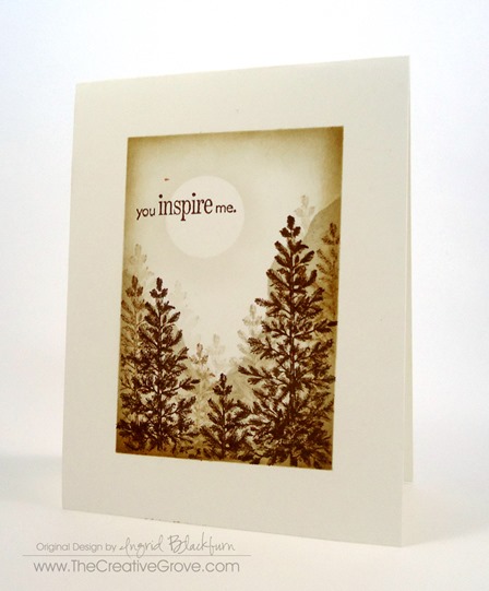
Series #001 – Project 1: One Sheet Mystical Forest:

DSC01414

  • Fold a piece of 4 1/2” x 11” piece of Whisper White card stock in half.
  • Mask off 3/4” around the border.  To see a great step by step video tutorial on how to do this, join the Creative Tips List for free – your first video will show this exact technique.  To see it – sign up to the right!

DSC01440

  • Sponge Sahara Sand around the perimeter and then a smaller soft suede.
  • Mask off mountains to the left and right, sponging in Sahara Sand.
  • Mask off a Moon.

DSC01445


  • Stamp several images of the main Pine Tree image in multi-generational Sahara Sand.  Stamp three images of alternating heights in Soft Suede in the front.
  • Add your greeting and remove your mask!

It’s a rather simple project – has a few steps, and I won’t lie – if you don’t mask it off properly, you can really mess it up…check out how you can turn two glaring mistakes that I made and learn how to avoid them!  Check out the second project here!

Signature-Blog

[optin_box style=”14″ alignment=”center” action=”http://www.aweber.com/scripts/addlead.pl” disable_name=”Y” method=”post” email_field=”email” email_default=”Enter your email address” email_order=”1″ integration_type=”custom” double_optin=”Y” name_default=”Enter your first name”][optin_box_hidden][/optin_box_hidden][optin_box_code]

[/optin_box_code][optin_box_field name=”headline”]If you enjoyed this tutorial…[/optin_box_field][optin_box_field name=”paragraph”]PHA+PHNwYW4gc3R5bGU9ImNvbG9yOiAjNjQ2MzVlOyI+TGV04oCZcyBzdGF5IGluIHRvdWNoISBNeSBvY2Nhc2lvbmFswqA8L3NwYW4+PHNwYW4gc3R5bGU9ImNvbG9yOiAjNjY2Njk5OyI+PHN0cm9uZz48ZW0+ZXhjbHVzaXZlPC9lbT48L3N0cm9uZz7CoDwvc3Bhbj48c3BhbiBzdHlsZT0iY29sb3I6ICM2NDYzNWU7Ij5DcmVhdGl2ZSBUaXBzIGUtbGV0dGVyIHdpbGwgdGVhY2ggeW91IHRvIG1ha2UgcHJvamVjdHMgdGhhdCB5b3UgbG92ZeKApjwvc3Bhbj48L3A+Cg==[/optin_box_field][optin_box_field name=”privacy”][/optin_box_field][optin_box_field name=”top_color”]undefined[/optin_box_field][optin_box_button type=”0″ button_below=”Y”]Send me exclusive tips![/optin_box_button] [/optin_box]


DSC01417

Watercolor Quaker Marriage Certificate

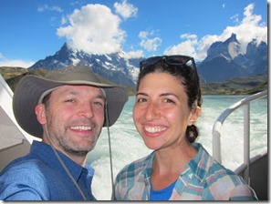
I’m in northern Vermont this week hanging out at the Smuggler’s Notch Resort.  We are in a two bedroom condo nestled at the top of the hill overlooking three mountains.  Today the wind is howling and the rain is coming down in sheets.  It’s a toasty 41 degrees outside, but I’m inside looking out at all that Vermont has to offer while sitting fireside working on Rachel’s Marriage Certificate. 

We’re in full wedding mode this week.  And this is what I’ve been practicing for.  If you’ve been following along, Rachel asked me earlier this year if I would be able to make a marriage certificate for her wedding.  I had to admit I had no idea what a Quaker Marriage Certificate was, but this journey has transformed me personally.

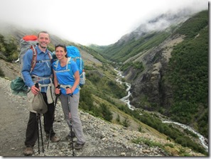
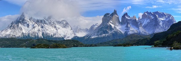
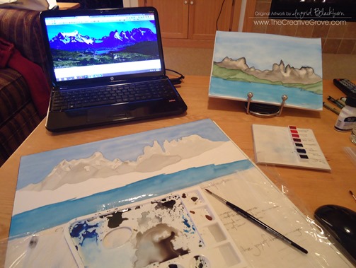
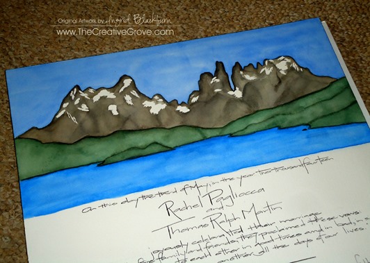
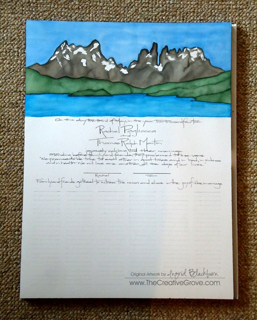
She originally wanted flowers, but if you know Rachel – that’s not her, and certainly not Tom.  Since they traveled around the world last year, I thought I’d create something that had meaning to both of them as a keepsake for their wedding.  Something that was personal – I interviewed Rachel, and poured over their travel blog before deciding to paint the world famous Torres del Paine in Patagonia, Chile.  This mountain range is a symbol of Chile, and their 5 day trek was a must do for them and certainly an experience they treasure.

IMG_0019IMG_0333

I was apprehensive at first, and after a few weeks of research, I decided I’d take on the challenge head on.  You see, these marriage certificates – well the hand painted ones, go for $500.  I thought that was pretty steep, and wanting to save Rachel money, I decided to learn how to watercolor.  That was not on my to do list.  In fact, I’ve been wanting to learn how to paint with oils and acrylics.  But the kids did give me a watercolor set and some brushes for Christmas, so why not?

Several online classes, and even a live one revealed one fact – I love to watercolor – who knew?  And to paint a landscape like this, I won’t say it was easy – hundreds of hours went into prepping for this week.  Michael kept asking me when I would paint it, and if I was over my head.  Well, I was not going to admit that I was, so I just kept saying don’t worry – I have a plan!  Well, I did – but I have to admit (don’t tell him), I was a bit worried.  After all, this is something they’ll have for a lifetime to commemorate the start of their married lives together.  More than 130 are set to sign it on Saturday, so I was really putting myself out there.  No easy task – especially for a perfectionist like me!

I’ve been very hush hush about it to the family, and I can only hope that Rachel and Tom love it.  It truly has been a labor of love on my part.  Now if only I had had enough time to learn and master calligraphy – then that would have been perfect!  Thankfully I have decent handwriting.  You’ll have to leave me a comment and tell me what you think!

I’ve taken to watercolor so much so that I’ve woven it into my j-o-b here at The Creative Grove.  After all, it IS the hottest trend in paper crafting today.  I’ve learned so much that I’m actually teaching a class on how to use everything I’ve learned and making cards with it!  For more info on that click here.  Class starts May 17th and is on sale during the pre-release period.

Torres del Paine – Watercolor Quaker Marriage Certificate

I have to admit, my original plan was to have two complimentary scenes at the bottom corners to round out this piece, but since we need more than 130 people to sign it, that was just not possible without reducing the artwork which was tough since it was such a wide image. 

25899298

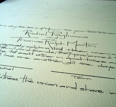
As it is, I painted it so that 3/4” can be hidden for framing if desired.  The spacing was a challenge with so many signatures.  Michael and I didn’t want the writing to be too small so that you couldn’t read it.  I played around with tracing and copying pretty scripts, but I just couldn’t write with confidence and ultimately ended up going with my own handwriting.  It was Michael who encouraged me to do that.  Since I have a way to accentuate it with flair, I think it actually came out okay.  I’ve never been so nervous to write something!  Overall, I’m pleased – it’s not perfect, but then again I’m my worst critic.  As long as Rachel and Tom love it, I’m happy.  Here are the details:

DSC00338DSC00339

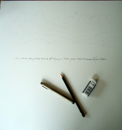
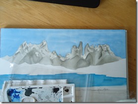
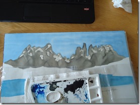
To make sure I had it down, I first did a watercolor scene on a smaller scale.  I had purchased some masking fluid and decided to use that on the actual certificate instead of pure watercolor as I wanted the snow to look like snow and not dirt.  It took me 1 1/2 hours to sketch out the final scene to just get it right.  Then came the writing.  I first did it in pencil and went over it with a micro pen.  Then I needed to add the 132 lines.  We actually have 138 people attending – but I know some will sign as husband and wife or miss it all together, so I didn’t worry about that as I couldn’t fit any more!  DSC00353

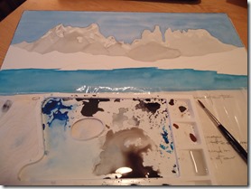
Next, I began with the sky and water.  Go figure I messed it up from the start, but since I watercolor in layers (just the technique I’m most comfortable with), I knew I could work through that.  I actually had several moments where I questioned if I’d have to make a second one!  But I’ve learned from several watercolor projects that the end result always turns out much better than you expected once all the layers are on there.  Patience….

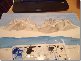
The mountains took the longest time as there are seven layers that were built up to the final scene. 

DSC00350DSC00355DSC00358DSC00359

In overall work time, the watercolor scene took me 13 hours start to finish.  The certificate itself 17 hours.  Now I know why they charge $500!  It’s a time consuming project!  Of course my practice scene took a day and then there was prep time too. 

DSC00366Handpainted Quaker Wedding Certificate

The end result was certainly worth every minute, and dollar!  Best of all, they’ll have it for a lifetime and I have a new skill. Smile

Signature Snowflake 001

Watercolor Narrow

Join me for a fun week of water coloring!  You will learn several techniques that will turn your paper crafting projects into WOW projects!  Class starts May 17th!  Click Here for more information and to save during the pre-registration!

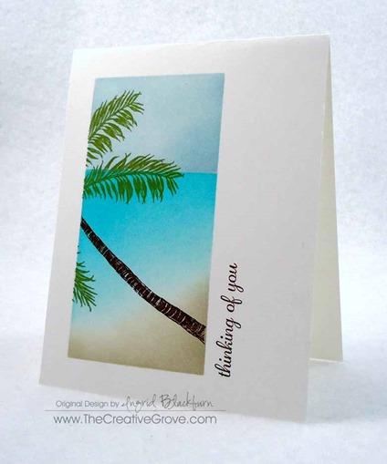
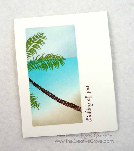
One Layer Tropical Scene

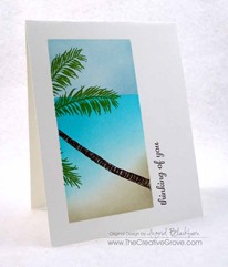
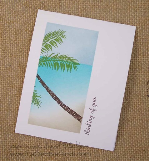
Stampscapes Palm Tree One Layer Creative Scenery Card (4)

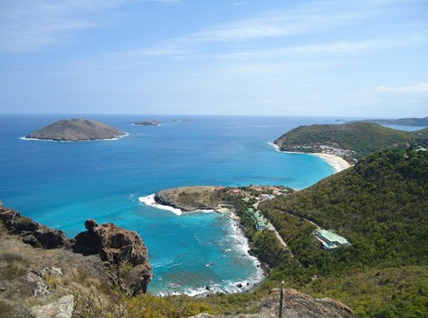
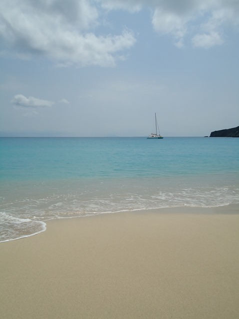
Do you ever just want to escape through your paper crafts?  Michael is in Saint Lucia today.  And yesterday he was in St. Barts – what a life!  Of course, it’s business – researching the Southern Caribbean for the family travel biz.  Well, he called me from the beach in St. Barts (I know – the nerve!) – so I just HAD to put myself there somehow – it’s SO gorgeous there.  This card was a close as I could get.  Here are some photos from when we were there last March!

DSC02207

DSC02283

For the full tutorial, be sure to watch my video One Layer Creative Scenery #2 posted on my YouTube channel.  If you haven’t already – subscribe! Smile  And be sure to give me thumbs up below the video too if you like it.

Stampscapes Palm Tree One Layer Creative Scenery Card (3)

To make this card, you will want to mask off the space you are looking to create.  I used a 1/2” border to the top, left and bottom and made my scene 2 1/4” wide leaving a white border on the right of 1 3/4”.

I used the following supplies:

  • Ranger Adirondack Lights Cloudy Blue and Aqua
  • Marvy Matchables Caribbean Blue, Turquoise, and Jungle Green
  • Stampin’ Up! Chocolate Chip and Sahara Sand
  • You will need a greeting, Pictured is Expressly You (hostess) by Stampin’ Up!
  • Stampscapes Stamps – Palm Trio (one trunk) and both Palm Leaf Left and Right
  • Sponges
  • Post It Notes
  • White cardstock – 4 1/4” x 11”
  • Stampscapes Palm Tree One Layer Creative Scenery Card (5)

This card does make me feel like I’m looking out a window into the gorgeous waters of St Barts and the Caribbean.  I hope I was able to transport you too!

Be sure to check out the Creative Scenery Classes in the classroom – over 2 hours of instruction in each one.  And if you’re not on The Creative Grove Newsletter List – be sure to sign up today – exclusive videos and tips are mailed out only to subscribers.  Don’t miss out!

Stampscapes Palm Tree One Layer Creative Scenery Card (8)

Signature Snowflake 001

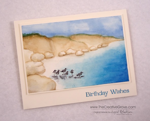
Wetlands Seascape Watercolor Tutorial

wetlands watercolor

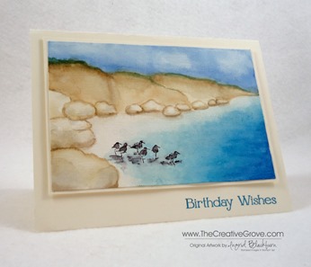
I was feeling artistic last night and wanted to bring my watercolor experience this past few weeks full circle by combining my first ever landscape with one of my favorite Stampin’ Up! stamp sets – Wetlands.   Here are all the details to this journey plus several tips on supplies at the end that I like to use for this medium.  I know it’s long, but it’s quite in depth! Enjoy this tutorial.  For the complimentary article on tools and supplies click here.

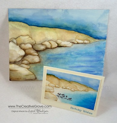
As you may have read a few weeks ago, I took a local art class in watercolor.  If you didn’t see my first ever landscape, it’s pictured below, but I’ve detailed the process here – you have to see what it started out as to appreciate the end result.  Check it out here.  I still can’t believe I turned my beginning mess into something beautiful that I’m actually quite proud of.  (that’s hard to do, I’m quite hard on myself with my own artwork)  Since my original had more mistakes than imaginable, I thought it might be fun to try it again, just in a smaller version that I could use stamps on as well to combine two artistic passions.

watercolor wetlands tutorial

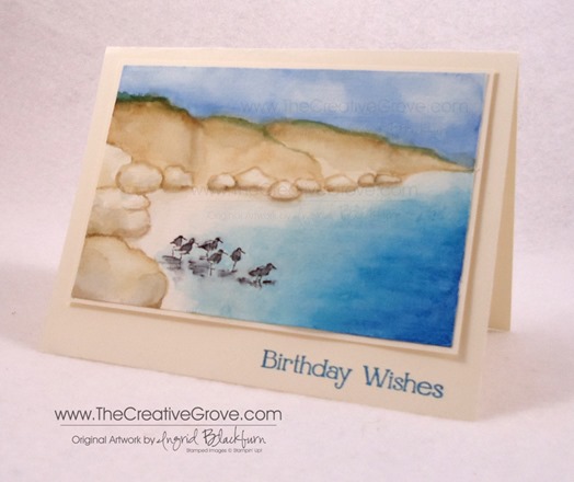
I was undecided on size, so I took out the stamp I wanted to use – the sandpipers from Wetlands.  It’s a rather long stamp and to get the perspective right, I realized my card was going to have to be much larger than the traditional A2 size (5 1/2 x 4 1/4).  I held the stamp up to my grid paper and settled on a  4 x 6” size for my watercolor image with a final card of  5 1/4 x 6 3/4”.  Now that I have the Envelope Punch Board, I never worry about fitting my card to an envelope – I can just make whatever size I need!

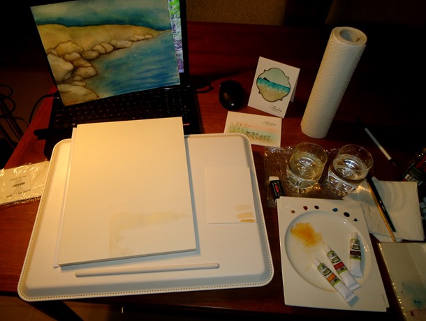
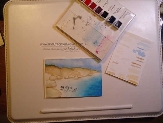
I used my painting and other similar cards as inspiration.  I used my 100 pound rough watercolor block which is 9.4 x 12.6 inches.  I wanted to work with something that was secured and wouldn’t warp.  Of course, I wasn’t paying attention, and used the side which wasn’t glued – so that kind of worked against me in the end at the bottom – oh well!  I won’t make that mistake a second time…lol!  Here’s my workspace:

DSC09982

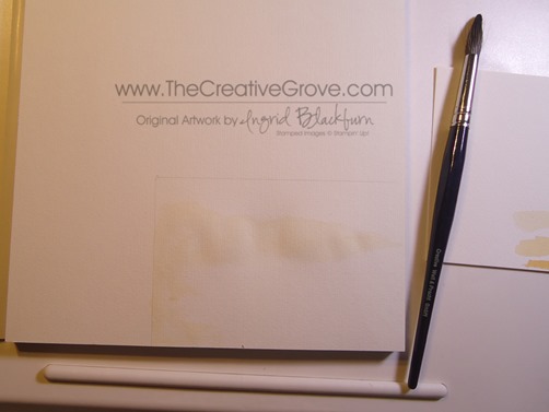
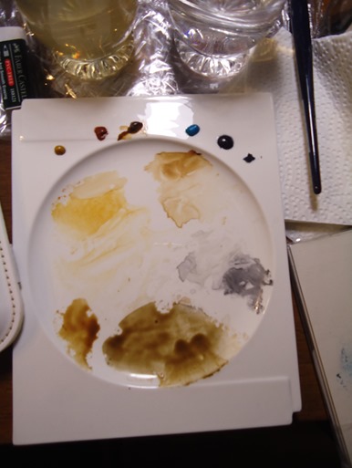
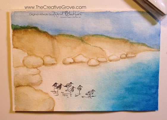
Creating this seascape comes over several stages.  To begin, you don’t need to worry too much about being too precise, just throw down some yellow ochre wash (really light – really watered down) in the general area and let the painting form from there.  I used a size 14 brush.

DSC09985

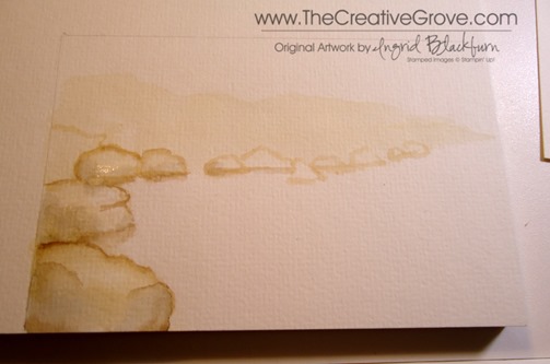
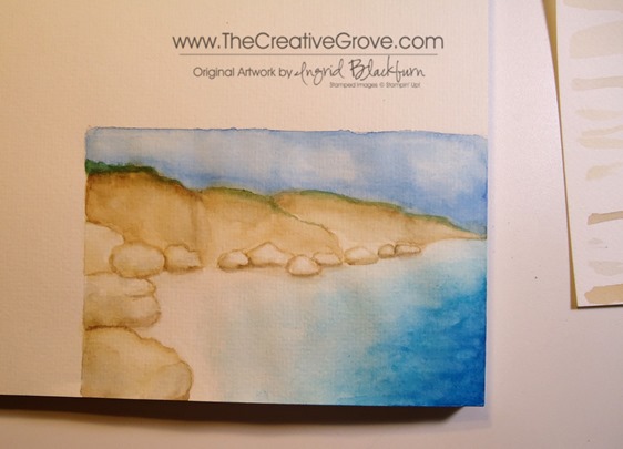
Using Yellow Ochre in a variety of consistencies from water, milk and cream – create your rocks from the edge of your negative space.  To give them definition, decide where the light is coming from and start to shadow the rocks with a rather light wash of paynes grey or yellow ochre or a mixture of both with some burnt sienna in them.  Keep it on the light side and build up your color.

DSC09986

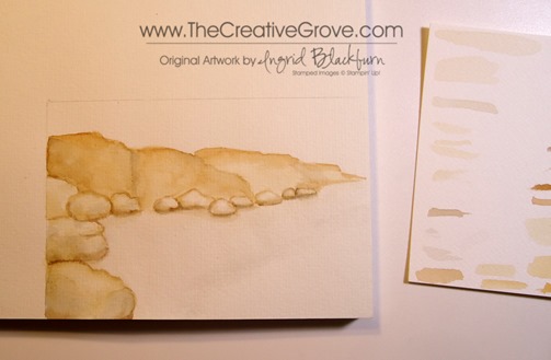
Add some more definition to the bottom of your rocks with a variety of consistencies of Burnt Umber and Paynes Grey as shadows under and between.  Use that also to define your cliffs and crevices.  Use your imagination or photos as inspiration for tone.

I went rather light in my card because it was small, you see much more depth in the full watercolor painting of my original.  I used several images of water colored rocks that I found online as inspiration as I found rocks quite difficult to attempt.  But after a few, I got the hang of them.

DSC09991

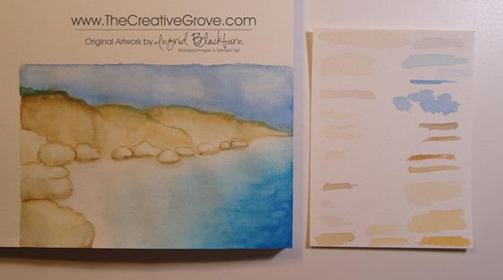
Use a variety of washes and mixtures in a milk consistency of Yellow Ochre, Burnt Sienna, Burnt Umber and Payne’s Grey as you can see here.  TIP – Paint a quick swatch on a scrap piece of watercolor paper so that you know if you need to go heavier or more than likely – lighter with water.  This is a great habit to get into rather than practicing on your painting.

DSC09989

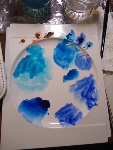
Next I added the blues to create the sea and sky.  I used Cerulean, Ultramarine, Prussian and Paris Blues in addition to Paynes Grey to darken any up if needed.

DSC09993

I started with the water.  Begin with a very light wash of Paynes Grey – super light for the boundry of where you want your water to go.  Then layer a really light wash of Cerulean Blue over that.  Don’t worry if you get too much color on the beach part.  I went back and forth getting it just right.  While that area is wet, use a clean watercolor brush to push the color from the beach back into the sea.

Add a light ultramarine/cerulean wash to the darker areas of the sea.  Once you have it the depth you want, let it dry.  Once dry, add some highlights in pure Ultramarine, but keep it minimal – just a highlight to show variety in your water depth and character.  I also added three small strands of a light watered down Prussian Blue after.

DSC09994DSC09995

Go over it with a clean wet watercolor brush to soften up and blend in the colors.  Play around with it, I guarantee you – you will mess it up, but while it’s wet, you can adjust it.  It’s quite forgiving, and that’s the beauty of water coloring!  Take note of the sea above and in this photo.  You can see how I blended it out a bit using a clean wet brush.

DSC09997

For the sky, start with a rather light wash of Paris Blue.  Choose a blue that is a bit more sky color rather than the bright sea colors.  They relate, but you can see the difference in hue between the two.  As it was still wet, I brought the intensity of the color closer to the cliff line.  I was a bit over-zealous and crossed over into my brown, but fixed that with a little Olive/Burnt Sienna mixture.  It added some color break and interest too – a happy accident.

For the clouds, while the sky was wet, I took a clean wet brush and removed some of the blue by gently moving my brush around in spots.  It creates a nice natural look of billowy clouds.

DSC00003

If you make a mistake, don’t fret – go over that area first with a clean wet brush and work the color back to where you want it with a light scrubbing motion.  If that doesn’t work, just adapt!  TIP – Work in light color washes first, that way you can always bring the intensity up or adjust as needed.  It’s harder to take away – not impossible, but harder.

To stamp, I removed my piece by cutting it off the block (for more on my watercolor block, read below).  I needed to use a stamp-a-majig, so I wanted to have a flat surface.  The birds were a bit long, so I left off the last two.  I inked the image up and wiped away the reflections and last two birds with a wet paper towel.  Position your transparent piece to exactly where you want it.  If you don’t have a stamp-a-majig, use a piece of transparency, or plastic to get a feel for where the birds need to be.  There’s nothing worse than spending all that time on a masterpiece only to mis-place your stamped image!

DSC09996

Once your scene is dry – I can’t stress that enough – do not attempt this with a wet scene.  A hairdryer will dull your colors, so air drying is the best option.  Clean up, work on your sky, something so that your sea dries.  Lightly go over your birds with a small watercolor brush (I used a size 1) in a very light Paynes Grey wash.  Be careful not to add too much water, you don’t want your image to run.  You can use Staz-On Permanent…I used Memento Tuxedo Black Dye Ink.  I have a good result with that black ink pad.  Be sure to let it dry after stamping.  I added a bit too much grey to the shadows in the water, try using a light cerulean wash instead.

DSC00006DSC00009

With your small watercolor brush, add a very light Cerulean wash around your stamped images to fill in the water where needed.  Be careful not to touch your birds if you’ve used Dye Ink!  This really finished my oncoming water on the shoreline and added just the right amount of color.  Remember with layers you can bring your scene to just the right color level.  You also create interest with under layers.  Just be careful not to wash away your underwork when doing this, a light touch is key.

The birds give the scene a human interest.  It’s important to put something there – a house, boat, people, something.  It helps to balance the scene and make the reader connect with the painting.  TIP – Notice that I placed the birds in the forefront of the painting.  The stamp that I used was large in comparison to the scene, so it’s important to have the perspective just right.  That’s why the rocks are larger in the foreground and get smaller as the scene goes back.

DSC00004

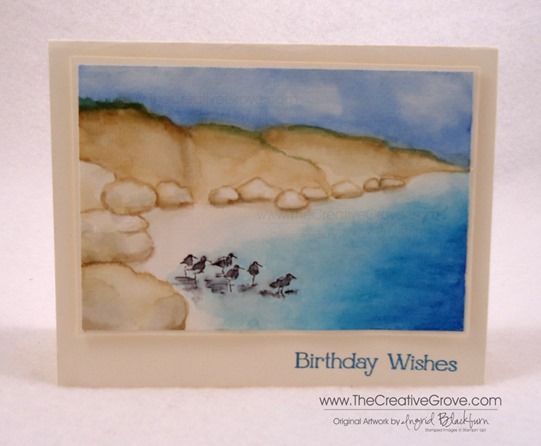
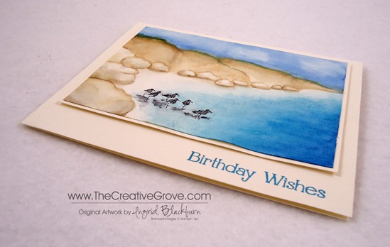
To finish your project, matte your cut out painting onto Very Vanilla leaving a 1/8” border.  Pop that up on several stamping dimensionals (I used 12!) to really keep it elevated.  Matte onto another piece of Very Vanilla cardstock for the card base.  I used a greeting from the Four You stamp set by Stampin’ Up.  I inked that up first in Stampin’ Up!’s Island Indigo, stamped off then in Marvy Light Blue for just the right blue.

Note – there is no white on my card at all. I think it’s best when your painting is completely painted!  My beach area has a super light wash of Yellow Ochre/Burnt Sienna and in spots Paynes Grey.

DSC00001

I have some great tips and DIY solutions for supplies and tools for getting started in a complementary article to this post here.  I hope you enjoyed this tutorial on this scene.  It’s super fun, is quite satisfying and I know the recipient of this card will love it, especially when they realize you pretty much created it yourself – Be sure to sign and date it!

Signature Snowflake 001

Watercolor Landscape Card

DSC09941

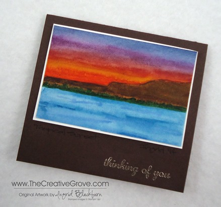
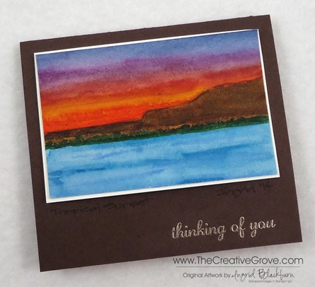
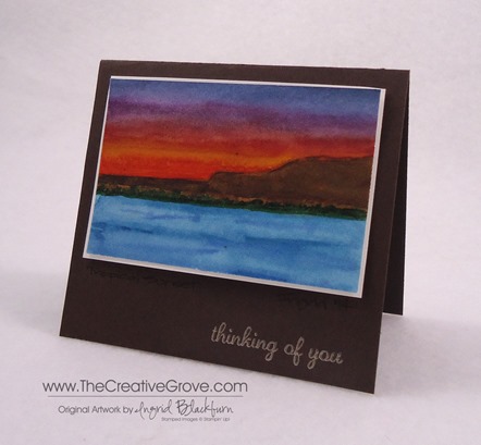
So have you tried your hand at a watercolor card yet?  Here is my third very different look for a quick, easy and totally artistic card – a watercolor landscape.  But this photo may do this card a little injustice – it’s a mini!  This is the perfect little gift card to really make you stand out from the rest.  Here is my first watercolor that has a graphic look to it  and here you will find my second – similar, yet completely different.

DSC09946

Of course, you could make this type of card in any size, I just wanted to get two out of the watercolor piece of paper I had, so I only used half the sheet and flipped it around to make a second.  The fun part is that this card literally took me about 5 minutes to make.  And that’s only because I had to let it dry in-between a few layers.

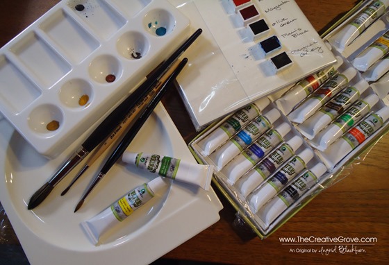
I used Schminke artist watercolor pans in the following colors: Paris Blue, Olive Green, Translucent Orange, Cadmium Red Deep and in Marie’s Tubes: Burnt Umber, Ultramarine, and Gambouge.  For the violet, I combined Paris Blue, Paynes Grey and Cadmium Red Deep.  For the greeting, I didn’t want it to stand out too much, so I used Pewter embossing powder rather than silver.

DSC09945

It’s fun to play with your colors.  I use a white flat China Plate as my Palette (round flat plate picture on bottom left).  If I’m using tubes, I squeeze a tiny bit on the edges and even allow them to dry.  I then treat it like the pans.  I’m come to the conclusion that I want all pans.  Although I have yet to watercolor anything larger than 10 inches.  I may feel different if I’m working on something large…lol!

DSC09930

I used my DaVinci Cosmotop blend #14 brush for the entire scene (large brush above).  I love that with the tip I can make the finest of details – although if I was going to need a ton of detail, I would definitely grab my smaller brushes!

Watercolor Landscape Cards Main L

I hope you have enjoyed this little series of watercolors, they are quite different from each other, but I made them all in one sitting in about 30 minutes.  It was fun to be varied, but yet also carry the theme of water coloring.

In case you need some more inspiration, head on over to a new challenge blog – Virginia’s View Challenge.  Her first challenge is about watercoloring and there are 250+ entries which give great inspiration.  Enjoy! 🙂

Now you give it a try!

Signature Snowflake 001

Shop 24/7 in my Online Store – Here

For other art supplies, check out these online resources:

Dick Blick and Jerry’s Artarama

For online card classes – be sure to check them out in the classroom under the Online Classes tab above!