Showcasing the Negative

Negative die cuts

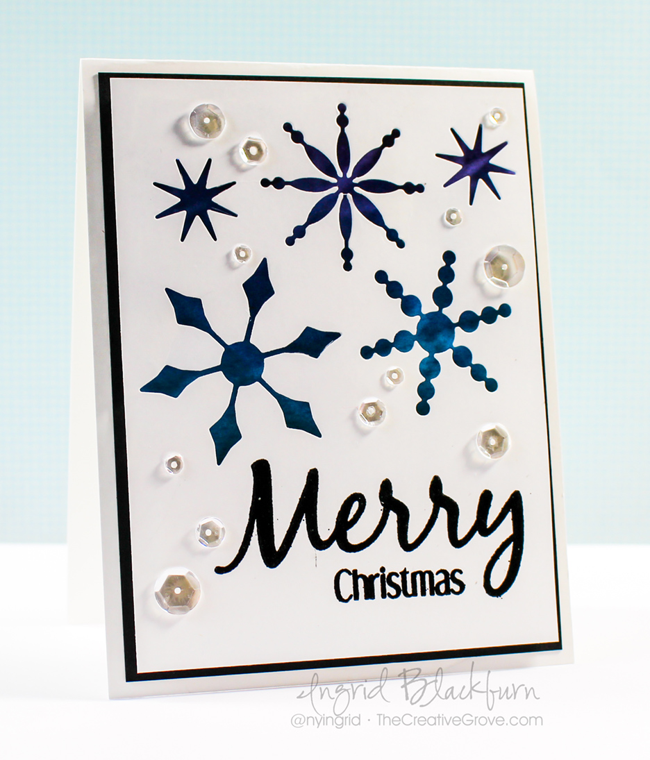
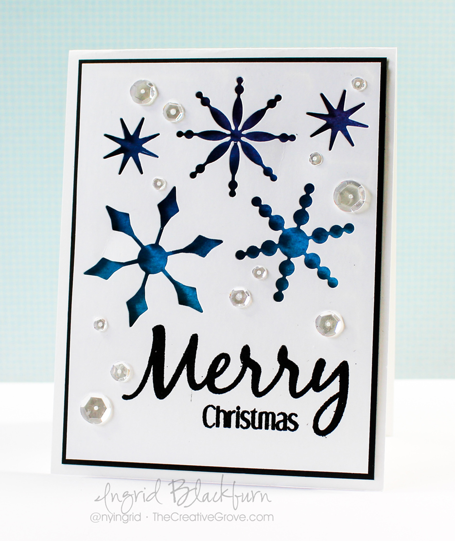
When you think Die Cuts, usually you would think about something laying on top of your project, or a paper piecing. But do you ever think in reverse? Today is all about showcasing what’s left over, once you use your die cuts to cut out your images – the negative die cut images. Over at Happy Little Stampers this month, the theme is Die Cuts. Now, normally I’d whip up something way cool piecing together some cool images that pop off your card. I thought it would be fun instead to pop UP my card and show a shadowed negative of the image. Best part – I still have the positive images cut out by my steel dies! That’s for another project….oh wait – I already created it HERE.

Happy Little Stampers Die Cut Challenge

Before I get into the nitty gritty of how easy it is to create this very cool card – be sure to welcome our Guest Designer for this month – Christine.

For this month’s project, I paired up with a rocking HLS sentiment from Everyday Sentiments and a few sparkling clear sequins – I have a great card that’s not only quick – serves double duty – not bad! Here’s how you can create your own:

using negative die cuts

How to Use Negative Die Cuts

  • Emboss your greeting in black first in the lower right corner of your card front – 3 13/16 x 5 1/16″. I wanted something big and bold to balance our my snowflake sky, so I chose Everyday Sentiments by HLS.
  • Arrange your snowflake dies – I used Bring on the Snowflakes by CAS-ual Fridays – , and cut out with your Die Cutting Machine. I got mine in the Holiday Collection from Stamp of Approval, but they’ll be released individually later this year.
  • Remove the dies cuts, leaving only the negative images in your card front

backgrounds for negative die cuts

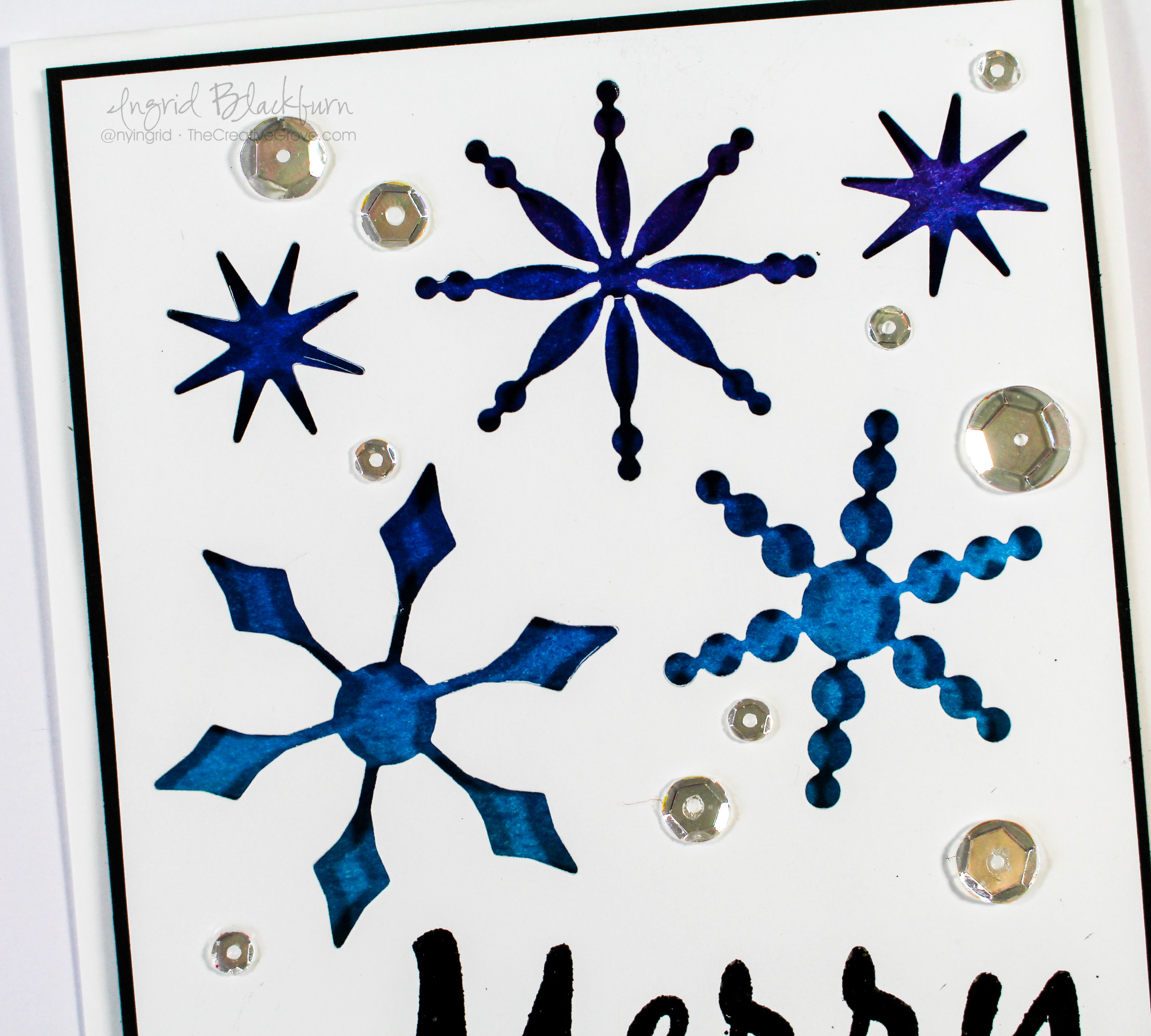
  • On a second slightly smaller piece – 3 11/16 x 4 15/16″ , sponge your desired colors or use a fun colored piece of card stock. You can do anything here, washi tape, watercolors, solids, patterned papers – it’s literally endless possibilities. I sponged an Ombre look starting with Broken China-Salty Ocean-Faded Jeans-Seedless Preserves and ending in Dusty Concord.
  • Adhere your colored background piece to a black piece of card stock cut slightly larger than your card front – mine is 1/16th larger  – 4 x 5 1/4″

easy christmas cards

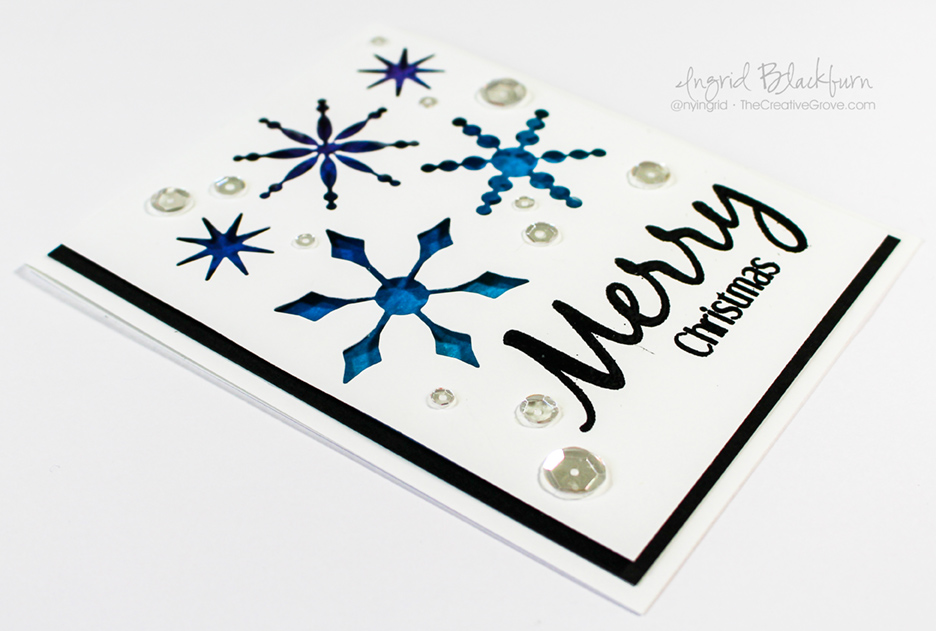
  • Now for the fun part – pop up your card front using fun foam, foam tape and dimensionals – I used all three with two sizes of smaller dots. Every nook and cranny was popped up – so nothing droops after shipping. You really want your card to have that full shadow effect.
  • Attach your black card stock to a folded A2 sized card (4 1/4 x 5 1/2″)
  • Add some sparkling clear sequins  by pretty pink posh – and you’re all set!

happy little stampers christmas challenge

And if you used colored card stock or sparkly paper, think of how easy and mass producible this card is!! Now it’s your turn – whip out those die cuts and get in on the action. It’s Happy Little Stampers birthday, so don’t miss out on some great prizes! Can’t wait to see what you create!

Now go get those fingers inky –

Signature

[optin_box style=”2″ alignment=”center” email_field=”email” email_default=”Enter your email address” email_order=”2″ integration_type=”aweber” double_optin=”Y” list=”3846012″ name_field=”name” name_default=”Enter your first name” name_order=”1″ name_required=”Y” opm_packages=””][optin_box_field name=”headline”]Learn more with our exclusive FREE video series:[/optin_box_field][optin_box_field name=”paragraph”]PHA+UGx1cyB5b3UnbGwgYmUgYWRkZWQgdG8gbXkgRlJFRSBDcmVhdGl2ZSBUaXBzIEUtbGV0dGVyIHdoZXJlIEkgc2hhcmUgZXhjbHVzaXZlIHByb2plY3RzLCB2aWRlb3MgJmFtcDsgdGhlIDEyIERheXMgb2YgQ2hyaXN0bWFzPC9wPgo=[/optin_box_field][optin_box_field name=”privacy”][/optin_box_field][optin_box_field name=”top_color”]undefined[/optin_box_field][optin_box_button type=”0″ button_below=”Y”]Get access now![/optin_box_button] [/optin_box]


Stacked Die Cuts – CAS Green Christmas Card

Stacked Die Cuts seem to be all the rage lately. If you haven’t tried this creative technique yet, I think you’ll be surprised at just how easy it is. Enjoy this quick tutorial into how this simple card was created!

Stacked Die Cuts 001

Stacked Die Cuts Card

  • You will first want to create your blended background on the top fourth of the card.  To see a step by step video tutorial on how to create a perfectly blended background, click here.
  • Mask off the bottom 3/4 of your card with post it notes. Use the following Distress inks in order when blending from the bottom up – Bundled Sage, Peeled Paint and Forest Moss.
  • Die cut the word Merry from your project, being sure to keep all the little pieces (Y, M – 2, E, R).  I keep these stuck to a piece of washi or painters tape so they don’t go missing.
  • Emboss the word Christmas in Black up above your Negative Die Cut word in the green area. Tip – be sure that area is totally dry – definitely use a de-static tool like an embossing buddy.

Stacked Die Cuts 003

  • Lay your Green/White cut out word Merry on a piece of painters tape or masking tape. Smoosh a versamark pad over your word and emboss in clear to give a shine. Once cool, remove with tweezers and set aside.
  • Stamp your gift in the bottom right corner using Memento Tuxedo Black ink. I use this ink because I’m going to watercolor with distress inks and it doesn’t bleed and gives a crisp image.
  • Watercolor your image using Bundled Sage, Peeled Paint and Fire Brick with an Aqua Painter.  Tip – be sure your paint brush isn’t too wet, as this is regular card stock. If you use too much water, you’ll get little white dots or lines from your paper.
  • Die Cut four more words in white.
  • To create your Die Cut stack, glue all five die cuts to each other with your Blended Piece on top.

Stacked Die Cuts 004Stacked Die Cuts 006

  • Add adhesive to a piece of Copy Paper that is wider than your negative cut out, adhere so that the sticky side faces the front.
  • Add your die cut and the cut out pieces to the sticky paper exposed in the negative die cut image. And there’s your stacked die cut!
  • Attach your card front to your card base and add a little Forest Moss to the top at the fold so there is no white exposed.
  • Add sparkling clear sequins from Pretty Pink Posh if you desire using Tombow Mono Liquid Glue.

Stacked Die Cuts 002

I designed this card with three challenges in mind today – Merry Monday – Gifts and Addicted to CAS – Green and Happy Little Stampers – Sponged.

CAS_Mar2015 150ATCAS - code word green

If you liked this tutorial on Stacked Die Cuts, be sure to get our exclusive video tutorial series by being on the Creative Tips E-letter list, sign up at the bottom!

Signature

[optin_box style=”14″ alignment=”center” disable_name=”Y” email_field=”email” email_default=”Enter your email address” email_order=”1″ integration_type=”aweber” double_optin=”Y” list=”2841626″ name_field=”name” name_default=”Enter your first name” name_required=”Y”][optin_box_field name=”headline”]If you enjoyed this tutorial…[/optin_box_field][optin_box_field name=”paragraph”]PHA+Li4ueW914oCZbGwgbG92ZSBvdXIgPHNwYW4gc3R5bGU9ImNvbG9yOiAjMjQ0YzVlOyI+PGVtPjxzdHJvbmc+ZnJlZSA8L3N0cm9uZz48L2VtPjwvc3Bhbj5zdWJzY3JpYmVyIG9ubHkgdmlkZW8gc2VyaWVzISDCoEdldCB0aGXCoDxzcGFuIHN0eWxlPSJjb2xvcjogIzI0NGM1ZTsiPjxlbT48c3Ryb25nPmV4Y2x1c2l2ZTwvc3Ryb25nPjwvZW0+PC9zcGFuPsKgQ3JlYXRpdmUgVGlwcyBlLWxldHRlciB3aGljaCB3aWxsIHRlYWNoIHlvdSBuZXcgdGVjaG5pcXVlcyB0byBhZGQgdG8geW91ciBzdGFtcGluZyBza2lsbCBzZXQuIMKgTGVhcm4gaG93IHRvIG1ha2UgcHJvamVjdHMgeW91J2xswqBsb3ZlITwvcD4K[/optin_box_field][optin_box_field name=”privacy”][/optin_box_field][optin_box_field name=”top_color”]undefined[/optin_box_field][optin_box_button type=”1″ text=”Send me exclusive tips!” text_size=”26″ text_color=”#000000″ text_bold=”Y” text_letter_spacing=”-1″ text_shadow_panel=”Y” text_shadow_vertical=”1″ text_shadow_horizontal=”0″ text_shadow_color=”#a3b640″ text_shadow_blur=”0″ styling_width=”100″ styling_height=”10″ styling_border_color=”#000000″ styling_border_size=”1″ styling_border_radius=”6″ styling_border_opacity=”100″ styling_shine=”Y” styling_gradient_start_color=”#a3b640″ styling_gradient_end_color=”#5b661e” drop_shadow_panel=”Y” drop_shadow_vertical=”1″ drop_shadow_horizontal=”0″ drop_shadow_blur=”1″ drop_shadow_spread=”0″ drop_shadow_color=”#000000″ drop_shadow_opacity=”50″ inset_shadow_panel=”Y” inset_shadow_vertical=”0″ inset_shadow_horizontal=”0″ inset_shadow_blur=”0″ inset_shadow_spread=”1″ inset_shadow_color=”#a3b640″ inset_shadow_opacity=”50″ location=”optin_box_style_14″ button_below=”Y”]Send me exclusive tips![/optin_box_button] [/optin_box]

Watercolor Christmas Cones

Don’t you just love watercolor and Distress Inks?   This tag card was actually an after thought believe it or not.  The main card was sent full tutorial and all to the Creative Tips List as part of the free 12 Days of Christmas series.  If you’re not on it – what are you waiting for – it’s free?

Watercolor Pine Cones 009

Back to this tag…I usually test stuff out when stamping with a new set and watercoloring, so this was my text swatch…thankfully it was just big enough for this tag die from Chalk Talk Framelit set by Stampin Up.  I wrapped it with some gold string, popped it up over some 1/2 strips – you know you have those lying at the bottom of your Cherry Cobbler folder with other scraps…added an embossed sentiment, some sequins and wallah – not sure on the spelling there!  Don’t you just LOVE the look?  Can you believe it’s made using Distress Inks?  You can use any dye based inks…but I just LOVE the result I get when I use Distress by Ranger.

Watercolor Pine Cones 010

It turned out so SUPER cute, I can’t stand it – this one is sitting on my desk at the moment…I just love the colors.  For all the details on how to do the watercolor stamping…be sure to get on the Creative Tips E-letter list.  I’ll be sure to get you the link for the tutorial…I promise! 🙂

Interested in the class instead?  We have all 12 projects + step by step videos + PDF’s as a class.  Take your time – it’s an online class with lifetime access 24/7!  

Get Instant Access Here

I also wanted to enter this card in a fabulous challenge that I just love – Distress.  I’ve participated in a few this past year…be sure to join in on all the fun – Virginia’s View is a fabulous way to get inky!

Virginias View challenge distressed

And one of my favorite stamp company’s challenge too – Simon Says Stamp Wednesday Challenge for Sparkly Creations.  They’re featuring Kaisercraft products, but I don’t have any!  So here are some fun sparkling clear sequins – my go to jewels of late by Pretty Pink Posh:

sss-wednesdayblog-logo


If you love the look Distress Inks can give a project – be sure to check out this fun technique – Vibrant Flicked Accents!

Happy Watercoloring!!

Signature_thumb.jpg

Clean and Simple Design with a European Twist

So what exactly is clean and simple card design – we’re going to explore just that…rooted in everyday life with a European Twist.  In the past several weeks, I created several projects to share with you here on the blog, our member VIP Community and the free Creative Tips List – 12 Days of Christmas Newsletter before setting off for a three week tour of seven countries in the Mediterranean.  We have been exploring various countries for a few weeks now, and today we are pulling into Naples, Italy.  As we sail up the Amalfi coast, the rain is pelting the window early this morning.  Thankfully, I don’t think it will last.

Rain or shine we venture out into each new city and country.  So far I’ve been inspired by the gorgeous ancient architecture of Athens, Greece, the barren and desolate countryside of Albania, and the uber-densely populated rich textures of the island of Malta.  In the coming days we will explore several ports in Italy, before venturing on to more countries and adventures.

Europe has such beauty and charm, and one of the things I am definitely drawn to is it’s simplicity sometimes.  Yes, there are the great works of art and architecture as in the Vatican City Sistine chapel and such beauty and grace all around, but the clean and simple look is what always captivates me.  I love the contrasting colors and find myself photographing a single cactus among a gorgeous old wall, or a unique door mixed with the textures of it’s surrounding building – just like clean and simple projects.

The Core of Clean and Simple Design

A true Clean and Simple project, aka CAS, has I would say up to 70% white space with only one true focal point and minimal embellishments.  It’s the empty space that allows you as the reader to focus on the beauty of the card.

Here are a few examples to help illustrate my point.  While the beauty of the Acropolis is amazing (pictured center below), because I truly love the clean and simple look, I am drawn more to the images on the right and left.  There’s real beauty in these photographs – mostly from their simplicity.  I took the CAS photos two days ago on the island of Malta.  On the left in Mdina – the Silent City and on the right in Valetta – the capital.  While the Parthenon (center) at the Acropolis is stunning, there’s a lot going on in this photo.  The Ruins take over.  I find the other two photos to be more interesting in texture and your eye is immediately drawn to the focal image – the door or Cactus.

Malta-Silent-City-DoorAcropolis 001Malta-City-Wall-cactus

In paper crafting, clean and simple projects consist mostly of ‘white’ space with one focal point.  This card definitely exemplifies that theory.  Your focal point should be placed with the Rule of Thirds in mind.  Break your area into a three section grid – horizontally and vertically – this gives you nine boxes (like a tic tac toe box).  In a nutshell, your focal point should never just be in the center, rather it should cross one of the main lines sharing two squares.  We’ll discuss that more in depth another day.  This will create more interest or drama in your project rather than just placing it in the center.  It makes it more appealing to the reader’s eye.

Look at all three photos above – the subject of each photo is never dead center with equal spacing – rather it crosses the thirds or two thirds – and in this, it gives the images interest, depth and character.

So let’s apply these rules to our project today.  The beauty of the stark white mixed with the neutral colors and simple embossed tree draws me in.  It also helps that the image, while in the center, crosses the top and middle rather than have equal spacing all around.  It makes it more interesting.  Take the tree itself as another example.  The greeting is in the bottom third of the tree itself and extends to the right or left, never just directly in the center.  Little details like this help pull a project together.

Clean and Simple Single Tree 001

To make this card, first, you’ll want to cut your tree.  Pick a center point on the top edge of a long rectangle and cut up from both opposite points.  I used a paper trimmer, but scissors will work fine.  I’d recommend longer scissors for a straighter edge over micro tip.

Once you have your tree, run it through your Big Shot with a fun embossing folder.

Clean and Simple Design Single Tree 003

Add a small trunk using a coordinating brown color.  I used Pear Pizazz for my tree and Early Espresso for my trunk.  Cut a sentiment in Espresso as well – I used Happy by Simon Says Stamp for my steel die – Merry would also work here.  Then stamp your greeting – I used Christmas from the coordinating Happy stamp set by Simon Says Stamp.  Use a hexagon punch to create your banner ends and attach them both using liquid glue.

Pop your tree up for a slight shadow on your card and you’ll have a great subtle layer in a shadow.  Overall, this card is super easy, quick and easily mass produced.

Clean and Simple Designed Single Tree 002

I love this card – simple always works for me.  What do you do for your Christmas cards – Clean and Simple or ornate? Tell me in the comments below!

Thanks for stopping by for a little bit about Clean and Simple Card Design today – wait till you see what I have for you next!

Smile

Signature

[optin_box style=”14″ alignment=”center” action=”http://www.aweber.com/scripts/addlead.pl” disable_name=”Y” method=”post” email_field=”email” email_default=”Enter your email address” email_order=”1″ integration_type=”custom” double_optin=”Y” name_default=”Enter your first name”][optin_box_hidden][/optin_box_hidden][optin_box_code]

[/optin_box_code][optin_box_field name=”headline”]If you enjoyed this tutorial…[/optin_box_field][optin_box_field name=”paragraph”]PHA+PHNwYW4gc3R5bGU9ImNvbG9yOiAjNjQ2MzVlOyI+TGV04oCZcyBzdGF5IGluIHRvdWNoISBNeSBvY2Nhc2lvbmFswqA8L3NwYW4+PHNwYW4gc3R5bGU9ImNvbG9yOiAjNjY2Njk5OyI+PHN0cm9uZz48ZW0+ZXhjbHVzaXZlPC9lbT48L3N0cm9uZz7CoDwvc3Bhbj48c3BhbiBzdHlsZT0iY29sb3I6ICM2NDYzNWU7Ij5DcmVhdGl2ZSBUaXBzIGUtbGV0dGVyIHdpbGwgdGVhY2ggeW91IHRvIG1ha2UgcHJvamVjdHMgdGhhdCB5b3UgbG92ZeKApjwvc3Bhbj48L3A+Cg==[/optin_box_field][optin_box_field name=”privacy”][/optin_box_field][optin_box_field name=”top_color”]undefined[/optin_box_field][optin_box_button type=”0″ button_below=”Y”]Send me exclusive tips![/optin_box_button] [/optin_box]

Sparkly Ornaments

DSC02021

It seems to be a sequin theme this week!  Today’s project combines two great weekly challenges – Mojo Monday and Merry Monday.  Fittingly – both give your week a creative jump start.  I have to admit, if I wasn’t prompted to use them (thanks to Deanne over at Merry Monday), I wouldn’t have used Sequins.  In actually, I had to go out to the store to get some!

I got lucky, there was a 50% off bin, and I quickly grabbed these super rich in color Magenta sequins along with some cool chocolate brown ones + plus three other colors at regular price – a whole 1,15 euros – seriously, that’s pretty cheap – where have these been all my life?

You may have seen my other Merry Monday card too – that one uses clear sequins to perfection – as snowfall!  I have a link to that project right here.  This week I’m a guest designer at the Merry Monday Christmas Challenge Blog.  Both Merry Monday and Mojo Monday challenges are fun, I encourage you to enter both!

Here’s the sketch for Mojo Monday this week and my interpretation:

mojo354DSC02020

Do you ever not know whether or not to put embellishments on your projects?  I have a little trick for what I do in that case below.

Creative Tips –

  • To really let the sequins be the star, choose neutrals as your card elements.  Here you see Basic Black, Whisper White and Basic Gray.
  • Both the darker pieces were run through the big shot with embossing folders, the black with the stylish stripes and the gray with the Mosaic Maddness.
  • To add a little depth to the Gray, sponge it lightly with the same color, then on the edges in black.

DSC02015

  • Cut a circle with framelits or a large punch.  Stamp your ornaments in a pigment based black in and emboss using the heat and stick powder then dazzling diamonds glitter.  To keep that glitter from really staying put – the heat and stick powder works wonders!  And the black ink under the glitter really shows off the various colors of the glitter – very cool!
  • Edge your circle lightly using a sponge and first Gray then black inks.
  • For the subtle background, use Christmas greeting stamps and emboss in Versamark ink, then heat and stick powder then Dazzling Diamonds glitter.  Edge with Gray or Black ink.

DSC02019

  • Adhere the black card stock strip (2 x 4 7/8”) to your background using Tombo Multi purpose glue.
  • Pop up the Gray piece on foam tape.  Glue the half of your ornaments circle to the gray, then add foam tape to the exposed side.  Adhere to your project.

DSC02011DSC02016

  • Wrap silver cord around your project three times.  Create a triple loop with four strings and place in between your stamped, embossed in black and cut out greeting.  Pop it up using foam tape and place over an Artisan Label punch out piece of Basic Black.
  • I wasn’t sure whether to leave it along at this point or use the Magenta Sequins as I planned.  Here are three choices I had.  My trick – take photos and then look at them in my camera or on the computer.  It’s much easier to figure out what to do here.  You can see that you can add sequins, photograph and switch out without having to adhere them.  My choices were none, clear or magenta.

DSC02007DSC02012DSC02015

  • I still couldn’t decide – so I went to my failsafe choice – ask my hubby Michael he quickly said purple and I knew my instincts were right!  Why do we always doubt those?!
  • My final touch was to add a few Rhinestones to the sequins, I know it’s a lot of bling, but why not?

DSC02022

Hope you love the end result.  If you liked this tutorial and want to learn more exclusive tips, videos and see other projects not on the blog – sign up in the box below and I’ll stay in touch with an e-letter from time to time.  You’ll immediately get the first of three project videos to keep you inspired!

Have a great day – now get stamping!

Signature

[optin_box style=”14″ alignment=”center” action=”http://www.aweber.com/scripts/addlead.pl” disable_name=”Y” method=”post” email_field=”email” email_default=”Enter your email address” email_order=”1″ integration_type=”custom” double_optin=”Y” name_default=”Enter your first name”][optin_box_hidden][/optin_box_hidden][optin_box_code]

[/optin_box_code][optin_box_field name=”headline”]If you enjoyed this tutorial…[/optin_box_field][optin_box_field name=”paragraph”]PHA+PHNwYW4gc3R5bGU9ImNvbG9yOiAjNjQ2MzVlOyI+TGV04oCZcyBzdGF5IGluIHRvdWNoISBNeSBvY2Nhc2lvbmFswqA8L3NwYW4+PHNwYW4gc3R5bGU9ImNvbG9yOiAjNjY2Njk5OyI+PHN0cm9uZz48ZW0+ZXhjbHVzaXZlPC9lbT48L3N0cm9uZz7CoDwvc3Bhbj48c3BhbiBzdHlsZT0iY29sb3I6ICM2NDYzNWU7Ij5DcmVhdGl2ZSBUaXBzIGUtbGV0dGVyIHdpbGwgdGVhY2ggeW91IHRvIG1ha2UgcHJvamVjdHMgdGhhdCB5b3UgbG92ZeKApjwvc3Bhbj48L3A+Cg==[/optin_box_field][optin_box_field name=”privacy”][/optin_box_field][optin_box_field name=”top_color”]undefined[/optin_box_field][optin_box_button type=”0″ button_below=”Y”]Send me exclusive tips![/optin_box_button] [/optin_box]

DSC02019

My type of Floral Garden

Fabulous Florets and Lattice  (3)

Do you have a flower garden?  I won’t lie, I do not have a green thumb.  Much to my parents dismay that I literally can not keep any floral plants alive – just ask my Dad, he asked me to care for 12 of his potted plants including two orchids earlier this year while traveling.  I explained that it wasn’t a good idea and that I was not cut out for this, but he insisted that I could do it.  Sure enough three months later, the one remaining orchid flower literally clinging on trying to prove me wrong, gave up and succumbed to the truth…I do not have a green thumb.  Story aside, today’s floral project I can do.

It’s July 1st and that means two of my favorite challenges went live – Virginia’s View and One Layer Simplicity Challenge – more on the latter tomorrow – it’s a great card (check it out here), you’ll want to stop by!  I wish I could post it today, but how many cards can I post in one day…lol?!  This month, Virginia’s View is about Die Cuts – one of my favorite toys to play with.  You too?

virginias view challenge 5

This one is a bit involved, but I had so much fun stamping, embossing and water coloring all afternoon!  Sometimes I just like to make an involved card, you know?  There are a ton of ideas below, so enjoy the creative tips tutorial!

Creative Tips –

  • I knew I wanted to use the lattice die today.  Try coupling it with an open area such as this one made by the Window Frames Collection by Stampin’ Up!
  • To make the flower garden, use various types of flower images of all sizes.  Here you see the large flowers from Blooming with Kindness, Regarding Dahlia’s, Fabulous Florals and Secret Garden.

Fabulous Florets and Lattice  (5)

  • First create masks out of copy paper and then add a little 2-way glue to the back.  Allow it to properly dry so that you can use it as a post it.
  • Mask several flowers, going around the frame, and filling up the entire card front. Here you see Perfect Plum ink on Elegant Eggplant card stock.
  • Attach your lattice die cut to the back of your frame filling it up evenly and pop it up with foam tape or dimensionals.  This will help create a shadow and give your project depth.

Fabulous Florets and Lattice  (8)

  • To create some whimsy, I used the branch stamp from Simply Sketched.  Emboss it on Vellum card stock with Espresso embossing powder.  Color from behind using Pear Pizzazz and Perfect Plum Markers.
  • Emboss the two flowers from Fabulous Florets in Black on watercolor paper.

DSC01631Fabulous Florets and Lattice  (11)

  • Color using Perfect Plum and Elegant Eggplant reinkers with varying strengths mixed with water.  We have a great tutorial on water coloring in layers in our Watercolor Techniques that Wow online class, along with six other techniques and projects.  Click Here for more Information

Fabulous Florets and Lattice  (9)Fabulous Florets and Lattice  (10)Fabulous Florets and Lattice  (1)

  • Arrange on your project and selectively choose where to place adhesive.  I used Liquid Glue for the branches – mostly on covered areas and tucked behind areas.  The flowers are popped up on dimensionals.
  • Emboss your greeting – this one from Fabulous Florets in Espresso on Vellum.  Vellum gives it a softer look to blend in a bit better with the flowers.  Wrap around the card front and tuck to secure under one of the branches.

Fabulous Florets and Lattice  (2)

Virginia’s View is a great challenge that will challenge your creative juices.  She’s really got some great ideas and I love participating in it!  I was honored to be considered a honorable mention last month for this tag.  A challenge that really put me out of my comfort zone.  So give it a try!

I hope I amused you and inspired you in some small way today.  For more inspiration on a regular basis, be sure to join the Creative Tips List.  Get projects, tips and exclusive videos sent directly to your inbox.

Have fun creating!

Signature-Blog

Fabulous Florets and Lattice  (7)


[optin_box style=”13″ alignment=”center” action=”http://www.aweber.com/scripts/addlead.pl” disable_name=”Y” method=”post” email_field=”email” email_default=”Enter your email address” integration_type=”custom” double_optin=”Y” name_default=”Enter your first name”][optin_box_hidden][/optin_box_hidden][optin_box_code]


IF YOU ENJOYED THIS POST
Let’s stay in touch! My occasional Creative Tips will teach you to make projects that you love…

[/optin_box_code][optin_box_field name=”headline”]If you enjoyed this tutorial…[/optin_box_field][optin_box_field name=”paragraph”]PHA+PHNwYW4gc3R5bGU9ImNvbG9yOiAjNjQ2MzVlOyI+TGV04oCZcyBzdGF5IGluIHRvdWNoISBNeSBvY2Nhc2lvbmFswqA8L3NwYW4+PHNwYW4gc3R5bGU9ImNvbG9yOiAjNjY2Njk5OyI+PHN0cm9uZz48ZW0+ZXhjbHVzaXZlPC9lbT48L3N0cm9uZz7CoDwvc3Bhbj48c3BhbiBzdHlsZT0iY29sb3I6ICM2NDYzNWU7Ij5DcmVhdGl2ZSBUaXBzIGUtbGV0dGVyIHdpbGwgdGVhY2ggeW91IHRvIG1ha2UgcHJvamVjdHMgdGhhdCB5b3UgbG92ZeKApjwvc3Bhbj48L3A+Cg==[/optin_box_field][optin_box_field name=”privacy”][/optin_box_field][optin_box_field name=”top_color”]undefined[/optin_box_field][optin_box_button type=”0″ button_below=”Y”]Send me exclusive tips![/optin_box_button] [/optin_box]


Sweet Summer Moments

It’s summer time – whoohoo!  And what reminds you of summer better than bold, fun and bright colors.  Admit it, you LOVE summer – so naturally, this last weeks CAS-ual Fridays Challenge was to create a clean and simple (CAS) card that uses hearts and summer colors.  I mean what a great combination!

So to make a real statement – I took it to another level and made a few butterflies out of some hearts too.  What do you think?  Let me know in the comments below.

DSC01587

CAS-ualFridays133

Creative Tips –

  • I’m sure you’ve figured out that my favorite color is blue.  I mean I use it all the time and have more blues than anything in my stock.  So I used Bermuda Bay from Stampin’ Up! as a base along with Coastal Cabana, Melon Mambo, Pacific Point (another blue…shocker!), and Daffodil Delight.   Aren’t those names just yummy! DSC01593
  • Cut some hearts out in two sizes with some framelit dies, another for your large butterfly, and you’ll need a smaller one too – I used a heart punch.
  • Some paper piercing adds some finishing detail, some foam tape or dimensionals for dramatic effect and stamp a fun design on the daffodil for your butterflies.  Here you see the left and right palm frawn from Stampscapes. DSC01595
  • To help define your butterflies, snip a little away from the sides to the end, make a small slit in the top and bottom and curl the edges.  Add some antennas and flight zoom (not sure what else to call it…lol) with a Pigma Micron or marker and you’re all set. DSC01597DSC01599DSC01598
  • The sentiment is perfect – it’s from the Happy Day set by Stampin’ Up! – how appropriate.

DSC01589

It’s a fun little card, perfect for the first couple days of spring.  I like the bright colors and clean and simple nature.  Now it’s your turn.  Have fun!

Signature-Blog

Looking for a fun place to learn techniques, see project videos and join in a paper crafting community?  Check out the VIP Community here at The Creative Grove!

TCG-VIP-Community

CAS Dahlia Mojo Monday

DSC01372

It’s been a while since I played along with the Mojo Monday challenge.  I have to admit, I’ve missed it!  I’ve been in a technique zone creating our new VIP Community here at the Grove (click here to find out more), so I threw a fun simple one into this project.  Sometimes when you have a cool texture that you’ve created for your card, making the rest clean and simple really allows it to stand out.

Here’s the sketch and my version.  You can see, I stayed pretty true this time.

Mojo349SketchDSC01375

Here are some tips on how to make this card, and join our Creative Tips list (on the right) to see exclusive free videos on how to make cards just like this:

  • Crumple your paper to create a faux leather look to your cardstock.  If you find it’s hard to do this, spritz it lightly with water.  Use the sweat from your palms to aid you in crumpling this up really well.
  • Cut your solid Navy strips thin – just 3/8” wide.
  • Adhere a thin strip of Cherry Cobbler and your Navy strips with Tombo Multi Liquid Glue.  When you alter cardstock, as with the crumpling, it becomes hard to work with.

DSC01376

  • Snip off the edges of all your strips and adhere your Sahara Sand cardstock to a 5 1/4” x 4” piece of white cardstock.
  • When adhering your large piece down, keep the same amount of space to the right, left and bottom.  It becomes an extended mat.
  • Cut a 2 1/2” circle with a circle punch, framelits or nestibilities. Stamp your Dahlia image in Cherry Cobbler.  Attach to your card front, leaving the same amount of space at the top as the bottom white to balance it out.  Use Liquid Glue on textured cardstock, dimensionals or foam tape to attach to the white to adjust for the height variance.

DSC01377DSC01378

  • Stamp your greeting and emboss in white on Navy cardstock.  Create a banner with your snips or hexagon punch (see video here on how to do that).  Attach with dimensionals onto the white, glue onto other parts.
  • Pierce edges of your card with a paper piercer and a template.
  • Add large pearls to Cherry Cobbler cardstock to finish your card.
  • Pop your card front up onto your card base.

DSC01373

You’re done!  It’s a fun little project, isn’t it?  Let me know what you think!  Leave me a comment below.  Happy Creating!

Signature-Blog

Interested in learning stamping techniques each month?  Check out our new VIP Community!