
Blending Distress inks works best when you do it in layers. I remember the first time I blended Distress Inks – I thought…I don’t get it – why do people love these? They didn’t stamp well, and I got funky lines when I sponged the inks. But, once I viewed a tutorial on the amazing properties of Distress inks, I decided to give them another shot and started to not just sponge them onto my project, but blend them together and it was one of those ah ha moments. Really a wow for me – just like when you embossed for the first time!
Today I have two versions of this card for you – a true one layer card and a kicked up version that is matted and uses the flicked distress technique. I also thought it would be fun to see exactly how to use your word stamps along with a step by step video tutorial on how to effortlessly blend your distress inks for an amazing background.
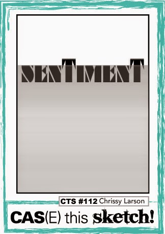
The concept for today’s project evolved from two challenges – CASe this Sketch #112 and One Layer Simplicity Words Challenge. This project uses your word stamps as a focal point and builds a card around that by blending distress inks.

Here’s are the keys to blending Distress inks:
You need multiple layers – one, two or three are not enough. Your first one is the undercoating, then you’ll build your color as you layer. Along with building your distress ink layers, you’ll also blend out any funky marks left by your sponge tool applicator. That’s the best part about these inks – the blending quality.
For instance, when you start to blend colors together, sometimes the darker color starts to overtake your project and it just doesn’t blend well. Come back in with your lighter shade and it will create an effortlessly blending between the two shades. That’s where Distress Inks really differ from other dye based inks. The inks have movable properties – especially when they come into contact with water.

On that note, you can also use your distress inks as watercolors. Yes, add water to them, and you can paint them onto your project. Or add water to your sponged inks and it’ll react to it. Their movable nature makes them reactive – and not so great for stamping. You will not get a good result like crisp edges. When I use them to stamp with, it’s with an image that doesn’t need to be so precise.
Another thing to remember is that Distress Inks are translucent, so they blend great with other colors to create new hues. That’s probably my favorite part!

Have fun with it! Here are the Creative Tips behind these two projects:
- Mask off 1 3/4” from the top of a 4 1/4 x 5 1/5” card. Blend your inks as in the video starting with Peacock Feathers, Broken China, Faded Jeans and Seedless Preserves.
- Be sure to go back over the Seedless Preserves with the Faded Jeans to get the deep blue you are looking for.

- Dry the blended background at the top where you will be stamping or set to the side until dry enough that embossing powder won’t stick to it.
- Stamp and emboss your word stamps to create a fun sentiment across the end of the blended area. Be sure to have your words go off the sides for a continual flow. Stamp the remaining greeting above or below to the right or left side. Emboss.
- The Matted card pops the black matte up using stamping dimensionals or foam tape.

Dimensions for the Matted Card –
- Blended Piece – 3 3/4 x 5”
- Black Matte – 3 15/16 x 5 3/16”
- White card Base – 5 1/2 x 8 1/2”

I also entered this project in a few other challenges – Virginia’s View Embossing Challenge, and the Less is More Makes me Happy Challenge.
I hope you enjoyed this tutorial on blending Distress inks. To see an exclusive video tutorial series with more great project – get our Creative Tips E-letter – see you next time!

[optin_box style=”14″ alignment=”center” disable_name=”Y” email_field=”email” email_default=”Enter your email address” email_order=”1″ integration_type=”aweber” double_optin=”Y” list=”2841626″ name_field=”name” name_default=”Enter your first name” name_required=”Y”][optin_box_field name=”headline”]If you enjoyed this tutorial…[/optin_box_field][optin_box_field name=”paragraph”]PHA+Li4ueW914oCZbGwgbG92ZSBvdXIgPHNwYW4gc3R5bGU9ImNvbG9yOiAjMjQ0YzVlOyI+PGVtPjxzdHJvbmc+ZnJlZSA8L3N0cm9uZz48L2VtPjwvc3Bhbj5zdWJzY3JpYmVyIG9ubHkgdmlkZW8gc2VyaWVzISDCoEdldCB0aGXCoDxzcGFuIHN0eWxlPSJjb2xvcjogIzI0NGM1ZTsiPjxlbT48c3Ryb25nPmV4Y2x1c2l2ZTwvc3Ryb25nPjwvZW0+PC9zcGFuPsKgQ3JlYXRpdmUgVGlwcyBlLWxldHRlciB3aGljaCB3aWxsIHRlYWNoIHlvdSBuZXcgdGVjaG5pcXVlcyB0byBhZGQgdG8geW91ciBzdGFtcGluZyBza2lsbCBzZXQuIMKgTGVhcm4gaG93IHRvIG1ha2UgcHJvamVjdHMgeW91J2xswqBsb3ZlITwvcD4K[/optin_box_field][optin_box_field name=”privacy”][/optin_box_field][optin_box_field name=”top_color”]undefined[/optin_box_field][optin_box_button type=”1″ text=”Send me exclusive tips!” text_size=”26″ text_color=”#000000″ text_bold=”Y” text_letter_spacing=”-1″ text_shadow_panel=”Y” text_shadow_vertical=”1″ text_shadow_horizontal=”0″ text_shadow_color=”#a3b640″ text_shadow_blur=”0″ styling_width=”100″ styling_height=”10″ styling_border_color=”#000000″ styling_border_size=”1″ styling_border_radius=”6″ styling_border_opacity=”100″ styling_shine=”Y” styling_gradient_start_color=”#a3b640″ styling_gradient_end_color=”#5b661e” drop_shadow_panel=”Y” drop_shadow_vertical=”1″ drop_shadow_horizontal=”0″ drop_shadow_blur=”1″ drop_shadow_spread=”0″ drop_shadow_color=”#000000″ drop_shadow_opacity=”50″ inset_shadow_panel=”Y” inset_shadow_vertical=”0″ inset_shadow_horizontal=”0″ inset_shadow_blur=”0″ inset_shadow_spread=”1″ inset_shadow_color=”#a3b640″ inset_shadow_opacity=”50″ location=”optin_box_style_14″ button_below=”Y”]Send me exclusive tips![/optin_box_button] [/optin_box]
So this post just made all the marbles in my head clicket together! Just as you described in your intro. I’ve been missing the link between the fabulousness of these inks and my creativity. Admittedly I’ve come to distress inks late in my playtime but I haven’t been able to do anything terribly profound with the mini set I bought beyond making vague patchwork quilt backgrounds (stamping the inks onto the surface side by side-ish and then spritzibg with water). Useful but not fabulousness. Your commentary comments hit all my trouble keywords – strange marks, darker colour overpowering lights, too much pressure, starting off the page, translucence! Going to play now keeping my “Aha facts” firmly pressed against the front of my brain. You just sit here in my iPad, Ingrid, next to me and cheer me on! *clicket*
Hi Sue –
I can’t wait to hear how you did – be sure to email me and let me know!!! ingrid at thecreativegrove.com
Ingrid, this is amazing! The blending is out of this world incredible…so smooth and perfect! It’s the perfect backdrop for words, words, words!
Thanks so much for sharing this at the One-Layer Simplicity Challenge!
Thanks Susan – glad you enjoyed it! 🙂
This is a great ‘words’ card. The arrangement of different fonts looks great and the blending is smooth and superb.
Thank you Heather! I love your work so much. 🙂
Congratulations on being Showcased at LIM, Ingrid! What a great post, too!! Hugs, Darnell
Thanks Darnell – your card was great too! Love that big smile. 🙂
Gorgeous ink blending, Ingrid! Love the video! Well done! So glad that you join the fun over Virginia’s View “All Things Embossed” Challenge!
Thanks Virginia! I love embossing – one of my favorite things to do. 🙂
Stunning use of distress inks – the deep rich colour is amazing! So glad you joined us at OLS!
Thanks Ardyth! Big compliment coming from the queen of blending! I SO love your work. Thanks for stopping by. 🙂
Sorry for my late visit, what a fab card for our happy challenge! Gorgeous depth of colour in that inking
Thanks so much for joining us
Anne
Less is More
Thanks Anne – you’re never late 🙂 It was a fun challenge – glad you liked the project. 🙂
Wow….your card is so beautiful, Ingrid. Fab blending en lovely colors. Like it :o)
Thanks jeanettie! I’m so glad you loved it. 🙂
Such a clever take on the sketch! Your ink distressed background is gorgeous!
Thank You Donna! 🙂
Beautiful cards and lovely blending! Thanks for joining us at CTS!
What a fabulous mix of colours, beautifully applied!
Great card!
Thanks so much for joining us.
Chrissie
“Less is More”
Thanks for visiting Chrissie! 🙂
Superb card and a brilliant informative video … I’m inspired now!
Thanks so much for sharing and taking part.
Sarah xx
Less is More
Thanks Sarah – glad you liked it! 🙂
FAB make – I LOVE how the text makes the blue panel look more like the sea with waves!!
Kathyk
Thanks Kathy! 🙂
Your card is so beautiful! Thanks for making the tutorial, showing how to blend distress inks! I didn’t realize how they worked exactly–you make the technique so easy to understand and execute! Thanks!
I’m thrilled it helped! Thanks for stopping by Jennifer! 🙂
Oh, your blending is fabulous! Great take on the sketch!
Thanks Leigh – quite a compliment coming from you! Thanks for stopping by today! 🙂
Hey Ingrid!! Your card is beautiful. I love the distress blues you blended together. They give the words such added interest. Nicely done.
Thanks Kymona! I’m glad you liked it. 🙂