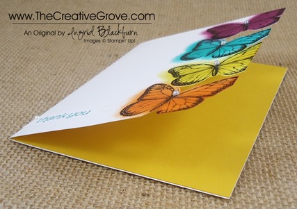
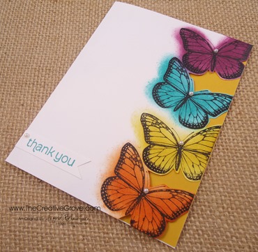
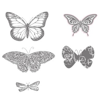
When I think of butterflies, I think of color. Butterflies are spots of color that fly around and color our world. It may be simplistic, but that’s what I see every time one flies by. So today I thought I’d add a little color to your world using the Best of Butterflies 25th Anniversary stamp set. Be sure to stop by tomorrow for the RemARKable Blog Tour with this set. You’ll get tons of ideas!
Creative Tips –
- I stamped my butterflies in Jet Black StazOn so that they wouldn’t smear when sponged.
- Normally I would use Sponge Daubers, but today I wanted a little messier a look, so I used my everyday Stamping Sponges.
- Tip – I wanted the sponging to have a light look, so I did it in a circular motion starting on my grid paper and then onto my butterfly. That way the harsh starting color isn’t on my project.
- When I think of the traditional butterfly, I think of the Monarch, so I started with two colors – Crushed Curry for that vibrant deep yellow and Tangerine Tango because that’s just the perfect shade.
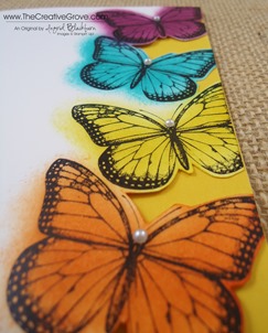
- I added a fun, bright blue – Bermuda Bay and wanted a purple, so I settled on Rich Razzleberry. I have to admit, it’s not my favorite shade for this project, but couldn’t settle on any other. What do you think?
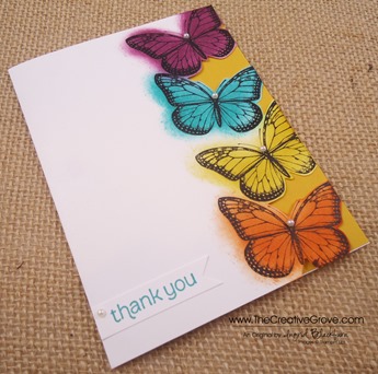
- I wanted a vibrant color on the inside that worked with all the colors so I chose Crushed Curry – one of my new favs! I added a full card panel on the inside. You could adhere it to the front cover, but the card would lose the flight effect.
- I have to admit, the greeting was not supposed to be a banner, but I dropped my card on my Razzleberry ink pad – whoops! Yes, I know, you’re thinking glad it’s not just me! Well if full disclosure is what you want, look at the bottom butterfly, see the extra ink? I cut out a little notch where it was really noticable, but couldn’t get it all – that’s okay, I’m human too!
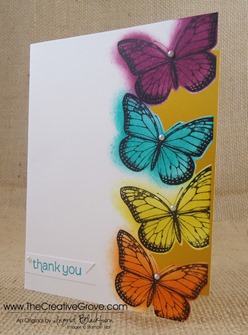
- So to fix my Razzleberry spot on my card, my greeting went onto a banner. Since I didn’t have any layers on the top of the card, I didn’t pop my banner up.
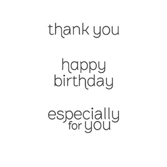
- The greeting is with our Made for You stamp set which is only available for two more weeks! It’s a great go to set that is so inexpensive, don’t miss out on this gem.
- For a little pop, I added the Pearl Basic Jewels on the butterfly heads – cause let’s be honest, the heads look a little freaky, so this way they are covered up in an elegant way.
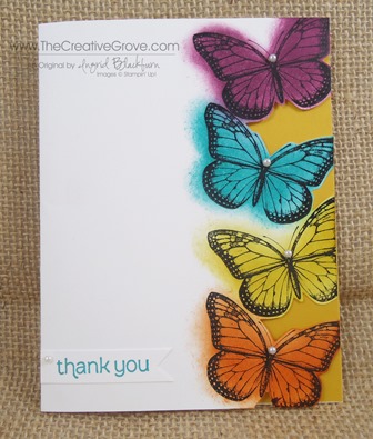
I hope you love my little splash of color into your day today. This is a fun, quick and bright card that works for any occasion. I like the messy colored look of it – kind of like I threw paint at it. Well, almost!
Are you getting my Exclusive Video Series?
Be sure to sign up for my Creative Tips Newsletter and get the latest Creative Grove news in addition to my free Creative Techniques Video Series! Don’t miss out on our creative community – the only way to get this exclusive content is to sign up in the box on the upper right or click here.
Upcoming Blog Tour
Be sure to stop by this Sunday for the 25th Anniversary Blog Tour featuring this cool stamp set. 20+ stampers with great ideas – you won’t want to miss it.
To Shop 24/7 in the Creative Store – Click here!
Stamp Sets – Best of Butterflies (133345c) Made for You (126342c, 126340w) Ink – Jet Black StazOn (101406), Tangerine Tango (126946), Crushed Curry (131173), Rich Razzleberry (126950), Bermuda Bay (131171) Paper – Whisper White (100730), Crushed Curry (131173) Cool Tools – Paper Snips (103579), 1” Square Punch (124094), Stamping Sponges (101610) Finishing Touch – Pearl Basic Jewels (119247)
![Signature-Snowflake-001_thumb1_thumb[1] Signature-Snowflake-001_thumb1_thumb[1]](https://thecreativegrove.com/wp-content/uploads/2013/05/Signature-Snowflake-001_thumb1_thumb1_thumb1.jpg)
Speak Your Mind