Have you ever played around with color theory using watercolor in your cards? This project shows how cool a little experimentation can be! I saw the sketch for Happy Little Stampers at the beginning of the month, and have been wanting to make this exact card ever since. Life and work kept me onto other projects, but I think you’ll agree with me, that it was worth the wait!
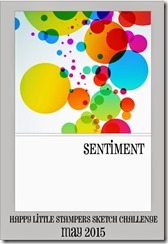
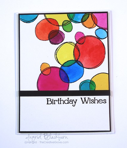
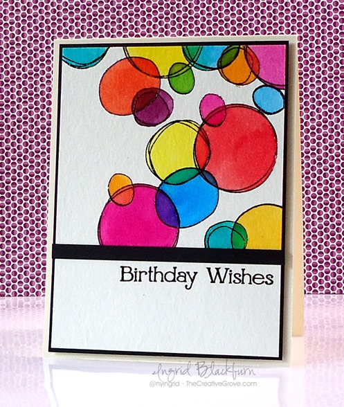
The sketch this month was quite colorful, and although I loved it so much that I created six completely different projects from it – yes six, I wanted to share my literal translation with you today. Here’s the original sketch and my card:
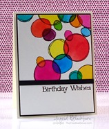
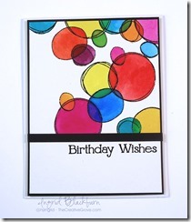
To get the best overlapping effect, I knew watercolor would be key. To use dye based ink for this purpose, try using distress inks to watercolor your embossed circles. Distress inks are so translucent in nature that they were perfect for this project. Keep the color wheel in mind when deciding which colors to place where, you don’t want to get a muddied color.
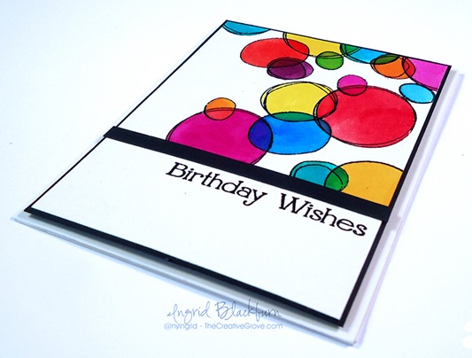
My favorite overlap mixture effect is in the bottom left – the large Picked Raspberry circle overlapping with the Spiced Marmelade and Salty Ocean – Both of those colors gave brilliant combinations with the pink – and surprised me!
I think the best part about this project is that I’m quite excited to try sponging new combinations, and I’m a bit more confident in the colors Picked Raspberry and Peacock Feathers – two colors that I used to be careful with when blending. Both were big surprises.
Watercolor Circles Tutorial
To get great boundaries for your watercolor – emboss the lined images from Simon Says Stamps: Scribble Flowers – there are 5, perfect for this project. Be sure to use a de-static tool to get rid of all stray pieces of embossing powder.
To watercolor, smoosh your pad onto a craft mat, spritz with water and use a watercolor brush. I used an Aqua Painter. Start with the lightest shades and work to dark. Spread the colors around and keep a color wheel either up on your screen or right next to you as a guide for which colors to combine.
The colors used in this project – Squeezed Lemonade, Mustard Seed, Wild Honey, Spiced Marmalade, Ripe Persimmon, Salty Ocean, Peacock Feathers, Picked Raspberry, Seedless Preserves, Mowed Lawn, Barn Door.
To help pull it all together and pop your images, matte your watercolor paper onto a black matte giving a 1-1/2/16” border. Then pop that panel up onto foam tape.
I’m also entering this into Simon Says Stamp Wednesday Anything Goes challenge! Why not – I love their stamps! 🙂
It’s a super fun project and has me thinking of other ways to overlap objects and watercolor. Time for more experimentations. Have fun with it!
[optin_box style=”13″ width=”500″ alignment=”center” action=”https://www.aweber.com/scripts/addlead.pl” disable_name=”Y” method=”post” email_field=”email” email_default=”Enter your email address” integration_type=”aweber” double_optin=”Y” list=”3846012″ name_field=”name” name_default=”Enter your first name” name_required=”Y”][optin_box_field name=”headline”]If you enjoyed this tutorial…[/optin_box_field][optin_box_field name=”paragraph”]PHA+4oCmeW914oCZbGwgbG92ZSBvdXIgPGVtPjxzdHJvbmc+PHNwYW4gc3R5bGU9ImNvbG9yOiAjMjQ0YzVlOyI+ZnJlZTwvc3Bhbj4gPC9zdHJvbmc+PC9lbT5zdWJzY3JpYmVyIG9ubHkgdmlkZW8gc2VyaWVzLiDCoExlYXJuIG5ldyB0ZWNobmlxdWVzIHRocm91Z2ggb3VyIDxzcGFuIHN0eWxlPSJjb2xvcjogIzI0NGM1ZTsiPjxlbT48c3Ryb25nPmV4Y2x1c2l2ZTwvc3Ryb25nPjwvZW0+wqA8L3NwYW4+Q3JlYXRpdmUgVGlwcyBlLWxldHRlcsKgYW5kIHN1YnNjcmliZXIgb25seSB2aWRlbyBhbmQgcHJvamVjdCB0dXRvcmlhbHMhPC9wPgo=[/optin_box_field][optin_box_field name=”privacy”][/optin_box_field][optin_box_field name=”top_color”]undefined[/optin_box_field][optin_box_button type=”1″ text=”Send me exclusive tips!” text_size=”32″ text_color=”#000000″ text_bold=”Y” text_letter_spacing=”0″ text_shadow_panel=”Y” text_shadow_vertical=”1″ text_shadow_horizontal=”0″ text_shadow_color=”#f6fefb” text_shadow_blur=”0″ styling_width=”50″ styling_height=”19″ styling_border_color=”#000000″ styling_border_size=”1″ styling_border_radius=”6″ styling_border_opacity=”100″ styling_shine=”Y” styling_gradient_start_color=”#a3b640″ styling_gradient_end_color=”#80902c” drop_shadow_panel=”Y” drop_shadow_vertical=”1″ drop_shadow_horizontal=”0″ drop_shadow_blur=”1″ drop_shadow_spread=”0″ drop_shadow_color=”#000000″ drop_shadow_opacity=”50″ inset_shadow_panel=”Y” inset_shadow_vertical=”0″ inset_shadow_horizontal=”0″ inset_shadow_blur=”0″ inset_shadow_spread=”1″ inset_shadow_color=”#80902c” inset_shadow_opacity=”50″ location=”optin_box_style_13″ button_below=”Y”]Send me exclusive tips![/optin_box_button] [/optin_box]


This is GORGEOUS! So well done! I love this!
Thanks!! Glad you liked it. 🙂
LOVE what you did with the sketch! Great colors you achieved. I had fun with this sketch too. 😉
Thanks my friend! It was fun. 🙂
Hi Ingrid. I LOVE LOVE LOVE how you used the sketch. Watercolours were a brilliant idea and those colours just jump off the page. Thanks so much for playing along at Happy Little Stampers and good luck with the DT call xx
I’m so glad you love it Kylie – that sketch inspired eight project videos for various classes by the time I was done…lol! SO thanks! 🙂
Wow! Great work … the watercolours are just perfect for this technique and I love how the colours change when they overlap. The black framing really makes the colours pop even more. Thanks for playing along at Happy Little Stampers.
Thanks Loll! That’s what I saw the first day it went live – took me a whole month to finally get to make this card – so glad your challenge is all month…lol! 🙂 Thanks for stopping by. 🙂
Gorgeous! Love the clean and graphic look. Your tutorial is awesome, Ingrid! Thanks so much for playing Simon Says Stamp Wednesday “Anything Goes” Challenge!
Thanks for stopping by Virginia! Glad you loved the card. 🙂
Love the squiggly look of the SS circles. Blending the distress inks in the overlapping circles really gives your card a great look.
Thanks – the photos don’t do it justice – they look so transparent and super cool when overlapped IRL. Almost like little pieces of colored plastic transparencies – way cool – you should try it Carol! 🙂 Thanks for always stopping by. 🙂
Love the bright colors in this card! You did a beautiful job of showcasing them with the ss stamp.
Thanks my friend! This card is way too cool! 🙂